


How UX Impacts Conversion Rate Optimization? CRO UX Tips



As businesses compete for clicks, conversions, and relevance online, two engines are powering this fight. Conversion Rate Optimization (CRO) and User Experience (UX) design.
CRO refers to the data-backed science of fueling the percentage of users taking meaningful/result-oriented actions (buying, subscribing, etc.) on digital platforms.
UX design is all about crafting the emotional and functional journeys of users on these platforms.
Good UX design makes users stay, explore, and trust digital platforms. This is why UX design is important for business, especially when attention spans are shrinking.
A good CRO is what makes them become committed customers.
Businesses that master UX conversion optimization get to create frictionless digital platforms that routinely win over new customers.
This blog post aims to unveil the crucial role played by CRO in UX and all the essential UX design tips to improve website conversions in 2025.
What is Conversion Rate Optimization (CRO)?

CRO is the process of increasing the % of visitors who take desired actions like purchasing, registering, or engaging with content on a website/app. It is a data-driven discipline that focuses on refining user experiences to maximize a digital platform’s ability to convert visitors to customers.
In 2025, conversion rate optimization in UX design is a nuanced field that blends AI, predictive analytics, and real-time personalization to create digital journeys with surgical precision.
But CRO wasn’t always this slick.
Born in the 90s alongside the commercial web, early CRO tactics were blunt instruments – pop-ups and flashing banners screaming “Click Here!” The 2000s introduced A/B testing and analytics, turning CRO into the discipline we know today. By the 2010s, it matured into a structured practice with tools like Optimizely and dedicated CRO teams tweaking buttons and headlines to maximize a platform’s conversion potential.
Fast-forward to today, and CRO is more sophisticated than ever. Today, predictive AI models anticipate user intent while they’re browsing and drive them toward conversion. Hyper-personalization is used to tailor user journeys to individual behaviors. In addition to tracking big wins like buys or subscriptions, businesses also track ‘micro-conversions’ like video views or users’ scroll depth on webpages.
The major brands of today have CRO locked in as a tried-and-tested science. They integrate their CRO efforts across teams, from marketing to product, using real-time data to optimize every touchpoint in users’ experiences with the brand. For them, UX design and conversion optimization are pretty much two branches of the same tree.
This mastery and prioritization of conversion rate optimization in UX design is vital because competition for users’ attention in the digital space is getting more brutal every year. Customer acquisition costs (CACs) are climbing year by year (some industries report 20% annual increases), and wasting traffic is reckless.
Effective CRO boosts ROI, cuts waste, and fuels growth. Ignore it, and you are bleeding revenue to rivals who have turned UX conversion optimization into an art form.
How UX Directly Impacts CRO?
UX builds the foundation for delightful, intuitive interactions, while CRO sharpens those interactions into precise conversion drivers.
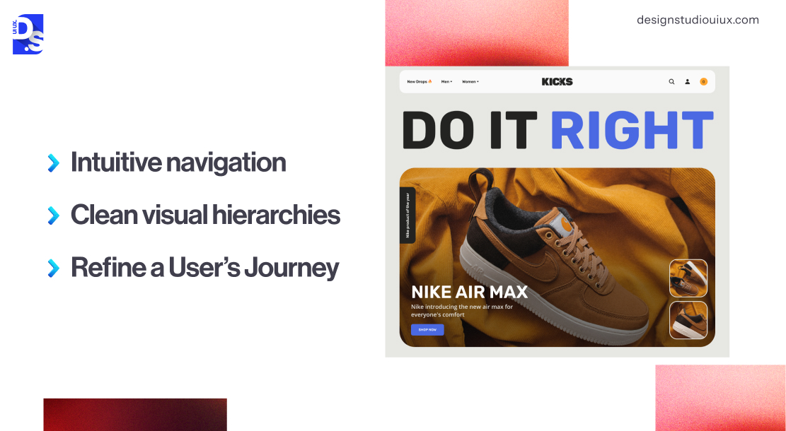
- Intuitive navigation (a facet of UX design) slashes cognitive load and keeps users on the path to conversion.
- Clean visual hierarchies guide eyes to effective CTAs that say “Buy Now” or “Subscribe”.
- Every scroll, click, or hesitation is a data point that UX designers use to refine a user’s journey from first contact to conversion.
Their synergy is critical in 2025, where modern users expect flawless, tailored experiences, and businesses cannot afford wasted opportunities.
Without good UX design, CRO efforts can feel pushy or manipulative. Without CRO, a platform’s UX design becomes directionless and yields no measurable results.
Contact Forms often act as the final conversion gateway, so improving form UX can significantly reduce drop offs and increase completion rates. That’s why the best companies integrate the two by setting up cross-functional teams.
Conversion rate optimisation in SaaS isn’t a standalone discipline; it’s the measurable outcome of every UX decision made across your product, from the moment a visitor lands on your marketing site to the moment they hit their activation milestone inside the product.
Our SaaS UX design complete guide covers the full SaaS UX lifecycle and shows exactly where conversion decisions are won and lost.
Integrating conversion rate optimization in UX design makes sure that every design decision fuels measurable business goals while addressing users’ overarching needs.
Key UX Elements for Better Conversion Rate Optimization
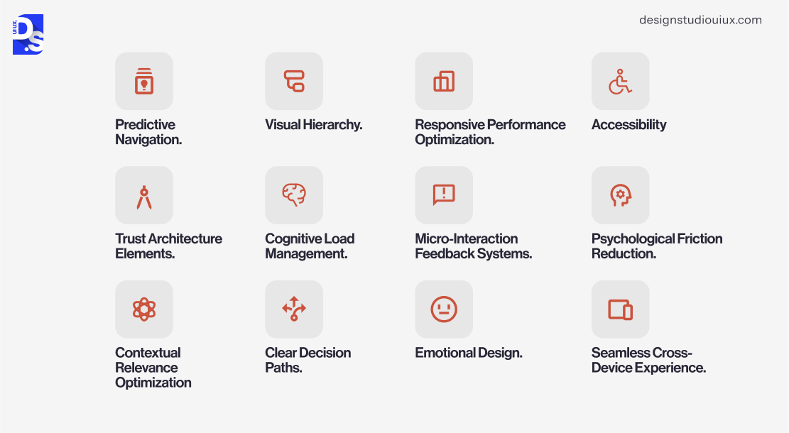
Certain UX elements operate as silent conversion engines in many digital platforms today. These carefully crafted components shape user pathways, reduce cognitive friction, and build subconscious momentum toward desired actions.
Predictive Navigation
Intuitive navigation architecture is the foundation of any digital platform. Without well-organized menus, links, and pages, digital products would not feel logical or familiar.
Clear labels and a structure that mirrors how people think guide users straight to what they want. This directly boosts conversions by slashing the time it takes to act. Without it, confusion reigns.
Nowadays, UX designers use AI tools to give these architectures predictive capabilities. These systems can anticipate user needs by analyzing historical interactions and real-time intent signals. Then, they dynamically adjust menu structures and content placement. This AI-powered wayfinding reduces exploratory friction, keeping users engaged on optimal conversion pathways.
Visual Hierarchy
This is the art of steering attention with design – bigger buttons, bolder colors, smart spacing. It subtly screams, “Look here first!” to highlight key actions like “Buy Now” or “Sign Up.” By making the next step pop, it indirectly lifts conversions without users feeling pushed.
Lose this, and pages turn into a jumbled mess. Eyes dart around, missing critical cues, and conversion opportunities fade. Visual hierarchy keeps the focus where it counts.
Creating an effective visual hierarchy is a significant component of good UX for landing pages. It guides the visitors in such a manner that they pay attention to the most important elements. This, in turn, makes the user journey smooth and intuitive, from arrival to conversion.
Responsive Performance Optimization
Speed is king in UX. Users demand pages that load fast and work flawlessly across devices.
To achieve this, UX designers fine-tune code, compress images, and ensure mobile responsiveness. When UX elements respond instantly, users stay on the path to conversion.
A sluggish site? Frustration spikes, bounce rates soar, and sales vanish. Fast, efficient performance keeps users hooked from the first tap/click.
Trust Architecture Elements
These are the subtle signals, security badges, clear policies, and customer testimonials that whisper, “You’re safe with us.” They are crucial at decision points, calming nerves before a purchase or signup. When trust is solid, conversions rise directly as users feel secure taking action.
Overlook this critical aspect of UX writing, and doubts fester in users’ minds. Strong UX writing transforms hesitation into confidence by clearly communicating value, security, and next steps at exactly the right moment.
Cognitive Load Management
This is about keeping things simple. It is about trimming clutter so users do not drown in mental effort. It is about using clean layouts, concise text, and only giving users simple, focused tasks.
By easing the brain’s workload, it indirectly boosts conversions as users glide toward decisions without exhaustion. Overcomplicate it, and users freeze, abandon forms, or leave.
Micro-Interaction Feedback Systems
Microinteractions in UX design are the tiny confirmations – a loading spinner, a checkmark after clicking “Submit.” They make digital actions feel real and responsive. They reassure users they are on track.
This directly enhances conversions by cutting uncertainty at key moments. Without them, users wonder if something broke. Doubt creeps in, actions stall, and conversions slip away.
Psychological Friction Reduction
These UX elements tackle the doubts, fears, and other emotional hiccups that slow users down. For example, a message like “No hidden fees” that eases users’ worries on checkout pages.
By soothing the mind, these UX elements indirectly lift conversions as users move forward without pause. Ignore it, and anxiety builds. Users second-guess, hesitate, and drop off.
Contextual Relevance Optimization
This is about serving up content that fits the moment. We’re talking tailored content or product suggestions based on user location or behavior.
Relevant content presentation directly drives conversions by showing users exactly what they need when they need it. Without it, users may lose interest and drift away.
Clear Decision Paths
This is about structuring choices, say, product options, so that they are easy to digest. For example, logical categories or guided comparisons that prevent overwhelm.
Simplifying user decisions indirectly boosts conversions as users confidently pick and proceed. Leave it out, and choice paralysis hits. Users stall, overthink, and abandon ship.
Emotional Design
Using warm tones, friendly copy, or joyful visuals builds a bond that makes users want to engage. Indirectly, it lifts conversions by sparking loyalty and trust.
Without emotion, user experiences can feel cold, forgettable, and unworthy of conversion. Disjointed emotional flows also create subconscious resistance and disrupt the narrative momentum necessary for users to make committed actions.
Seamless Cross-Device Experience
A fluid cross-device flow respects users’ time and boosts their chances of conversion. Users should be able to hop from phone to laptop mid-task or mid-conversion.
Small UX elements like a saved cart directly impact conversions by allowing users to dodge time-consuming journey restarts that kill conversion momentum.
That’s why following mobile UX best practices is a critical aspect of CRO today.
Accessibility
Designing for everyone widens your reach and sharpens usability for all. Indirectly, it boosts conversions by smoothing the path for more users. Skip it, and you lose entire audiences.
Best Practices for UX & CRO
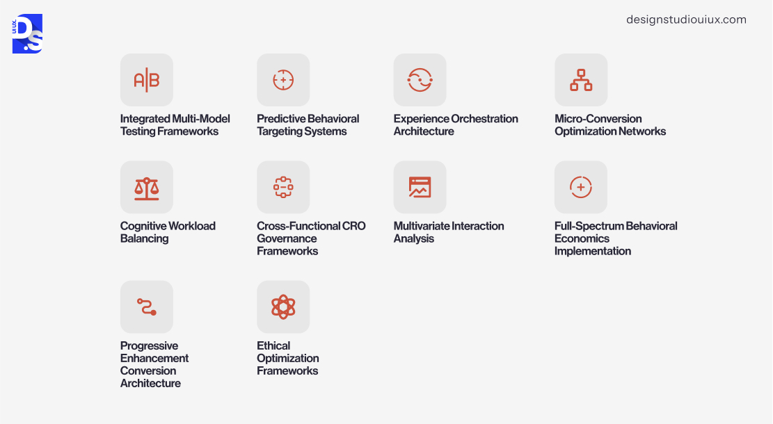
Since UX design and conversion optimization are inextricably linked fields, following UX design best practices is the best way to boost a digital product’s conversion potential.
But, some practices are specially designed to serve as force multipliers for conversion strategies. Most of these practices are rooted in conversion centered design principles , a framework that treats every design decision as a direct driver of user action.
They include:
Integrated Multi-Model Testing Frameworks
Ditch the old, one A/B test at a time, playbook.
The leading brands employ modern testing frameworks and run dozens of experiments at once, using AI to instantly funnel traffic to top-performing designs.
Think of it as survival of the fittest for your UX – only the strongest variations survive. Without this, you’re stuck waiting weeks for results while competitors sprint ahead.
Slow testing means stale ideas, and stale ideas kill conversions.
Predictive Behavioral Targeting Systems
By analyzing subtle cues like how long someone hovers, where they hesitate, the latest behavioral targeting systems can predict what users want before they ask.
Imagine your site morphing its content to match each visitor’s hidden intent. No more serving the same bland experience to everyone.
Experience Orchestration Architecture
This is the practice of syncing every experience your brand delivers online – on its emails, site, and app- into one cohesive journey. Centralized data tracks behavior, ensuring consistent UX everywhere. This indirectly boosts conversions by erasing channel friction.
Micro-Conversion Optimization Networks
Big wins start small. Track tiny victories on your website or app – email sign-ups, video views, and keep refining them until you finally nudge users toward the finish line.
Share affirmative messages with users every time they complete a small step. Keep reminding them what awaits once they take the macro-step.
Cognitive Workload Balancing
Use tools to simplify forms or menus based on context, like shortening form fields for smartphone users or reminding users of their screen time if they use your app for too long.
These practices build empathy. They make digital experiences feel more human and more conversion-worthy.
Cross-Functional CRO Governance Frameworks
Break down the office silos. Get designers, marketers, and data nerds speaking the same conversion language. Set shared goals, track unified metrics, and watch teamwork fuel results.
Without unified governance, departments tug in opposite directions. Experiences fragment, and conversions suffer.
Multivariate Interaction Analysis
Never tweak UX elements in isolation.
Every piece of your UX, colors, copy, and layouts work together. Always perform multivariate analyses to ensure you optimize all connected UX elements for conversion.
For example, merely making the CTA buttons of your landing pages bigger in size won’t work unless the size adjustments are in line with the pages’ visual hierarchy.
Full-Spectrum Behavioral Economics Implementation
Bake psychology into every step. Use scarcity for urgency, social proof for trust. This practice indirectly supports conversions by tapping into users’ natural instincts.
But keep it subtle. Slapdash tactics feel manipulative.
Progressive Enhancement Conversion Architecture
Not everyone has 5G. Build core features that work on ancient browsers or spotty Wi-Fi, then layer on fancy extras for high-speed users.
No one likes a broken site, especially when they’re ready to buy. Fail here, and you’ll lose the lagging (but paying) crowd.
Ethical Optimization Frameworks
Routinely perform UX audits on your product’s design to spot and eliminate dark patterns.
Make opt-outs as easy as opt-ins. Users remember when you respect them and punish when you do not. Cut corners on ethics, and those quick conversions will cost you lifelong customers.
How to Align UX and CRO in Your Strategy
Once you bake in these best practices and error avoidance strategies into your product design plans, create a shared playbook for your UX designers and CRO specialists to follow, by:
Breaking Down Silos
Schedule weekly cross-team huddles where designers and marketers dissect funnel drop-offs. Use shared dashboards blending bounce rates with heatmaps. If a beautiful page is not converting, dig into ‘why’ as a team. Use Confluence to maintain a shared journey map, tagging pain points with CRO metrics.
These steps ensure all design efforts made by your team prioritize user flow and revenue.
Use Heatmaps as X-Ray Vision
Deploy Hotjar to constantly track where users click, hover, and bail. Set up Google Analytics custom events to capture micro-interactions, like hover times on CTAs.
Build dashboards in Looker Studio to visualize drop-off points and then correlate those with your UX elements. Schedule monthly reviews to prioritize fixes based on data.
Test, Tweak, Repeat
Replace one-off macro-redesigns with a cycle of routine micro-tests and micro-redesigns. Run parallel A/B tests with Optimizely, targeting specific UX elements like button placement.
Create a Trello board for a two-week optimization sprint, ranking tasks by conversion impact and effort. Store results in Notion, detailing all hypotheses and outcomes for all teams to see.
Use AI to automate traffic allocation to top performers. This relentless cycle will keep maximizing your CRO plans’ effectiveness.
Simulate Real Struggles
Run usability tests where participants attempt tasks (such as checkout) while you watch.
Use Maze to run remote tests, scripting tasks that mimic checkout or signup flows. Integrate eye-tracking into your tests with Tobii to spot where attention drifts from CTAs. Record sessions using Lookback, analyzing verbal hesitations at key steps. Score tests with a rubric blending usability and conversion intent.
Share findings in bi-weekly debriefs and assign UX fixes to specific team members. Simulate real struggles with user testing.
Speed as a Feature
Compress images using WebP, lazy-load off-screen content, and minify code. Use tools like Lighthouse to grade page speed. Treat any score under 90 as an emergency.
Device-Hop Proofing
Only create responsive designs that adapt to any screen and test them routinely. Create a PWA with Workbox for offline cart persistence. Use Tailwind CSS for fluid components.
Test across devices with BrowserStack. Track sessions in Amplitude, flagging cross-device drop-offs. Implement OAuth for seamless logins, preserving state.
Run monthly device-specific UX audits to catch errors. These measures will keep unifying your brand’s digital journeys and boosting its overall CRO efforts.
Common UX Mistakes That Kill Conversion
Following every best practice will be futile, and even the most meticulously detailed and conversion-focused website redesign project plan will crash against rocky UX shores – if you let the following mistakes pile up.
Cluttered Chaos
Overstuffed pages bombard users with too many choices, visuals, and messages. This sensory overload paralyzes decision-making. When everything screams for attention, nothing gets it. Users bounce rather than wade through the noise, leaving conversions buried under the mess.
Mobile Mayhem
Sites that are not mobile-optimized force pinching, zooming, and accidental clicks.
On smaller screens, every pixel counts. Frustrated users abandon ship rather than fight unresponsive buttons or glacial load times.
Silent Systems
Actions without feedback, like form submissions, leave users guessing. Did it work? Should they resubmit? Uncertainty breeds distrust, pushing visitors to exit rather than risk errors.
Ghost CTAs
Buttons hidden in visual static or labeled vaguely (“Learn More”) fail to guide new-age users. Missed cues mean missed conversions; if they cannot see the next step, they won’t take it.
Speed Bumps
Slow pages test patience. Each second of delay chips away at commitment, especially on mobile. Users won’t wait; they’ll leave before your site finishes loading.
Maze Navigation
Confusing menus and buried pages force users to hunt for content. Every wrong click drains momentum, increasing the odds they’ll quit rather than keep searching.
Unnatural Flows
Designs that break conventions (like reverse-scrolling) demand extra mental effort. Familiarity breeds confidence; confusion breeds exits.
Form Fatigue
Lengthy forms or multi-step checkouts test resolve. Each field adds risks of abandonment. Users want simplicity, not interrogation.
Inconsistent Vibes
Buttons that change color or placement across pages force users to relearn basics. Inconsistency erodes trust; if the rules keep changing, why stay?
Broken Search
Weak search tools that cannot handle typos or synonyms dead-end users. Failed searches mean lost sales, especially in eCommerce.
Search UX best practices ensures your search bar handles typos, synonyms, and user intent, keeping users on track rather than sending them to competitors.
Pop-Up Pandemonium
Intrusive ads or endless pop-ups shatter focus. Users come to convert, not dodge distractions. Annoy them once or twice, and they are gone.
Conclusion
Effective UX design is the heartbeat of successful conversion optimization and vice versa. By embracing the practices and alignment strategies we’ve outlined here, you too can craft digital experiences so smooth that converting feels effortless.
Start now. Audit your site or app today. Where do users stall? Which forms frustrate? Fix one UX flaw this week – test, measure, repeat.
If you need help getting started, contact Design Studio UI/UX for more detailed and personalized assistance!
Frequenty Asked Question
What is the link between UX and conversion rate optimization?

UX supplements the user journey by simplifying it, thus making it more direct and intuitive to the visitors who complete actions as desired. This results in the increase of the rates of conversion.
How does better UX increase conversions?
Good UX reduces friction, simplifies navigation, and builds trust. This encourages users to stay longer and complete actions like sign-ups or purchases.
Which UX elements impact conversion the most?
Key UX factors include fast loading speed, mobile responsiveness, simple navigation, effective CTAs, and clean forms.
Is there a difference between UX and UI in CRO?
Yes. UX focuses on the overall user journey, while UI deals with visuals. Both are critical for optimizing conversion paths.
How do you measure UX impact on CRO?
Track metrics like conversion rate, bounce rate, session duration, and heatmaps to see how UX changes affect performance.









