


10 Dark Mode UI Best Practices, Principles & Examples



Quick Summary
Best practices for dark mode design include using desaturated colors like dark grey instead of high-contrast blacks, and choosing images that remain clear in low light without straining the eyes. Designers must ensure the text mentioned in the website is not pure white and try to keep keyboard focus outlines visible for accessibility. Also, they should test all the design layouts in both dark and bright lighting before launching the final product.
Dark mode has become second nature to how we experience screens today. It’s what people turn to when their eyes feel tired or when the glow of a white screen feels too harsh late at night.
It’s not just a visual preference anymore; rather it is about comfort, focus, and even a bit of calm built into design.
The best combination for elevating dark mode design is to use white text and black background.
It is recommended to make the dark mode with dark grey (#121212) and off-white so the contrast is not too harsh.
Avoid bright colors and heavy shadows for lighter layers, keep focus indicators visible, and always test it. This combination reduces eye strain, saves battery, and makes your app look clean and focused.
What is Dark Mode in UI/UX Design?
Dark mode is a night-friendly UI design style that predominantly features dimmed, dark, and grey color themes for all UI elements. This design mode reflects less light and that is why it is more night friendly for users.
Less light means less glare from the screen. In low-light environments, activating ‘dark mode’ can provide some much-needed relief when your eyes feel strained from staring at bright screens.
This shift in design can be integrated effectively through professional UI/UX development services for a smooth user experience.
This trend highlights the impact of color psychology in web design, as the choice of darker tones helps create a more comfortable and visually appealing user experience.
That’s why “dark mode” has become more than just a design style.
On many apps and websites, dark mode is a default feature that users can switch to any time they feel tired of using the standard “light theme.”
10 Best Practices for Dark Theme UI
Here are some essential practices that professional UI designers engage in to avoid the pitfalls mentioned below and seamlessly integrate dark mode into their app or web designs.
- Recommended to add dark grey color (#121212) in the background, and not just use pure black.
- Do not use saturated colors on dark surfaces.
- Do not use pure white text or UI elements due to poor visibility.
- Build a branded dark theme from a darkened version of your primary color.
- Design dark mode separately; don’t just invert your light theme.
- Communicate depth with lighter surface layers, not shadows.
- Use slightly darker, desaturated whites for body text.
- Keep keyboard focus indicators clearly visible.
- It is advised to swap images and illustrations for dark-mode-specific versions.
- Always test all design features in every light condition( low and high- light).
1. Dark Mode Does Not Mean Pure Black
Giving your app or website UI a pure black background is not a good idea. White text on a pure black background has too much contrast, and can cause severe eyestrain. Google’s design team recommends using the color “Cod Gray,” i.e., “color #121212” instead.
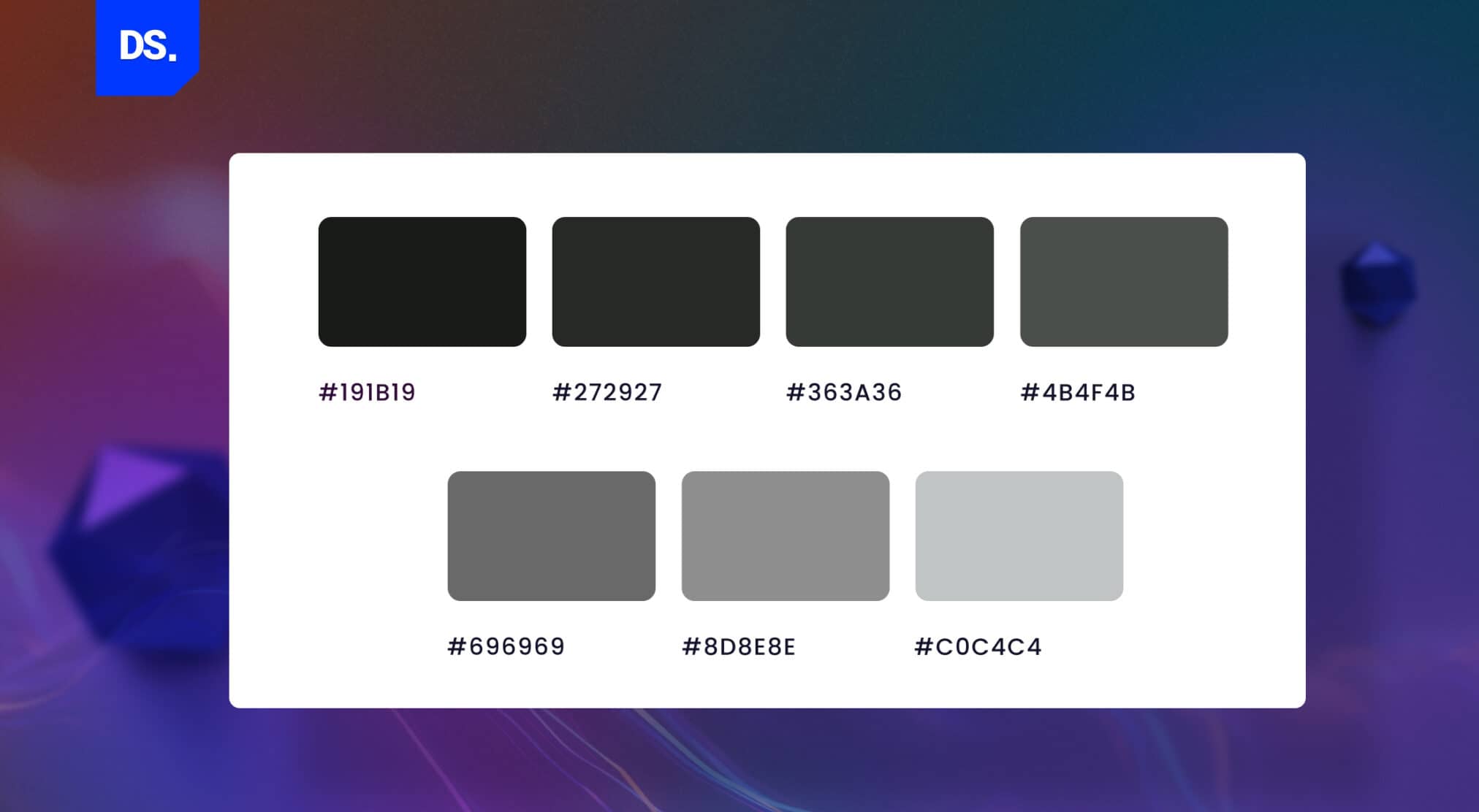
Under the RGB system, true black color is labeled as hex code #000000 since it uses 0% red, 0% green, and 0% blue.
The color shade #121212 (“Cod Gray”), in contrast, mixes in 7% red, 7% green, and 7% blue.
This slight variation is why #121212 looks like a soft, high-end dark grey instead of a sharp, blinding black which is not good for your eyes.
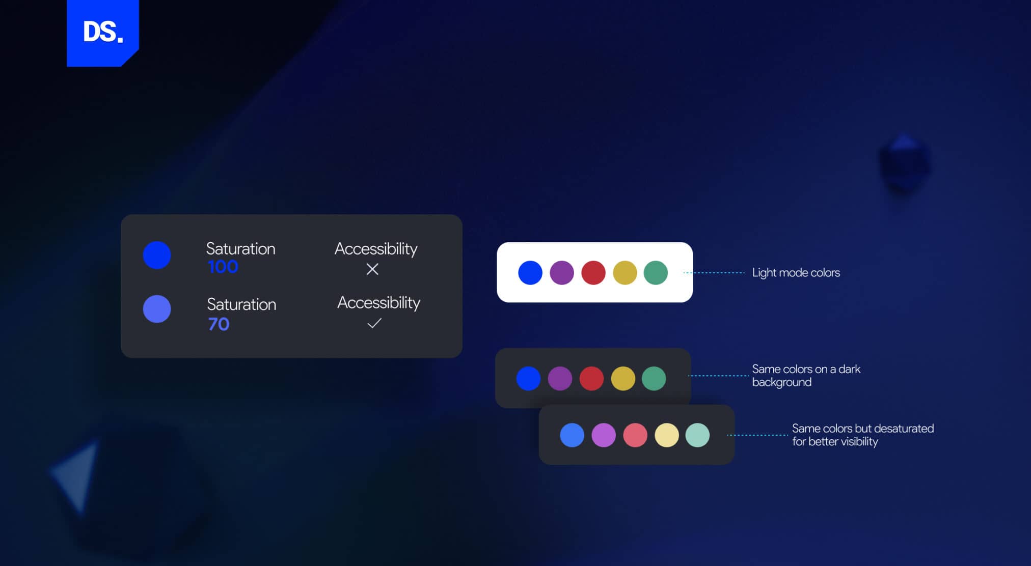
2. Avoid Saturation
Design elements with bright, saturated colors stand out on light surfaces. They stand out even more against black backdrops. That’s a plus on light surfaces but on a dark background, it works against you.
Here’s a visual example:

The softer Dune Dress Woman card is always pleasing for the eyes and its other counterpart is oversaturated which is eye straining for users.
The main idea is to use lighter, less saturated colors because they are easier to read even if the background color is black/grey.
3. Never Use Pure White
Bright white color design elements stand out too much on dark backgrounds and this can easily cause an uncomfortable glare. So, always use a color palette that has a slightly dialed-down shade of white.
A commonly used off-white for dark mode body text is #E0E0E0 (87% white) which is bright enough to stay legible, soft enough to avoid the glow effect described above.
4. Create Your Own Brand of Dark
Want to make your dark mode UI stand out? Instead of black or gray, use a much darker shade of your primary brand color as the background.
Here’s an example:
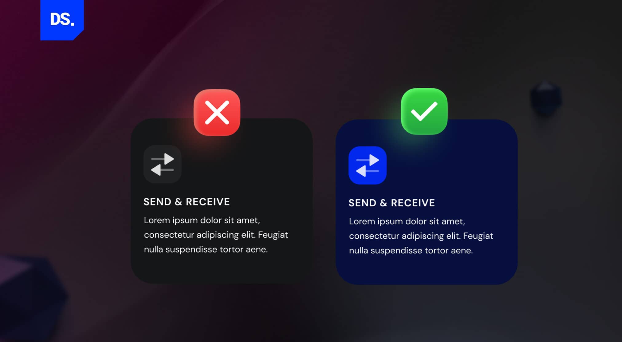
Notice how the branded dark mode design looks more eye-catching? Combining the dark background with colored fonts makes the design on the right stand out.
5. Inverting the Color Scheme Is Not Enough
If your website or app already has a light mode design, don’t assume that merely inverting its color scheme will create an appropriate dark mode design.
You will have to separately create dark mode-specific design strategies and color palettes to create a UI that’s pleasant to the eye.
6. Communicate Depth Without Using Shadows
Soft shadows are used in standard UI design to create depth and this feature shows users what to look at first. In dark mode UI design, this option isn’t there.
- Light mode: shadows do the work of communicating depth and hierarchy.
- Dark mode: shadows aren’t visible, so designers apply lighter fills instead — elements meant to appear “higher” simply get a lighter shade.
Here’s an example of how lighter color shades can be used to convey depth in dark mode UI design:

7. Use Saturated Color Palettes for The Text
A pitch-black background combined with text presented in pure white is the perfect recipe for eye strain. That’s why using slightly darker shades of white for the text is a must.
Here’s designer Michal Malewicz’s guide to using lighter font weights for dark mode UI design:
8. Focus Indicators Should Be Visible
Focus indicators are visual indicators that “highlight” the design elements selected by the user. People who use keyboards to navigate websites/apps use commands and focus indicators (WCAG 2.4.7 / 2.4.11) to identify which elements on the screen they’re interacting with.
These visual indicators are typically presented as simple outlines around the design elements.
If these focus rings are missing when someone uses your app or website in dark mode, it can ruin their experience.
Here is an example:
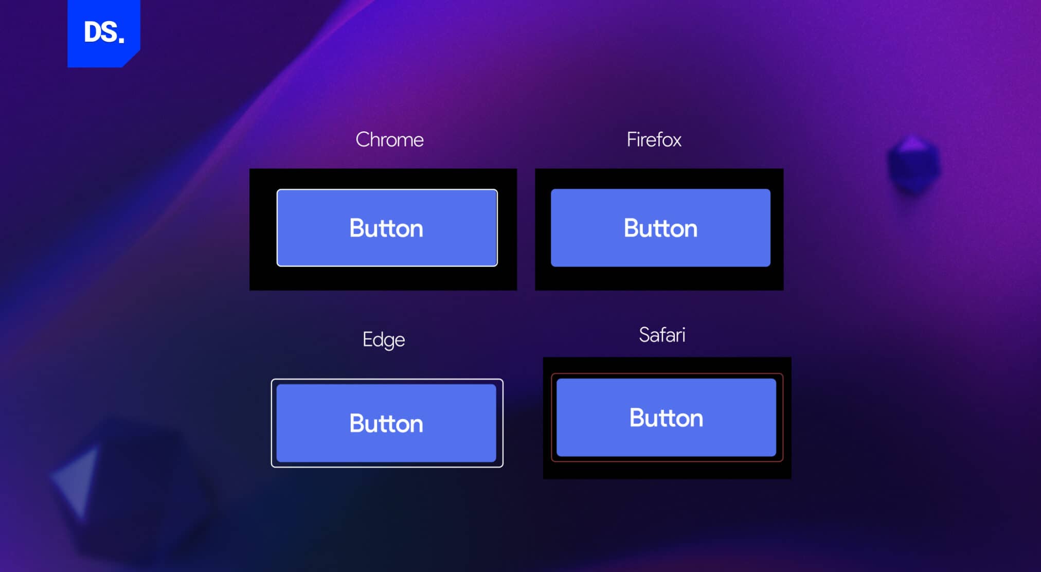
- Chrome and Edge: The button uses a double outline, and this offers perfect contrast against dark screens to tell users precisely where their cursor or keyboard selection sits.
- Firefox: The button’s focus ring is solid black, and this causes it to disappear into the dark background, which is exactly how not to do it.
9. Use Images That Match the Dark UI
Don’t use the same images for your light and dark mode interfaces. Many recent web design trends now focus on adaptive visuals that respond naturally to changing user environments.
- Do not use same image for both light and dark themes and prefer adaptive visuals.
- Use CSS media queries ( prefers-color-scheme ) to load the right visual automatically
10. Test in Low and High-Light Settings
Before finalizing your dark mode UI design, test how it looks in all types of light settings: low and high.
Test and make sure the design works for LED, daylight, and dim ambient lighting and colors are easy to read everywhere your users might be.
Dark Mode UI Design Examples
X ( earlier Twitter) introduced “Night Mode” in 2016, but updated the app in March 2026. You no longer turn dark mode on inside X as it changes automatically along with your device settings.

Dark designs have long been used by apps like Adobe and Spotify to reduce screen glare.
But, this design style became wildly popular in 2019 when it was introduced as a default feature on both Android 10 and iOS 13.
Users could now apply systemwide dark modes across all apps and platforms on their Android or Apple mobile phones.
Since then, there’s been an explosion of consumer-facing dark mode options. Here are some prominent examples of the dark revolution in 2019:
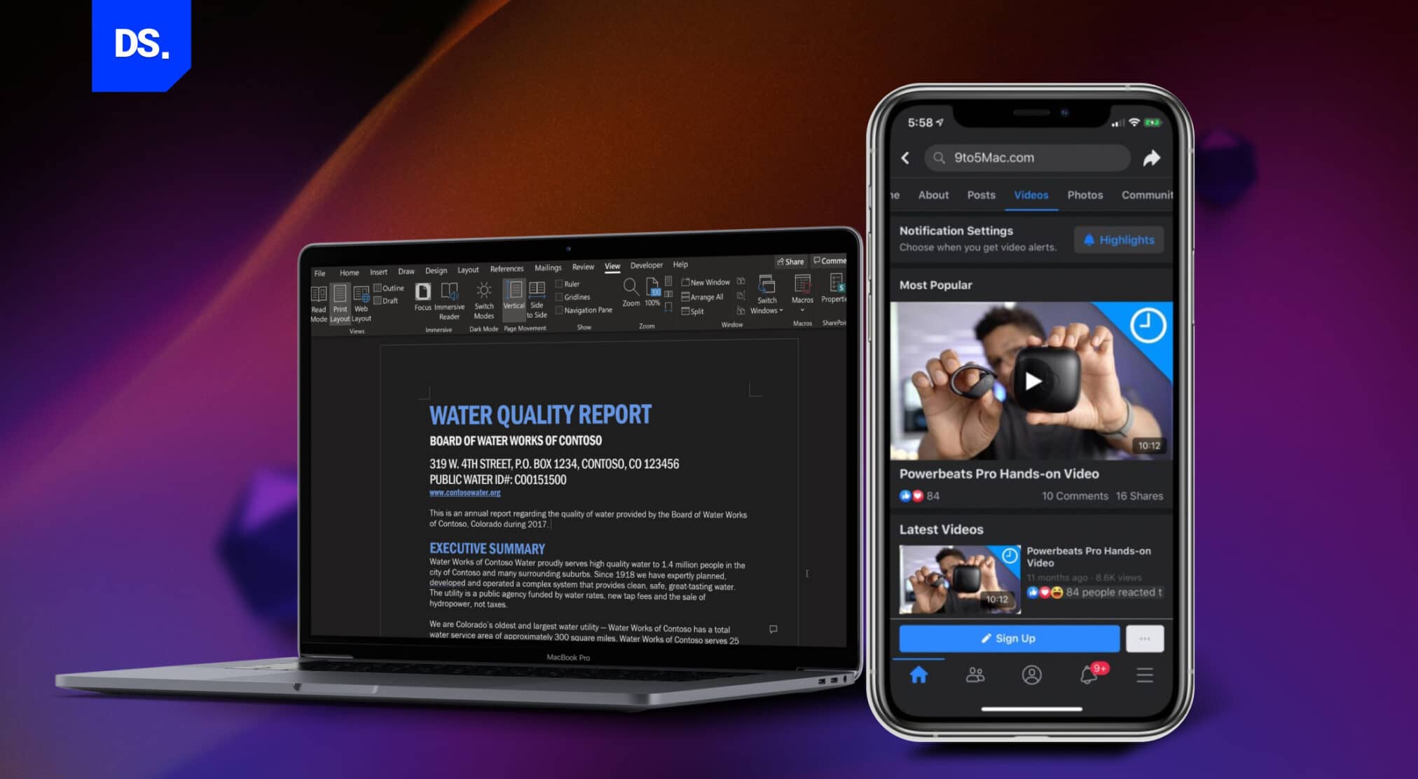
(i) Microsoft Word: launched a dark mode in which entire documents are presented as dark canvases.
(ii) Facebook: started offering dark mode on both the app and the desktop site, available globally.

(iii) Halo: many gaming app UIs, like Halo, started featuring darker themes, dark backgrounds reinforce the striking visuals and add a sense of mystery to the UI.
(iv) Stack Overflow: Dark mode was the top user request on Stack Overflow before launching in 2020.

(v) White House Official Website: In a bid to boost accessibility, even WhiteHouse.gov added a dark mode option.
So why are so many website, app, and web app design professionals switching to the dark side? The answer is delivering good user experiences.
Just imagine yourself in a setting where the lights are dim and other people are around, like on a night flight.
If you’re using a laptop or a mobile in such a setting, using dark mode is the polite thing to do as your screen won’t emit as much light or glare.
Here are some other factors that are driving the popularity of dark color palettes in UI/UX, website, and app design.
Why Is Dark Mode So Popular in UI/UX Design?
Relief from Computer Vision Syndrome (CVS)
Dark mode is popular for five reasons which are- relieves digital eye strain, extends OLED battery life, improves user focus on the content, clarifies visual hierarchy, and looks sleeker.
Computer Vision Syndrome (CVS), or digital eye strain, refers to vision problems triggered by long hours of screen viewing.
- It is caused by prolonged exposure to screen light, and
- More at risk if you use digital screens for 2 hrs or more daily
Dark mode has the potential to reduce this risk. When your screen is in dark mode, it emits much less light compared to bright, white backgrounds.
If you use dark mode on your screen, it will lower eye strain and fatigue. It gives best results particularly if you use it in dark rooms where bright white screens can feel very harsh on eyes.
Tech professionals know this discomfort well. According to a 2019 survey made by a Google Chrome developer relations engineer, Thomas Steiner, more than 82% users chose dark mode in their operating system as it was much more eye pleasing.
Improved Battery Life
- Modern phones/laptops use OLED screens. They power every single pixel rather than using a constant backlight.
- With dark mode active, fewer pixels require activation.
- Fewer active pixels results in better battery efficiency and less power consumption.
A 2021 Purdue University study measuring real OLED power draw found dark mode cuts screen power use by 39–47% at 100% brightness, but only 3–9% at the 30–50% brightness most people actually use indoors.
Designers who want to prolong their app or website usage times can benefit a lot by integrating this battery-friendly design style into their digital products.
Just bear in mind the savings are real but condition-dependent, not a flat multiplier.
Focus on Content
Bright backgrounds are inherently distracting. Dark mode is the opposite. A dark color palette is an effective tool for reducing visual noise and directing attention toward the content.
Once the content takes center stage in the reader’s mind, the web or app becomes more readable and engaging.
Visual Hierarchy
Brighter elements and text in bright-colored font automatically stand out against dark backgrounds, which is why UI designers use this to give their designs well-defined visual hierarchies.
Dark mode drew attention toward specific sections and design elements of the website page.
Aesthetic Appeal
Dark mode simply looks and feels sleek. For many users, activating dark modes make interfaces appear elegant, sophisticated, and easier on the eyes.
How Dark Mode Impacts UX
Dark mode isn’t just a visual choice anymore; it’s emotional. The way people use screens has changed; they’re working later, reading longer, and switching between bright and dim spaces all day.
A dark interface gives their eyes a break, but it also does something quieter; it helps them focus.
In 2026, dark mode is becoming adaptive, more of a companion than a static setting.
Apps are starting to sense light conditions, time of day, even a user’s screen habits, and then gently adjust tone and contrast on their own.
But this shift isn’t just about aesthetics or tech; it’s about empathy. The most thoughtful products now treat light as part of user wellbeing, helping reduce fatigue, guiding focus, and balancing emotion through color.
That’s where modern UX is heading: creating designs that don’t just look good but feel right in every environment.
What Are the Disadvantages of Dark Mode in UI Design?
Common disadvantages of dark mode are accessibility and readability problems of the digital product, brand and logo mismatches, and inconsistency across different devices.
Since we want to be fair, let’s discuss some of the less rosy aspects of dark mode in UI design as well.
Potential Accessibility and Readability Issues
Reading light-colored text against dark backgrounds is not everyone’s idea of a positive experience.
This is especially true for people with visual impairments like astigmatism and colour blindness. Apps and websites that only feature dark mode are inaccessible to such users.
Potential Branding Issues
Not all brand colors and logos look good against dark backgrounds. If your brand design isn’t suited to the dark mode color palette, adding this feature to your website or app may not be a good idea.
Limited Compatibility
Since some devices do not support dark mode, your app needs a light mode so everyone can use it.
While these potential disadvantages are valid reasons for concern, they can all be avoided if you follow the best practices for using dark mode in UI design.
Final Take
Dark mode has become a staple feature in most popular apps, websites, and operating systems.
Crossing over to the “dark side” is a skill that most new-age UI designers must master, just as they should explore bold design trends like Neubrutalism design to stay ahead in modern UI aesthetics.
Taking help of a UI/UX agency will give you a huge advantage by building a perfectly readable and comfortable dark mode for your app.
This expertise guarantees you get dark mode designs that aren’t just pretty to look at, but user-friendly too, for seamless and enjoyable navigation on every screen.
FAQs on Dark Mode UI Design
Is dark mode actually better for your eyes?

It really depends on where you’re sitting and how long you’re looking at a screen. When it’s dark around you, that softer interface just feels easier — kind of calming. But in bright daylight, dark mode can make you squint a bit. Most people just switch it on or off when it feels right. There’s no golden rule here, just personal comfort.
Does dark mode really help save battery?
A little bit, yes. Phones with OLED screens use less energy when the pixels are dark. But if your device has an LCD screen, you probably won’t see much of a change. It’s more of a nice side effect than a big energy hack.
Can I just flip my colors to make a dark mode?
It sounds easy, but no. When you just invert colors, everything feels wrong — the balance, the mood, even how buttons look when you tap them. Real dark mode takes a separate palette, some testing in different lights, and a bit of restraint. It’s about feel, not just colors.
Is dark mode comfortable for everyone?
Not really. Some folks, especially with mild vision issues like astigmatism, say light text on a dark screen feels blurry. That’s why it’s smart to let users choose. Give both options and let them stick with whatever feels easier on their eyes.
When is dark mode actually worth adding?
If your app keeps people on the screen for hours – think reading, streaming, or design tools — it’s worth it. It makes the experience softer and less harsh. But if it’s a quick-use app, maybe skip it. The key is to add dark mode because it helps people, not just because it’s trendy.