



8 Responsive Design Best Practices with Examples in 2026


Responsive design is mandatory because mobile users drive more than half of the global web traffic . Also, Google now ranks all the websites based on their mobile performance.
With this trend, designers would be sharpening an already known truth: The responsive web design best practices no longer remains optional; responsive design has become essential. It could be a smartphone, tablet or desktop; when it comes to your site, a smooth and consistent user experience should be across all viewports.
Lack of its doing may give rise to:
- Frustrated users
- The rate of bounce is high
- Expensive redesigns
- Lost Business opportunities
Top responsive design practices that even professionals should follow are mobile-first approach, thumb-friendly layouts, scalable menus, fluid CSS grids, responsive fonts (em/rem), optimized images (WebP/srcset), lazy loading, and landscape support.
Responsive Web Design at a Glance
| Responsive Web Design Practice | UX Implementation Process | Why It Matters | Source |
| Mobile-first approach | Start designing for mobile, then expand for tablets and desktops | Improves SEO rankings and creates a better mobile experience | Google Mobile-First Indexing 2024 |
| Thumb-friendly design | Make buttons at least 44px, place key actions within thumb reach, and avoid crowded links | Reduces misclicks and increases engagement | Smashing Magazine / UX Mattos Research |
| Scalable navigation | Use responsive menus, hide secondary items when needed, and rely on media queries | Maintains a consistent experience across devices | Baymard Institute |
| Fluid layouts | Use flexible systems like Grid/Flexbox, avoid fixed pixel widths, and define limits with min/max | Makes sure layouts work across all screen sizes, not just set breakpoints | MDN Web Docs |
| Smart typography | Use scalable units, stick to clean fonts, and test across devices | Keeps text readable and avoids layout shifts | Nielsen Norman Group |
| Responsive images | Implement srcset, WebP, responsive cropping, and SVG icons | Improves load speed and Core Web Vitals | Google PageSpeed / web.dev |
| Lazy loading | Load content only when needed and avoid heavy assets on mobile | Speeds up initial load and reduces bounce rate | Google Core Web Vitals 2024 |
| Landscape support | Design for landscape screens and horizontal interactions | Covers ~17.5% of users who browse in landscape | CSS Media Queries Spec |
These eight practices will ensure the site automatically adjusts its structure, speed, and navigation for a better product experience on any screen.
The article will examine eight of the most important best practices of responsive web design in this article that professionals should observe in 2026 and beyond. By perfecting these methods you will have a site that will perform well, will be accessible, and will have satisfied users- no matter how it is viewed.
What is Responsive Web Design and Why It Matters?
Responsive web design (RWD) is a design approach where websites dynamically adjust their layouts and content to fit the user’s screen.
Responsive sites can adapt to all screen sizes and resolutions – from desktops and mobiles to tablets and TVs.
The goal of RWD is to create websites that can function across all platforms and support user needs, irrespective of the circumstances.
Note: Since July 2024, Google switched to mobile-first indexing. This means sites that fail on mobile first designs won’t show up in search results.
In responsive web design, there are two essential factors that designers must consider – breakpoints and visual content.
Breakpoints are specific screen widths where the layout of a website changes to ensure optimal viewing across various devices. Designers typically focus on three primary viewports: smartphones, tablets, and desktops. However, for a fully responsive design, it’s crucial to account for both portrait and landscape orientations.
That means the average responsive site must have at least five breakpoints:
- Mobile – portrait
- Mobile – landscape
- Tablet – portrait
- Tablet – landscape
- Desktop
To effectively use breakpoints, use CSS media queries to create responsive layouts that adapt at specified breakpoints.
Visual content includes images, videos, and GIFs. Optimizing these elements for responsiveness is vital to ensure quick loading on all devices. Poorly optimized visuals can lead to slow loading, increasing bounce rates, and frustrating users.
You can enhance visual content by:
- Compressing Images: Use tools to reduce file sizes without sacrificing quality for faster load times.
- Considering Adaptive Formats: Serve content in responsive formats like WebP (where file sizes are smaller than JPEG or PNG) for better compatibility.
Our list of responsive design best practices will cover both breakpoints and visual content in detail. Before that, let us ask the question – why is RWD so important in today’s landscape?
The main reason is device fragmentation, a term that refers to the diversity of devices people use to access online content. The average Internet user does not have one fixed type of device to access websites.
Your website has to cater to smartphones, tablets, desktops, and other gadgets of varying screen sizes, resolutions, and processing capabilities.
- RWD helps website owners deliver seamless web browsing experiences across this ever-expanding spectrum of devices.
- Responsive websites dynamically adjust their layouts, content, and other aspects based on the device being used to access.
- These sites have flexible grids, fluid layouts, and responsive media queries that dynamically adjust/resize based on the user device’s screen size and orientation.
- Users no longer have to manually zoom, pan, or resize responsive websites to have enjoyable and engaging experiences.
If you are a website owner, creating a responsive site with RWD will help you:
- Reach more users, especially mobile users who are higher in numbers.
- Deliver higher-quality website browsing experiences with no zooming, scrolling, or slow-loading media files.
- Save money as you no longer have to design or maintain separate mobile and desktop sites.
- Secure higher time-on-page, retention and conversion rates.
- Improve SEO rankings as Google prefers sites that deliver engaging, multi-device experiences in its search rankings.
- Manage your content better as you’ll only have to maintain one content set for your single, responsive site (not distinct sets for mobile/desktop versions.
We can go on and on about the importance of responsive design but that is not the point of this article. Let us move on to the all-important responsive design best practices that will help you create a site that reaps all the potential benefits we listed above.
What Are the Best Responsive Web Design Practices to Follow in 2026?
The 8 best responsive web design practices in 2026 are:
(1) mobile-first design approach
(2) thumb-friendly UI placement with 44px+ tap targets
(3) scalable navigation with CSS media queries
(4) fluid layouts using CSS Grid/Flexbox and relative units
(5) responsive typography with em/rem units
(6) image optimization using srcset, WebP, and lazy loading
(7) conditional and lazy loading for non-critical resources
(8) landscape orientation support
Let’s discuss them one by one-
#1. Start with a Mobile-First Approach

A mobile-first approach is a web design philosophy where you start designing your website for mobile devices first, before adapting them for larger screens.
This concept prioritizes core site content and simple navigation. It also speeds up load times, which makes the desktop experience better, too.
Why It is Important
- Approximately 90% of websites today have already implemented some form of responsive design.
- This results in over 60% mobile traffic, peaking at 62.54% in Q4 2024. As a result of this rate, desktop usage has dropped significantly, around 37-39%.
- Google focuses on mobile-first indexing and responsive sites ensures high search rankings and consistent user experience across phones, tablets, and desktops.
- To stand out, you need to adopt a web design philosophy that acknowledges the increasing prevalence of mobile internet usage.
- With a mobile-first approach, designers can account for our mobile-centric world and ensure that their web designs are optimized for small screens with limited bandwidth.
- Websites optimized for mobile are also more likely to rank higher in search results because of Google’s mobile-first indexing.
How to Implement It on Your Own Website
- Identify the essential design features, content, and functionalities users need on mobile devices.
- Focus on letting users accomplish the most important tasks on your site quickly.
- Employ CSS media queries to create fluid layouts that auto-adapt to different screen sizes.
- Start with CSS styles for mobile devices and progressively enhance them for larger screens (from Mobile styles to Tablet and Desktop styles).
- Use tools like Browser Stack or DevTools’ Device Mode to test your design’s responsiveness on different devices and revise accordingly.
Going mobile-first will help you attract more mobile users and solidify your position as a reliable, mobile-friendly site. Take Flipkart as an example.
They were one of the first eCommerce platforms in India to go mobile-first. Now, according to Statista’s global mobile traffic data, over80% of all eCommerce sales in the country happen on mobile.
Pro Tip
- Even though this isn’t mandatory, opting for a minimalist aesthetic can save you a ton of headaches.
- A minimalist website interface design is easier to replicate across multiple devices and different screen sizes.
- Web pages with less content and less HTML, CSS, or JavaScript code load faster.
- A minimalist approach to content presentation will create less clutter and make it easier for users to focus on important content.
#2. Design for Thumbs
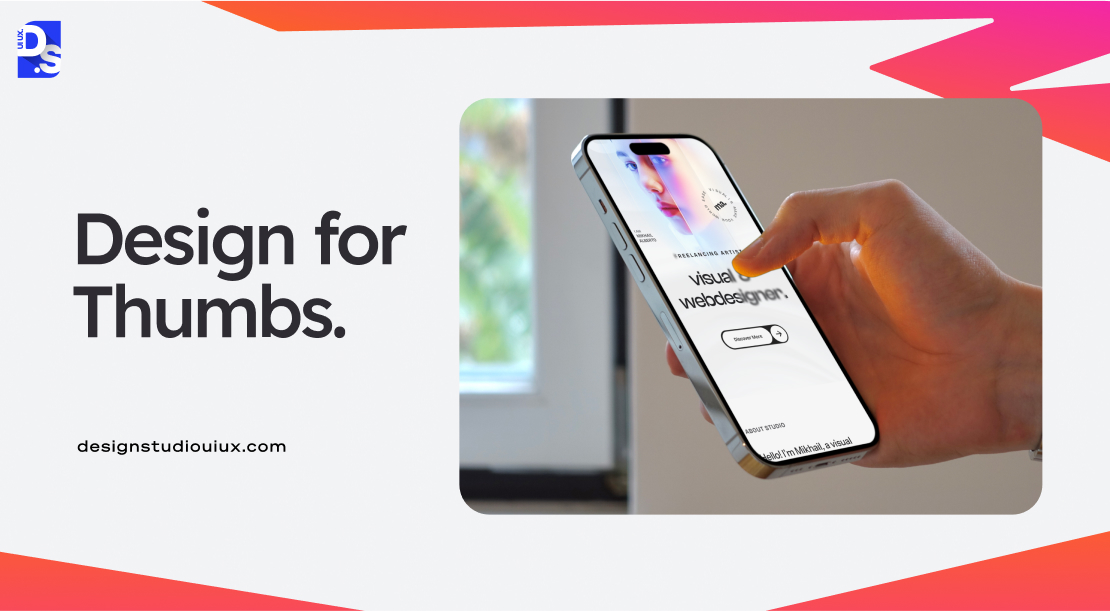
Designing for thumbs means accommodating the physical limitations of thumb movements as mobile users navigate the website using taps and swipes.
Effective mobile design places interactive elements with easy reach. This includes CTA, navigation, form inputs, etc.
Data shows most people prefer a thumb-friendly approach since almost half hold their phones one-handed. Hence, this concept is recommended to stop users from overstretching on large screens. For best results, follow the standard tap size, adjust the navigation bar and spacing to prevent accidental taps.
Why It is Important
- Around 75% of all mobile interactions are driven by thumbs.
- If your interface doesn’t actively facilitate this form of navigation, your site will not feel interactive.
- Placing essential navigation elements within the thumb zone (the areas of the screen that are easily reachable to the thumbs) is vital for encouraging interactions.
- Users typically hold their devices with one hand so design elements outside of the thumb zone are difficult to reach.
How to Implement It on Your Own Website
- Position important design elements like navigation menus and CTAs within the natural reach of the thumb.
- Place them at the bottom or center of the screen to minimize stretching and straining.
- Move primary navigation to the bottom of the screen where it is more accessible for thumbs.
- Important links and CTA buttons should have a minimum height of 44px to ensure they are easily tapable and do not trigger accidental clicks.
- Ensure that scrolling is smooth, and responsive, and does not need excessive thumb movements.
- Add adequate amounts of whitespace between all links and buttons to avoid ‘misclicks’.
Check out the thumb-friendly designs of websites like Gumroad, Serious Eats, or Crumbl Cookies. The mobile site versions of these popular eCommerce platforms are packed with large, tapable buttons, simplified navigation menus, and other simple, thumb-friendly elements.
#3. Design Scalable Navigation
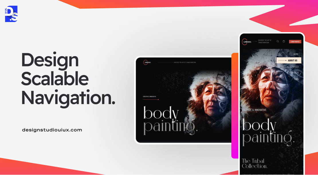
- Scalable navigation refers to designing navigation elements that can adapt seamlessly across different screen sizes/devices.
- It adjusts the location and layout of menus and navigation bars. This ensures that the menus remain accessible and uncluttered when the display size changes.
- It basically includes a full menu for desktop and a “hamburger” menu for mobile, hiding secondary navigation on small screens.
- Here the main goal is to keep the most important links visible on small screens.
Why It is Important
- All users (mobile users in particular) prefer finding information quickly without unnecessary clicks or scrolling.
- A well-designed navigation system that always offers familiar pathways to content, regardless of the device being used, is vital for giving users what they want.
- Scalable navigation ensures that essential links are always visible and reachable, even on mobiles where screen real estate is limited.
How to Implement It on Your Own Website
- Implement CSS media queries to adjust navigation styles based on screen size.
- Identify and display the most important links prominently on mobile screens.
- Hide less critical items behind expandable menus.
- Consider using vertical navigation menus if your site has numerous categories.
- Vertical navigation accommodates more items without cluttering the interface and allows for easier scanning.
Dribbble, Mammoth Media, and Evernote are great examples of responsive websites with scalable navigation systems that adapt seamlessly across devices.
#4. Make Layouts Fluid by Default
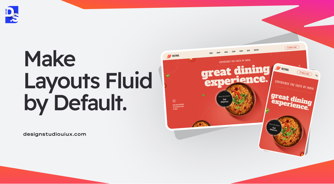
Fluid layouts are important because they make your design fit any screen size. It uses percentage-based widths and correct image settings so that elements do not stretch or shrink too much. All these factors makes the site flexible and user-friendly on every device.
Why It is Important
- Users often resize their desktop and phone browser windows – a fluid layout ensures that content remains readable and aesthetically pleasing regardless of the window size.
- While webpages with responsive breakpoints are critical for reflowing and adapting web layouts, fluid designs fill in the gaps by accommodating all sizes in between all the breakpoints.
- Using fluid and relative units like percentages allows elements to always resize proportionally and maintain the design’s integrity across different screen sizes.
How to Implement It on Your Own Website
- Use fluid grids that adjust dynamically based on the screen size (by using either CSS Grid or Flexbox) to create flexible layouts that adapt seamlessly.
- Define widths and heights of all design elements using percentages, not fixed pixel values.
- Establish minimum and maximum widths for elements to prevent them from becoming too small/large.
- Use SVG image format that can be scaled without losing quality (not JPGs or PNGs).
Basecamp, Figma, and Smashing Magazine use fluid grids and layouts to great effect. Fluidity is the hallmark of responsive web design, unlike adaptive web design its close counterpart.
To learn more about these two design approaches and why fluidity makes RWD the better choice, it is best to understand the debate of Adaptive vs Responsive Design.
#5. Choose the Right Fonts
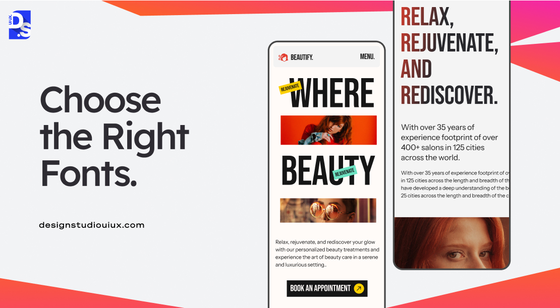
To pick fonts for responsive sites, priortize clean typefaces and relative units. You can create a clear hierarchy where headings and body text scale at the same rate. It is important to test how your font looks on multiple screen sizes.
Why It is Important
- Users may abandon sites with readability issues.
- Even though most browsers may default to a font size of 16px, merely relying on this functionality is not enough to guarantee universal readability.
- For example, bold lettering may look visually appealing on smaller screens; but, it can also be visually overwhelming on large screens, even if the browser auto-adjusts its size.
- Choosing the right fonts is also important for ensuring that all headings in your content create a seamless visual hierarchy.
How to Implement It on Your Own Website
- Instead of fixed pixel sizes, use relative units like em or rem for defining font sizes.
- Avoid overly decorative fonts for body text.
- Use simple sans-serif fonts that are easier to read on all screens.
If you are having trouble choosing the right fonts, here are some examples to inspire you:
- Webflow uses Roboto for its clean, modern look in a wide range of weights and styles.
- Figma uses Inter across its platforms to maintain clarity and readability on all devices.
- Tuts+ uses Lora which stays visually appealing and highly readable on all screens.
#6. Modify Images

- Responsive images must be appropriately sized and cropped to fit different screen dimensions.
- You can define a list of image sources with different resolutions or sizes and use WebP to reduce file sizes by 25–35%.
- These techniques can easily improve your Core Web Vitals scores which ultimately increase search results.
- Also, if the site contains unoptimized images, it can cause poor LCP.
- For example, landscape images may need to be cropped into square formats for mobile devices to maintain visual impact and clarity.
Also, apply lazy loading or images that aren’t on screen yet.
Why It is Important
- Large images can significantly slow down page load times, especially on mobile devices with limited bandwidth.
- Cropping images appropriately ensures that key visual elements remain prominent across different screen sizes.
- This consistency prevents users from encountering distorted or poorly framed images that could detract from the overall web design.
How to Implement It on Your Own Website
- Implement the srcset attribute in your <img> tags to provide multiple image sources for different screen sizes.
- Use tools like Canva or Adobe Photoshop to crop images effectively before uploading them.
- Ensure that important elements are centered and visible in smaller formats.
- Only use SVG for logos and icons, as they scale without losing quality.
Medium famously uses a combination of responsive image modifying techniques, (mainly srcset and cropping) to ensure that visuals complement text articles effectively across devices.
#7. Lazy and Conditional Loading

- Lazy loading is a trick that waits to load images or videos until they actually appear on the user’s screen.
- Conditional loading ensures that only relevant elements are loaded based on the user’s device and context.
You can implement responsive image loading to reduce data usage in the first few seconds. This way, you can boost performance metrics which improve Core Web Vitals scores.
Why It is Important
- Lazy loading can significantly reduce initial load times by deferring the loading of non-critical resources.
- By only loading images and videos when they are visible, lazy loading minimizes unnecessary data transfers.
- Conditional loading helps streamline the interface by hiding elements that are not essential for mobile users.
How to Implement It on Your Own Website
- Use the loading attribute in HTML to enable lazy loading for images.
- For more complex scenarios, use JavaScript libraries or the Intersection Observer API to manage when elements should be loaded based on their visibility.
- Only load elements that are necessary for specific devices.
- Hide complex animations or large images on mobile devices using CSS media queries.
- Use modern formats like SVG or WebP for images, which provide better compression.
Etsy employs lazy loading for product images which ensures that only the images that are visible in the user’s viewport are loaded initially.
The Guardian has implemented conditional loading by simplifying its mobile site layout; non-essential elements are always hidden on smaller screens.
Both of these strategies contribute to faster load times and improved user engagement.
#8. Account for Landscape View

The portrait orientation is the most common way users engage with their devices. But, some users may also engage with your site with landscape view, where they rotate their devices 90 degrees.
It is recommended to use media queries to add specific styles for horizontal screens. Consider switching to left-to-right sliders in landscape mode and always verify that your site works in both positions.
Scrolling can be more challenging in landscape orientation due to the reduced vertical space. If not addressed properly, this can lead to suboptimal user experiences.
Why It is Important
- Approximately 17.5% of smartphone users prefer landscape mode for video consumption.
- Designing for this mode is vital for making all content on your site (especially video content) accessible to all users.
How to Implement It on Your Own Website
- Implement specific breakpoints for landscape orientation using CSS media queries.
- For content that stacks vertically in portrait mode, consider using sliders with left and right navigation buttons in landscape mode.
- Regularly test your designs on various devices in both orientations.
- Avoid hiding essential navigational elements or content when switching from portrait to landscape.
YouTube is a popular example of a website that switches to landscape orientation seamlessly.
Conclusion
Adopting these responsive web design best practices is the first step to creating a ‘super website’ that is consistently useful across devices. But, there is more.
Even after you implement every practice we listed, you must conduct thorough testing across multiple devices. Keep recruiting users to navigate the site and understand its compatibility across different devices.
Collaborating with responsive website design companies can also provide valuable insights to improve your site’s performance.
Use tools like UserTesting, Crazy Egg, or Hotjar to gather qualitative data from real users as they navigate your site.
Also, implement post-session surveys using tools like SurveyMonkey or Qualaroo to collect user feedback on their experience and any difficulties they encountered.
Continue refining your design and making it more responsive. This relentless approach to making websites responsive is a hallmark of Design Studio UI/UX.
We consistently aim to position ourselves among the leading responsive website design agency through innovative and user centric strategies.
To learn more about our in-house responsive web design best practices and projects, contact us now. We respond to every user inquiry with an in-depth explanation.
FAQ’s About Responsive Design Best Practices
What is responsive web design?

Responsive web design is a concept that designers follow to create sites that fit the structure and pictures to match the screen’s resolution. It uses CSS media queries and fluid grids for better site navigation and accessibility.
Why is responsive web design important for SEO?
Responsive design is an important concept for SEO because Google now prioritize mobile first indexing since July 2024. This implies search results ranking depend on mobile performance. If your site is not responsive and looks bad on a phone, it won’t be indexed well and impact SEO performance. Plus, a bad mobile experience also increases bounce rates.
What is the mobile-first approach in web design?
Mobile first is a critical design strategy where designers worked on the interface of site for phones before moving on to larger desktop screens. Designers write the basic styles for mobile first and then add more complex features for tablets and PCs using progressive CSS rules. This is important because majority of global web traffic is now on mobile, and Google’s crawlers prioritize the mobile version when indexing your site.
What are the most important responsive web design best practices?
Top responsive design practices that even professionals should follow are mobile-first approach, thumb-friendly layouts, and scalable menus. This also includes fluid CSS grids, responsive fonts (em/rem), optimized images (WebP/srcset), lazy loading, and landscape support.
What is the thumb zone in mobile design?
The thumb zone is the part of a phone screen that is easiest to reach during one handed use. Since most people rely on their thumbs for almost all interactions, this zone is where the most important content should live. Designers should put buttons and menus in the bottom and center area which is more easier and natural to use.
What is lazy loading and why is it important for responsive design?
Lazy loading is a trick that waits to load images or videos until they actually appear on the user’s screen. This reduces data usage in the first few seconds and improves loading page of the site. According to Google reports, this fast loading feature can directly improve Core Web Vitals, which can help your site rank higher in search results.
How does responsive web design affect website performance?
Responsive design increases site productivity by loading necessary content and correct sized images for every device. This concept cuts down on data waste and speeds up your site. It also improves your Google ranking scores, which is directly linked to user engagement and sales figures.