


5 SaaS UX Design Best Practices & Guide with Examples


What is SaaS UX Design?
SaaS UX design is the process of creating a smooth, intuitive user experience for SaaS products. SaaS stands for “Software-as-a-Service.” It is a delivery model for cloud-hosted software products that allow users to access applications via the Internet.
Great SaaS UX makes software feel effortless. It’s not just about clean visuals, it’s how fast users find value. When the experience feels smooth, retention and revenue grow naturally.
According to research, good SaaS UX design stops you from losing up to 75% of new users who leave when a product fails to show value on the first try.
Implementing SaaS UX best practices ensures that these applications meet user needs effectively and offer an optimized experience.
In other words, users can access SaaS apps through the Internet without installing any physical media, while a subscription gives them access to their features.
Netflix is a good example of saas website design examples, and a good SaaS UX design makes it easier for users to navigate it. Here, users can access Netflix via the Internet and pay the subscription fees to watch its content.
Why is UX Design for SaaS So Important?
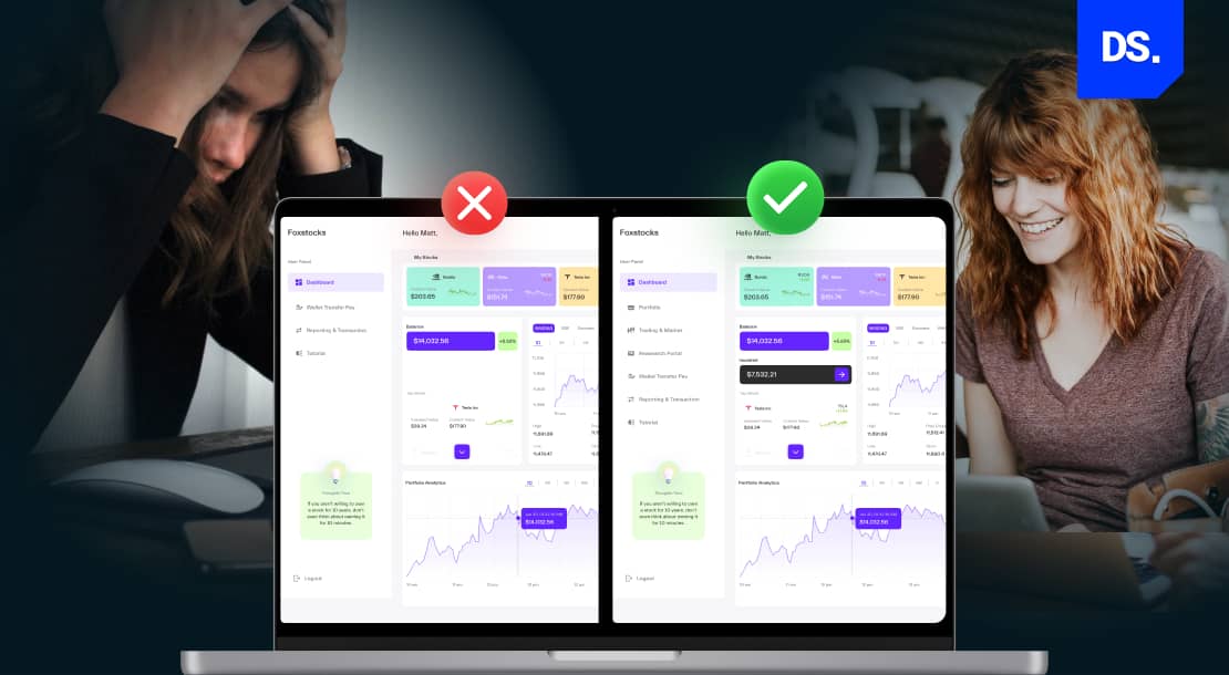
UX design is important in SaaS today because the sale of the product does not end after completing signup/onboarding. Users need a solid reason to keep using the product and paying for its monthly charges.
A good user experience reduces cognitive load, helps users use more features, and can turn free trials into paying customers.
Also, poor UX can quietly increase churn as users switch to competitors.
Take Netflix as an example again. If users are not satisfied with Netflix today, they would cancel the subscription and might not use the product again. If a SaaS app’s UX design is good, users will continue paying recurrent subscription fees for it.
The SaaS market is a fast-paced environment in which users’ expectations have to be addressed on a regular basis. This is why staying updated with the SaaS design principles and design trends becomes crucial for product teams.
More important than success or failure is the usability of the SaaS app.
Unless SaaS products can deliver seamless and intuitive user experiences, accomplishing this goal is impossible for SaaS app developers.
Here are some other factors that make SaaS UX design vital in the SaaS ecosystem:
What are the Key Benefits of Good SaaS UX Design
The benefits of a good SaaS UX design includes better user acquisition, retention, engagement, and conversion rates and reduced churn and additional support costs.
| Benefit | What It Affects | Business Result |
| Boost user acquisition, retention, conversion: Get more users and conversions | First-time use and onboarding | Lower CAC and more users moving from trial to paid |
| Reduce churn: Keep users longer | Product habits and repeat value | More stable subscription revenue |
| Improve engagement: Increase product use | Sessions, feature use, and task completion | Longer subscriptions and higher LTV |
| Empower Users to Maximize Potential: Help users get more done | Task speed and ease of use | Better reviews, more referrals, and fewer support requests |
Now, take a look at the benefits in detail:
1. Boost User Acquisition, Retention, and Conversion
User acquisition is the process of getting new people to try your SaaS product. User retention means keeping those current users so they do not leave for rivals; and user conversion means turning those users into paying customers for recurrent subscriptions.
An effective SaaS pricing page design plays a crucial role here by removing confusion, highlighting value tiers, and guiding users toward the right plan.
According to data, SaaS products typically retain around 15% to 25% of users after 30 days, with 25–35% considered good. Great UX design beats this average by fixing the issues that make people leave the product fast.
Efficient SaaS UX design is vital for all 3 of these processes. Users are more likely to try out a SaaS product that has a well-designed, intuitive, and friction-free interface. This is exactly where conversion rate optimization UX plays a crucial role by improving journeys that turn visitors into active and paying users.
They are likelier to continue using the app and pay subscription fees if their experiences on it are consistently good.
That is why the best SaaS web design companies focus on delivering enjoyable customer service: to acquire users and keep them satisfied once they become paying customers.
These efforts kickstart a “recurring revenue model” for SaaS products.
- This business model generates revenue every month/year for the company from the same users via regular, scheduled payments.
- Predicting income becomes easier and the risk of sales fluctuating is diminished.
- Monthly/quarterly planning also becomes easier and more effective.
Retaining existing users helps SaaS companies generate more revenue and reduce user acquisition costs. A recent study suggests that repeat users of SaaS products are 67% more likely to spend more money on additional in-app purchases. They’re also likelier to make referrals.
2. Reduce User Churn Rates
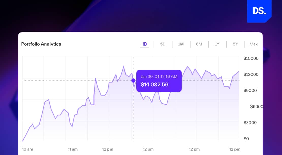
Churn is the rate at which paying users of a software service cancel their monthly or yearly subscriptions. According to mobile app retention research, the average app loses up to 77% of its user base within the first 3-days of initial registration. This figure applies to both standard apps and SaaS apps.
But, such a high churn rate is a more serious problem for SaaS apps. That is because SaaS apps need to establish a recurring revenue model for them to exist and thrive in the long run. Thankfully, high churn rates can be easily avoided with good UX design strategies.
The best UX designers implement a procedure called ‘the hook model.’
This model can be broken down into four stages:
1. Trigger: The trigger can be an email or some other type of notification that prompts the user to take specific action/s on the SaaS app.
2. Action: The desired action could be to register for a free trial or to create a free account on the SaaS app. The easier it is to complete the action, the higher the chances of the user engaging with the product.
3. Variable Reward: The variable reward could be discounts on yearly subscriptions, access to premium content, etc. The reward should be designed to keep the user coming back to the app.
4. Investment: When these steps are successfully implemented, they lead to the user investing in the product. The investment can be in the form of:
- subscription fees, dwelling time,
- spending more time on the SaaS app, or the
- user agreeing to share their data.
By optimizing a SaaS app’s UX design for these four stages, companies can cut down their product’s churn rate. That is because the UX hook directly leads to habit formation in users. This becomes even more critical in fintech products, where trust, clarity, and intuitive behavior loops are non-negotiable.
Adopting the right Fintech UX design trends can help reduce saas churn by fostering habit-forming and secure experiences users want to return to.Take Instagram as an example:
- The first thing that many people across the world do in the morning is scroll through their Instagram feeds. They do not do this on purpose. They do it on instinct.
- Instagram’s UX design is so alluring that many users cannot help themselves but check the app first thing in the morning.
- When a SaaS app has its users hooked like this, churn rate becomes less of a concern.
Plus, SaaS apps only need to hook a small share of their users. Once a small group of users are hooked to a SaaS app, establishing a recurring revenue model becomes easier.
Good UX design is the key to hooking users and reducing churn rates.
3. Improve User Engagement

When users have positive experiences engaging with a SaaS product, they are likelier to continue using it. Efficient UX design can secure higher user engagement rates for SaaS apps. The term user engagement rate can mean different things for different SaaS products.
- For some apps, increasing monthly revenues is the main indicator of a healthy user engagement rate.
- For others, the number of subscribers the app gains every month correlates to how engaged their users are.
However, there are some standard user engagement benchmarks that universally apply to all SaaS products.
UX design plays a key role in meeting all of these benchmarks:
- Session Time: It refers to how much time a user spends on the SaaS app on each visit. SaaS apps with efficient UX designs convince users to spend more time in each session.
- Key Features Usage: This metric refers to how frequently users access and use a SaaS app’s key features. For example, if an app’s key features are hidden deep inside the menu, most users would not find or use them. Good UX design will make its key features easy to access and use.
- Fulfilment of Expected Outcomes: If a SaaS product’s key service is document sharing, then the number of documents shared per user should be one of its vital engagement metrics. The number of times this expected outcome is fulfilled will determine the SaaS app’s effective ability to engage users. When a SaaS app’s UX design is optimized to enable users to fulfill the expected outcome, its overall user engagement improves drastically.
This ultimately leads to the formation of loyal user bases for SaaS companies.
4. Empower Users to Maximize their Potential
Efficient UX design in SaaS products empowers users to take specific actions and fulfill expected outcomes. This is especially true for enterprise SaaS apps. If a business-centric SaaS app has poor design, users would not feel encouraged to use it frequently.
What are the SaaS UX Design Best Practices
Conducting UX research, simplifying registration process, optimizing onboarding steps, refining IA, and offering better customer service are the common SaaS UX best practices. These strategies help reduce friction and guide users to complete their actions.
The SaaS ecosystem is highly competitive and extremely expensive to operate in. It can cost a company anywhere between $50,000 and $150,000 to build, deploy, and maintain a SaaS app. In such a competitive environment, every detail matters, and SaaS UX design is an essential detail that no company should overlook.
Here are some essential UX design practices that set apart ‘good’ SaaS UX design from bad:
1. Conduct UX Research
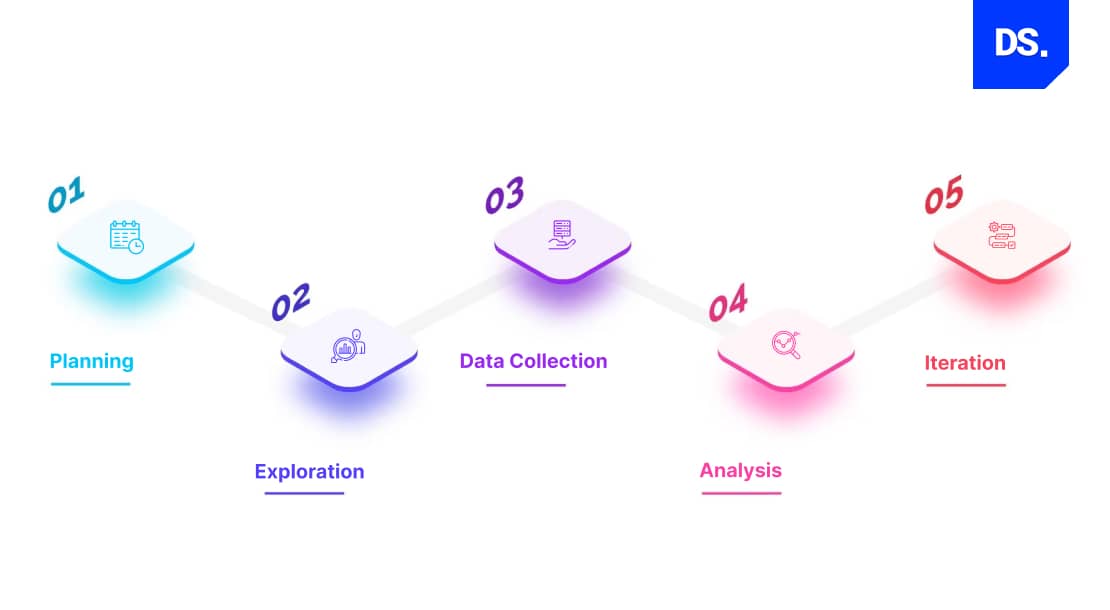
UX research is the process of studying user behaviors, needs and preferences. Unless a SaaS company understands its target users, it cannot create experiences that will address their needs.
Many SaaS businesses rely on professional UX research firms to conduct this work effectively.
Conducting UX research can prevent designers from wasting their precious time and resources on wrong solutions and design decisions. It also reduces unnecessary SaaS UX design costs by validating ideas before development begins.
Here are some easy steps SaaS product designers can take to conduct efficient UX research:
- Conduct interviews, observational studies, surveys, and other forms of user research procedures.
- Study what competitors are doing to satisfy their user bases.
- Test different interface layouts with existing or target users to determine which designs satisfy target users the most.
- Leverage user feedback to refine the SaaS product’s UX design.
Obtain first-hand knowledge of what types of experiences your users expect from SaaS products. Lead the design process keeping this information in mind.
2. Simplify the Registration Process
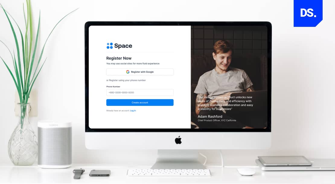
The registration page is the first true test of user design. If it is too hard or long, users quit before trying the tool. This means a simple signup process helps more people reach the active stage.
It is the first point of contact between a SaaS product and a user. However, users typically arrive here after interacting with a SaaS landing page design that motivates them to begin the signup process in the first place.
This touchpoint needs to be as straightforward as possible.
A complex registration process can unnecessarily hike up the SaaS company’s customer support expenses. Users may keep calling or emailing the company for assistance completing the registration process.
Simplifying the process can make it easier for users to:
- start using the SaaS app,
- reduce the number of customer support requests, and
- reduce the time it takes to provide value to users.
Here are some easy ways SaaS app designers can simplify and streamline the registration process:
- Essential Info Only: Ask for only the essential info upfront. Username, email ID, and password for initial registration process. Ask for additional details like location, payment info, etc., after they start using the app.
- Instructions: Provide clear-cut instructions on how to complete the registration process.
- Call to Action:The registration page should feature a clear call-to-action button with short and simple message like, ‘Get Started,’ or ‘Sign Up Now.’ The button should be designed to be eye-catching.
- Progress Indicator: Add progress indicators to the registration page. These indicators should inform users about how far along they are in the registration process.
- Social Media Sign-In:Allow users to register on the SaaS platform using their Google, Facebook, X, or other social media accounts.
- Auto Fill: Use auto-fill to pre-fill fields with data that the user has already offered.
- Positive Feedback: Provide positive feedback to users after they complete each stage of the registration process.
Lastly, don’t forget to continuously test and refine the registration process. With each test, identify areas of potential improvement. Don’t forget to consider user feedback during these refinements as well!
3. Optimize the Onboarding Process
The onboarding process in SaaS UX design introduces user to the app’s user interface, core functionalities, and key features. Account setup, customer education, and data collection are the three key stages of the onboarding process.
UX designers must optimize all three of these stages and make them as user-friendly as possible. That means completing each of these stages should feel very easy for users. A poorly designed onboarding process can confuse users and cause them to cancel their memberships.
Slack is a SaaS app for business communication/collaboration, and its onboarding process is perfectly optimized. Slack’s onboarding process consists of a friction-free signup, two welcome screens, a short onboarding survey, and a simple product tour:
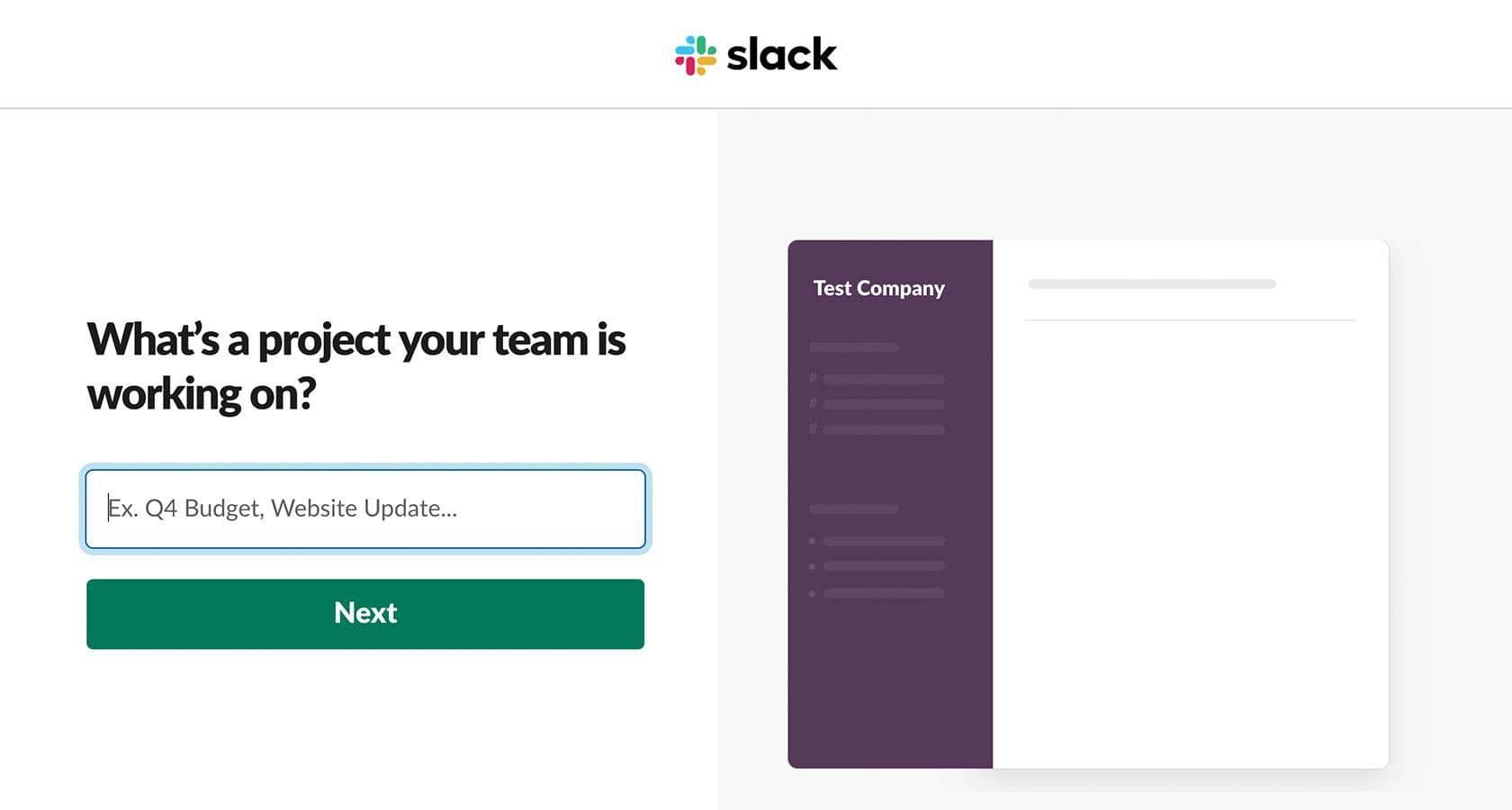
Onboarding Steps:
- To start, users are given a simple series of queries to create their company and team profiles.
- Users have the option to skip these queries and dive right into the SaaS app’s core features.
- After this step, Slack gives users access to an onboarding AI bot called “Slack-bot.”
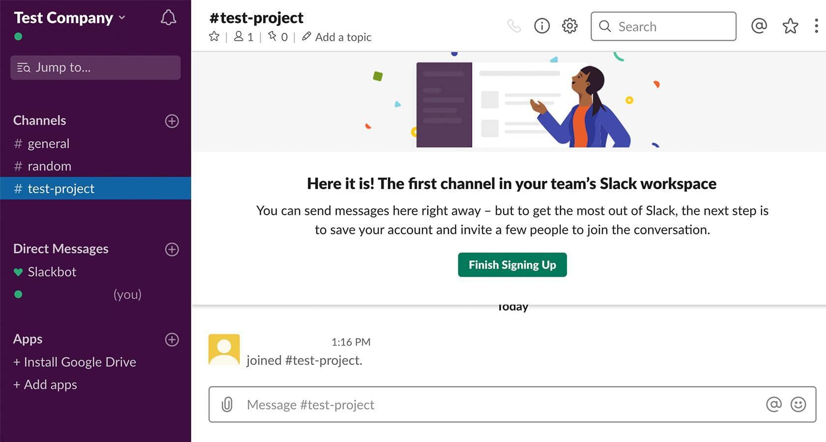
- Slack-bot automates much of the remaining onboarding process. It fields basic questions to users, helping them fast-track the sign-up process.
- The bot also directs users through the SaaS app’s core features like making new groups or adding more new members.
Slack’s well-designed onboarding process is one of the key reasons why the SaaS app has 42.7 million daily users and over 3 million long-term subscribers. Its easy setup process works for all SaaS products.
Here are some of the key UX design lessons that we can learn from Slack’s finely-designed onboarding process:
- Keep it simple. Slack’s onboarding process does not overwhelm users. Instead, it only focuses on the most important tasks and gives users the option to skip certain actions.
- Use clear and concise language.
- Use images, videos, animations, and other visuals to help users understand how to use the SaaS app’s key features and functions.
- Provide feedback to users after they complete each stage of the onboarding process. The Slack bot does this for users, making them feel motivated to continue with the onboarding process.
- Personalize the onboarding experience to make users feel invested in the app right from the get-go. For example, users can be given access to personalized dashboards following SaaS dashboard UI design best practices. Also, feature visual indicators like progress bars and charts as soon as user sign up.
Not all SaaS companies will be able to afford to build AI-powered chatbots or integrate advanced features, like interactive walkthroughs, into their SaaS products. But, as long as they follow the basics and keep their onboarding processes simple, they will attract and retain several users.
4. Refine the Information Architecture
The term Information Architecture (IA) in UX refers to the way that a SaaS app’s content is organized and structured. A SaaS app with a well-designed IA will make it easy for users to quickly and easily find the information they need. Here are some key elements of a SaaS app’s IA:
- Content Categories: The SaaS app’s content should be categorized in a way that makes perfect sense to users.
- Content Labels: The labels for all content on the SaaS app should be clear, succinct, and descriptive. They should give users a clear-cut idea of what the content is all about.
- Navigation: The SaaS app should be easy to navigate and users should be able to find their way around the app.
- Search: SaaS apps should have a powerful search function so that users can access the information they need in case they don’t know where to find it manually.
SaaS products with clear navigation menus, properly labeled content, and easy-to-use search bars have perfect IAs.
Hence, they’re easy to use. Asana, an enterprise SaaS app is the perfect example of getting the IA design right.
- Asana’s IA is well-organized. All of the app’s key features, tasks, projects, etc., are well-labeled and divided into different sections.
- Navigating the app is also very easy.
- Asana also offers a robust search functionality that allows users to quickly find specific information.
- Users can easily create tasks, track their progress, and oversee their projects on Asana.
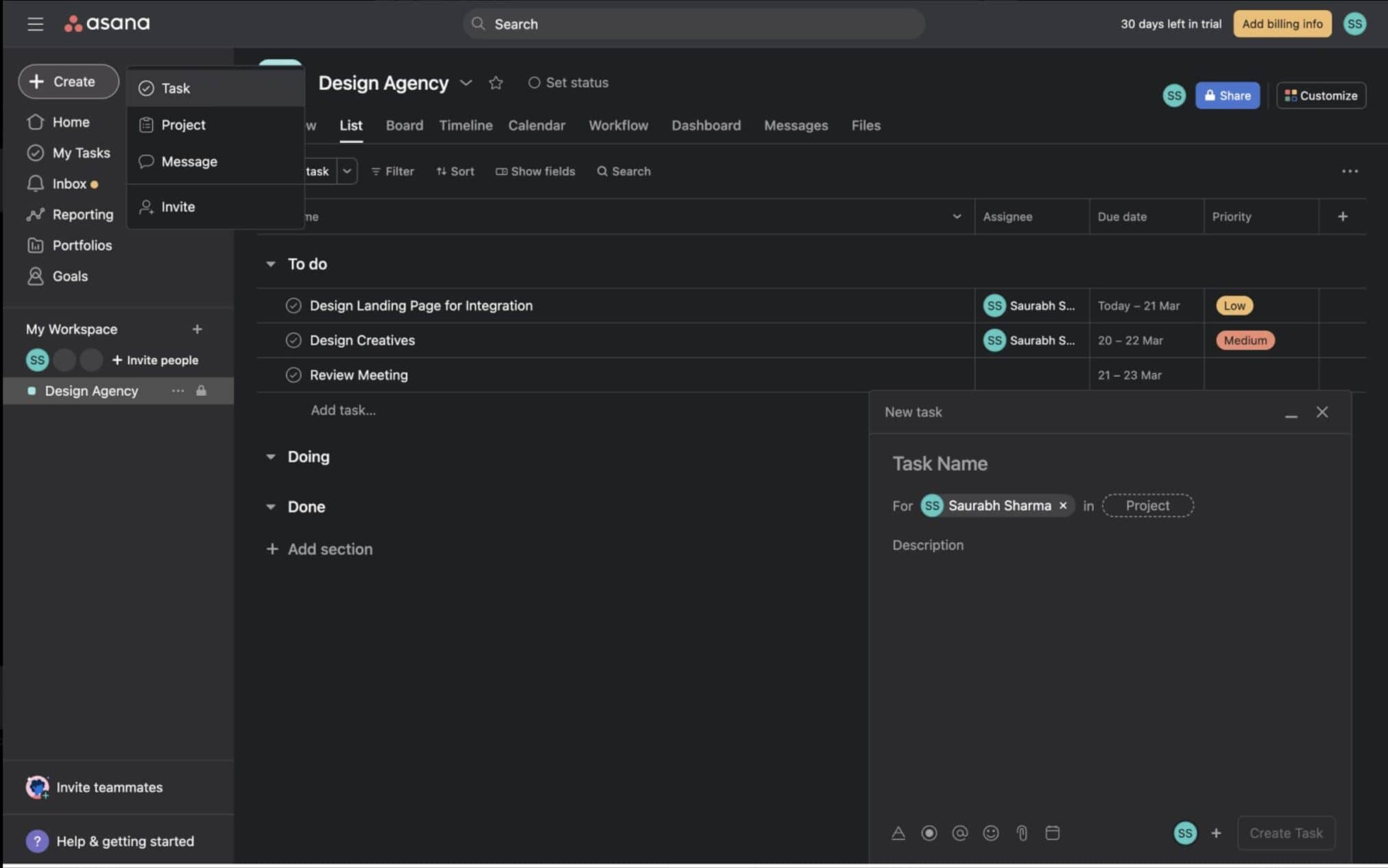
Thus, the app’s clear and intuitive interface is loved by hundreds of thousands of users.
5. Make Help and Support Easily Accessible
No matter how easy-to-use a SaaS app’s interface is, some users will get stuck or overwhelmed from time to time.
For such users, SaaS apps should offer intuitive help and assistance systems. There are a few ways this can be accomplished:
- Live chat is a great way to help SaaS app users in real-time
- Many SaaS apps feature ‘knowledge bases,’ i.e., collections of resources (blogs, how-to guides, etc.) that help users find answers to their questions.
- Bots can be used to automate basic user support tasks.
- Many new SaaS apps also offer user support through social media or email.
These user help/support systems should be easily accessible, from anywhere in the SaaS app.
For example, Dropbox is a file-sharing SaaS app. On this app, the “community forum” (i.e., the knowledge base) feature is always available in the side menu.
How Do You Measure SaaS UX Design Success?
Measuring SaaS UX success involves mixing user data and user feedback, then connecting them to user retention, onboarding, and task completion. You can track these six metrics to measure the success of your SaaS product:
| Metric | What to Track | Good Range |
| Activation Rate | New users who finish the main onboarding step | 50–70% |
| Day 7 Retention | Users who return within 7 days | 40%+ |
| Feature Usage | Active users using key features | 30–50%+ |
| Time to First Value | Time until the first useful action | Under 5 min (simple) / 30 min (enterprise) |
| Monthly Churn | Paying users who cancel | Below 2% |
| Net Promoter Score | Users willing to recommend the product | 30+ good, 50+ excellent |
What to do:
- Compare these numbers before and after every UX update.
- Use Hotjar or Microsoft Clarity for user behavior.
- Use Mixpanel or Amplitude for product data.
- Early products should focus on activation. Mature products should improve retention and NPS.
Mobile SaaS UX Design: What is Different on Smaller Screens?
A good mobile SaaS design cuts down navigation, supports quick tasks, and makes tapping easy. It should focus on the 3 to 5 actions users need most on their phones.
- Simplified navigation: You can use a hamburger menu/bottom tabs instead of full desktop navigation. Limit mobile navigation to 5 primary items.
- Touch targets: Always keep every tappable element at least 44x44px. Generally smaller areas in mobile screens increase the chance of wrong taps and user frustration.
- Notifications as a re-engagement tool: Push notifications can help bring mobile users back more directly than email. Treat notification copy like any other product copy.
- Reduced feature scope: The mobile app does not need every desktop feature. Pick only 3 to 5 tasks users are most likely to complete on mobile and make those easy.
- Offline capability: Enterprise users may use SaaS products in places with poor internet. Where possible, cache key data so important features still work offline.
- Test on real devices: Developer simulators do not match real phone use in every situation. Test major releases on real iOS and Android devices.
What Are the Key Future Trends in SaaS UX Design?
AI-first interfaces, collaborative design patterns, accessibility, usage-based pricing, and stronger design systems are the important future trends in SaaS UX design.
G2’s 2025 Buyer Behavior Report shows that AI is now expected in software, while buyers want clear proof of value.
1. AI-Powered Interfaces Will Become the Default
AI will help users complete tasks, find data, and make decisions faster. Natural-language input will work alongside normal menus and filters. Clear AI explanations will also help build trust.
2. Collaborative Design Patterns Will Replace Solo-User Workflows
SaaS products will support more work between teams. Presence indicators, comments, @mentions, activity feeds, and editing controls will become standard patterns.
3. Accessibility Will Become a Design Standard
Accessibility will be planned from the start. WCAG 2.2 covers areas such as focus appearance, target size, dragging, and accessible authentication.
4. Usage-Based Pricing Will Reshape Onboarding UX
Users need to know what they use, what remains, and when costs may change. Good onboarding should explain value before users reach their limits.
5. Design Systems Will Become a Product Itself
Design systems will support designers and developers with shared components, clear documentation, version updates, themes, and enterprise branding.
Final Take
The main threat to SaaS isn’t competition, it’s user drop-off. Every day users see no value equals a cancellation, while great UX design keeps them paying.
However, it takes a lot of effort to maintain a popular SaaS application, including ensuring a positive user experience. Here’s where a UX Audit Agency can be a valuable asset.
By identifying usability issues and optimizing the user journey, UX Audit checklist can help you retain users and keep your SaaS application thriving. Additionally, conducting a UX audit yields actionable insights, enabling immediate enhancements in user satisfaction and overall product performance.
Good SaaS UX design makes this mammoth task a million times easier. If your SaaS app is struggling to attract or retain users, Design Studio UI UX’s SaaS website design services are here to help. We will apply the SaaS UX best practices to your SaaS products and make them more user-centric!
FAQs
What is the Hook Model in SaaS UX design?

The Hook Model is a four-phase product guide by Nir Eyal in Hooked: How to Build Habit-Forming Products. It helps create strong app habits that turn regular users into daily automatic users.
How can SaaS UX design help reduce churn?
SaaS UX design can reduce churn by helping users reach product value quickly. It makes important tasks easy to repeat. Clear onboarding, useful features, simple help, and smooth workflows reduces churn and gives users more reasons to stay.
What is information architecture (IA) in SaaS UX design?
Information architecture in SaaS UX design is defined as the process of how a SaaS product arranges/organizes its content, features, labels, navigation, etc. It is basically the structural blueprint of an application that helps users find information without confusion.









