


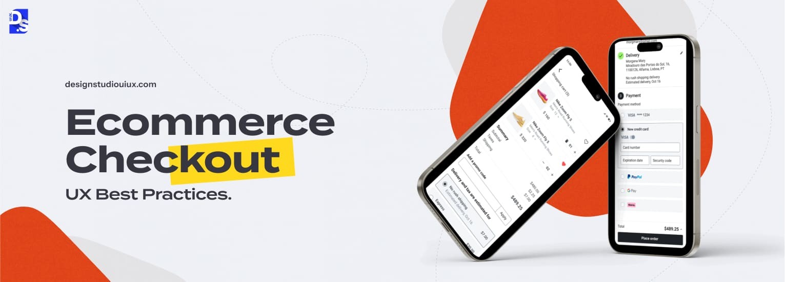
15 Ecommerce Checkout UX Best Practices That Convert 2026



Quick Summary
Ecommerce checkout UX best practices focus on making the final purchase process easy, clear, and transparent for buyers. Key techniques include removing unnecessary elements, adding progress indicators, displaying trust signals, and optimizing the checkout experience for mobile devices.
Ecommerce checkout UX best practices simplify the final purchase process and make it easy, clear, and transparent for buyers. Best practices include:
- Following clear visual hierarchy
- Adding Save Cart, Move to Wishlist, or guest checkout options
- Displaying clear cost and delivery transparency with security cues
- Using a simple, step-by-step flow with a persistent cart summary
- Designing smart forms with optimized input fields
- Using thumb-friendly mobile layouts with sticky actions to reduce drop-off rates
Data shows the global abandonment rate of ecommerce carts is over 70%, with mobile checkouts around 85%, so a better checkout design is a profitable investment. With guest checkout feature, you can save around 24% of those lost sales. Also, following these core tips can reduce overall abandonment rate of the digital product by 35%.
A click on “Add to Cart” starts with excitement for many brands but this can be a moment of dread for some companies due to several design challenges.
Stores are not adhering to eCommerce cart and checkout UX best practices. A poor user experience (UX) at the final conversion point of an online store bleeds revenue.
By fixing the source of the problem by using e-commerce website design services and following the latest ecommerce best practices, store owners can streamline user journeys from their stores’ carts to confirmation points. They can fix all the leaks in their revenue funnels. This guide shows how.
Quick Checklist for Ecommerce Checkout Optimization
Ready to optimize your checkout flow? Use this simple list to run a quick audit of your checkout process first.
Cart Page Optimization
- Inline cart editing capabilities
- Persistent cost summary display
- Clear visual hierarchy and CTAs
- Save cart and wishlist options
- Guest checkout prominence
Checkout Flow
- Guest checkout as default option
- Minimized form fields (6-8 maximum)
- Real-time form validation
- Progress indicator implementation
- Multiple payment options
Mobile Optimization
- Thumb-friendly button placement
- Large touch targets (44x44px minimum)
- Single-column layouts
- Sticky action buttons
- Mobile wallet integration
Trust and Security
- SSL certificate display
- Payment method badges
- Security certifications
- Money-back guarantee visibility
- Customer support accessibility
Post-Checkout
- Comprehensive confirmation pages
- Immediate email confirmations
- Abandoned cart recovery sequences
- Cross-sell opportunities
Checkout Optimization Priority Table
| Optimization | Effort Level | Abandonment Impact |
|---|---|---|
| Enable guest checkout | Low (1-2 days) | Removes the friction behind the 19% of abandonments caused by forced account creation |
| Show costs before payment step | Low (config change) | Reduces surprise-cost abandonment by 48% |
| Add progress indicator | Low-Medium | Builds a sense of progress, increases motivation to finish. |
| Reduce form fields to 6-8 | Medium (dev) | Cuts default form elements shown by 20-60%. |
| Add real-time field validation | Medium (dev) | Cuts errors by 22%, boosts satisfaction 31% (Elasticpath) |
| Mobile tap target audit (44px) | Medium (design) | Meets WCAG 2.5.5 minimum target size |
| Integrate Apple Pay / Google Pay | Medium-High | Lifts conversion 15-20%. |
| Full abandoned cart email sequence | High (setup) | Recovers 3.3% of sessions on average, up to 7.69% for top performers. (Klaviyo) |
| Add security badges near payment | Low (asset add) | Builds gut-level trust, drives checkout completion. |
| Optimize checkout page load speed | High (technical) | Each 0.1s saved = 8.4% more conversions |
Get ALL of these details right. They are all vital for coming off as professional and trustworthy. That is why all of these details are fundamental to good startup UI/UX in the eCommerce space.
What Do Users Expect From an Ecommerce Checkout Experience in 2026?
Today’s shoppers expect checkout pages to load in under 2.5 seconds, show all taxes and shipping fees upfront, and offer a guest option without forcing account creation.
They expect these basic features to manage cart abandonment:
Speed: Users expect the checkout process to be completed within a minute. According to research, a tiny one-second lag drops total conversions by 7%. Slow or confusing payment pages directly cause shoppers to ditch their carts.
Total Transparency: Shoppers want shipping costs, taxes, and the final total visible before they commit to checkout.
Control: The power to check out as a guest, choose multiple payment options (digital wallets, BNPL, cards), easily edit their cart, and save items for later. New account creation is not required.
Flawless Mobile Experience: With around 57% of all online shopping happening on mobile devices, designers must create web page layouts that are fast, thumb-friendly and small-screen-friendly. Globally, mobile devices drive around 60% of e-commerce sales which means a clumsy mobile experience can destroy brand revenue.
Why Shoppers Leave Their Cart and How Better Checkout Design Solves It
| Why Users Leave | UX Fix |
| Hidden shipping charges or taxes | Show the full cost before users reach payment |
| Forced account signup | Keep guest checkout as the default option |
| Long or confusing checkout steps | Avoid adding more than 6 fields in the checkout page and use a simple check out process. |
| Security concerns during payment | Display SSL badges, payment logos, and trust signals near payment fields |
| Slow-loading checkout pages (2+ seconds) | Improve speed with page optimization, lazy loading, and CDN support |
What Are Ecommerce Cart UX Best Practices?
The best e-commerce cart UX practices include editable items, a persistent cost summary, clear visual hierarchy, and a wishlist option.
These steps stop people from leaving by letting them change orders instantly, showing shipping costs upfront, and allowing hesitant buyers save items without pressure.
The design needs to be clear, informative and transparent so taking the next step feels completely effortless.
This page is not just a summary of their purchase, rather it is the final thing users review before committing.
Following these cart UX best practices will help achieve these objectives:
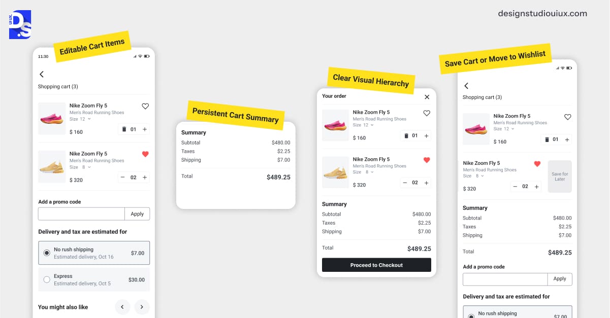
Editable Cart Items
Editable cart items allow customers to edit item details like size, color, and quantity, or delete items instantly with a live price update without any page reloads.
This keeps them in the purchasing/checkout flow and prevents them from leaving the checkout.
Inline cart editing removes checkout friction by letting shoppers quickly update orders.
This smooth process saves buyers from using the back button, preventing frustration and keeping them focused on finishing their purchase.
To create this, make sure your checkout UX has:
- Control buttons: ➕/➖ buttons right next to the item that, upon clicking, update the cart’s subtotal instantly.
- Variant Swaps: Let them change it right there in the cart without heading back to the product page.
- Simple delete option: A basic trash icon that removes the item without making users click through secondary warning windows.
- Immediate totals: Prices and discounts must update automatically the moment a user changes anything.
Persistent Cart Summary
A persistent cart summary always shows a visible cart summary so shoppers see their exact total and fees.
It must show:
- Item Subtotal
- Calculated Shipping Cost (or “Calculated at Checkout” if impossible earlier)
- Estimated Taxes
- Shipping Costs
- Any Extra Fees
- Applied Discounts & Savings
- Grand Total
According to the Baymard Institute, this prevents final price surprises, which are a major reason people leave without buying.
A persistent cart summary reassures the customer about the costs they are undertaking and eliminates the risk of price shock at the final step.
Clear Visual Hierarchy
Following a clear visual hierarchy means adding one dominant CTA button alongside smaller, low-contrast secondary choices to the cart pages.
This also includes showing clear whitespace separation between the item list, cost summary, and action buttons.
Since Hick’s Law shows fewer options to reduce decision time, this single-focus design drives faster cart completion rate.
Here is how to create a clear visual checkout hierarchy:
- Make sure “Proceed to Checkout” call-to-action stands out.
- Design primary button with strong fonts+high-contrast colors+prominent position.
- Separate item list, summary, and CTA buttons, i.e. leave plenty of room for easy scanning.
- Ensure links for “Continue Shopping” or “Save for Later” are attached nearby without impacting visibility of important CTAs.
Save Cart or Move to Wishlist
Save cart or wishlist options can help keep hesitant shoppers connected to the store as they browse from different devices.
You can keep them engaged by providing a Save for Later feature, syncing carts across different devices, and sending an email reminder within the first hour to close sales.
Not everyone is ready to buy right now. Forcing an immediate decision means losing future sales.
Respect hesitant buyers and prime them for future conversion by:
- Providing “Save for Later” or “Move to Wishlist” buttons to make items easily retrievable for future sessions.
- Using cookies to remember the cart for returning visitors (even without an account). You can attach a simple “Your cart is saved” message to build goodwill.
- For logged-in users, ensuring their carts sync flawlessly across devices.
- Re-engaging them later with reminder emails about their saved items.
What Are Ecommerce Checkout Flow UX Best Practices
Best e-commerce checkout practices that can help increase conversion are: offering guest checkout, using one page/ step-by-step progress tracker, and smart forms with 6-8 auto-validated fields.
This also includes showing upfront costs before the final click, placing security badges near payment inputs, and optimizing the entire flow for mobile screens.
Once a user clicks “Proceed to Checkout,” they have entered the final funnel. Design a clear and helpful final payment step that removes all doubts and makes buying easy.
Here’s how to improve checkout experience where it matters most:
The Non-Negotiable Guest Checkout Option
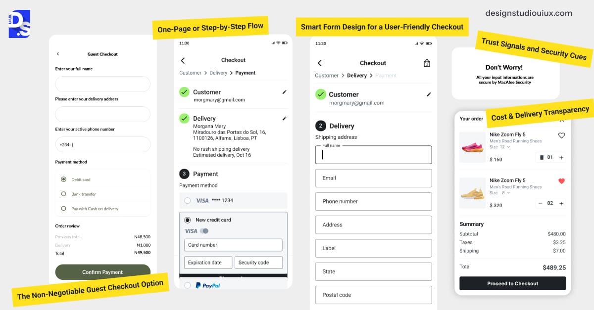
Guest checkout is mandatory since forced account creation causes about a 1/5th of buyers to leave. Make this guest checkout the easiest option to see.
Only ask users for new account creation after they make their purchase. This way users can save time during their next site visit.
One-Page or Step-by-Step Flow
Most online stores see better conversion rates with a stepped checkout rather than a single long one page. It reduces cognitive load and makes the transaction feel manageable. Just be sure to use a progress indicator that lets users review earlier steps without wiping out their typed information.
Pick the layout that fits your shop:
- One-Page: Great for quick, simple purchases with few items and standard shipping.
- Step-by-Step (Highly Recommended): Spreads out the details into digestible parts like Shipping, Payment, and Review to keep things stress-free.
To make a multi-step checkout succeed, focus on a smart progress tracker:
- Put a clear progress bar right at the top of the screen.
- Clearly show each step, like “1. Shipping, 2. Payment, 3. Review.”
- Change the look of the active step so users know where they are.
- Allow people to click backward easily to edit their info without erasing their data.
Smart Form Design for a User-Friendly Checkout
Checkout forms should include 6-8 fields max and remove unneeded details like middle names and optional phone numbers.
Speed up data entry by using Browser Autofill and an Address Lookup API as this cuts keystrokes by 80%. Using inline, plain-language error messages fixes user mistakes immediately without requiring a full page refresh.
Follow these form optimization steps:
- Only ask for essential info. Do not ask for no titles, middle names, or unnecessary phone numbers unless absolutely required.
- Pre-fill details such as- country based on IP, phone number code, etc.
- Also, enable necessary browser autofill options.
- Integrate address lookup APIs (like Google Places).
- Format the fields as users type.
- Tell users instantly if their email is invalid or if their card number is too short.
- Show clear error messages next to the field in plain language (e.g., “Dvnvr is not the right location name!”).
Follow these detailed form UX best practices to create responsive design for your digital product.
Also, conduct UX audits regularly to find usability issues and accordingly take action.
Trust Signals and Security Cues
Trust signals secure payment pages and reduce checkout hesitation by placing payment-related logos, Norton badges, and browser safety padlocks next to the payment form.
Designers must place these elements where they draw attention and are visible enough for users to click on them as required.
Users are wary of sharing financial data online. Reinforce security visibly:
- Show the padlock icon in the browser bar.
- Display logos of all accepted cards and wallets.
- Place badges like Norton Secured, McAfee, TRUSTe and BBB badges near payment section.
- Attach live chat option, link for phone number, or any support link to show help is available to the users.
- Include “Your data is safe” messaging across the checkout flow.
Perform user testing to confirm if all trust signals are visible and effective.
Cost & Delivery Transparency
Transparency means showing a full price breakdown including items, shipping, taxes, and instant promo code discounts before a user clicks pay.
This eliminates the unexpected costs that drive cart abandonment. Displaying clear, estimated delivery dates on the review page makes shoppers feel well informed and confident enough to finish their purchase.
Reiterate the final cost breakdown clearly on the review step before the final “Pay Now” button. Show:
- Itemized costs
- Shipping cost & method
- Discounts applied
- Taxes
- Final Total
Clearly state estimated delivery windows. For promo code UX, provide a field near the order summary, apply codes instantly, and update the total visibly.
How to Optimize an Ecommerce Checkout for Mobile Users?
You can optimize the overall mobile checkout process by using a one-column layout, placing main buttons at the bottom-center of the screen, and using at least 44px wide tap targets.
Keep essential actions sticky, load the correct mobile keyboard for specific inputs, and include Apple or Google Pay to completely avoid manual form filling.
Mobile now drives the majority of US ecommerce, making these checkout upgrades mandatory.
The mobile checkout experience is where many brands still fail.
Use these checkout design tips for mobile to avoid being part of that group.
Thumb-Friendly Layouts
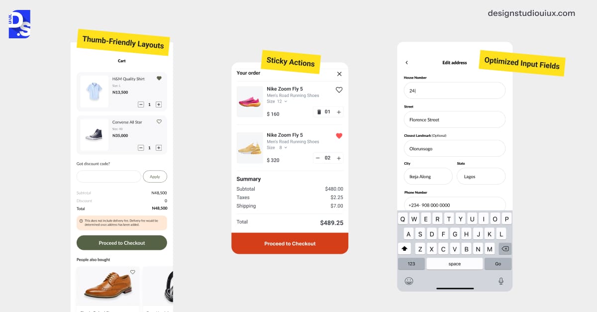
A thumb-friendly checkout is built for easy one-handed phone use. It places primary CTA buttons at the bottom center of the screen, uses large and well-spaced buttons, and removes awkward horizontal scrolling.
Design for how people actually hold phones, i.e. one-handed, thumb scrolling:
- Place key CTAs in the “Thumb Zone.”
- Place Continue, Pay Now and critical buttons at the bottom-center of the interface.
- Check every button and input box measures at least 44×44 pixels.
- Give clickable elements a lot of breathing room so users do not accidentally click any link.
- No horizontal scrolling, just make all checkout content vertically scrollable.
Sticky Actions
Sticky buttons stay at the bottom of the screen and ensure the checkout option is always visible. This is important for long mobile pages.
According to research from CXL Institute, this seamless experience helps drive an 18% lift in mobile checkout.
Do not make users scroll around hunting for the “Continue” button. Keep key actions sticky as the main CTA button stays locked to the bottom of the screen as the user scrolls through forms or their order summary.
This provides a persistent, clear path forward and is a subtle but important aspect of smart cross-device checkout design.
Optimized Input Fields
Mobile checkout should show the correct keyboard type automatically, for example, number pad for phones, email keyboard for emails, and standard keyboard for names.
You must add large, tappable buttons, clear labels outside of boxes, and include auto-fill and biometric i.e. face or fingerprint login features.
You can optimize mobile fields and make typing easier by-
- Use the correct keyboard type for each field.
- The number pad should appear for phone numbers, and the email keyboard for email addresses.
- Make all buttons and tap targets large enough to be tapped accurately.
Follow the latest ecommerce web design trends and consider ones that entice mobile-first shoppers.
Also, adhere to mobile-optimized UX and keep adding them to your design plans.
What Are the Best Post-Checkout UX Practices?
Some best post check out UX practices are using immediate confirmation page and transactional email with order number, delivery date and receipt.
These also include some re-engagement efforts such as sharing related products, referral programs, and social links.
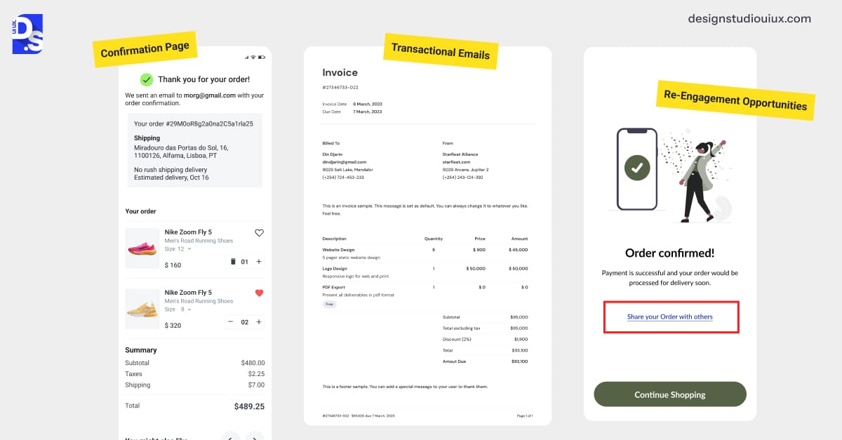
Confirmation Page
An order confirmation page includes order number, receipts, tracking details, support info, and a “what happens next” section.
You can include a quick account setup prompt at the very bottom, framing it as an easy way to save order details.
The order confirmation page should immediately reassure the customer.
Elements to include:
- Clear Success Message: “Thank You For Shopping With [Brand]! Your Order is Confirmed (#82739)”.
- Detailed Summary: Items, quantities, shipping and billing addresses, payment method, total cost breakdown.
- Delivery Timeline: “You will receive your order between [date] – [date]”.
- What’s Next section: “Check for a confirmation email; track your order in real time here ” with link.– cant make too many changes here as this is a whats next text mentioned after purchase
- Support Access: Clear links and phone numbers for customer service.
- (Optional) Account Upsell: “Create an account to get free delivery next time!”
Transactional Emails
Post-purchase transactional emails must land in the inbox within 30 seconds and look perfect on mobile devices and around 55-65% of emails are opened on mobile. Include all necessary details and a clear tracking link.
According to Klaviyo, transactional emails like order updates are powerful engagement drivers because they get opened up more than regular emails.
An email should hit their inbox instantly and it must contain:
- Mobile-first design
- All order details (mirroring the confirmation page info)
- Tracking info and link
- Support links
- Messaging and design elements that reinforce the brand
Re-Engagement Opportunities
Use confirmation pages and emails to suggest products in a ‘You Might Also Like’ section, offer referral discounts, incentive options, and share social media links.
Always place these extra promotional items below the main receipt details. Marketing prompts should never clutter or distract from the customer’s actual purchase data.
You can consider confirmation page and email as subtle re-engagement efforts:
- Related Products: ‘You Might Also Like…product ‘ based on previous purchase (on confirmation page or in follow-up email).
- Referral Programs: ‘Love your order? Share with friends and get a $10 coupon for free!’
- Social Links: ‘Follow us on [platform] for updates and deals!’
The post-purchase phase is actually prime conversion rate optimization territory, so strategize it accordingly.
What Are the Most Common Ecommerce Checkout UX Mistakes That Kill Conversions?
Some common ecommerce checkout UX mistakes that can kill site conversions are forcing users with account sign-ups, hiding extra charges, unclear error pop-ups, clunky mobile screens, and slow page loading.
Addressing these five specific problems can help recover double-digit lost revenue.
- Forcing account creation: This is the top offender and the express lane to cart abandonment; always offer guest checkout.
- Hiding fees until the end: Surprise shipping costs/taxes are a guaranteed way to shock your shoppers into abandoning (around 39%).
- Poor error handling: Vague error messages (‘Sorry Error’) with no context or instructions for course-correction infuriate shoppers.
- Lack of mobile adaptation: Tiny buttons, cramped layouts, non-responsive design make mobile checkout impossible and signal that your brand does not value its mobile shopper base.
- Slow Loading: Data shows every 100ms additional load time reduces conversion by as much as 8.4%). So, carefully optimize images and code.
If your store only makes a few of these mistakes, upgrade the checkout process, but go for a full website redesign if it fails completely.
Conclusion
Following these best practices related to the custom ecommerce UX can reduce cart abandonment and improve conversion rate. Start by removing major friction points before adding layout upgrades.
Observe carts-to-confirmation user journeys and keep looking for small details to improve upon. Keep chipping away at your store’s cart abandonment rate.
If you think there are deeper issues plaguing your store, get your store’s UX fully audited. Design Studio UI/UX as a leading UI/UX Design Agency knows how to improve user journey and boost conversion rates.
FAQs
What are the best practices for an ecommerce cart page?

Clarity. Control. Total visibility of all purchase-related details. And, big bold CTAs.
Should I offer guest checkout or require account creation?
Guest checkout. Always. Make buying easy first. Secure conversions first. Ask them to create accounts later, post-sale.
How can I reduce cart abandonment during checkout?
The key is to remove friction.
- Shorten your forms.
- Show a progress bar so shoppers always know where they stand.
- Be transparent about costs upfront.
- Offer multiple payment options.
- Make the checkout UX mobile-optimized.
If the problem is serious, consider working with top ecommerce web design companies.
Where should I place the promo code field during checkout?
Promo code UX design has to be strategic. Tuck it near the order summary. Make it visible but not too visible. Never front-load it. Why? Shoppers will scavenge for codes elsewhere… and ghost.
What should a good checkout progress indicator include?
Keep it stupid simple. Label steps clearly (“Shipping → Payment → Review”). Highlight the current step. Show completion visually. No fluff. It should answer, “How much longer?” and cut anxiety – that’s all.
How do trust signals improve conversion rates?
They work by making shoppers feel safe about the site they are sharing their payment information with.
They also indirectly help in creating better product flow. If buying one item from your store feels safe, then buying the rest will also feel safe.
What cost details should be shown before payment?
Everything. Show every purchase-related cost upfront. This is a basic eCommerce UX best practice.
How can I optimize the checkout process for mobile users?
Think with users’ thumbs in mind. Giant tap targets (44px+). Sticky “Pay Now” buttons. Autofill-friendly forms. Digital wallets for one-tap buys.
What should be included on the order confirmation page?
A clear message confirming the order was successful. A clear display of the order number. A purchase summary. The expected delivery date. Clear links to customer support.
What are the most common checkout UX mistakes to avoid?
Hiding costs until the final step. Forcing account creation. Confusing forms with bad error messages. Offering a terrible mobile UX.









