



7 Important Visual Hierarchy Design Principles



What is Visual Hierarchy in UX Design?
“Visual Hierarchy” is a core design principle that refers to how different elements are arranged in a design by order of relevance. The best product, website, or app interface designers manipulate the characteristics of different elements (colors, alignment, fonts, etc.) to give their designs engaging visual hierarchies.
To do so, these designers adhere to certain visual hierarchy design principles. These principles help them pre-determine what their target users look at and focus on when exploring their designs. In other words, the better the visual hierarchy of a design, the easier it will be for users to digest the visual information presented.
In this article, I will discuss the most important visual hierarchy design principles that new designers need to follow if they want their app interfaces or website designs to succeed. New-age web designers work with responsive frameworks and have to think about multiple different pages/screens simultaneously.
Adhering to essential visual hierarchy design principles will add structure and coherence to their designs. It will also minimize their users’ uncertainty regarding the information they are presented with. All of this while giving users something pleasing to view. Before we discuss these principles, let’s try to understand how these principles help designers achieve their design objectives.
It is one of the most powerful tools in a designer’s process, but it’s most effective when it’s built on a foundation of solid user research and clear information architecture. Our ultimate UI/UX design guide connects visual hierarchy to every other phase of the design process so you can see how it all fits together.
Why is Visual Hierarchy Important?
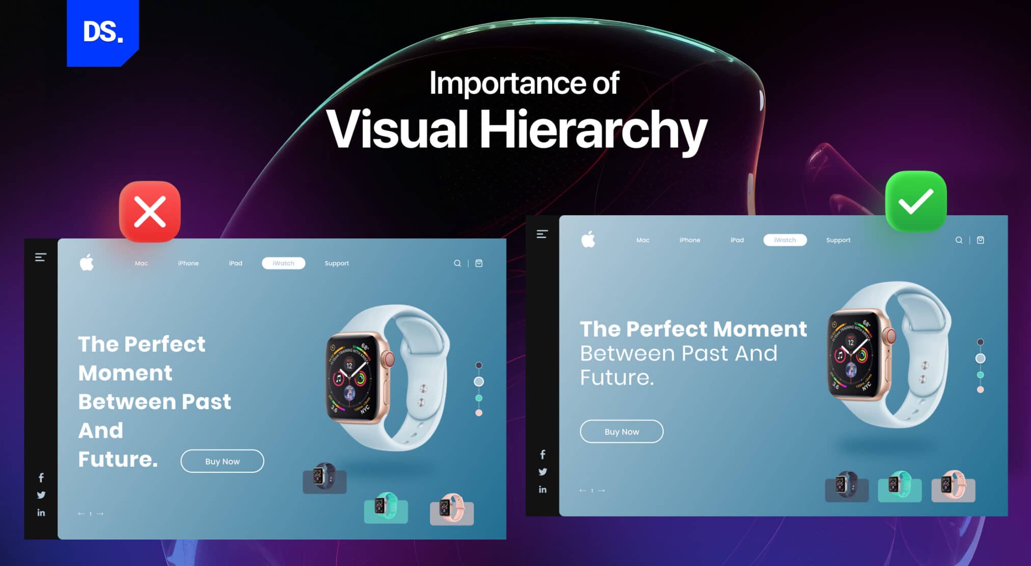
The human brain is the most complex organ on the planet. It has tremendous processing power and the ability to cut corners to conserve energy. For example, when processing a ton of visual data, the human brain will use certain built-in shortcuts to organize and interpret the information. The brain will automatically focus on the most relevant visual data at first glance.
In psychology, these built-in shortcuts are known as “cognitive schema.” These mental structures help the brain organize data and direct a variety of cognitive processes. But, how does the brain choose what to prioritize while processing visual data? To answer this question, look at the landing pages of the following websites:

(Source: www.justgive.org)

(Source: www.goodwill.org)
Both of these websites want their users to donate money. Which of the two do you find more engaging? If you are like most people, you will find the second site more appealing. Unlike the first one which tries to influence users through words, the second website contains very few words. Instead, it provides clear answers to queries users may have:
· How much money they can donate?
· Who will the charity help?
· How will the charity help people?
These are the pieces of info that users need to know right away. One glance at the site and users can instantly understand which design elements they need to focus on and what they mean. In short, the second website’s design is more effective because it has a better visual hierarchy.
The designer of the second website has also adhered to basic visual hierarchy design principles like:
· Manipulating the size and scale of the design elements to make them more noticeable.
· Using alignment to create focal points that stand out visually.
· Following a fixed reading pattern to ensure users can scan through the important text.
· Using whitespace around important design elements to draw attention toward them.
Now, let’s explore these four and a few more core visual hierarchy design principles in detail.
Visual Hierarchy Design Principles
1. Manipulating the Size and Scale of Design Elements
The louder a sound, the likelier you will hear it. The same logic applies to visual design. Of course, we cannot measure the auditory volumes of the different design elements in a visual hierarchy. But, we can assign visual weight to different design elements.
Visual weight is a force that entices the eyes of viewers. The more visual weight a design element has, the more eye-catching it is. Here is an example of a designer manipulating a scale to assign visual weight :-
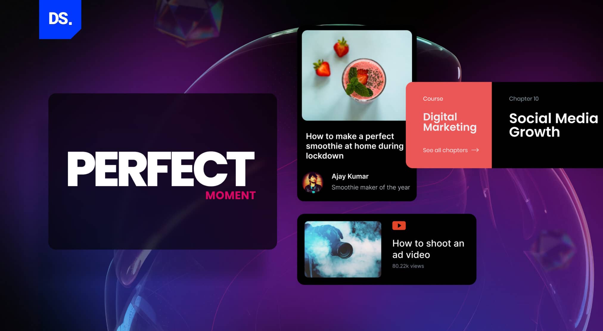
As you can see, the larger design elements naturally attract more attention than their smaller counterparts. This is why:
- Headlines or calls to action are characteristically bigger in size than body copy on websites.
- The most important buttons on app interfaces (e.g., “Request a Ride” and “Confirm Pickup” buttons on the Uber app) are bigger, and more prominent in size.
- On news websites, popular articles appear visually larger than non-popular articles.

(Source)
There are several other examples of product, UI/UX, or web designers making elements that are significantly bigger in size than their non-significant counterparts. They effectively move the non-significant design elements toward the far end of the visual hierarchy and make users focus on what matters.
2. Focal Point Design
Focal point design is the practice of guiding viewers to specific areas of interest with the aim to make them complete specific actions. The “focal point” of a design/image is the central element that you wish the viewers to see as soon as they open a web/app page.
For example, when you are designing a webpage, you would like the main CTA on the page to be its focal point. Every other design element should serve as a supporting character to the focal point. Here is a real-world example of focal point design:
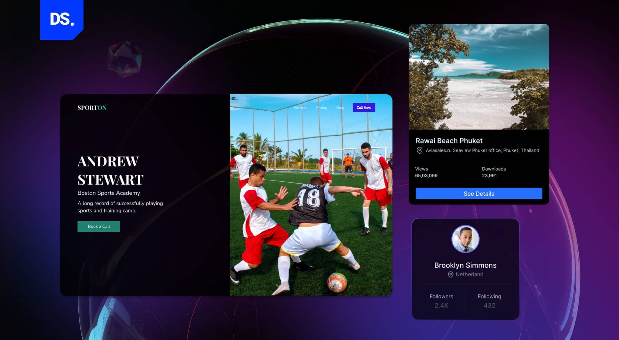
Notice how both the CTA buttons: “Sign Up for Free,” and “Start Your Free Month” stand out from the other design elements on the page? Here are the design tricks used to establish these focal points and make them stand out:
- The designer has a clear understanding of what the webpage trying to convey to the viewers. In this case, the design is intended to make users sign up on the website.
- Another key step to establishing strong focal points is to keep the design uncluttered. In the example above, you can easily figure out what the site wants you to focus on.
- You can create focal points by using contrasting colors, especially for the CTA buttons. In the example above, two vibrant contrasting colors: deep blue and deep yellow encourage clicking.
- You can also create focal points by using other design elements like lines, arrows, and “highlighted” sections of text. Using a series of similar shapes across a page and then breaking the pattern with a different shape can also create a sense of emphasis.
In the example above, only the CTA buttons have unique shapes. The other design elements are all shaped straight. The cylindrical shape of the CTA buttons incites greater focus. Explore CTA button best practices blog to create more effective CTA’s.
3. Reading Patterns
In most cultures, people read from the top down and from left to right. But, that does not make every piece of text that is presented in that format readable. More importantly, the traditional top-down and left-to-right format does not make web/app pages easily scannable.
According to a study conducted by the Nielsen Norman Group, 79% of Internet users scan through websites. These users do not have the patience to read webpage content word-by-word. Your design must address this impatience.
How? All content on your website should be adjusted to suit the reading patterns of your target users. In other words, always present content in ways that it is super-easy to digest and scan through.
But, how do designers achieve that goal? By integrating the reading/scanning patterns of your target customers into your web design. The Nielsen Norman Group has done great research on this topic for several decades.
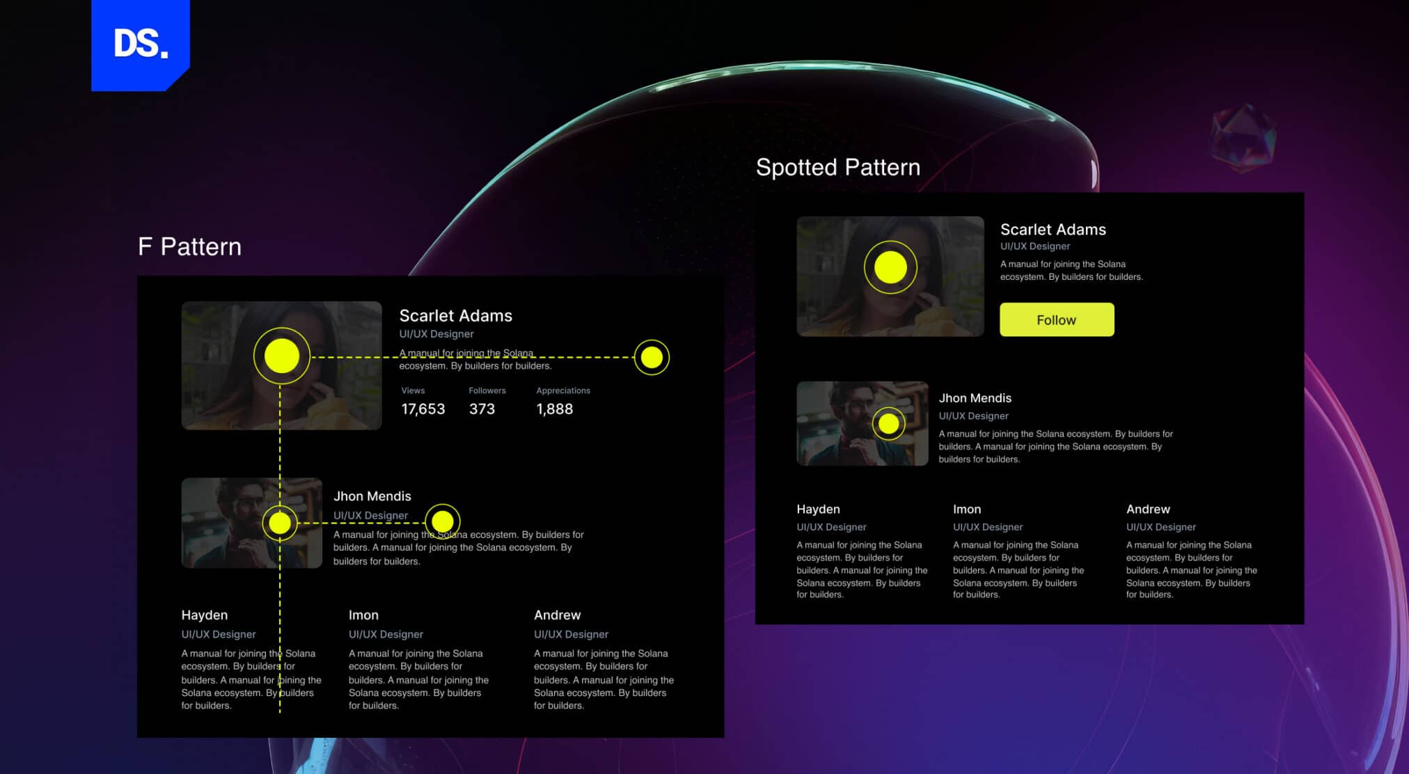
In their famous “eye-tracking” study, the group assessed the reading patterns of thousands of Internet users. Here are the three most common scanning patterns that people use to scan through web pages:

(Source: Nielsen Norman Group)
- F-Patterns: Most traditional, text-heavy pages (e.g. blog posts) are designed as per this pattern. As you can see in the example above, the focus is on the content which is located on the right side of the screen.
- Spotted Pattern: Many users employ this reading pattern because it allows them to skim through the text. This reading pattern design is typically seen in service-related business websites. These web designers use capital letters and larger fonts to make specific words or design elements (for example, the address of the business) in the content stand out.
- Layer-Cake Pattern: This reading pattern leverages large-sized headings and subheadings to make users focus on blog/article titles and subheadings. If the titles and subheadings are enticingly worded and designed, users will click them in an instant.
There are several other reading patterns like the Z pattern, the commitment pattern, and more. These three patterns are the principle patterns web designers use to create web pages that are engaging and easy to scan.
4. Typographic Hierarchy
Typographic hierarchy is a visual hierarchy design principle that focuses on the science of organizing text content in ways that it is easier to scan and understand. Modern designers often refine this structure based on current typography trends to improve readability and visual impact across platforms. It is used in both print, web, and design.
Designers also refine readability by adjusting tracking in typography, which controls the spacing between letters and improves clarity across different screen sizes.
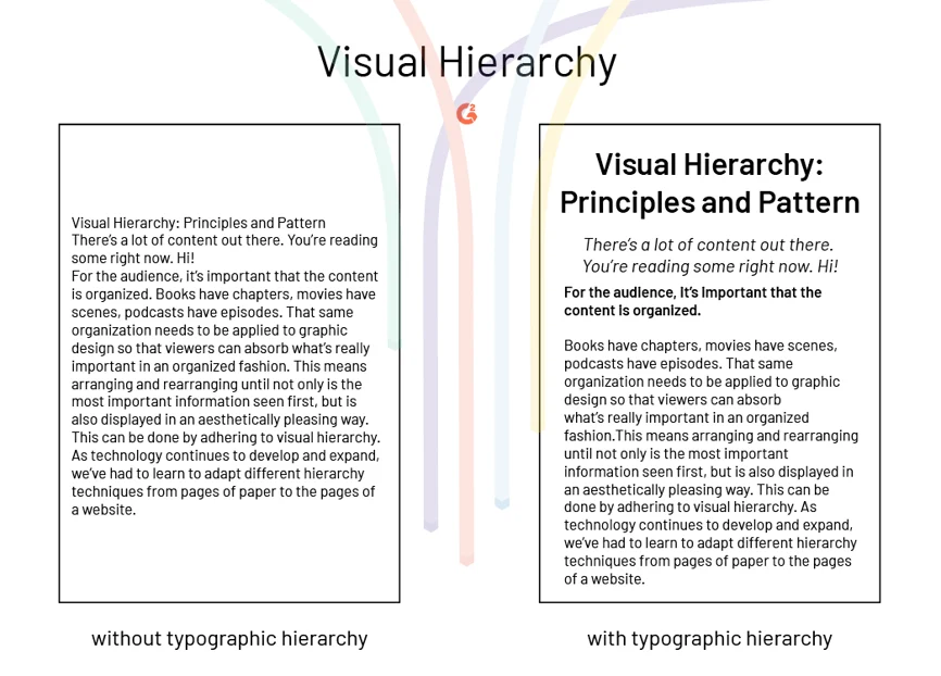
Two of the key aspects of this visual hierarchy design principle are: using different font sizes to generate visual interest and using whitespace to divide the text and make it easier to scan. This image from G2 perfectly explains this design principle:
(Source)
In this image, you see two pages. Both contain text but only one is designed with typographic hierarchy. It is the one that is easier to read. Notice the difference in font and size of the heading, subheading, and copy in the second image?
The most notable content on the page is the headline. It is the first thing you see as it is typed in a bigger font. The text in the second image is also broken up, making it easier to scan. The same qualities cannot be attributed to the page that is designed with a typographic hierarchy.
So, if you want your design to be easy to scan/read and look visually appealing, creating a clear and consistent typographic hierarchy for your design is vital.
5. Space
Professional web designers and their clients rarely agree on anything. But, there is one desire both clients and designers share: they want to fit as many design elements, content, and features as they can on a page/screen. The more, the better for consumers, right? Wrong.
Too many design elements with little-to-no breathing space can ruin user experiences. To avoid overloading their users with information and design elements, web designers follow the visual hierarchy design principle of whitespace. By following this principle, they get to:
- Boost the scan-ability of their designs
- Makes the bonds between different elements in the design easily perceivable
- Make their designs appear less cluttered
- Encourage users to focus on core design elements
- Adds visual appeal to the page
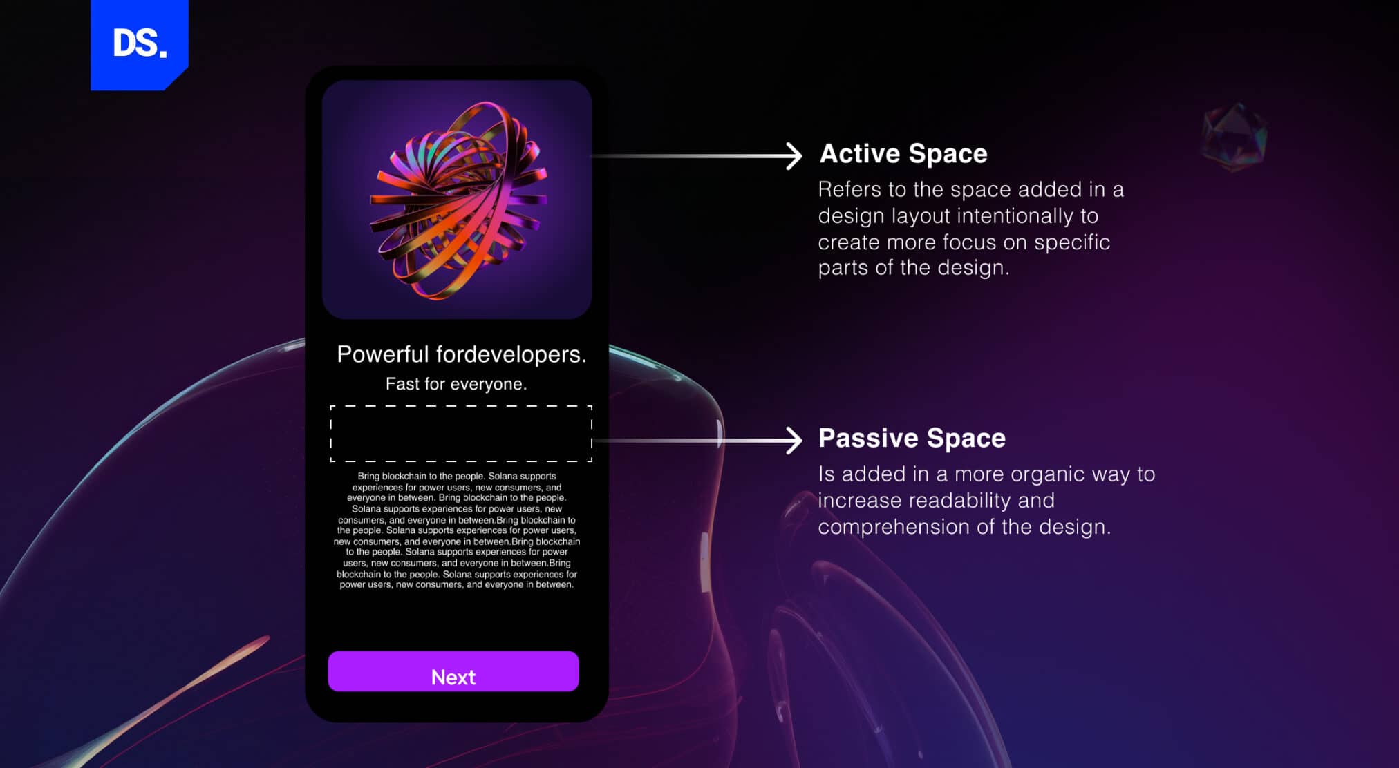
In modern-day UI design, there are two ways designers use whitespace: active and passive. Active whitespace represents the spaces that are intentionally designed to create specific effects like improving legibility or directing the user’s focus.
Passive whitespace represents the spaces that are unintentional. They occur naturally in-between different design elements. Here is a visual representation of the two ways designers use the visual hierarchy design principle of whitespace:
6. Proximity
While browsing eCommerce sites, have you noticed that products that are related to each other are grouped together in a single section? Here is an example:
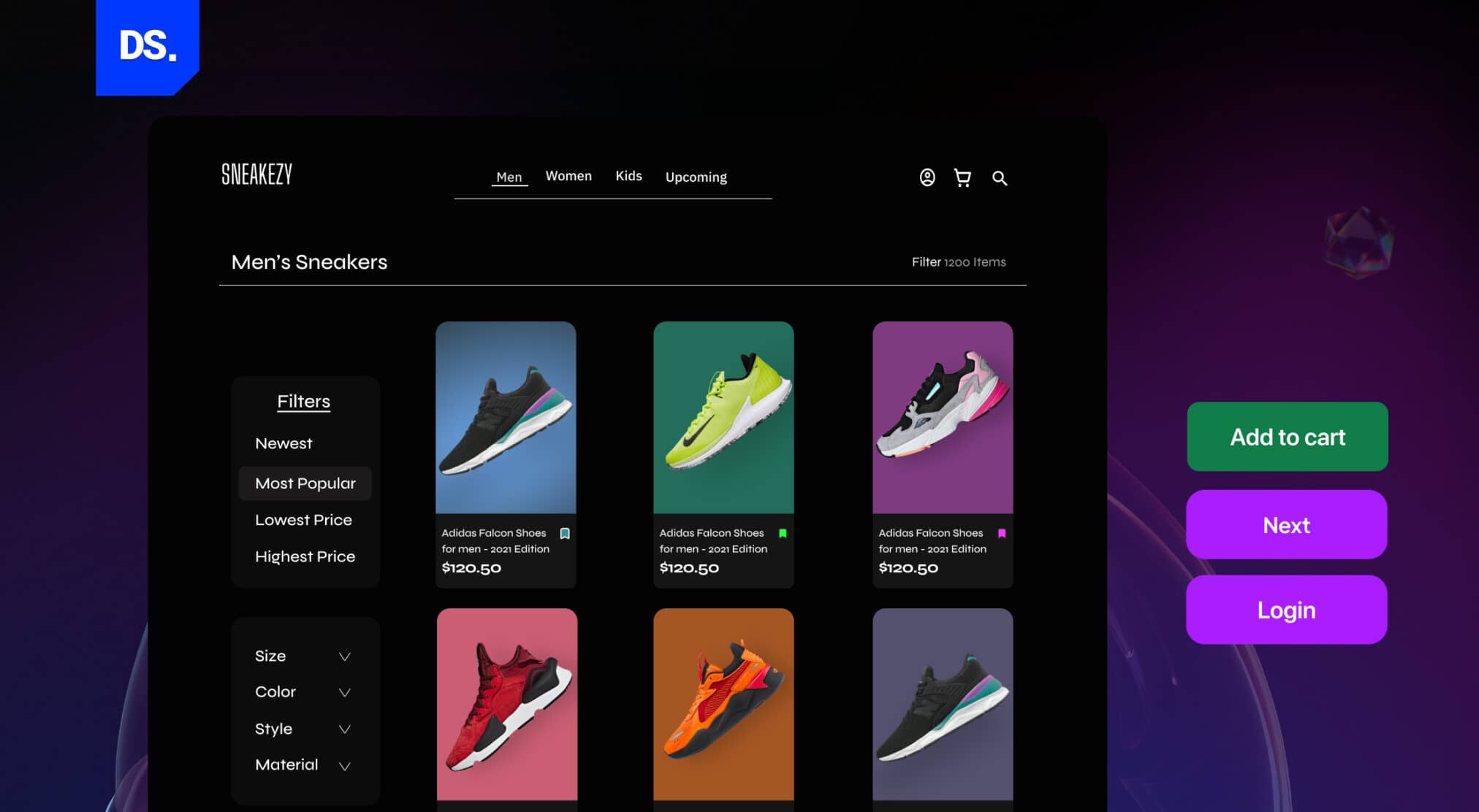
Now, have you noticed how the CTA buttons on some apps have similar designs, are always placed close together, surrounded by whitespace, and designed to be more prominent than the other elements? Here is an example:

(Source)
This practice of giving related elements similar designs is based on the Proximity principle. It was created in the 1920s by German psychologists. This principle is based on the innate human tendency to perceive things in groups.
7. Repetition
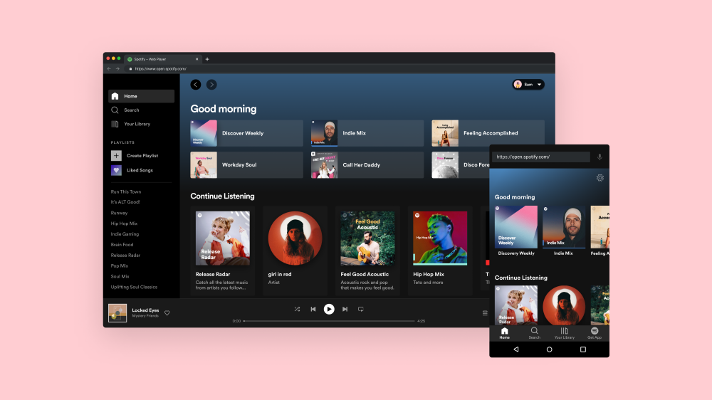
In design, the principle of repetition dictates that designers must reuse all elements: patterns, colors, fonts, textures, etc., throughout a piece of design. A good way to understand this principle is to look at Spotify’s website and app:
(Source)
As you can see, both the Spotify website and app have a consistent design. The look, use of colors, fonts, and icons are all consistent, across their products. By following this visual hierarchy design principle, Spotify simplifies the process of using its products across all devices.
Final Take
These were some of the fundamental visual hierarchy design principles that must never be overlooked when designing any digital product. No principle matters more than another. But, the more principles you follow, the higher your chances of creating visually engaging designs.
FAQs
What are the main visual hierarchy design principles?

Visual hierarchy is a map that arranges design elements by order of significance. The main principles prioritize size, focus, contrast, color, reading patterns, typography, space, distance (proximity), and repetition.
How does visual hierarchy guide user attention in UI design?
Visual hierarchy in UI design structures content and design elements to help users skim through the page. Elements of highest priority are emphasized to draw the most attention, and the order goes on. Also, content with similar intent is grouped together to create a familiar environment and reduce confusion.
How does color affect visual hierarchy in UI design?
Color plays a vital role in visual hierarchy, it enhances and diminishes an element’s priority. Bright-colored, high-contrast elements draw immediate attention, and are mainly used in CTAs (primary actions). Muted colors are used to minimize the intensity, and let the background shine whenever necessary.
What is the role of typography in visual hierarchy?
Typography guides users toward the significant information that should be read first, using elements like size, weight, style, space and consistency. Large texts hold attention for the longest time, followed by other content.
How to use visual hierarchy for better website navigation?
Visual hierarchy can be used to establish the primary and secondary paths to guide users navigate a page. Website navigation can be established by sticking to a primary menu, CTAs, and consistency across typography and design elements.
What are examples of visual hierarchy in modern UI/UX?
In SaaS, visual hierarchy consists of the following elements:
- Large, bold primary headline
- Short subtext to support the headline
- High-contrast CTA
- Subtle background
For eCommerce, it includes:
- Large product images
- Price and description
- Add to Cart Buttons
- Reviews
What is the F-pattern in visual hierarchy?
F pattern is how users scan content available on a web page or a web blog. First, they scan the first line horizontally, then the second line, and shift attention to the vertical left side. Usually, they are looking for keywords, bullets, or section titles
How to avoid common visual hierarchy mistakes in design?
These visual hierarchy mistakes should be avoided:
- Treating everything as primary elements
- Using bold colors, effects, and contrast to highlight content
- Not using a consistent typography
- Not using a grid to place elements