


12 Form UI/UX Design Best Practices to Follow in 2026



Slash your form drop-off rates! Learn the smartest form UX design best practices. Learn how to design flawless mobile-friendly forms with perfect layouts, CRO patterns, OTPs, and more.
Forms sit at the heart of every meaningful user interaction online. They are at the final step in every lead generation process, at the core of every eCommerce checkout, and at the gateways to every user onboarding journey.
Yet, many product leaders continue to overlook the importance of the user experiences (UX) their products’ forms deliver. They continue to avoid following the most basic form UX design best practices.
The result? They fail to reduce form drop-offs. And, they lose tons of customers. One in five shoppers abandons their carts solely because of poorly designed forms at checkouts. Every extra field in a form leads to lower conversions. It leads to <20% abandonment rates.
Don’t want to lose over 20% of your customers just because of poor form design? You have to understand the latest web form best practices. That’s what this 2026-updated guide on form UX design best practices is here for. You’ll learn every smart form conversion optimization trick in the book.
Once you master user-friendly form design, don’t stop there. Read our ultimate guide to UI/UX design. Optimize every other aspect of your product’s UX as well!
TL; DR – Form UX Design Best Practices
- Keep forms concise with single columns and labels having optimum clarity.
- Validate inline (not prematurely) with clear success/error states.
- Follow WCAG 2.2 accessibility guidelines regarding labels, focus order, and error semantics.
- Optimize for mobile by offering autofill, OTP auto-retrieval, and thumb-friendly design.
- Support all modern login options (OTP, passkeys).
- Track drop-off analytics and refine form design accordingly.
Why Form UX Still Matters
Good form UX is vital for securing more conversions, leads, sales, and satisfied users.
Your users come across forms in your product at critical conversion points. ‘Form UX’ refers to the experiences your product delivers at these critical points.
If these experiences are frustrating, your digital product will not generate leads. It will not deliver successful onboarding processes. And it will frustrate the remaining users at checkout.
In other words, poor form UX = users will leave your product unconverted and unsatisfied. Hence, form conversion optimization is such a critical discipline.
Mastering it is the only way to reduce form abandonment rates. You also have to measure key form metrics like completion rates, abandonment-per-field, average fill time, etc. They’ll teach you where exactly your product’s forms fail your users. Use this data to continuously refine your form’s design.
Eventually, your forms feel ultra-intuitive to use. You minimize your form abandonment rates in no time. And, your product earns more leads, more signups, and more ‘success’ overall.All of this begins with following the most essential form analytics best practices and form UX design best practices. Let’s dissect these practices one by one.
Form UX Design Best Practices
1. Information Architecture and Scope
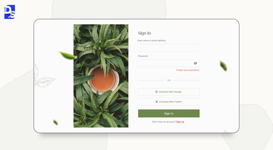
The foundation of a high-converting form is its architecture. This form UX best practice is about asking for the right information, at the right time, and in the right order.
Your form’s ‘architecture’ refers to the way it’s structured. Its ‘scope’ refers to everything it covers. To get these two aspects of your form’s UX right, follow industry-established form usability guidelines and core UX Design laws that define how users process information structures:
- Start by asking for only what is absolutely necessary.
- Use progressive profiling to gather more data over time (common in B2B forms).
- Never demand all required info upfront.
- Move from easy, low-friction questions (name) to more sensitive ones (email).
- Group related form fields into logical sections (like ‘Shipping Info’ with ‘Contact Info’).
- Avoid using multi-column layouts that break a user’s natural vertical scanning pattern.
Follow these online form design principles to create flawless custom web forms. The more complex the form, the more important it is to follow these form UX best practices.
This is especially true for complex enterprise forms. When designing these forms, strictly follow single column form design rules. Also, learn about navigation and form UX patterns to make these complex forms easily digestible.
2. Layout and Visual Structure
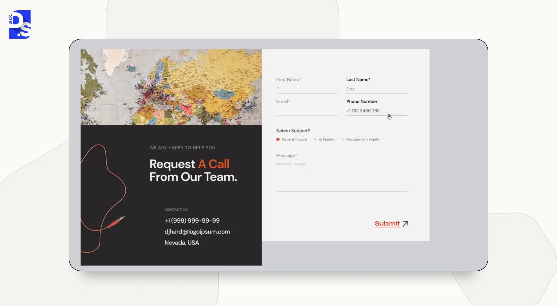
A form’s layout is the visual roadmap that guides users through the tasks. It needs to have a clean, logical visual structure to reduce cognitive load and make the process feel effortless.
The single-column form design: that’s the gold standard of form layout best practices. It’s also one of the most important form UX design best practices in general.
Use a single-column form design to create a simple, predictable path for users’ eyes to follow. This form design improves completion speed and reduces error risks. In longer forms, using section headings can break the single-column into digestible chunks. Use whitespace to de-clutter the single-column. Make use of progress indicators in multi-step forms to motivate users to complete all fields.
Two-column layouts are generally a no-no in user-friendly form design. That’s unless you’re using them for short, related fields. Like ‘First Name’ and ‘Last Name.’ Or, ‘City’ and ‘State.’
3. Labels, Microcopy, and Help Text
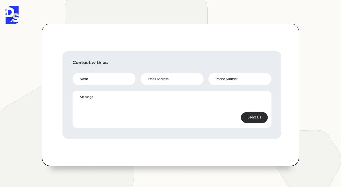
Every word in the form – in its labels, microcopy, and help text should guide and reassure users. They should clarify every step.
Clear communication is the soul of a good form. To maintain this soul:
- Always use persistent labels positioned directly above the input fields.
- Never use placeholders as labels – they might disappear as the user starts typing, and force them to rely on memory.
- All microcopy in forms should contain clear and action-oriented language.
- For fields with specific formatting requirements (like dates), use an input mask to prevent errors before they happen.
- Make all inline help text instantly visible next to the relevant field – not hidden behind a tooltip.
4. Validation and Error Handling

How do your forms validate accurate user entries? How do they respond to wrong entries? Smart form validation UX is all about making these responses feel like a helpful conversation, not harsh critiques.
The best practice for making form responses feel friendly is using real-time form validation.
- Validate a field after a user has finished typing and moved to the next one. Not while they are in the middle of it.
- When a user corrects an error, the validation message should disappear instantly.
- Inline error messages should appear directly next to the field in question.
- Error handling in forms should feel friendly; Use human language to explain exactly what’s wrong and how to fix it.
To optimize all aspects of your form’s validation UX design, validate your forms with user testing pre-launch.
5. Modern Authentication
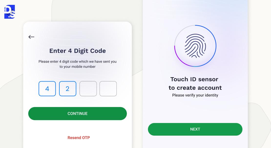
Modern authentication is all about one-time passwords, temporary passkeys, and password-free logins.
One-time password or OTP form UX design is now the norm to implement a one-time password input design.
- Use segmented fields that automatically advance the cursor..
- Make sure the form supports pasting the full code.
- Use the WebOTP API on mobile to automatically retrieve the code from an SMS.
- Establish a clear ‘resend code’ flow to ensure users have multiple opportunities to register their OTPs.
The latest startup sign-up flows are going one step beyond OTPs. They are using passkey login UX. This form of passwordless authentication UX allows users to sign in with a biometric scan. Or a device PIN. Mobile-first OTP flows are standard in markets like India. Passkeys are gaining rapid traction in the West. Your next mobile onboarding UX design must feature both options.
6. Accessibility and WCAG 2.2 Compliance
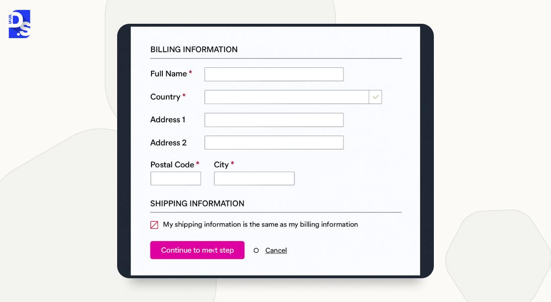
An accessible form design should follow the latest WCAG 2.2 forms guidelines.
Follow these form accessibility guidelines.
- Abide by the latest WCAG 2.2 forms guidelines.
- Use proper semantic HTML and ARIA form labels so that screen-readers can correctly announce all fields and their purpose.
- Error identification must be clear and programmatically associated with the correct field.
- Make all tap targets large enough for users with motor impairments.
7. Mobile-First Form Design
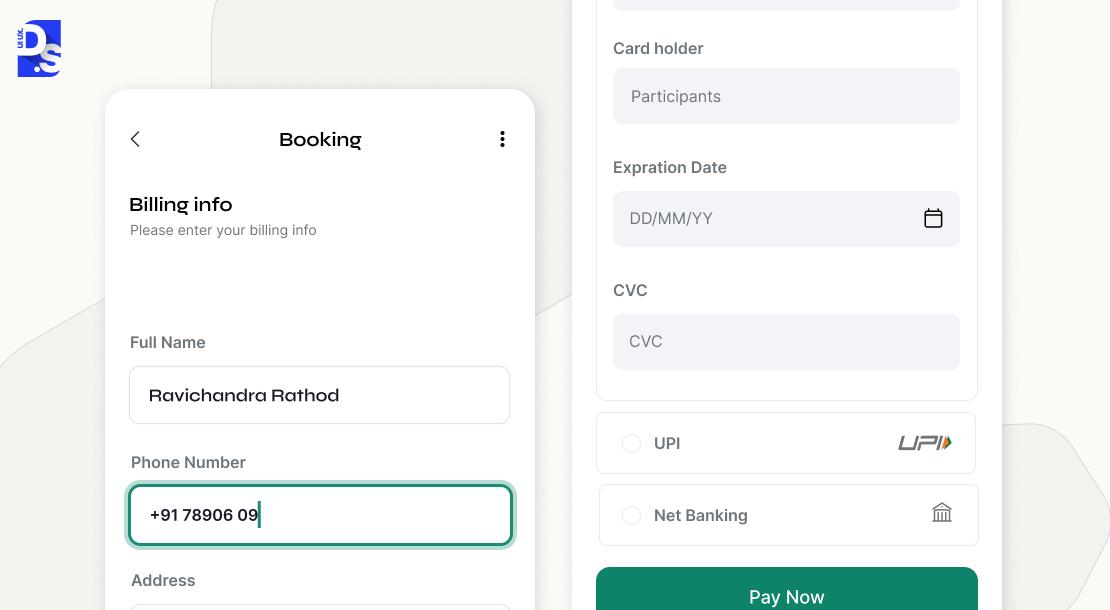
Mobile form design means designing all forms with mobile users in mind. It involves designing for the thumb reach zone, making all action buttons touch-friendly and ‘tappable, ’ optimizing the form for mobile keyboards, and offering auto-fill.
Most of your product’s form-fillers are mobile users. which is why mobile optimization is a core part of ecommerce ux best practices today.
To maximize your forms’ mobile usability and create mobile-friendly forms.
- Use the correct input mode attribute (for example, tel.. for phone #, numeric for PIN) to show the right keyboard.
- Follow autofill best practices – include the autocomplete attribute on all relevant fields.
- Use sticky CTAs that remain visible as the user scrolls.
- Follow all general responsive web design best practices.
8. Internationalization and Formatting
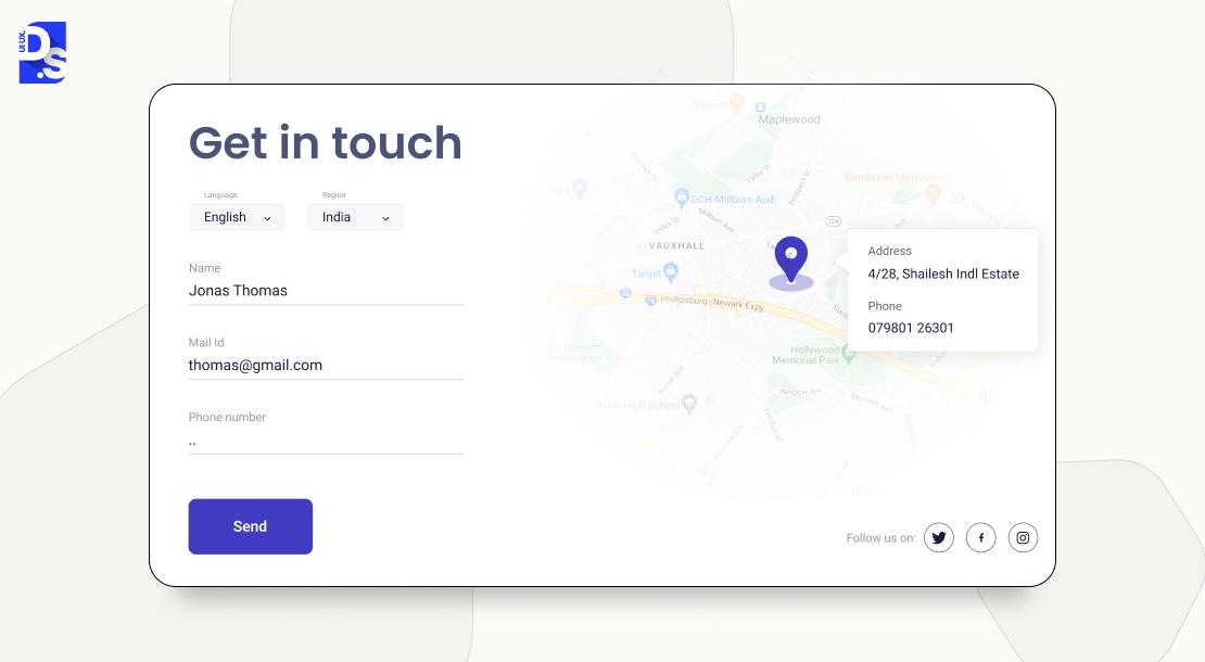
Thoughtful localized form design is vital for earning trust with local audiences. But, if you have a global audience? You need a globalized form design approach.
- Use localized input masks for region-specific formats like phone numbers and postal codes.
- Make sure your forms handle multi-part names and addresses with flexibility.
- Your form’s naming and address UX must accommodate the different sentence structures used around the world.
9. Security and Privacy UX
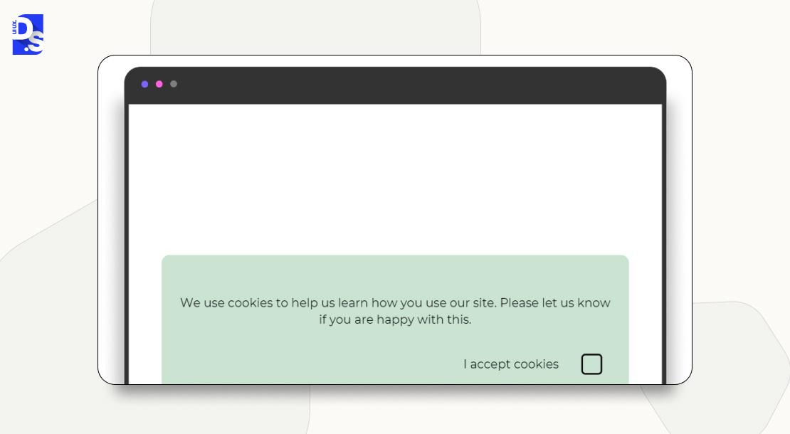
Be radically transparent. Create transparent consent requests. Avoid using ‘dark patterns’ that trick users into agreeing to things without full knowledge.
Want your users to trust you enough to share their info? Follow these secure form design practices:
- Write all privacy and consent statements in plain, simple language – not legal jargon.
- Give users total privacy in forms, i.e., provide total control over how their data is used.
- If you’re going passwordless, communicate the security benefits clearly.
- Avoid using deceptive ‘dark patterns’.
10. Patterns by Use Case
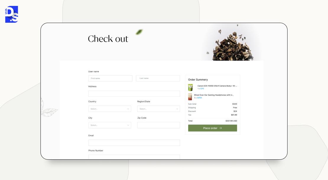
B2B forms, checkout forms, and account sign-up forms – these different forms have different jobs. They also have different design patterns.
- For B2B lead gen forms, use progressive profiling: start with just an email, ask for more information over time.
- For checkout form UX, prioritize speed with address lookup APIs, prominent security badges.
- For account sign-up UX, offer social logins, OTPs, and passkeys.
Want to master every pattern?
Study every leading eCommerce website UX case study and follow the latest eCommerce checkout form UX best practices if you wish to design high-converting checkout experiences for your eCommerce platform.
Analyze popular B2B website forms for improving lead generation and streamlining user onboarding.
Learn about new-age SaaS product form design with modern UX principles and user-focused features, if you’re building modern, user-friendly SaaS products.
11. Analytics and Testing
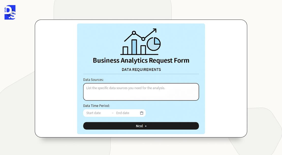
Track the final form completion rate. Optimize form drop-off rates by routinely fixing all high-impact problems.
Following form analytics best practices means.
- Constantly track the final form completion rate.
- Set up event tracking for every single form interaction to identify which specific fields are causing the most friction.
- Optimize form drop-off by instantly fixing all highest-impact problems.
Constant improvement is the essence of a conversion-focused UX strategy. To better understand how to improve your forms, get UX research services.
Or study this dashboard form UX case study that explains the ‘why’ behind form-tracking data.
12. Common Anti-Patterns (and Fixes)
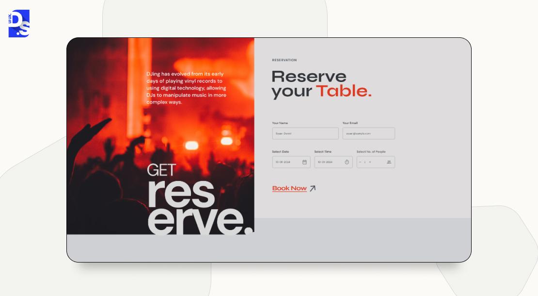
Many persistent design mistakes (‘anti-patterns’) continue to plague web forms. Using placeholders as labels and sharing ambiguous error messages are the most common ones.
Avoid using these anti-patterns at all costs.
- Avoid using placeholders as labels (fails accessibility standards). Use persistent labels instead.
- Avoid premature validation. Validate inline only after a user leaves a field
- Avoid hidden help text and ambiguous error messages. Be clear, specific, and helpful.
- Get rid of aggressive CAPTCHA walls. Use friendlier, modern alternatives.
Get a detailed UX audit checklist for forms. Use that list along with UI UX audit tools to audit your website forms. Find and eliminate these common anti-patterns.
Conclusion
What happens when you follow these form UX design best practices?
You get better conversions, fewer drop-offs, and happier users. With accessible form design, you also get access to higher-quality user data.
Do your forms currently generate these benefits? If not, it may be time to redesign forms to improve UX. Need help optimizing your forms? Our UI/UX design services can help!
Get in touch for form UX optimization.
Let us transform your forms – from conversion barriers into business assets.
FAQ’s
Is single-column always best?

Yes, for most cases. Single-column forms align with natural vertical scanning patterns, reduce cognitive load, and improve completion rates—except for short, related fields like “City” and “State.”
Inline vs. on-submit validation- Which one is better?
Inline validation is better. It gives real-time feedback after field completion, helping users fix errors instantly without overwhelming them, unlike on-submit validation, which delays error discovery.
How to mark required vs. optional fields?
Clearly mark required fields with an asterisk (*) and label optional fields explicitly as “optional” to avoid confusion and improve accessibility and user clarity throughout the form.
Best way to handle OTP forms?
Use segmented fields with auto-advance, support pasting full codes, implement WebOTP API for mobile auto-fill, and offer a clear, retry-friendly resend code option for smoother experiences.
Are placeholders okay as labels?
No, they disappear during input and create accessibility issues. Always use persistent labels. That’s one of the most important form UX design best practices.









