


Dark Patterns in UX Design: Examples and Legal Risk



In late 2025, around September, Amazon settled Federal Trade Commission charges for $2.5 billion over Prime. They agreed to pay somewhere around $1 billion in civil penalties and $1.5 billion in consumer refunds.
Employees reportedly called the cancellation flow the “Iliad Flow,” a four-page, six-click process named, only half-jokingly, after Homer’s epic.
This is the single largest dark-patterns enforcement action in FTC history. It happened to one of the most sophisticated product teams in the world. When Amazon pays huge fines for a simple interface issue, smaller product teams must watch out.
Dark patterns in UX design are tricky interface choices made to trick users into doing things they did not want to do, like
- hiding a cancel button
- adding hidden fees
- pre-selecting a paid add-on,
- using fake urgency to rush a decision, etc.
UX designer Harry Brignull named this term in 2010. What was once seen as a normal growth trick is now facing big legal actions from the FTC.
What Are the Most Common Deceptive Types of Dark Patterns?
The most common types are roach motel, confirmshaming, sneak into basket, false urgency, forced continuity, and disguised ads. Once you know these patterns, you start noticing them everywhere.
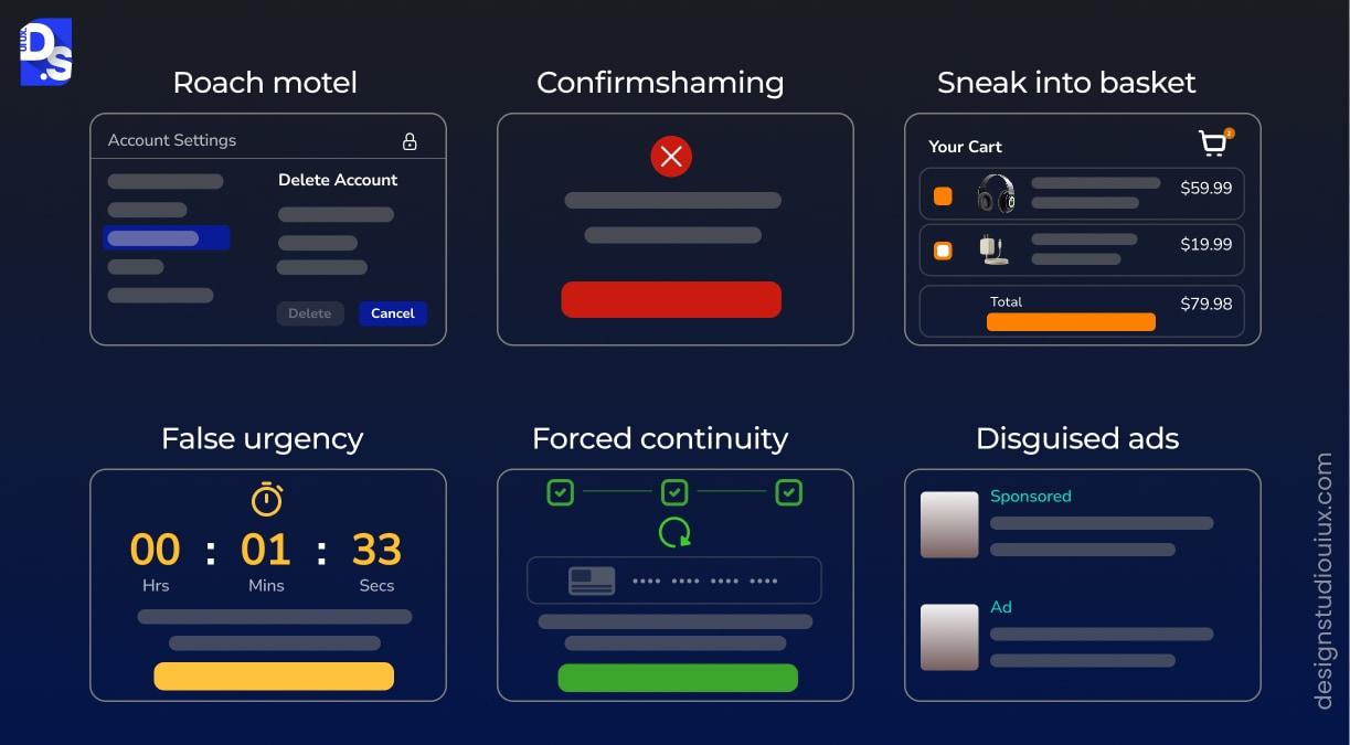
| Pattern | What It Looks Like | Why It Works |
|---|---|---|
| Roach motel | Easy to sign up, deliberately hard to cancel, hidden menus, required phone calls | Exploits the effort gap between joining and leaving |
| Confirmshaming | “No thanks, I don’t want to save money” as the decline option | Uses guilt or embarrassment to discourage opting out |
| Sneak into basket | An item or add-on placed in the cart without the user choosing it | Relies on users not reviewing the cart line by line |
| False urgency | Countdown timers or “only 2 left” messages that are not real | Manufactures pressure to skip careful consideration |
| Forced continuity | A free trial that silently converts to a paid plan with no reminder | Bets on the user forgetting to cancel in time |
| Disguised ads | Advertisements styled to look like organic content or search results | Exploits the trust users place in non-sponsored content |
Roach motel and sneak into basket both show up constantly at checkout specifically, our eCommerce checkout UX best practices guide covers the honest version of that same flow. Confirmshaming, meanwhile, is really a UX writing problem wearing a design problem’s clothes, the interface layout is often fine, it is the microcopy on the decline button doing the manipulating.
Why Do Dark Patterns Carry Legal Penalties Now Rather Than Ethical Concerns?
Dark patterns are a legal risk because the FTC now treats them as an enforcement priority, not just an ethics complaint. The Amazon settlement is the clearest signal of how far this has gone.
The FTC’s complaint centered on a subscription flow that made it easy to sign up and deliberately hard to leave. It also flagged a decline option worded to guilt users into staying, exactly the kind of confirm shaming pattern in the table above.
Two Amazon executives were named individually in the case. The court ruled they could be held personally liable if the evidence showed they knew about the practices. Personal liability, not just a corporate fine, is a real shift in how seriously this is now treated.
In this shift, Amazon is the biggest case, but part of a wide enforcement trend.
- Epic Games paid $245 million after using confusing button design to trick players, many of them children, into unwanted purchases
- Vonage returned $100 million to customers trapped by a cancellation flow the FTC found unreasonably difficult
- Credit Karma paid $3 million for misrepresenting that consumers were pre-approved for credit offers
The Click-to-Cancel rule by the FTC is not in force right now. It aimed to make quitting a plan as easy as joining. The rule came to light in 2024 but a federal court blocked it in 2025 over budget and benefit study flaws.
What has not gone away is the underlying legal exposure. Amazon was pursued under the existing Restore Online Shoppers’ Confidence Act and the FTC Act’s general unfairness and deception authority, neither of which needed the cancelled rule to apply. The regulatory tool changed; the risk did not. California, Colorado, and Connecticut also now write dark patterns directly into their state privacy laws.
Is This Only a US Problem?
No, and the exposure outside the US is arguably larger. The EU’s Digital Services Act became the first law anywhere to prohibit “dark patterns” by that exact name. Article 25 bans online interfaces that deceive, manipulate, or otherwise materially distort a user’s ability to make a free, informed decision.
Violations can be fined up to 6 percent of a company’s global annual revenue, a larger maximum exposure than anything the FTC can currently impose. Enforcement is already underway against major platforms including Meta, Temu, and X.
The scale of the underlying problem is part of why regulators moved. A European Commission screening of retail websites found that 97 percent of the most popular sites and apps used by EU consumers deployed at least one dark pattern.
A well-known example regulators point to is drip pricing, Ticketmaster displaying a ticket at one price and only revealing service and processing fees at the final checkout step, after a user has already invested time and entered payment details. Transparent pricing from the start, the approach we cover in our SaaS pricing page design guide, is both the compliant version and, generally, the better-converting one. If your product has any EU users at all, US-only compliance is not the full picture.
What UX Patterns Replace Dark Patterns Without Hurting Conversion?
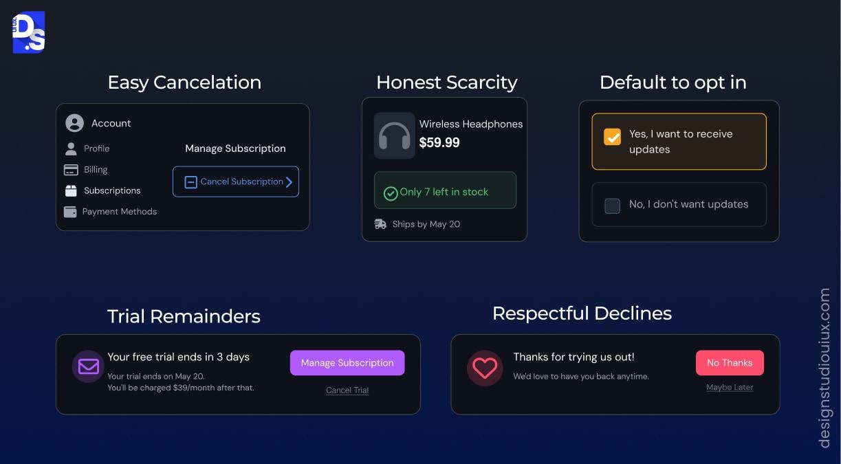
The honest version of most dark patterns is not actually a worse conversion tool, it just requires trusting the product to hold up without the trick. Our conversion rate optimization guide covers this in more depth, but the short version is that trust and conversion are not actually in tension the way dark patterns assume.
- Make cancellation exactly as easy to find as upgrade, same number of clicks, same visibility in navigation
- Use real scarcity or none at all, if a countdown or limited-stock message is not literally true, remove it rather than fake it
- Default to opt-in for anything that costs the user money or adds a subscription, never pre-check it for them
- Send a reminder before a free trial converts to paid, with a clear, one-step way to cancel from that reminder, this is the same principle behind good SaaS onboarding UX design
- Let a decline option read as a decline, not a guilt trip, “No thanks” instead of language designed to shame the click
What Do You Do When Leadership Wants to Add One?
This happens more often than most agencies will admit. A growth team requests a pre-checked upsell. A stakeholder wants the cancel flow to include three retention offers before the actual cancel button appears.
The useful move is rarely a flat refusal. It is reframing the request around risk the business already cares about, which is really a question of UX strategy rather than personal taste. Two things tend to land better than an ethics argument alone.
- Translate it into legal exposure, not just user experience. “This is the exact pattern Amazon paid $2.5 billion over” gets a very different reaction in a leadership meeting than “this feels manipulative”
- Propose the honest version as an A/B test rather than a philosophical objection. If removing the trick genuinely does not hurt conversion, which is common, that is a stronger argument than any ethics case, it is data leadership already trusts
- Document the decision either way. If a dark pattern ships over your objection, a dated note showing the concern was raised protects the designer specifically, not just the company, given that individual employees have now been named personally in FTC actions
How to Audit Your Product for Dark Patterns?
Check the complete signup and checkout process to know if there is any flaw in the design navigation. Also, walk through the cancellation and payment workflows.
Write down every place a choice was made for them instead of by them. This is essentially a heuristic evaluation, just run against a specific list of manipulation patterns instead of general usability principles. Specifically check:
- Is anything pre-selected that costs money?
- Is the decline option as visible as the accept option?
- Does urgency messaging reflect something actually true?
- Can a user cancel in roughly the same number of steps it took them to subscribe?
If a flow only converts well because of one of these tricks, that is worth flagging as a business risk, not just a design one, before a regulator or a viral social post flags it for you.
Where to Start If You Suspect Your Product Has These
Dark patterns are usually easiest to spot from the outside. That is exactly why an internal team often misses them, they were added gradually, by different people, for reasons that made sense at the time.
If you want a structured pass through your own product, our UX audit checklist and our guide on how to conduct a UX audit cover the full process. Our UX audit services team can also run this specifically for dark-pattern and compliance risk if you would rather have a second set of eyes on it.
FAQs
What is a dark pattern in UX design?

Dark patterns are deceptive interface patterns that guide users toward choices that benefit the business. They can include confusing menus, false urgency, hard-to-find cancellation links, or paid add-ons selected by default.
Who coined the term dark patterns?
The term “dark patterns” originated in July 2010 via designer Harry Brignull. He published a web portal to document and shame deceptive tricks.
Are dark patterns illegal?
Many dark patterns are illegal, or carry real legal risk. The FTC secured a $2.5 billion settlement against Amazon in 2025 over Prime enrollment and cancellation practices, the largest dark-patterns enforcement action to date.
Is the FTC's Click-to-Cancel rule still in effect?
No, the FTC Click-to-Cancel rule was struck down in 2025. The court found that the FTC had failed to complete a required early review of the rule’s costs and benefits.
Do dark pattern regulations apply outside the US?
Yes, dark pattern rules and regulations apply in the European Union. Article 25 of the Digital Services Act restricts designs that can mislead users or limit free and informed choices.
Do ethical alternatives to dark patterns hurt conversion rates?
No, ethical UX does not have to hurt conversion results. Clear pricing, honest choices, and easy cancellation can create better customer relationships while reducing legal and brand risks.



