


Understanding Cognitive Load in UX and How to Minimize it?



Quick Summary
In UX, cognitive load is the mental effort a user applies to process interface information and make decisions. High cognitive load causes confusion, and it reduces usability and accessibility, while low cognitive load improves ease of use and clarity.
According to Laws of UX, overloading working memory with too much information causes missed details and harder tasks. This overload causes users or readers to feel overwhelmed, which is exactly what poor UX design does.
The human brain thrives in natural environments. From navigating day-night cycles to adapting to seasonal changes, our cognitive systems have excelled at filtering relevant information from an overwhelming sea of stimuli.
This mental effort, known as cognitive load, is present in every interaction, and our inherent ability to manage it holds a valuable lesson for user experience.
Just as effective information processing and cognitive load management are crucial for survival in the wild, they are essential for successful interactions with digital products.
A well-crafted user experience minimizes this load, allowing users to focus on their goals without expending unnecessary mental energy. On the other hand, a cluttered, poorly-designed interface, with confusing navigation, forces users to solve problems that should not exist.
This leads to “cognitive overload,” one of the most common UX design mistakes, resulting in frustration, disengagement, and ultimately, a negative UX.
What is Cognitive Load in UX Design and Why Does It Matter?
Cognitive load, in the context of user experience, refers to the mental effort users exert while processing information and navigating your product.
Cognitive load matters because every user decision i.e. where to click, or how to navigate the digital product, uses a limited supply of mental resources. If your interface drains that supply too fast, users will simply quit.
Cognitive load is basically the outcome of design decisions made across research, information architecture, visual design, and content.
Understanding how the human brain handles information is crucial to minimizing this load and creating a smooth user experience. The study of human cognition has a long history, but its application to instructional design emerged in the 1980s with the work of Australian educational psychologist John Sweller.
Sweller’s research focused on identifying the optimal conditions for information retention. In his book, ‘Cognitive Load Theory‘,, he explained: “How can we design learning experiences that minimize cognitive load and maximize retention?”
According to Simply Psychology’s overview of Cognitive Load Theory, instructional design must align with the natural processing limits of the human brain. Sweller’s core argument applies directly to reducing cognitive load in digital interface design.
This system operates based on four key principles.
To see how every phase of the design process helps manage cognitive load, our UI/UX design ultimate guide maps the full workflow with practical context.
Let’s explore these principles and their impacts on designing UX:
What Are the Core Principles of Cognitive Load Theory in UX?
Cognitive Load Theory principles provide a framework for understanding how cognitive load is influenced by information acquisition, organization, and processing within the brain. This theory relies on core principles including the information store principle, borrowing and reorganizing principle, randomness as genesis principle, and limits of change principle.
Here is a quick reference for all four principles:
| Principle | What It Says | Key UX Design Application |
| 1. Information Store | The brain stores two types of knowledge: innate (primary) and learned (secondary) | Use familiar patterns and design conventions; reduce the need to learn entirely new concepts |
| 2. Borrowing and Reorganizing | The brain acquires and organizes information from the external world by building on existing knowledge | Maintain consistent layouts; break information into chunks; avoid making users relearn familiar patterns |
| 3. Randomness as Genesis | Creative design needs experimentation, but extreme novelty frustrates users. | Roll out new features gradually and apply progressive disclosure with clear instructions. |
| 4. Narrow Limits of Change | The brain has a finite capacity for processing new information at any given time | Break complex tasks into smaller steps; reveal information gradually; keep UI elements recognizable |
1. Information Store Principle
The Information Store Principle, highlights how the brain stores two types of knowledge: innate (primary) and learned (secondary) knowledge. This principle holds huge significance for designing user experience:
Primary Knowledge and UX Design
- Familiarity is Key: Users bring inherent abilities and common sense to the table. Designers can capitalize on this by employing consistent design patterns and intuitive interfaces. This reduces cognitive load by minimizing the need to learn entirely new concepts.
- Simplicity Wins: Basic cognitive processes like memory and attention are also part of primary knowledge. Simplifying interfaces by avoiding unnecessary complexity allows users to focus on their goals with minimal mental strain.
Supporting Secondary Knowledge
- Contextual Learning Matters: Users possess learned skills and experience-based knowledge (secondary knowledge). By providing users with opportunities for contextual learning (such as tooltips, informational videos, and guided onboarding processes) designers can help users grasp new features and concepts.
- Personalization Pays Off: Secondary knowledge also includes personal preferences and habits. By personalizing the user experience, designers can minimize the cognitive load that comes with adapting to unfamiliar interfaces.
Applying this UX Cognitive Load Principle
- Clear Information Architecture: Organize information logically using familiar categories and labels for easy navigation. This reduces the effort required to find specific information.
- Visual Hierarchy Guides Users: A consistent visual hierarchy will help users identify the most important elements on a page.
- Progressive Disclosure in Action: Reveal information gradually using progressive disclosure. This allows users to focus on their goals without being overwhelmed by profuse details.
- Feedback and Guidance: Clear feedback and guidance empower users to understand how to use the interface effectively. This reduces the mental strain associated with figuring things out independently.
2. Borrowing and Reorganizing Principle
This principle highlights how we acquire and organize information from the external world, building a vast knowledge store.
When information is properly organized, it becomes easier to access and retrieve, allowing the brain to efficiently process and integrate new information.
According to NN/g research, using progressive disclosure can help manage cognitive load as it structures complicated tasks across multiple screens/stages. This technique only reveals information when needed, and it mirrors how the brain naturally absorbs new information.
Here’s how UX designers can apply this principle to their work:
- Consistency is King: Maintain consistent design patterns and layouts. Use familiar UI elements and microcopy. This allows users to grasp new information, reducing cognitive strain.
- Chunking for Clarity: Break down complex information into smaller chunks. This reduces the mental effort required to process and retain information.
- Gradual Disclosure of Information: When information is disclosed step-by-step, users can concentrate on their goals without being bombarded by details.
3. Randomness as Genesis Principle
The Randomness as Genesis Principle suggests that true novelty arises from experimentation and testing. This mirrors evolution, where random mutations introduce new traits. This principle highlights the tension between introducing new features and ensuring user comprehension.
Here’s how UX professionals should introduce new features without causing overload:
- Clear Explanations are Key: Provide onboarding, tooltips, and contextual help to explain new features and their benefits.
- Gradual Exposure Builds Understanding: Use progressive disclosure to unveil new features and information incrementally.
- Prioritize User Needs: Focus on introducing features that directly address user goals and needs. Avoid novelty for novelty’s sake.
- Leverage Existing Knowledge: Draw on users’ existing knowledge by employing familiar UI patterns and terminology with new features.
An overabundance of novelty can lead to cognitive overload, frustrating users and hindering adoption. Follow this principle to avoid that risk!
4. Narrow Limits of Change Principle
The Narrow Limits of Change Principle asserts that our brains have a finite capacity for processing information at any given time. This principle is crucial for crafting UX. It emphasizes the importance of managing task complexity to prevent cognitive overload and optimize learning:
- Always break down complex tasks into smaller, manageable steps.
- Always reveal information gradually using progressive disclosure.
- Organize information logically using familiar categories and labels.
- Only use recognizable UI elements and microcopy.
- Provide clear onboarding processes to explain new information, features, and concepts.
By applying the Narrow Limits of Change Principle, UX experts can present content in a more digestible manner.
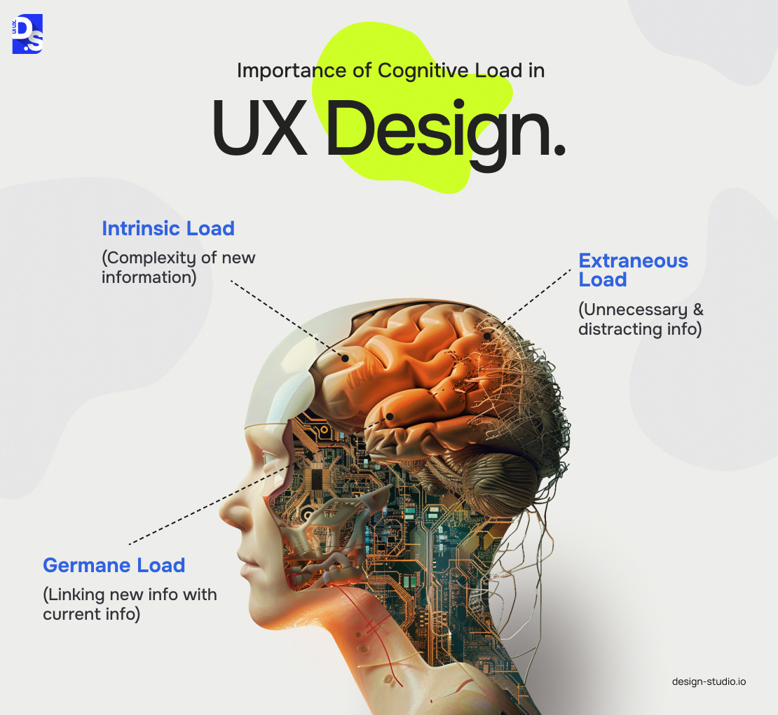
What Are the Three Types of Cognitive Load in UX?
The three types of cognitive load in UX are intrinsic, extraneous, and germane.
| Type | What Causes It | UX Impact | How to Reduce It |
|---|---|---|---|
| Intrinsic Cognitive Load | The inherent complexity of the task itself — some tasks are just hard regardless of interface design | It cannot be removed without changing the task, but it can be managed. | Split complex tasks into smaller steps. Add progress indicators and worked examples. |
| Extraneous Cognitive Load | Cluttered design layouts, unclear labels, inconsistent patterns, and unnecessary steps. | The most damaging type — causes abandonment, errors, and frustration; entirely within designer control | Remove visual clutter, apply consistent patterns, reduce choices, use familiar UI conventions |
| Germane Cognitive Load | The mental work users invest in learning and building mental models of your product | Productive load — good germane load builds user confidence and feature fluency over time | Support with good onboarding, consistent design systems, and progressive disclosure |
For UX designers, extraneous cognitive load is the biggest area to address. It comes from interface design and can often be reduced without changing the task itself.
A user may describe a product as “hard to use” when the interface makes the task harder than it needs to be. Clutter, poor labels, confusing navigation, and inconsistent interactions are common causes of this extra load.
The goal is not to make every interface minimal. The goal is to remove mental effort that does not help users complete the task.
How to Reduce Cognitive Load in UX
You can lower cognitive load by reducing complexity of the website/app, applying design psychology concepts, using structured/concise content and personalization feature, and maintaining consistency and responsiveness throughout.
Also, create clear user journeys, group elements with similar functionality, motivate users with progress indicators, add trust signals and give users a clear model to follow.
Additionally, laws of UX confirm consistency, chunking, and progressive disclosure minimize cognitive load in the UX projects.
Psychology in UX
Deepen your understanding of user psychology and core UX principles with some more research. Apply established design laws like Miller’s Law (chunking information into groups of 7±2 for better memory) and Hick’s Law (reducing choices for faster decisions) to optimize your interfaces.
Reduced Product Complexity
Avoid overwhelming UIs altogether. Prioritize essential features, minimize distractions, and aggregate notifications to prevent information overload. Need inspiration? Slack’s single-step workspace creation is a prime example of user-friendly onboarding.
Reward Progress
Motivate users with progress indicators. Consider subtle celebratory messages or animations for completed tasks, like Asana’s “celebration creatures.” This reinforces a sense of accomplishment and encourages continued engagement.
Building Trust and Confidence
For apps/sites handling sensitive data, prioritize user trust with security features like multi-factor authentication and data protection badges.
Concise Content
Focus on clear, concise writing.
- Avoid jargon, technical terminology, and overly formal language.
- Structure content with headings and logical chunking for easy scanning, similar to the approach advocated in this article.
- Combat user frustration with specific language. Instead of sharing generic error messages, explain issues clearly and offer actionable solutions.
Design Harmony and Responsiveness
Strive for design consistency across your product.
- Establish a style guide outlining colors, typography, icons, etc.
- Familiar UI patterns further reduce the learning curve for users. Maintain this consistency across all screen sizes and devices by investing in responsive design.
Clear User Journeys
Identify primary user tasks and prioritize them visually.
- Organize your design to guide users through the content, minimizing cognitive effort.
- Customer surveys and interviews help pinpoint user goals, allowing you to rank tasks and design a streamlined user flow.
- Include clear navigation systems for those who deviate from the intended path.
Offer Personalization
Empower users to personalize their experience.
- Offer options for theme changes, font size adjustments, and layout tweaks to cater to individual preferences.
- Gather user feedback to continually improve accessibility for wider audiences.
Combat the Split-Attention Effect
Users struggle when forced to jump back and forth between unrelated elements on the screen. Placing related items close together minimizes this “split-attention effect.”
Grouping elements based on function streamlines information processing and combats this effect. Grid layouts with clear separation between different content zones further reduce cognitive strain.
Provide Visual or Haptic Feedback
Implement immediate feedback mechanisms to reduce cognitive strain.
- Buttons, links, and interactive elements should all offer visual cues (like color changes) when hovered over or clicked, indicating system recognition of the user’s intent.
- Completed actions should be acknowledged with appropriate responses, such as confirmation messages.
Support Learning
- For complex apps and platforms, use “worked examples” to simplify complex concepts.
- Demonstrate task completion through step-by-step guides, video demonstrations, interactive tutorials, or annotated screenshots.
- Give users a clear model to follow.
Cognitive Load on Mobile: Why It Needs a Separate Strategy
Cognitive load on mobile is the mental effort that users spend on tasks to process details, navigate interfaces, and complete their actions on mobile devices. These are the cognitive load strategies mobile users need because users have less screen space and more distractions:
- Place actions in the thumb zone: Keep primary actions within the natural thumb reach, near the bottom center. Reaching farther adds physical and cognitive effort.
- Give each screen one job: Use one clear purpose and one primary CTA per screen. Several goals are harder to understand on a 6-inch display than on a 27-inch monitor.
- Cut unnecessary text: Mobile users read and process text more slowly. Use icons and short labels when their meaning is clear.
- Show information step by step: Use progressive disclosure/lazy loading feature to show only what users need for the current task.
- Avoid extra typing: Use autocomplete/pre-filled defaults, toggles, dropdowns, and sliders. These features reduce the cognitive and physical load of mobile form completion.
- Check one-hand use: Test the core flow with one hand on a standar
Why Is Cognitive Load Management Important in UX Design?
Cognitive load management in UX design is important because the concept lowers mental effort so users avoid frustration and task abandonment. Note that any sudden screen transition, or unclear label can lead to high cognitive toll.
Cognitive load theory was popularized in UX by Steve Krug’s influential book “Don’t Make Me Think.” It offers invaluable lessons on how cognitive load affects user behavior and decision-making.
Here are some key takeaways from this book:
- Satisficing Users: Users often choose the first or easiest solution, not necessarily the best. Design with this in mind.
- Usability for All: Usability is achieved when users of average ability can accomplish their goals.
- Time: All users prioritize speed. Always design to facilitate quick task completion.
- The All-Important Back Button: Make the back button prominent, as it’s one of the most heavily used features.
- Reassurance Through Design: A visible home button, even if rarely used, offers a sense of security and control.
- Clarity is King: Every page should be self-explanatory, catering to users entering from any point.
By following these principles, designers can effectively manage cognitive load and create user experiences that are intuitive, efficient, and enjoyable.
Causes of UX Cognitive Load: Good and Bad Cognitive Load UX Examples
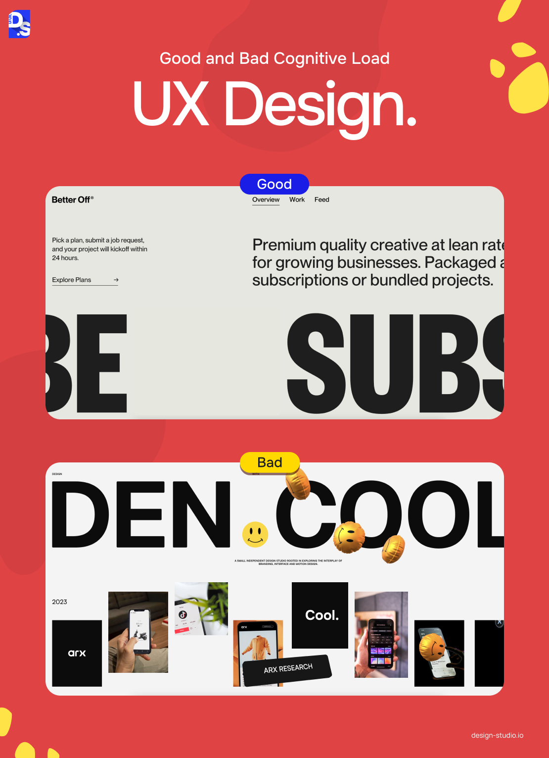
Common causes of UX cognitive load are unfamiliar interface patterns, excessive design choices and content, distractions, extra steps, hidden features, and design inconsistency.
Here is a summary of the prevalent cognitive load related mistakes while crafting UX, along with real-world examples:
| Cause | Poor UX Example | Better UX Example | Fix |
| Extra Steps | Booking.com’s old hotel search forced users through multiple sequential filter screens | Agoda presents key search filters upfront with icon-based filter options | Reduce steps to core decisions; surface key filters at point of need |
| Overstimulation and Distractions | Facebook’s news feed — constant barrage of updates, ads, and notifications creates visual overload | Trello — clean, distraction-free task management with minimal visual competition | Remove or aggregate non-essential UI elements; prioritize white space |
| Excessive Options | Rakuten’s extensive product categories leave users unsure where to begin | Airbnb’s curated property search reduces choices and speeds up decision-making | Apply Hick’s Law — fewer choices = faster decisions; use filters to reduce, not multiply, options |
| Excessive Content | Arngren.net — cluttered layout makes product information unreadable | Etsy — chunked categories, clear/ headings, and ample white space that make product browsing easy for users | Use chunking concept and split content into short paragraphs-clear headings and white space |
| Unfamiliar Interfaces | Cryptic icons and unconventional button labels force users to decipher UI | Skeuomorphism (envelope email icons) bridges reality and digital familiarity | Use familiar icons and microcopy; opt for ‘Contact Us’ over ‘Ring Us Now’ |
| Hidden elements/features | Hidden key actions – buried under menus and subpages | Single-page or clear-hierarchy layouts where users can easily access primary actions. | remove redundancies; merge related pages; make primary tasks always visible |
Extra Steps
Every step a user takes during a task consumes mental effort. Excessive steps derail users’ train of thought and test their patience. Prioritizing speed and a clear path to completion is crucial for a positive UX.
Booking.com’s hotel search process exemplifies how unnecessary steps can lead to cognitive overload.
- To book hotels on the website, users had to wade through multiple steps, selecting destinations, dates, and room types, followed by a lengthy list of available hotels.
- This bombardment of information was overwhelming and it led to severe user frustration.
Competitors like Agoda adopted a more user-friendly approach to searching and browsing through smart filter design:
- Reduced Steps: They presented key search filters upfront, allowing users to refine their choices without unnecessary navigation.
- Visual Clarity: Iconic imagery replaced text labels for filter options, minimizing cognitive processing.
- Horizontal Layout: Filters were spread horizontally, enabling users to scan options quickly and efficiently.
Agoda demonstrated a smarter way of minimizing cognitive load and now they are the leading hotel booking platform globally.
Overstimulation and Distractions
Cluttered interfaces overloaded with visuals and distractions pull users away from their goals. Working memory, the brain’s short-term processing center, becomes overwhelmed by competing stimuli. This leads to information overload and hinders the ability to focus on the task at hand.
Facebook’s news feed exemplifies bad friction through overstimulation with constant updates, ads, and notifications.
This makes it difficult for users to focus on a single task, leading to fatigue and decreased engagement. Studies have shown a steep decline in user engagement on Facebook due to this very issue.
Trello is the opposite. The project management tool prioritizes clean and concise information presentation. Free from distractions, Trello allows users to focus on their tasks without being bombarded by visual clutter. It’s the perfect example of minimizing cognitive load through minimalist design.
Excessive Options
Hick’s Law, a core principle in UX design, states that the time it takes to make a decision increases with the number of available choices.
According to this law, complex interfaces increase processing time, so designers must simplify navigation and reduce choices to maximize conversion rates.
Rakuten, a Japanese e-commerce marketplace, is a prime example. Their extensive product categories and filtering options can leave users feeling of where to begin their search.
Airbnb website’s convenient property search feature exemplifies the opposite. The platform’s intuitive interface presents a curated list of options, reducing the number of choices and facilitating quicker decision-making.
Excessive Content
Overwhelming content strains a user’s working memory. Chunking, the practice of grouping related information into manageable units, is a powerful tool for combating content overload.
Arngren.net, the Norwegian electronics retail website, is one of the oldest and most prominent examples of websites suffering from content overload. Although this website was not overloaded with products, the poor presentation still overwhelmed users.
Arngren’s direct competitor Etsy (a genuine product-heavy online store) used chunking to make its website more user-friendly. Instead of endless rows and columns, their site had short paragraphs, clear product categories with headings, and ample whitespace.
Unfamiliar Interfaces
Confusing and unfamiliar user interfaces (UIs) are a major culprit in cognitive overload. Users should not have to decipher cryptic icons or spend time figuring out how to complete basic actions. They need common visual cues and established navigation patterns to explore apps and websites, even the newer ones.
- Use familiar icons and microcopy whenever possible; opt for clear button labels like “Contact Us Now” or “Submit” over unconventional options like “Ring Us Now.”
- Attach self explanatory design elements to maintain clarity.
- Skeuomorphism, is ideal for bridging the gap between reality and the digital world. That’s why early email icons resembled envelopes.
- Also, consider adding onboarding guides/tutorials to present entirely new features.
Hard-to-Locate Features
Cognitive load increases when users waste mental energy searching for features. The lack of clarity, especially amidst a visually-busy layout, makes navigation unnecessarily difficult.
To avoid this, eliminate redundancies by combining pages or menu items. For example, you can merge employee bios and contact information onto a single webpage.
Lack of Internal Consistency
Inconsistency within a website or deviation from established UI patterns can be jarring for users.
Imagine a website where links are sometimes underlined and sometimes not. This inconsistency forces users to pause and question, even if they have no immediate need to interact with the link. Typos and grammatical errors have similar disruptive effects.
Dark Patterns: When Cognitive Load Is Made on Purpose
Poor design can cause cognitive overload by accident. Dark patterns such as Confirmshaming, hidden charges, roach motel, trick questions in forms, etc. deliberately add confusion. They create extra cognitive load to push users toward actions they did not plan to take.
UX designers should know and take actions to prevent these deceptive patterns-
- Confirmshaming: The decline option uses words that make users feel confused or guilty. For example, “No thanks, I prefer to pay full price” vs. “Get my discount.” Here, users often get confused and feel pressured as they have to deal with multiple options.
- Hidden subscription mechanics: A product may be shown as a one-time purchase while subscription terms sit in small print. This uses cognitive load to hide important information when users are paying the least attention.
- Roach motel: Users can sign up quickly but may struggle to cancel. The cancellation flow can include many steps, hidden menu items, or a phone call. This makes leaving harder and increases cognitive cost.
- Trick questions in forms: Forms can include pre-checked boxes for newsletter sign-ups or data sharing. Double negatives like “Uncheck if you do not want us to not share your data” make the choice harder to understand.
The EU’s Digital Services Act (2024) prohibits deceptive and manipulative interface designs, while the FTC’s updated rules (2024) continues to enforce laws against dark patterns and deceptive subscription practices. For UX teams in 2026, avoiding dark patterns is both an ethical responsibility and, in applicable contexts, a legal requirement.
Cognitive Load UX Audit: A Quick Checklist for Your Product
You can use this checklist to audit any page or flow in your product for cognitive load issues.
A ‘No’ or ‘Sometimes’ answer on any row is a design opportunity.
- Does each page have one clear primary action?
- Are navigation labels written in plain user language (not internal jargon)?
- Are related elements placed physically close together (Gestalt proximity)?
- Is the visual hierarchy immediately clear — do users know what to read first?
- Are form fields grouped logically, with labels adjacent to their fields?
- Can users see which elements they can interact with?
- Do error messages tell users what went wrong and what they
- Has complex multi-step content been broken into separate screens or stages?
- Are there more than 7 items in any single navigation menu?
- Has the page been tested on a real mobile device with one hand only?
- Is there any extraneous animation or content that does not serve the user’s current goal?
- Are onboarding and help features available in context — not in a separate help section?
Conclusion
The human mind is a complex labyrinth, and understanding its inner workings is the key to crafting exceptional user experiences. By weaving insights from cognitive psychology into the world of UX design, we unlock the potential to create UI/UX interfaces that resonate with users on an intuitive level.
At Design Studio UI/UX, this approach enables us to craft digital experiences that are intuitive, efficient, and memorable. We use cognitive psychology to design websites and turn apps into UX favorites!
FAQS
What happens when cognitive load is too high?

When cognitive load is very high, it overwhelms the working memory of readers which slows down their mental processing process. This type of mental exhaustion is known as cognitive overload.
How does cognitive overload affect user behavior?
Cognitive load can cause task abandonment, more errors, and higher bounce rates.
Users may also miss features and rate the product lower when the experience feels confusing.
What is the split-attention effect in UX design?
The split-attention effect in UX design happens when users look at different separated pieces of information to grasp one concept. This effect in UX design increases their mental effort.