


9 Expert Tips to Design a Website That Converts in 2026



from our Complete CRO & UX Guide

Your website is your hardest-working salesperson. This guide on high converting website design shows how to transform this salesperson from passive to profit-driven. Learn how to design a website that converts visitors into customers, donors, or loyal subscribers by following essential conversion rate optimization (CRO) principles.
What does “conversion” mean for your website? It is the moment a visitor takes the action you want, be it buying a product, signing up for a newsletter, or submitting a lead form. It is about transforming casual browsers into something valuable for your business. Every site has a goal, and conversions are how you measure success.
For businesses, this often translates to revenue. Nonprofits might measure conversions as donations or volunteer sign-ups. Regardless of your goal, your conversion rate and the percentage of visitors who complete that action determine your site’s effectiveness.
Why obsess over conversion-focused design? Because it is the difference between a site that just looks good and one that works hard for you. If your current site isn’t meeting your goals, consider our website redesign services to unlock its full potential. Even a 1% increase can mean double-digit revenue growth. Conversion rate is the percentage of website visitors who end up reaching a given goal on the site.
Now, imagine two sites with identical traffic: one converts at 2%, the other at 4%. The latter is not just twice as effective, it generates twice the ROI from the same marketing spend. A high conversion rate means more profit from the same traffic. Think of it as squeezing every drop of value from your visitors. As long as you have a higher profit-per-visitor than your competitors do, then every day your brand will have a slight unfair economic advantage over them.
Unfortunately, most websites squander their conversion potential. They prioritize aesthetics over usability, jargon over clarity, and assumptions over data. By learning how to design a website that converts, you and your site can avoid this fate.
Creating a high-converting website design is a proven science and is commonly known as conversion rate optimization (CRO). These outcomes are rarely accidental and are usually the result of following proven web design best practices.
CRO is a series of strategies and activities that help create websites that are perfectly optimized to sell, get sign-ups, get downloads, or do whatever the website wants its visitors to do.
Let’s unpack these strategies and activities.
How to Design a Website That Converts
What is your site’s current conversion rate? Five percent? Ten? Don’t know? A 5% conversion rate means that of every 20 visitors to your website, 19 leave empty-handed. Here are the steps you need to take to gradually lower that number.
1. Understanding Your Target Audience
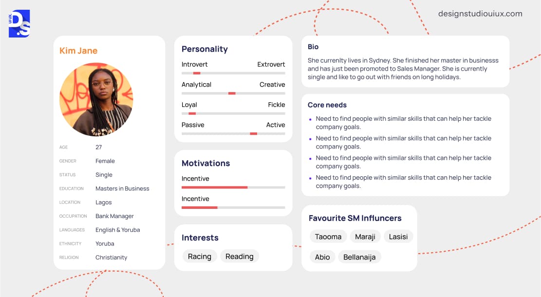
Your website is not for everyone. It is for your people. Start by defining your ideal customer persona. What keeps them up at night? What language resonates?
Use surveys, interviews, and sales data to flesh out these profiles. The more specific, the better your design can cater to their needs. Next, analyze real user behavior. Tools like heatmaps or session recordings reveal where visitors click, scroll, or abandon ship. Maybe they’re dropping off at a lengthy form or missing your key call-to-action (CTA).
Pair this with A/B testing to validate hypotheses in line with best practices for ecommerce sites. For instance, an eCommerce site might test whether showing customer reviews early increases add-to-cart rates. Finally, let data, not hunches, drive all design decisions.
If 70% of mobile users leave your checkout page, simplify the process. If blog visitors rarely explore product pages, add contextual CTAs. If data says visitors hate long forms, simplify them.
Your audience’s behavior is the ultimate focus group. This approach, inspired by the “Diagnose → Problem → Solution” method, ensures you are solving real issues. Design becomes an ultra-precise problem-solving tool when it’s fueled by insights, not hunches.
2. Crafting a User Centric Website Layout
A confusing layout kills conversions almost instantly. Keep navigation dead simple. Users should find what they need in seconds—think clear menus and logical paths.
Stick to familiar patterns, like a top bar or hamburger menu on mobile. If they are hunting for the “Buy Now” button, you have already lost them. Test your setup with real people to ensure it flows effortlessly.
Up next, white space. White space is not wasted space, it is your secret weapon. It gives content room to breathe, making your site feel clean and focused. Clutter overwhelms; breathing room invites exploration. Use it to separate sections or highlight key elements like a signup form. (PS: Notice how Apple’s product pages use ample margins to spotlight devices.) The result? Visitors stay engaged instead of bolting from a chaotic mess.
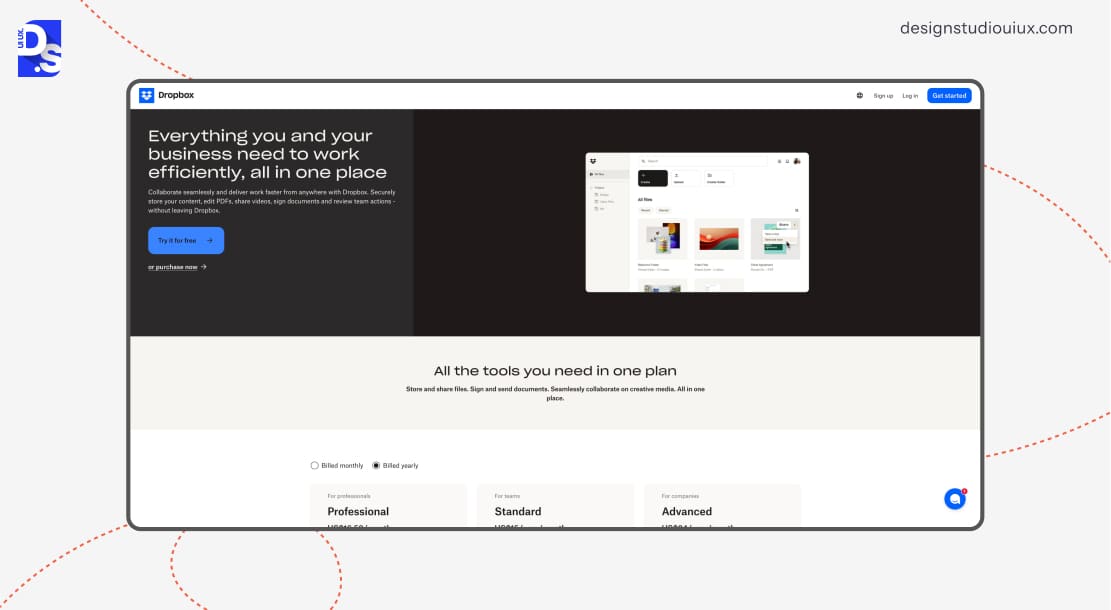
Lastly, create a visual hierarchy to guide visitors’ attention. Guide eyes where you want them. A strong visual hierarchy uses size, color, and spacing to prioritize content. Make your headline bold and your call-to-action pop with a bright hue. Subtle cues, like a slightly larger font for key benefits, steer visitors toward action without them noticing. It’s like an invisible hand nudging them to convert.
For example, Dropbox’s homepage uses a bold headline (“Everything you and your business need to work efficiently, all in one place”), followed by a bright blue CTA that says, “Try it For Free”. Your eye flows naturally from value proposition to action.
3. The Power of Compelling Calls-to-Action (CTAs)
Great CTAs grab attention and spark action.
To get them right, first use bold colors that contrast with your site’s palette (for example, orange on a blue background). Place them where eyes naturally land, like after a compelling pitch or at the page’s end.
Wording is also crucial. Keep it sharp and benefit-driven. Use action verbs + value. For example, “Start My Free Trial” beats “Submit” and “Grab Your Discount” beats “Click Here” every time.
See our guide to CTA button design best practices for more examples of actionable language and placement strategies.
Lastly, never guess what works; test it. A/B testing pits two CTA versions against each other to see which wins. Maybe a green button outperforms red, or “Start Now” trumps “Learn More.”
A fitness app might A/B test “Get Fit Now” vs. “Lose 10 Pounds in 30 Days.” Run small experiments with real traffic and track the results. Tools like Unbounce or Google Optimize simplify this.
It’s a low-risk way to uncover big gains, often doubling clicks with tiny tweaks.
Need inspiration? High-performing CTAs create urgency (“Sale Ends Tonight!”), reduce risk (“Try Risk-Free for 30 Days”), build trust (“Join 10k Happy Users”), or invoke curiosity (“See How It Works”).
These types of CTAs work because they’re clear, specific, and tap into what users want – results, fast. Study top sites in your niche for more ideas.
4. Optimizing Website Speed and Performance
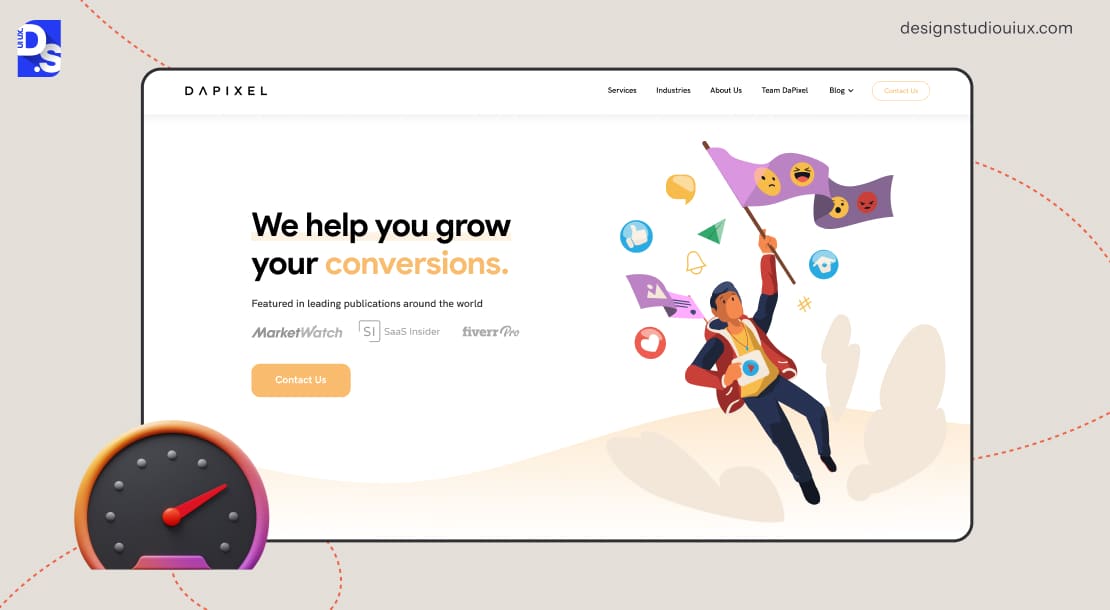
Your website’s load speed is a conversion gatekeeper.
When eCommerce websites load just 0.1s seconds faster, their conversions increase by 8.4%. For travel sites, that figure is 10.1%. When B2B sites load 1s faster, they see5x more conversions. Every extra second of delay can reduce a site’s conversion rate by up to 7%.
This isn’t just because new-age users are impatient. Slow speeds erode trust. Users equate sluggish performance with outdated technology or poor security, questioning your credibility before they even see your offer.
To avoid giving your visitors this perception, start by auditing your site with tools like Google PageSpeed Insights or WebPageTest. These tools identify bottlenecks like unoptimized images (which account for ~45% of page weight) or render-blocking JavaScript. Also:
- Implement lazy loading for images and videos (prioritizing above-the-fold content).
- Adopt next-gen image formats like WebP (30% smaller than JPEG).
- Use browser caching to store reusable assets locally.
- Upgrade to a content delivery network (CDN) like Cloudflare to reduce server distance.
Web design techniques like using skeleton screens (placeholder content that loads instantly) or creating progressive web app (PWA) versions of your site can also create the illusion of speed.
5. Mobile-First Design
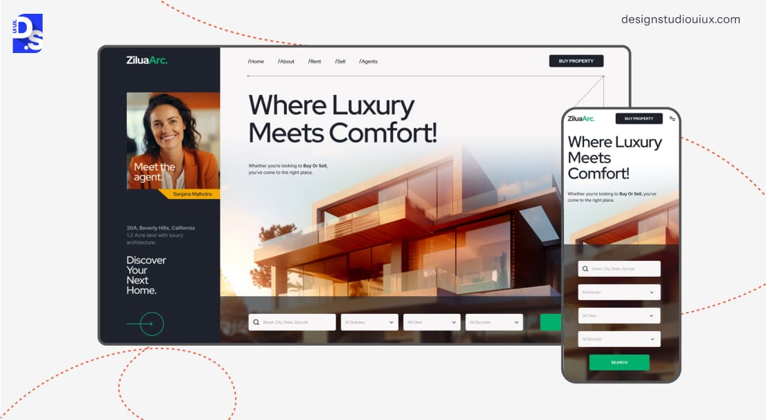
Over 63% of global website traffic comes from mobile devices in 2025. That means going “mobile-first” by designing for thumb zones, micro-moments, and easily distracted users is now a must for all website makers.
Prioritize thumb-friendly navigation. Place key CTAs within the natural arc of a thumb’s reach (bottom 1/3 of screens). Use sticky headers for critical actions like carts or menus, but avoid overcrowding.
Also, use:
- Context-aware forms that auto-fill addresses via GPS, and shrink keyboards for numeric fields.
- Tactile feedback in the form of subtle vibrations or animations that confirm user actions (for instance, “Item added”).
- Offline functionality to let users browse cached product pages or save carts.
Use Google’s Mobile-Friendly Test alongside real-device testing on platforms like BrowserStack. Testing the site’s responsiveness and mobile-friendliness across different devices.
Analyze your site’s mobile scroll depth as well. If a large share of your users never reaches your main webpages’ footer sections, reposition critical content.
6. Trust Engineering
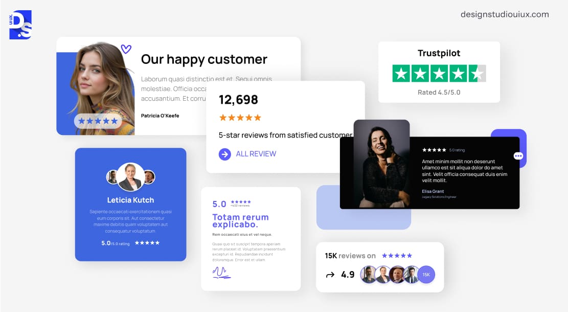
Neuromarketing research shows trust signals activate the brain’s ventromedial prefrontal cortex, the region responsible for valuing decisions. That’s why sites with a lot of user-generated content (UGC) like reviews and testimonials have3.8% higher conversion rates than their peers with no or little UGC. To create a site that exploits these innate user behavior patterns, embed user-generated photos/videos that update weekly in a distinct section of your site’s homepage.
Modern users crave contextual proof that speaks directly to their needs. For example, instead of “Great service!”, showcase a video testimonial from a customer in your target demographic: “As a busy mom, this meal kit saved me 5 hours weekly”. Pair this with real-time social validation by custom-designing real-time counters that spout out facts like “127 people bought this product today” to boost visitors’ sense of urgency.
Display BBB ratings near pricing, SSL icons at checkout. Embed Instagram shopper photos using tools like Taggbox. Link to return/refund pages beside product prices to reduce buyer anxiety.
Trust-building is all about giving your visitors strategic reassurances at key decision points.
7. Conversion Copywriting
The difference between “Buy Now” and “Get Your Custom Plan in 90 Seconds” is not semantics.
It is neuroscience.
fMRI studies reveal that action-oriented language triggers the supplementary motor area, priming users to act. To transform all text on your site into psychological triggers, structure content using the Problem-Agitate-Solution (PAS) model.
- Problem: “Lost 47% of leads to clumsy forms?”
- Agitate: “Every abandoned form costs $218 in lost revenue (based on 2023 Marketing Sherpa data)”.
- Solution: “Our AI-form builder recaptures 68% of lost leads.”
Also, avoid “we-focused” jargon. Instead, use you-driven language.
- Weak: “Our software optimizes workflows.”
- Strong: “You’ll ship projects 2x faster—without weekend work.”
For product pages, apply the BLUF method (Bottom Line Up Front).
- Start with outcome: “Cut energy bills by 42%”
- Add social proof: “Join 14,320 eco-conscious homeowners.”
- End with risk reversal: “Try risk-free for 90 days, we’ll pay return shipping.”
Use Hemingway Editor to simplify all complex sentences on your site (aim for an 8th-grade reading level). Also, use Hotjar Surveys to periodically ask your visitors, “What nearly stopped you from buying?” to identify potential flaws in your site’s content.
8. SEO & CRO Alignment
High traffic means nothing if it does not convert. Align your site’s SEO and CRO strategies by targeting commercial-intent keywords, like:
- Transactional: “Buy ergonomic office chair [your city]”
- Comparison: “HubSpot vs. Salesforce pricing”
- Solution-seeking: “How to fix leaking gutters”
Use tools like Ahrefs to identify keywords with:
- High commercial intent (for example, “buy,” “price,” “near me”)
- Low difficulty scores (<30 for new sites)
- Local modifiers (for instance, “best CRM for small businesses”)
Optimize all webpages using the Searcher’s Journey Framework:
- Awareness Stage (Blogs): “10 Signs You Need New Gutters” → Capture emails with lead magnets.
- Consideration Stage (Guides): “Composite vs. Aluminum Gutters” → Embed ROI calculators.
- Decision Stage (Product Pages): “Gutter Installation Packages” → Show “Frequently Bundled” upsells.
Also, apply these technical SEO fixes to boost your site’s conversion potential:
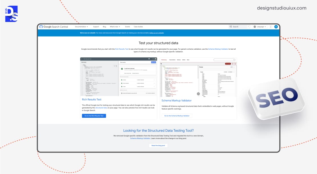
- Add product schema markup to display prices/stock status in search results using Google Structured Data.
- Fix 404 errors causing cart abandonment using Screaming Frog.
- Optimize internal links from blog posts to product pages.
9. Data-Driven Optimization
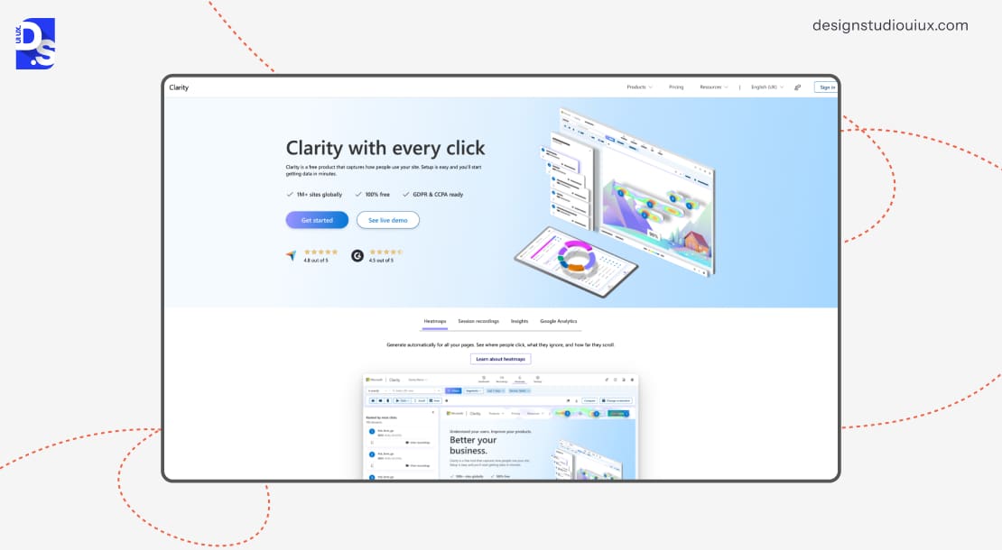
Your analytics dashboard is a CRO treasure map, only if you know how to read it. While bounce rates show symptoms, tools like Microsoft Clarity reveal why users leave.
- Heatmaps: Spot ignored CTAs (move them to high-click zones).
- Session Recordings: Watch real visitors struggle with forms (simplify fields).
- Scroll Maps: If 80% never reach pricing, shorten pages or add anchor links.
Prioritize metrics that directly impact conversions, like:
- Shopping Cart Abandonment Rate: If it’s oddly high, test guest checkouts or exit-intent popups.
- Form Drop-Off Points: If there are too many points at the start, remove all optional fields.
Implement a Test-Learn-Refine Cycle.
- Hypothesis: “Adding trust badges increases checkout conversions.”
- Test: Run A/B tests via Google Optimize.
- Analyze: Did Variant B (with badges) outperform by 15%?
- Scale: Apply the winning version site-wide.
CRO is all about relentless, data-informed tweaks. Start small. Even a 2% monthly conversion gain will ultimately compound to 27% annual growth.
Common Mistakes That Kill High Converting Website Designs (and How to Avoid Them)
Now that we have covered the essentials of high converting website design, let us dive into the common pitfalls that can derail your efforts.
Even the most beautifully designed websites can hemorrhage revenue if you overlook these sneaky and subtle mistakes.
The good news? The mistakes are both fixable and avoidable with the right approach.
1. The Tyranny of Too Many Choices
Psychologist Barry Schwartz’s famous “jam study” revealed a counterintuitive truth: offering 24 jam varieties led to fewer sales than displaying just 6. Why? That is the paradox of choice – too many options overwhelm people, and they end up doing nothing.
On your website, throwing a dozen products or plans at visitors has the same effect. They’ll likely bail instead of deciding. Simplify their journey. Group similar items into clear categories, and spotlight your bestsellers or staff picks.
2. Broken Promises = Broken Trust
Nothing tanks credibility faster than a mismatch between ads (“50% Off Summer Sale!”) and landing pages showing full-price items. This bait-and-switch erodes trust. Most shoppers will abandon a site if the content does not match search intent.
To avoid that, align every touchpoint: if your Google Ad says “Organic Dog Treats,” ensure the landing page hero section immediately showcases those treats with the promised discount.
3. Poor Readability and Overwhelming Design
Dense text walls, clashing colors, and hidden menus are not just ugly, they are profit killers.
75% of users judge credibility based on design alone. If your site is packed with tiny text, flashing banners, and menus that lead nowhere, users will get instantly frustrated and leave.
Clean it up. Use plenty of white space to let your content breathe, pick fonts that are easy on the eyes, and make sure navigation makes sense at a glance. Take cues from Notion’s minimalist templates: generous white space, readable fonts (16px+), and a “F-shaped” layout that mirrors natural reading patterns.
Bonus: Use Hotjar heatmaps to constantly identify and eliminate design elements users ignore.
4. No Clear Value Proposition
Forgetting to explain why you’re worth it is a silent killer. Why should someone choose you over the competition? If your website doesn’t answer that fast, visitors will bounce.
Your value proposition needs to shine. Skip the vague fluff and get specific.
What problem do you solve? How do you make life better? Maybe you offer same-day shipping or a no-questions-asked return policy. Whatever it is, make it crystal clear.
5. Trust Deficits
Skimping on trust-building elements can scare users off. If your offer seems too good to be true, they’ll smell a rat. And if your site looks sketchy, they will bolt.
Sprinkle in testimonials from real customers, flaunt your security badges, and be upfront about your policies. A little transparency goes a long way.
6. Neglecting A/B Testing and Ongoing Improvements
Guessing what design choices work or not is like marketing in the dark. A/B testing is your torch. Before making any change, A/B test two versions of a design element with users.
See which one wins and roll with it. Test everything from headlines to button colors. A culture of testing turns guesswork into growth.
Start small: test two headline variants using Google Optimize (free tool), then scale to multivariate tests.
7. Ghosting Converts Post-Conversion
Dropping the ball after the sale is a loyalty killer. The journey does not end at checkout. If you ghost customers post-purchase, you’re missing out on repeat business.
Send a thank-you email, offer support, or recommend related products.
A little post-sale love turns one-time buyers into loyal fans. Plus, it is easier to sell to someone who already trusts you. Do not waste that chance.
8. Sending Traffic to Nowhere
Sending everyone to the homepage is a rookie error. Your homepage is a hub, not a destination. If someone clicks an ad for a specific product, do not dump them on your homepage and make them search. Create targeted landing pages that match the ad’s promise.
Conclusion
Now you know how to design a website that converts! Start by deeply understanding your audience’s needs, then craft intuitive layouts that guide them toward action with compelling CTAs and trust-building elements like testimonials or real-time social proof.
Prioritize speed and mobile responsiveness to meet modern expectations, and always let data, not assumptions, drive your design decisions.
Ready to supercharge your site? If you need help, contact Design Studio UI UX today! We’ll craft a custom, conversion-focused masterpiece tailored to your goals. Your audience isn’t just browsing, they’re waiting to act. We’ll give them a reason to stay, trust, and convert.
FAQ’s
How to improve conversion rate of a website?

Simplify the site’s navigation, clarify core value with strategic content, and optimize for speed. Make the design mobile-first. Perform A/B testing on every design element. Continuously refine every element with the test data and user feedback. Keep repeating these steps.
How to design a website that converts visitors into customers?
Understand the visitors! High-converting websites know how their users behave. They have visual hierarchies that naturally guide these users toward conversion. They have benefit-focused copy that instantly answers all queries. There are also confidence-building trust signals like real customer testimonials.
What are the examples of website conversion?
To ‘convert’ a user is to make them do anything you want them to do. That could be making them sign up for your weekly newsletter. Or, submit quote requests. Or, register for trials. Or, buy something directly from your site.
What is a good conversion rate for a landing page?
Conversion Rate above 10% is good. The cross-industry average hovers around the 4-5% mark. And, the top performers seasonally achieve rates of 15% or higher with targeted optimization campaigns.
What is the anatomy of a high-converting website?
High-converting websites constitute compelling hero sections with clear value propositions. Users also enjoy visually stunning CTAs, trust-building elements, and benefit-focused content in such sites. Browsing through every section feels effortless, all the more on the main conversion pages.
What are the 7 principles of conversion centered design?
These 7 principles work together to guide visitors toward conversion
- Creating clear focus on primary goals.
- Maintaining visual consistency.
- Establishing logical structure.
- Demonstrating clear benefits.
- Using attention-directing techniques.
- Building trust through social proof.
- Systematically reducing friction throughout the user experience.
How to create a high converting product page?
Keep the page’s layout simple and mobile-optimized. Minimize the purchase steps. Don’t just list the product’s features, but explain its benefits with HD images/videos. Demonstrate the product’s value by explaining its price. Share customer reviews for social proof.









