


Conversion Centered Design: Definition, 7 Principles & UX Examples



Quick Summary
Conversion Centered Design (CCD) is a UX-led design framework that structures digital pages around a single, clear user action. It reduces decision friction by aligning content, layout, visual hierarchy, and trust signals to help users move confidently from understanding to conversion.
The median conversion rate for SaaS landing pages is 3.8%, which means over 90% of visitors don’t sign up. It’s not that they don’t want to sign up, but the experience is not curated to support clear decision-making.
Conversion centered design is a UX-led framework that focuses on restructuring pages around a single, clear primary goal and removing friction from these points. CCD is the bridge between UX and CRO, UX is necessary for maintaining usability, while CRO focuses on performance optimization.
What is Conversion Centered Design?
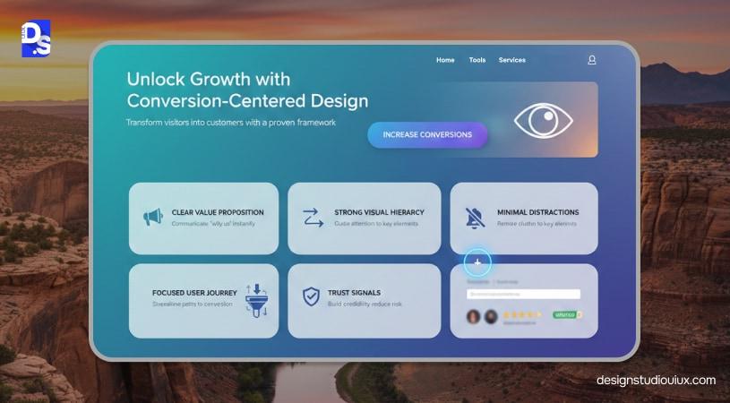
Conversion Centered Design (CCD) is a conversion-focused UX design framework used primarily to guide users to complete a clear action. The entire interface, content, and UX layout is structured to achieve this goal by minimizing friction and cognitive load.
The conversion is not always sale, it can be any of these things:
- Newsletter signup
- eBook download
- Demo booking
- Add to Cart
- Sharing Content on Social Media
So, can we say that CCD and traditional web design are the same? Let’s understand the differences between them. The former emphasizes decision clarity, unlike traditional web design, which relies on visual appeal and branding.
Now, let’s address the difference between CCD and CRO. CRO (Conversion Rate Optimization) is the process of tweaking a website to enhance its performance.
CCD is the process of creating a conversion focused website using design principles to enhance user engagement and increase desired actions. It comes first as a proactive measure, in contrast to CRO, which is a reactive approach.
It extends UX design by adding purpose-driven layers to guide users towards the intended actions. Through this process, designers can align usability, intent, and business goals, thus improving UX feasibility.
What Makes a Design Truly Conversion-Centered?
Can we consider any design to be conversion-centric? The answer is no. A true conversion-first page helps buyers to make correct decisions, not just look pretty. Here is a checklist to consider:
One page leads to one primary action
The page is structured around a single outcome, so users are never unsure about what they are expected to do next.
The value proposition is clear above the fold
Users can immediately understand what the product or service offers, who it is for, and why it matters without scrolling.
Content follows a decision-first flow
Information is presented in the order users naturally think, helping them move from understanding to action without interruption.
User objections are addressed before the call to action
Concerns related to trust, effort, cost, or risk are resolved before users are asked to commit.
Content hierarchy is driven by user intent
Messages are prioritized based on what users need to know at each stage of the decision, not internal business priorities.
Cognitive load is kept to a minimum
The design limits choices, reduces mental effort, and avoids overwhelming users with unnecessary information.
The 7 Principles of Conversion Centered Design
1. Single Conversion Goal

What It Means
A conversion-centered page is built around one clear action. Every section, message, and interaction supports that single outcome, instead of trying to serve multiple purposes at once.
The Impact
When users know exactly what is expected of them, decision-making becomes faster and easier. This focus significantly increases the likelihood of conversion.
Common Mistakes
Including multiple CTAs or mixed goals on the same page, which creates confusion and hesitation.
Quick Fix
Define one primary action per page and remove or visually downplay all competing actions.
What Is the Attention Ratio in Conversion-Centered Design?
Attention Ratio, a concept coined by Oli Gardner of Unbounce, measures the number of things a visitor can do on a page against the number of things they should do. A typical homepage might have a ratio of 40:1 — forty possible clicks (menu items, footer links, social icons) competing against one intended action. A high-converting landing page pushes this toward 1:1, where nearly everything on the page points to a single outcome.
Reducing the Attention Ratio is one of the most measurable ways to apply CCD: audit every clickable element on a page, ask whether it supports the primary goal, and remove or de-emphasize anything that doesn’t.
2. Visual Hierarchy & Attention Control
What It Means
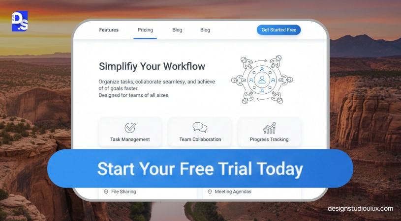
Conversion-centered design heavily relies on visual hierarchy to drive consumer’s attention. Designers play with design elements, size, colors, contrast, typography, and content to optimize conversion rate.
Why Does It Matter?
Visual hierarchy in UX tells users where to look in the right order. People will first see Heading 1, then the subheading, and then click on CTA buttons. Users will only skim the important details, visual hierarchy helps them achieve that.
Common UX Mistake
In an overdesigned page, everything competes for attention, which means users deviate from the actual messaging.
Quick Fix
A single page should have a top heading, immediately followed by a subheading to help users navigate through. Designers can also use contrast, spacing and consistent alignment to further strengthen visual hierarchy.
3. Clarity Over Creativity
What It Means
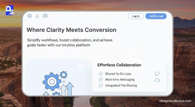
CCD is all about converting casual visitors into buyers through clear and direct messaging and aligning the design accordingly. A simple page that goes straight to the point, and nudges people toward the next action is the benchmark.
Why It Impacts
Sometimes, UX designers can get carried away and use multiple design elements in the same page. They may have the best intention, but it has the opposite effect on consumer psychology. Buyers want to know the “why”, i.e., why would they need your product/ service. Give them clarity and get them to make a decision faster.
Common UX Mistake
We have seen pages cluttered with too many graphical elements. Another UX mistake, using vague headlines that don’t reveal anything about the actual value.
Quick Fix
A page should not have too many elements, otherwise, people will be confused. The headlines can be rewritten to directly express the product’s value.
4. Friction Reduction
What Does It Mean?
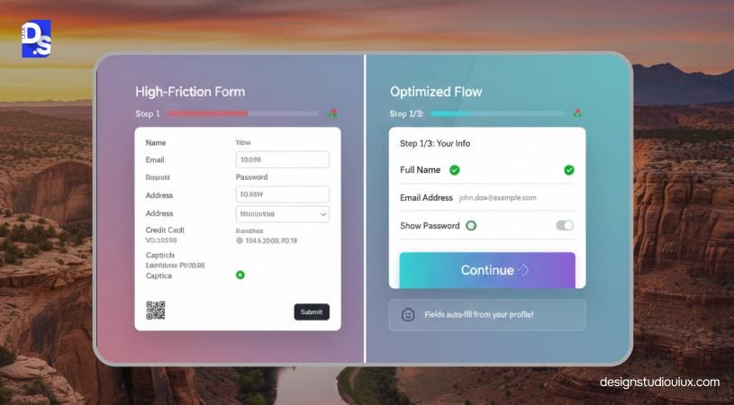
This principle talks about minimizing friction in the conversion process, by optimizing the flows, forms, and removing any distracting elements. Designers should also ensure that the experience is consistent across mobile devices too.
The Impact
If the user flow is frictionless, people are more likely to sign up or follow the dedicated action path.
Common UX Mistake
The navigation paths rely too heavily on internal data and bias, or ask too many questions, both of these can deter people.
Quick Fix
Designers should not add multiple commitment-heavy options, especially those that don’t enable people to complete the primary decision.
5. Trust Architecture
What It Means
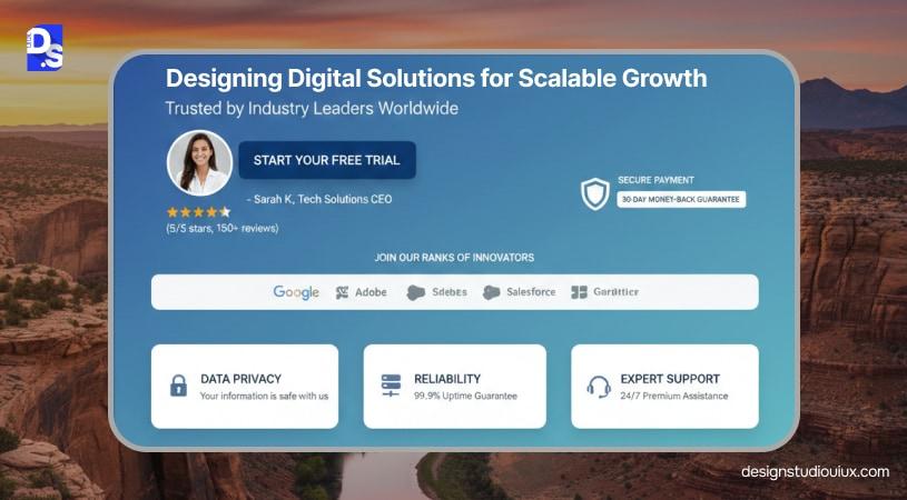
People will only convert when they trust the brand, and it is the basis of CCD. This is achieved through a simple and uncluttered design that feels responsive, intuitive, and easy-to-navigate. The trust is further enhanced through trust signals such as testimonials, security badges, and client logos.
The Impact
When people see these trust signals on page, they instantly feel more secure and connected with the brand. When applied correctly, these elements can boost sales and customer loyalty.
Common Mistakes
Treating trust signals as decorative elements, and not using them strategically in design.
Quick Fix
Designers should identify the points where users are hesitating and place trust signals accordingly.
6. Behavioral Cues & Microcopy
What Does It Mean?
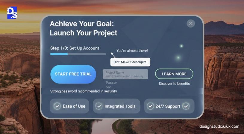
Microcopy and subtle cues guide users by explaining actions, outcomes, and expectations at key moments.
Impact
These small details reduce hesitation and reassure users during moments of uncertainty.
Common Mistakes
Using generic labels like “Submit” or failing to explain what happens after an action.
Quick Fix
Add short, helpful text that clarifies intent, next steps, or reassurance near CTAs and forms.
7. Momentum & Commitment
What It Means
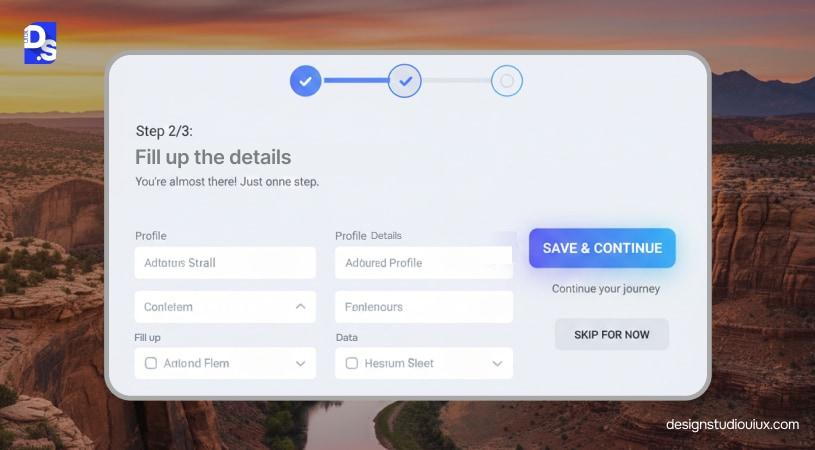
Once users begin an action, the design supports continued progress without interruption. This is achieved by following CTA hierarchy best practices and using the urgency vs. scarcity principle wisely.
The Impact
Maintaining momentum increases the likelihood that users will complete the process.
Common Mistakes
Breaking flow with unexpected steps, unclear progress, or sudden context changes.
Quick Fix
Use progress indicators, step previews, or confirmation cues to keep users moving forward.
What Is an Example of Conversion-Centered Design?
In this section, we will see how CCD works in real-time, through 3 specific use cases, SaaS landing page, SaaS pricing page, and B2B service lead page.
1. SaaS Landing Page
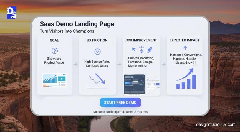
The landing page is designed to get product demo requests from qualified users.
Possible UX friction
Friction might arise if the page tries to satisfy too many intents at once. Multiple CTAs compete for attention, and the demo form demands detailed information before users fully understand the value.
Improvement
The page is redesigned by following landing page UX best practices and removing all secondary CTAs. The value is described at the top and the form only contains the essential fields.
Expected impact
Users immediately understand what the page is for, feel less friction when submitting the form, and are more likely to complete the demo request.
2. SaaS Pricing Page
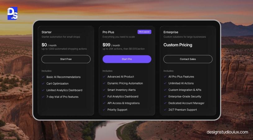
This page is curated by user type or outcome, helping people to choose the right pricing plan (1st CCD principle).
The trust elements, social proof and usage metrics are placed where people might hesitate, thus removing friction and boosting SaaS website conversions.
The saas pricing page mainly focuses on a dominant CTA, and the non-dominant CTAs are albeit a little less emphasized. For more details check our guide on SaaS pricing page design.
3. B2B Service Lead Page
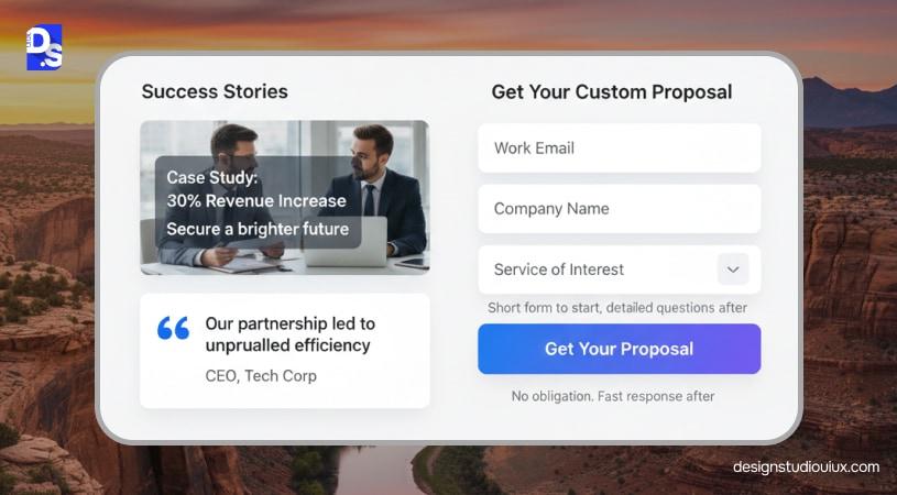
Message match
The page headline directly matches the intent of traffic sources such as ads, search queries, or referral links, reinforcing relevance and trust.
Case study placement
Short, outcome-focused case studies appear immediately after the service explanation to validate claims before asking for contact details.
Form length logic
The form is intentionally short, requesting only the information required to start a conversation, with deeper qualification handled later..
Conversion Centered Design vs UX vs CRO (Clarifying the Confusion)
UX design, CRO, and CCD are used in various stages to solve design problems, even though these terms are used alternatively. CCD is applied in the early design stage, UX design focuses on creating highly usable experiences and CRO is mainly about performance optimization. This comparison table will give a glimpse of the differences between these three:
| Aspect | Conversion Centered Design | UX | CRO |
|---|---|---|---|
| Primary Objective | Clear user decisions | Focus on usability and experience | Boosts conversion metrics |
| Core Question | What should be the next step? | Can users use this product easily? | What performs better? |
| Role | Pre-launch design framework | Foundation | Post-launch optimization |
| Method | Intent-driven structure and layout | Research, flows, heuristics | A/B tests, experiments |
CRO comes when the existing design fails to meet business expectations. In this method, different variations are tested and a final version is selected, based on performance. CCD is a decision framework used as a strategic and preventive measure, and is usually not driven by elements, unlike its counterparts.
Your UX design can follow all the best practices and still fail to entice and convert users, CCD adds a decision-first directive to UX to align usability with business goals.
Conversion-Centered Design Templates
Now, let’s templatize conversion-centered design for design teams and break them on a practical level. Here is a practical, repeatable template that can be used by design teams:
Hero Section
The Hero section should follow a simple formula: primary outcome, who it’s for, key benefit and primary action. The goal is to answer user’s core questions within seconds using this structure:
- Outcome-specific headline
- Supporting subheadline
- Primary CTA to match user intent
- Supporting proof
CTA Ladder Model
All visitors are not ready to convert/ commit at the same time, because they have different levels of readiness. In most cases, it is achieved through this structure:
- Primary CTA indicating a high-intent action (e.g., “Start Free Trial”)
- Secondary CTA typically dictates a lower-commitment action (e.g., “View Demo”)
- Tertiary CTA is optionally used to direct users toward learning action (e.g., “See How It Works”)
Things to consider:
- Only one CTA is visually dominant
- Secondary CTAs should support the primary CTA, not compete with it
- Each step moves users closer to the same outcome
Trust Stack Order
Trust signals are most effective when placed in a specific sequence that mirrors user hesitation.
A landing page with this sequence is more likely to convert:
- Establish proof of credibility through client logos, user count, or usage stats
- Strengthen the social proof by placing testimonials or reviews
- Reduce user hesitation further by providing a guarantee, security, privacy reassurance
- Broadcast authority signals by showing certifications, media mentions, awards
Form-Length Decision Logic (Friction Control)
The form should not be incessantly long, or powered by internal data needs. It should be determined by user intent level as described below.
- Low intent (top-of-funnel)- Email only
- Medium intent- Name + email + one qualifying field
- High intent- Detailed forms with clear value exchange
Red flags to avoid:
- Never ask for information without explaining why
- Match form effort to perceived reward
- Defer non-essential fields until after conversion
How to Measure Conversion-Centered Design Success
Investing in CCD is one thing, but how do you validate the investment? You have to analyze design against UX metrics that impact growth such as conversion rate, CTA click-through rates, form completion rates, drop-off points, and lead quality rate.
Conversion Rate
Conversion rate shows whether the design successfully guides users toward the intended action. An increase here usually indicates that users understand the value and feel confident enough to act.
CTA Click-Through Rate (CTR)
CTA CTR measures how clearly the primary action is communicated. It reflects whether users recognize and engage with the next step.
Form Completion Rate
Form completion rate reveals how much friction exists at the moment of commitment. It highlights whether users are willing to finish what they start.
Drop-Off Points
Drop-off analysis identifies where users hesitate, get confused, or lose confidence in the flow.
Lead Quality (SQL Rate)
Lead quality measures whether conversions translate into meaningful business outcomes, such as sales-qualified leads.
Common Conversion-Centered Design Mistakes
Businesses think that conversion loss is a direct result of weak offers or low traffic. Although it is partially true, friction at different decision points is the major contributor. These common UX design mistakes should be avoided at all costs:
Building Pages With Multiple Competing Decisions
When confronted with multiple options, users will hesitate, and compare and contrast the decision paths. Why? Because they don’t have clarity on what to do next, and the consequences of their actions. This results in low demo signups, bookings, and inquiries.
Asking for Commitment Before Showing Value
No one likes those long, never-ending forms that ask too much information at once. If you want your users to convert, show what you offer first before asking for detailed information, payments, or other details.
Information Overload
In UX design, the goal is to balance data with cognitive load. But in most cases, designers provide complex technical information too early, which almost creates the opposite effect. People will disengage low before reaching the pricing page, which means the conversion rate will plummet even further.
When Should Businesses Invest in Conversion-Centered Design?
CCD works in situations where businesses need to guide users and help them take the next step. It does not replace the foundational UX, but rather, works as an additional decision layer. Here are some situations where it works best:
Web Redesign
This is one of the best use cases for CCD. The necessity for web redesign may arise in two situations; one, when the design itself is poor, and two, when the design is visually good, but not performing.
It works best in the 2nd case, especially if the web page has multiple conversion paths. Through this process, designers will ensure that a page has a primary conversion goal, and follows a supportive structure. It will not only improve the design’s aesthetics, but also its conversion rate.
High Traffic But Low Conversion Rate
Sometimes, the website attracts the right audience, but fails to nurture or convert them. Here, the audience is hesitating, even though they want to book that demo. CCD identifies where the hesitation is occurring and restructures the page to support the conversion.
For Paid Traffic/ Campaign Landing Pages
Paid campaigns don’t have as lot of room for experimentation or mistakes, as every click is costly. Through CCD, designers can create value-driven pages to prevent the leads from leaking, resulting in higher conversion.
SaaS Onboarding
SaaS onboarding pages are designed with the principles in mind, as each step tells users about the product. We know that even small moments of friction can increase churn rate. That’s why these pages align user intent with onboarding steps, enforcing deeper commitment.
When CCD is not the right solution?
- For products with major usability issues
- Wrong product-market fit
- Wrong audience is targeted
- Page has informative content
In these cases, UX issues should be addressed first, before proceeding further.
How Design Studio UI/UX Applies Conversion Centered Design
At Design Studio UI/UX, use conversion-centered design as a practical guideline. Our goal is to create design that supports decision-making and business outcomes without forced persuasion. Here is how we proceed with a project:
UX Audit
In this step, our specialists narrow down the points where users are hesitating and dropping off. These are things we review for UX audit services:
- Intent
- Content hierarchy
- Areas of friction
- Trust gaps
Strategy for Conversion
The insights collected from the previous step are then used to plan a conversion strategy, which includes:
- Goal setting per page
- Mapping user intent
- Setting the information Architecture
Web Redesign
In this stage, our experts will restructure the design to align with the conversion path. This means all the unnecessary steps will be removed to reduce cognitive load. In the web redesign services, the messaging, layout, and the interactions will be aligned to ensure a seamless experience.
Design Optimization
After these steps, we will review the UX performance metrics and adjust the design accordingly. As a SaaS website redesign agency, we mainly look for new friction points and ways to optimize the design to boost its performance further.
FAQs
What is an example of conversion-centered design?

A SaaS demo landing page is a clear example: it’s built around one primary action, requesting a demo states the product’s value above the fold, resolves common objections before the CTA, and uses trust signals like customer logos near the form. This follows the Attention Ratio principle, coined by Oli Gardner, by keeping the ratio of possible actions to intended actions as close to 1:1 as possible.
Is conversion centered design only for landing pages?
No. While landing pages are the clearest use case, CCD applies to any page with a specific goal — pricing pages, SaaS onboarding flows, B2B lead forms, and even product pages benefit from the same single-goal, friction-reduction principles.”
How is conversion-centered design different from CRO?
CCD is a proactive design framework applied before a page launches, structuring layout and content around one clear action. CRO is a reactive, data-driven process that tests and adjusts an existing page’s performance after launch. CCD shapes the first version; CRO improves it over time.



