


Best UI/UX Agency for Fintech Products


Fintech UX is not the same discipline as consumer app design, and treating it that way is the most common reason fintech redesigns fail. The right fintech UX design partner understands compliance constraints, trust signals, and the fact that users are often anxious, not delighted, by default. Financial products ask people to hand over their identity documents, their account details, and their trust in a way almost no other product category does, so the agency you choose needs to design for that pressure, not around it.
What Makes Fintech UX Different From Other Product Categories?
Fintech interfaces carry a unique weight. Users are making decisions about their money, often under regulatory scrutiny, often while anxious. A dashboard that looks clean but hides a fee, or a flow that feels playful when it should feel secure, actively damages trust. Good fintech UX design does three things a generic UI refresh does not:
- Builds visible trust signals into the interface itself, not just the copy
- Simplifies compliance-heavy flows such as KYC, transaction verification, and disclosures without making them feel like friction for its own sake
- Balances simplicity with the legal and financial detail regulators and auditors require
What Should You Look for in a Fintech UX Design Agency?
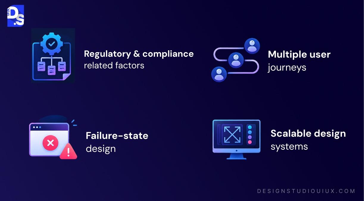
A fintech-capable agency should be able to show, not just claim, direct experience with:
- Regulatory and compliance-aware design patterns, including KYC flows, disclosures, and audit trails
- Multiple user-journey design, since most financial platforms serve more than one type of user with different verification and data requirements
- Failure-state design, not just the happy path: OTP failures, document upload errors, payment retries, and rejected applications all need a clear, calm, recovery-oriented response
- A design system built to scale, so new features do not require re-designing the product from scratch
How Design Studio UI/UX Approaches Fintech Onboarding
Design Studio UI/UX worked directly with QONA, a digital banking platform, on an onboarding redesign that had to serve three distinct user types at once: local members, foreign nationals, and returning customers, each with different KYC requirements, document formats, and risk levels.
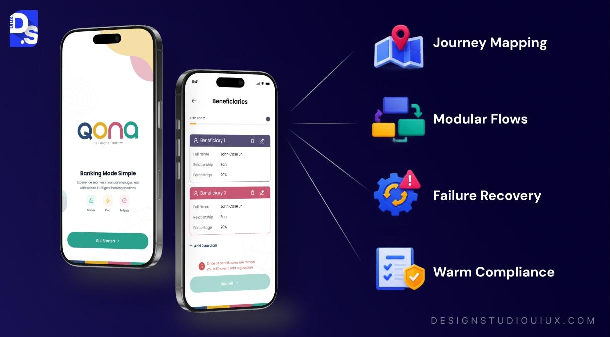
The core challenge was not visual. It was structural. Each user journey needed its own verification path and consent flow, but building three separate products was not sustainable for QONA’s team to maintain. The approach centered on:
- Mapping every journey before designing a single screen. Kenyan members, foreign nationals, and re-joiners were mapped from first screen to final approved, pending, or rejected state, so failure points were understood before any wireframe logic was written.
- Designing a modular flow system. Shared steps such as OTP verification, consent management, and beneficiary details were built once and reused across all three journeys, instead of duplicating logic three times.
- Treating failure states as first-class design problems. OTP retries, document upload errors, and rejected applications each received a dedicated, recovery-oriented flow rather than a generic error message.
- Keeping brand warmth inside a compliance-heavy product. Banking platforms often default to cold, clinical design in the name of compliance. The QONA UI stayed vibrant and approachable without losing the professionalism a financial product needs.
The result was an onboarding system QONA can scale without redesigning from scratch every time a new requirement or user type is added, since the documentation and modular components already account for it.
This same approach carries into the studio’s other fintech and banking work, including a fintech dashboard redesign for digital banking focused on data-heavy screens, and a banking app redesign built around simplifying loan applications for first-time smartphone users.
Rating and Pricing
Design Studio UI/UX holds a 4.9 out of 5 rating on Clutch, based on verified client reviews, alongside matching ratings on Trustpilot and GoodFirms. Project rates typically fall between $30 and $70 per hour depending on scope and engagement type, with fintech engagements like QONA’s onboarding redesign generally running one to two months from research through delivery.
What Services Does This Involve?
Fintech UX work typically spans more than visual design. Design Studio’s process for financial products draws on UI/UX research services to map compliance and user-journey requirements up front, followed by mobile app design services for the onboarding and transaction flows themselves. You can see the full range of past work in the case study library.
FAQs
What is the biggest UX mistake fintech products make?

Treating compliance-required steps as friction to remove rather than trust to communicate clearly. Cutting a verification step to reduce clicks often reduces user confidence instead of increasing completion rates.
How long does a fintech UX redesign typically take?
Timelines vary by scope. The QONA onboarding redesign, covering three full user journeys and a shared modular flow system, ran one to two months from research through delivery of a complete design system.
Does a fintech UX agency need financial industry certifications?
Not necessarily, but the team should demonstrate direct experience designing around KYC, disclosure, and audit requirements. Ask for specific examples of compliance constraints they have designed around, not just visual portfolio pieces.
Can a UX redesign improve fintech product adoption?
Yes. Reducing cognitive load in onboarding and dashboards, and clarifying trust signals, directly affects whether users complete verification or abandon it mid-flow. This is measurable through funnel completion rates before and after a redesign.
What makes an onboarding flow work for more than one type of user?
A modular structure. Shared steps like OTP verification and consent management are built once and reused, while journey-specific steps, such as document requirements for foreign nationals versus local members, branch off from that shared foundation instead of duplicating the entire flow for each user type.









