


High Performing CTA Button UX Best Practices & Examples



from our Complete CRO & UX Guide

Quick Summary
High-converting CTA buttons rely on six-evidence elements: benefit-led copy, WCAG 2.1 AA compliant (4.5:1 minimum), mobile-optimized tap targets (44X44 px), funnel-aligned placement, real scarcity, and regular A/B testing. Placing personalized CTAs can bring more conversion, sometimes up to 202% (HubSpot 2024). This blog will cover all these best practices, copywriting techniques, placement strategy, and a complete A/B testing framework.
Whether you call it a CTA button, a CTA block, or CTA section design, the same core principles apply — clarity, contrast, and placement matter more than the specific label.
Your calls-to-action are not just regular design elements. They are the tipping points where your users’ interest becomes action. Nail it, and your business metrics will sing.
Flub it, and you are toast at the finish line. Lucky for you, with this ultimate playbook on CTA best practices in UX design, you are ready to play at the top of the pack.
Master these CTA button best practices to make your website or app’s CTAs go from background noise to conversion magnets.
But, in today’s crowded Internet, CTAs are not just buttons. They are the bridge between a curious visitor and a loyal customer, the most important conversion drivers on digital platforms.
A 2023 report from Hubspot states that personalized and optimized CTAs will convert 202% more than the generic versions.
CTA button best practices have evolved considerably, from being generic links that say “Click Here” to being AI-driven hyper-personalized prompts.
Nowadays, they combine psychology, design, and data science to capture attention, drive clicks, and directly address user’s needs.
Modern CTA best practices in UX include A/B testing, placing buttons after analyzing heatmaps, AI-based hyper-personalization, etc.
11 Proven CTA Button UX Best Practices For Better Conversion
Top 11 proven CTA button best practices that improve conversion rate are: 1.High-contrast color instead of just bright colors 2. Whitespace to define the button 3. 44x44px size for mobile taps 4. Spaces with rounded corners for better approachability 5. Micro-interactions to ensure feedback on click 6. Clear, bold typography to attract attention 7. Following an established visual hierarchy 8. Treating WCAG 2.1 AA accessibility as a non-negotiable entity 9. A design system that helps with consistency 10. Contextual placement of CTA buttons 11. Designing for light and dark mode.
You must understand human psychology, adapt with evolving technology, and align your expertise with what user requirements to create high-converting CTAs. Moreover, you should understand how UX and CRO work together.
Following these CTA button best practices will help you master this intersection of neuroscience and tech and create CTAs that cut through all the visual noise with precision:
1. CTA Button Color
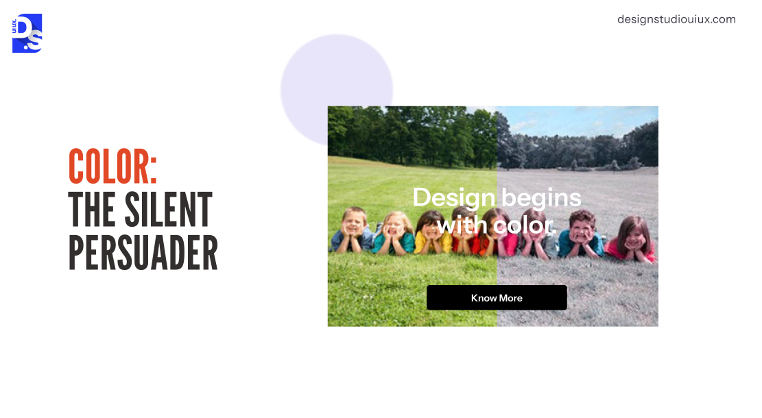
CTA button color relies on user psychology and contrast to drive conversion, and there is no single answer for the “best color”. As per WCAG 2.1 AA compliance, the minimum contrast ratio should be maintained at 4.5:1.
- Blue-green is necessary for fostering trust, orange signifies urgency
- 1 in 12 men and 1 in 200 women suffer from color vision deficiencies, CTA buttons should use texture and typography for better accessibility.
- The early versions of CTAs were red, but nowadays, CTA buttons of today combine contrast with intent. A teal-CTA button placed on a muted peach background is not just “popping”, it creates associations of trust (teal) and warmth (peach).
The color-combination of the CTA button should be prominent, and must match the brand’s core messaging and personality.
2. Whitespace
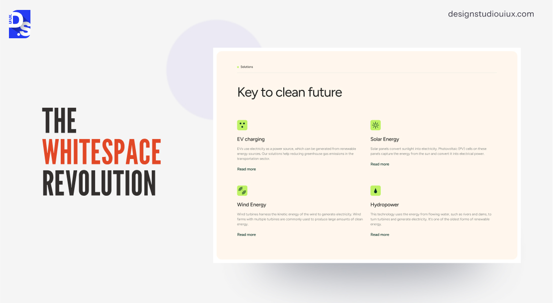
Whitespace around CTA buttons minimizes cognitive load, by separating them from the remaining elements and letting users focus.
Using generous padding and whitespace to breathe (Gestalt principle of figure-ground separation), these buttons become the central element, with higher chance of converting than the visually cramped ones.
This is one of the low-effort, yet high-yielding CTA optimization best practices.
3. Mobile Responsiveness and Tap-Friendly Design
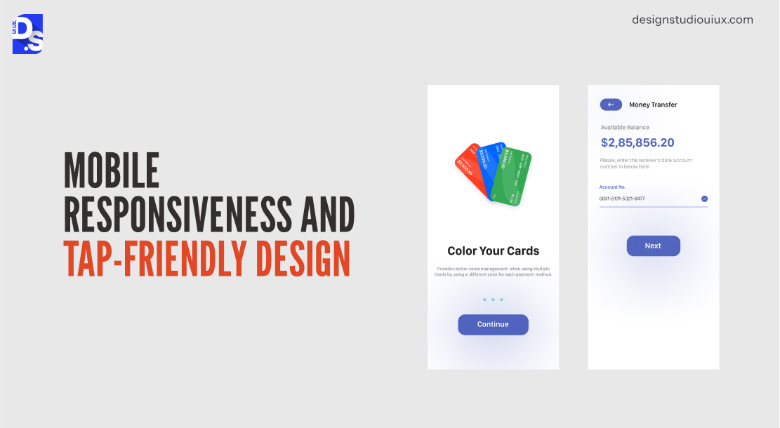
A Statista report mentions that 62.54% of global traffic is coming from mobile devices. Mobile-friendly CTA buttons should follow these criteria, 44×44 pixels (Apple HIG) or 48×48 (Google Material Design) to account for that.
- Smaller buttons might not convenient for users
- Mobile CTA buttons should have sub-2-second loading speed.
- Use pill-like shapes to support thumb taps.
- Do not place buttons in dead zones (screen corners).
4. Button Shape
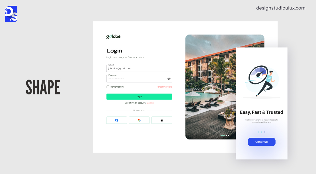
CTA button shape plays a significant role in improving clickability and approachability:
- For softer appeal, buttons must have rounded corners with border-radius: 8-24px
- Pill-shaped buttons with border radius of 50px+ works best for mobile devices to simulate fingertips
- Adaptive shapes expand on desktop and compress to pill form on mobiles, maintaining visual consistency.
- Rectangular buttons with sharp edges have low approachability, but might work in high-authority and B2B contexts where precision matters.
5. Micro-animations
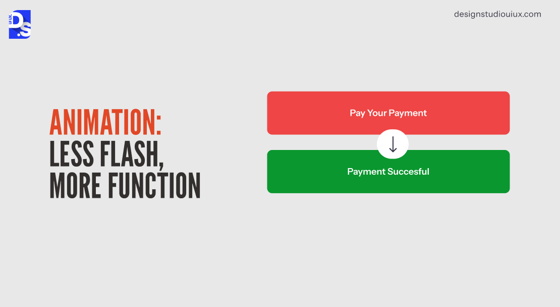
Effective CTA animations improve functionality, instead of acting as decorative elements. Animated UX microinteractions like 5% scale lift on hover, color transition on focus, and gently pulsating CTAs confirm clickability.
- Animations that slow down Time-to-Interactive past 3 seconds or loops without user intent triggers banner blindness and kills clicks.
- These animations should respond to user behavior, instead of acting as individual elements.
Remember those spinning “CLICK ME!” GIFs? Today’s animations in CTAs are not anything like that. They are more subtle, purposeful, and silent.
6. Typography and Readability
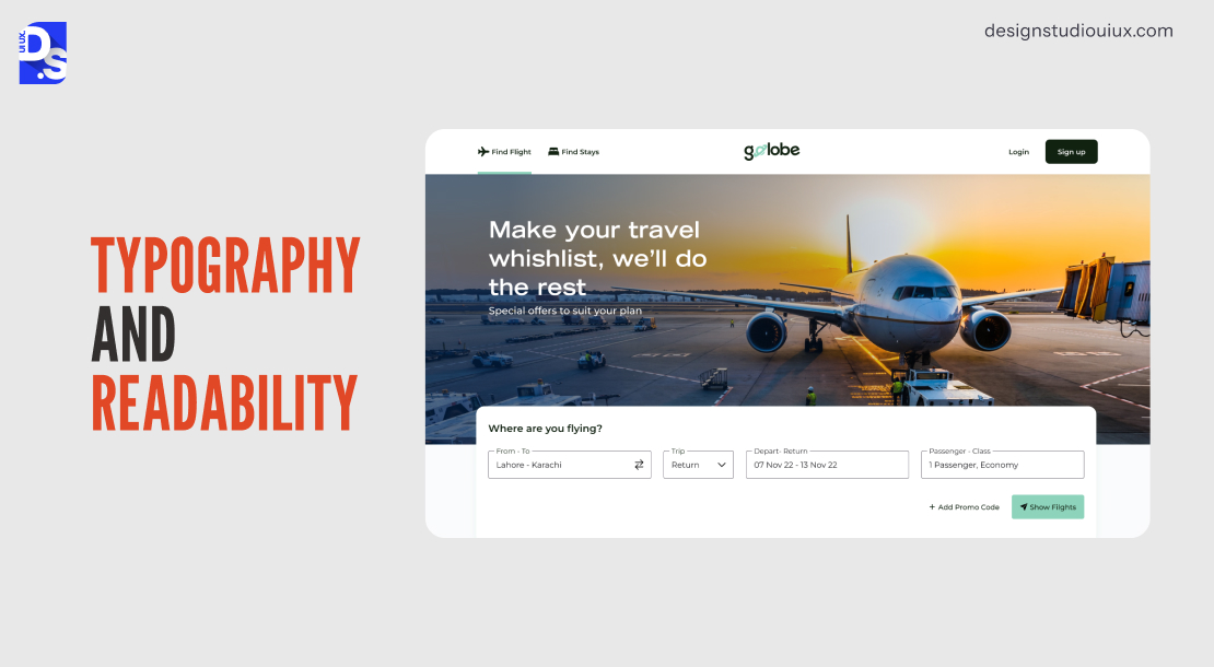
CTA button text must use sans-serif font with 16px minimum, and font weight 600 or more for readability:
- CTAs should not contain decorative fonts or scripts
- The text to background contrast ratio should be maintained at 4.5:1 according to WCAG 2.1 guidelines.
- The copy should not exceed 5 words for it to outperform competitors in A/B tests.
7. Hierarchy That Guides, Not Confuses
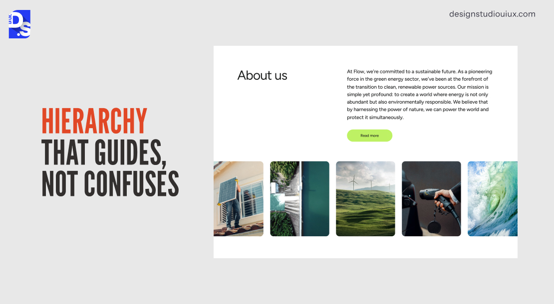
CTA visual hierarchy ensures the button is dominant over every page element:
- Size: Primary CTA is noticeably larger than secondary buttons.
- Color contrast: Uses full brand color with accents; secondary CTAs use outline or ghost style.
- Button placement should follow the user’s natural path, such as F-pattern or Z-pattern.
The Three-Tier Button System
Most pages need exactly three button styles, never more:
- Primary: filled, full brand color, used for the one main conversion action per screen (e.g., “Start Free Trial”)
- Secondary: outlined or ghost style, used for an alternative path (e.g., “Learn More”)
- Tertiary: an underlined text link or icon-only, used for low-stakes actions (e.g., “Read the docs”)
Mixing more than three styles on one screen creates decision paralysis and dilutes the primary CTA’s visual dominance.
The design hierarchy must direct towards the primary CTA to ensure users don’t have to decide about which button to click.
8. Button Accessibility
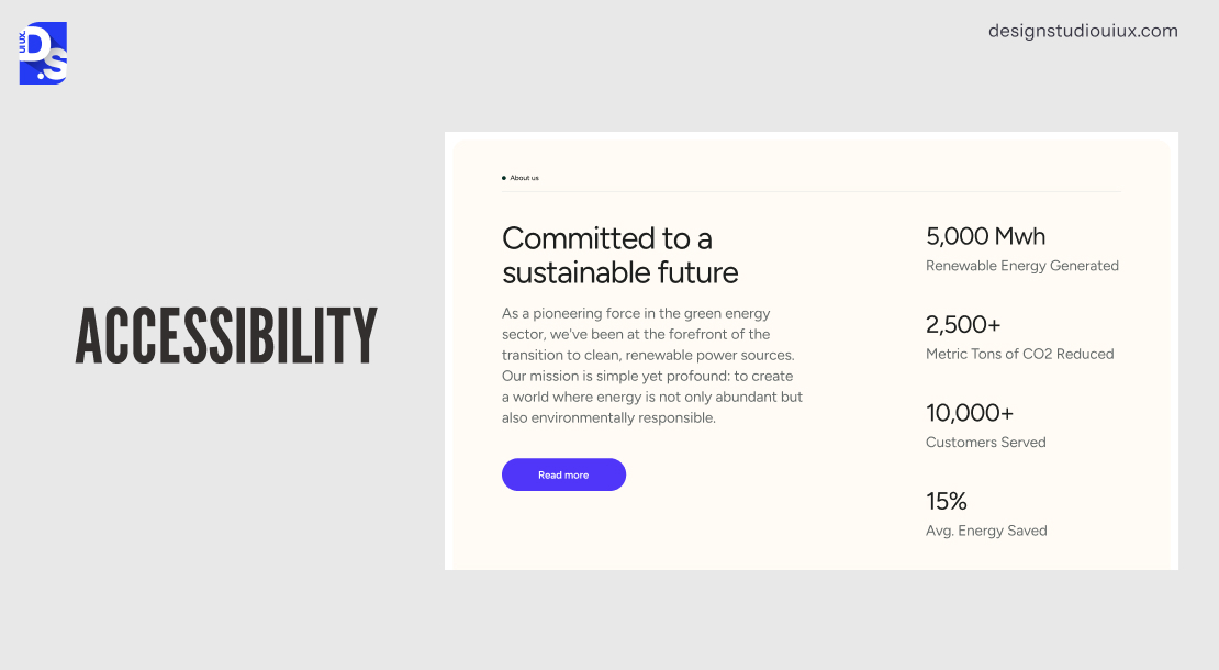
The Web Content Accessibility Guidelines 2.1 AA standards suggest 4.5:1 contrast ratio for button texts, or 3:1 for large texts for 18pt size, with visible keyboard focus states and ARIA labels for icon-only buttons and ensuring accessibility for screen reader navigation.
CTA Button vs. CTA Link: Which Should You Use?
Use a real <button> element when the CTA triggers an action on the same page – submitting a form, opening a modal, adding to cart. Use an <a> link when the CTA navigates somewhere a new page, a different section, an external site. Screen readers announce these differently, and keyboard behavior differs too: buttons respond to both Enter and Spacebar, while links only respond to Enter and support right-click “open in new tab,” which buttons don’t. Styling a link to look like a button (or vice versa) without matching its actual behavior creates a mismatch that confuses assistive technology users about what will actually happen when they activate it.
In 2023, the WebAIM Million Report suggests that 96.3% of website home pages have CTA buttons with some type of WCAG failure. These buttons should also follow ADA and EU Accessibility Act.
9. Design Systems: Consistency Is In
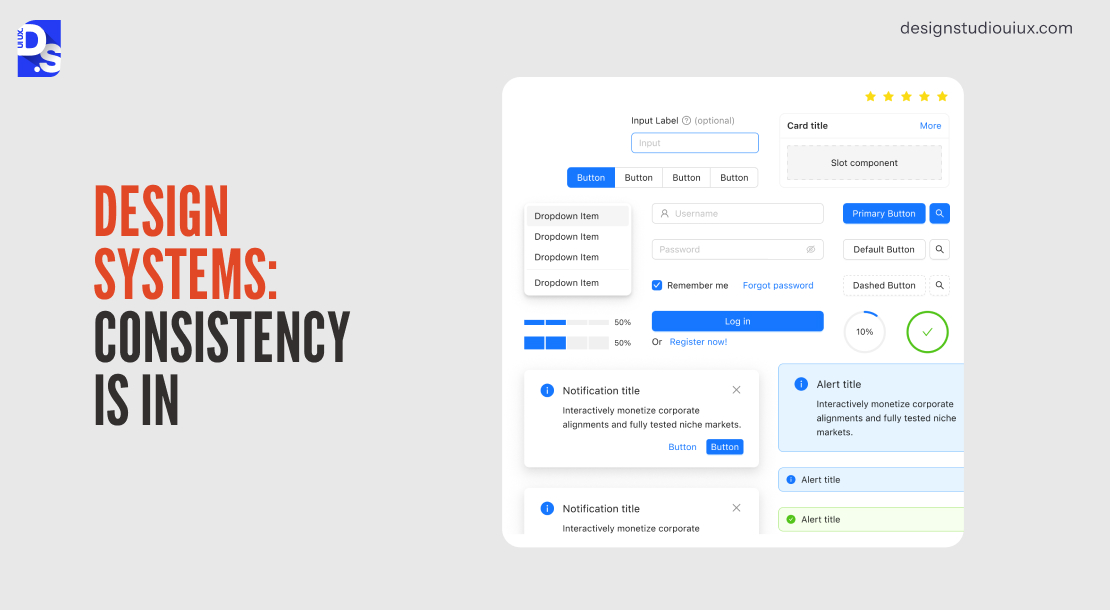
A CTA design system comprises rules and guidelines regarding button color, shape, size, typography, spacing and interaction states applied across all platforms, websites, mobile apps, emails, and paid ads.
- A design system provides consistency in how the button should behave or look like and helps brands follow mental models.
- Any inconsistency (such as different button color) may lead to loss of confidence and micro-friction during conversion.
- Google’s Material Design 3 and Atlassian’s Design System both handle it as a critical requirement.
10. Context Is Everything
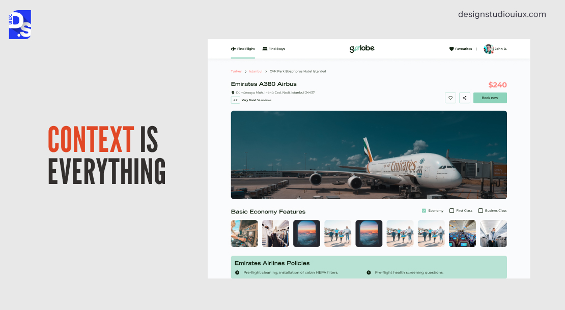
Context-aware CTA design refers to how the button copy, visual weight, and placement changes based on the content and context:
- A blog post CTA is a recommendation (‘Read The Full Guide’).
- A product page CTA is a decision point (‘Add to Cart — Free Returns’).
By matching with the user’s mental state and by answering the implicit questions, a contextual CTA can remove mental friction and outlast generic buttons.
11. Dark Mode Mastery
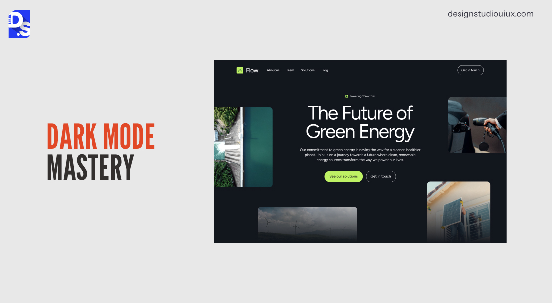
80% of smartphone users prefer dark mode in their daily lives (Android Authority Dark Mode Survey, 2024). Dark mode CTAs should not just invert to light-mode color schemes — otherwise, it will lead to washed-out and low-contrast buttons.
- CTA buttons in dark mode should have higher background opacity values.
- Use light, saturated accent colors (e.g. electric blue #6CACE4 on slate #2D2D2D), paired with white or near-white border strokes.
- The contrast ratio should work for dark mode independently — passing in light mode is not enough.
What Makes a CTA “High-Converting”? 6 Evidence-Based Factors
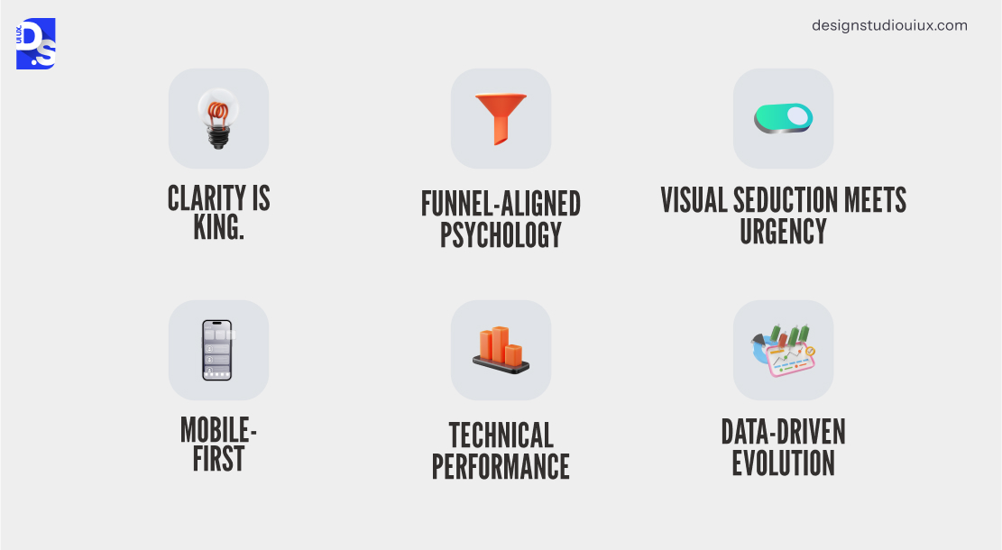
Six evidence-based factors that affect CTA conversion are as follows: 1. Clarity (action and benefit are explicitly spelled without ambiguity), 2. Funnel copy that aligns with user-stage (low-commitment top-of-funnel vs high-intent bottom-of-funnel), 3. Visual contrast 4. Mobile optimization (tap-friendliness and placement) for 63% of global traffic 5. CTA load speed is less than 2 seconds 6. Data-driven iteration through A/B testing (95% confidence thresholds).
Clarity In CTA Copywriting
CTA buttons should be optimized to reduce micro-friction and doubt:
- An optimized CTA copy would look like “Start My 7-Day Free Trial”, where it addresses the action (Start), timeframe (7-day), and commitment level (Trial) in one line.
- Vague labels like “Learn More” or “Submit” don’t answer anything.
In an A/B test by Content Verve, changing CTA copy from “Start your free 30-day trial” to “Start my free 30-day trial” showed that CTA buttons with explicit copy create 90% more clicks by facilitating low-effort decisions.
Funnel-Aligned Psychology
Funnel-aligned CTA design matches copy and visual weight to purchase stage:
- Top-of-funnel buyers prefer low-commitment CTAs: “Download The Free Guide”
- Mid-funnel users prefer comparative CTAs: “Compare Plans”
- Bottom-funnel consumers prefer high-commitment CTAs: “Upgrade to Pro”
Visual Urgency In High-Converting CTAs
High-converting CTAs apply contrast and micro-animations to signal interactivity:
- A charcoal background with a neon orange button creates stimulating contrast to help users focus.
- Pulse animation on idle CTAs uses peripheral motion detection to re-engage users from scrolling away.
Using a sense of urgency in copy leads to loss aversion (“Claim Your Spot — 5 Left”), as identified by Kahneman and Tversky. The scarcity should be real — fabricated urgency will destroy long-term brand trust.
Mobile-First
Mobile-first CTAs must support thumb-friendly navigation, as 63% of the traffic comes from mobile devices (as per Statista 2025). These buttons must match these rules to be deemed to be mobile-friendly:
- 44×44 px tap target minimum.
- Placement within the natural thumb zone (bottom-center of screen).
- Load time under 2 seconds.
- Avoid dead zones (screen corners).
CTA Technical Performance
CTA button technical performance indicates the speed of rendering and response across all devices:
- Google’s Core Web Vitals, including LCP, INP, and CLS, determine a CTA’s effectiveness
- A button that has INP greater than 200ms is considered unresponsive
- A button that takes more than 3 seconds to load will lose 53% of mobile users
- CTAs can be optimized by choosing SVGs over PNGs, lightweight animation libraries, and not using non-critical scripts
- The render time should be tested through Chrome DevTools Lighthouse and Google Page Insights
Data-Driven CTA Design
CTA design depends on real user behavior analysis using heatmaps, session recordings, A/B test results, and AI-powered personalization:
- Different AI tools can be used to run analysis of various CTA versions as per user segments, for example, “Get My Discount” appeals to Gen Z, over “Save 20%”, and vice versa.
- Brands that use AI-personalized CTAs have experienced 202% higher conversion rates, as per HubSpot.
- The best practice would be to test the buttons for one variable at a time, until it generates 95% statistical confidence, and examine the novelty-effect decay during post-test monitoring.
Why Specific, Benefit-Led CTA UX Copywriting Outperform?
These are the most effective CTA copywriting techniques:
1. Lead With Benefit (‘Unlock 50 Templates’ vs ‘Download’),
2. Framing It In First- Person Narrative,
3. Authentic Urgency-countdown, times, and inventory counts,
4. Embedded social proof- ’Join 10,000+ marketers’,
5. Risk reversal micro-copy- ‘cancel anytime’ under the button,
6. Phrasing based on funnel-stage,
7. Curiosity-gap hooks.
A standout CTA copy complies with all established UX writing tips and strategies. Also, one must follow these rules:
Clarity in CTA Copy
CTA copy should eliminate mental effort to drive higher conversion. The label “Grab Your Free Trial” answers: what is being offered (trial), targeted users (me), and what action to take (grab). Only using “Grab” or “Click Here” is likely to generate 90% less clicks, as per Unbounce Conversion Benchmark Report.
First-Person Copy
A personalized CTA copy goes through a narrative shift, from second-person (“Start Your Free Trial”) to first-person (“Start My Free Trial”) to create a sense of ownership.
The Michael Aagaard A/B test (ContentVerve 2013), which is a landmark in itself, and later reproduced by CXL Institute CTA Copy Research in 2022, shows that a change from ‘you’ to ‘my’ resulted in 90% increase of click-through rate.
This principle extends beyond trials: ‘Get My Report’, ‘Claim My Discount’, and ‘Build My Plan’ will outperform second-person narrative.
Authentic Urgency
Urgency-based CTAs exploit people’s tendency to weigh potential losses more heavily than gains (Kahneman & Tversky, 1979). This is further validated through:
- Real-time countdown timers (‘Sale Ends in 2:14:33’)
- Live inventory signals (‘Only 2 seats left at this price’)
- Dynamic social proof (’47 people viewing right now’)
The urgency should not be manufactured, because it will result in short-term increase in conversion, later followed by trust erosion and higher return rates.
Kayak, Booking, and other eCommerce platforms used real inventory data to indicate urgency, which follows FTC guidelines 2023 (16 CFR Part 233– Guides Against Deceptive Pricing).
Benefit-First CTA Copy
As the name suggests, benefit-first CTA will disclose the benefit before the action, and also address user queries, “What’s the actual benefit?”
- Replacing ‘Download Now’ with ‘Unlock 50 Templates- Download Now’
- This helps users anticipate the reward before the cost, increasing conversion rate.
A practical tip: proportionally present the benefit whenever the CTA is accompanied by a form, a payment, or an email address request.
Social Proof In Copy
CTA copy that directly embeds social proof, ‘Join 10,000+ Marketers’ reduces decision anxiety by enhancing trust validation at the exact moment of commitment.
This exploits the herd behavior, indecisive users will choose a popular option by default.
Dynamic social proof, “Join 125 people in your city who signed up today” that shows geo-location and real-time data adds a layer of personalization and reality.
According to Nielsen’s Consumer Trust Survey 2023 states 88% of consumers trust peer recommendations over brand, and social proof in CTA copy exploits that.
Risk Reversal in CTA Design
Risk reversal in CTA design is achieved through micro-copy placed directly below or beside the primary button to mitigate user objection:
- ‘Start Free Trial’ combined with ‘Cancel anytime. No credit card required’ eliminates three objections: financial, commitment, and effort.
- These silent objections are never raised by users, but they cause friction.
A study by ConversionXL (CXL, 2023) depicts that risk-reversing micro-copy in primary CTAs improves conversion rates by 17.18%, including lifts in high-ticket sales and product subscriptions.
Funnel-Smart Copy
Funnel-smart CTA copies align intent and information at each stage to encourage users to take action:
- Top-of-funnel (curiosity/ awareness): ‘Peek at What’s Possible’, “See How It Works”, and “Get the Free Guide”
- Mid-funnel (to compare): “Watch A Demo” and “Read Case Studies”
- Bottom-of-funnel (buying decision): “Start My Trial”, “Get Started Today”, “Upgrade to Pro”
Curiosity-Gap
CTAs with curiosity-gap tease the real value without completely revealing it, creating an information mismatch. This is stated by George Loewenstein’s Information Gap Theory (1994) in Psychological Bulletin, which states that curiosity is a motivation-driven trigger that appears during the mismatch.
- An outstanding example will be ‘Get The 3 Tactics That Block 99% of Attacks (Free PDF)’, which works because it follows these rules, specificity (3 tactics), low commitment (Free PDF), curiosity-triggering (which 3? By remaining incomplete).
CTA buttons that don’t follow these rules are simply clickbaity, and bound to experience higher bounce rates and negative brand association.
Where Should You Place CTA Buttons for Maximum Conversions?
The best CTA placement strategy involves 3 positions:
- Above the fold — for users who don’t need persuasion to act fast.
- Mid-content — to present the option after a pain point (e.g. ‘Get the Template’ or ‘See How It Works’).
- End of page — for methodical users who need all information before deciding (‘Book a Call’, ‘Get Started’).
If a page places CTA buttons strategically in all these positions, they are more likely to outperform, by appealing to different cognitive states — impulsion, scepticism, and analytics — and nudging users towards readiness.
Here are some other placement strategies you should employ for different types of CTAs:
Above the Fold, Mid-Content, and End of Page
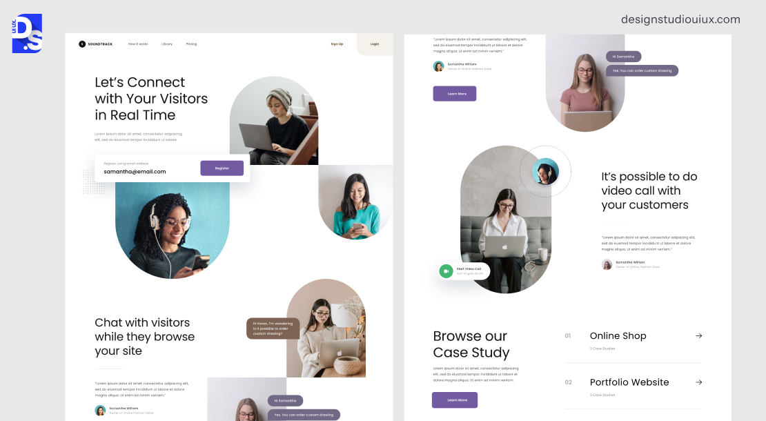
The myth of “above the fold or bust” is dead. Modern users don’t follow linear paths. They zigzag, skim, and bail without warning.
Landing pages with high conversion rate place CTAs in these critical areas:
- Above the fold: Placing a bold ‘Start Free Trial’ to address visitors to act now
- Mid-content: Contextual nudges like ‘Get the Template’ after explaining a pain point.
- End of page: A final ‘Book Demo’ for those that need all info before committing.
This multi-layered approach respects cognitive diversity. Impulsive clickers get instant gratification, skeptics get proof-driven CTAs mid-scroll, and methodical users convert only after soaking up every word.
Pages using this trio see higher conversions than single-CTA layouts because they meet users where they are, not where you wish they’d be.
Blog Posts: Inline CTAs That Feel Like Natural Pitches
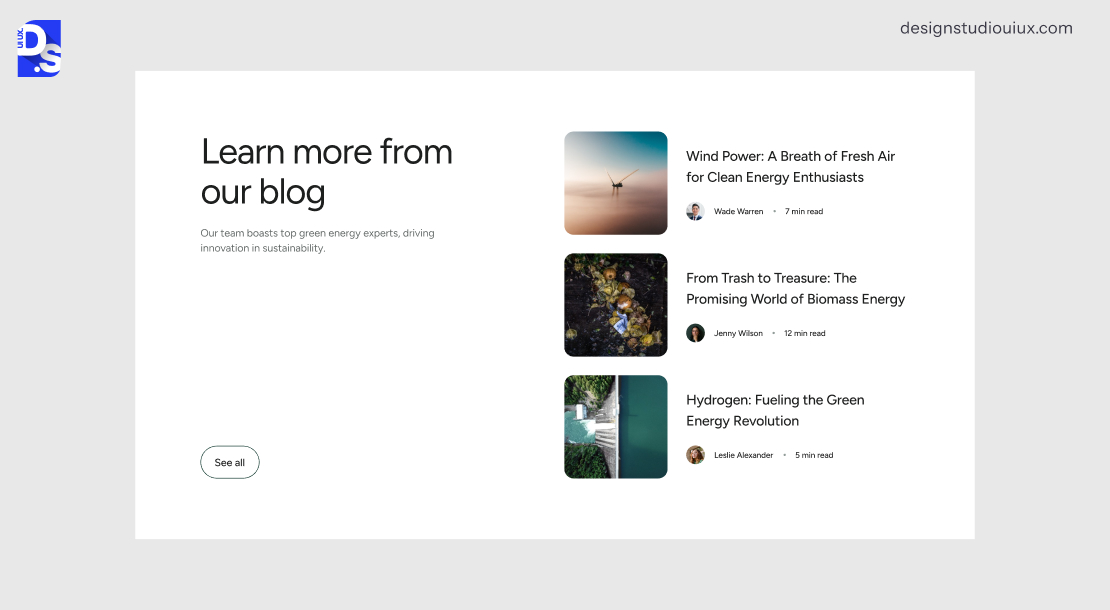
Blog posts with inline CTA buttons immediately after a paragraph that discusses the pain point (contextually relevant) would convert more than the blogs that have CTAs in the sidebar or the banner. Through this placement, CTA appears as a natural recommendation rather than a forceful entry.
Nowadays, a generic banner is no longer used on the top of a blog. In 2026, these are usually embedded into the content, just like a salesperson who times their pitch appropriately.
- Imagine a blog about SEO struggles dropping an inline ‘Download Our Rank-Tracking Kit’ right after detailing keyword nightmares — relevant, not random.
- Mid-content drop zones: These CTAs appear after a user scrolls to the pain point section, such as a floating CTA, ‘Struggling? Let’s Fix It’ will be considered a lifeline after peak frustration.
- For the small percentage that reads to the end: a tailored ‘Next Step’ CTA (e.g. ‘Ready to 2X Traffic? Start Here’) seals the deal.
It is content marketing’s evolution from ‘educate’ to ‘educate then activate.’
Landing Pages: CTAs as Decision Checkpoints
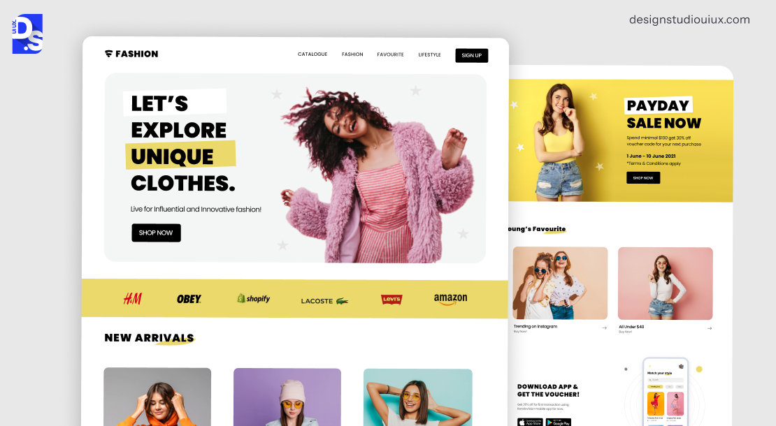
Landing page CTAs work best on saas landing pages psychologically in three checkpoints:
- Post-benefits: After listing features, a “See Pricing” button bridges the desire to action.
- Post-testimonials: A “Join 10,000+ Users” CTA leverages social proof’s afterglow.
- Post-pricing: A sticky “Get Started” button stays fixed as users compare plans.
This mirrors how humans make decisions: First, they need proof, then permission to act.
Sticky CTAs
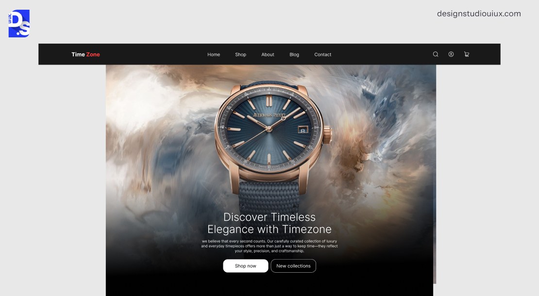
Sticky CTAs are effective when:
- They don’t occupy more than 5% of screen area.
- They rely on gentle animations rather than rough entries.
- They use dynamic copy (‘Learn More’ near the header and ‘Buy Now’ near the pricing section).
- These buttons should not block content and scroll context, or produce hassle and distrust at any stage
In long-form sales pages, a sidebar CTA that automatically transitions from ‘Learn More’ to ‘Buy Now’ when users scroll to the pricing section.
You can pinpoint the section (linger) by studying heatmaps and user behavior reports.
Overeager stickies that obscure content tank trust, the sweet spot is buttons that occupy ≤5% of the screen and use gentle animations (e.g. a soft glow).
AI-Personalized Placement
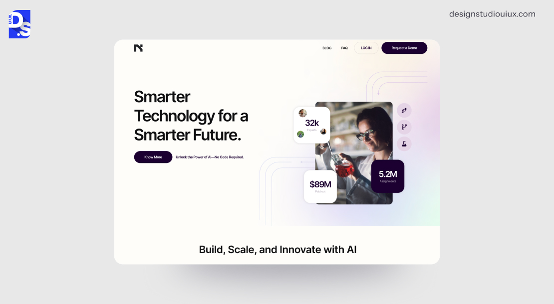
AI-enabled CTA placement depends on the analysis of scroll-depth, click patterns, time-on-section, device type, and user history to maintain personalization. Microsoft Clarity can be used to collect heatmap and session recording data to be used as a guide for placing the buttons as per user segment.
- Frequent scrollers: CTAs appear in the first 300px.
- Methodical users: CTAs appear after key subheadings.
- Returning visitors: Get a personalized CTA (‘Welcome back, Sarah — ready to finish?’).
This shifts brands from assumption-based to dynamic optimization, the same evolution that transformed email marketing.
How Does CTA Placement Strategy Differ Across Blog Posts, Landing Pages and Sticky CTAs?
The CTA placement strategy depends on the page context:
| Page Type | CTA Position | CTA Position |
| Landing Pages | Above the fold | Mid-benefits and post-pricing |
| Blog Posts | Intro / above fold | Mid-scroll (60% scroll depth) and article end |
| Home Pages | Hero section | Mid-feature section and social proof zone |
How to A/B Test Your CTA Buttons: A Step-by-Step Framework in 2026
A/B testing CTA buttons include the following steps:
- Understanding which buttons are underperforming through heatmaps and session recordings,
- Forming a hypothesis (improving contrast to 4.5:1 will improve conversion by 15%),
- Testing one variable (color, size, placement or animation),
- Running the test until it reaches 95% confidence score,
- 7300 visitors per variant will lead to 5% baseline conversion rate and 10% target lift (Evan Miller’s A/B Test Sample Size Calculator).
Tools: VWO‘s session recordings to see which CTAs make users stall. Or Optimizely‘s path analysis to pinpoint drop-offs. Then craft a specific hypothesis:
- Suppose your checkout page has a 70% drop-off rate, a heatmap study might tell you that users are having visibility issues (squinting) to see a ‘Buy Now’ button with poor contrast.
- Hypothesis: If the button contrast is increased to meet WCAG 2.2 standards, it will lead to reduced cognitive load, and a boost in conversion by X%.
Only one parameter should be analyzed at a time:
- Color: The color contrast ratio should be tested with WebAIM’s Contrast Checker; A/B test #FF6B6B (coral) vs. #4A90E2 (trust blue)
- Copy: The tone must be analyzed to prevent unintended intensity. ‘Claim Offer’ (aggressive) vs. ‘Unlock Offer’ (empowering).
- Size: 44x44px minimum for mobile.
- Placement: Sticky vs. inline.
- Animation: Hover effects or none.
Post-test, keep monitoring all CTAs for novelty effect decay. AB Tasty’s Significance Calculator automates this process.
Set your parameters, define your audience, and let the data flood in. Post-test, keep monitoring all CTAs for novelty effect decay. Add them to your UX audit checklist.
What Are the Best Real-World CTA Examples and Why Do They Convert?
Best CTA examples don’t lead with generic language, instead they lead with user identity, how they benefit, and match the brand’s emotional quotient.
- Indochino’s ‘The tailor is in’ — experiential, not transactional.
- CloudSpot’s ‘Get your app’ — ‘your’ signals ownership.
- Moona’s ‘The science’ — answers skeptic objections proactively.
- Waldo’s ‘Start your free trial’ — pairs an emotional headline with a zero-ambiguity action.
Each CTA succeeds by understanding its specific user’s next question.
Here are some examples of well-designed CTAs:
Indochino’s “The Tailor Is In”
Indochino’s CTA uses experiential positioning over transactional copy:
- It does not promote a purchase action (‘Shop Now’, ‘Buy A Suit’) — it promotes an emotion of getting a custom, tailor-made suit.
- It does not evoke anxiety — instead, a sense of calm.
- The design amplifies the copy intent, placed below tailored suits to get the ‘Halo’ effect.
Why Does It Work?
Indochino proved that experientiality can pay dividends by inviting users for an experience first before urging them to spend money.
This tracks with luxury and high-end CTAs, where experiential CTAs provide more benefit than transactional versions.
CloudSpot’s Cleverness
CloudSpot’s ‘Get your app’ appeals to its niche audience, professional wedding and portrait photographers because:
- It strategically uses possessive language to indicate ‘this is for you’, not a generic SaaS product.
- This possessive framework works across industries, the personalized always outperforms the generic.
Why Does It Work?
For niche audiences, using possessive language provides the right context, and encourage users to opt for high-ticket value.
Moona’s “The Science”
Moona’s CTA “The Science” is headlined by, “A cool head means better sleep”, to address a specific conversion barrier, skepticism to spend US$ 299 on a pillow:
- It’s CTA is not urging people to spend money at that moment
- It takes an opposite approach to ask users to believe in the product by asking them to analyze the product first to build trust
- This doubles as authority positioning for high-ticket conversion.
Why Does It Work?
Moona smartly navigates rational objection by addressing it in the primary CTA, instead of charging money.
Waldo’s Whimsy
Waldo masterfully pairs its headline, “Get ready to see happiness,” with the “Start your free trial” button:
- The headline creates emotional connection.
- The CTA handles logical decision-making (a free, zero-risk next step).
- This separation works, neither element has to serve two purposes simultaneously.
What Makes It Different?
Waldo’s CTA relies on creating rational connection, turning the headline into the brand’s emotional quotient to prevent any competition between the two elements.
What Are the Most Common CTA Mistakes That Kill Conversions?
The top 14 common CTA conversion killers include: low contrast (failure WCAG 4.5:1), double-action copies, weak labels (‘Submit’), no mobile optimization, animations to delay TTI beyond 3 seconds, GDPR banners preventing CTA visibility, untested buzzwords, missing micro-animations (hover and active states), layout shift from late-loading CTAs, desktop hover feedback, missing ARIA labels and heavy media assets to slow down the rendering process.
This is a comprehensive list of common CTA errors you must test your buttons against:
- Low Contrast: Buttons blending into backgrounds fail WCAG 2.2 4.5:1 standards.
- Overloaded Prompts: “Start Trial & Get eBook” confuses users; pick one action.
- Weak Value: “Submit” flops; “Unlock 48 SEO Tips” pulls.
- Mobile Breaks: Desktop-only CTAs die on smaller screens.
- Animation Excess: Effects delaying TTI past 3 seconds chase users off.
- Popup Clashes: GDPR banners hiding CTAs kill momentum.
- Untested Buzzwords: Something like “Get Yours” might bomb with some users; test it first.
- State Gaps: No hover/active cues signal a dead button.
- Funnel Missteps: “Buy Now” on early content scares off prospects.
- No Trust Signals: Missing badges or stats breed doubt.
- Layout Shifts: Late CTAs hurt Core Web Vitals.
- Hover Silence: No desktop feedback feels flat.
- Accessibility Misses: Not using ARIA labels will exclude screen reader users.
- Slow Loads: Heavy media assets in CTAs delay rendering, and users won’t wait.
Which CTA Style Convert Best & When?
| CTA Type | Avg. Conversion Lift | Effectiveness | Key Condition | Best Use Case |
|---|---|---|---|---|
| Generic CTA(e.g. ‘Click Here’) | Below avg. | Low | N/A | Not recommended |
| Benefit-led CTA(e.g. ‘Get 50 Templates’) | +42% against generic | High | First-person reward phrasing | Product pages, landing pages |
| Urgency CTA(e.g. ‘Only 3 Left’) | +15–25% | High when authentic | Real scarcity only | E-commerce, event signups |
| Social proof CTA(e.g. ‘Join 10k Users’) | +10–18% | Medium–High | Embed proof in button copy | SaaS onboarding, newsletters |
| Personalized CTA(AI-driven) | +202% vs default* | Very High | Requires user data & AI tooling | Returning visitors, email flows |
| Contextual inline CTA(mid-content) | Higher than sidebar | High | Place after pain-point moment | Blog posts, long-form content |
Conclusion
CTAs act as a critical sales force that moves users from exploring to taking action. If you create poor designs, users will face friction and this will ultimately result in site bounce.
However, poor CTAs might lead to friction, confusion, and trust erosion.
However, in our experience, even minor changes, like replacing ‘Submit’ with ’Get My Free Guide’ or testing and improving the color contrast can increase the conversion metric by double-digits.
Your next move? Audit like a pro:
- Are the CTAs clear? Do they feel like a natural next step or are they jarring?
- Heatmap tools like Hotjar can be used to test A/B copies or spot dead clicks
- You can ask the question: Is it compelling to act?
However, you don’t have to do it on your own. Unlock a premium audit of your CTAs with our Design Studio UI UX team. We’ll dissect your buttons, headlines, and flows through the lens of conversion science, then deliver actionable fixes.
Claim Your Free Audit Now!
FAQs
What makes a CTA button high-converting?

A high-converting CTA button uses benefit-first copy, visual contrast (4.5:1 for WCAG 2.1 AA), strategic placement, and support mobile friendly taps (minimum 44×44 px). Hubspot’s 2024 report shows 202% uptick in conversion.
What is the best size for a CTA button on mobile?
The minimum recommended size is 44X44 pixels as per Apple’s Human Interface Guidelines and Google’s Material Design to ensure the tap size is large enough for average finger size, otherwise it would lead to frustration.
How should CTA button copy be written?
CTA copy should use action-oriented, first-person language that leads with the user benefit rather than the action. Examples: ‘Start My Free Trial’ outperforms ‘Start Free Trial’; ‘Unlock 50 Templates’ outperforms ‘Download Now’. Avoid vague labels like ‘Submit’ or ‘Click Here’ — they provide no value signal.
Where should CTAs be placed on a landing page?
High-converting landing pages use CTAs at three points: above the fold (for ready-to-act visitors), mid-content after a key value statement (for skeptical users), and at the page end (for methodical readers). Pages using all three placements see significantly higher conversions than single-CTA layouts.
How many CTAs should a page have?
A page should have one primary CTA with a clear visual hierarchy, supported by one or two secondary CTAs that don’t compete for attention. Overloading a page with equal-weight CTAs increases cognitive load and decision paralysis. Each secondary CTA should be visually subordinate to the primary.
Should a CTA be a button or a link?
Use a <button> for actions that happen on the current page (submit, open a modal). Use an <a> link for navigation to a new page or URL. The distinction matters for accessibility — screen readers and keyboard behavior differ between the two.
Does CTA color affect conversion rates?
Yes. CTA color affects conversion through contrast and psychological association, not a universal ‘best color.’ The button must contrast strongly against the page background (4.5:1 minimum ratio) and align with brand context. Orange and green frequently outperform in A/B tests, but results are context-dependent and must be validated per audience. One must test their brand palette with VWO.
What is A/B testing for CTA buttons?
A/B testing for CTAs means showing two variants of a button (different copy, color, size, or placement) to split audiences simultaneously and measuring which drives more conversions. Test one variable at a time, run until you reach 95% statistical confidence, and require approximately 7,300 visitors per variant for a 10% lift on a 5% baseline conversion rate.
How to Write a High-Converting Copy?
Keep it punchy: first-person verbs (“Secure My Spot”) beat vague fluff (“Learn More”). Tease value, “Get 3 Free Templates” trumps “Download,” and cap it at 2-5 words. Run it through Grammarly for sentiment analysis. Test, tweak, convert.
How Many CTAs Per Page?
Homepages can handle 3-5, nav, hero, features, testimonials, and footer.
Landing pages? One primary, two secondary (think demo, pricing, FAQ).
Blogs? Maximum two – inline upgrade, end-of-post magnet
How to optimize CTA button UX placement?
In blogs, the best strategy would be to slip it after paragraph three. Hotjar scroll maps show the areas with peak engagement, which can provide better insights. In product pages, CTA buttons can be paired with a floating cart for mobile, and a sticky right panel for desktop. Moreover, in landing pages, it should be placed 71px below the hero with an arrow nudge.