

Navigation UX Design Types, Best Practices & Patterns


In today’s fast-paced digital world, users expect to find what they need quickly and efficiently. Poor navigation can cripple your website or app, driving users away and costing you valuable conversions.
This is where navigation UX design comes in, serving as a silent guide, enabling users to achieve their objectives quickly and intuitively.
Navigation UX design is the practice where designers structure interface menus, links, buttons, tabs, breadcrumbs, and search tools.
They use strategies such as hierarchical, object-oriented, task-oriented, workflow-based, faceted, and context-sensitive designs.
Most interfaces also use common patterns such as vertical menus, breadcrumbs, tabs, dropdowns, dashboards, sidebars, search, tooltips, spotlight features, customization options, and progressive disclosure.
When you choose the right blend of these navigation types and patterns, it can reduce your site’s bounce rate. This helps users complete their tasks more quickly, which can improve your overall conversions.
It is a branch of user experience (UX) design that focuses on guiding users through an interface. This includes:
- Design Layouts: The arrangement of navigation elements like menus, search bars, tabs, and strategic CTA placement in navigation, which drives user actions.
- Interactions: How users interact with micro-interaction elements (clicks, swipes, etc.)
- User Flows and Journeys: The overall path that ensures smooth transitions between all sections and interactions.
Users have goals and expectations when they interact with your website or app. Navigation-focused UX design helps designers create the clearest path to achieving those goals. That is why it is crucial to make positive user experiences.
The best navigation feels natural and intuitive and does not distract from the content. Users do not even notice that specific design decisions are influencing their actions and guiding them toward specific goals.
In this article, we’ll cover how to master navigation UX design:
- Common Patterns of Navigation UX
- What Is Navigation UX?
- Navigation UX Best Practices
- The Relationship Between Navigation Design and UX
- Different Types of Navigation UX
What Is Navigation UX?

Navigation UX is the part of design that deals with how users travel through an interface to reach their goals.
It covers three main areas: layout (menus, search bars, and buttons), interactions (clicks, swipes, or gestures), and user flows.
Data shows task completion rate is 87% higher when the site navigation is clear and organized.
Research shows that 37% of users leave sites with poor navigation and around 88% of online customers won’t return to a site once they’ve had a frustrating experience.
It is clear that good navigation is the most important factor in keeping people on your page, not a secondary concern.
With good navigation design, users can move through an app or website intuitively and efficiently.
It keeps users aware of where they are and exactly how they can achieve their goals within the digital interface. Without good UX navigation, there is no good UX.
What are the Best Navigation UX Practices
Common navigation UX best practices include understanding user interactions, creating clear hierarchy, using common navigation patterns, integrating responsive designs, and user feedback systems.
Navigation design deserves center stage throughout the product development process, especially during information architecture planning, wireframing, and prototyping.
Here are key practices to keep in mind throughout the UX design process:
Understand User Interactions
The secret to great navigation lies in understanding your users. Collect real insights into how they behave, what they need, and what they prefer through proper user research. Look at their actual app usage, direct feedback, and journey paths.
Designers combine both qualitative and quantitative data using these approaches:
- Quantitative tools: Scroll through Google Analytics, Mixpanel, and Amplitude data as they will explain exact usage statistics and the navigation trail of your users.
- Behavior tools: Use Hotjar and Microsoft Clarity for visual heatmaps, recorded user sessions, and scrolling habits.
- Direct feedback with qualitative method: Go through surveys and interviews that actually disclose user mindsets, intents, and motivations behind user actions.
Create Logical Information Architecture
Information architecture (IA) in navigation UX is about structuring and labeling your content so users can find their way around without getting stuck.
A well-built IA establishes a clear flow from main sections down to specific items that aligns with user expectations.
Designers rely on these three core techniques to structure and test information architecture:
- Open card sorting: Users arrange items into groups and name the categories themselves. This reveals their personal logic and mental frameworks.
- Closed card sorting: Users slot specific topics into an already established list of categories to verify if your structural layout holds up.
- Tree testing: Use this to evaluate navigation labels during initial stages and spot poorly chosen labels well before development kicks off. It is recommended by the ISO 9241-210 standard.
Best design practices suggest organizing features of the digital product in a sensible order. This allows users to scan and find items rapidly. Also, select navigation patterns with tab bars, breadcrumb trails, or search boxes.
This will open up different sections without causing visual overload. Conduct regular IA and usability audits to learn more about friction points.
Maintain Familiarity and Clarity in Navigation
Design familiarity means using visuals people already know. Common examples of familiarity in design include attaching magnifying glass for search, a hamburger icon for menus, and breadcrumbs to show location.
These choices improve clarity, reduce error rates, and build confidence when users navigate your product. The familiarity approach in UX design works because of Jakob’s Law.
The law states that users prefer your site to work in a way that matches their experience on every other site they visit. If you do not follow this concept, you might see an increase in cognitive load which can result in bounce rate of the website.
Optimize UX for All Users and Devices
The main goal of UX design is to create responsive navigation i.e., works for any device or screen size. Make sure all the buttons are clickable and are at least 44×44px size – as per WCAG accessibility standards. Ensure the interface works flawlessly with keyboards and screen readers.
Data shows that in 2026, more than 80% of users browse their favourite applications on mobile phones, and mobile devices bring around 62% – 64% of web traffic globally. This makes mobile-first design a basic UX requirement.
Extra tips for device and accessibility are:
- Built a design system that allows users to personalise their navigation menus to match their habits.
- Use simple clear language in tutorials and user guides to help users navigate the platform effectively.
- Add intuitive keyboard shortcuts so that advanced users can jump between sections much faster.
Make sure the layout is consistent and mobile friendly through adaptive design.
Improve UX with Feedback and Testing
Upgrading the navigation setup of the digital product is a non-stop journey that depends entirely on user behavior metrics and live feedback.
Use tools such as Hotjar which provides visual heatmaps and real session recordings that reveal customer scrolling time and their habits.
Some important testing and feedback channels are:
- A/B testing: It is recommended to check the different labels and layouts of the website. For best result, consider around 7,300 sessions per variant to detect a 10% increase in completions.
- Direct feedback forms: Attach these tools to get information about behavioural data and direct user sentiment.
- User testing panels: Industry data shows that if you test your design interface with just 5 real people, you can spot around 85% of your primary user experience issues.
Implement a user feedback system to gather timely insights and suggestions.
This direct feedback loop allows you to continuously refine your navigation and optimize it for user needs with expert UX design consultation.
The Relationship Between UX and Navigation
The connection between UX and navigation is direct and inter-reliant. Effective navigation empowers users to find what they need quickly and efficiently.
This translates directly to usability through better site exploration, faster onboarding, fewer user errors, lower support costs, and increased retention.
Here is how a good website navigation makes a huge difference across every layer of the user experience:
- Effortless Exploration: Well-thought-out site navigation helps users find tools and work faster. One example of effective navigation is Google Maps which follows an organized website navigation pathway. Here, the entire app relies on instinctive gestures and clear directions.
- Faster Onboarding: Simple and intuitive navigation reduces learning/training time as new users do not have to struggle to learn the interface. This also signifies faster product adoption. For example, Canva is known for mastering this quick, welcoming introduction.
- Fewer Errors: Clear navigation reduces user mistakes and results in smoother and more accurate interactions. One example is online banking platform – Chase, known for its seamless navigation patterns.
- Reduced Customer Support: If users can figure out the next step on their own, they will solve problems independently which saves both time and money. Amazon’s navigation is built for this sort of scale. Here clear site architecture helps shoppers navigate the product and fix issues on their own.
- Reduced Abandonment Risk: Great navigation means easy browsing. If you can create smooth navigation pathways, you can prevent users from getting annoyed and leaving the site. Top apps like Netflix and Spotify keep their users because finding content is effortless.
According to research, every $1 you put into UX design, you can get back around $100 in value. This is a massive 9,900% return on your design investment.
Also, let’s take Amazon, for instance, they created a design system with strong self-service navigation. This handles about 60–70% of issues and saves hundreds of millions of dollars every year.
Frictionless navigation directly translates to lower frustration and higher user retention.
What are the Main Types of Navigation UX Design
Navigation types define the overall approach to organising content. Think of them as the blueprint for your website or app.
The main types include hierarchical, object-oriented, task-oriented, workflow-based, faceted, and contextual UX navigation. The right type depends on your product’s nature and user goals.
| Navigation Type | Best For | Main Benefit | Design Difficulty | Modern Example (2026) |
|---|---|---|---|---|
| Hierarchical | E-commerce, blogs, documentation platforms | Creates clear content structure for easy browsing | Low to Medium | Amazon, Wikipedia, IKEA |
| Object-Oriented | Creative tools and collaborative platforms | Encourages flexible, non-linear exploration | Medium | Figma, Miro, Notion |
| Task-Oriented | SaaS tools, productivity apps, enterprise dashboards | Helps users complete tasks faster with fewer clicks | Medium | Asana, Jira, HubSpot |
| Workflow-Based | Onboarding, forms, wizards | Guides users step-by-step without confusion | Low | Typeform, Duolingo, Tax portals |
| Faceted | Shopping and searchable content platforms | Makes filtering and discovery much easier | Medium to High | Airbnb, Booking.com, Amazon |
| Contextual | Smart apps with AI personalisation | Predicts user needs using behaviour and location | High | Spotify, Uber, Google Maps |
Hierarchical Navigation UX

Hierarchical navigation works by sorting content into a tree structure. Here, main categories lead to nested sub-sections.
It is the default choice for ranking e-commerce sites such as The New York Times or Amazon. This keeps the main navigation simple even as the site grows to thousands of web pages.
Key Considerations for Implementation
- Limit navigation depth– For smooth navigation, prevent the structure from getting too deep. Users often lose their way if the site structure is more than three levels deep.
- Use visual cues: Use breadcrumbs and make sure the design labels are concise, clickable and easy to understand.
Object-Oriented Navigation UX
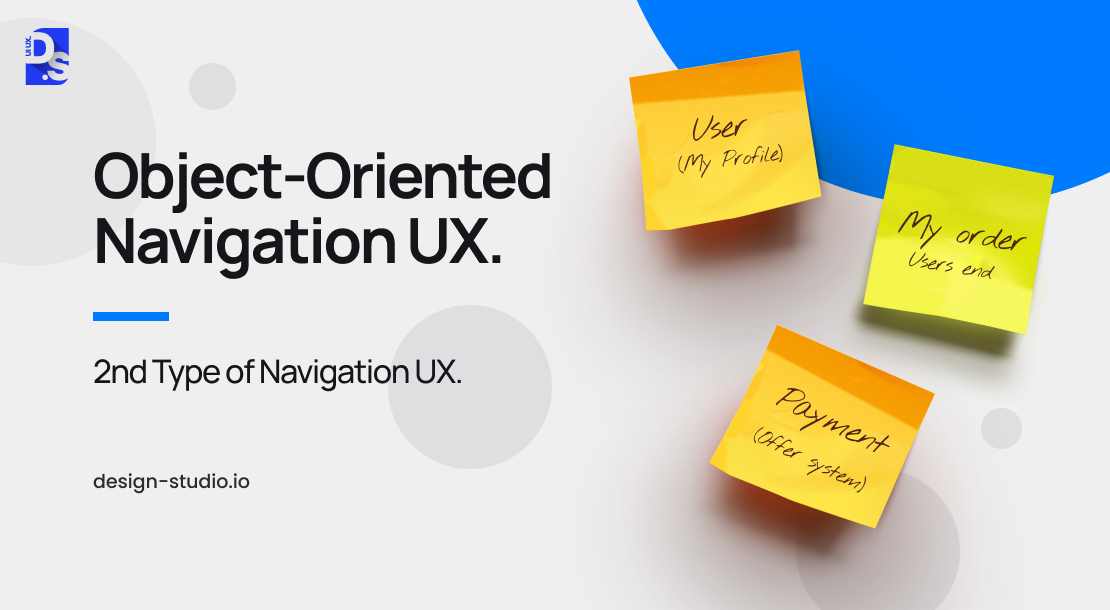
Object-oriented navigation of the digital product can shape the interface around distinct, self-contained features instead of relying on a top-down category list.
Here, each and every design feature acts as an independent ‘object’. This is similar to the standalone apps scattered across the home screen of smartphones.
This layout is common in highly flexible creative tools like Figma or Notion, where users constantly swap between different functional toolsets.
This design style works best for software built around exploration and open-ended projects.
For example, in a digital whiteboard workspace, users can jump between different sections like sticky notes, drawing shapes or dropping in photos – all on one endless canvas.
Key Considerations for Implementation
- Self-Contained Features: Every design feature needs to be complete so that users can interact with it without relying on anything else. For instance, a sticky note tool should be easy to open and work perfectly without making people click through other unrelated tools first.
- Visual Differentiation: Use unique contrasting shapes, distinct colors, or clear animations to separate different features. This also makes the navigation pattern intuitive. and make moving around the app feel natural. You can add specific features like adding notes to make the color or motion effect distinguishable.
Task-Oriented Navigation UX
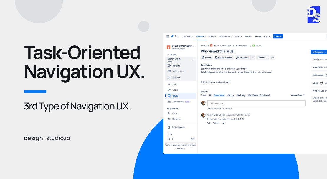
Task-oriented navigation organises a site by grouping features based on what the user is actually trying to achieve.
Rather than showing a long list of every technical feature, it puts all tools needed for a specific job under one simple label.
For instance, when you design a project management app, group options like “set deadline” and “assign task” together under a single menu called “Project Coordination” menu.
You do not have to attach these options in separate places.
This takes the opposite approach to object-oriented navigation where the user experience revolves entirely around the tasks users need to accomplish, rather than showcasing individual features.
This approach works best when the product has clear goals, such as for apps related to booking systems, payroll platforms, or project management tools.
Key Considerations for Implementation
- Run thorough user interviews (user research), practical user testing, and direct observation. This will help understand how your customers try to get things done.
- Logically group features of the digital platform around specific user goals and stick to clear, concise navigation labels.
- Regularly gather real-world input and refine your interface accordingly to match actual human behavior.
Workflow-Based Navigation UX
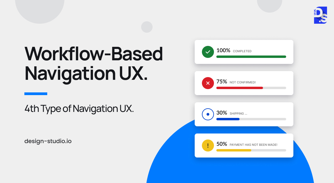
Workflow-based navigation leads users down a set navigation path or screens. This is perfect for apps that rely on standardized processes where users need to follow particular steps to complete the website trail.
It works better for intricate tasks which need complete focus, such as- website check out process, creating an account, finishing a tutorial, etc.
Key Considerations for Implementation
- Visual Progress Indicators: Attach progress bars or numbered steps to keep users updated on their exact position. This transparency reduces assumptions and provides a rewarding sense of user journey completion.
- Prioritize Features: Tone down or hide features that are not necessary for users’ journey. Focus mainly on the immediate task related features and minimize ( or hide ) secondary functions/ distractions as well.
- Save Progress: Make sure people can save their work whenever they need to and resolve any errors at the early stage.
Other Types of Navigation UX
While object-oriented, task-oriented, and hierarchical navigation form the core navigation UX toolbox, there are other valuable strategies to consider:
Faceted Navigation:
Faceted navigation offers users full control over large data by letting them sort through various categories all at once.
For example, when you are looking at shoes online, faceted navigation lets you filter the output options by price point, brand name, and color choices. This setup is the best choice for large databases and complex search needs.
Contextual Navigation:
Contextual navigation is a more advanced approach. It changes how the app behaves depending on user activity like their scrolling pattern and device type, context and location.
This anticipates user needs and provides personalized user experiences. For example, think of an app on your smartphone that shows restaurant choices based on location preference that is how contextual navigation functions.
For sites packed with text or product listings, it is critical to choose between pagination and infinite scroll . This is a massive design choice that can influence both UX and SEO metrics.
Designing for smaller screens comes with its own set of challenges, our dedicated guide on mobile navigation UX covers the patterns, best practices, and real-world examples you need.
Common Patterns of Navigation UX
Navigation types set up the overall blueprint and layout for your website or app. Navigation patterns are what actually bring that blueprint to life.
Some major navigation patterns are vertical menus, drop downs, dashboards, sidebars, spotlights, search bars, tooltips, breadcrumbs, tabs, settings menus, and progressive disclosure.
To make the web site simple and intuitive, combine three or four of these design patterns.
A smart navigation type creates the starting point, while good navigation patterns handle the day-to-day execution.
Navigation patterns are just one part of the bigger world of UX design patterns, meant to tackle regular design roadblocks across all areas of a digital system.
| Navigation Pattern | Best Device Fit | Ideal Use Case | Common Limitation | Popular Example |
|---|---|---|---|---|
| Vertical Menu | Desktop and web apps | Managing large navigation option lists | Uses significant screen space on smaller displays | Slack, Gmail |
| Breadcrumbs | Desktop and mobile websites | Deep content and category navigation | Less useful for flat content structures | Amazon, Shopify |
| Tabs | Mobile apps and dashboards | Switching between related content sections | Too many tabs reduce usability quickly | YouTube, Instagram |
| Dropdown Menus | Desktop websites and SaaS platforms | Organising grouped navigation options cleanly | Hidden links reduce visibility for users | Canva, HubSpot |
| Dashboards | Enterprise and analytics products | Showing multiple data points together | Can overwhelm first-time users easily | Salesforce, Google Analytics |
| Sidebars | Productivity and creative software | Persistent access to tools and sections | Reduces horizontal workspace area | Figma, Notion |
| Search Navigation | All devices and platforms | Fast access to specific content or tools | Depends heavily on search accuracy | Google, Slack |
| Tooltips | Desktop software onboarding | Explaining features without extra screens | Poor experience on touch-only devices | Canva, Intercom |
| Spotlight / Product Tours | SaaS onboarding and feature discovery | Highlights important actions and updates | Feels intrusive when overused | Linear, Notion |
| Customisation Menus | Power-user and enterprise products | Gives users layout and workflow control | Adds extra UX and engineering complexity | Figma, VS Code |
| Progressive Disclosure | Complex apps with advanced settings | Keeps interfaces cleaner and simpler initially | Advanced users may need extra clicks | Gmail Settings, iOS |
Vertical Navigation Menus
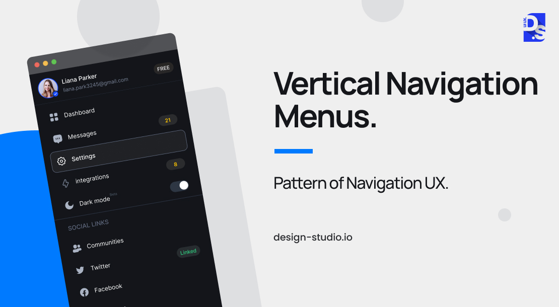
Vertical menus show the navigation choices in a tall column right on the left side of your screen. They work well for complex desktop software like Gmail, VS Code, and Slack.
These menus save horizontal screen space because these options can be collapsed into a simple row of icons while using the full height of the desktop window.
Best practices for designing vertical menus are given below:
- Use clear fonts, colors, and hover/click states to show a clean layout and highlight where the user is.
- Build in smooth keyboard navigation and make sure the layout easily collapses on every mobile device.
- On smartphones, swap vertical columns for drawers, hamburger links, or bottom bars. This will save limited screen space.
Breadcrumbs

Breadcrumb navigation acts as a visual horizontal map that helps users understand their location within the site hierarchy. This trail (Home > Category > Subcategory > Current Page) makes it easy to move to higher sections quickly without using the back button.
Breadcrumbs make navigation easier on sites which have three or more layers. For example Amazon, Stripe, or government portals. Adding JSON-LD code helps Google understand your site which makes search results look better and increases clicks by 15-20%.
Tabs
Tab navigation organizes/groups related content into separate sections so that users can easily navigate those features with a single tap or click. This layout is efficient for apps that have three to five core areas for people to discover.
Platform-specific placement rules are:
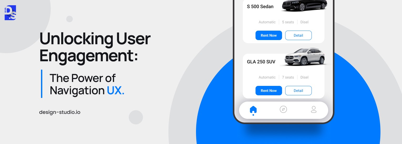
- Mobile: Put tabs at the bottom of the screen. This should match Apple HIG and Google Material Design guidelines. This positioning ensures key features remain within easy thumb reach.
- Desktop: Put tabs at the top of the site interface.
Best practices for building tabs are:
- Do not attach more than five tabs. This will prevent interface clutter and not overwhelm users.
- Match icons with clear text labels to make sure the design is fully accessible.
- Visually emphasize the active tab to show users’ current location.
- Do not use tabs for step-by-step processes or content that needs to be viewed in order.
To know more about such design setups, study how YouTube, Twitter/X, and the iOS Settings app structure their tab systems.
Dropdown Menus
These UI elements open up to show extra choices when you click or hover over them. They basically pack lots of options under a single clean label and save layout space. But sometimes they hide links from users who are just skimming web pages.
Nielsen Norman Group research shows that mega-menus actually perform better than small dropdowns because they lay out all your choices at once.
Some best practices of this design approach are:
- Configure menus to open when you click them rather than when hovered over.
- Limit menu upto two layers deep and keep the site navigation simple and easy for users.
- Make sure menus are fully accessible and compatible for keyword navigation.
- Do not put important links inside these menus where quick-scanning visitors might completely miss them.
Dashboards
A dashboard navigation menu is basically a personalized hub that shows important metrics. It also displays quick links to regular tools, and live updates.
The concept works best for data heavy apps, for example analytics tools (like Google Analytics, sales systems like Salesforce, or money-management apps like Mint).
These are some important design requirements for this approach:
- Users must pick and customize the widgets on their screens.
- The standard layout must highlight the 3 to 5 most tasks an average user needs.
- Each shortcut or data point should have a direct link to a detailed page.
- Show only useful information that users can act on to prevent cognitive load.
Sidebars
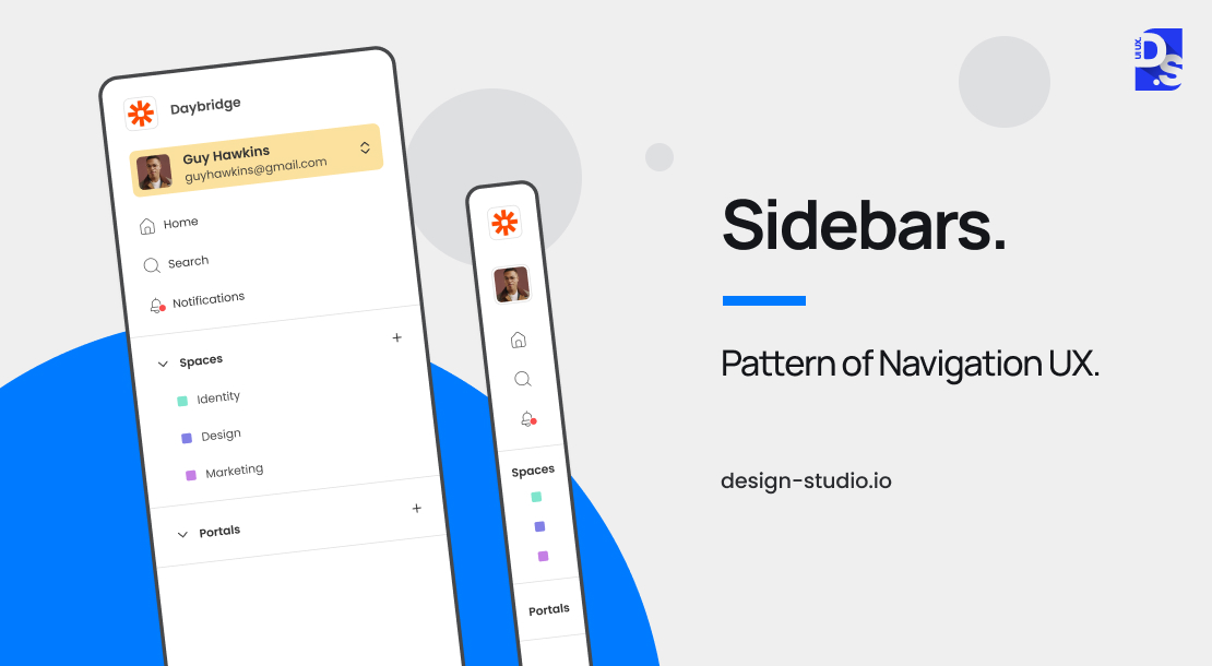
Sidebar navigation keeps your most important navigation links fixed on the left edge of the screen. This allows users to swap pages without losing context and makes the overall navigation always visible. This concept is trusted by major desktop applications such as Slack, Figma, Notion, and VS Code.
Some major benefits of sidebar navigation are:
- Users always know exactly where they are within the overall app structure or navigation hierarchy.
- It provides a steady sense of direction across the entire interface.
- Hidden/collapsible modes save screen space and users can easily browse through expanded (labels visible) and icon-only modes.
If the screen size goes below 768px, swap the sidebar for a pull-out drawer or bottom navigation bar. Keeping a standard side menu on mobile screens can cause more mistakes with accidental clicks.
Search
Search navigation is a shortcut design concept which helps users find what they are looking for skipping complex menus and category grids. A great search setup uses auto-suggestions and mainly focuses on showing the helpful matches instead of just the latest uploads.
Some excellent search design tips for this concept are:
- Add easy filters and sorting options directly on the results page.
- Do not show no results page and always suggest other paths or products instead.
- Monitor zero results to know what content is missing.
- Show brief text previews and bold the searched words. This works better than standard, plain search tools.
By following these top UX standards, like using clear snippets and highlighting query terms you will see much better performance than with a basic search.
Tooltip Pattern

Tooltips are little pop-up UI elements (or text boxes) that users can hover over or click into a specific spot on a screen. These text boxes mainly explain what that button or feature does without making you leave the page.
Here are the standard guidelines for tooltips –
- Timing: These text boxes should pop up quickly, within 200 to 300 ms of a mouse hover.
- Dismissal: They need to disappear completely the exact moment a user moves their mouse away.
- Length: Keep the text short, just one or two sentences.
- Device Limits: Remember that tooltips only function on desktop screens since they rely on a mouse hover. For mobile phones and tablets, you should use tapable info icons or dedicated help sections instead.
Spotlight Pattern
Spotlight navigation works by dimming the background to make a specific interface element stand out.
This design concept is used to onboard new users, explain workflow steps, or guide users through initial setup.
Guidelines for spotlight patterns to keep in mind:
- Explain the purpose of the feature so the user sees its immediate value.
- Give them absolute control by always leaving an open choice to exit or bypass the spotlight guide at any moment.
- Reserve this visual trigger for special occasions, such as brand-new accounts or major software releases- instead of showing it during routine sign-ins.
- Use between 3 and 5 spotlight steps maximum per session.
Customization Menus
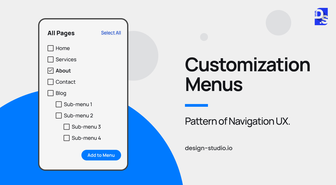
Customisation menus allow users to change their navigation layout by pinning frequent tools, rearranging menus, or hiding unused features.
For example., Notion, Linear, and Figma rely on this pattern to help advanced users streamline and optimize their workspaces.
Important implementation rules:
- Keep customization completely optional and easy to find. Do not pressure new users to design their own menu the moment they sign up.
- Build a sensible default layout that works well for 80% of your audience, placing deeper layout options inside a settings link or a sidebar button.
- Make sure personalized configurations save automatically and stay exactly the same every single time a user logs back in.
Progressive Disclosure Navigation Menus
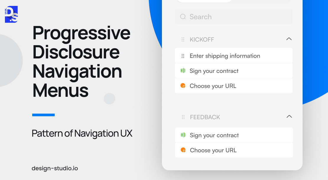
Progressive disclosure navigation organizes the site interface to display important options at the start. It reveals deeper layers only when a user asks for them-preventing users from getting confused by too much information.
For example, you can find this in expandable menus, ‘Advanced’ settings dashboards, and toggleable search filters. Software teams also use it during onboarding to present platform features one clear step at a time instead of all at once.
NN Group research shows that progressive disclosure can help reduce error rates for new users. The concept actually helps experienced users find deeper tools.
This approach keeps the interface clean and reduces cognitive overload. Menus should be designed to expand intuitively and reveal deeper navigation levels only when users need them.
How to Choose the Right Navigation Type and Pattern for Your Website
You need to think like your target users when you select the right navigation type and pattern for your website. You must match your design according to content structure, user’s goal, device and screen size and need for user customization.
When you understand what users want at every step of their browsing journey, you can easily tailor navigation as per their pain points.
This is how you can make the right design choice:
- Speed and information retrieval: Search-based navigation is usually the best bet.
- For guiding user for a particular workflow: Breadcrumbs mixed with a workflow-driven layout increases efficiency.
- For accessing different sections at once: Tab-based, task-focused navigation is the most practical design choice.
Here are the four key factors to evaluate:
Content Structure
The way your information is structured determines the most suitable navigation type. If you need to mention heavy data, you have to use hierarchical navigation to stay organized. On the other hand, a simple digital product with clear sections thrive with tab-based navigation.
Intended User Experience (UX)
What kind of experience do you want for your users? For seamless and intuitive experiences, consider tab-based navigation or clear breadcrumbs. If your goal is task completion efficiency, prioritize workflow-based navigation.
Device and Screen Size
How are people opening your platform? Mobile devices have small screens, making hidden hamburger menus or vertical navigation the smartest choice. Desktop layouts have plenty of room, so horizontal navigation bars with dropdown menus offer the best visibility.
Customization
Do you want your users to change their own layout and customize as per their needs? If so, add customisation menus and allow them reorganize the menu shortcuts to match their daily workflows. This can boost both productivity and overall satisfaction.
Final Take
A well-designed navigation system not only keeps users happy and engaged but also serves as a strong foundation for adding features and content without overwhelming users.
As a leading UI UX design agency, we ensure your product thrives as it grows, providing a seamless user experience that adapts to changing user needs and preferences. And that is why at Design Studio UI UX, we prioritize navigation UX in every project.
It is not a one-time decision. Designing is an ongoing process that every feature must constantly adapt as the functions of digital products and users grow.
Whether you are testing the design feature for accessibility or a picking navigation type and pattern, the goal should be very clear, that is helping users reach their goals with zero frustration.