


SaaS Onboarding UX: Best Practices, Patterns & Examples (2026)



SaaS Onboarding UX Summary
SaaS onboarding is the guided journey that helps new users understand your product, reach value, and build habits. Strong SaaS Onboarding UX focuses on a clear “Aha!” moment, fast time to value, simple signup, and helpful in-product guidance instead of noisy tours. When you define activation events, measure them, and keep removing friction, onboarding stops being a one-time setup screen and becomes a reliable growth engine.
Why SaaS Onboarding Growth Really Starts
Most SaaS teams work hard on acquisition. Ads, content, sales calls, demos. Then a new user signs up, lands on a busy dashboard, feels lost, and quietly closes the tab.
You rarely hear from those users. No ticket. No complaint. Just silent churn.
This article is here to stop that. It will walk through SaaS onboarding best practices, simple UX patterns, analytics ideas, and a practical checklist you can hand to your team.
The focus is very direct: help product leads, founders, and marketing owners design onboarding that feels clear, honest, and fast, so new users actually experience value and want to come back.
Think of it as a calm, step-by-step guide you can read today and apply tomorrow.
SaaS Onboarding UX Design Best Practices
Onboarding is the first touchpoint, but it’s just one part of the full SaaS UX journey. The dashboard, pricing page, and retention flows are equally critical. We’ve covered all of it in our SaaS UX design guide.
This section is your practical playbook. Each best practice stands alone, but together they create a smooth journey for new users.
Simplify Signup And Access

Signup is often the first point of friction. If it feels heavy or unclear, users leave before they even see your product.
Helpful patterns:
- Ask only for the minimum info you truly need to start.
- Use SSO options so users can sign in with Google, Microsoft, or similar accounts.
- Delay non-essential questions, such as team size or role, until after the first session.
- Where possible, let users explore the product before strict verification.
Think of the sign-up screen as a light door, not a security interview. The sooner users get into a working interface, the faster they can experience value.
You can still support compliance and security later with clear microcopy, proper flows, and a gentle reminder system.
Accelerate Time To Value (TTV)

Once users are in, the clock starts ticking. If they do not see a concrete benefit within the first few minutes, attention drifts.
To shrink time to value:
- Use a welcome screen that restates the promise in everyday language and points to a first task.
- Avoid dropping people into an empty dashboard with no guidance.
- Preload sample data, example projects, or templates so they can see what “good” looks like.
- Remove steps that do not directly support the first core outcome.
Ask yourself a simple question: “If a new user only gives us ten minutes, what can we do to prove that we are worth a second visit?” Then design your first run flow around that answer.
Personalize Onboarding Flows

Different users arrive with different goals. A founder setting up billing has a different mental model from a marketer setting up campaigns.
You can personalise without building a huge decision tree:
- Ask one or two smart questions at the start, such as “What do you want to do first?” or “What best describes your role?”
- Adjust copy, examples, and suggested templates based on that choice.
- Use behaviour to refine paths over time. If someone never opens the “Integrations” section, do not push integration prompts too early.
Even light segmentation can make SaaS Onboarding UX feel more human. Users see that the product “recognises” their context and does not waste time on irrelevant steps.
Use Progress Indicators And Interactive Checklists

People like to see progress. It gives a sense of control and reduces anxiety.
Effective patterns include:
- A simple progress bar during setup that shows “Step 2 of 5”.
- A checklist on the dashboard with clear items like “Create first project”, “Invite your team”, “Connect one integration”.
- Checkmarks and small celebrations when items are completed.
Keep checklists short and focused on activation, not administration. Five strong steps are better than fifteen weak ones.
Interactive checklists also help teams onboard new members later. A new hire can simply follow the same steps, with less hand-holding from a manager.
Contextual Guidance And Micro Learning

Long product tours are often skipped or forgotten. Most people just want to do their job, not watch a slide show.
Contextual guidance works better:
- Tooltips that appear the first time a user hovers over a complex control.
- Small inline hints near confusing fields, written in clear, friendly language.
- Short micro tutorials or animations for key flows, available on demand rather than forced at login.
Here, UX writing best practices really matter. Use short sentences, everyday words, and focus on what the user gets, not what the feature does. SaaS Design Trends emphasise contextual education over long product tours to reduce cognitive overload during onboarding. One helpful line at the right time beats a whole page of technical text.
Track And Measure Onboarding Metrics

You cannot improve what you never measure. For onboarding, a simple set of metrics goes a long way:
- Sign-up completion rate.
- Percentage of new users who reach activation events.
- Time from sign-up to first key action.
- Completion rate for any guided onboarding flow.
- Early retention, such as day 7 and day 30 activity.
Use these metrics in regular product reviews. When numbers dip, treat onboarding like any other growth project. Run small experiments, measure outcomes, iterate.
This is where conversion rate optimization (UX) thinking blends with product design. Each screen, form, and message is an opportunity to help more users reach value and stay.
Accessibility, Localization, And Edge Case Handling

Onboarding should work well for users in different locations, with different abilities, and on different devices.
Some practical steps:
- Use good contrast, sensible font sizes, and clear focus states.
- Support screen readers and keyboard navigation where possible.
- Adjust date formats, currency, and examples for different regions.
- Handle slow networks and timeouts with gentle messages, not confusing errors.
Treat accessibility and localization as part of your core SaaS landing page design and product flows, not as an afterthought. It is both a user experience win and a business opportunity, because it opens doors in markets competitors may overlook. These saas website design examples show how inclusive onboarding and localization directly improve adoption across global markets.
Avoid Onboarding Mistakes

Sometimes it is easier to start with what not to do. Common issues include:
- Asking for a full profile, payment details, and team info before showing any value.
- Forcing new users through a long tour that does not match their goals.
- Leaving “dead ends” where the user finishes a step and has no clear next action.
- Forgetting to follow up with users who stall halfway through.
Treat these as bugs, not preferences. When you spot them, log them, fix them, and re-measure.
Why SaaS Onboarding UX Matters
Onboarding is not only about “teaching features”. It is about moving a stranger from curiosity to confidence.
If onboarding works well:
- New users reach their first meaningful outcome quickly.
- Support tickets about “how do I start” go down.
- Trials convert at a higher rate.
- Customers stick around long enough to explore deeper value.
If onboarding fails:
- A big slice of new signups never returns after day one.
- Your paid acquisition becomes more expensive than it looks.
- Sales have to over-explain simple things.
- Product teams are tempted to add more features instead of fixing the first run.
Good SaaS Onboarding UX connects marketing promise with in-product reality. Your website says, “We help you close deals faster”. Onboarding should show that outcome in the first session, not in week three.
Business Outcomes: Activation, Retention, LTV
Three big business outcomes sit behind onboarding:
- Activation
A user completes one or more key actions that prove serious intent. For example, “imports contacts”, “creates a first project”, or “sends a first campaign”. - Retention
Activated users return and keep using the product. Onboarding shapes whether they build a habit or only try things once. - Lifetime Value (LTV)
Customers who activate and stay are more likely to upgrade, expand, and refer others.
If activation is weak, you feel it in retention and LTV. Fixing onboarding is often cheaper and faster than buying more traffic, because you are making better use of people already at your door.
Types Of SaaS Onboarding
Not all SaaS products need the same approach. Broadly, you will see three patterns:
- Self-serve Onboarding
Users discover, sign up, and start using the product without talking to sales. This needs very strong in-product guidance and clear, simple flows. - Enterprise Or White Glove Onboarding
Larger accounts get a customer success manager, an implementation plan, and training calls. The interface still matters, but humans carry part of the weight. - Hybrid Onboarding
Most modern products land here. Users start self-serve, and higher value accounts get a human layer on top when needed.
When you design onboarding, keep this model in mind. The same product can support all three, but the core flows need to work for self-serve first. That is where SaaS design principles such as clarity, consistency, and feedback really show their value.
Define Your “Aha!” Moment And Activation Events
You cannot fix onboarding if you do not know what success looks like for a new user.
The “Aha!” moment is when the user first feels real value from your product. It is that small internal click that says, “Oh, this actually helps me”.
Examples:
- In a CRM, it might be seeing a clean pipeline with real deals.
- In a project management tool, it might be viewing tasks for the week and knowing what to do next.
- In a marketing platform, it might be sending a campaign and seeing first opens.
Activation events are the measurable steps that lead to that moment. They sit in your product analytics and can be tracked session by session.
How To Map Activation Events
Here is a simple way to map activation with your team:
- List your best customers
Pick a group of customers who have stayed for many months and use the product actively. - Look at their first few weeks
Ask what they did in the first 7 to 30 days. Did they import data, invite teammates, connect integrations, or publish something? - Pick 1 to 3 activation events
Choose a small set of actions that appear again and again before long-term retention. For example, “created 3 projects and invited 2 teammates”. - Connect these to onboarding flows
Design your SaaS Onboarding Design so that the first sessions gently push users toward those actions. That might include templates, prompts, and checklists. - Instrument and review
Add events. Watch funnels. See how many users reach each activation step today.
This becomes your north star. The goal of onboarding is no longer “show them everything”. The goal is “guide them to these key actions as smoothly as possible”.
Example: Activation Mapping For A Project Management SaaS
Imagine a project management tool aimed at small teams.
You might find that your healthiest customers:
- Create at least one project in the first session.
- Add ten or more tasks.
- Invite at least one collaborator.
- Complete one task within the first 48 hours.
From this, your activation definition could be “project created, ten tasks added, one collaborator invited, one task completed”.
Now you can shape onboarding around that:
- The welcome screen suggests creating a project with a simple starter template.
- The first view helps users add tasks in bulk rather than one by one.
- A friendly nudge encourages them to invite a teammate.
- The interface highlights the “complete” action with a small visual reward.
Suddenly, onboarding is not random. It is intentionally pushing users to feel “I am organised now, this tool works” as early as possible.
Core UX Principles For SaaS Onboarding
Beneath the patterns and screens, a few principles keep everything aligned. These principles also sit nicely with general SaaS design principles for digital products.
Reduce Friction
Friction is any extra step, question, or decision that slows the user down.
To reduce it:
- Remove or delay fields that are not essential for the first session.
- Explain why you ask for sensitive details such as payment info or permissions.
- Use defaults that make sense, so users can accept and move on.
- Avoid making people jump between browser tabs or tools during setup.
A good rule of thumb is simple: if a step does not directly support the first meaningful outcome, question whether it belongs in onboarding at all.
Progressive Disclosure And Contextual Help
Not everything needs to be visible at once. In fact, showing too much can hide the important things.
Progressive disclosure looks like this:
- Show basic controls and common paths upfront.
- Reveal advanced settings when users ask for them or reach a certain level of usage.
- Offer inline help icons that expand when clicked, instead of long static help pages.
Contextual help also means matching the help to the moment. A short note beside a complex checkbox can save more time than a twenty-page guide hidden in a footer.
Personalization And Segmentation
We touched on this earlier, but it is core enough to repeat. The more you can tailor onboarding to user type, the more relevant and efficient it feels.
Ideas to explore:
- Role-based flows. A manager sees team setup guidance, and an individual contributor sees personal task setup.
- Industry-specific examples and templates.
- Different messaging for free, trial, and paid plans.
Back this up with simple UX research methods such as interviews and usability tests. Watch real people go through onboarding and note where they look confused or bored. That insight is gold.
Tactical Patterns And Design Solutions
Now, let us move closer to the screen. These are patterns you can sketch, prototype, and test with your team.
Welcome Screens And Value First Messaging

The welcome screen is your handshake.
It should:
- Confirm that the user is in the right place.
- Restate your value in one sentence.
- Show a simple path forward, such as “Start setup” or “Create your first project”.
Avoid packing this screen with five different CTAs. One clear action is easier to follow. You can also echo elements from your marketing site, so the transition from browser to app feels natural.
Checklist And Progress Indicators
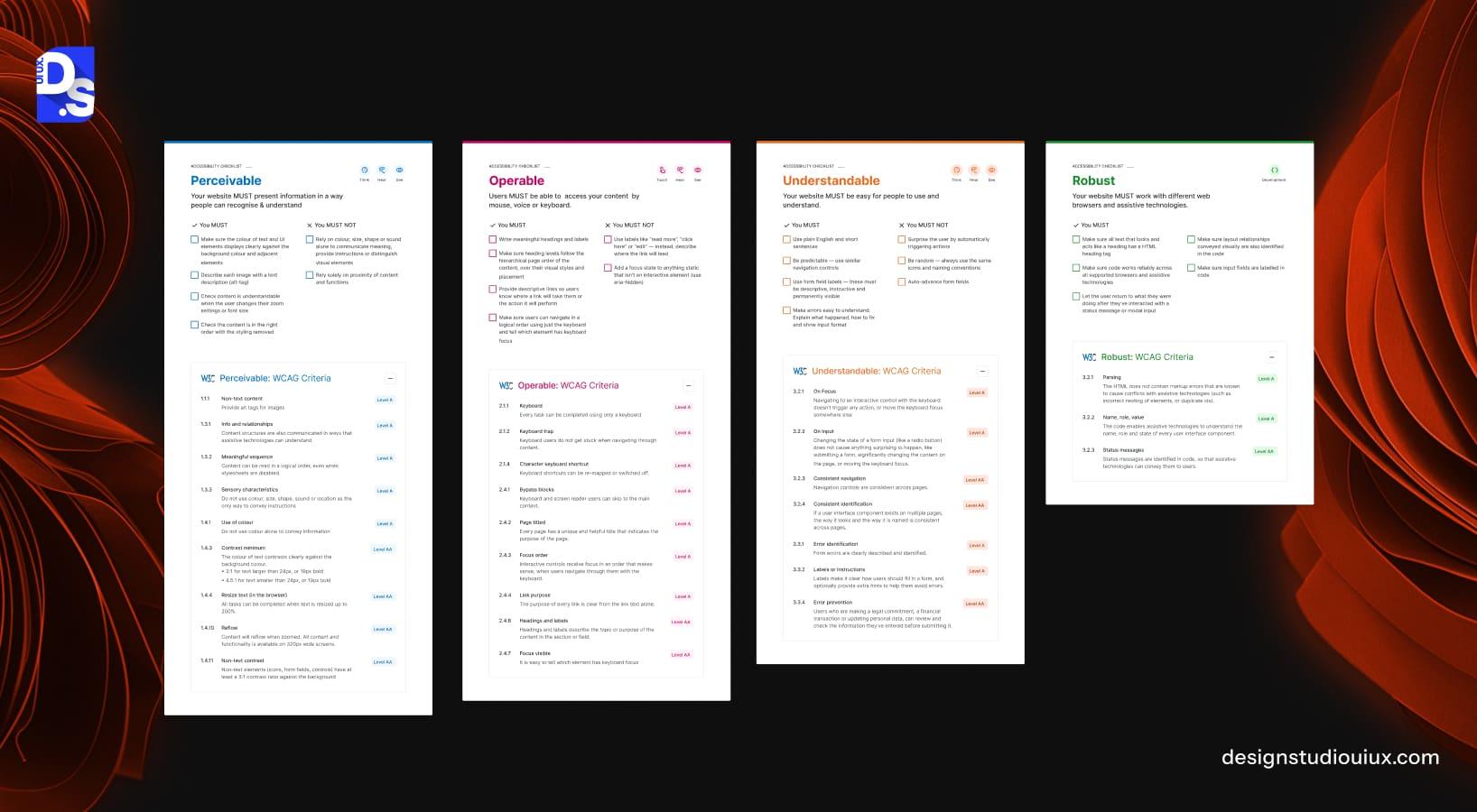
We already talked about checklists, but here is how to design them well:
- Keep them visible on the main dashboard.
- Link each item directly to the screen where that action happens.
- Show small, satisfying feedback when items are completed.
You can also show an estimated time for the whole list, for example, “About five minutes to finish setup”. This helps busy users decide to complete it now instead of postponing.
Interactive Product Tours Versus Lightweight Micro Learning
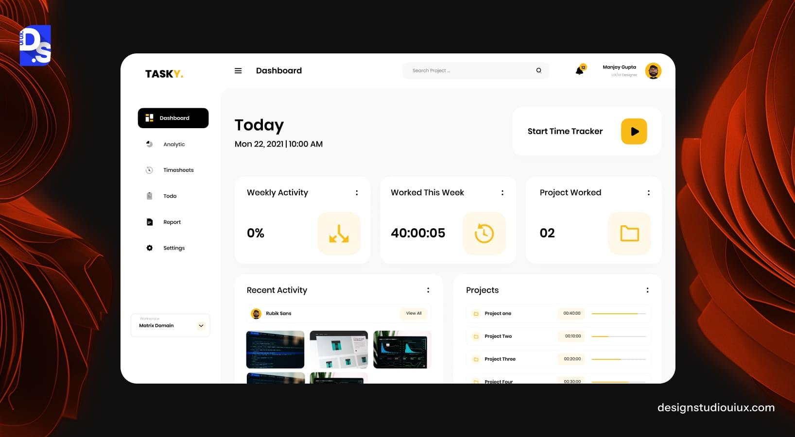
Some products benefit from guided tours. Others feel better when users can explore and learn at their own pace.
You do not have to pick one forever. Instead:
- Use interactive tours for complex or risky workflows where mistakes are costly.
- Use lightweight micro learning, like small tips and optional overlays, for everyday actions.
On mobile, be extra careful about screen space and gesture patterns. Bring in mobile app onboarding best practices so that swipes, taps, and gestures feel natural rather than forced. Short, focused coaching screens often work better than long sequences on a small device.
Templates And Pre-Built Content
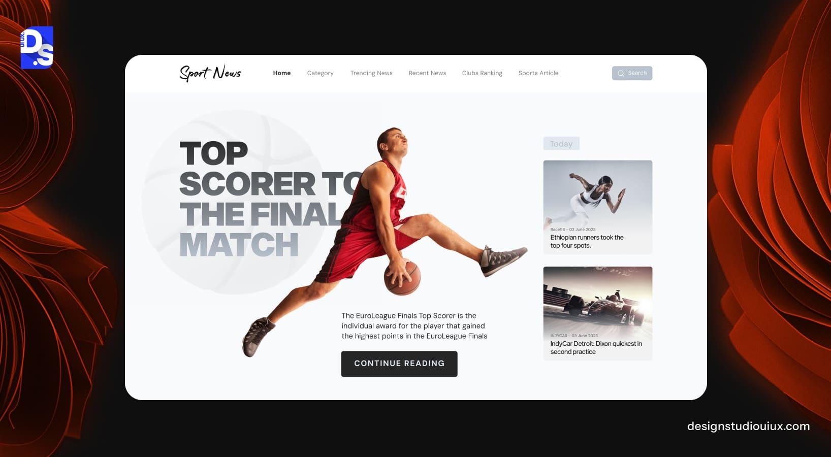
Nothing kills motivation quite like a blank screen.
Templates help users see the product “in motion”:
- Provide starter projects, boards, or documents based on common use cases.
- Pre-fill them with realistic but fake data.
- Let users either edit these directly or create new items based on the templates.
Mention your downloadable onboarding checklist here as well. For example, you can add a card on the dashboard that says “New here? Download the onboarding checklist we use with our clients” and link to a simple PDF.
You might even showcase this in a UI/UX design case study to show how templates, checklists, and personalised paths helped improve activation for a particular product.
Inside your own content library, you can support this section with posts such as “ux-design-tips-to-load-website-faster” so that engineers and designers remember performance is also a key part of the onboarding experience.
Do this now:
- Write down your main “Aha!” moment and activation events.
- Review your sign-up screen and remove one non-essential field.
- Sketch a five-step onboarding checklist tied to those activation events.
- Add one short tooltip to your most confusing feature.
- Watch three recent sessions from new users and note where they get stuck.
- Plan one small experiment to improve time to value next month.
Analytics, Experimentation, And Measurement
Onboarding is not a one-time project. It is an ongoing experiment.
Key Metrics For SaaS Onboarding
Core metrics to track include:
- Activation rate.
- Time to first key action.
- Completion rate for key onboarding flows.
- Early retention, such as day 7 and day 30.
- Feature adoption for your most important features.
Keep these numbers in a visible place, not buried in a report. When you ship a change, check how these metrics move. Over time, you will see which patterns and messages actually help people succeed.
Tools And Event Taxonomy
You do not need a huge tool stack, but you do need a clean structure for events.
Simple event names could be:
- signed_up
- onboarding_step_completed
- project_created
- integration_connected
- teammate_invited
- task_completed
Pair this with funnels, segments, and cohorts so you can see how different user types behave. Then involve both the product and marketing teams, so experiments cover messaging and interface together.
Accessibility, Internationalization, And Edge Cases
As your product grows, onboarding must scale across markets, roles, and connection types.
Inclusive Language, RTL, Network Constraints
Support more people by:
- Using simple, inclusive language in all onboarding copy.
- Handling right-to-left layouts properly where needed.
- Designing for slow or unstable connections with loading states and retries.
- Avoiding heavy assets on first-run screens, especially on mobile.
Good SaaS Onboarding UX respects that not everyone sits on a fast desktop connection with perfect English. When you design for the edges, the core experience becomes cleaner for everyone.
Support For Low-Skill Users And Enterprise Complexity
One group of users might be new to tools like yours. Another group might be part of a large enterprise rollout.
Make room for both:
- Offer a “quick start” path for simple setups and a “guided setup” path for more complex teams.
- Give admins dedicated views and guides for inviting users, setting permissions, and connecting systems.
- Provide training material and live help for enterprise customers who need structured rollout plans.
Here, ongoing research and observation pay off. Over time, you can align your onboarding with how real teams learn, not just how you imagine they learn.
Common Mistakes And How To Avoid Them
A few mistakes show up again and again in SaaS onboarding. The good news is that each one is fixable.
- Overloaded first session
Trying to showcase every feature at once. Instead, focus on one clear path to the first win. - Unclear value
Users see buttons and charts but do not understand what outcome they are moving toward. Bring your value statement into the product, not only the website. - No next step
Screens that say “Done” with no suggestion for what to do next. Always signpost the next meaningful action. - No measurement
Onboarding flows are shipped once and then forgotten. Put someone in charge of onboarding metrics and make improvements part of regular planning.
Tie these fixes back to your own list of SaaS Onboarding Best Practices so new team members learn them quickly.
SaaS Onboarding Case Studies And Examples
Stories make ideas easier to remember. Here are a few brief examples inspired by well-known saas ux design patterns.
Notion Style: Templates And Calm First Run
Imagine a workspace app that greets users with a small set of templates like “Personal tasks”, “Team projects”, and “Knowledge base”. Instead of forcing a tour, the app invites users to pick a template and start editing.
This approach removes the fear of the blank page and gets people typing notes within seconds. The onboarding feels calm, flexible, and respectful of different work styles.
Asana Style: Role-Based Checklists
Think of a project tool that asks “How are you planning to use this?” with options like “Marketing”, “Product”, and “Operations”. It then loads example projects matched to that choice and shows a short checklist.
Managers see prompts about creating projects and assigning tasks. Individual contributors see prompts about updating their own tasks. One product, multiple paths, each tuned to user goals.
HubSpot Style: Hybrid Guidance
Picture a marketing platform that supports both small teams and large companies. Small teams get self-serve onboarding with helpful tooltips and starter campaigns. Larger accounts get a customer success partner who walks them through a structured plan.
In both cases, in-product UX does part of the job, and human support fills the gaps. This is a good model if your pricing spans many customer sizes. SaaS pricing page design practices recommend aligning onboarding depth with pricing tiers to reduce friction for SMB and enterprise users.
SaaS Onboarding Implementation Checklist
Here is a simple checklist you can turn into a downloadable PDF for your own readers and leads. It can become your shared reference for SaaS Onboarding Design work.
- Define your primary “Aha!” moment.
- Choose 1 to 3 activation events and instrument them.
- Simplify the signup to the minimum number of fields.
- Create a welcome screen with one clear primary action.
- Add a short onboarding checklist to your main dashboard.
- Provide at least one meaningful starter template for core use cases.
- Implement key onboarding metrics in your analytics tool.
- Review recent new user sessions each week.
- Add contextual tips to your three most confusing features.
- Plan one onboarding experiment every month and document results.
- Share learnings with product, marketing, and support so everyone aligns.
Offer this checklist as a PDF download on your blog or inside the app. It works nicely as a simple lead magnet for product teams and founders.
Ready to Improve Your Onboarding? Here’s the Next Move
If your current onboarding feels noisy, unclear, or simply too slow, the best next step is a focused review rather than another feature release. A structured UX review will reveal missing steps, confusing messages, and hidden friction. Leading SaaS Design Companies can help with this.
As a UI and UX partner, we combine UX audit services, onboarding strategy, and detailed interface design so your product feels intuitive right from the first click.
Reach out to us at Design Studio UI/UX, a leading UI/UX design agency specialising in digital product experiences, to review your flows and build an onboarding journey that lifts activation, retention, and long-term revenue.



