


SaaS Pricing Page Design: 12 Best Practices & Examples



Quick Summary
A good SaaS pricing page earns trust the moment users land. With clear layout, transparent pricing, and subtle psychology like anchoring and loss aversion, it helps people choose fast and confidently—turning what could feel like a sales wall into an honest, conversion-driving part of the SaaS experience.
Pricing pages can make or break a SaaS funnel, which is why nailing the SaaS pricing page design best practices matters from the moment a user first glances at it. Prospects land, skim for a few seconds, and decide whether to start a trial, book a demo, or bounce.
The struggle is familiar: getting pricing “just right” is not only about numbers; design and UX do much of the heavy lifting. Poor pricing UX creates drop-offs, confusion, and mistrust.
In this guide, you will see what actually converts: clear patterns, helpful psychology, and practical tweaks your team can ship this quarter. If you need expert help designing conversion-focused pricing pages, A SaaS website design agency can help you craft layouts that boost free-to-paid signups.
Why SaaS Pricing Page Design Matters
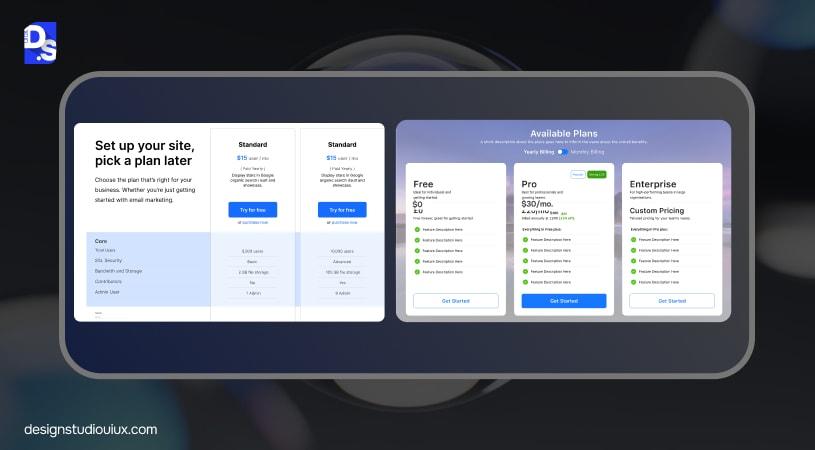
A pricing page shapes perceived value and trust within seconds. Most visitors decide in under ten seconds if they will explore further. That micro-moment influences core metrics: sign-ups, free trials, and demo bookings. Clean layout lowers cognitive load. Strong microcopy answers unspoken fears.
An interactive SaaS pricing page design shaped by evolving SaaS design trends – uses toggles, accordions, sticky CTAs, and clear comparison cues, keeps momentum. Psychology does the quiet work too: anchoring, contrast, and loss aversion nudge choices without tricks.
Modern SaaS product design treats every customer touchpoint as part of the product experience. Treat pricing as a product surface. Design it, test it, and iterate with the same care you give the app. When teams maintain pricing like a living feature, conversion rates stabilize and upgrade paths become predictable.
Your pricing page doesn’t exist in isolation; it’s one of the most psychologically loaded moments in the entire SaaS user journey, shaped by what users experienced in your onboarding flow and how clearly your value proposition was communicated before they got here. Our SaaS UX design guidelines covers how the pricing page connects to every other touchpoint in the full SaaS UX lifecycle.
12 SaaS Pricing Page Design Best Practices
1. Keep Pricing Clear And Transparent
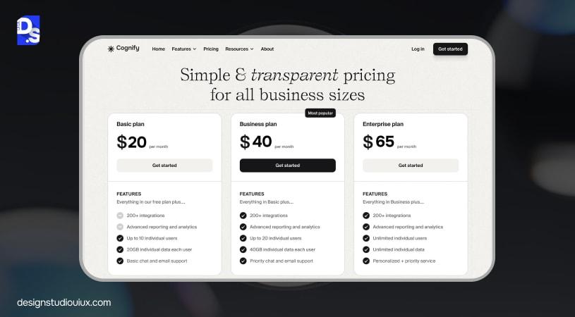
Show the headline price plainly. Do not hide set-up fees, usage thresholds, or per-seat rules. Place a concise “What is included” list beneath each tier so no one hunts for essentials. If metered usage applies, show the unit rate in simple language.
Clarity is not only ethical; it is commercial. Transparent pricing reduces support tickets, shortens sales cycles, and lifts paid conversion because buyers understand value at a glance. Think transparent pricing like Notion or Trello: simple numbers, plain labels, and no surprises at checkout. If you change pricing, add a “grandfathered plan” note so existing customers feel secure.
2. Use Strong Visual Hierarchy
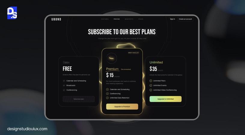
Guide the eye with a single “Recommended” plan, which is one of the foundational SaaS pricing page best practices. Use color, soft shadows, or a tasteful badge, and keep cards the same size to avoid pushiness. Maintain a clean rhythm: plan name, short benefit line, price, key features, and one primary CTA.
Hierarchy should also govern spacing and typography—larger type for plan names, medium for the price, small for features. Align currency symbols and decimals so prices are scannable. Figma’s clear highlight on its professional tier is a good model. When hierarchy is strong, scanning feels effortless and decisions feel safe.
3. Simplify Comparison Tables
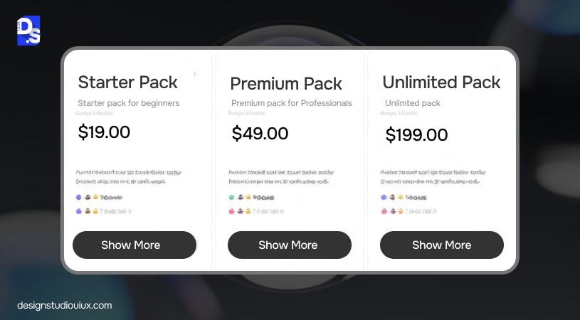
Tables should clarify, not overwhelm. Keep differentiators to the top five or six. Move edge-case details into collapsible rows. Label features in everyday language rather than product jargon. Repeat CTAs at the bottom of long tables so users can act without scrolling back.
Consider progressive disclosure. Start with a summary line such as “Unlimited projects” or “Advanced permissions”. If a term requires context, add a small info icon with a one-sentence tooltip. Slack’s grid is a solid reference: crisp, minimal, and scannable. The aim is to help someone choose in under two minutes without contacting support.
4. Add Social Proof Near Pricing
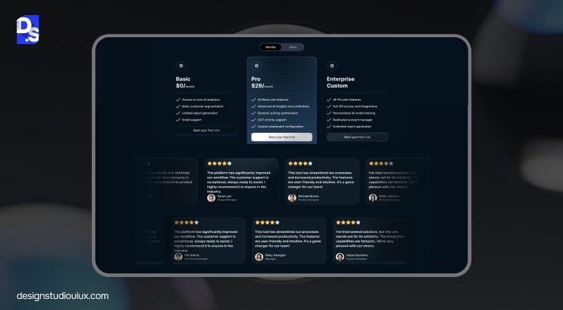
Place trust signals exactly where decisions happen. Add recognizable client logos, one-line testimonials, star ratings, compliance badges, or G2 quotes near the plan cards.
A simple “Trusted by 10,000+ teams” carries more weight beside the price than in a distant case study. Social proof at the decision point reduces doubt and shortens the time to click. Prioritize proof that maps to each plan. For example, besides the “Business” tier, show a testimonial about SSO and audit logs rather than a generic quote about nice support.
5. Optimize CTA Copy And Placement
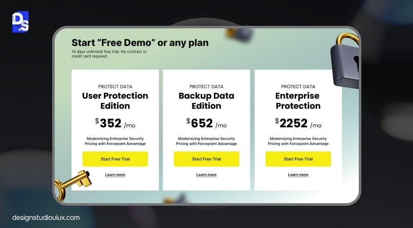
Use direct, action-oriented copy: “Start free trial”, “Book demo”, “Upgrade now”. Keep button styles and colors consistent across the page so users always recognize the primary action.
A persistent CTA on scroll, like Intercom’s, prevents dead ends. Pair each CTA with a micro-reassurance line under the button, for example, “No credit card required” or “Takes 2 minutes”. Test first-person variants such as “Start my trial” if your tone of voice supports it. Small copy shifts can move big numbers, so test them. For deeper guidance, follow CTA design best practices to ensure buttons drive immediate action.
6. Prioritize Simplicity And Scannability
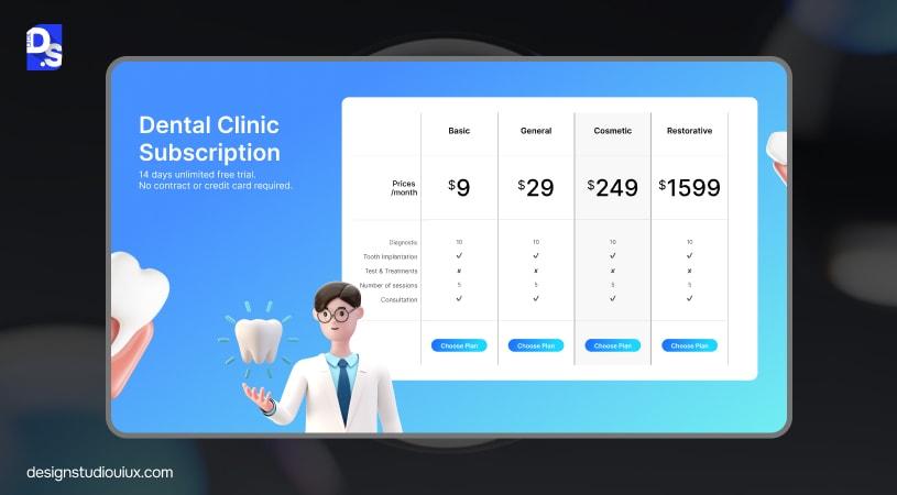
Keep the design calm. Use whitespace generously, avoid visual clutter, and resist pop-ups or auto-playing video in the pricing flow. Lead with the plans; tuck deeper info, such as security, integrations, and legal, into accordions below the fold.
Simple pages get read. Busy pages get skimmed and skipped. One headline promise, one price, one benefit line, one CTA. Everything else goes lower. If you feel tempted to add more, ask what the prospect must know to choose now, and move the rest to tooltips or the FAQ.
7. Offer A Free Trial Or Money-Back Guarantee
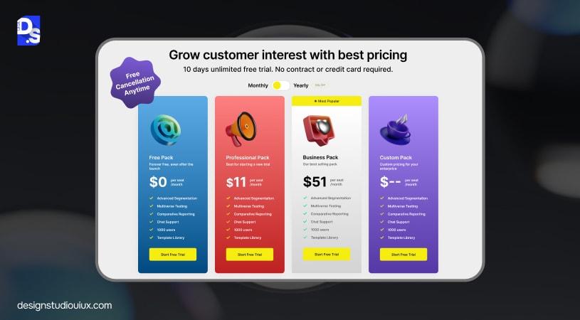
Reduce risk. Trials allow hands-on evaluation; guarantees reduce fear for annual commitments. Badges like “Cancel any time” or “No credit card required” calm objections. If you operate usage-based pricing, consider a capped free tier so teams can feel the value before they commit. Make end dates and trial limits explicit to avoid surprise churn.
If you serve both self-serve and sales-assisted motion, use a short trial for self-serve and a guided trial for larger accounts. Clarify what happens at the trial’s end. If accounts downgrade automatically, say so near the CTA. If they convert automatically, send reminders, and show the future invoice value clearly.
8. Ensure Mobile-First Responsiveness
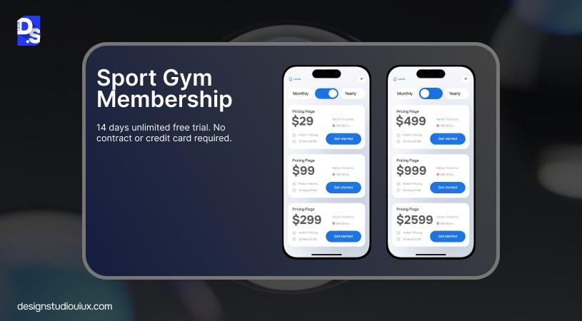
Assume half your traffic is on phones—stack cards vertically with generous spacing. Enlarge toggles and ensure touch targets meet accessibility sizes. Keep CTAs thumb-reachable. Consider sticky headers or footers so the primary action never disappears.
Test the full path on real devices, from pricing to sign-up to confirmation, and verify performance as well as visuals. Compress images, lazy-load secondary graphics, and avoid heavy animations that hinder scroll. Mobile visitors are often in research mode; make it effortless to email themselves the plan or copy the link with selected options applied.
9. Use Localization and Currency Personalization
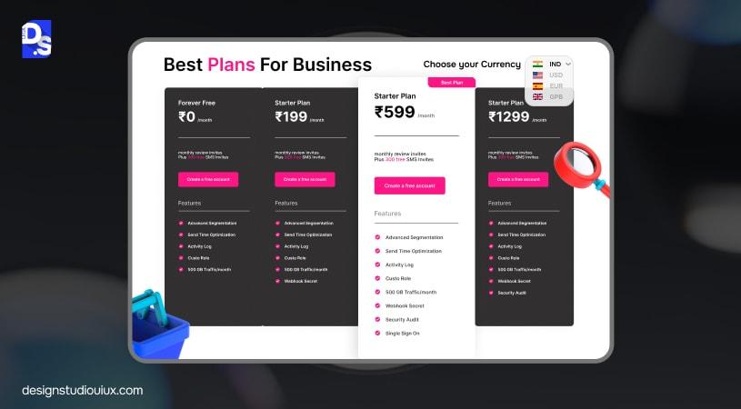
Display prices in the visitor’s local currency and clarify VAT or GST where required. Make billing cadence explicit, for example, “Billed annually, save 20 percent”. Provide a currency switcher for global teams and remember to localize date and number formats. Local feels trustworthy; unexpected currency at checkout erodes confidence.
If you sell region-specific bundles, state the differences without creating new plan names for every market. Keep plan architecture stable and overlay currency, tax, and compliance notes. This approach shares code, reduces confusion, and prevents version sprawl.
10. Add Interactive Plan Toggles
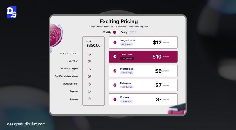
Offer a Monthly versus Annual toggle that updates the price and highlights savings, such as “Save 25 percent yearly”. For usage-scaled tiers, a simple slider can update seats, contacts, or messages and show price changes in real time. HubSpot’s pricing toggle is a reliable benchmark: obvious, fast, and reversible. Interactivity should clarify, not distract.
If you include a usage slider, pair it with a small “Most teams pick 10–25 seats” nudge to anchor expectations. Save the state to the URL so teams can share the exact configuration with colleagues or procurement without re-selecting options.
11. Leverage Visual Storytelling
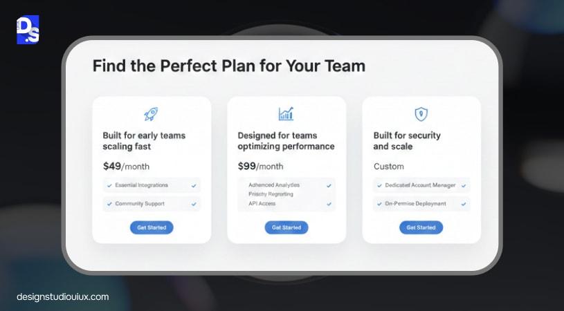
Pair each plan with a short, benefit-driven descriptor and purposeful icons. For example: “Startup plan, built for early teams scaling fast.” Use product imagery that shows outcomes, such as a dashboard with highlighted metrics.
Apply principles from SaaS landing page design to make your pricing hero more persuasive. Let visuals reinforce value rather than decorate the page. For instance, a small animation that shows a workflow unlocked by the higher tier can say more than a long feature list. Keep animations subtle and CPU-light so mobile users are not penalized.
12. Include An FAQ Section Below Pricing
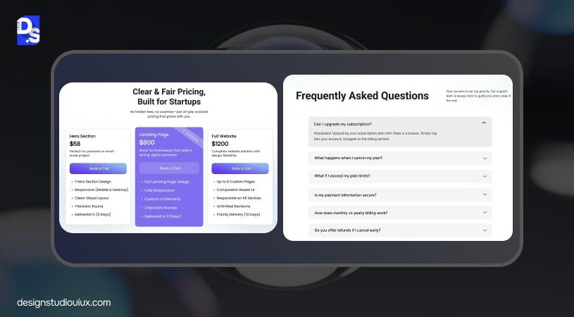
Handle objections on the page. Cover billing cadence, upgrades and downgrades, refunds, security basics, and data export. Use accordions for readability and add the FAQ schema for SEO. Keep answers short, specific, and jargon-free. Visitors should not need to leave the pricing page to feel confident.
Include at least one answer that explains how to downgrade without losing data. The ability to leave safely increases the willingness to try. It sounds counterintuitive, yet confidence in exit reduces fear of entry.
Content discipline matters. Unrelated keyword clusters dilute intent and trust.
Real World SaaS Pricing Page Examples
Looking for SaaS pricing page examples you can borrow from today? Start with these leaders and note the specific patterns that make choosing fast and low-friction.
1. Notion
Notion presents simple, transparent tiers with tidy “what is included” notes and clear toggles. The benefit lines match real jobs to be done, so users map themselves to a plan quickly.
2. Slack
Slack shows a strong hierarchy and a focused comparison grid highlighting fundamental differences rather than long lists. The labels are crisp and the CTAs remain visible, which helps teams move from exploration to purchase without friction.
3. Ahrefs
Ahrefs pairs credibility signals near price with straightforward explanations of limits and add-ons. The mix of authority and clarity reassures buyers who compare SEO tools closely.
4. Figma
Figma keeps design minimal while gently highlighting the recommended plan, supported by concise benefit copy. The visual rhythm helps new users choose while giving experts enough detail to validate the decision.
Bring screenshots into your review deck. Annotate what aids scanning, what builds reassurance, and what you will test next. For a broader context on how product and marketing align around outcomes, review a SaaS app design case study and observe how interface tone matches pricing promises.
Psychological Principles Behind SaaS Pricing Page Design
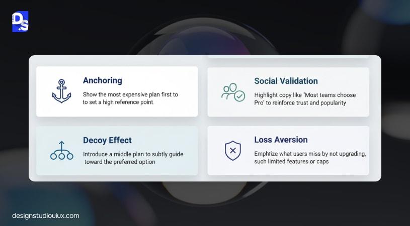
Anchoring sets expectations. These patterns sit at the heart of SaaS pricing strategy, UX, and shape choices in seconds. Anchoring sets expectations; showing the most comprehensive plan first establishes a value benchmark, so cheaper tiers feel like savings rather than compromises.
The decoy effect guides choice by placing a mid-tier plan next to a weaker sibling, making the preferred plan look clearly better value. Social validation reassures with lines such as “Most teams choose Pro,” tapping herd instincts without pressure.
Loss aversion is powerful; instead of saying “Pro includes SSO”, spell out what a user loses by not upgrading: “Without Pro, SSO and audit logs are unavailable”. Frame trade-offs honestly. People make better choices when the consequences of staying small are clear. These UX triggers work best when backed by a holistic SaaS UX design guide approach that keeps persuasion ethical and user-centered.
A/B Testing And Optimization
Treat pricing as a living system. Test CTA copy, plan order, compare SaaS pricing page CRO, the location of testimonials, and trial length. Explore sticky versus static CTAs. Experiment with toggles that default to annual if that fits user preference.
Use Hotjar or similar tools for scroll-depth, click maps, and hesitation analysis; rely on VWO or your testing stack for controlled experiments. Instrument the whole journey, impressions, card clicks, sign-ups, activation, and paid conversion, so you optimize for revenue, not just button clicks.
Before larger releases, run a structured pre-launch review using a thorough UX audit checklist to catch avoidable friction. Keep the testing ritual simple and repeatable: define a hypothesis, set a success metric, run to significance, double-check the data, publish a short summary, and commit the learning to your component library. Momentum beats sporadic big bangs. A small win every fortnight compounds faster than a speculative overhaul each quarter.
Common SaaS Pricing Page Mistakes To Avoid
Too many plans cause pricing page UX mistakes; aim for three or four. No value differentiation leaves users comparing on price alone, which slows decisions and increases churn. Hidden fees or vague “from” pricing erode trust.
Unclear microcopy leaves buyers guessing about seats, usage caps, or billing cadence.
Ignoring mobile creates silent leaks.
Burying answers to security or data export questions forces users to leave the page.
Distracting pop-ups near the pricing cards usually harm conversion more than they help. When in doubt, remove and retest. The simplest page that answers the most objections wins.
Conclusion
Clarity converts. Psychology steers. Testing proves. High-performing pricing pages are calm, honest, and easy to act on: precise numbers, noticeable differences, ethical nudges, mobile-first execution, and ongoing experiments. Leading SaaS website design agencies apply these principles consistently. Evaluate your page against these SaaS pricing page design best practices today.
If you are planning a larger overhaul, follow a website redesign checklist for B2B & SaaS to protect both SEO and conversion. Want to redesign your SaaS pricing page with evidence-backed UX and a realistic 90-day plan? Contact Design Studio UI/UX for a free UX consultation.
FAQs
What makes a good SaaS pricing page design?

A great pricing page is transparent, easy to scan, and centered on trust: clear value, concise feature differences, and strong CTAs supported by social proof.
How many plans should a SaaS product have?
Three to four is ideal. More causes confusion; fewer limit flexibility. Highlight one “best value” plan to guide choice.
Should I include a free trial?
Yes, where feasible. Trials reduce friction and often improve trial-to-paid conversion, especially with low-touch products.
How do I improve SaaS pricing page conversions?
Simplify layout, add social proof near price, test CTA copy and placement, and use ethical psychology such as anchoring and loss aversion.
What are the biggest SaaS pricing page mistakes?
Hidden costs, weak hierarchy, unclear value differences, neglecting mobile optimization, and burying answers to billing or security objections.









