



Mobile App Onboarding: 11 Best Practices & Examples (2026)



How do the top apps use strategic mobile app onboarding design to maintain high retention? We dissect high-performing onboarding UX patterns to definitively answer that question.
First impressions decide retention in apps. The average app loses 77% of its users within 3 days of installation. “We don’t deserve uninstallation” – their first few moments with most users fail to make that critical impression.
That first tap, first few screens, first scroll – that First-Time User Experience (FTUE) is what either hooks or loses most users. That’s why SaaS onboarding UX focuses heavily on early activation and time-to-value.
Design teams majorly rely on core Mobile App Design Principles to structure these early interactions so users immediately understand how the app works and why it matters.
To ‘onboard’ a user is to successfully convert them from a curious downloader to an impressed user. It is to educate users on why the app is worthy of a permanent place on their phones without overwhelming them.
TL;DR – Mobile Onboarding UX Best Practices
- Good onboarding improves retention – apps lose 77% users in 3 days without FTUE.
- Follow best practices: minimal steps, early value, personalization, optional sign-up.
- Duolingo, Blinkist & Headspace show great onboarding examples.
- Track Day 1 & Day 7 retention to measure success.
- Use these strategies to boost app retention & create engaging onboarding flows.
What Is Mobile App Onboarding UX?
Mobile onboarding UX design is the strategic design of a new user’s first journey in an app. It aims to:
- Educate users on the app’s value.
- Activate users by encouraging key interactions.
- Retain users by delivering a smooth First Time User Experience (FTUE).
The goal of this design is to guide them from the app’s launch to the point where they understand and appreciate the app’s core value.
It is to deliver a strong First-Time User Experience (FTUE) and set the right tone for the relationship between the user and the app.
There are several types of onboarding, each suited for different apps and goals:
Types of Mobile App Onboarding
Basic Introduction
A few simple screens that highlight the app’s primary value proposition without being overwhelming.
Progressive Onboarding
Here, the onboarding UX reveals features and information gradually as the user navigates the app – it’s an effective way of reducing cognitive load in onboarding and encouraging users to learn at their own pace through natural discovery.
Interactive Onboarding
Learning by doing, not reading: this approach only progresses users to the next step in the onboarding flow after they complete specific action/s.
Value-Focused Onboarding
Here, the onboarding screens clearly lay out what immediate benefits the app will deliver, even before explaining the app’s features or asking for too many interactions.
All four of these types of onboarding can fail. Drop-off patterns in high-churning apps reveal that these failures usually happen because their onboarding UX design makes users:
- Feel confused about the app’s purpose.
- Get frustrated by a complicated sign-up process.
- Feel overwhelmed by too many feature explanations at once.
- Fail to see any immediate value.
Ambitious app makers want to avoid these outcomes at all costs. That’s why they religiously follow and learn from mobile onboarding UX best practices & examples.
Why Effective Onboarding UX Matters?
Onboarding is your app’s “first date” with users. Done well, it guides them from “What is this?” to “I get it!” in under 60 seconds. Done poorly, and they will abandon your app even faster.
Studying recent mobile user behavior insights will make this pretty obvious. Their average attention span is just 47 seconds. Modern mobile app users are basically goldfish with thumbs. If a freshly downloaded app does not pique their interest and demonstrate some value within that timeframe, it will most likely get deleted.
Designing the perfect FTUE is now more important than ever. Once your app makes the right first-time impression and you improve onboarding conversion rates, it will have a cascading effect on its other metrics, like:
- Monthly retention rate
- Overall trial-to-subscription conversion
- Annual churn reduction rate
Users who complete one core action (for instance, taking the first ride on Uber) right during onboarding are way more likely to become long-term users. But creating action-driving onboarding UX patterns requires making many strategic design choices.
You have to share the right information at the right time by learning everything about creating effective microcopy in onboarding. You need to share the right trust indicators alongside the info. Also, you have to ensure all design elements load fast. Here are 11 mobile onboarding UX best practices. Follow these practices to get the onboarding recipe right.
11 Mobile Onboarding UX Best Practices
- Keep Onboarding Minimal and Purposeful
- Highlight Core Value Early
- Use Visual Cues and Animations
- Self-Selection & Customization Options
- Keep Sign-up Optional or Seamless
- Progressive Disclosure Instead of Overload
- Show Progress and Success States
- Make Permissions Transparent & Timely
- Offer a Skip or Exit Option
- Reinforce with Microcopy and Feedback
- Personalize the Onboarding Flow
The following proven mobile onboarding UX best practices can help you design attention-securing FTUEs. Each practice comes with real-world examples and practical app UX tips:
1. Keep Onboarding Minimal and Purposeful
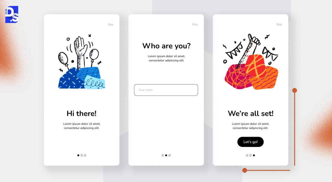
Avoid the temptation to show users everything at once. Guide users to their first “win” as quickly as possible, without too much info-sharing, like Duolingo’s quick intro does.
The app uses a quick, one-screen introduction to swiftly establish the user’s goals. It immediately demonstrates its core value – fun, gamified language learning—before ever asking for an account. Users feel engaged and start learning within seconds.
Use no more than 3 onboarding screens. Each screen should have a singular, clear purpose. It should quickly move the user closer to experiencing the app’s core value. Establishing instant value is especially important for small apps by startups. These apps typically do not have major marketing or user re-targeting for budgets. High-quality UX for startups is their main user acquisition and retention tool.
Designers of such small startup apps must learn from Duolingo’s onboarding design patterns (another small startup app). On that app, we see little info sharing and fast value demonstration: First screen for goal setting (15s) → Second screen for skill test (30s) → Third screen for letting users complete the first lesson (and sharing XP as a reward).
2. Highlight Core Value Early
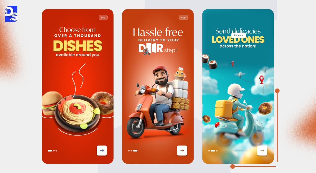
You must communicate your unique value proposition before asking for any commitment, especially a sign-up. Users need a compelling reason to hand over their information. Show them what’s in it for them first. For example, Blinkist showcases its value brilliantly:
- It presents recognizable book covers.
- It clearly communicates its core promise: get key insights in minutes.
- Users can browse the library and see the value before they are prompted to subscribe.
Add similarly short, value-focused user activation steps to your app’s onboarding UX. Also, add a progress preview or a success preview. Do not tell users what they can do. Show them what they’ll achieve. That’s one of the key UX principles.
3. Use Visual Cues and Animations
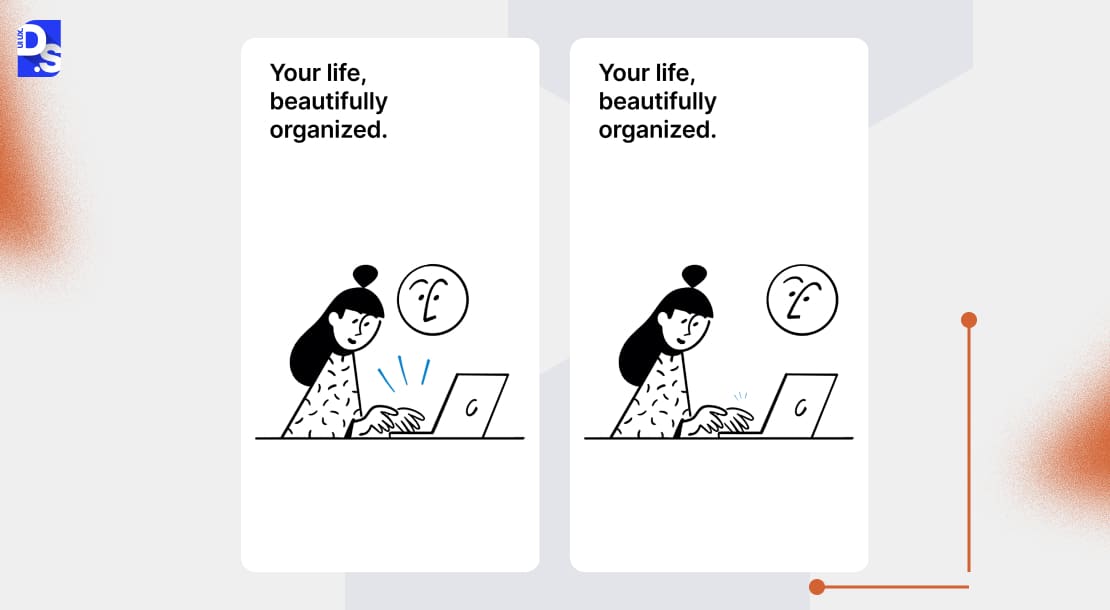
Interactive guidance > static text. Well-placed animations can guide the user’s eye. They can explain complex interactions simply. They can provide delightful feedback.
For example, Notion’s animated onboarding flows use subtle, elegant animations to guide users through the app’s workspace setup. The flow feels smooth, fast-loading, and responsive. Micro-interactions confirm every user action and create a sense of forward momentum.
This is one of the best mobile app design examples of intuitive guidance. Want to replicate it? Opt for subtle motion. Use animations only to clarify your app’s features. Don’t make ’em the center of attention.
4. Self-Selection & Customization Options
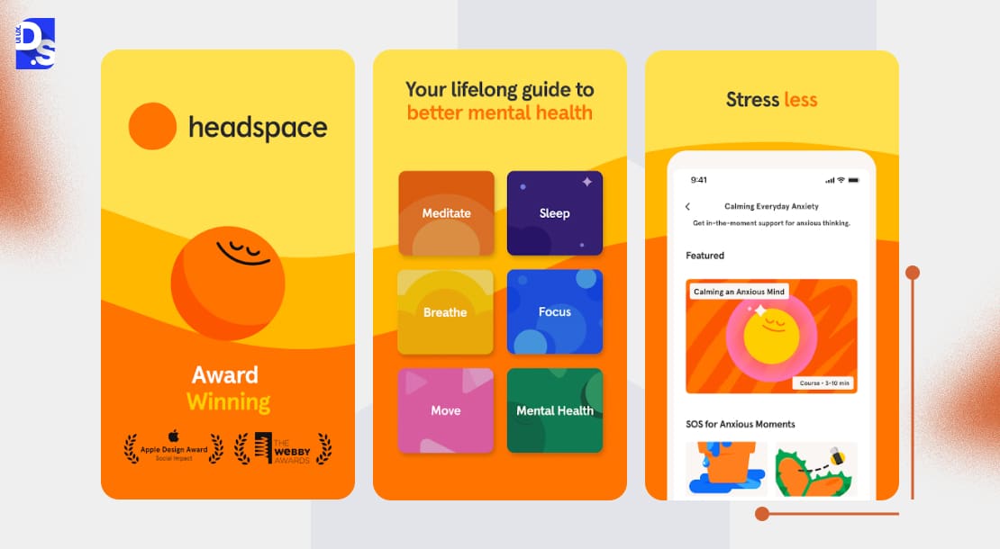
Allow users to tailor their FTUE. Allow them to choose specific goals, needs, or interests right from the start. Personalized onboarding journeys = users feeling invested in the outcome.
For example, in Headspace‘s onboarding, the app asks users to select their goals (such as reducing stress, sleeping better) right away. Self-selection makes the subsequent content recommendations feel incredibly personal. It increases the likelihood of continued engagement.
One of the many benefits of good UX design is that it encourages users to act. You don’t need to spoon-feed your users once the app’s intuitive UX has them going. But it should also allow them to stop whenever they want. Always include a skip/fallback option in the onboarding screens. This prevents users from feeling stuck on specific journeys. It lets them start their journeys all over again.
5. Keep Sign-up Optional or Seamless
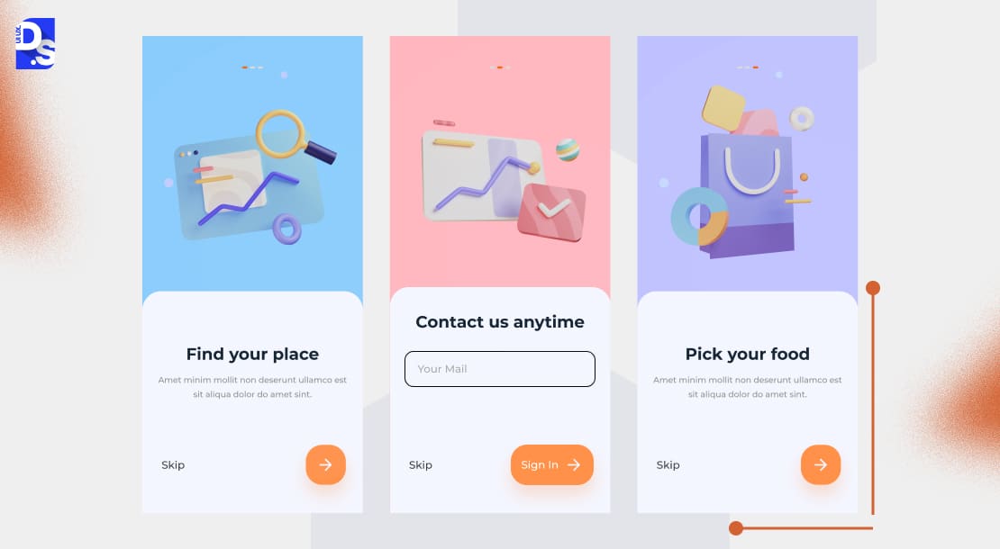
Friction during registration is one of the top causes of user drop-off. Whenever possible, delay the sign-up process. Delay until it is absolutely necessary. Or, make it as seamless as possible, like Instagram does, by offering previews before login.
Instagram and many other social apps allow users to browse a certain amount of content before forcing a login. This “try before you buy” approach demonstrates the platform’s value. It builds user interest and makes the eventual sign-up feel like a natural next step.
Make the signup even more seamless by allowing social sign-in (via Google, Apple, Facebook). Also, offer guest browsing modes.
6. Progressive Disclosure Instead of Overload
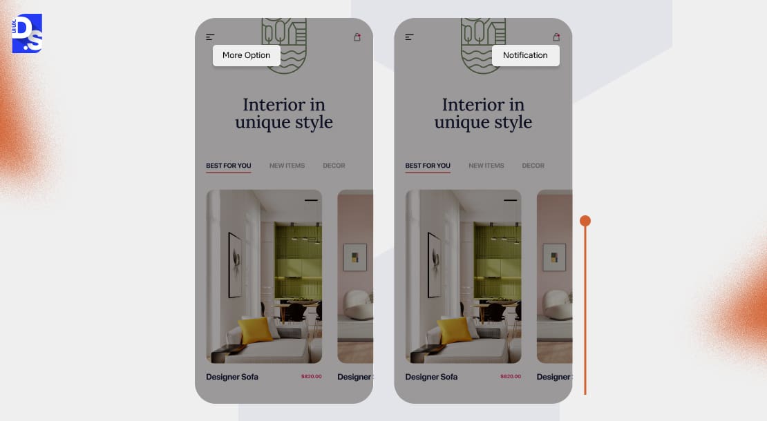
Mobile screens are small. Attention-deficit mobile users are especially prone to information overload. So this practice is one of the essential, non-negotiable mobile design best practices. Always reveal features contextually, over time. Make those features teach users by doing, Canva’s step-by-step editor tooltips:
- Instead of a lengthy tutorial, it provides small, contextual tooltips.
- These tooltips appear exactly when a user might need a particular feature.
- This helps them learn the interface naturally as they create their first design.
Replicate this onboarding example. Show features only when they’re contextually relevant to the user’s current task.
7. Always Show Progress and Success States
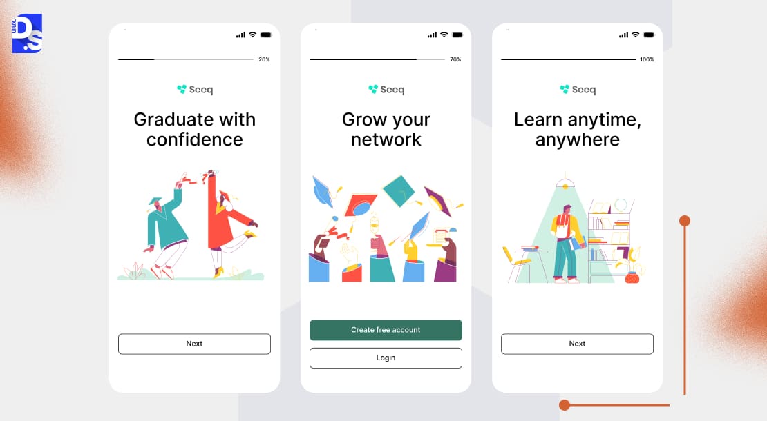
Users need to feel a sense of direction. They need to feel a sense of accomplishment. Progress bars. Checklists. Success messages. These simple onboarding UX elements do those things perfectly. They give feedback that motivates users to complete the onboarding.
Duolingo’s XP bar is a good example of this. A visual XP bar shows users’ learning progress from the start. Completing a lesson is met with a rewarding sound and animation. This positive feedback loop encourages users to keep learning.
8. Make Permissions Transparent & Timely
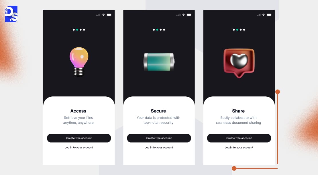
The user’s location. Their contacts. Their camera. Should a brand-new app ask for access to these features during onboarding? Only if it wants to feel invasive, untrustworthy, or unworthy of retention. Apps should never ask for access to these features during onboarding.
They should follow Google Maps‘ lead. This app waits to ask for location access until the user actively tries to find a location or get directions. The request is paired with a clear explanation of
why the permission is needed. The request is made long after onboarding.
Never share a permission request without explaining how it would benefit users. Keep this explanation crisp and clear.
9. Offer a Skip or Exit Option
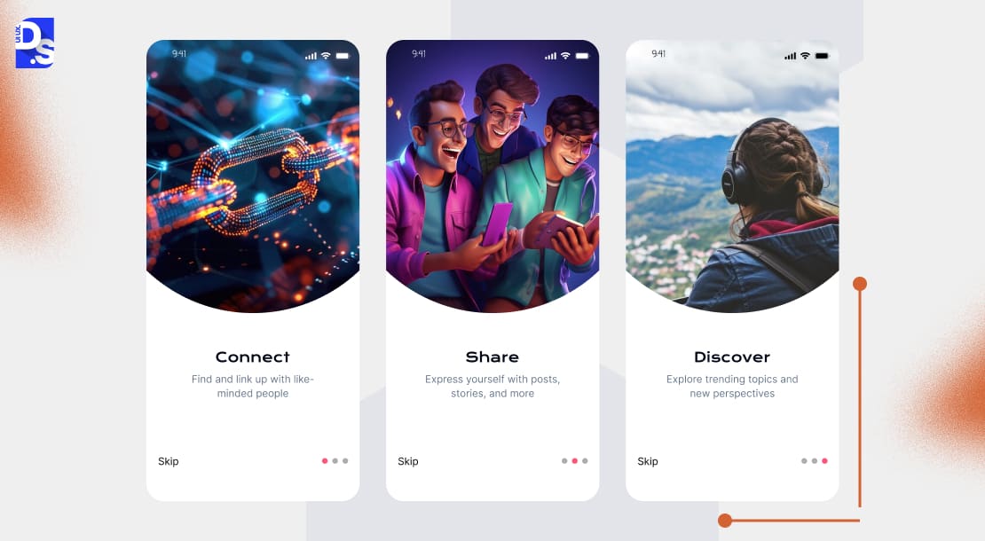
Forcing users through a rigid onboarding flow = instant churn. Always provide an easy way out for impatient users. Let them explore the app on their own terms, like Spotify does.
Spotify allows new users to skip the initial music preference selection and guided setup. It lets new users jump straight into the app’s core features. The app respects the autonomy of users who’d rather search for their favorite artists directly.
An ever-visible “skip” button is a must-have on all onboarding screens.
10. Reinforce with Microcopy and Feedback
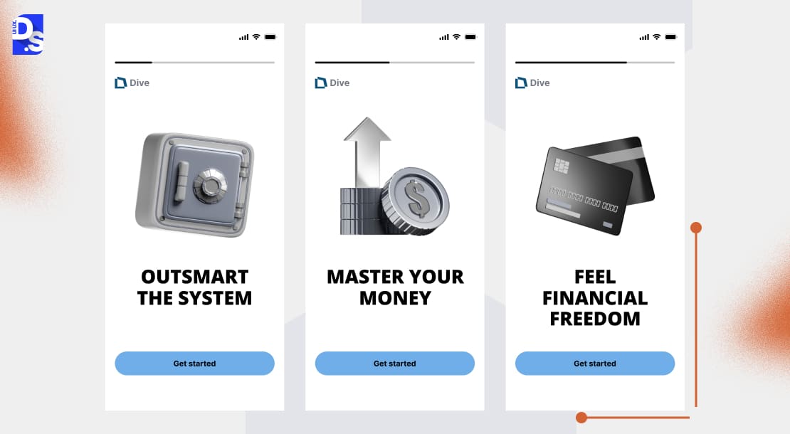
Taps. Swipes. Inputs. They only feel meaningful during onboarding when the app cogently responds to them. This is why UX writing for onboarding screens is so important. Without it, user activation is nearly impossible. With them, your onboarding design patterns can feel alive like we see in Tinder.
Tinder provides immediate and clear feedback for its core swipe gesture. A “Nope” or “Like” stamp appears, confirming the action. When a match occurs, the celebratory screen and “It’s a Match!” message create a powerful moment of positive reinforcement.
“Great! You’re in!” “Try Entering ***” “Go To Settings and Search For ****” “All set!”
Short pieces of microcopy like this add a ton of personality and momentum to the onboarding process.
11. Personalize the Onboarding Flow Based on User Input
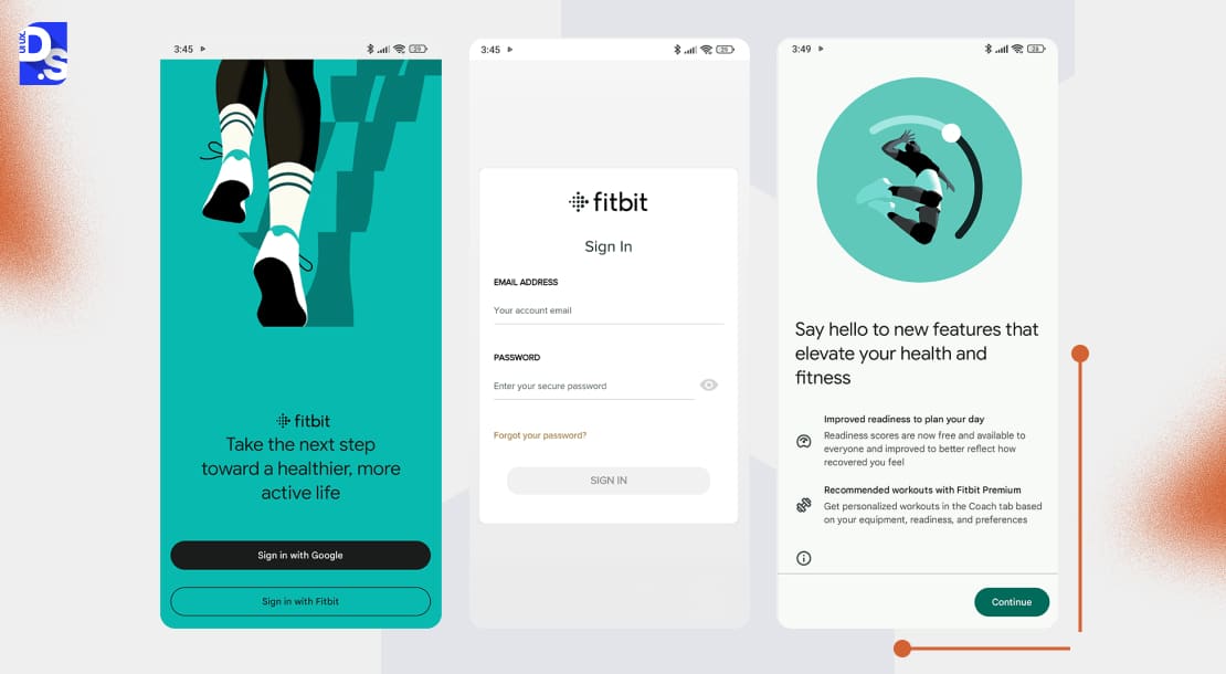
Want to take customization a step further? Use conditional logic to create truly adaptive onboarding UX. By that, we mean that the onboarding flows should change based on the user’s stated goals, preferences, or role.
Fitbit does this well. It asks users about their main fitness goals (track steps, improve sleep, lose weight) during setup. Then, it tailors its onboarding dashboards and initial feature highlights based on that input. A user focused on sleep will see sleep-tracking features prioritized.
Instant relevance – that is what this next-level personalization creates. And, more relevance = more retention. This practice is a bit complex. So, make it the last item on your onboarding UX checklist. First, use conditional logic in your onboarding screens to create just two different paths for two different user segments. Slowly add more conditions and paths.
Real Examples of Great Mobile Onboarding UX
Here’s a quick comparison of how some of the top apps implement these best practices:
| App Name | Onboarding UX Patterns Used | What Works | Suggested Improvement |
| Duolingo | Progressive steps,Gamification | Highly motivationalGamification makes onboarding more engagingMakes learning feel like a game (the app’s USP) from the start | The skip option could be made more visible for users who want to bypass the initial placement test |
| Calm | Visual storytelling | Serene visuals and calming audio create a strong emotional engagement | Not personalized enoughIntroductory tips can feel a bit repetitive for returning users |
| Slack | Value first, then sign up | CTAs are clearValue is demonstrated upfront | Needs more animation to guide users through creating their first channels |
Metrics to Measure Onboarding Success
You have just redesigned your app’s onboarding flows using these industry best practices. It looks sleek. Minimal screens. Subtle animations. A frictionless sign-up. But without tracking the right metrics, you are still flying blind.
You won’t know if users actually get your app, or if they are quietly uninstalling it while you celebrate the new UI. Here are the metrics you need to track to know what is actually happening:
| Metric | What It Measures | Why It Matters |
|---|---|---|
| Day 1 Retention | % of users returning in 24 hrs | Indicates strong first impression |
| Day 7 Retention | % of users returning in 7 days | Shows early loyalty |
| Time-to-Activation (TTA) | Time to first meaningful action | Lower TTA → Higher retention |
| Drop-off Points | Where users quit onboarding | Identifies UX friction points |
Day 1 and Day 7 Retention
Did your first impression stick? Day 1 retention shows if users returned within 24 hours of onboarding. Day 7? That’s loyalty territory. It proves that your app has earned a permanent home screen spot. If Day 1 is strong but Day 7 crashes, users liked the onboarding but found no ongoing value in the app.
Time-to-Activation (TTA)
This measures the seconds between an app’s launch and the user’s first meaningful in-app action. And by meaningful in-app action, we don’t mean just tapping “Next. ” We are talking actions like:
- Sending a message (Slack)
- Booking a ride (Uber)
- Completing a lesson (Duolingo)
If TTA > 1 minute, drop-off spikes. Users think, “This takes too long,” and quit. Apps with TTA < 30s see higher Day 30 retention. Why? The app has proven its value before boredom hits.
Drop-off Points in Onboarding Flow
Analyzing where users abandon the onboarding flow is crucial:
- If 60% bail when you request location access, you asked too early (or did not explain why).
- If 80% skip your tutorial, it is either too long or poorly timed.
- A 15% drop on a “swipe tutorial” screen? Maybe users did not feel the swipe worked (you need to add haptic feedback)
The data will reveal what UX design changes you need to make.
A/B Testing Basics for Onboarding
Test 2,3,4, or more versions of the same onboarding elements against each other. See which one performs better:
- Test 1: 3-screen vs. 5-screen flow → Which has higher completion?
- Test 2: “Sign Up” wall at start vs. after value demo → Which converts more?
- Test 3: Tooltip animations vs. static hints → Which reduces support tickets?
Keep testing. Keep refining each onboarding element.
Common Onboarding UX Mistakes to Avoid
Most designers are aware of common UX mistakes that derail their otherwise good designs. Still, they make those mistakes. The same thing happens in onboarding UX design. Here are the mistakes you need to be wary of:
- Long overwhelming walkthroughs
- Asking for too many permissions early
- Forcing sign ups before showing value
- Inconsistent UX or UI between onboarding screens
- Lack of Visual Feedback (dead UI after user taps/swipes)
Mobile Onboarding UX Checklist
Planning to perform a UX audit for mobile onboarding before you implement these practices? Use this checklist as a guide:
- Minimal flow focused on a single goal
- Show value before asking for info
- Add progress bars or checklists
- Personalize onboarding
- Provide skip/exit option
- Ask permissions only when necessary
- Add microcopy & feedback
For similar checklists on auditing/designing other sections of your app, read our mobile app UX design guide.
Conclusion
Want to improve app retention? Then, not following these onboarding best practices is not an option. Nail your FTUE and earn a permanent spot on users’ screens. Keep an eye on mobile app design trends. Never get complacent. Keep refining your app’s onboarding UX based on user data.
Ready to optimize? Save our onboarding checklist now! For more personalized assistance, sign up for professional UX audit services. Or contact Design Studio UI/UX for a UX consultation!
FAQ’s
What is mobile app onboarding in UX design?

It is the process of designing the first real meeting between an app and a new user.
Great onboarding:
- Shows value in under 10 seconds
- Teaches through action
- Builds trust by respecting users’ time and intent
How many steps should a mobile app onboarding flow have?
As few as possible. A banking app (high stakes) might need 4 steps for security setup. A weather app? Just 1 step.
What are the common mistakes in mobile onboarding UX?
5+ intro screens explaining features new users don’t yet care about. Onboarding that looks/feels nothing like the actual app. Asking for contacts/location before proving value. Forcing registration to share the app’s core functionality. These are all opposites of onboarding UX best practices.
What’s the difference between static and progressive onboarding?
Static onboarding = A museum tour. Users passively swipe through pre-packed screens (for instance, “Here, read about 7 features!”).
Progressive onboarding = A hiking guide. It teaches users as they climb. Tooltips appear when they hover over a button. Contextual hints explain features only when first used. It matches how our brain learns – through action.









