

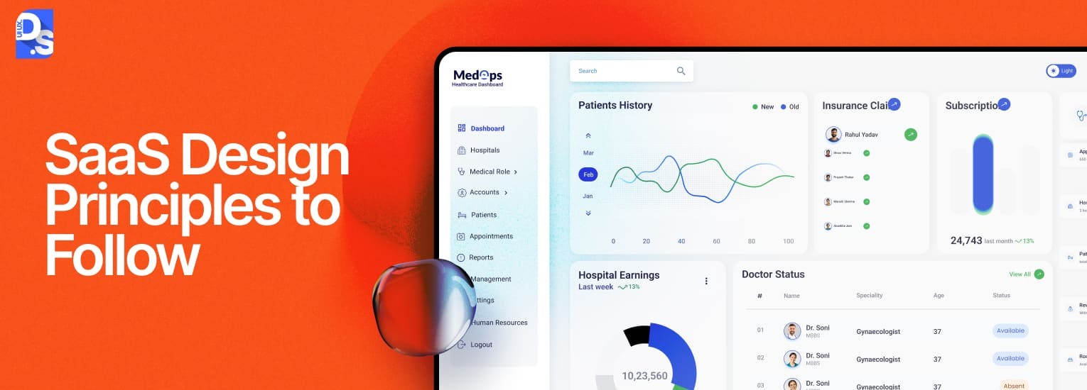
12 Proven SaaS Design Principles for Stronger Product UX



The world of Software-as-a-Service (SaaS) moves fast. What worked yesterday might be table stakes today, and downright obsolete tomorrow. The same applies to SaaS design. Early iterations of this field focused on simply getting features online.
Now it is a sophisticated discipline that blends user empathy with sharp technical awareness, and the same principles can help you craft better SaaS landing page designs too.
And like every evolving, complex field, it is underscored by certain fundamental principles. SaaS design principles are the core tenets, the guiding philosophy that shapes how users interact with and perceive value from cloud-based software.
They are the framework ensuring your SaaS application is not just functional, but intuitive, efficient, and enjoyable to use. Every SaaS product design internalizes these rules.
Ignoring them is a fast track to high churn, ballooning customer acquisition costs, and watching users flock to wiser competitors.
In this blog, we’ll dissect the 12 most important SaaS design principles of 2025. But first, let us learn a bit about the SaaS product design field itself.
12 Essential SaaS Design Principles
Understand why following tried-and-tested SaaS design principles is so important for a SaaS business?
These principles aren’t rules to memorise in isolation; they’re lenses that shape decisions across every stage of the SaaS product design process, from discovery and research right through to onboarding flows and retention UX. If you want to see how these principles play out in a full design workflow, our SaaS UX design guide is the most comprehensive resource we’ve built.
Now, let’s dive into these principles:
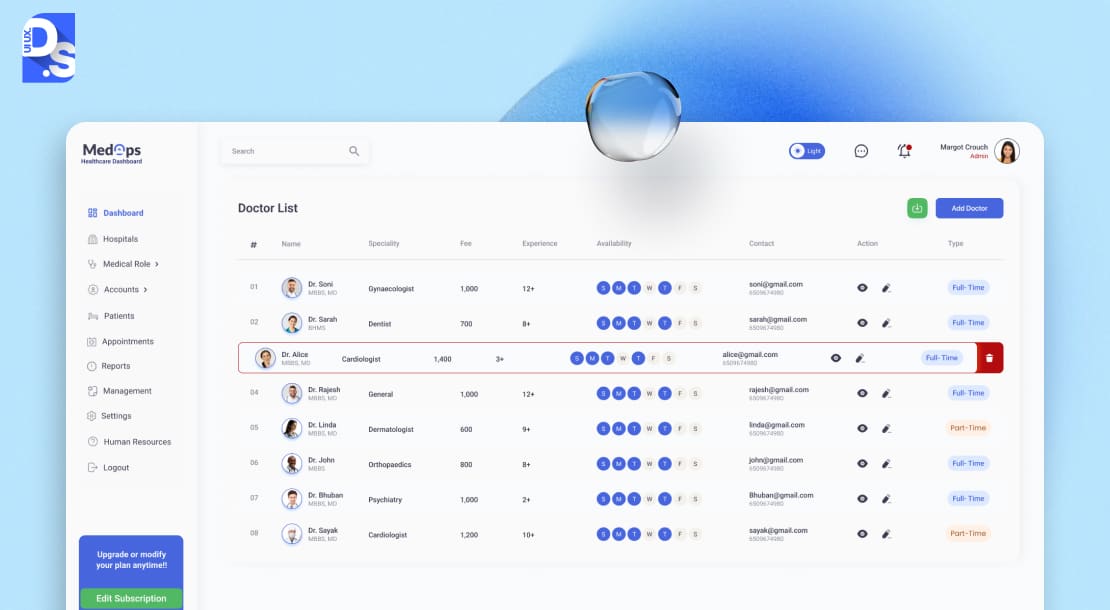
1. Design for Time-to-Value (TTV)
First impressions are everything, especially in SaaS. That’s why this sits at the top of our list.
TTV is all about shrinking the gap between signup and the user experiencing that critical “Aha!” moment – the point where they truly get the value your product offers.
- Because if you lose them here, nothing else matters.
- Initial adoption hinges entirely on rapidly proving worth.
- Users have zero obligation and infinite alternatives; they won’t wait around.
- Prioritizing TTV means relentlessly optimizing those crucial first interactions.
Think about how quickly Slack lets you start messaging colleagues or how Canva presents beautiful templates immediately. To nail this, map the shortest path to core value, strip out non-essential steps, use templates or sample data, and guide users visually towards that first win. The payoff is huge: higher trial conversions, lower onboarding drop-off, and users who are immediately invested.
Neglect TTV, and you bleed signups, face high initial churn, and struggle to gain traction.
2. User Centric, Task Driven Design
Stop building features and start solving problems.
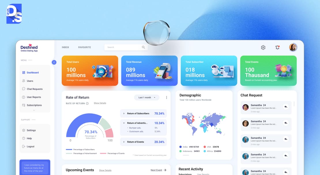
User-centric, task-driven design means prioritizing what your users actually need to accomplish over packing in every conceivable function. It is about understanding their core tasks, the real “jobs-to-be-done,” and making those tasks smooth, intuitive, and efficient.
This principle follows TTV on our list because once users see the initial value, the focus shifts to making their ongoing work effortless. Making their work effortless requires deep user research to identify those crucial workflows and then designing the UI around them. Cutting clutter and optimizing every user path for task completion are also vital steps.
Ignore these steps, and you get bloated, confusing SaaS tool where critical functions are buried and users only ever touch 10% of the features. Tools like Notion excel with this principle by offering only a few user-defined tasks on their flexible interface.
If you want to have a similarly effective SaaS UI, cultivate the discipline to say “no” to features that don’t directly serve primary user goals.
3. Progressive and Adaptive Onboarding
Ditch the overwhelming product tours.
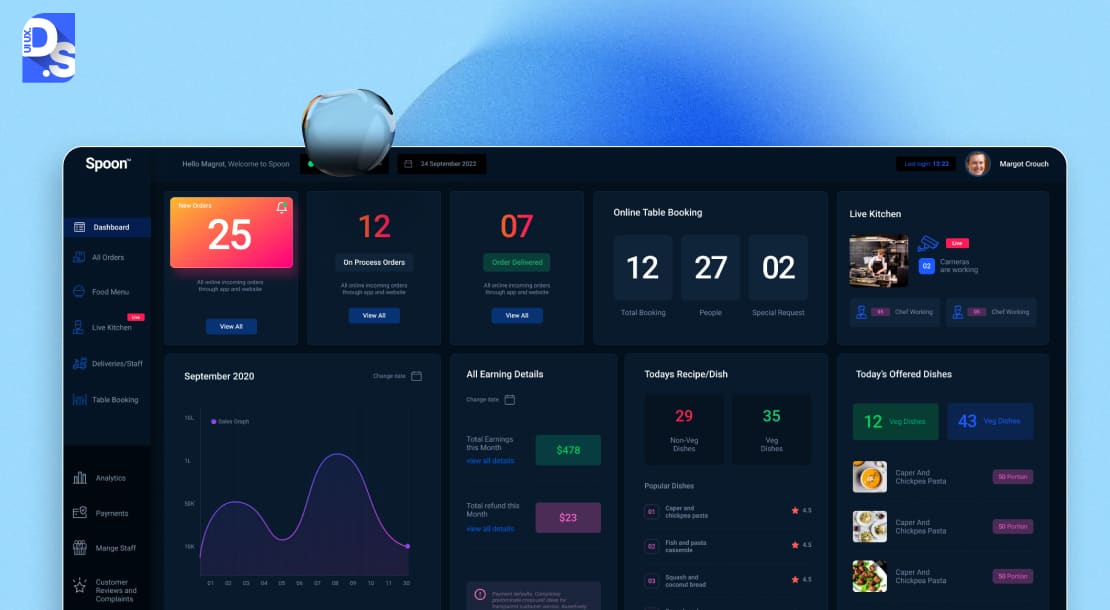
Adopt progressive and adaptive onboarding to teach users as they go. Offer guidance precisely when needed based on their actions, role, or progress.
This principle acknowledges that learning happens best in context, not through a firehose of information upfront. Instead of showing everything at once, introduce features incrementally as users explore or hit specific milestones.
Adaptive elements can tailor this guidance – maybe a team leader using a project management SaaS tool sees different tips than an individual contributor.
The perks of following this principle are clear: better feature discovery, reduced confusion (and support tickets), and users who feel empowered as they master the tool step-by-step. Without it, users face either terrifying complexity or bafflingly empty screens. Both lead to fast abandonment.
To do this well, track user behavior, build contextual help snippets (tooltips, short guides), and trigger them intelligently.
4. Context Aware Interface
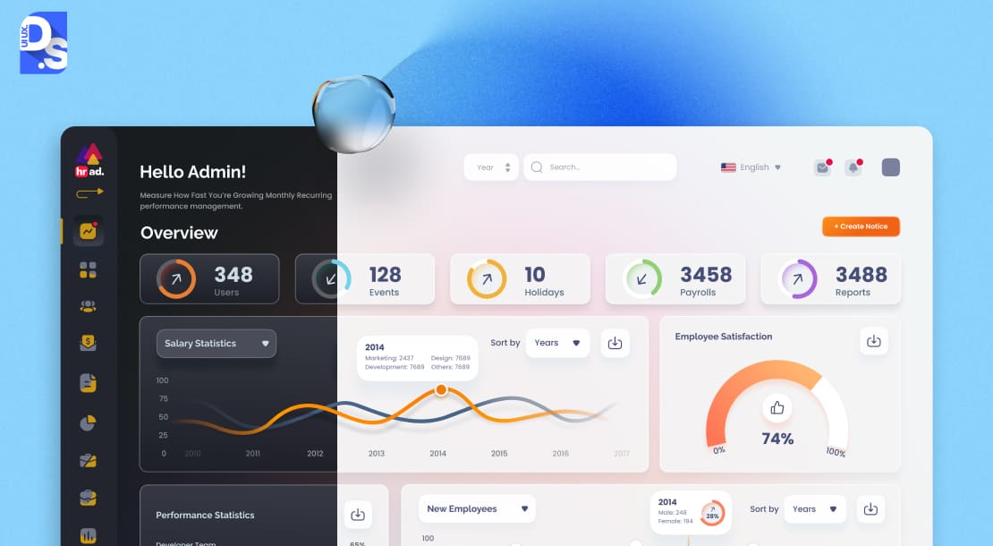
This principle involves designing UIs that intelligently adapt based on who the user is, what they are doing, or their current situation.
It is about personalization that goes beyond just themes, dynamically changing layouts, available actions, or displayed information to be maximally relevant right now. We are talking:
- Showing admin controls only to admins.
- Simplifying the view for new users.
- Surfacing specific tools only when editing a certain type of content.
When SaaS UIs adapt smartly, cognitive load drops, tasks get done faster, and workflows feel incredibly efficient. Users feel that the SaaS app just understands them.
Neglecting context leads to generic, unsmart SaaS UIs where everyone wastes time navigating irrelevant options. Implementation of this principle requires creating:
- Robust user profiles.
- Clear information architecture allowing for variations.
- A careful plan that considers when adaptation adds real value versus just complexity.
5. Consistency Across Devices and Use Cases
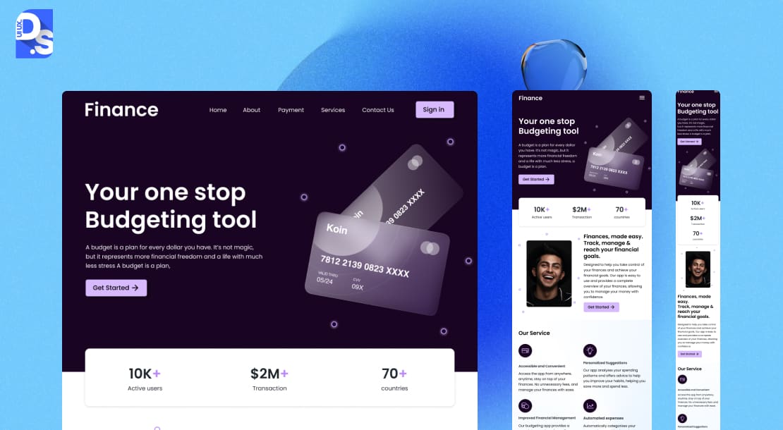
Your SaaS product should feel like your product, whether accessed on a giant monitor or a tiny phone screen, and whether the user is drafting a report or managing settings.
The goal is not creating identical screens everywhere, but always delivering a coherent underlying logic and feel. In today’s multi-device world, following this principle is vital.
The benefits of it are major: higher mobile engagement, reduced learning curves when switching devices, and increased usage because workflows are not interrupted by context shifts.
Users build confidence and muscle memory. Inconsistency, however, breeds frustration, fragments workflows, and makes the product feel disjointed and unprofessional.
To achieve this, you have to create a strong design system, clear pattern libraries, and perform rigorous cross-platform testing.
6. Performance as Part of the UX

Speed is not just a feature in modern-day SaaS product design, it is the primary feature.
This principle embeds this truth into the design process. It mandates treating performance metrics (like Time to Interactive, input latency) as critical UX requirements. It also asks designers to set performance budgets and optimize their designs for speed relentlessly. Implementing this requires:
- Engineers and designers collaborating.
- Setting performance goals early.
- Continuous monitoring.
- Building a culture where performance is every team member’s responsibility.
The near-instant feel of Google Workspace apps or the smooth handling of files in Figma are good sources of inspiration for designers who want to create fast, fluid SaaS interfaces.
7. Built-In Support and Guidance
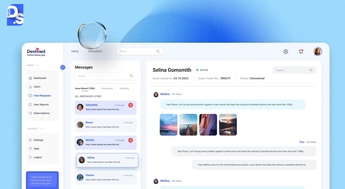
Even the best SaaS designs can hit edge cases or involve complex workflows.
Offering built-in support and making guidance contextual and readily available is the best way to simplify matters. This principle advocates for design features like:
- Tooltips on complex icons.
- Short video tutorials embedded near relevant features.
- Interactive walkthroughs for new sections.
- Creating bite-sized help content.
- Easy access to chat or help docs right within the SaaS app.
Providing help contextually reduces friction, boosts feature adoption (users aren’t afraid to try new things), increases user confidence, and cuts down on support requests.
Intercom excels with targeted in-app messages. Webflow offers brilliant inline documentation as you build.
8. Scalability in Both UI and System Architecture
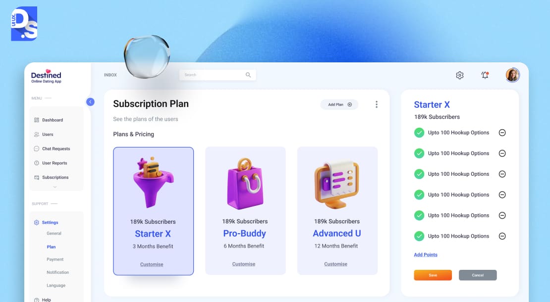
Growth is the goal, but it can break your product if you’re unprepared. Scalability in both UI and system architecture means designing today for the users, data, and features of tomorrow.
This principle talks about the SaaS UI accommodating expansion without becoming a labyrinth. It requires:
- Forward-thinking information architecture.
- Modular UI components built within a robust design system.
- Backend systems designed for increasing complexity and traffic.
- Strategically planned navigation patterns that can grow seamlessly.
- Continuous monitoring of both technical and usability metrics as you grow.
Get this right, and your product can evolve gracefully and add capabilities without disruptive redesigns that alienate users.
Salesforce manages immense feature depth through customizable, modular layouts. GitHub‘s strategically planned navigation adeptly handles vast, growing amounts of information.
9. Lifecycle Centered Design

Users’ needs change dramatically from their first tentative clicks to becoming seasoned power users, team admins, or even potentially dormant accounts you want to re-engage.
Lifecycle-centered design acknowledges this journey and asks UI/UX designers to create distinct, adaptive experiences for
- Novices (simplicity, guidance)
- Experts (efficiency, shortcuts)
- Administrators (control, reporting)
- Inactive users (re-engagement prompts, simplified value props)
This approach optimizes the UX across the entire customer journey, improves onboarding, enables effective administration, and creates pathways back for lapsed users. It also promotes personalization, one of the most important SaaS design trends of our time.
Consider how Miro reveals advanced tools progressively, or how Asana offers different views and controls for team members versus project managers.
10. Design for Collaboration

Modern work is rarely a solo act. This principle encourages designers to go beyond single-user workflows and create features that support teamwork directly in the SaaS experience.
We are talking real-time co-editing, commenting, and @mentions, shared workspaces, activity feeds showing team progress, and clear permission structures for shared assets.
Products designed for collaboration become hubs for team activity. Their ‘stickiness’ and ability to render network effects increase. Teams can move faster, stay aligned, and maintain context within the tool itself, like they do in Figma, Google Docs, or Asana – SaaS tools that thrive on shared visibility and collaboration.
11. Security and Trust by Design
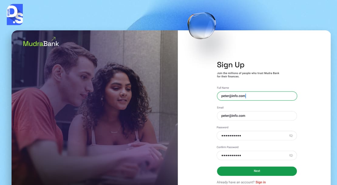
This principle states that security in a SaaS tool needs to be visible and clear to the user. It asks designers to integrate privacy considerations, permission clarity, and data transparency directly into the UI/UX. This includes:
- Prioritizing clarity in security-related UI elements.
- Communicating transparently about data practices.
- Sharing clear indicators of security status (like connection encryption).
- Making controls for sharing and permissions intuitive.
- Sharing transparent explanations of data usage
- Offering easy access to security settings.
Look at how cloud platforms like AWS or Google Cloud provide granular security dashboards. In an era of intensifying cyber threats, building trust through such design choices is paramount.
12. Feedback Loops and Micro-Interactions
The final polish that elevates a SaaS UI from functional to delightful often lies in the details. This principle focuses on those subtle animations, transitions, and visual cues that acknowledge user actions, guide attention, and make the UI feel responsive and alive.
It wraps up our list because it adds a layer of refinement over a well-structured, performant, and usable core.
These small touches provide instant confirmation that the system has received input. They make waiting times feel shorter, prevent errors by guiding users, and contribute to a sense of craftsmanship and quality.
While seemingly minor, their absence can make a SaaS UI feel static or unresponsive. Many leading SaaS tools, like Stripe, use subtle, satisfying micro-interactions to great effect.
What Makes SaaS Product Design Unique?
Designing for SaaS is not like crafting traditional, installable software. Unlike those tools, SaaS products have to operate in real-time, scale effortlessly for thousands, millions, or more users, and rapidly convert strangers into addicts within days (or even hours).
Forget one-time purchases and hefty upfront licenses. SaaS thrives on subscriptions, demanding continuous value delivery month after month. This inherently shifts the design focus towards long-term engagement and immediate perceived benefit.
Users need to feel the value, fast, or they simply stop paying. It is a constant courtship, not a one-off transaction.
The technical features of SaaS apps also lead to many unique design challenges. Most SaaS platforms operate on a multi-tenant architecture. This means one instance serves many customers. It requires elegant design solutions for data privacy, customizable experiences, and granular permissions, all while maintaining a unified core product.
Add the expectation of real-time updates and flawless performance across any device – desktop, tablet, phone – and the complexity multiplies. Users expect to start a task on their laptop and finish it on their mobile during their commute. This demands responsive, adaptive design interfaces that feel native everywhere.
All of these factors converge into specific, high-stakes design challenges like:
- Onboarding New Users Fast: SaaS design must eliminate friction and guide users straight to their “Aha!” moment.
- Retention Over Time: Retaining users requires a design that evolves alongside their needs.
- Scalability and Flexibility: Successful SaaS products grow in users, data, and features; the design must anticipate this. SaaS UIs need scalable navigation, modular components, and information architectures that can expand gracefully.
That’s why, in SaaS, user interface and user experience (UI/UX) design are tightly tied to core business metrics. Get them right (by following principles and SaaS UX best practices), and the numbers follow.
Don’t follow the principles, and you’re constantly fighting bad metrics.
For example, an intuitive, well-designed onboarding process in a SaaS tool reduces friction during trials. It leads to higher conversion rates and lower Customer Acquisition Costs (CAC).
When users effortlessly achieve their goals and consistently discover new value within a SaaS platform, they stick around longer. They upgrade tiers. They add more seats. Thus, superior UI/UX design also translates into longer subscription durations, higher average revenue per customer, and higher Lifetime Value (LTV).
On the other hand, users have little patience for SaaS tools that make their jobs harder. Poor UI/UX design with confusing UIs, performance lags, or clunky workflows leads to high churn.
5 Common SaaS Design Mistakes to Avoid
Even with the best intentions and principles in mind, product teams can stumble. Here are five common SaaS design pitfalls the best SaaS design agencies want you to actively avoid.
Overcomplicating Onboarding
This mistake directly violates Principle #1 (TTV) and #3 (Progressive Onboarding).
Bombarding new users with tutorials, demanding too much setup info upfront, or presenting a complex, feature-packed UI instantly creates cognitive overload and kills motivation.
Users do not need to know everything on day one; they need to achieve something valuable quickly. Keep initial onboarding focused, contextual, and geared towards that first win.
Inconsistent Spacing and Typography
This undermines Principle #5 (Consistency).
Random variations in margins, padding, font sizes, weights, and line heights make a SaaS UI look sloppy, unprofessional, and harder to scan.
A solid design system with defined spacing rules and typographic scales is vital for maintaining coherence and readability across the SaaS app.
Hiding Critical Features Behind Menus
Burying frequently used or core value-driving features deep within nested menus or behind obscure icons violates Principle #2 (Task-Driven Design).
Prioritize key actions, and make them easily accessible in the main UI. Use progressive disclosure thoughtfully. Ensure that primary tasks are always readily available.
Ignoring Mobile/Tablet UI
This mistake violates Principle #5 (Consistency).
Mobile and tablet experiences need to be intentionally designed with adequate touch targets, screen real estate, different usage contexts (on-the-go), and potentially different primary tasks.
Using Trends Over Functionality
Chasing the latest visual trend (like excessive neumorphism, glassmorphism, or overly complex animations) at the expense of usability is a classic mistake.
While following the right SaaS design trends is important, they should never compromise clarity, accessibility, or task efficiency.
Integrating SaaS Design Principles into the Development Process
Knowing SaaS design principles is one thing; weaving those principles into your actual product development lifecycle is where the real magic happens.
Here’s how to operationalize these principles:
Supercharge Design-Dev Collaboration
The old days of designers throwing mockups over the wall to developers are dead. Or at least, they should be. Designers + developers must speak the same language with Figma and Storybook.
Designers live in Figma, crafting interactive prototypes and detailed specs. Developers build UIs with components in Storybook, an open-source tool for developing UI components in isolation. The game-changer is integrating them. Plugins allow designers to see live-coded components from Storybook directly within Figma. This creates a single source of truth.
Designers understand technical constraints earlier, and developers see design intent perfectly. Iteration cycles shrink dramatically when everyone’s looking at the same live element.
Establish a Living Design System
A design system is your product’s DNA, a centralized library of reusable UI components, style guidelines, and documentation. It is fundamental for Principle #5 (Consistency) and #8 (Scalability). So, build your component arsenal. Start with atomic components (buttons, inputs, icons) and build up to more complex molecules (forms, navigation bars, cards).
Each component should have clearly defined variants (primary, secondary, disabled states, sizes) and be configured with auto-layout in Figma to handle dynamic content gracefully.
After creating a comprehensive library that covers 90%+ of your UI needs, embrace the power of tokens:
- Instead of hardcoding hex values (#FF5733) everywhere, define primitive tokens (for instance, brand-red-500: #FF5733).
- Then, use semantic tokens to define usage (for instance, color-background-button-primary: brand-red-500).
- Finally, use component-level tokens might to these (for example, a button component uses color-background-button-primary).
This abstraction makes theming, dark mode, or brand refreshes incredibly efficient. Lastly, create interactive playgrounds where anyone can test components for your design system.
Tools like Zeroheight or Storybook itself are excellent for this.
Wire Up a Continuous User Feedback Loop
Design decisions made in a vacuum are guesses. You need constant input from actual users. Use tools like Hotjar or Pendo to constantly perform short, contextual surveys:
- Ask new users (30-day mark) how likely they are to recommend.
- Ask power users who have adopted advanced features why they like the design.
- Ask team admins similar queries.
Combine quantitative data from your product analytics (Mixpanel, Amplitude) with the qualitative insights from the surveys or session recording tools like Hotjar or FullStory.
See where users rage-click, abandon forms, or hit navigation dead ends. Correlate these with error logs to understand the full picture of user frustration.
Implement a Rigorous Design QA Process
Integrate tools like Axe-Core (from Deque) into your CI/CD pipeline. They can automatically flag issues like insufficient color contrast (violating WCAG 2.1 AA standards) or missing ARIA labels
Use real device cloud platforms like BrowserStack or Sauce Labs to test critical user flows on Android, iOS, Safari, Chrome, Flexbox/Grid, etc.
Learning from the SaaS Product Design Masters: Case Studies in Excellence
Theory is great. But seeing these principles in action is even better. Analyzing successful SaaS products reveals how these design tenets translate into market leadership:
Notion’s Flexibility and Progressive Engagement
Notion’s genius lies in its chameleon-like ability to be whatever the user needs – a doc, a database, a project board. This aligns perfectly with Principle #2, as it molds to countless tasks.
Their onboarding is a masterclass in Principle #3 – you start with simple page creation, and complex features like relational databases are discoverable as you grow.
Their real-time collaboration features and clear sharing demonstrate Principle #10.
Grammarly’s Seamless Assistance and Trust-Building
Grammarly wins by being incredibly helpful without being intrusive. Its near-instant suggestions embody Principle #6 and Principle #12. Corrections often appear before you even finish typing.
Their clear language about data handling and security indicators (like when checking sensitive documents if you use their desktop app or certain integrations) helps promote Principle #11.
Airtable’s Power Meets Approachability
Airtable makes complex database functionality feel surprisingly accessible. Its grid UI is familiar, yet it scales to handle vast amounts of structured data, showcasing Principle #8.
Giving users the ability to create custom views, fields, and automations matches what Principle #4 says. Despite this customization, Airtable’s core UI maintains Principle #5 across devices.
Studying these tools (and others like Slack, Figma, or Miro) will help you realize the design thinking that led to their solutions and how they solved common SaaS challenges elegantly.
Conclusion
The path to category-leading SaaS design excellence is clear. But, execution demands focused expertise. Need assistance in that department? Team up with Design Studio UI UX!
Our dedicated SaaS product design agency will help you design SaaS apps that anticipate user needs, evolve over time, and deliver experiences that users can’t quit.