


40 Inspiring SaaS Website Design Examples in 2026



A SaaS website’s design is more than a first impression as it is the first step toward a sale. Today users spend only a few seconds before deciding whether to stay or leave. SaaS design trends analysis reports that 94% of first impressions are linked to design, while poor navigation can drive around 40 % visitors away before they see the product.
Also, SaaS Landing Page Benchmark Report found a 3.8% median conversion rate for SaaS landing pages, 42% below the all-industry average. All these factors make effective SaaS website design crucial for businesses aiming to capture leads and drive conversions via their SaaS websites.
But, what goes into making the design of a SaaS website effective?
As per our analysis, high-converting SaaS websites tend to have the following qualities:
| Quality | What It Means | Why It Works |
| Clarity | Clear value propositions, CTAs, and visuals on the homepage — visible within 5–8 seconds | Users decide within seconds; clarity prevents bounce |
| Show Your Differences | Screenshots, Product demos, and animations instead of long text paragraphs | Visual proof converts better than marketing copy |
| Clear Differentiation | Unique benefits highlighted and clearly distinguished from competitors | Users need to know why to choose you over alternatives |
| Guide, Don’t Confuse | Seamless navigation from homepage to all pages (features, pricing, case studies) | Confused users don’t convert — intuitive paths do |
| One Prominent CTA | Highlight one key action like demo/trial/signup. | Adding extra CTA buttons can easily distract users from the main goal. |
| Speak User Language | SEO-friendly copy that addresses users’ most pressing needs directly | Users respond to their own words and pain points |
| Social Proof | Show client reviews/testimonials, client logos, case studies, etc. | 63% of B2B buyers begin shortlisting from peer recommendations |
| Optimal UX | Fast loading, user-friendly navigation, strategic color/typography/whitespace | UX is the foundation — without it, all other qualities fail |
Now that we have clarified the basics of ‘effective’ website design for SaaS tools, let us look at some real-life examples.
Best SaaS Website Design Examples
ClickUp, Trello, Basecamp, Slack, Pitch, Modify, Salesforce, Hubspot, Grow, NetSuite, SugarCRM, Welcome, Pipe, Ramp, Spline, Framer, etc. are best examples of SaaS website design examples.
The best SaaS UX design practices come from specialized SaaS design agencies, including simple onboarding, easy pricing pages, and user-focused retention features.
1. ClickUp
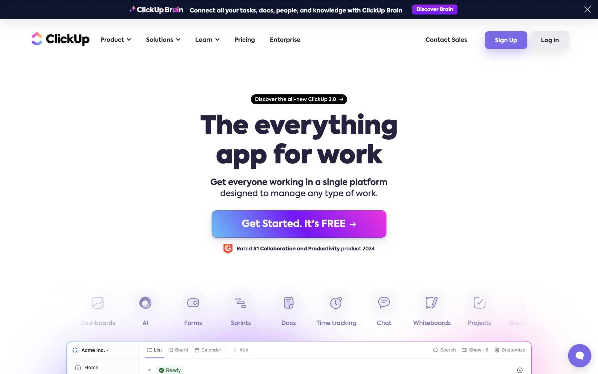
ClickUp perfectly demonstrates the strategic use of landing pages for targeted SEO. It is a proven example of how SaaS landing page design best practices can drive clarity and conversions.
Design Highlights:
- The homepage’s navigation excels in clear categorization, guiding users efficiently through key product features.
- Clear CTAs and well-structured ‘product explanation’ pages with tables full of concise content enhance the overall user experience.
- Categorized drop-downs guide visitors to features, use cases, and resources. What else do you need?
2. Trello
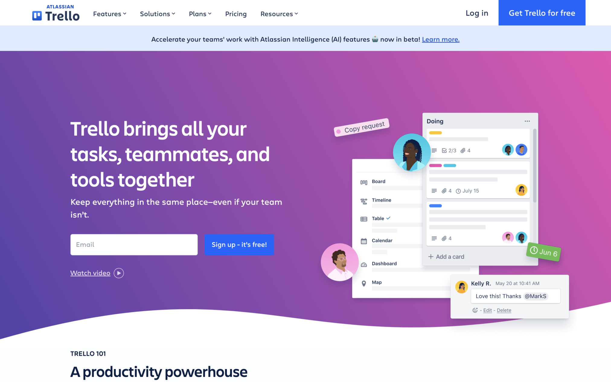
The first thing you will see on Trello’s site is a prominent screenshot of the tool accompanied by a clear and concise copy. This briefly explains the product, its core functionalities, and how it can help the target audience.
Design Highlights:
- Trello positions itself as the perfect, user-friendly alternative to complicated project management software tools.
- This compelling elevator pitch is followed by a focused CTA: a single, prominent button that encourages the user for a free trial.
- These two features alone make Trello’s website a perfect example of ‘effective SaaS website design.’
3. Basecamp
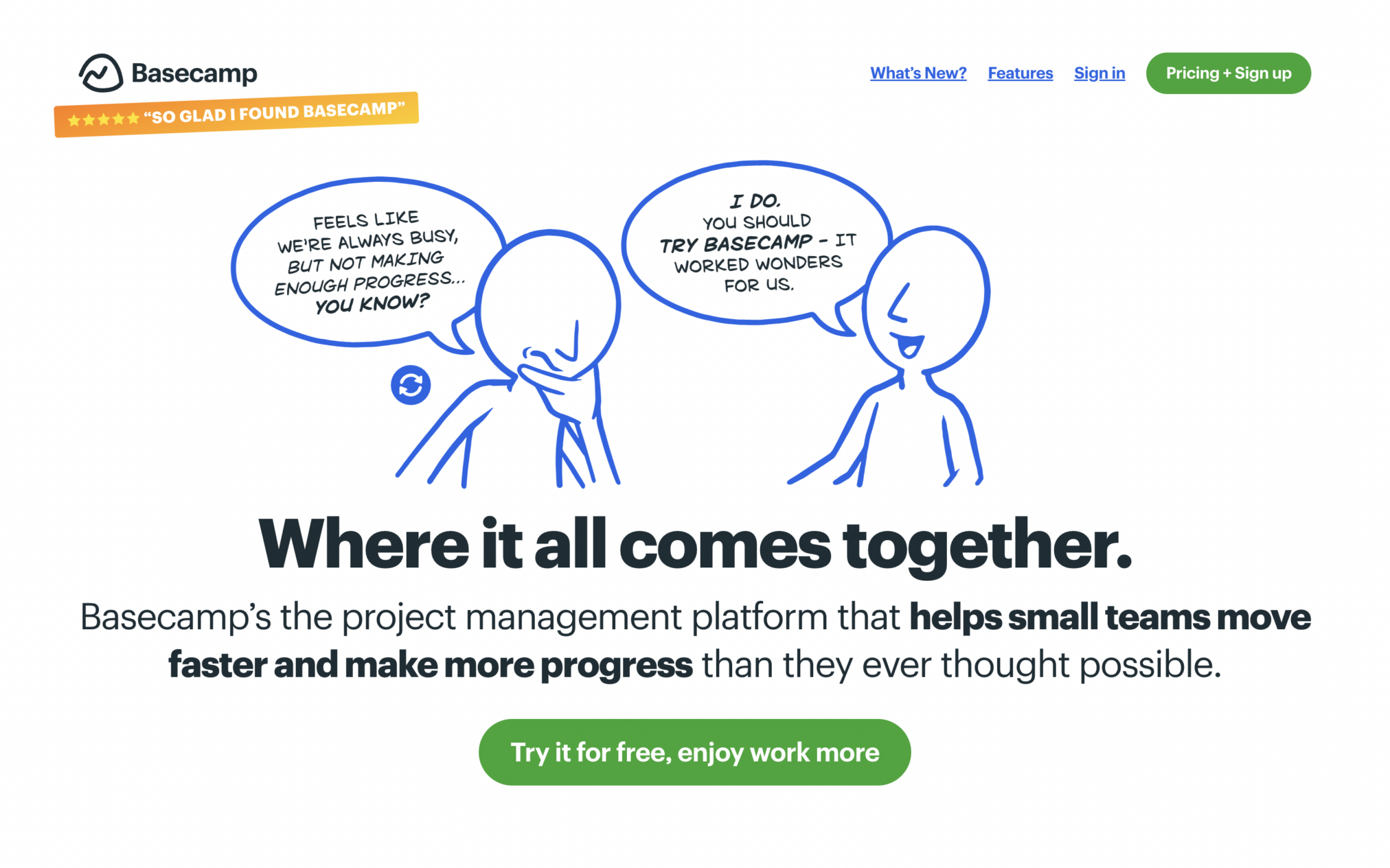
Basecamp’s homepage seamlessly blends fun, eye-catching visuals with a clean, minimalistic design.
Design Highlights:
- Unlike the menus in most SaaS websites, this website’s navigation bar prioritizes key information only.
- Users only get a brief product overview, followed by some basic user testimonials, pricing details, and essential product-related details.
- This rationalized approach to information-sharing minimizes users’ cognitive load and simplifies their decision-making process.
- Bold CTAs presenting a ‘30-day free trial’ offer spread across the website’s homepage further simplifying the decision-making process!
SaaS Website Examples for Collaboration Tools
Best Collaboration tool SaaS sites include Slack, Pitch, and Modify. These websites contain clear layouts and fast visual demos. Research shows users must grasp what the product does in five seconds or they leave.
4. Slack
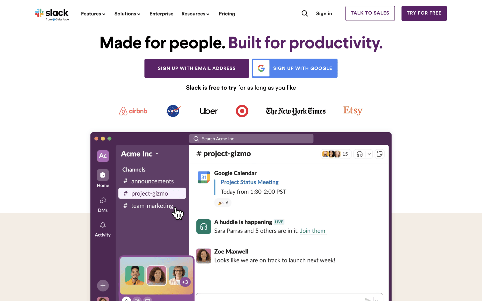
The best SaaS companies invest heavily in world-class SaaS website design services and it shows on their websites. Like many of the world’s leading SaaS websites:
- Slack’s website prioritizes focus and clarity. It avoids the use of complex graphics and text-based information.
- This clarity-driven approach fosters efficient information-sharing, optimizes user experience.
- Demo videos and free trial offers on the homepage have maximum conversion impact precisely because they are not buried in clutter
5. Pitch
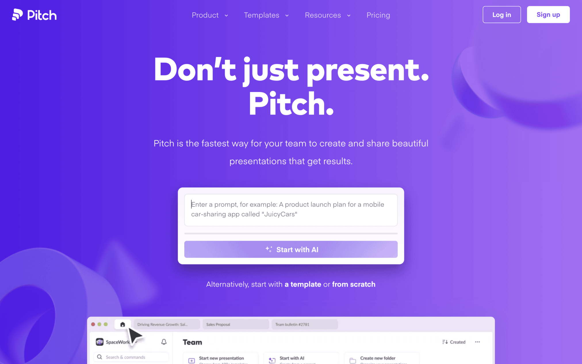
Pitch was a pioneer in adopting the playful yet clean aesthetic that is now standard in most SaaS websites.
Design Highlights:
- Pitch’s pricing page presents three distinct plans for users: Starter, Pro, and Enterprise.
- Under each plan, users have easy access to information on product features, relevant, social proof, and other educational resources.
All of these qualities, coupled with the site’s user-friendly navigation, make Pitch one of the most compelling SaaS websites on the Internet.
6. Modyfi
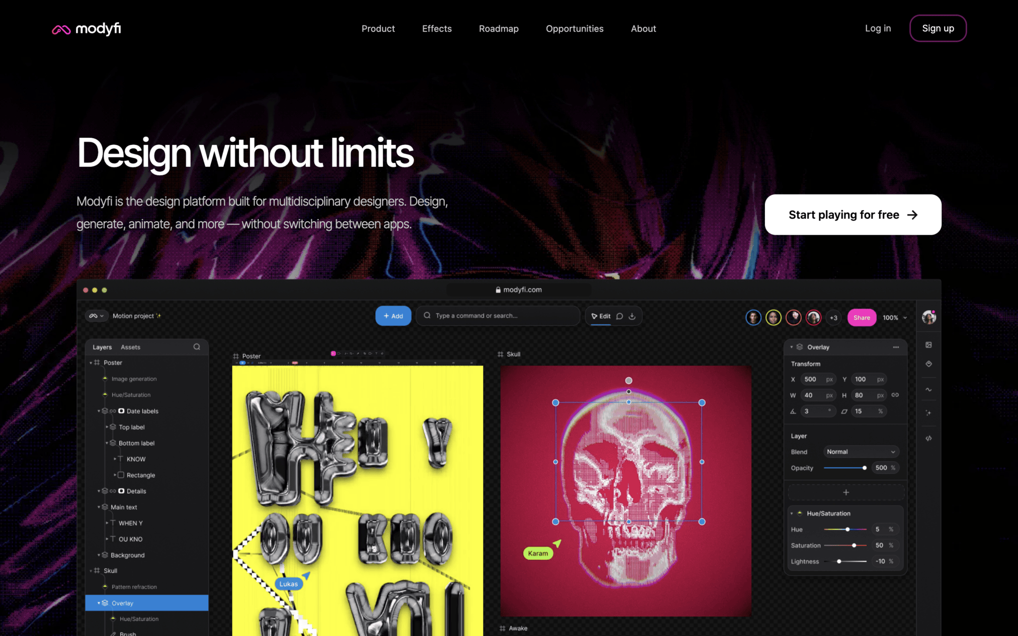
Modyfi is an AI-powered image creation platform popular among designers because of its collaborative editing tools. Modyfi’s unique SaaS UX design is also hugely popular among designers because:
- It utilizes interactive storytelling (scrolling the homepage triggers dynamic design elements), bold color palettes, striking imagery, and smooth animations.
- These elements give users a clear idea of what Modyfi stands for – creativity, creativity, and more creativity!
SaaS Website Examples for CRM Software
The best CRM SaaS websites show trust, value, and ease of use of the digital product. The list includes tools like Salesforce, Hubspot, Grow, Netsuite, SugarCRM, and Freshsales, They use clear customer value, real proof/ reviews, and simple paths to start a trial or book a demo.
CRM buyers often check with peers before choosing a new tool. Noble Research 2025 found that about 63% of B2B marketing executives begin vendor shortlists through peer recommendations. This makes social proof a key part of CRM website design.
7. Salesforce
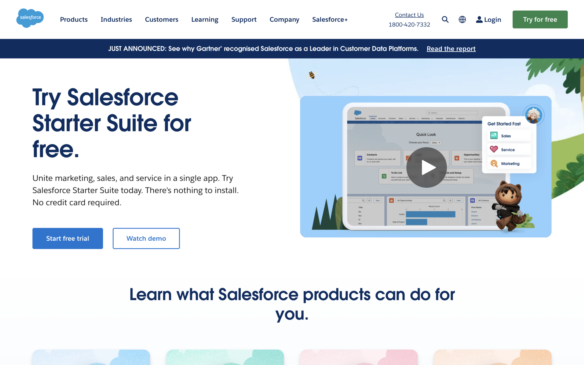
Salesforce leads this category with the most powerful example of benefit-driven value proposition design in SaaS (at the top of their home pages).
The first thing users see when they visit this site is a concise, relevant, and impactful value proposition that instantly ‘hooks’ them.
8. HubSpot
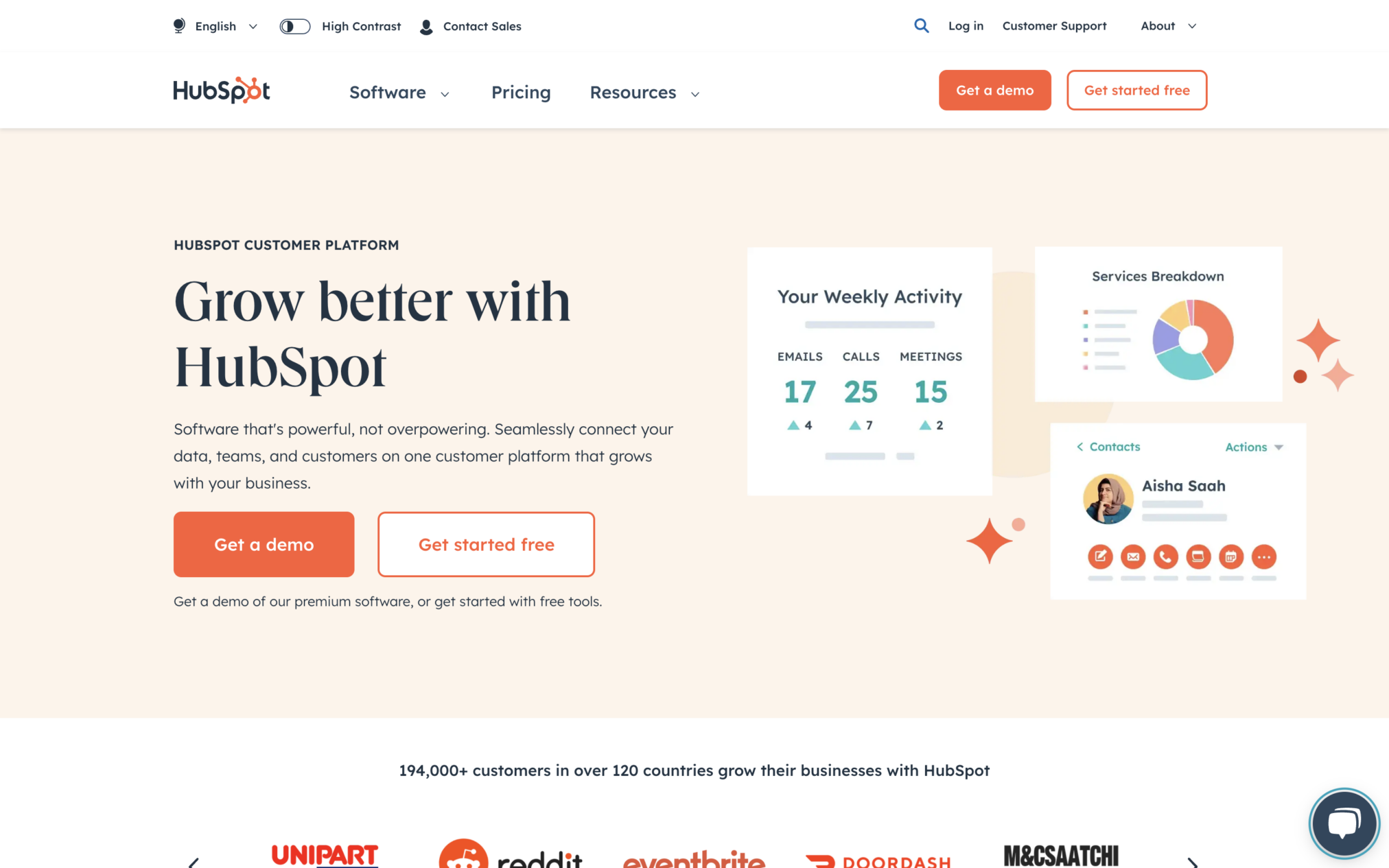
HubSpot is not a ‘single-product company.’ To cater to its diverse user base:
- This CRM software’s website clearly outlines its key offerings (including free features) directly on the homepage.
- The homepage is also packed with clear product names, short descriptions, and eye-catching CTA buttons.
All of these design elements combine to deliver smooth user journeys..
9. Grow
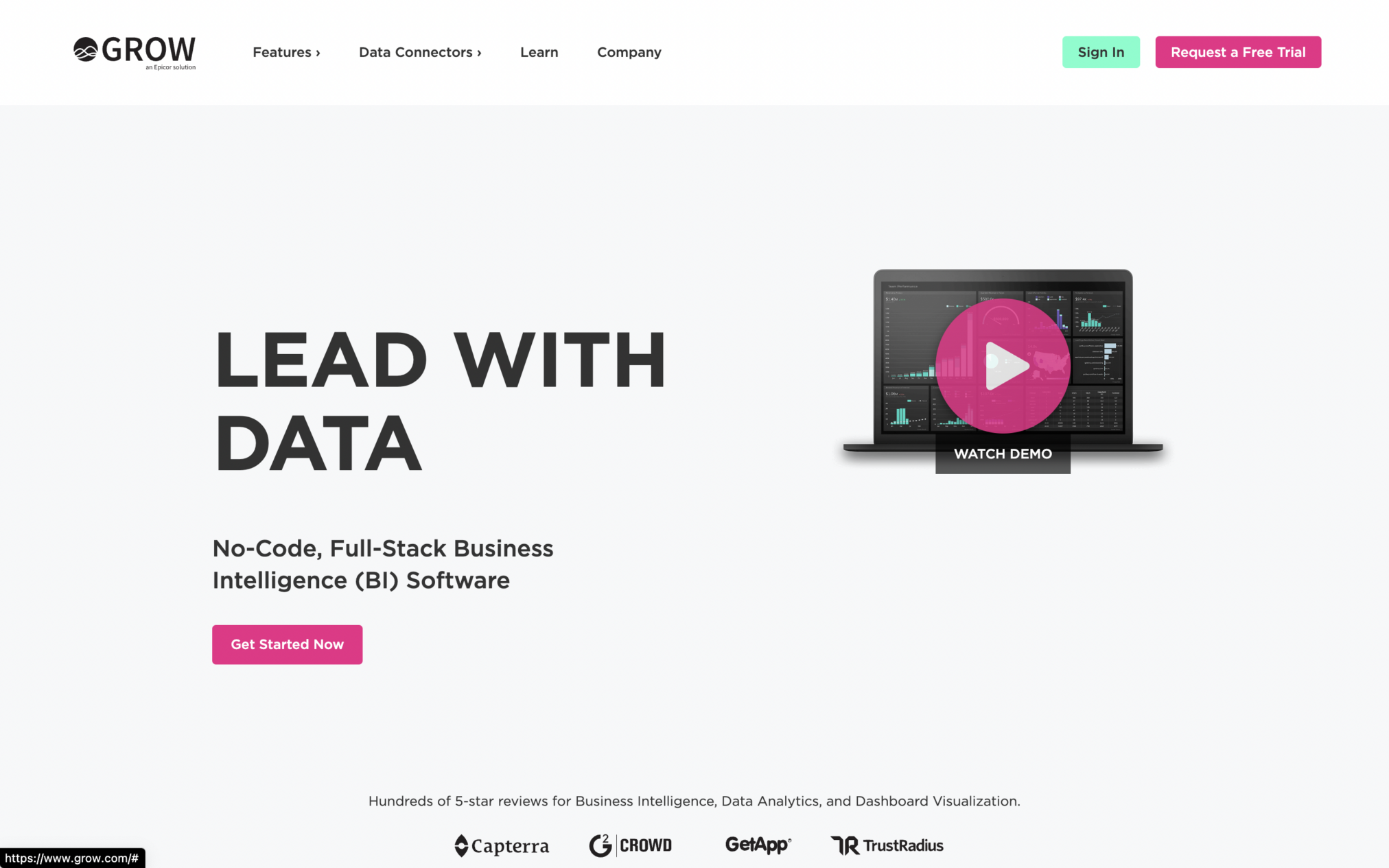
Grow leverages dark color palettes and simple, yet descriptive slogans to pique the interests of B2B clients seeking advanced CRM and business analytics solutions. This minimalist aesthetic also avoids the risk of overwhelming visitors. Additionally, Grow could be a great example for any B2B web design agency looking to craft a user-friendly and results-oriented website.
10. NetSuite
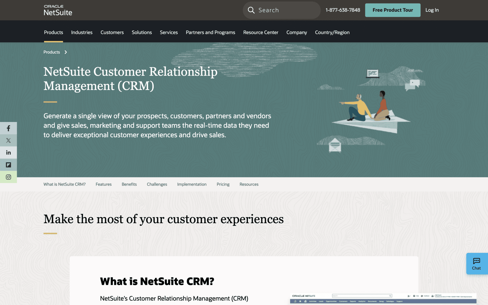
Just like Grow, NetSuite’s website avoids overwhelming users by focusing on:
- minimalist aesthetics,
- impactful data visualizations of the software, and
- concise messages.
All these points explain how NetSuite is the perfect ERP and CRM solution for large-scale organizations.
11. SugarCRM
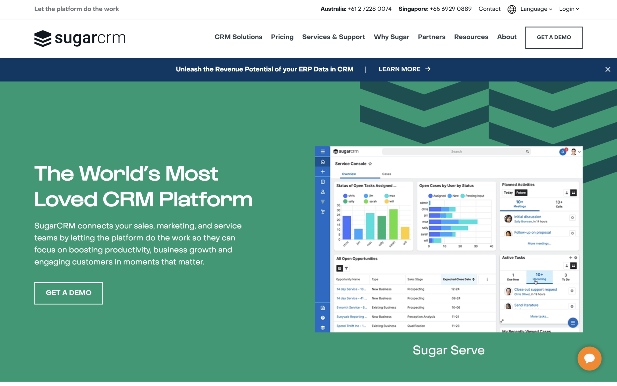
SugarCRM aims to advertise itself as the most user-friendly CRM tool on the Internet and its website is in line with these goals.
Design HIghlights:
- The SugarCRM website has clear navigation and an intuitive interface.
- The site also delivers customized journeys to repeat visitors.
- By simplifying and personalizing user experiences, the site has been able to build many long-term relationships.
12. Freshsales
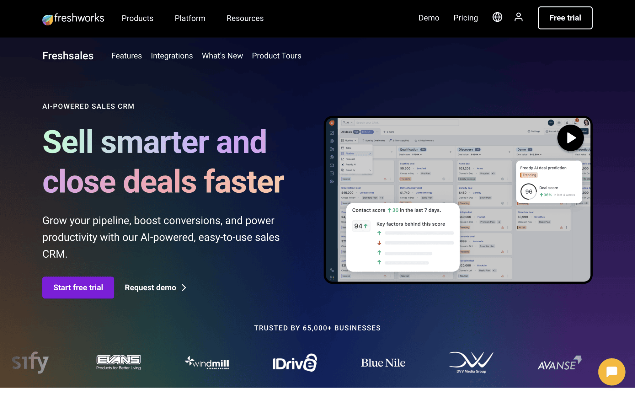
Freshsales is a unique SaaS tool that allows sales teams to collaborate and deliver high-quality experiences to customers. How does their website advertise this unique feature? By using a ton of team-oriented visuals and messaging!
The website repeatedly emphasizes the SaaS tool’s ability to facilitate collaboration within sales teams. Visitors are also greeted with interactive features, gamified design elements, and explanatory data visualizations.
SaaS Website Examples for Marketing Automation Tools
Top SaaS websites for marketing automation are Mailchimp, Welcome, Jasper, Beehiiv Attentive, Kajabi, Gumroad and Buffer. These tools explain the value of the digital product within the first few moments. They contain clean content, design layouts, text structures, and stepwise product visuals. With 60%+ B2B research conducted on phones, creating a responsive design is important today.
13. Mailchimp
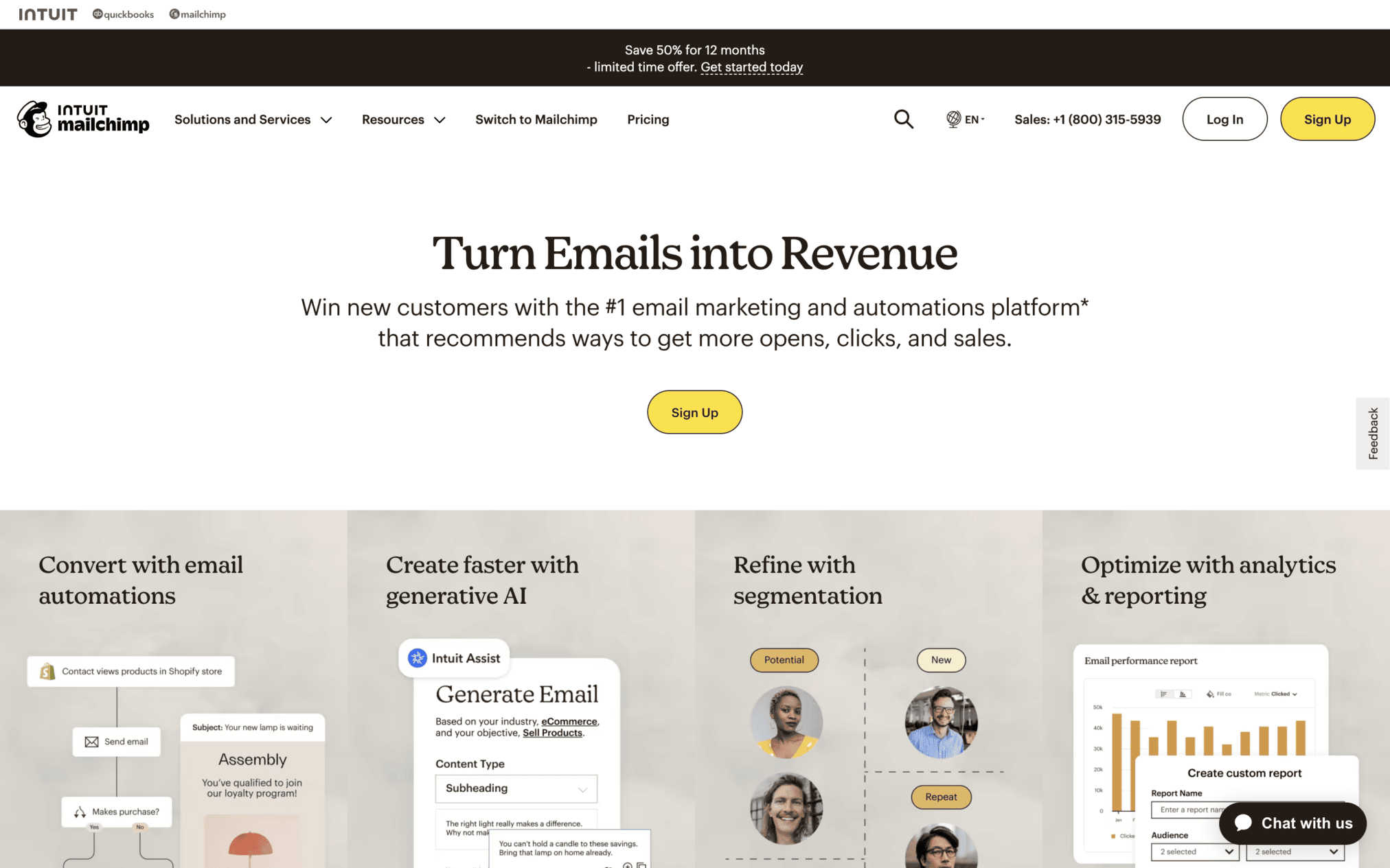
This email marketing automation tool has been successfully implementing the basics of SaaS website design for a long time.
Design Highlights of Mailchimp:
- Elegant typography,
- strategic brand-centric color palettes, and a
- clear information hierarchy packed with ample whitespace.
14. Welcome
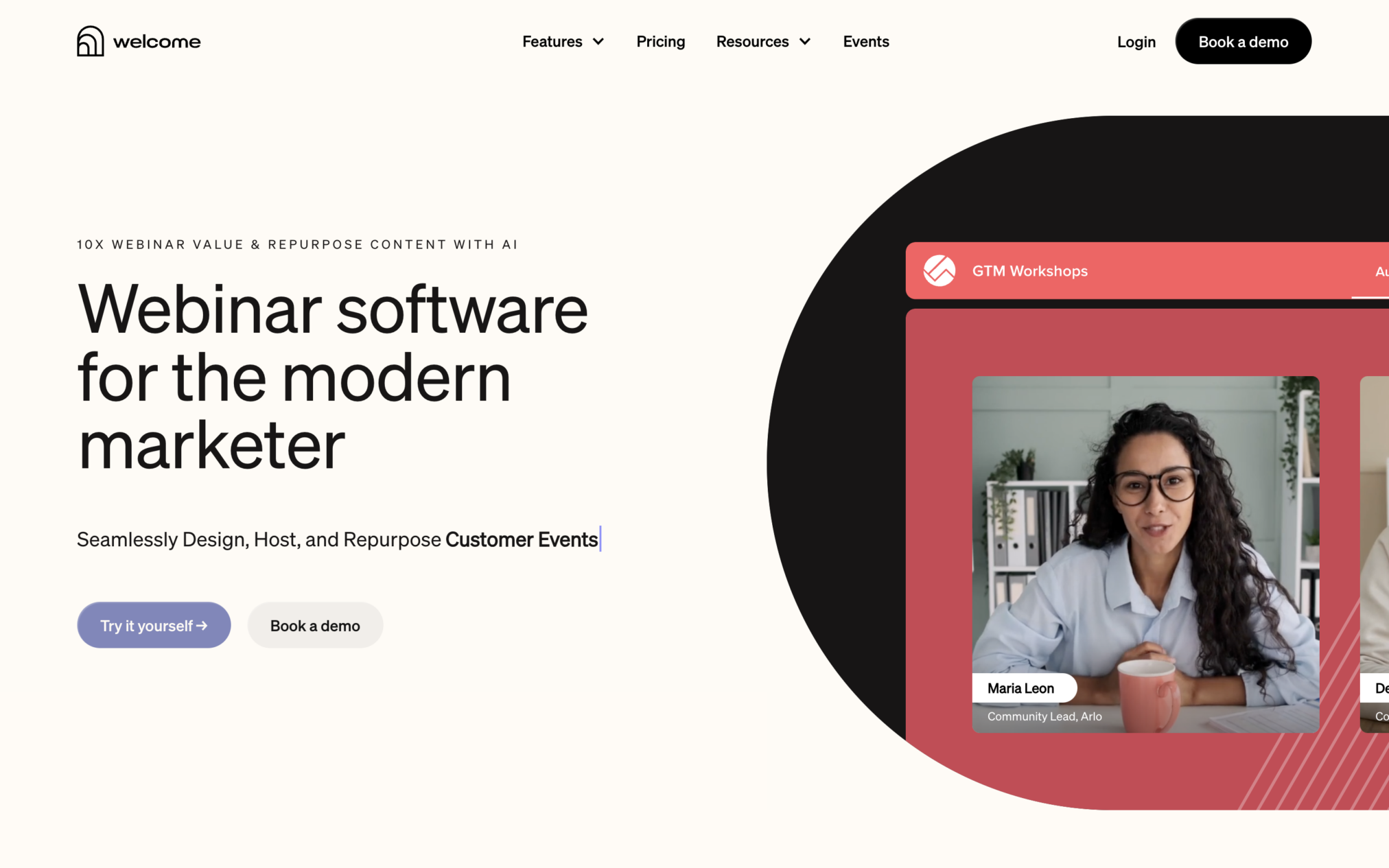
Welcome is a virtual event platform that marketing teams use to host live marketing campaigns.
Design Highlights:
- This SaaS tool’s website utilizes a clean and contemporary design to deliver a compelling first impression.
- Visually appealing images, product screenshots, and subtle yet clear messaging present Welcome as a worthy marketing solution.
15. Jasper
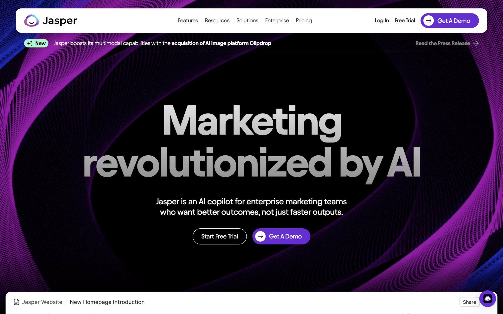
Jasper’s website employs a bold design to attract marketers seeking AI-powered copywriting solutions. The website is packed with explainer videos, customer testimonials, and clear value propositions that demonstrate the product’s benefits for marketers.
16. Beehiiv
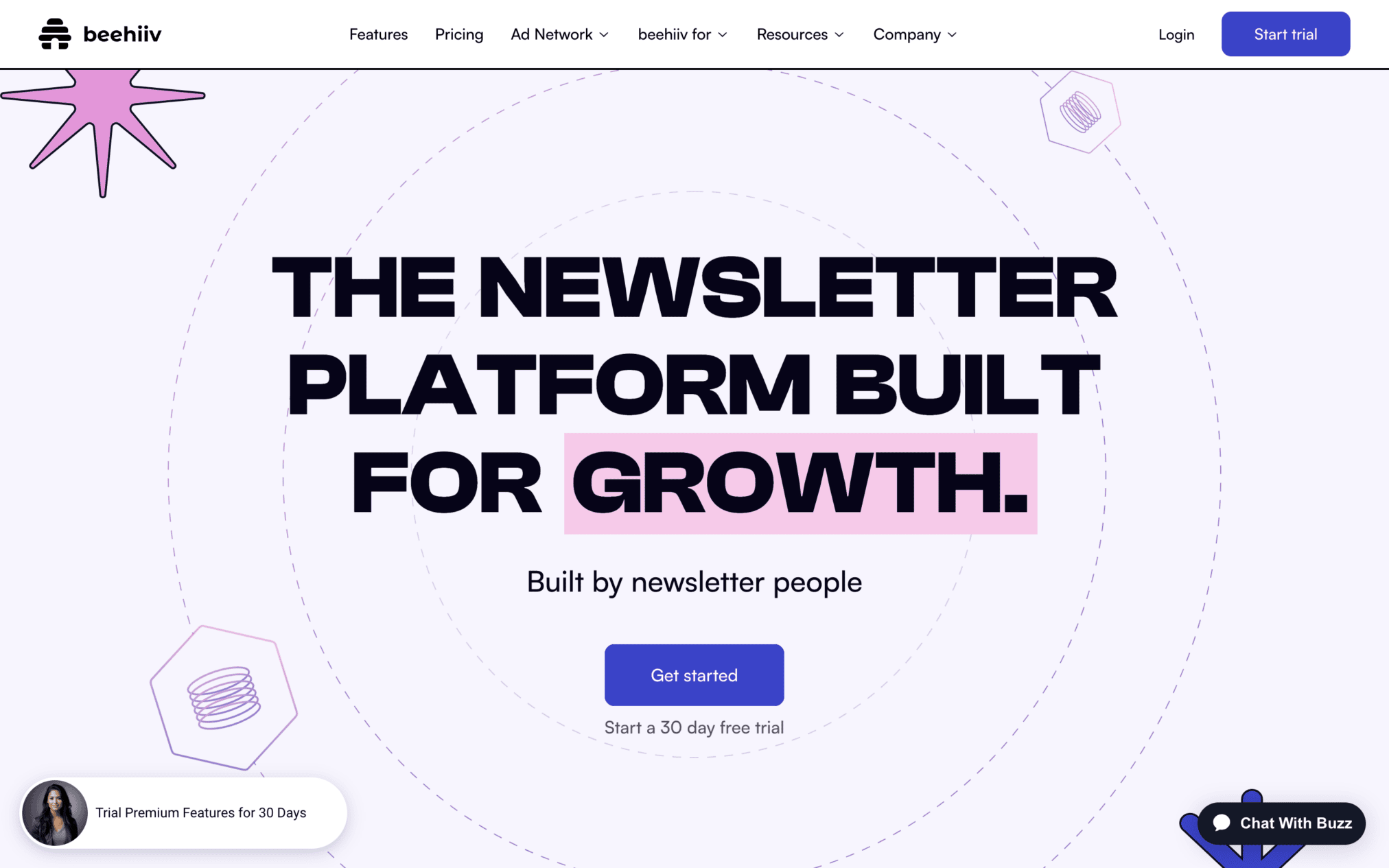
Beehiiv is a newsletter platform designed specifically for marketers. This website is on this list mainly because of its intuitive navigation, key product features and main value proposition.
17. Attentive
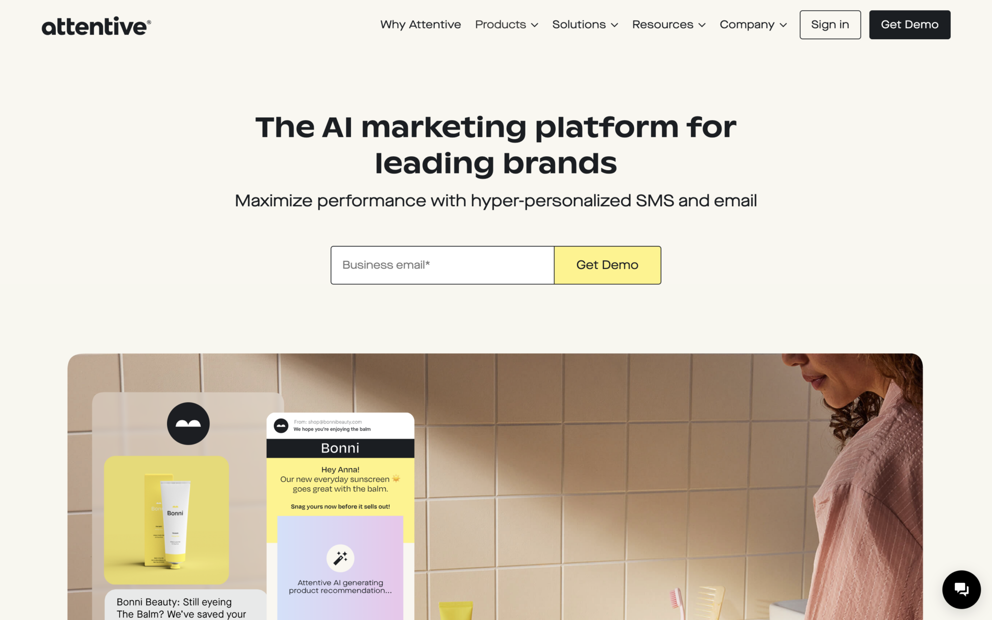
Attentive’s website uses a colorful, clean, and user-friendly design to directly speak to its key target audience: businesses seeking SMS marketing solutions. Every main design feature on this site like-
- easy-to-understand product feature categories and
- interactive drop-down menus optimized for user engagement.
18. Kajabi
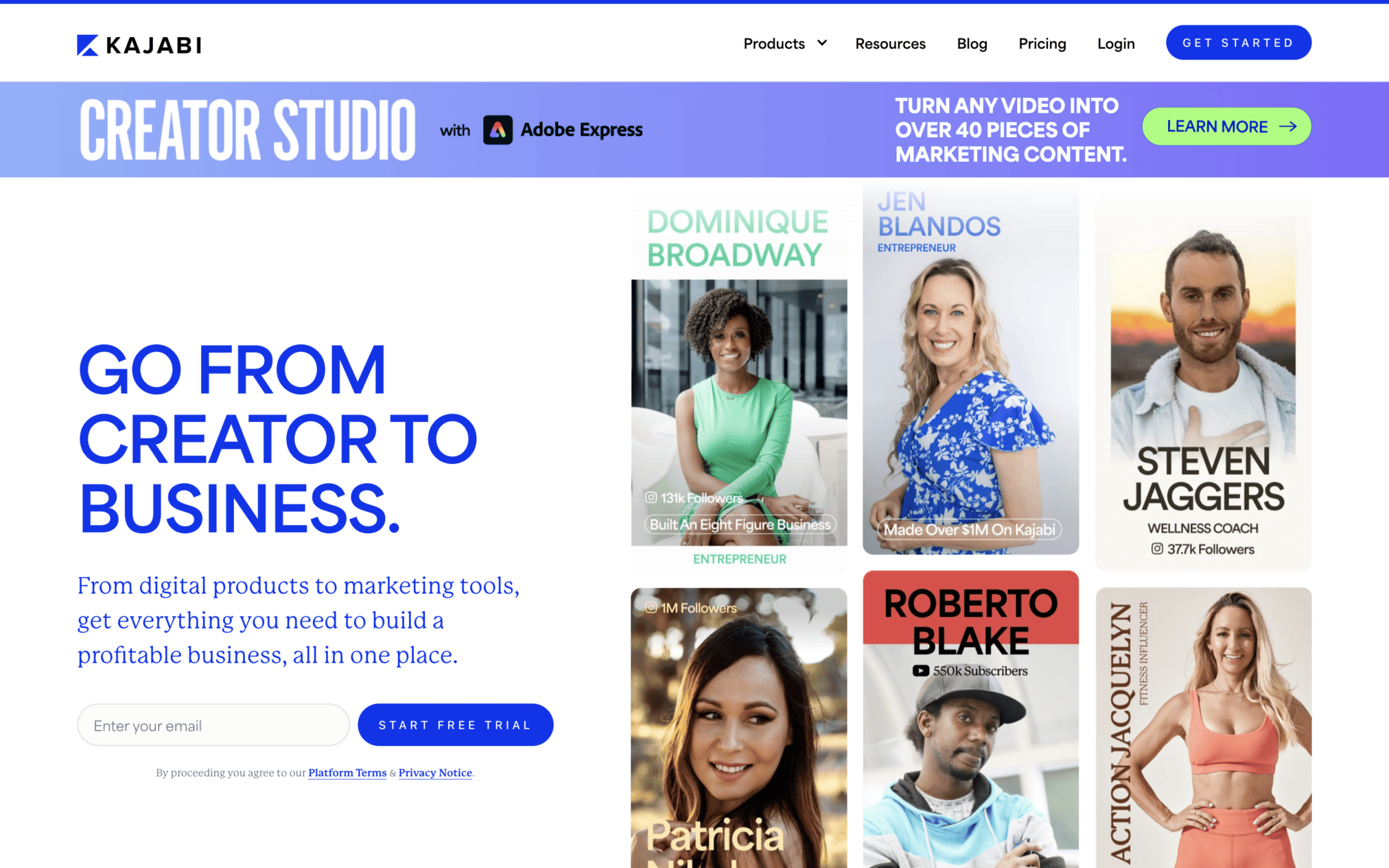
Kajabi is an all-in-one platform that allows creators/entrepreneurs to build, market, and directly sell their digital products.
- This site focuses more on its users by sharing their success stories on the homepage.
- The site also leverages minimalist design to stand out from competitors who often pack their sites with long and complex blocks of text.
19. Gumroad
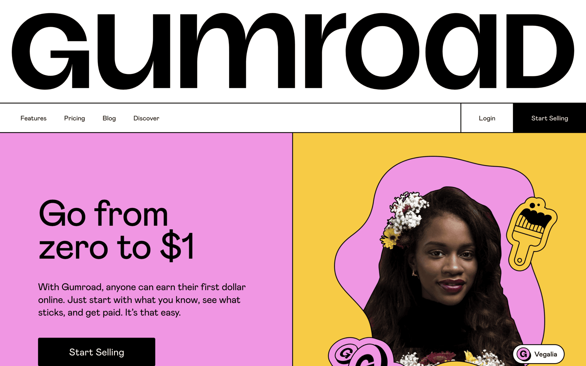
If your brand is all about empowering individuals to become entrepreneurs, your website should reflect this thinking! Gumroad’s website does this perfectly.
- The site has a unique layout, which instantly sets it apart from conventional SaaS homepage layouts.
- Each section of the site is packed with playful visuals and animations that explain how the tool simplifies users’ journeys toward selling products online.
20. Buffer
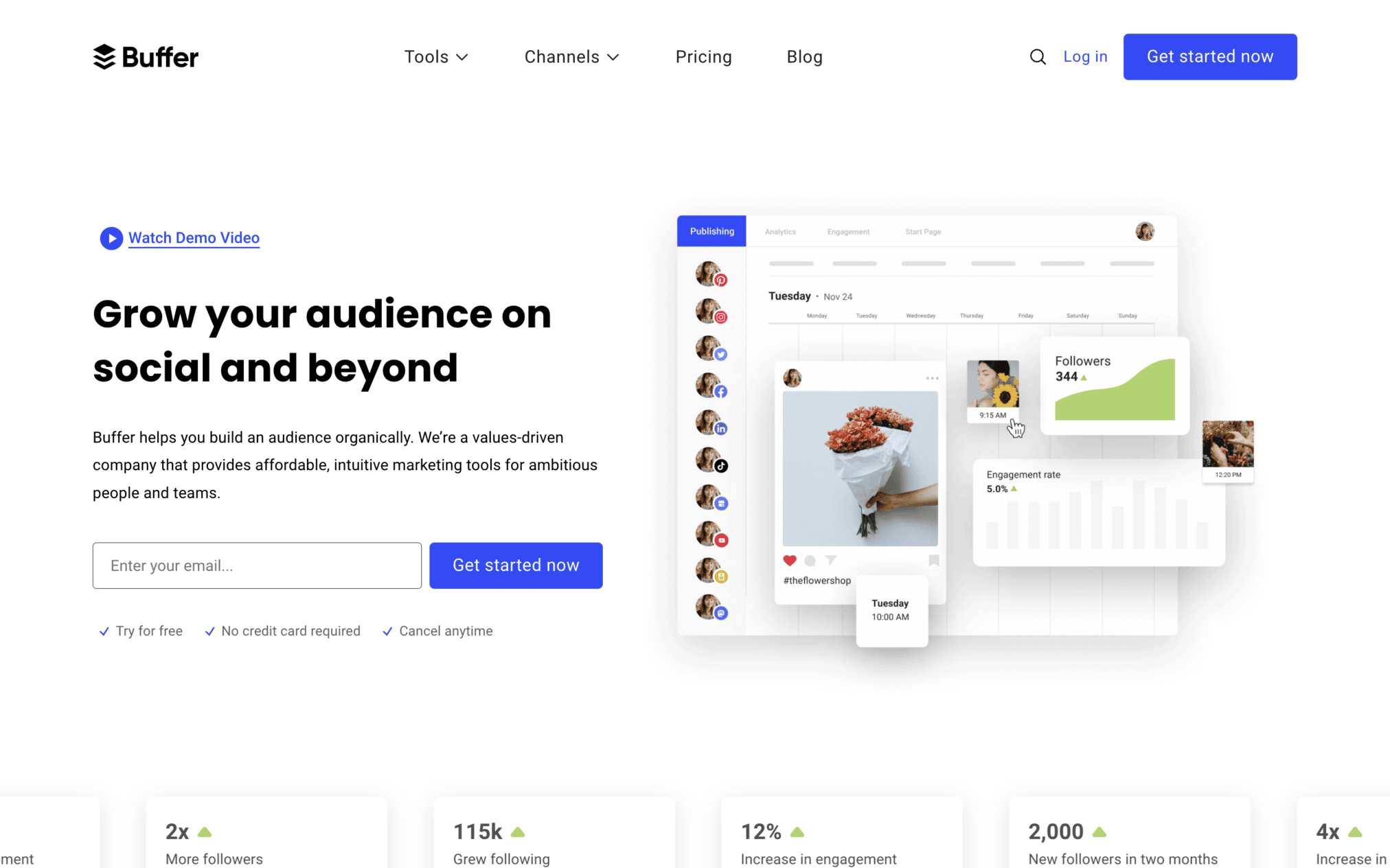
There aren’t many examples of website design for SaaS that leverage the power of clean, brand-focused design as effectively as Buffer. This marketing tool’s website is packed with brand-aligned imagery and step-by-step visual walkthroughs that effectively demonstrate the software’s functionalities without confusing the target audience.
SaaS Website Examples for Accounting & Finance Tools
The best finance and accounting SaaS websites include Tranch, FullCircl, Freshbooks, Pipe, Ramp, Method, and Rippling. They make complicated financial topics feel simple and trustworthy. They are designed for users who want clear answers before making important business decisions.
Top examples use clean minimalist layouts, real customer proof (social proof), and easy-to-read data visuals.
21. Tranch
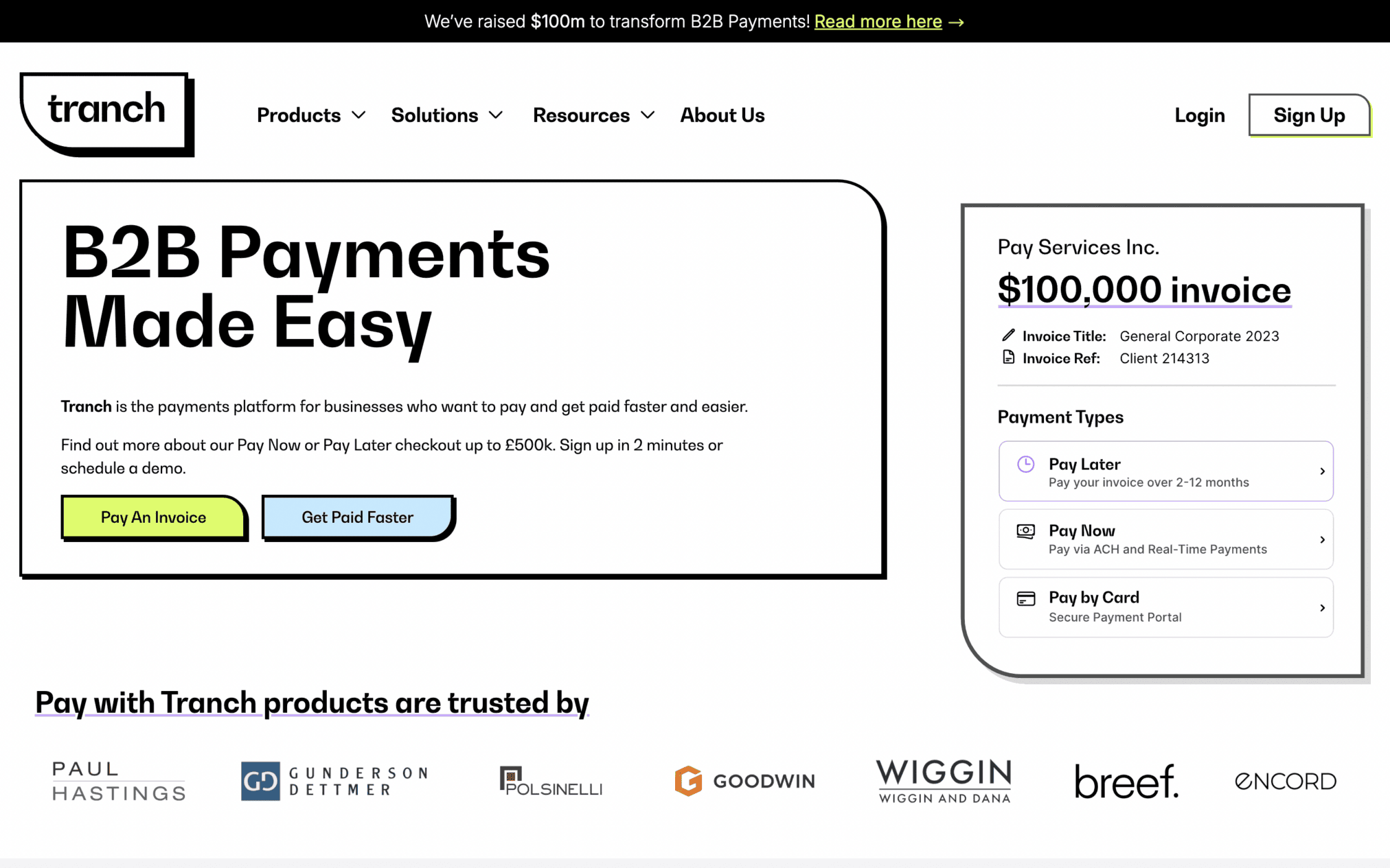
Tranch uses playful design, contrasting visuals, and bright color accents to reduce complex finance-related topics to the barest of bones.
Design Highlights:
- The simple navigation bar facilitates smooth scrolling and
- There is a comprehensive FAQ section that answers every possible question users may have about this financing SaaS tool.
22. FullCircl
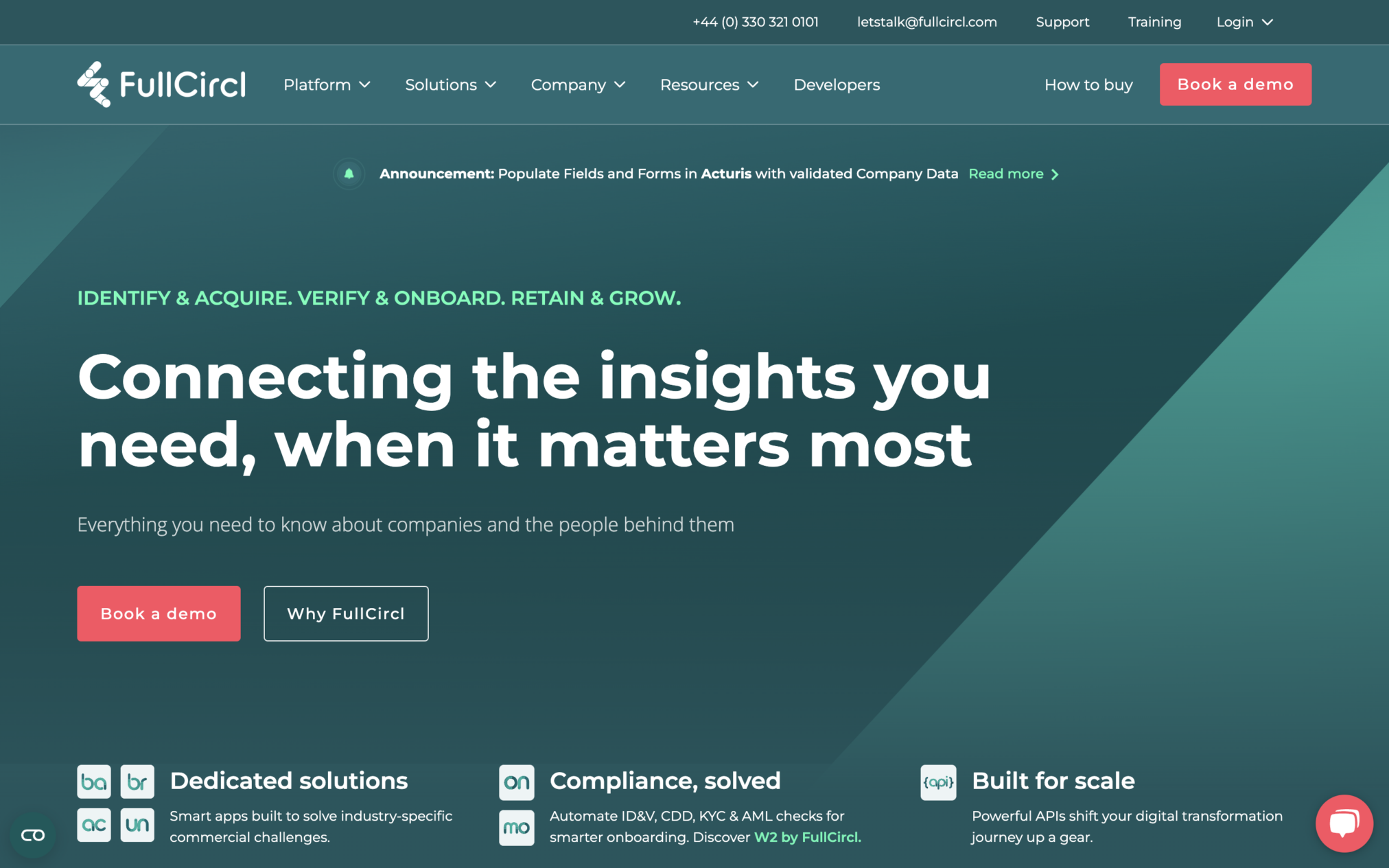
FullCircl break down complex concepts like “finance-ready leads” or “customer lifecycle intelligence”. It uses a combination of:
- attractive photographs, illustrations, and
- demo screens to showcase the platform’s long list of capabilities.
23. Freshbooks
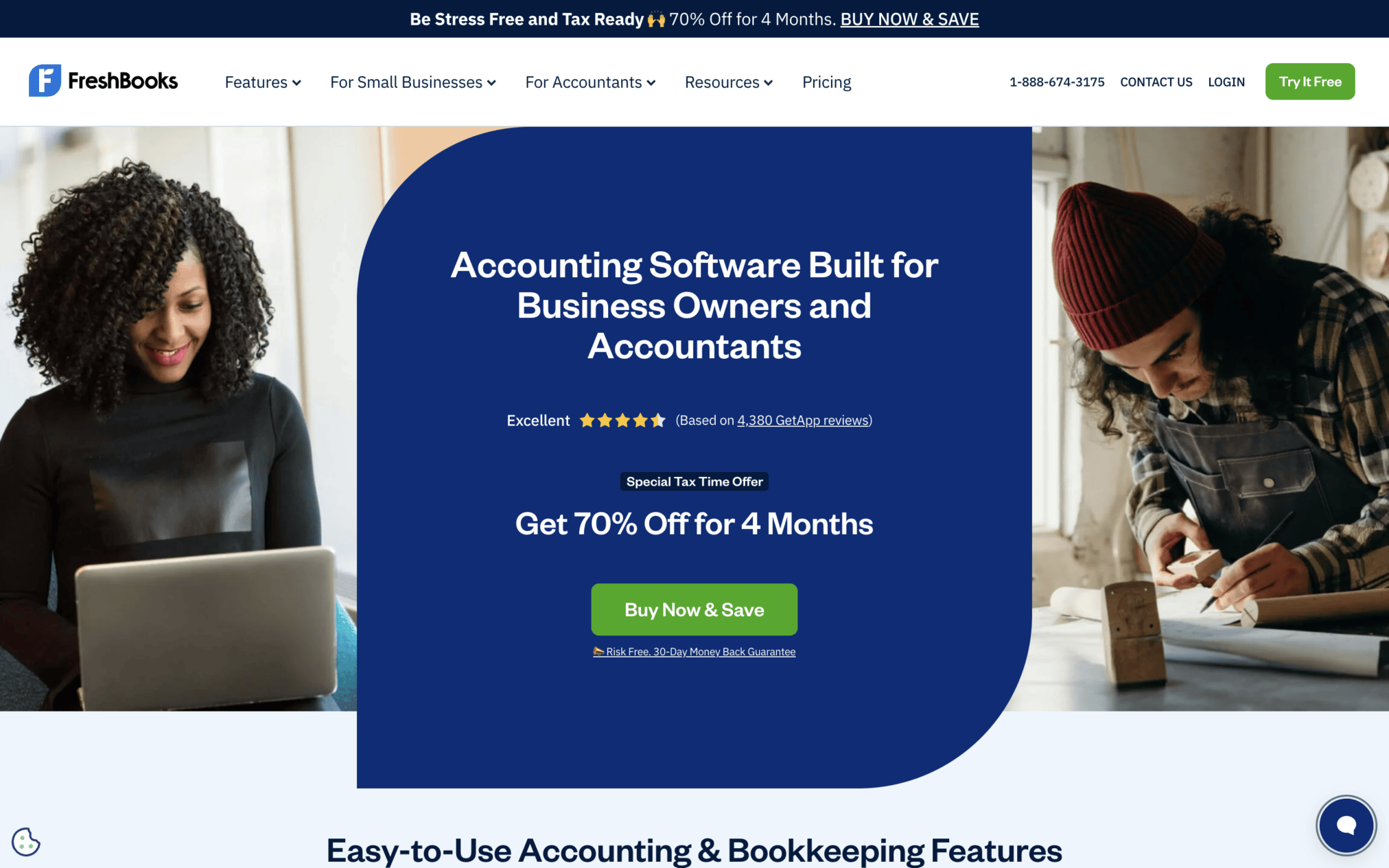
Freshbooks prominently displays key features and benefits across 5 prominent and well-differentiated tabs, allowing users to easily compare/identify the platform’s value proposition.
To establish further credibility with potential customers, the site’s homepage also displays
- five-star app store ratings,
- client testimonials, and
- quotes from industry publications like Forbes.
24. Pipe
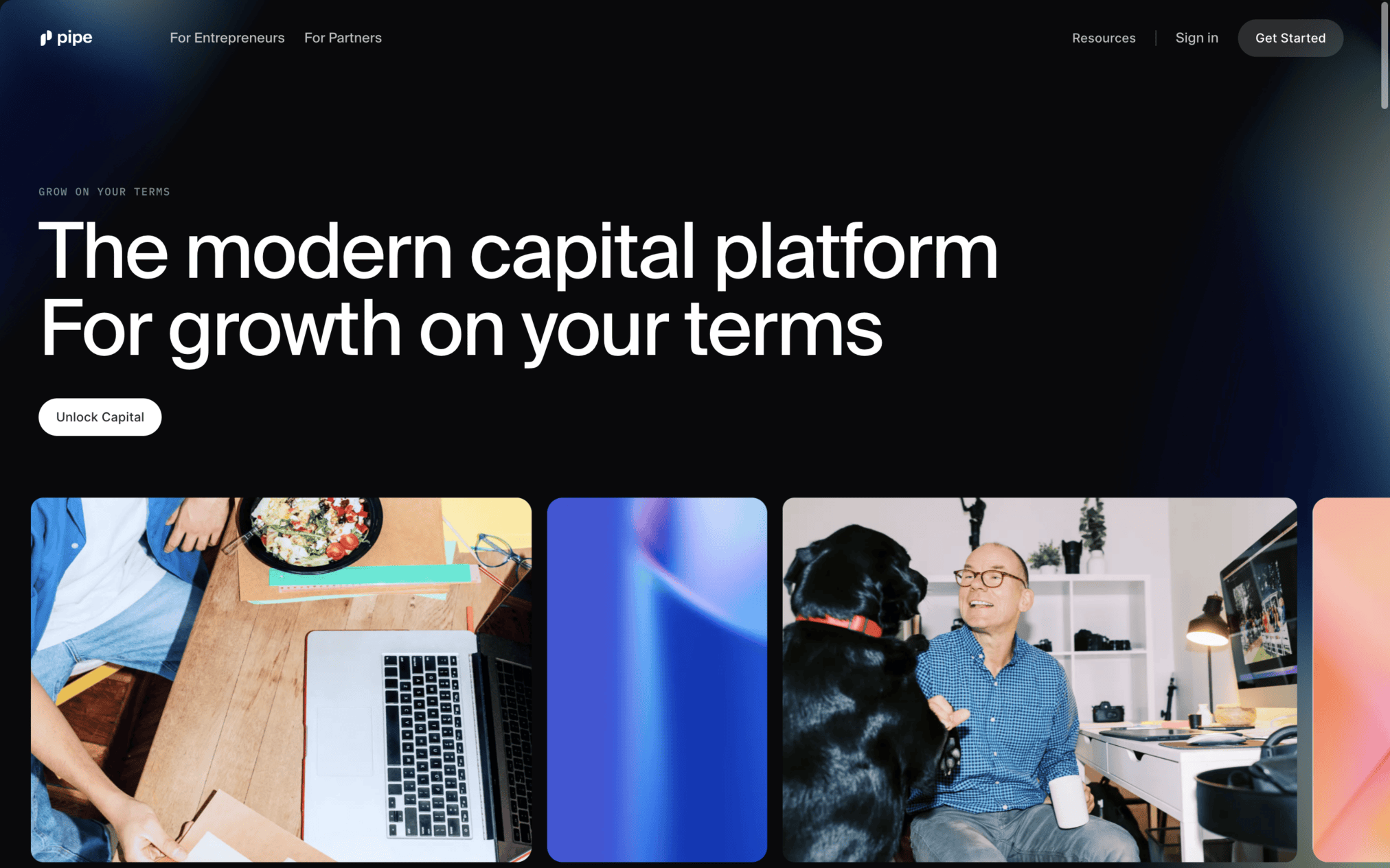
Pipe’s homepage is a prime example of a well-structured SaaS website homepage.
Design Highlights:
- It is packed with social proof, product-related details, CTAs, and answers to potential user concerns. But it does not look ‘packed.’
- Instead, the site uses minimalist design and drop-down webpage sections to deliver clutter-free, yet informative user experiences.
25. Ramp
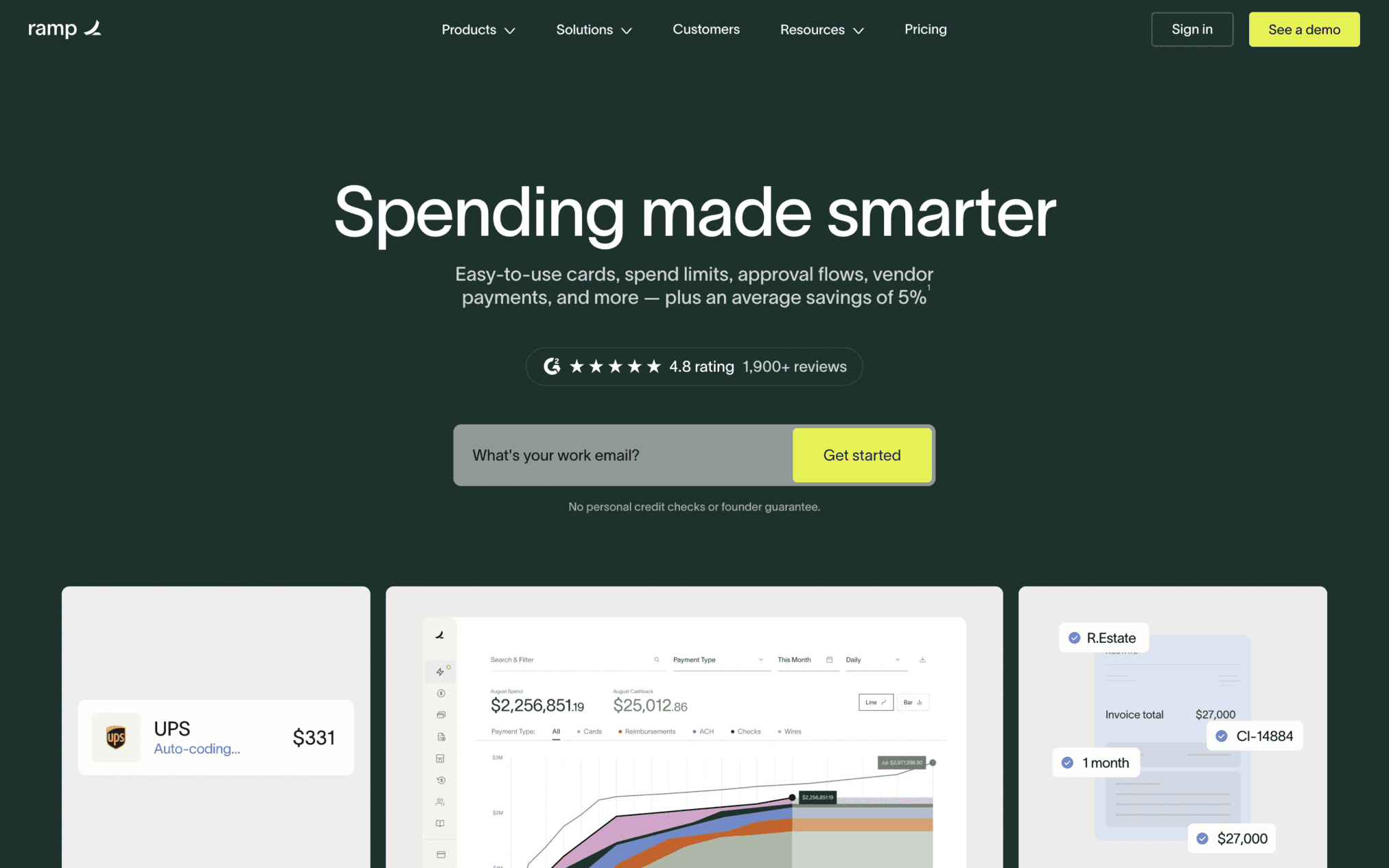
When it comes to providing users with live product demos, no one does it better than Ramp. This is an important takeaway for SaaS brands. They should show the product in action rather than just describe it to drive conversions.
In addition to embedded videos, this accounting automation tool’s website features logos of its well-known clients like Shopify- something that instantly boosts the brand’s credibility.
26. Method
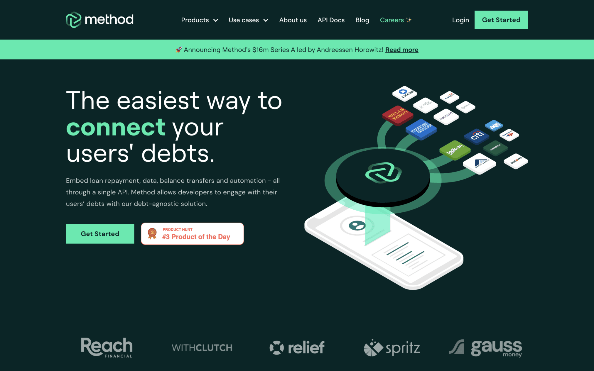
Method’s website minimizes visual distractions by adopting a clean, clutter-free design. All key pieces of info: product features, use cases for different user segments, pricing-related information, etc., are clearly separated, making them easy to understand.
27. Rippling
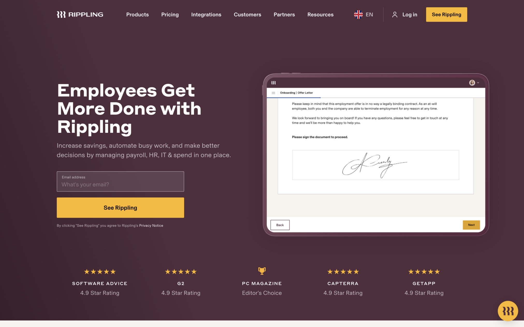
Rippling uses progressive information architecture in SaaS designs. As users scroll down the site’s homepage, they progressively discover different facets of this SaaS tool that offers HR, IT, and finance-related solutions. Here, each scroll reveals a new product dimension without overwhelming users upfront.
SaaS Website Examples for HR Tools
Good HR SaaS websites keep the experience simple for HR professionals. The list includes tools like Homerun, Gusto and Onboarding by Workleap.
They use clean design, simple visuals, and clear navigation. Also, customer stories/reviews, results, and social proof help show how the software works and evaluate the ROI.
28. Homerun
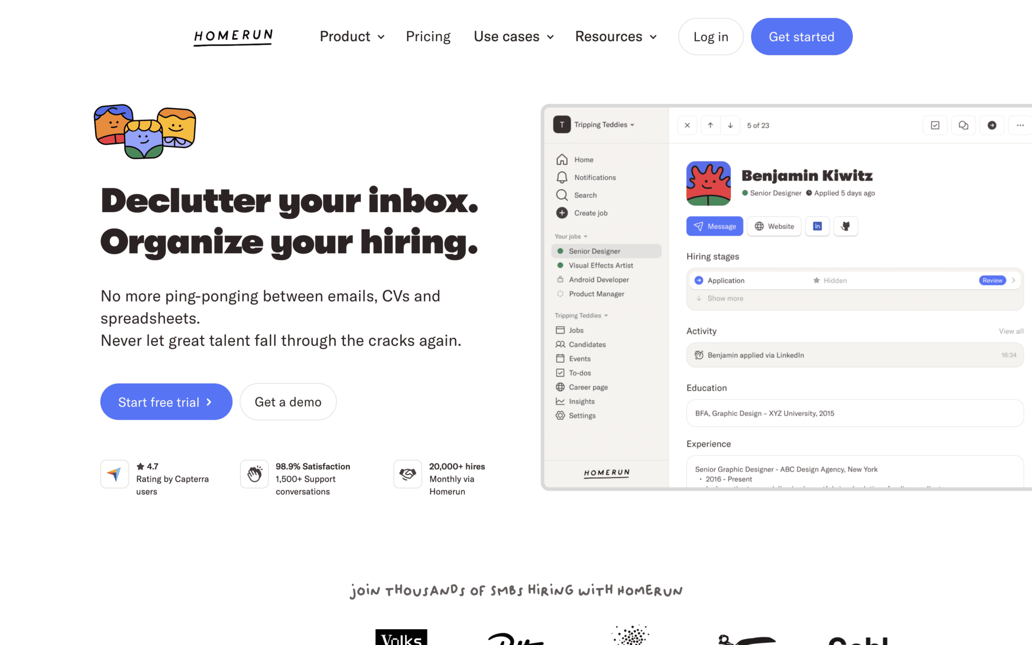
Recruiters and HR professionals need tools that simplify their day-to-day work. Homerun is a SaaS tool that promises to deliver:
- clean/structured design, intuitive navigation,
- bold colors, clear typography, and ample whitespace.
All these features combine to deliver visually appealing user experiences.
29. Gusto
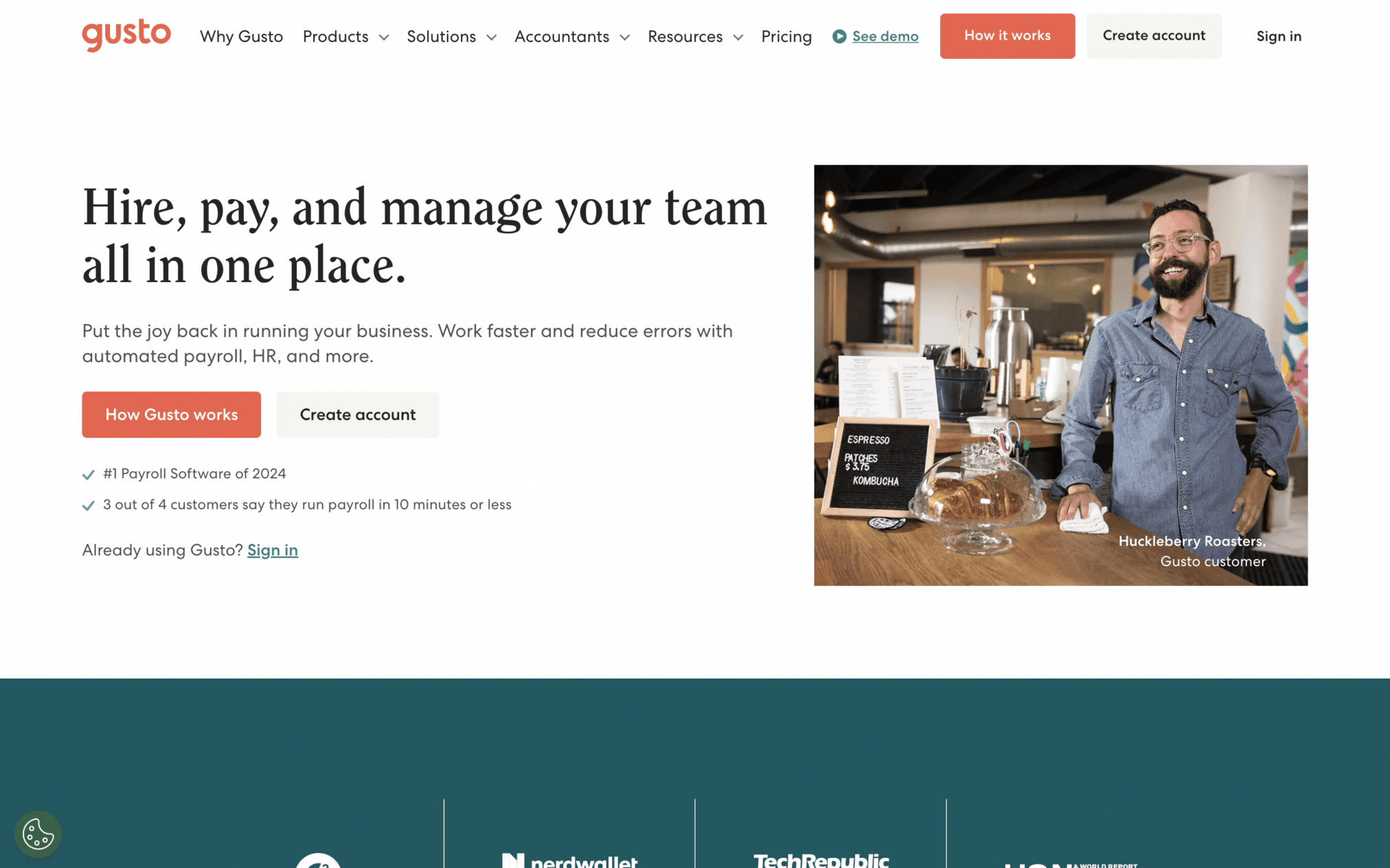
Gusto’s website also reflects the simplicity that HR professionals look for in the team management tools. It features:
- clear navigation, uncluttered visuals,
- clean branding, and a top menu that gives users straightforward access to the site’s main sections and subcategories.
30. Onboarding by Workleap
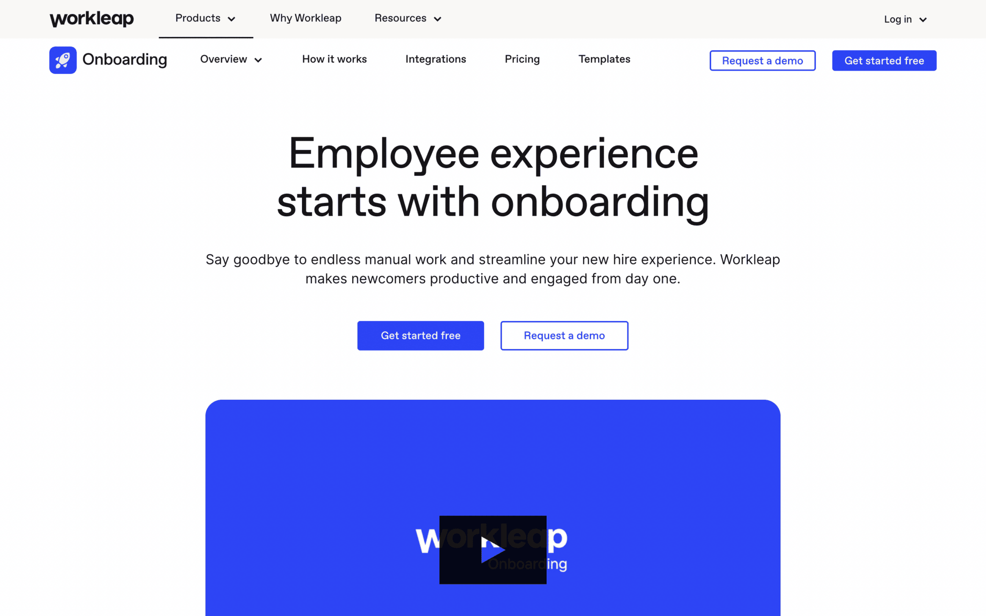
Onboarding by Workleap is a tool that streamlines the employee onboarding process and its website embodies the brand’s desire to simplify things.
Instead of overloading users with text-based info, the site’s homepage is packed with actual product screenshots that succinctly demonstrate the tool’s key features and user-friendly interface.
Other SaaS Website Examples
Lokalise, Nauto, Orderful, Framer, Campaign Monitor, Bill, Spline, Airtable, Ghost, and Copilot are useful SaaS website examples. They span different types of niche categories, starting from localization software to 3D design tools and supply chain management. Their designs use clean layouts, simple visuals, and clear paths to make important information easy to find.
According to a research done by Portent on website speed, if the load time of the site exceeds by one second, it reduces conversion rates significantly. This statement is a reminder that both design quality and technical performance of the site are equally important.
31. Lokalise
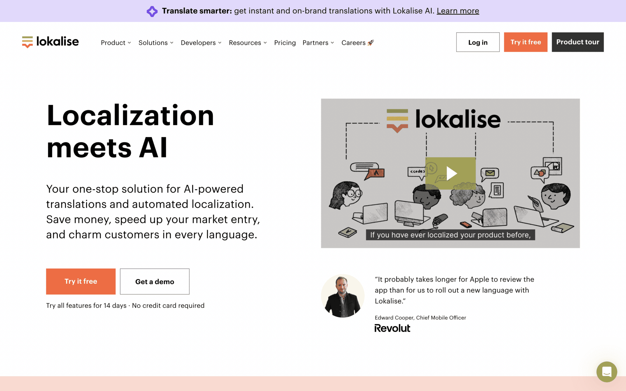
If you are selling a localization software tool, like Lokalise, your website should be packed with testimonials from users across the world. That is exactly what this website does: use credibility-building elements to capture user interest.
32. Nauto
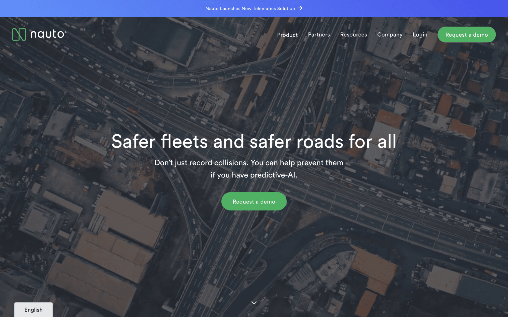
This AI-powered driver behavior monitoring platform has a niche target audience. Nauto’s website uses a combo of engaging visuals and data-based content to effectively appeal to that user base (car companies) and demonstrate the tool’s main value propositions.
This unique blend of visual appeal and data-driven information makes this site ‘hook’ visitors right away.
33. Orderful
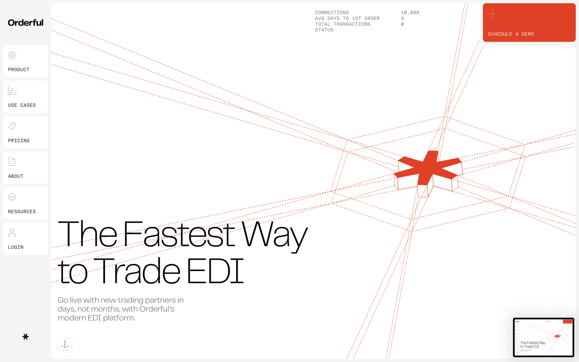
Orderful’s website leverages social proof to instantly impress visitors. Within seconds of landing on this site, you will know what major brands use Orderful’s SaaS tool to streamline their supply chains.
User-friendly CTAs and a resourceful navigation structure make this SaaS site a classic!
34. Framer
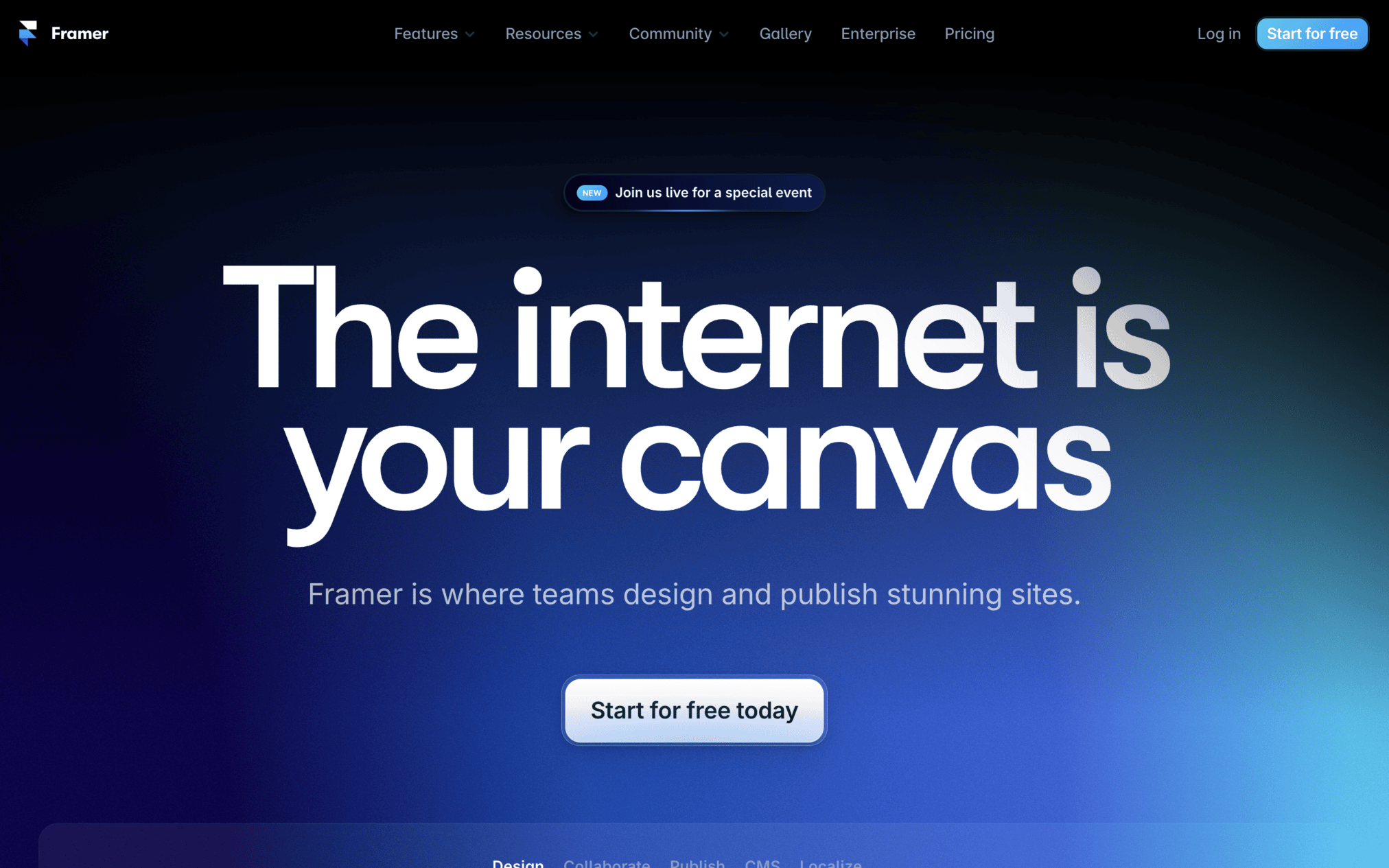
Framer is a user-friendly website builder that contains interactive screenshots to explain the product’s key capabilities. The site is also packed with competitor comparisons and abundant social proof.
35. Campaign Monitor
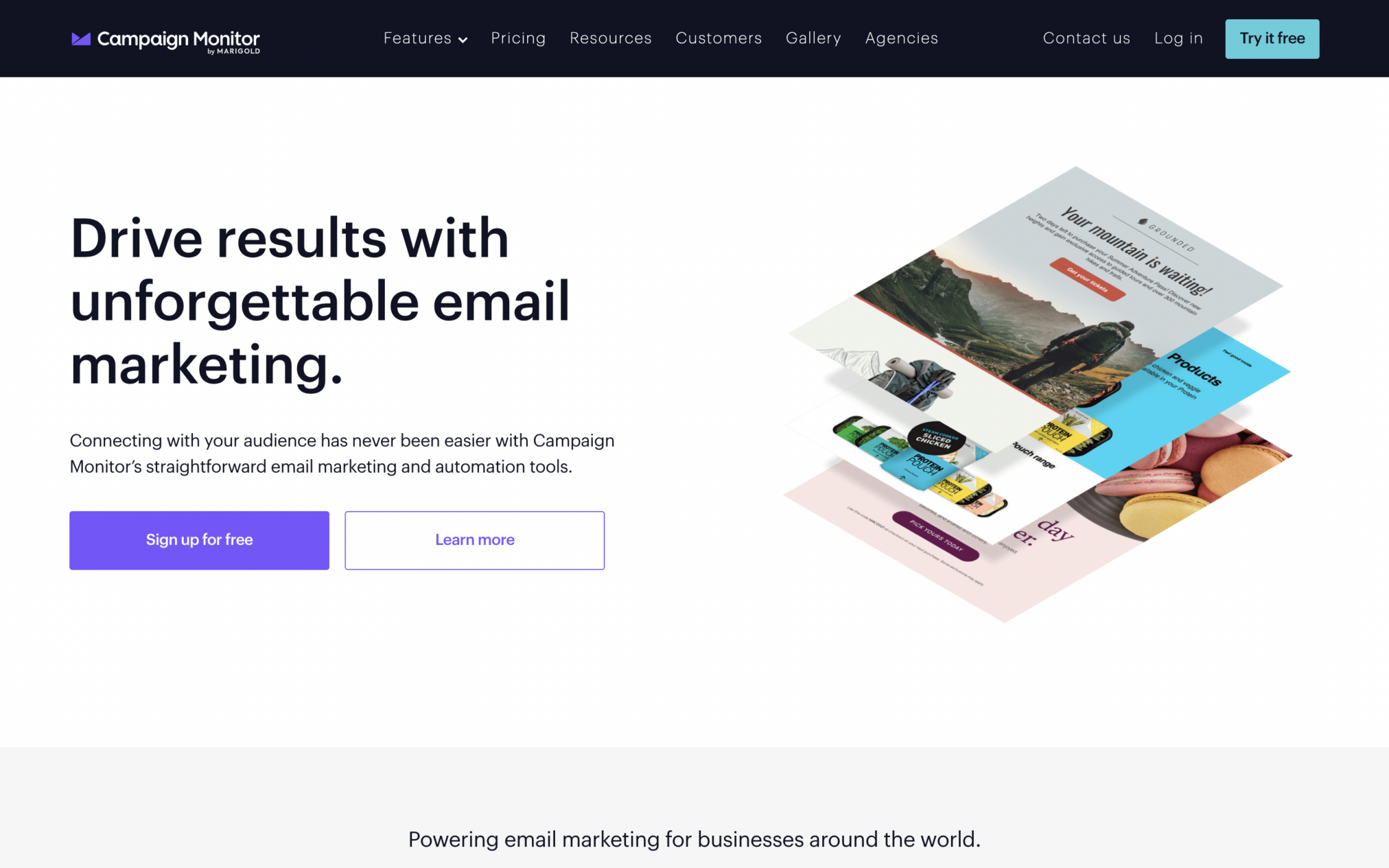
Campaign Monitor’s website uses a combination of design features to share its value proposition:
- Looping videos,
- engaging product-related visuals,
- sliders, animations, and
- clear and concise messaging
36. BILL
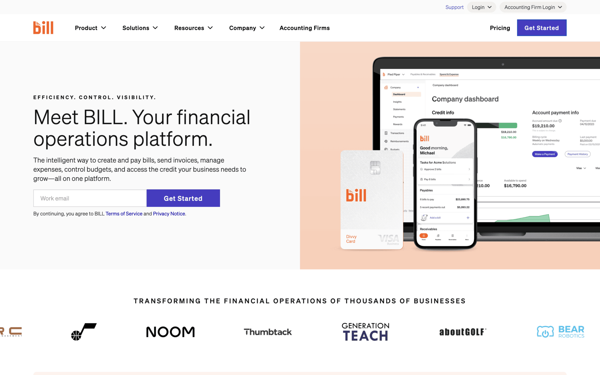
How to make data-based information appealing? BILL does it through dynamic messaging. Open the site and you will be greeted with floating messages that explain the different benefits of using this payroll management tool.
37. Spline
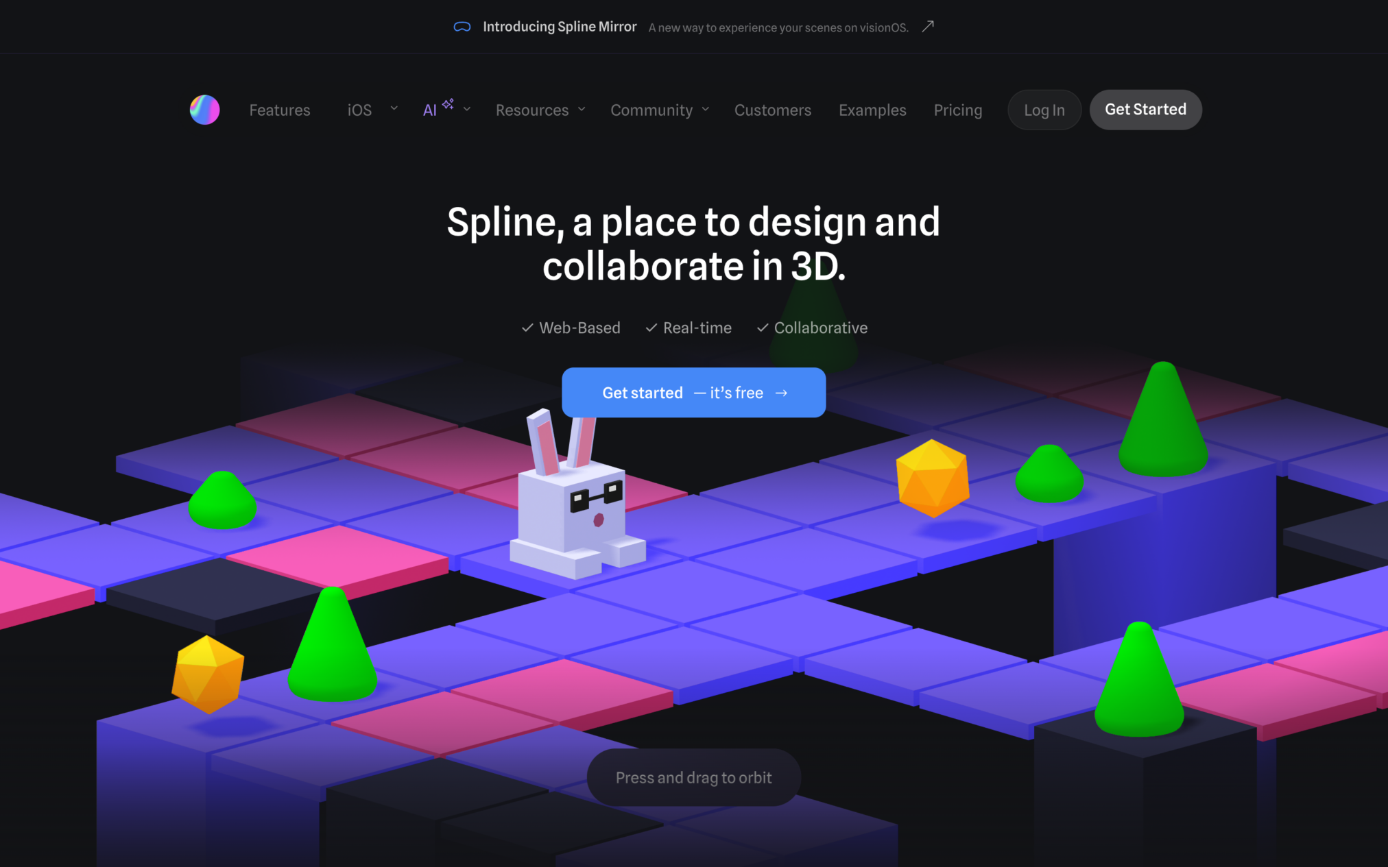
To successfully appeal to its target audience of 3D design professionals, Spline’s website employs a clean, tech-oriented design. The website is packed with animated design elements that demonstrate the SaaS tool’s distinct functionalities.
38. Airtable
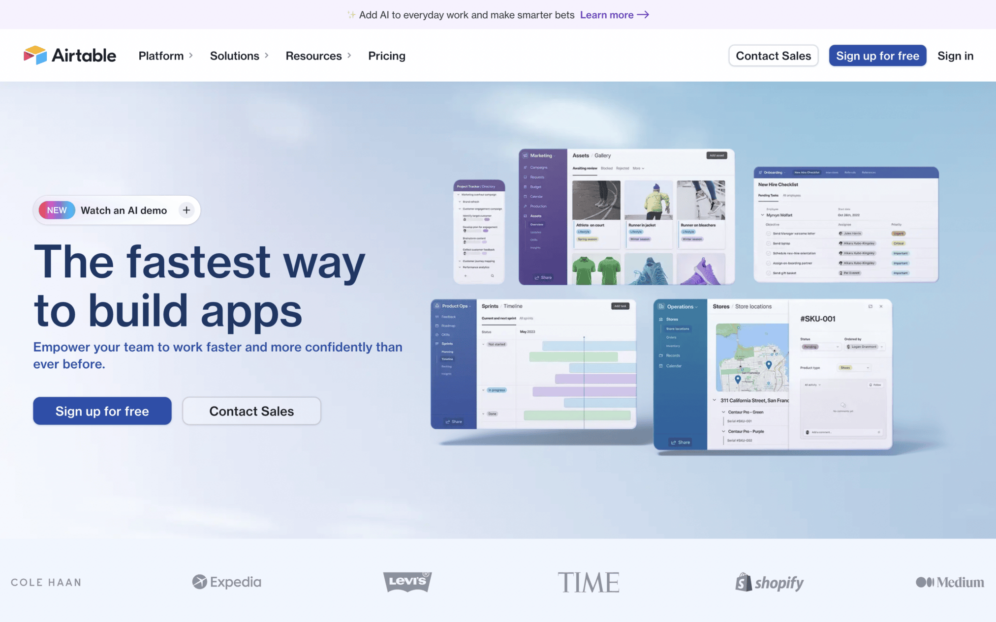
Airtable’s website is indeed a great example of website design for SaaS. It strategically uses a combination of these simple design elements to deliver an informative yet user-friendly experience:
- Animations,
- clear CTAs, and a
- helpful resource hub packed with easily accessible case studies, blog posts, and pricing information.
39. Ghost
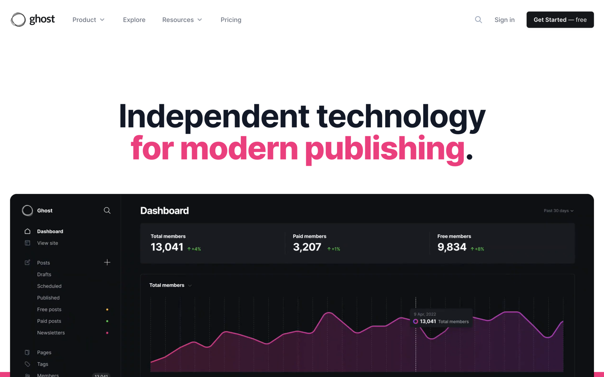
Ghost’s homepage features a graphical representation of the software’s writer-friendly dashboard. This SaaS tool is ideal for building websites, publishing content, and sending newsletters.
The website’s overall design is clean, clutter-free, and focused on visual demonstrations.
40. Copilot
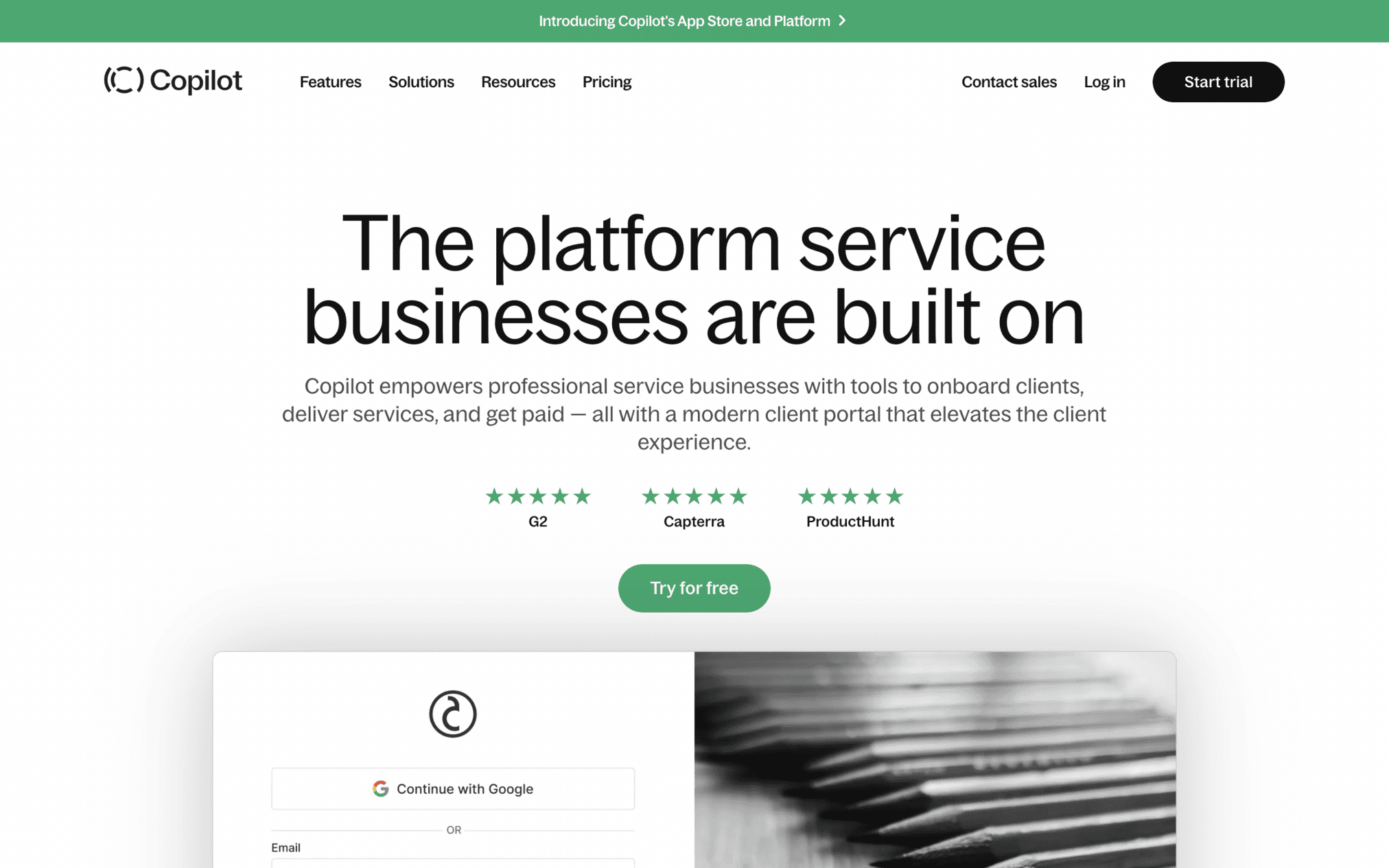
Copilot uses a short headline on its homepage to explain its main value. The message quickly shows how the SaaS platform can help businesses run their work more smoothly.
The headline sets the direction for the full website. From there, visitors get demo videos, customer testimonials, and clear details about the platform’s key offerings.
SaaS Website Design Checklist
Use this checklist before you launch or redesign any SaaS website:
Above the Fold
- Clear headline: users understand what the product does and who it’s for in under 5 seconds
- One primary CTA: free trial, demo request, or freemium sign-up — visible without scrolling
- Product visual: screenshot, interactive demo, or short video demonstrating the product immediately
Trust & Credibility
- Client logo wall: 5–10 recognizable brand names near the top of the homepage
- Named testimonials: real quotes with name, title, and company — not anonymous reviews
- Usage statistics: mention specific numbers (‘10,000+ teams’, ‘99.9% uptime’, ‘$2M saved’,) do not write any vague claims
Navigation and Structure
- Pricing in main navigation: accessible within one click from every page
- Feature pages linked clearly: users can self-educate without contacting sales
- Mobile-responsive: Test the features of the website on iOS and Android devices, not just through browser DevTools.
Conversion Optimization
- Load time under 2.5 seconds: Check mobile page speed with Google PageSpeed Insights. Data shows sites that load in 1 sec see 3x better conversion than the one loading in 5 sec.
- Single CTA: Keep the same main CTA throughout the homepage
- SEO optimized copy: Build product copy around language used in real reviews/search queries.
Conclusion
These 40 SaaS website design examples for 2026 showcase the innovative trends and best practices that define the industry today. By analyzing these exemplary designs and by following SaaS UX best practices, you can enhance your own SaaS website. This will improve user engagement, streamline navigation, and ultimately drive conversions.
The same concepts also apply when improving your entire SaaS product design to provide a consistent user experience across the platform.
Stay ahead of the curve by incorporating modern aesthetics, user-centric interfaces, and seamless functionality. Ensure your SaaS platform not only meets but exceeds user expectations in the competitive digital landscape.
Reach out to Design Studio UI UX and share your thoughts with us.
FAQs
What makes a SaaS website design effective?

An effective SaaS website design generally has a clear value proposition, simple navigation pattern, proper product demonstrations, call-to-action buttons, fast loading pages, and social proof for credibility. It should also use clear copy, and show how it is different from the competitor website.
What is the average conversion rate for a SaaS website?
The conversion rate of a SaaS website is about 3.8%( median rate). Data suggests higher-converting sites (8-12%) have strong social proof, clear messaging, better interactive demos, simple trial flows, and fast loading site pages.
How important is mobile design for SaaS websites?
Mobile design is important for SaaS websites as more than 60% of B2B research now happens on mobile phones. If the SaaS website is not mobile-optimized, it will surely miss prospects early, which is why all featured choices are mobile-responsive.
How do SaaS companies use social proof on their websites?
The best SaaS websites show trusted client logos, review scores, real customer quotes, case studies, press mentions, and clear results ( metrics) . Noble Research 2025 shows that more than 60% of B2B buyers start shortlisting products from peer recommendations, which makes these trust signals important.
What SaaS website design trends are dominant in 2026?
Dominant SaaS trends in 2026 are- minimalist product designs, interactive product demos, dark mode, animation, AI-personalized content, and clean product layouts. Progressive information architecture and strategic whitespace are also common across popular SaaS websites.
How do I choose a SaaS website design agency?
You can easily choose a SaaS website design agency based on their SaaS-specific case studies and conversion-focused process. Also consider their UX research process, responsive design and accessibility standards, usability testing approach , and post-launch support and guidance.



