


UX Design Patterns: Practical Examples & When to Use Them



UX design patterns guide designers on addressing common user interface challenges by explaining user behavior and industry best practices. Using these, experts can create intuitive, consistent experiences that pass Jakob’s 10 usability heuristics.
What are UX Design Patterns?
UX design patterns are reusable, standardized components used to build user interfaces and resolve usability problems, create a familiar and frictionless experience for new and returning users. These are a foundational element of the broader design process. If you want to understand how they fit into research, information architecture, and final handoff, our complete guide on UI/UX design walks through every stage in detail.
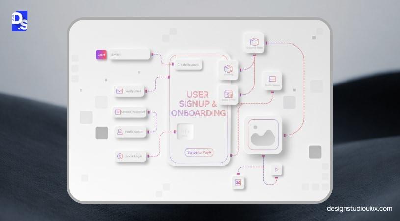
What Is the Difference Between UX Patterns and UI Patterns?
UX patterns are used to create familiar user flows and navigation, such as Page Refresh.
UI patterns are used to create aesthetics and interaction design, such as the hamburger icon.
How Are UX Patterns Different From Components and Design Systems?
UX patterns involve user behavior and interaction logic to provide seamless user experience.
UI patterns are the Legos of a functional and visually appealing platform.
Design Systems is a framework that designers use for consistency, scalability, and governance.
Why Do UX Design Patterns Work So Well for Usability?
UX patterns follow human psychology and the best practices of UI/UX design.
Familiarity
Driven by Jakob’s Law, one of the most important UX Design laws, users arrive with a preconceived idea of how a “checkout” works. Patterns reduce friction; users don’t have to spend 30 seconds wondering, “How do I navigate?” They can jump straight into your product.
Consistency
When an interface is predictable, users feel safe and in control.
If a “Save” button is always in the bottom-right corner of a modal, the user develops “muscle memory.”
Inline validation (red text or crossl) catches errors against a UX audit checklist.
Reduced cognitive load
People have limited working memory, and patterns prioritize “recognition.” A magnifying glass icon tells a user “Search” immediately, and reduce cognitive load in UX.
Better task completion
Patterns are essentially “paved paths” that guide a user toward a goal. Patterns like Progress Bars in a multi-step form visualize this proximity, motivating users to finish the task.
What Are the Main Categories of UX Design Patterns?
1. Navigation Patterns
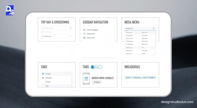
These navigation UX design patterns guide users from one section to another through simple directions. Some work best in either desktop or mobile mode, while others can perform well on both devices. Common navigation patterns include hamburger, tab bar, modal view, wizard, and breadcrumbs.
2. Input & Form Patterns
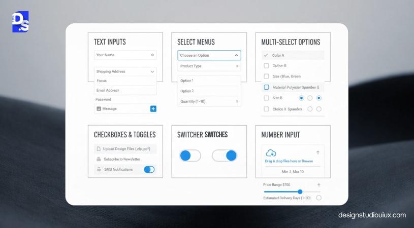
These patterns allow users to provide input or complete different actions through forms. Datepicker is one example that offers almost the same functionality/layout and is often accompanied by a CTA option. Form UX design best practices include submissions, success/fail messages, app notifications, and progress bars.
3. Feedback & System Status Patterns
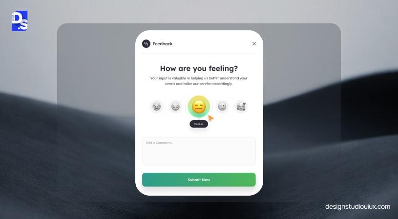
These feedback patterns are designed upon Nielsen’s heuristic, “System status visibility.” It includes skeleton screens (grey placeholders used for content loading), toasts (non-intrusive messages to confirm an action), and empty states (for no data situations).
4. Content & Layout Patterns
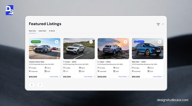
Content and layout patterns are necessary to establish scanability and readability. Cards (for information encapsulation), accordions (collapsing content sections), infinite scrolling, and pagination are usually applied for this purpose.
5. Search, Filter & Discovery Patterns
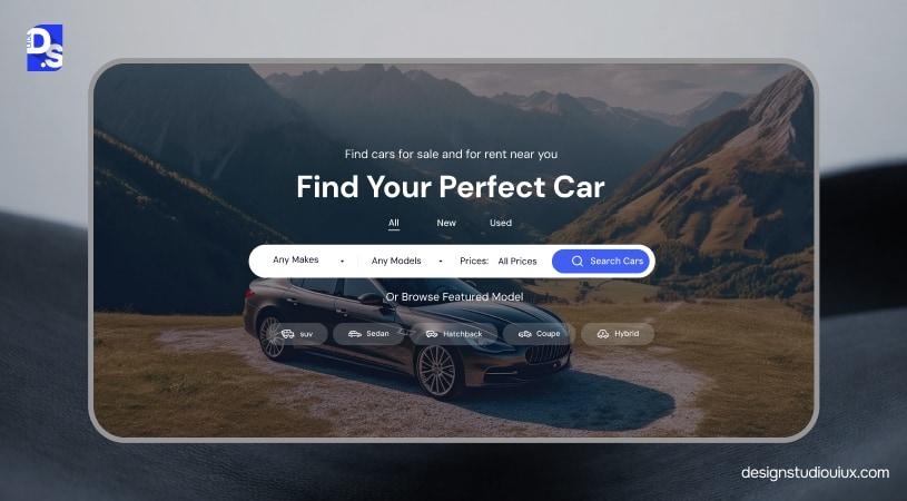
Search, filter, and discovery patterns help users find relevant information. Some of the best options include typehead/autocomplete (query suggestion), faceted search (using filters), and scoped search (limited search).
6. Onboarding & Activation Patterns
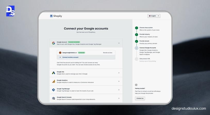
Onboarding and activation patterns bring users to the desired moment as soon as possible. These include walkthroughs (step-by-step overlays) and tooltips, checklists (gamification), and interactive playgrounds (try before they buy), all helping users achieve a common goal.
7. Dashboard & Data-Heavy Patterns (SaaS/enterprise)
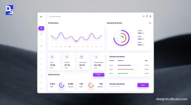
Dashboard UI design guide include patterns like data tables, KPI widgets, and drill-downs help users to process large data sets and make relevant decisions.
8. Trust, Privacy & Permissions Patterns
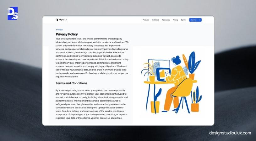
Just-In-Time, Privacy toggles, and verification badges are necessary to maintain ethical and privacy considerations
What Are the Most Common UX Design Patterns With Examples?
It’s impossible to cover all the interaction design patterns examples, but we have tried to accommodate most of it:
Navigation UX Patterns (with examples)
Navigation UX patterns optimize movement between sections without breaking user flow.
Sticky header
What it is
A sticky header will remain fixed at the top of the website, even if users scroll to the bottom.
Use when
For primary navigation to help users access the key actions.
Avoid when
Sticky headers must be avoided with constricted vertical spaces (for small devices).
Example
Amazon showcases sticky headers (with the logo, search bar, and Add to Cart action).
UX writing tip
Should be task-focused and short (“Browse,” “Pricing,” and “Docs,” instead of being generic).
Accessibility/interaction notes
Sticky elements should be accessible, without obscuring content, even when zooming.
Success metric to track
Check these parameters for performance review:
- Click-through rate
- Search usage
- Task completion rate for longer pages
Mega menu
What it is
A mega menu consists of a large panel with multi-category dropdown menus in one place.
Use when
Best suited for multi-category websites, where users prefer to compare and contrast information.
Avoid when
With a shallow information architecture in UX in UX, simple dropdowns will suffice.
Example
Walmart and Best Buy strategically implement mega menus and display product categories.
UX writing tip
The mega menu should match user language, not internal communication labels.
Accessibility/interaction notes
These menus should be easily navigable through keyboards, assisted with ARIA roles and labels.
Success metric to track
These metrics should be tracked:
- Time taken to click on the relevant category,
- Jumping between categories
Sidebar navigation (SaaS)
What it is
A collapsible vertical navigation, often situated on the left or right, highlighting primary services.
Use when
Suitable for websites with multiple focus areas (projects, reports, and settings) and supports contextual switching.
Avoid when
Not an ideal choice for simple web pages or where the vertical navigation is heavily prioritized.
Example
Slack, Notion, and Figma offer seamless navigation for spaces, channels, docs, and projects.
UX writing tip
Use clear section labels to scan through different subsections, such as Workspace and Account.
Accessibility/interaction notes
The sidebar should be accessible through the keyboard and be collapsible upon screen magnification.
Success metric to track
- Navigation depth (clicks to reach key sections)
- Time taken to switch between modules
Breadcrumbs
What it is
A navigation pathway to move from a high-level page to a specific page.
Use when
Hierarchical structures (e.g., categories-subcategories-item) to provide quick navigation.
Avoid when
Websites with flat IA or non-hierarchical (procedural) structure.
Example
This is Amazon’s breadcrumb for “Digital Cameras”, Amazon: “Home>Electronics>Cameras & Photo>Digital Cameras.”
UX writing tip
Use short labels and separators in the pathway and ensure clickability.
Accessibility/interaction notes
Screen readers must have easy access through aria-label=’breadcrumb’.
Success metric to track
Number of clicks on the breadcrumbs, on the back button,
Tabs vs side nav (decision rule)
What it is
A decision rule that combines horizontal (2-6 elements) and vertical tabs for deeper exploration.
Use when
Mainly used to support frequent switching between content tabs.
Avoid when
This decision rule cannot be used for diverging sections or overflowing labels.
Example
The GitHub repo supports this content switching, tabs for viewing code/issues, and side nav for organizational settings.
UX writing tip
Using verbs/nouns for parallel tabs.
Accessibility/interaction notes
Always focus on keyboard accessibility and proper ARIA tab roles.
Success metric to track
These two parameters are tracked: switch frequency and time-to-view content.
Pagination vs infinite scroll (pattern choice)
What it is
Pagination is a type of navigation decision rules, necessary for precise position control, and infinite scrolling assists with casual scrolling.
Use when
- Use pagination to promote comparison/search.
- Infinite scroll to prioritize engagement
Avoid when
Infinite scroll is not a good option for websites with informative footers.
Example
Google has pagination, and Instagram has infinite scrolling.
UX writing tip
In pagination, we usually use “Next/Previous” terms. For infinite scrolling, we use the “Load More” option.
Accessibility/interaction notes
Apart from keyboard control, we also use live announcements for infinite scrolling.
Success metric to track
These three parameters are usually tracked in this section:
- Items viewed
- Scroll depth
- Conversions
Bottom navigation (mobile)
What it is
This mobile navigation UX support for only 3-5 destinations at the bottom.
Use when
This is necessary to frequently access main app areas.
Avoid when
It should be avoided when there are only 5 sections or linear tasks.
Example
Instagram supports mobile-friendly navigation between tabs (Home/Search/Reels/Profile).
UX writing tip
Icons should be paired with short labels to provide information.
Accessibility/interaction notes
Accessibility should be covered through clear active states and 44px+ targets.
Success metric to track
Usually, we analyze tab distribution and section reach time to measure success.
Form & Input UX Patterns (with examples)
Inline validation
What it is
Used for real-time field validation through typed/blurry messages and immediate feedback.
Use when
For high-error fields (emails, passwords) where rework kills completion.
Avoid when
Heavy server calls or premature nagging (1-character passwords).
Example
The card validation system in Stripe.
UX writing tip
Users need specific guidance: “Needs 8+ chars + number” vs “Invalid.”
Accessibility/interaction notes
Must comply with ARIA live errors and non-color cues.
Success metric to track
Field error rates and form completion.
Password strength meter
What it is
A common occurrence is a visual bar/text showing password robustness live.
Use when
Mainly in finance, in high-security contexts.
Avoid when
Cannot be paired with simple policies or misleading rules.
Example
Dropbox uses a color-coded system to define “Weak → Strong” with tips.
UX writing tip
Pair meter with actionable tips.
Accessibility/interaction notes
Screen reader announcements, text backups.
Success metric to track
Strong password %, login failures.
Multi-step forms (progressive disclosure)
What it is
Chunked forms with visible progress, revealing fields sequentially.
Use when
Long/complex forms for onboarding or loans.
Avoid when
Short forms (<8 fields).
Example
Shopify setup: Business → Payment → Shipping steps.
UX writing tip
Outcome titles: “Payment details” vs. “Step 3.”
Accessibility/interaction notes
Step navigation, save progress.
Success metric to track
Per-step drop-off and total completion.
Autofill & smart defaults
What it is
Pre-populating from known data (profiles, browser autofill).
Use when
Repeated fields (addresses).
Avoid when
Sensitive/shared-device data.
Example
How Amazon supports autofill for stored addresses.
UX writing tip
Label edits clearly.
Accessibility/interaction notes
Autofill attributes, label persistence.
Success metric to track
Form time, default edits
Input masking
What it is
Auto-formatting details as typed (cards: 1234-5678-…)
Use when
Strict formats (phones, dates).
Avoid when
Varied international formats.
Example
Stripe card input.
UX writing tip
Hint examples (MM/YY).
Accessibility/interaction notes
Keyboard-friendly, no reader confusion.
Success metric to track
Format errors, correction time.
Social login/SSO (when to use)
What it is
External auth (Google, SAML) for seamless entry.
Use when
The audience has provider accounts.
Avoid when
Privacy-sensitive B2B.
Example
Notion: “Continue with Google.”
UX writing tip
Benefit clarity + email fallback.
Accessibility/interaction notes
Labeled buttons, focus order.
Success metric to track
Signup rates by method.
Error summary + field-level errors
What it is
Top summary + inline per-field errors.
Use when
Long forms.
Avoid when
Short/simple forms.
Example
GOV.UK: Linked summary bullets.
UX writing tip
Actionable, field-linked.
Accessibility/interaction notes
ARIA-describedby, and live summary.
Success metric to track
Resubmission and fix time.
Feedback & System Status Patterns
Toast vs modal vs inline message (decision rule)
What it is
Toast is applied for non-blocking info; modal is used for blocking decisions, and inline is used in field-specific cases.
Use when
Toast- “Saved” confirmations.
Modal- Deletes & failures.
Inline- Form errors.
Example
Figma: Toast (“Copied”), modal (“Delete?”).
UX writing tip
Outcome-first: “Sent—Undo.”
Accessibility/interaction notes
Live regions and focus trapping.
Success metric to track
Action and dismissal rates.
Skeleton screens
What it is
Layout placeholders during async loads.
Use when
Supports hierarchical structure and 300 ms load time.
Avoid when
Instant loads (flicker).
Example
LinkedIn feed skeletons.
UX writing tip
Loading dashboard.
Accessibility/interaction notes
Non-interactive, no announcements.
Success metric to track
Perceived load time and post-load engagement.
Progress indicators
What it is
Bars/spinners for >1s operations.
Use when
Users might doubt system responsiveness.
Avoid when
Instant actions.
Example
Google Drive uploads.
UX writing tip
“Uploading (2/5)…”
Accessibility/interaction notes
ARIA progress roles.
Success metric
Abandonment during waits.
Undo/confirm actions
What it is
Post-action undo or pre-action confirm.
Use when
Destructive/irreversible steps.
Avoid when
Compliance forbids undo.
Example
Gmail “Undo send.”
UX writing tip
Undo warnings where possible.
Accessibility/interaction notes
Reachable undos.
Success metric
Undo frequency, mistake reversals.
Empty states (with guidance)
What it is
Helpful screens for no-data scenarios.
Use when
New users or filter dead ends.
Avoid when
Demo data illustrates better.
Example
Notion: “Create page” prompts.
UX writing tip
Reassure + CTA.
Accessibility/interaction notes
Focusable enterprise CTAs.
Success metric
First-action conversion.
Rate limit / session timeout messaging
What it is
Clear notices for throttling/expiry.
Use when
Backend constraints hit often.
Avoid when
Silent renewals suffice.
Example
Banking: “Logged out for security.”
UX writing tip
Why and next steps.
Accessibility/interaction notes
Timed warnings and focus on actions.
Success metric
Timeout complaints.
Search, Filter & Discovery Patterns
Search autosuggest
What it is
One of common UX design patterns, it includes live suggestions as users type.
Use when
Large catalogs with repeat queries.
Avoid when
Tiny datasets.
Example
YouTube/Google suggestions.
UX writing tip
Highlight matches and categorize.
Accessibility/interaction notes
ARIA combobox.
Success metric
Suggestion clicks, search success.
Filter chips
What it is
Removable pill tags for active filters.
Use when
Frequent filter tweaks.
Avoid when
Dozens of options.
Example
Airbnb: “Pets allowed” chips.
UX writing tip
Readable + “Clear all.
Accessibility/interaction notes
Button semantics.
Success metric to track
Filter & conversion lift.
Faceted filters
What it is
A structured filter panel with categories (price, brand, rating, etc.), often with multi-select.
Use when
- The product or content catalog is large and multi-dimensional.
- Users need control and precision in narrowing results.
Avoid when
When the dataset is simple; faceting may overwhelm users.
Example
Amazon sidebar filters: price ranges, brands, ratings, and shipping options.
UX writing tip
Prioritize the most-used facets at the top and collapse less-used ones by default.
Accessibility/interaction notes
Use form controls that are accessible by default (checkboxes, sliders).
Success metric
Depth of filtering, conversion per filter combination, and use of key facets.
Sort patterns
What it is
Allowing users to reorder results (e.g., by relevance, price, or date).
Use when
- Different orderings make sense for different user goals.
- Users have strong preferences (e.g., “lowest price first”).
Avoid when
- Results have a clearly optimal default sort (e.g., relevance only).
- Sorting adds complexity without supporting a real user need.
Example
Amazon: Sort by “Featured”, “Price: Low to High,” “Newest arrivals.”
UX writing tip
Use user-friendly labels, not technical ones (“Most popular” vs “Sort by descending order of purchases”).
Accessibility/interaction notes
These UX design pattern examples include accessible select elements or radio groups.
Success metric
Use of sort controls, conversion by sort option, and time to find an item.
Saved searches
What it is
Letting users save queries and filters and optionally get alerts.
Use when
- Users repeat similar searches (jobs, properties, deals).
- Inventory changes over time.
Avoid when
- One-off searches dominate, and users rarely return.
- Privacy concerns around storing sensitive queries.
Example
LinkedIn, Zillow: Save the search and get email or push alerts.
UX writing tip
Clarify what “saving” means (“We’ll email you when new jobs match this search”).
Accessibility/interaction notes
- Make save/unsave clearly indicated and operable by keyboard.
Success metric to track
Number of saved searches, return visits, and conversions from saved search alerts.
“No results” recovery pattern
What it is
A deliberate design for empty search states that helps users recover.
Use when
- Search is central, and queries can easily fail.
- Filters are powerful enough to exclude all items.
Avoid when
You can automatically correct or broaden queries safely.
Example
Etsy: “We couldn’t find anything for ‘x’” plus suggestions and related categories.
UX writing tip
Offer specific next steps: “Try removing filters,” “Check spelling,” or show examples of popular searches.
Accessibility/interaction notes
Ensure suggested actions are focused on buttons/links with clear labels.
Success metric to track
Recovery rate from no results (users who go on to find something) and bounce rate on no-results pages.
Onboarding & Activation Patterns
Progressive onboarding
What it is
SaaS onboarding UX introduce product features gradually as users encounter them, rather than in a single upfront tour.
Use when
- The product is feature-rich.
- Users are likely to skip long tutorials.
Avoid when
- Critical safety or compliance information must be delivered upfront.
- Tasks are linear and simple.
Example
Notion: Minimal initial onboarding, then contextual tooltips as you explore.
UX writing tip
Keep messages short, action-oriented, and tied to immediate value (“Create your first page to start organizing notes”).
Accessibility/interaction notes
Ensure hints are reachable by keyboard and dismissible.
Success metric to track
Activation rate (e.g., first project created) and feature adoption.
Checklists
What it is
A visible list of key steps users should complete, often with progress.
Use when
- Onboarding involves multiple actions done in any order.
- You want to guide users to “aha” moments.
Avoid when
- There’s only one simple next step.
- Tasks are strictly sequential and already handled by a wizard.
Example
Asana, Trello: “Get started” checklist (create a project, invite teammates, add tasks).
UX writing tip
Use clear, outcome-focused items (“Invite your team,” “Create your first board”) and show why each item matters.
Accessibility/interaction notes
Use semantic lists and buttons/links.
Success metric to track
Checklist completion rate, retention after completing key items, and time to reach critical milestones.
Tooltips / coach marks
What it is
Small overlays pointing to specific UI elements, explaining what they do.
Use when
- Features are powerful but not obvious.
- You introduce new features to existing users.
Avoid when
- Overused; users start ignoring them.
- They block important content or interactions.
Example
Figma: Coach marks for new features or tools.
UX writing tip
One sentence per tooltip. Focus on value: “Share this file with your team to collaborate in real time.”
Accessibility/interaction notes
Ensure they are dismissible and not keyboard-trapping and that content is available in another modality (docs, help).
Success metric to track
Interaction with coach marks and feature usage before vs. after introduction.
First-success path
What it is
A guided sequence focused on getting users to their first meaningful success as quickly as possible.
Use when
- Product value is not obvious until users complete a key action.
- Churn is high in early sessions.
Avoid when
Products where value is immediately visible without setup (e.g., read-only tools).
Example
Canva provides a quick path to create a design using templates rather than a blank canvas.
UX writing tip
Tell users what’s about to happen and celebrate completion (“Your first report is ready!”).
Accessibility/interaction notes
Ensure the guided path is navigable via keyboard and that users can opt out.
Success metric to track
Time to first key action, conversion to “activated” cohort, early churn.
Demo data vs empty state (decision rule)
What it is
Choosing between showing demo/sample data or a blank slate when users first arrive.
Use when
Use demo data when
- Real value is best demonstrated with populated content (dashboards, analytics).
- Users may struggle to imagine usage from an empty screen.
Use empty state when
- Data is highly sensitive or personalized.
- You need users to create real content immediately.
Example
Analytics tools: Demo dashboards with sample metrics before the user’s own data appears.
UX writing tip
Clearly label demo data (“Sample data for illustration only”) and guide users to connect real data.
Accessibility/interaction notes
Ensure demo labels are accessible text, not just subtle badges. Avoid confusing demo with real alerts.
Success metric to track
Conversion from demo to real setup, confusion about demo vs real, first real data event.
Dashboard & Data-Heavy SaaS Patterns
Table patterns (sticky columns, density toggle)
What it is
Enhanced tables: sticky headers/columns, row height controls.
Use when
Daily large-list work (CRM).
Avoid when
Small data/cards fit better.
Example
Airtable.
UX writing tip
Tooltip acronyms.
Accessibility/interaction notes
Semantic tables.
Success metric to track
Task times.
Bulk actions
What it is
SaaS website design agency use actions that apply to multiple selected items at once (delete, move, assign, export).
Use when
- Users frequently process many items in one go.
- Efficiency is a core value proposition.
Avoid when
- Actions are highly risky and must be done individually.
- Selecting multiple items is rare.
Example
Gmail: Select multiple emails and archive/delete/label them.
UX writing tip
Clarify scope (“Delete 5 selected items”) before execution. Confirm destructive bulk actions or offer undo.
Accessibility/interaction notes
Make checkboxes and “select all” reachable and labeled. Announce selection counts for screen readers.
Success metric to track
Bulk action usage, time saved on multi-item tasks, and error/undo rates.
Role-based dashboards
What it is
These micro-interactions examples include persona-tailored metric views.
Use when
Divergent stakeholder goals.
Avoid when
Unified needs.
Example
Salesforce reps vs. managers.
UX writing tip
Role-language match.
Accessibility/interaction notes
Clear switches.
Success metric to track
Engagement by role.
Drill-down navigation
What it is
Letting users go from high-level summaries into more detailed views via clicks on charts, table rows, or cards.
Use when
- Data is hierarchical or multi-level.
- Users need to investigate anomalies or details.
Avoid when
- Data lacks clear drill-down paths.
- Important metrics are hidden too deeply.
Example
Google Analytics: Click a traffic source to see campaign-level details.
UX writing tip
Use clear affordances (“View details,” clickable rows) and show breadcrumbs or back links.
Accessibility/interaction notes
Ensure clickable regions are large and labeled. Provide visible focus and explicit links, not just clickable entire rows for screen readers.
Success metric to track
Drill-down usage, time to answer specific questions, and “dead-end” views with high bounce.
Export/download patterns
What it is
Letting users download data (CSV, Excel, PDF) or reports.
Use when
- Users analyze or share data outside the product.
- Regulatory or reporting needs exist.
Avoid when
- Exports bypass core value (everyone leaves the product to work elsewhere).
- Data is extremely sensitive and must not leave the system.
Example
Intercom, HubSpot: “Export CSV” for report tables.
UX writing tip
Label formats clearly (“Download as CSV”) and explain implications (e.g., time range, filters applied).
Accessibility/interaction notes
Ensure download links are real buttons/links with clear labels.
Success metric to track
Export usage by segment, time to generate, and support requests for additional formats.
Alerts & exceptions patterns
What it is
Highlights anomalies, errors, or exceptions in data (threshold breaches, failed jobs, anomalies).
Use when
- Users monitor systems or metrics.
- Actionability of alerts is clear.
Avoid when
- Too many low-priority alerts cause fatigue.
- You cannot suggest meaningful next steps.
Example
Datadog, New Relic: Alerts dashboard and alerts list with severity.
UX writing tip
Prioritize clarity and action: “Error rate increased by 40% in the last hour. Investigate in Service X.”
Accessibility/interaction notes
Use color, icon and text for severity.
Trust, Privacy & Permission Patterns (Enterprise-ready)
B2B software may have some additional design patterns. Here are some UX patterns for SaaS products:
Permission prompts (timing)
What it is
Contextual requests (location on use).
Use when
Immediate value justifies the question.
Avoid when
Upfront “just in case.”
Example
Maps: Tap “Current location.”
UX writing tip
Pre-system why.
Accessibility/interaction notes
Decline paths.
Success metric
Grant rates.
Consent patterns
What it is
Granular data-sharing opt-ins.
Use when
GDPR/CCPA compliance.
Avoid when
Unnecessary friction.
Example
Cookie managers.
UX writing tip
Plain language.
Accessibility/interaction notes
No pre-checks.
Success metric
Opt-in rates.
Security reassurance UI
What it is
Trust signals (locks, badges).
Use when
Sensitive transactions.
Avoid when
Fake-feeling.
Example
Stripe checkout.
UX writing tip
Concrete explanations.
Accessibility/interaction notes
Text + icons.
Success metric
Drop-off reduction.
Audit logs & activity feeds
What it is
Action histories for accountability.
Use when
Collaboration/compliance.
Avoid when
Single-user, low-risk.
Example
GitHub.
UX writing tip
Human-readable.
Accessibility/interaction notes
Filterable lists.
Success metric
Dispute reduction.
What are Dark Patterns in UX Design?
Dark patterns mimic UX patterns, but they misguide users instead of helping. Some popular patterns include:
Forced continuity
What it looks like: The free trial auto-renews without clear notice; the cancel option is buried.
Why it harms users: Users feel tricked, lose money, and distrust your brand.
Better alternative: Clear trial end date, upfront pricing, reminders before billing, and easy cancel flow.
Roach motel (easy in, hard out)
What it looks like: One-click signup; multi-step, confusing cancellation process.
Why it harms users: Users feel trapped, leading to complaints, chargebacks, and regulatory risk.
Better alternative: Make cancellation as simple as signup with clear steps.
Prechecked Boxes
What it looks like: Marketing or data-sharing boxes checked by default.
Why it harms users: Users “agree” without awareness, violating informed consent.
Better alternative: Opt-in boxes unchecked by default; concise, clear descriptions.
How Do You Choose the Right UX Design Pattern?
The decision to choose the right UX pattern will depend on the following factors:
Frequency of task
How often will users perform this task?
- Keyboard shortcuts will work in low frequency
- Wizards are more suitable for high-frequency tasks
Risk level
What consequences will the user face after making a mistake?
- High-risk patterns with symmetric friction
- Low-risk- seamless patterns and non-intrusive feedback mechanisms
Complexity
How much data should be processed at once?
- High-complexity: Data-heavy patterns
- Low-complexity: Content patterns
User expertise
Depends on the primary persona.
- Novices require onboarding and guided patterns
- Power users require flexible and dense patterns
Device context
What device is the user using?
- Mobile: thumb-friendly patterns
- Desktop: Precise patterns
Accessibility constraints
What is the usability of this pattern?
- Is it keyboard navigable?
- How accessible is it to all users?
- Support for screen readers?
| Task category | Risk | Pattern Category |
| Simple, frequent | Low | Input and navigation |
| Complex, infrequent | High | Onboarding and feedback |
| Data-heavy, expert | Medium | Dashboards and data |
| Public and personal | High | Trust and privacy |
Have questions in mind? Our experts are ready to answer your queries about these patterns and UI UX design and consulting services.
Conclusion
UX design patterns with examples are reusable solutions that guide user behavior and interaction, making digital experiences intuitive, predictable, and efficient. These mainly indicate how users navigate, complete tasks, and achieve business goals. When applied thoughtfully, they can increase usability, reduce cognitive load, and improve conversions, while supporting accessibility and consistency.
FAQs
What’s the difference between UX patterns and UI patterns?

UX patterns map out how users interact with the interface, and UI patterns define the visual layout and presentation.
Are UX patterns the same as design systems?
No. A Design system is a complete ecosystem of UX and UI patterns, components, rules, and tokens, and is used to create a consistent interface.
How many patterns should a product use?
There is no fixed formula. A product should use as many interaction design patterns examples as needed to improve usability, learning curve, and scalability.
Do UX patterns improve conversions?
Yes, UX patterns can help in conversion rate optimization UX to guide users through the platform and make better decisions.
What’s the best way to document patterns?
UX patterns should be clear, reusable and easy to reference. Here are 7 simple steps to do it:
- A clear, descriptive name
- Define the goal of the problem
- Describe how it works
- Add real product screenshots or wireframes
- Define details and do’s and don’ts
- Link similar patterns
- Follow accessibility guidelines such as WCAG