


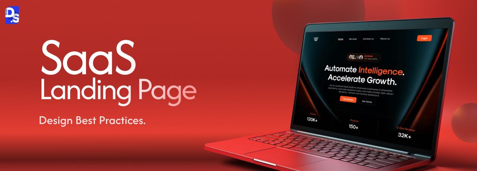
10 SaaS Landing Page Best Practices for Higher Conversions



Your SaaS website’s homepage is there to instantly impress visitors and gradually reveal your company’s story. The site’s pricing pages are there to inform visitors about your products and deals, and to put them at ease about spending money on your SaaS product/s.
But the landing page? It has one job. Convert.
Their only purpose is to drive high-intent actions that directly impact your bottom line. They exist to generate trial signups, demo requests, and ultimately, paying customers. That’s why creating these pages requires a clear, undivided focus.
Sure, there’s room for creativity. But, there are certain SaaS landing page design best practices you CAN NEVER stray away from. These are the practices that add clarity, proof of legitimacy, and frictionless conversion flows to the landing page’s DNA.
Without following these practices, you cannot create high-converting SaaS landing pages. Teaming up with an experienced SaaS Design Agencies that prioritizes following these practices at an institutional level is the best thing you can do.
A landing page is often the first UX layer your users experience. How it connects to your onboarding flow, dashboard design, and pricing page determines the full conversion path. We break that down in the SaaS UX design complete guide.
The next best thing is to learn these essential SaaS landing page design best practices yourself. Learn them before you create the landing pages for your next campaign.
That’s why you’re here. We’ll discuss the most essential SaaS landing page best practices from a 2025-26 lens. By the end, you’ll know exactly what your landing pages need to become your company’s most valuable growth drivers.
TLDR: SaaS Landing Page Best Practices
No time for the deep dive? Here’s a TL-DR SaaS landing page checklist:
1. Lead with a clear, benefit-driven hero section→ headline + CTA that communicates value
2. Keep one primary call-to-action→ (trial or demo) visible above the fold
3. Show product visuals in action→ screenshots, GIFs, or explainer video
4. Add social proof & trust signals→ customer logos, testimonials, review badges
5. Highlight benefits, not just features→ explain outcomes in user terms
6. Be transparent with pricing & plans→ comparison tables and trial details
7. Simplify signup/demo forms→ minimal fields, progressive profiling
8. Design mobile-first & optimize speed→ responsive, fast-loading, thumb-friendly CTAs
9. Use clean visual hierarchy & scannable sections→ whitespace, headings, contrast
10. Continuously test and update→ A/B test CTAs, pricing layouts, and messaging
SaaS Landing Page Design Best Practices
1. Craft a Clear, Outcome-Driven Hero Section
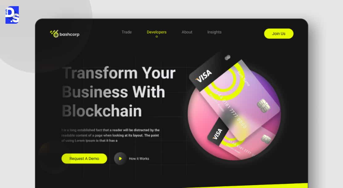
Your hero section is your first and best shot at a conversion. It must instantly communicate your SaaS tool’s core value. And, it must present clear, compelling next steps.
The hero section is the most critical real estate on your landing page. Most high-converting SaaS landing pages win visitors right here. They win them with speed and punch.
First, their headlines explain the ‘why.’ Not just the ‘what.’ Hero section headlines should focus on explaining the specific, tangible benefit the user will get. For example, “Slash reporting time by 7.5 hours.”, not “Advanced CRM Dashboards”.
The sub-headline needs to back this promise up. Explain the ‘how to get this benefit’ in one crisp line. Then, the CTA. It should be action-oriented and benefit-focused. For example, ‘Start Your Free Trial’ is good. ‘Start saving 7.5 Hours a Week for Free’ is way better.
Make the supporting CTA benefit-packed: “Kick off your 14-day free trial” or “Grab a demo slot now – Only 300 Remain.” Finally, show the product. A real HD screenshot. Or, a short GIF of an animated workflow that shows the product in action.
This combo is the foundation of every high-converting SaaS landing page’s hero section. A/B test these components until you get the combo right.
2. Focus Messaging on Benefits, Not Features
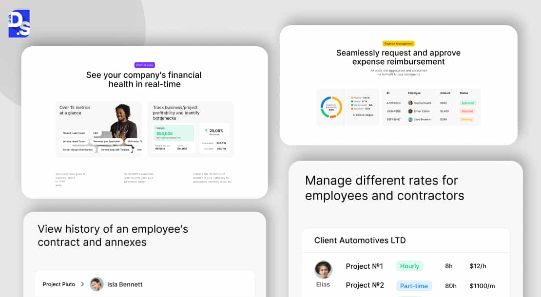
Your customers don’t buy features. They buy solutions to their problems. Your copy must translate your SaaS products’ technical capabilities into their tangible results.
‘Advanced AI Algorithms’ is a feature. ‘Let AI Generate Your CRM Reports in 30 Seconds’ is a benefit. See the difference? One is what you have. The other is what the user gets.
This shift is everything. Turn your SaaS product’s specs into the user’s success. Use bullet points to make these benefits instantly scannable. This requires deep empathy.
Get UX research services to understand your users’ needs/pain points. Then, align your landing pages’ copy with your users’ immediate needs and the language they use.
Need a deep masterclass on SaaS landing page messaging techniques? Read our SaaS UX design guide.
3. Showcase Social Proof and Trust Signals
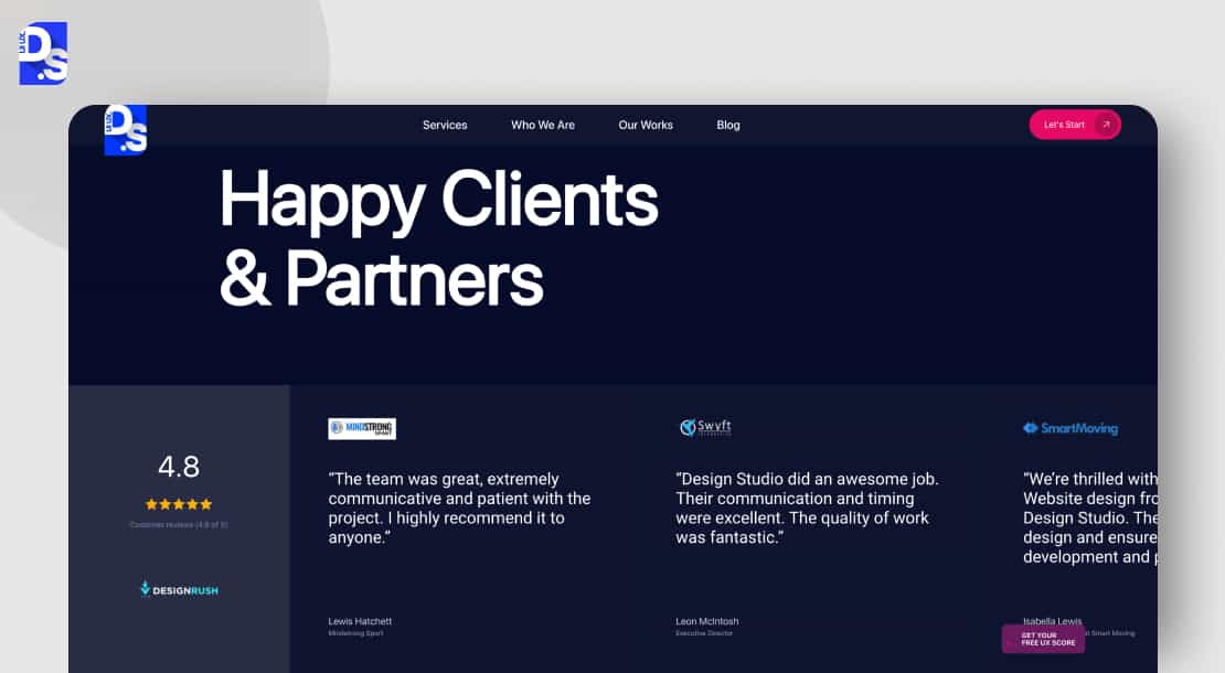
Following this practice shows that other users have taken this leap and landed safely.
People trust other people more than they trust you. Use that to your advantage. Display logos of your best-known clients. It builds instant credibility.
Feature short, specific testimonials. Something like “It’s great!” is weak. “This tool cut our weekly CRM reporting time by 65%” is powerful. Always use a real name, title, and photo.
Show numbers as well. “Trusted by 15,000+ teams across North America” is a powerful trust signal. Add badges from review sites like G2 or Capterra.
Place these elements strategically, for instance, right near the CTA button/s. It gives that final nudge of confidence a visitor needs to click.
4. Use Product Visuals, Interactive Demos
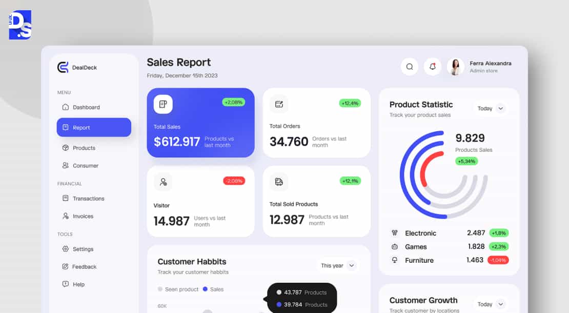
A picture of your SaaS tool is worth 1000+ words of marketing copy. It proves you have a real, working SaaS product. It lets users visualize themselves using it.
Your landing page must provide tangible proof that your SaaS product works.
The best way to do this is to show the actual UI. A clean screenshot of your dashboard. A short, silent GIF that shows a key workflow in action. They are very effective.
Even better? An interactive demo.
Let users click around a sandbox version. It reduces the perceived risk of signing up. It answers the ‘how does this work?’ question before it’s even asked.
Read any successful SaaS app design case study. You’ll see that the SaaS product itself is usually the best salesperson. Let it do the talking.
5. Simplify Pricing and Plan Communication
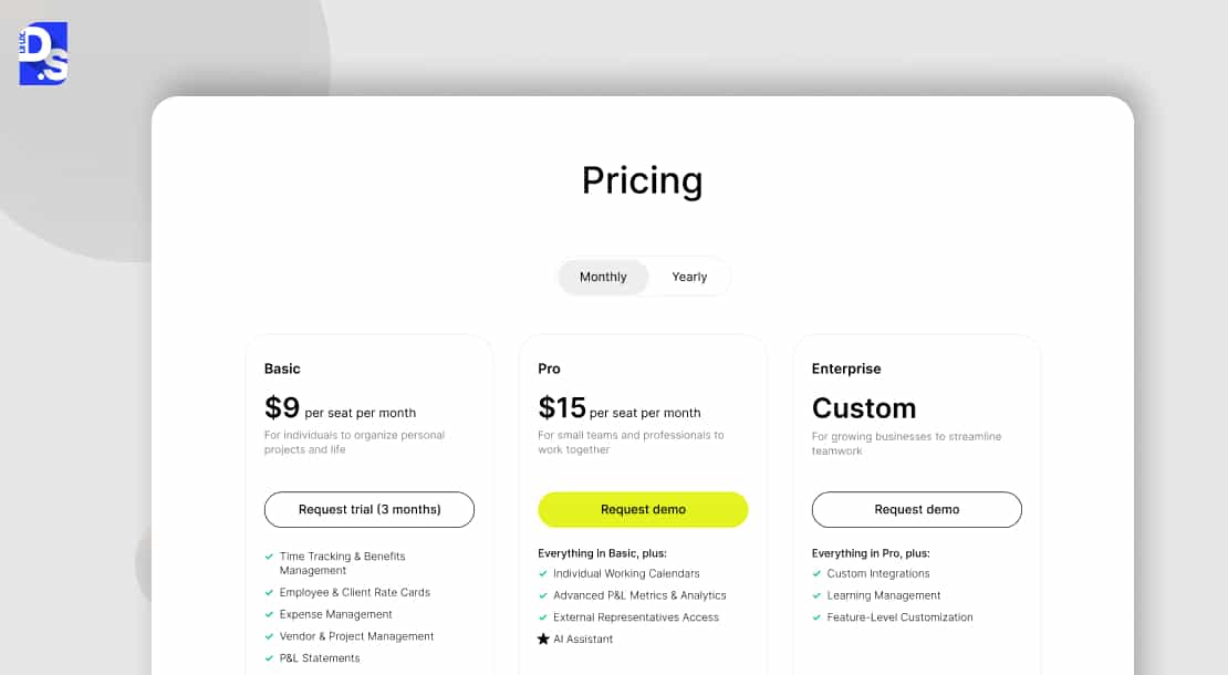
Pricing confusion is a conversion killer. Ambiguity breeds distrust. Transparency, even if your price is high, builds respect. It helps the right customers self-investigate and self-select.
Never hide your pricing. This is a core tenet of good SaaS landing page UI/UX design. It’s a critical part of the user’s decision. Make that decision easy by being transparent.
Are you offering multiple plans? Use a clear comparison table that highlights the key differences.
Always present your free trial or demo as the most prominent, low-friction entry points. Use microcopy to reduce anxiety. ‘No credit card required’ and ‘Cancel anytime’ work wonders.
This transparency kills objections before they form. It shows you respect your prospects’ time and intelligence. It filters out wrong-fit customers. It makes the right ones feel confident.
6. Optimize Signup and Demo Flows
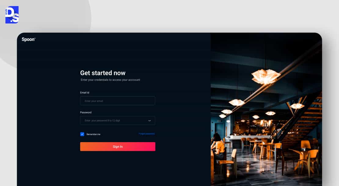
The form is the moment of truth. This is where friction lives. Your goal is to eliminate it. Make the path to conversion so simple, so short that it feels effortless.
Every form field is a hurdle in the users’ minds. Only keep the essential ones.
A great trial signup landing page design often has only two fields: name and email. Collect more data later through progressive profiling after you convert them. Also, offer both paths: ‘Start Free Trial’ for the self-starters. ‘Book a Demo’ for those who need guidance.
Your SaaS demo landing page design can have a few more fields. But still, keep it lean. Use reassuring text. ‘We value your privacy’ or ‘No spam, ever.’ Small words that build confidence right before the user submits their info.
7. Mobile-First, Fast-Loading SaaS Landing Page UI/UX Design
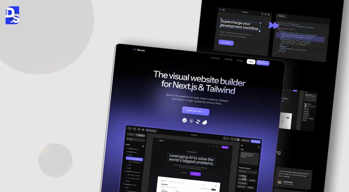
Mobile isn’t the future. It’s the present. If your SaaS landing pages are non-mobile-optimized, you’re rejecting a majority of your audience at the door.
Over 60% of global website traffic is mobile. Yes, many SaaS buyers still do most of their business via desktop. But most of these buyers visit SaaS sites via mobile to explore the products after business hours.
Your landing page must be flawless on their small screens, because for many users, the landing page experience becomes their first step into SaaS onboarding UX.
Give all landing pages responsive layouts so that they look and work perfectly on all screens. Optimize their load times by compressing all media assets. Minify their code. Test all forms for mobile-friendliness. Make all CTAs large and thumb-friendly.
8. Strong Visual Hierarchy and Scannability
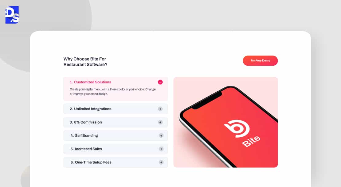
SaaS buyers don’t have time to read through landing pages. They need scan-able info. The design should guide their eye effortlessly – from the hero section to the benefits to the CTAs.
Make the landing page easy to scan.
- Break the page’s content into short, digestible sections.
- Use clear, benefit-driven headings to break up the content.
- Use whitespace to give your design room to breathe and to separate distinct sections.
- Use high-contrast colors to make your text readable and your CTAs pop.
- Maintain a consistent brand identity with your colors and typography.
A clean, scannable landing page subconsciously tells the user, ‘This brand is organized and professional.’
9. Build Trust with Compliance and Transparency
Enterprise buyers, in particular, need to know their data is safe. Display your security credentials on the landing page to give them that assurance.
Address every visitor’s security concerns head-on.
- Add trust badges for security protocols (like SOC 2).
- Add compliance links for regulations like GDPR and CCPA.
- Make your privacy policy and terms of service easy to find.
- Be crystal clear about the terms of your free trial or demo.
What happens when the SaaS product’s trial ends? Is a credit card required?
Answer these questions upfront as well.
Also, make it easy to get help. Provide clear links to support chat or help-related documents.
All high-quality enterprise UX design solutions are built around a foundation of trust and transparency.
If your landing page is asking for critical business info, it’ll need this foundation too.
10. Continuously Test and Iterate
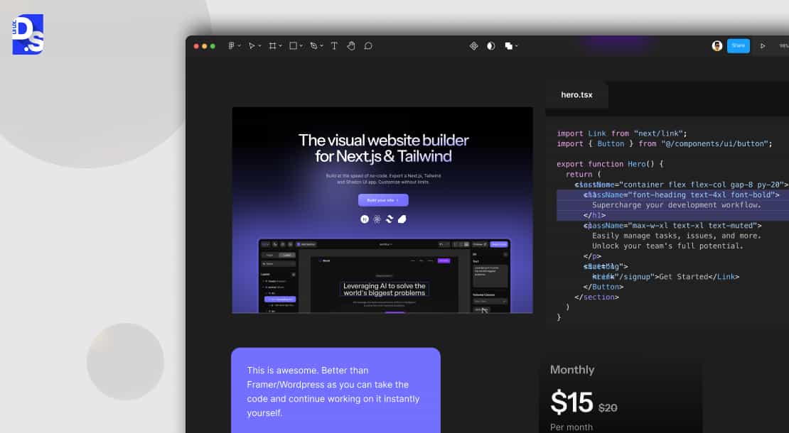
The best landing pages are never ‘done.’ They evolve based on how real people react. This final practice is about making your landing pages living, evolving items.
What’s the most important of all SaaS CRO best practices? It’s this one. The best way to optimize SaaS landing page conversions is to never stop improving. So, A/B test everything.
The headlines and hero sections. The CTA button colors and pricing table layouts. Test everything, measure everything. Does an HD video increase time-on-page? Does a different offer copy get more demos? The tests will reveal the right answers, the design decisions.
Use this UX audit checklist to understand what elements you need to routinely test and refine. Get UX audit services if you don’t know how to A/B test individual webpage elements. Use the audit data to launch a targeted conversion rate optimization UX strategy.
Also, keep refreshing your social proof and product visuals regularly to keep them current. Keep the landing pages’ design up-to-date with the latest SaaS design trends. For many of these actions, you may need to get website redesign services from time to time.
That might cost a bit of time and money. But your high-converting SaaS landing pages will consistently earn way more revenue than you spend on these testing/refining efforts.
SaaS Landing Page Examples
Theory is good. Examples are better. Here’s how leading SaaS companies apply these principles in the real world to drive incredible results.
Examining high-converting SaaS landing page examples is one of the best ways to understand these principles in action.
Slack’s landing pages are masters of the outcome-driven hero section. Headlines clearly explain that Slack is “where work happens” for 21st-century employees.
Right underneath are logos of prominent clients, a video showing the product in action, and prominent ‘TRY FOR FREE’ CTAs.
Asana’s landing pages instantly explain how the product helps you ‘Work anytime, anywhere.’
That’s what their B2B clients want to see – the SaaS tool’s core value in a nutshell.
Every B2B SaaS product design case study highlights this kind of clear value-driven communication.
‘Loom on. Meetings off.’ Along with this intriguing headline, Loom’s landing pages feature stunning walls of video testimonials from real users.
They instantly intrigue and hook visitors. Companies like Loom invest in world-class B2B website design services to create such effective landing pages.
Check out these SaaS website design examples to find more inspiring examples.
Conclusion
Master these SaaS landing page design best practices one by one. And, never stop refining the guided paths to conversions on these pages. Remember – the best SaaS landing page design is one that’s always improving.
Need help getting started?
Reach out to our SaaS website design agency for a free consultation on implementing these practices. Let’s co-create a website redesign project plan that places your SaaS site on the path to continuous growth right away!
FAQ’s
What is the most important element of a SaaS landing page?

The hero section is the most important element. It must instantly communicate your unique value and feature a clear, primary CTA.
Should SaaS landing pages show pricing?
Yes. Transparency builds trust. Hiding pricing creates friction and suspicion.
What’s better: Free trial CTA or Demo booking CTA?
Offer both. Self-service users prefer trials. Complex or expensive products often need a demo. Let your visitor choose.
How long should a SaaS landing page be?
A SaaS landing page should be there as long as it needs to be. Simple products need less. Complex, expensive solutions often need more copy to overcome objections and build trust.









