


12 SaaS Website Design Best Practices & Examples (2026)



Quick Summary
SaaS website best practices include a clear above-the-fold value proposition, product-led CTAs, trust signals like security certifications and case studies, mobile-first layouts, and interactive product demos — all built around a SaaS-specific information architecture (Home, Product, Pricing, Solutions, Resources) rather than a traditional B2B brochure structure.
Why SaaS Website Design Matters?
SaaS marketplace is highly competitive, and if your website does not follow SaaS website best practices, it’s difficult to gain the audience’s attention. Also, Stanford research shows 75% of users would leave if the website design fails to impress them.
SaaS websites don’t address the right audience, or communicate product details without overwhelming. In some cases, the website’s layout can affect conversion rates, bringing it up to 23%, as per Databox survey. This is why experts recommend prioritizing SaaS UX fundamentals while getting a website done.
What Makes SaaS Website Design Different From Traditional B2B Websites?
Traditional B2B websites introduce a company, but SaaS websites are meant to go beyond that. These websites introduce the product’s value to guide buyers with their decision-making process. Here are major differences:
Freemium vs Trial Models
Traditional B2B sites often push contact forms or long sales conversations.
SaaS websites, especially self-serve ones, must support freemium or free-trial entry points.
- Freemium SaaS websites highlight what users can access immediately and what upgrades unlock.
- Trial-based SaaS websites emphasize urgency, scope, and what users should accomplish during the trial window.
Demo-Based Selling
Many SaaS companies sell through demos, not proposals. This means the website must earn the demo, not just request it.
SaaS website design best practices frame demos around:
- Specific use cases
- Measurable outcomes
- What the buyer will learn in 30–45 minutes
Product-Led Growth Changes the Website’s Role
In product-led SaaS, the website acts as an extension of onboarding, mirroring many principles discussed in SaaS onboarding UX best practices.
Key implications:
- Primary CTAs lead to the product, not sales
- Messaging mirrors in-product experiences
- Value is demonstrated before human interaction
A traditional B2B website usually displays the information as a top-of-funnel brochure, unlike SaaS websites.
Time-to-Value Messaging
SaaS buyers care deeply about how fast value appears after signup.
Effective SaaS websites emphasize:
- Speed of setup
- First meaningful outcome
- Low switching and implementation effort
These best practices don’t exist in isolation; each one is grounded in a deeper understanding of how SaaS users think, navigate, and make product decisions. Our complete SaaS UX design guide ties all of these practices back to the UX research, onboarding psychology, and retention design principles that make SaaS products genuinely work.
12 SaaS Website Best Practices
1. Craft a Clear SaaS Value Proposition (Above The Fold)
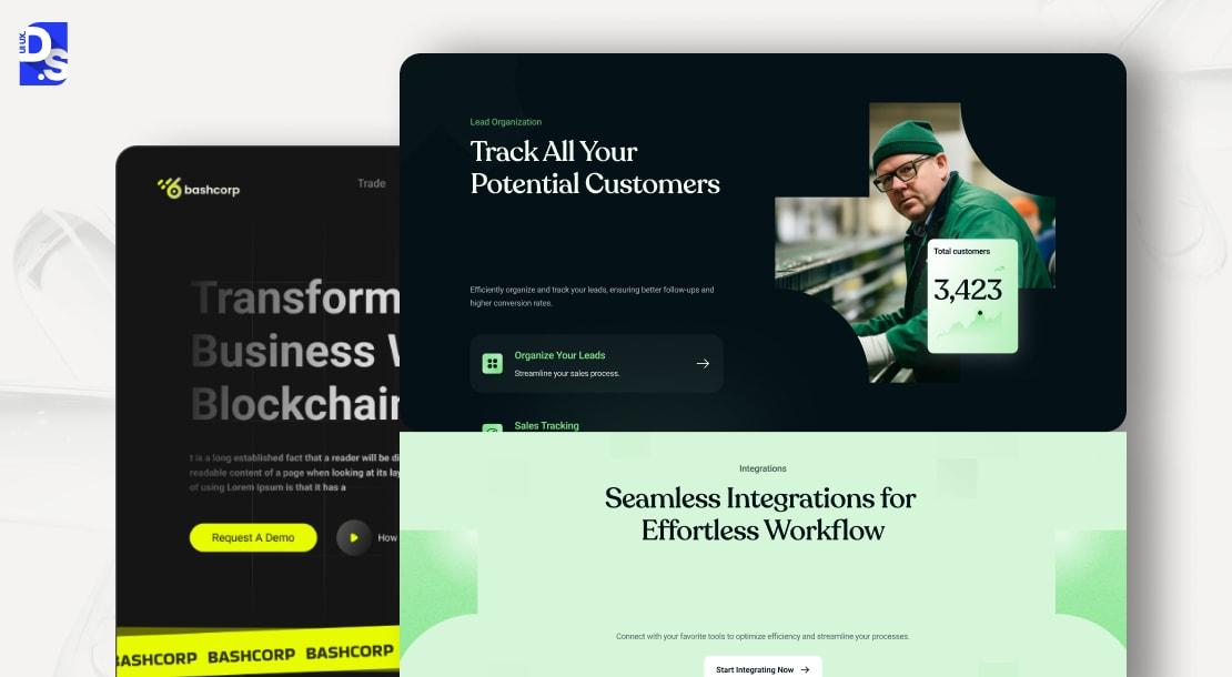
A SaaS website with a clear value proposition would quickly grab the attention of consumers. SaaS consumers will not read text paragraphs, they need snapshots. The hero section, when designed with SaaS home page best practices in mind should answer these questions:
- What is the product all about? Add a statement detailing the product and its purpose.
- Who is the target audience? Mention who would benefit from your product.
- What is the ROI of the product? Specify how the product will benefit the target audience.
SaaS website best practices mention specificity, in terms of target audience and the product’s uniqueness. Let’s understand this with a few examples.
An AI work management system should clearly mention the product’s outcomes, and have a prominent CTA to drive action.
A video messaging platform shows video testimonials and product intent in the Hero section to showcase ROI.
A ridesharing website clearly mentions its primary intent in the Hero section, followed by a subheading, and an appropriate CTA.
An online music platform clearly states the purpose, and encourages users to hit the Upload button.
2. Build a SaaS-Focused Information Architecture (IA)
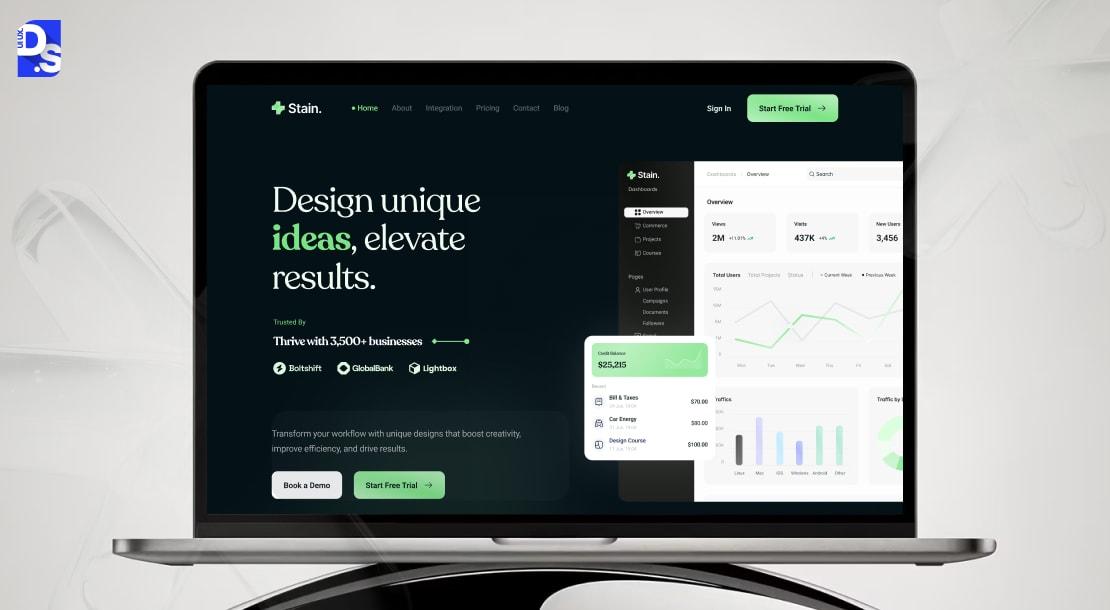
The proper Information Architecture for a SaaS website design consists of these pages:
Home, Product/ Features, Pricing, Solutions, Resources, Login/ Signup, and Support.
Home Page
An ideal Home page of a SaaS website would follow these SaaS design principles:
- Value proposition
- Proof/ Results
- Primary CTA
Product Page
- Features
- Integration
- Security/ Compliance
Solutions
Solutions page is divided into sections:
- By Role (Founders, Sales, Marketing)
- By Use Cases
- By Industry
Pricing
- Plan tiers
- Feature comparison
- Upgrade tabs
- CTAs
Resources
- Blogs/ Guides
- Case Studies
- FAQs
- Docs
Login/ Signup
- Email/ SSO
- Post Signup
Support
- Help center
- Chat/ Contact
3. Design High-Converting SaaS Homepage Layouts
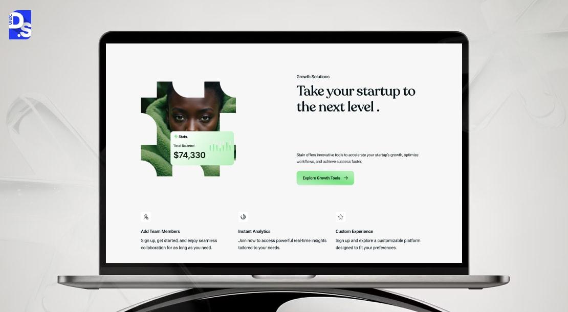
The home page is the first point of contact between your brand and customers, so it needs to create a positive impression.
How to achieve that?
Problem→ Solution Framing
Most SaaS website examples highlight these points:
- A pain point recognizable to your audience
- A statement showing your product solves the problem (What, How, Why)
Social proof placement
9 out of 10 consumers prefer going through reviews before making a decision. Once you have stated the value proposition, back it up with social proof. Show actual snapshots either directly in the Hero section, or just below it. The best formats: customer logos (highly effective), usage numbers, and outcome-based testimonials (What Our Customers Are Saying).
Use Cases
Use cases provide reassurance to your claims, without forcing people to go through the entire website. They typically provide these answers:
- Is this built for my industry?
- What specific result does it offer?
Product Shots
This section includes the in-depth presentation of your product, along with images, and tutorials. It will provide technical perspective, including features and functionalities. It should be concise, mostly visual through images and screenshots.
CTA Hierarchy
Primary CTAs should be placed after the subheading, and is the most important button of the page. These buttons would prompt people to take action, such as “Try for free”, or “Book A Demo”.
Secondary CTAs are created to target people who are not ready to convert, and they follow SaaS landing page best practices. Maybe they need more information about the company/ product. “Read Success Stories” or “See How It Works” are the best examples of secondary CTAs that should be placed on the home page.
4. Effective Feature & Product Pages for SaaS
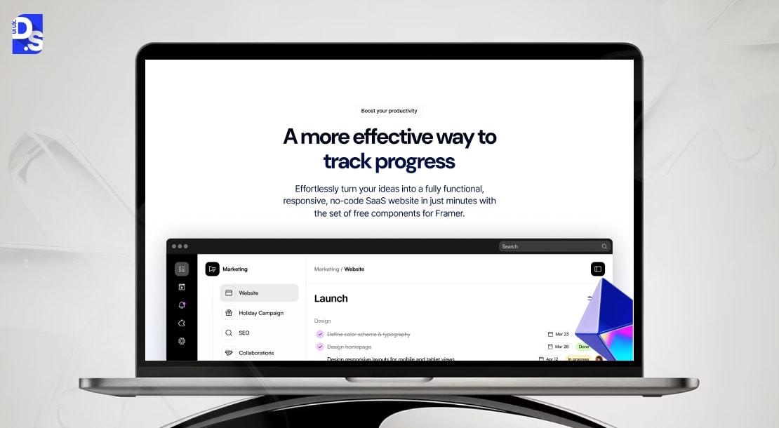
If you consider your website as a funnel, then each page has a separate role. Home page is for the first impression, and the product page is where the conversion begins.
The “Feature/ Product” page turns interest into intent, they are prepared to validate and justify options.
It should answer “how does this help me with my business or deliver results for my business?”
Logically, the product page should follow this structure: feature → benefit → outcome, or “outcomes with/ without product”, for example:
| Feature | Benefit | Outcome |
| Real-time reporting | Sales and finance teams can check performance metrics live | Accurate forecasts, fewer missed quotas |
| Automated workflow | Eliminate manual approvals | Saves hours per week, reduce errors |
| Centralized customer data | Teams access unified history | Faster support, higher retention |
This model works because buyers understand the product’s purpose, impact, and ROI (to justify the purpose to other stakeholders).
Even better, use screenshots or interactive elements to drive people to take the specific action.
5. Trust & Social Proof Elements That Boost SaaS Conversions
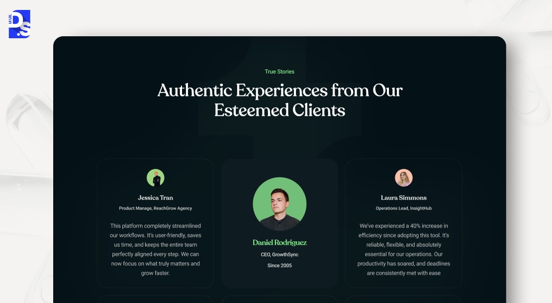
The buyer journey in B2B SaaS is complicated and can span several months, as multiple stakeholders are involved in selecting the SaaS design agencies.
If you want to earn trust from these stakeholders and boost website conversion, you have to show proof and follow SaaS conversion best practices. Here are some formats you can try:
Testimonials
Testimonials, especially video testimonials are the most authentic form of social proof, and can create emotional connections. If you use quotes, add specific results, metrics, or something that helps in visualizing the benefits.
Case Studies
Case studies express how your product can solve a particular issue, in the classic problem-solution-result format. The case study should mention:
- Problem statement
- Pain points to be addressed
- Implementation process and timeline
- ROI
- Quotes/ unexpected results
These case studies should be filtered by industries and outcomes, to help viewers with their search.
Security Certifications
Security badges do not only imply that the website is safe and secure, it shows the tenacity of your business as well. It shows that you will budge from compliance (ISO, GDPR, and SOC 2) to ensure you earn customer loyalty and trust.
Uptime Guarantees
Your website should mention how dependable and stable your business is. How to do that? By adding an uptime promise (99.9% SLA) upfront to reassure your clients about that.
Integrations Library
A SaaS product, compatible with all third-party tools and integrations, demonstrates expertise, flexibility, professionalism, and ease of use.
6. Optimizing CTAs for SaaS (Free Trials, Freemium, Demo)
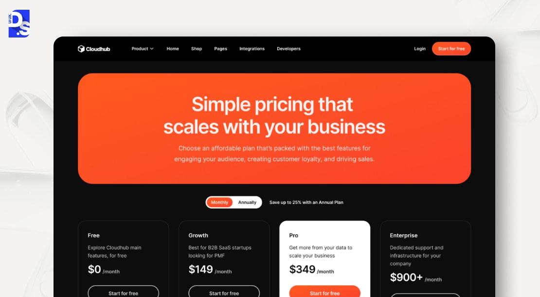
SaaS web design best practices state that CTA buttons should use action-first verbs to evoke emotions and sense of urgency in the B2B SaaS audience. The micro-copy should not be generic, rather, it should be relevant to the user’s intent.
If you plan to offer a free trial, the CTA should be “Start Your Free Trial”, instead of “Click here”.
To increase software download or demo booking, you can try “Ready for 3X outcome? Start here”, instead of Download Now.
You can also use the same CTA if you plan to provide Freemium to users.
7. SaaS Navigation & Micro-Interactions for Better UX
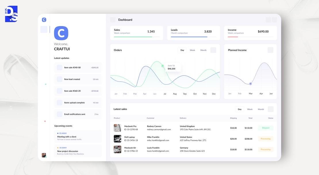
Your SaaS website structure should be smooth and engaging, otherwise, the conversion rate will dip. A thoughtful navigation system also plays a crucial role in Conversion Rate Optimization by guiding users toward key actions without friction.
Sticky Navigation
The primary menu, placed at the top, should be sticky, otherwise, it would make user experience unnecessarily complicated. A responsive website is necessary for better Navigation UX design patterns.
All the important user flows, such as “Case Studies”, “Explore Features”, or “Sign Up”, should be frictionless and free from frustration.
Simple design principles like progressive disclosure help users navigate the website without getting overwhelmed.
Login visibility
Login buttons help users to access their personal information, and they are located at the top right corner.
Dashboard preview snippets
Dashboard preview snippets on a B2B SaaS website give buyers a fast, concrete way to understand product value without committing to a full demo.
Microinteractions
Microinteractions (hover effect, form validation, and progress indicators) reassures users that they are following the right way, and keeps them engaged while navigating through the website.
8. High-Quality SaaS Visual Design (UI, Color, Screenshots)
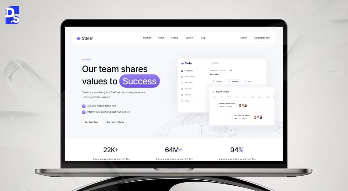
A SaaS website’s UI must be visually appealing, and functional, just like its UX. So, these points are taken into consideration:
Clean UI
SaaS UI design trends mention the website should present a seamless experience, and the flow should be logical, from one section to the next. This is to ensure your buyer explores the website in depth, and it can be reinforced through consistent branding and color scheme.
Real Product Screenshots
Real screenshots show buyers what they will actually interact with, signaling maturity, readiness, and credibility to enterprise buyers.
Dashboard Hero Section
Dashboard hero sections work because they communicate what the product does, what metrics it surfaces, and how teams use it to make decisions.
Avoid Mockup Overuse
Mockups should support context, not aesthetics. Overreliance on stylized device frames and conceptual visuals can dilute trust and slow understanding. .
9. Mobile First SaaS Website Design
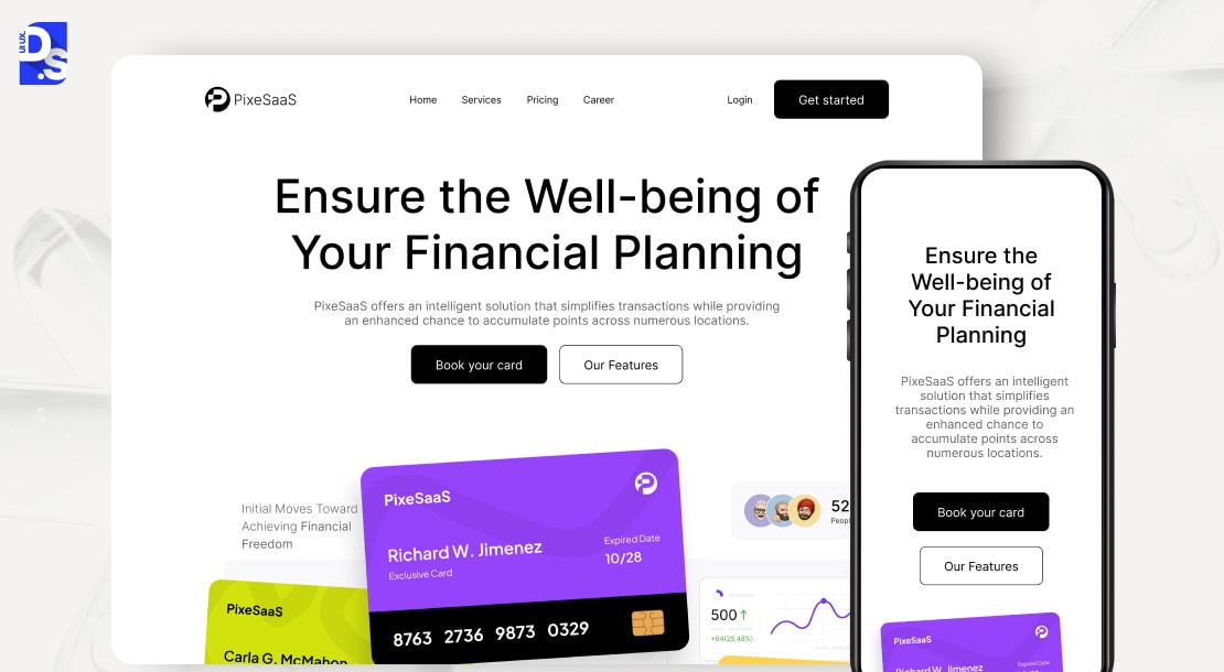
The success of your website depends on its conversion, especially, mobile-first conversion. Let’s understand why mobile-first design matters for SaaS companies:
Smaller screen size
Mobile screens are smaller, so your website needs to adjust, to ensure consistent user experience across devices. This means
- Short headlines
- Sections should be independent
- Visual proof
- No dense blocks
10. Technical SEO Considerations for SaaS Websites
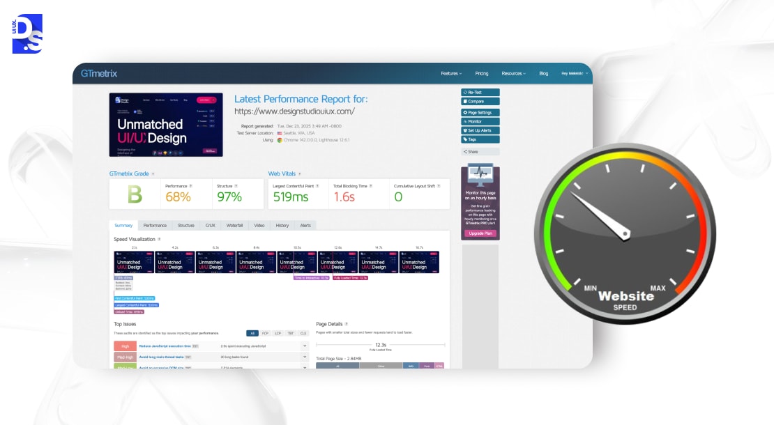
SaaS is highly competitive, so basic SEO optimization will not suffice. For on-page SEO, incorporate problem-specific keywords and purchase-intent keywords to capture relevant traffic (hreflang tags can be used for multi-lingual support).
For technical SEO, focus on schema markup, canonical tags, and segmented XML sitemaps to assist engines crawl and index your page. Want to delve deeper into website speed UX tips? Our consultants are here to help.
11. Personalize the SaaS Website Experience Using Behavioral & Account Data
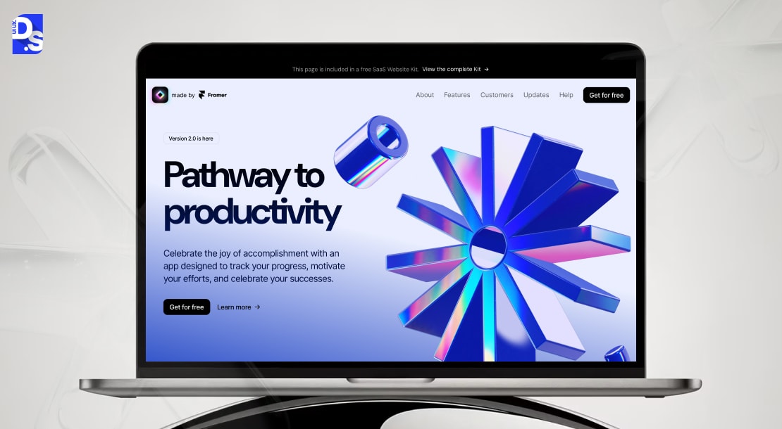
Modern SaaS websites adapt in real time based on who the visitor is, what they’ve done, and where they are in the buying journey. Personalization turns generic messaging into relevant experiences that accelerate engagement and conversion.
Behavioral signals reveal why a visitor is on your site.
- Pages visited (features, pricing, integrations)
- Repeat visits vs first-time visits
- Time spent on specific sections
- CTA interactions (demo clicks, comparisons viewed)
How to apply it:
- Show use-case–specific messaging after repeated feature views
- Surface comparison content for pricing-page return visitors
- Promote demos or trials once high-intent behavior is detected, as mentioned in SaaS pricing page design
12. Integrate Interactive Product Experiences (Tours, Sandboxes, Live Demos)
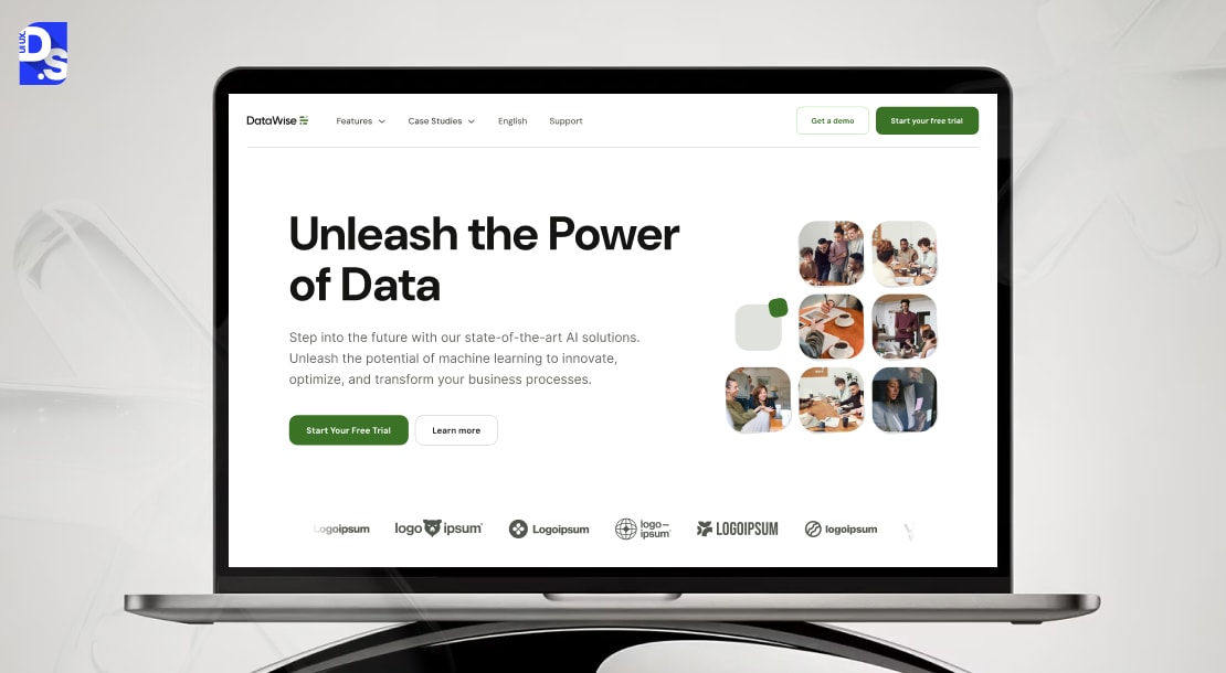
Interactive product experiences help SaaS buyers understand value by using the product, not by reading about it.
Embedded Interactive Demos (No Signup)
Embedded demos allow visitors to explore the product directly on the website—without creating an account.
Impact
- Removes friction at the evaluation stage
- Builds confidence by showing real interactions
- Increases trial intent by previewing actual value, not promises
Feature Walkthroughs
Workflow-based walkthroughs show how users move from problem to outcome.
Impact
- Communicates value in context
- Aligns product capabilities with real jobs-to-be-done
- Improves perceived usefulness before signup
Click-Through Product Tours
Click-through tours simulate key product flows using guided steps.
Impact
- Shows how features connect into workflows
- Helps buyers visualize day-to-day usage
- Reduces cognitive load during first exposure
Live Demo for Decision Stage
Live demos remain critical for late-stage SaaS decisions.
To maximize impact:
- Personalize demos by role or use case
- Show before → after outcomes, not feature tours
- Tie workflows to measurable results
Mini Sandboxes for Core Actions
Mini sandboxes let users try a limited but meaningful action—creating a report, configuring a workflow, or triggering an automation.
Impact
- Delivers hands-on value instantly
- Reduces skepticism by proving functionality
- Accelerates emotional buy-in
Guided Trial Onboarding
Some SaaS websites embed guided onboarding before the actual trial starts—explaining what users will do first, second, and third.
Impact
- Sets clear expectations for the trial
- Shortens time-to-value once users sign up
- Increases activation rates post-signup
Pre-Recorded Walkthroughs
For advanced or enterprise SaaS, short pre-recorded walkthroughs explain complex capabilities without requiring a demo call.
Impact
- Educates buyers asynchronously
- Filters high-intent users before signup
- Reduces dependency on sales for early evaluation
Examples of High Performing SaaS Websites (Explained by Patterns)
Product-Led Homepages
Product-led homepages treat the product as the main hero, with above-the-fold focus on what the product does in practice, Clear “Try it” or “See it in action” CTAs, and interactive previews.
Conversion-First SaaS Websites
Conversion-first examples of SaaS website design are engineered around one primary action, trial, demo, or activation, by establishing a CTA hierarchy, direct messaging, and highly targeted content.
Value-Outcome Messaging Over Feature Lists
The best SaaS websites frame features in this “Feature → benefit → outcome” structure to emphasize results, speed, and efficiency and help buyers make the correct decision.
Proof-Driven Evaluation Pages
Saas websites place social proof near CTAs and rely on use-case validation instead of generic testimonials.
Conclusion
SaaS websites are much more than a marketing asset, it is a growth engine, sales qualifier and consumer onboarding page. SaaS buyers are increasingly becoming self-directed, so following SaaS website best practices is necessary to earn consumer’s trust and drive conversion.
These websites prioritize clarity over storytelling, through above-the-fold value propositions, SaaS-based Information Architecture, action-driven CTAs, trust signals and product experiences to drive the point home.
If your Saas website is not demonstrating value, maybe it’s time to audit your website against these best practices, or book a strategy call with SaaS Design Agencies to boost its profitability and ROI.
FAQs
What makes a good SaaS website design?

A good SaaS website design clearly communicates what the product does, who it’s for, and the value it delivers, through product clarity, strong CTAs, proof, and a SaaS-focused information architecture that supports trials, demos, and product-led growth.
How do you structure a SaaS website?
A SaaS website should be structured around the buyer journey, and it should include core sections like Home, Product/Features, Pricing, Solutions, Resources, Login/Signup, and Support.
What should a SaaS homepage include?
A SaaS homepage should include a clear hero value proposition, real product or dashboard screenshots, a primary CTA (trial or demo), social proof, and supporting use cases.
What are the best practices for SaaS feature pages?
High-performing SaaS feature pages use a feature, benefit, outcome structure, show workflows instead of isolated features, include screenshots or interactive demos, and connect every section to a conversion action like starting a trial or booking a demo.
How do you increase conversions on a SaaS website?
SaaS website conversions improve with clear value messaging, focused CTAs, strong trust signals, fast performance, and reduced friction.
What is the difference between SaaS website design and traditional web design?
SaaS website design focuses on demonstrating product value, enabling self-serve evaluation, and driving trials or demos. It prioritizes product-led growth, time-to-value messaging, and conversion paths over static brand storytelling. Traditional web design mainly focuses on building brand presence through emotion-driven storytelling cues.



