


B2B SaaS UX Design: Patterns for Buyers, Users, and Admins



The person who approves your B2B SaaS product may never use it. The person who uses it every day may have had no role in choosing it. Then there is the admin, somewhere in between, who must set it up for 40 people before either person can use it. If you design for only one of these three people; and not considering the pain points of the rest, the other section of people may decide the product is too hard to use. In the worst cases, they may stop using the product, thereby increasing the abandonment rate.
That is the actual difference between B2B and B2C SaaS UX. Yet, many articles miss this point. They take basic SaaS onboarding tips, add the word enterprise, and present them as a strategy. The real approach looks at the buyer, admin, and end user as three people with different needs using the same product.
B2B SaaS UX design means creating a product experience that works for everyone which includes buyer, admin, and end user. Here, admins need tools that make setup and user management easier. End users need clear screens that help them finish their daily tasks. Buyers need enough proof to explain the purchase to others. Onboarding also needs to work for a team, not just one person. A B2B digital product may be rolled out in multiple stages, with setup, training, user access, etc. happening separately, over days or weeks, not through one simple signup.
User Persona for B2B SaaS product: Who Are You Actually Designing For in B2B SaaS?
In B2B SaaS, you mainly design for four distinct groups, which are: the chooser, admin, end users and IT/ security reviewer:
| Persona | What They Actually Need | Where They Interact With the Product |
| The champion / chooser | Evidence to justify the purchase internally: ROI clarity, security posture, ease of rollout | Marketing site, sales demo, trial environment |
| The admin | Fast, safe configuration: permissions, integrations, data setup, without breaking things for end users | Admin console, settings, user management screens |
| The end user | A fast path to their actual task, minimal training required | Core product screens, day-to-day workflows |
| IT / security reviewer | Proof the product will not create risk: SSO support, audit logs, compliance documentation | Security pages, admin audit trail, documentation |
Most B2B SaaS products design carefully for the end user and treat the other three as an afterthought, usually a PDF security sheet emailed on request. Buying committees for enterprise software commonly run six to eleven people across these roles, according to widely cited Gartner research on B2B purchasing, and every one of them forms an opinion based on what they can actually see. Also, if the control panel looks messy, buyers lose trust during making a sale. This happens even when the security elements are hidden under support requests, resulting in drop-off.
How is UX Designing process different for B2B SaaS and B2C SaaS?
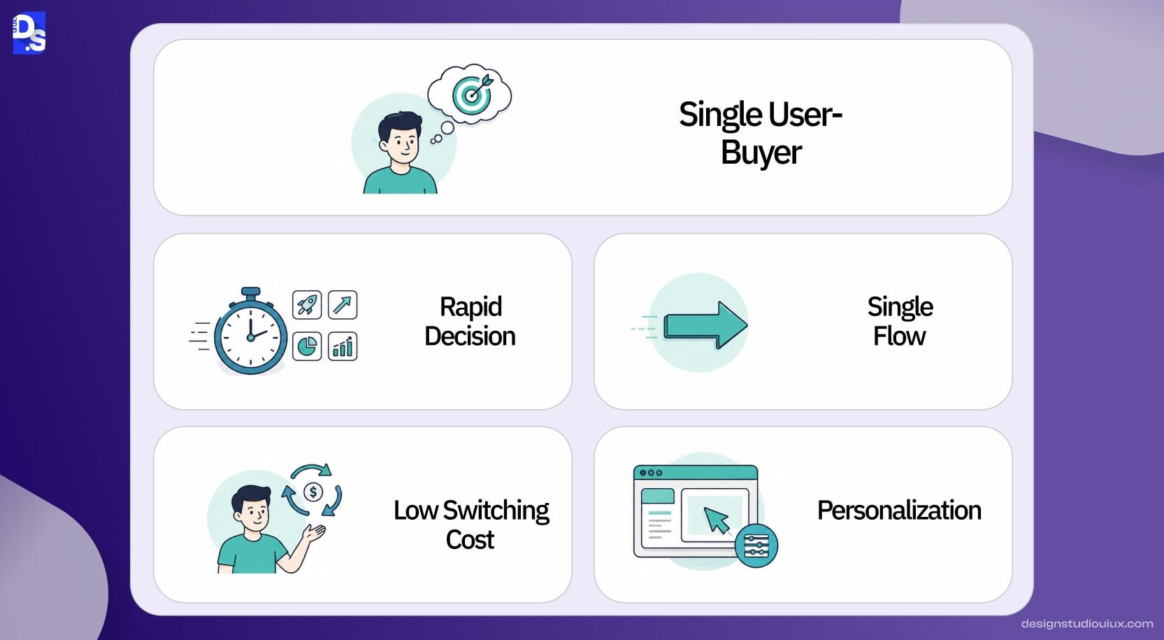
The main difference in the UX designing process is who you are designing for and how long it takes them to decide. In consumer software, the user and the buyer are almost always the same person, and the decision happens in minutes. In B2B SaaS, Nielsen Norman Group draws a useful line between the “user” and the “chooser”, the person who will use the product day to day is frequently not the person who decides to buy it, and B2B buyers also carry higher switching costs, since walking away from a signed contract is a bigger deal than closing a browser tab.
That gap shows up constantly in how B2B software gets built. Teams design a beautiful onboarding flow for the end user and forget that a security team member needs to see compliance details before anyone signs anything, or that an admin needs a permissions screen before a single end user logs in. NN/G’s research into B2B usability found that a lot of B2B sites and products still design as if none of this matters, treating the buying and using experience as one and the same. It is not, and the products that treat it as one flow tend to satisfy neither audience well.
Which UX Patterns Support Multi-Stakeholder Buying and Multi-Role Usage?
Good UX patterns show what each user needs based on their role. This keeps users from relying on support or sales for basic tasks.
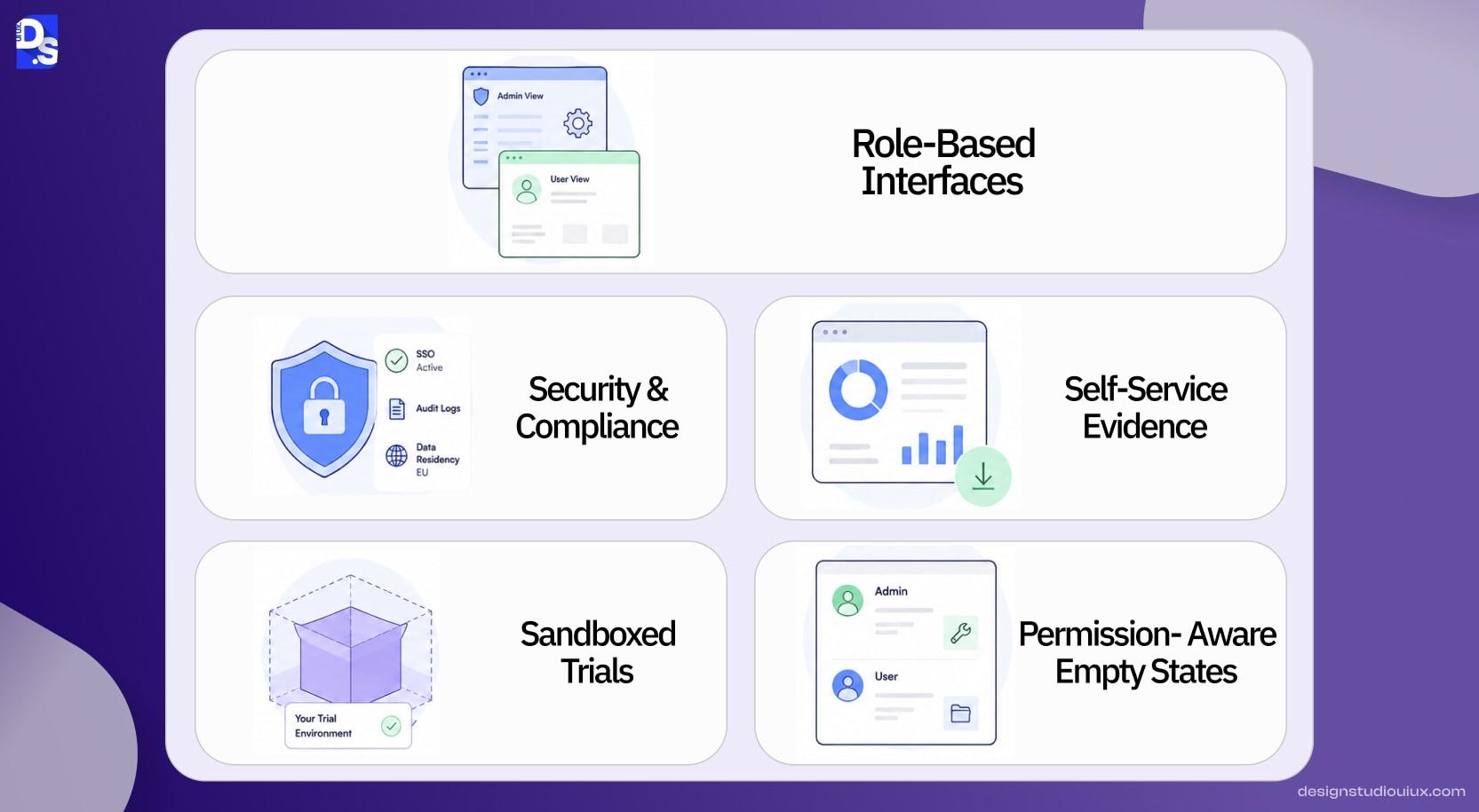
- Role-based interfaces, not one dashboard for everyone. .Admins see configuration and permissions, end users see their workflow, nothing more
- A visible, in-product security and compliance surface, SSO status, audit logs, data residency, so IT reviewers do not have to leave the product to evaluate it
- Self-serve evidence for the champion, usage reports and ROI-relevant metrics that a non-technical buyer can pull together into an internal pitch without help
- Sandboxed trial environments that let a champion demo the product to their own stakeholders without needing you in the room
- Permission-aware empty states, a new admin and a new end user should never see the identical blank screen with identical instructions
What Does This Look Like in Products People Actually Use?
A few well-known B2B tools make the persona split visible rather than theoretical.
- HubSpot separates its audience and gives each group the tools they require. Leaders get high-level dashboards that focus on pipeline and ROI. Marketers and sales reps see screens built around daily tasks. Admins work in a separate settings area for integrations, permissions, and data controls. Each group gets a different interface within the same product.
- Slack keeps its main member experience simple. Here, regular users do not have to deal with setup/security settings and workspace admins get a separate console for provisioning, security settings, and billing. Most regular members never have to think about this area.
- Atlassian’s Jira separates project tasks for regular team members from high-level management tools handled by system administrators. Regular users focus entirely on their daily boards and tickets without ever touching the complex admin layer. This smart design keeps daily work simple while giving IT leaders full control over the system.
None of these tools solved the user experience problem by adding more features to a single dashboard layout. They solve the issue by accepting that decision-makers, system admins, and everyday buyers/users bring completely different goals and operational needs to the platform. By designing separate workflows for each role, the product remains clear and efficient for everyone involved.
Check out our B2B SaaS product design case study to know how we executed this structural approach for a real client.
How Should Onboarding Differ for B2B SaaS With Long Sales Cycles?
Consumer onboarding helps one user start right away in a single visit. B2B onboarding requires an admin to set up the team, invite members, and adjust rules before others begin weeks later. Plan for this step-by-step group process instead of expecting everyone to join together.
- Give the admin a distinct setup flow, separate from what end users will eventually see, focused on configuration, not feature discovery
- Let admins invite teammates in stages rather than requiring a full team import before anyone can start using the product
- Build end-user onboarding that works whether they arrive on day one or week six of the rollout, do not assume a shared start date
- Surface a rollout progress view for the admin, seats activated, teams onboarded, so they can see and report on adoption without pulling a report from support
This is where our own thinking on activation design applies directly, the same product-led growth UX patterns that drive individual activation still matter here, they just have to work for a staggered, multi-person rollout instead of a single new signup.
What Are the Common Mistakes in B2B SaaS UX?
Hiding security and compliance information and unstructured or poor onboarding in SaaS products can frustrate users, impacting the adoption rate. The most common mistake is designing the product as if it only has one audience, when in practice five of these show up in almost every B2B SaaS product we review.
- Designing the whole product around the end user and treating the admin console as a lower priority afterthought
- Hiding security and compliance information behind a support request instead of showing it in the product where reviewers actually look
- Giving every account the same onboarding regardless of company size, a 5-person team and a 500-person rollout need different setup paths
- Building one dashboard that tries to serve buyers, admins, and end users at once, and satisfies none of them well
- Assuming the whole team arrives and activates on the same day, when in practice adoption trickles in over weeks
How to Check If B2B SaaS UX Needs Complete Redesign or an Optimization?
The decision between a SaaS redesign or a simple site optimization comes down to identifying where friction occurs. You do not have to redesign the software entirely, if simple workflow cleanup can fix the issue. If everyday users find the interface messy but complete their tasks, targeted UX optimization will streamline their experience.
Conversely, if security teams block contract approvals or system administrators struggle with setup, you have a structural persona problem that screen updates cannot fix. Base your decision on where revenue or user activation actually stops, not on aesthetic trends.
Get SaaS UX Advice From a Team That Has Shipped Products
Most of the B2B SaaS products we get called in to fix or redesign the software are not failing because their interface looks bad. They are failing because an admin gave up during setup, or a security reviewer never got what they needed and quietly killed the deal. Our SaaS UX Design Ultimate Guide covers the broader principles this piece builds on, and our SaaS onboarding UX patterns and SaaS dashboard design guides go deeper on the individual screens involved.
If you want us to look at where your own product is actually losing adoption and know about the usability issues, our UX audits use actual data instead of guessing.
FAQs
Who are the main personas in B2B SaaS UX design?

User persona of B2B SaaS is divided into four categories and the main personas are – buyer, admin, end user, and IT or security reviewer. Here, each and every person has a different role in choosing, setting up, using, or approving the product.
Why is B2B SaaS onboarding different from B2C onboarding?
B2B SaaS onboarding happens in stages and the process. It guides the entire whole team through setup and tech links to prove value. On the other hand, B2C onboarding gives one user a fast and easy start all by themselves.
Does a B2B SaaS product need a different design for admins and end users?
Yes, admins need data controls, user tools, and setup options, while end users need clean, fast steps for daily work. Separate designs stop confusion, keep the system safe, and match each person’s exact job.



