


What Are UI/UX Design Key Principles to Improve Usability?



The principles of UX design are the rules that can assist in the development of accessible, attractive, and user-friendly digital content. To achieve effortless experiences, they concentrate on usability, consistency, accessibility, feedback, and user-centered design.
Adherence to these principles enhances user satisfaction, retention, and business performance in general.
Why Are UX Design Principles Important for Usability?
UX pioneer Peter Morville outlined 7 pillars of a good user experience (UX): useful, usable, findable, credible, accessible, desirable, and valuable. UX design principles help designers create products and services that are user-centered, accessible, enjoyable to use, and have all of these 7 qualities.
Why should professionals learn, follow, or care about the principles of UX design?
Because they are the secret sauce behind those seamless experiences. They guide designers to prioritize users, ensuring products are intuitive and enjoyable. For pros, mastering these principles means happier users, fewer errors, and better business outcomes, like loyal customers and lower support costs.
Here, we will unpack all the major UI/UX design principles that turn chaotic interfaces into intuitive masterpieces. Whether you are a designer, product manager, or business leader, learning and following these principles will help you craft experiences users love and keep coming back to.
Let us dive in.
What are UX Design Principles?
UX design principles are foundational guidelines that steer designers toward creating products centered on user needs. Rooted in research and real-world practice, these principles keep the focus on the human behind the screen.
They are not rigid rules like the must-follow laws of UX, but flexible frameworks or best practices to ensure usability, accessibility, and engagement are baked into every decision. Think of them as a compass.
They do not dictate every step but keep you aligned with your true north, the user.
Picture a team debating button colors for hours. Without shared guidelines, subjectivity takes over. The core principles of UX design cut through the noise, offering evidence-based strategies to resolve conflicts and streamline workflows.
They also bridge the gap between user desires and business goals. For example, maintaining consistency in design (a core principle) both reduces user frustration and reinforces the brand identity.
These principles are battle-tested insights from decades of research, failures, and breakthroughs. Ready to explore the principles every designer should master?
UX design principles are the foundation of every design decision — but understanding each principle in isolation only gets you so far. To see how they connect across research, wireframing, prototyping, and handoff, our complete UI/UX design guide walks through the entire design process in one place.
Let us unlock the secrets to building products users cannot live without.
15 UX Design Principles & Best Practices
- Usability First
- Consistency and Standards
- Accessibility for All
- Feedback and Response Time
- User-Centered Design
- Visual Hierarchy
- Mobile First Design
- Learnability
- Error Prevention and Recovery
- Aesthetic Usability Effect
- Minimalism and Clarity
- Task Oriented Design
- Context Awareness
- Trust and Credibility
- Feedback Loops
These 15 UX design principles are your go-to guide for crafting world-class UI/UX design services that users cannot get enough of.
1. Usability First
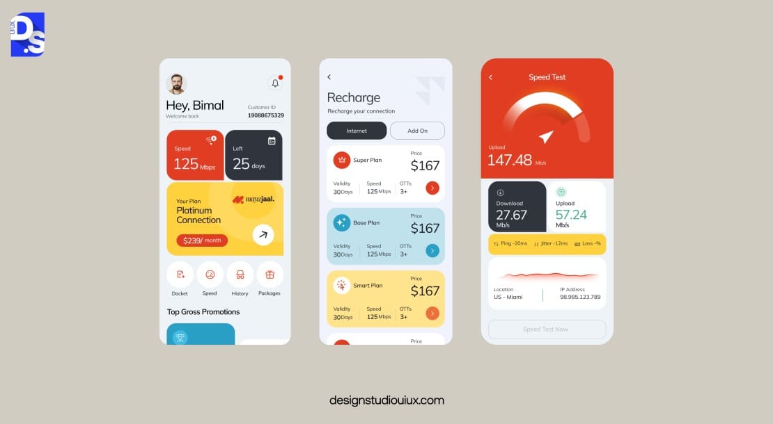
The reason we need to keep the actual human beings, or users, front and center, is to ensure the wrong decisions do not get pushed through because of the personal opinions of the business stakeholder, or, worse, the assumptions of designers.
To keep everyone’s irrelevant opinions and assumptions at bay, and put the attention back on the user, start every project with the following questions:
- Who is it for (the audience)?
- Why will they use it (the goal)?
- How will they use it (the context of use)?
A usable design lets its target users achieve their goals without friction. That means making sure your product is dead simple to use, no head-scratching required. We are talking clear navigation, intuitive layouts, and zero confusion.
Why does it matter? If users cannot figure out your app or site instantly, they are gone. Simplicity cuts frustration and keeps them coming back. Plus, it is a win for businesses. Engaged users mean more loyalty and fewer support headaches.
How do you nail it? Start with user research to know who is using your product and why. Keep navigation straightforward, think clear labels and minimal steps. Testing all designs with real people helps you spot trouble areas.
Also, use familiar design patterns. A magnifying glass icon for search? Users get it instantly. Reinventing the wheel risks confusion.
Adopting a ‘usability first’ mindset sets your design project for success.
2. Consistency and Standards
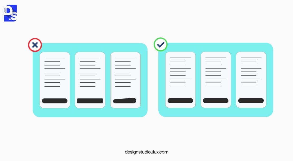
Consistency is your user’s best friend. It makes your design predictable, so users do not have to relearn how to use it every time they switch screens.
Keeping visuals and functions uniform across your product, same colors, same button styles, same vibe, boosts usability and screams professionalism. It also strengthens your brand’s image in the users’ minds.
Take Apple. Whether you are on an iPhone or Mac, the experience feels familiar. That is consistency in action, making life easier for users and designers alike.
To pull it off, build a design system with set rules for fonts, colors, and components. Stick to platform norms, like iOS or Android guidelines, so users feel at home. Audit your product regularly. Ask specific questions about your design choices like – does the “Submit” button look the same everywhere? If not, fix it.
3. Accessibility for All
Accessibility in UX is usability for people who interact with products differently. That could mean people who are blind or color blind, or people with mobility, hearing, or learning difficulties, but it also includes people who are sleep deprived, holding a baby while also holding a mobile phone, or people who need their glasses to read.
If accessibility is considered up front and implemented correctly, it ends up benefiting everyone.
- Closed captions on videos are essential for deaf people but are also helpful for users watching videos in public.
- Upping the contrast is essential for visually impaired people, but it is also helpful for people using their phones in glaring sunlight.
- Simplifying language is essential for people with learning disabilities, but it is also helpful for people whose native language is not English.
And the list goes on and on. It is the right thing to do, and it widens your audience. Prioritizing accessibility also keeps your designs legally viable and SEO-friendly in many parts of the world.
To follow this principle, conduct routine accessibility audits. Identify and fix accessibility issues as soon as you spot them. Use clear navigation. Add assistive technologies like support screen readers and other assistive tools to your product’s design.
Also, allow for differences in digital literacy in your design. Make sure that the design of the interface can be used easily regardless of digital literacy. That means designing for the people with the lowest level of digital literacy first.
Ensure that the interactions and language are easily understood and context-appropriate.
Users should be able to use your design at their own pace. Also, add sufficient help and instructional information throughout the experience.
4. Feedback and Response Time
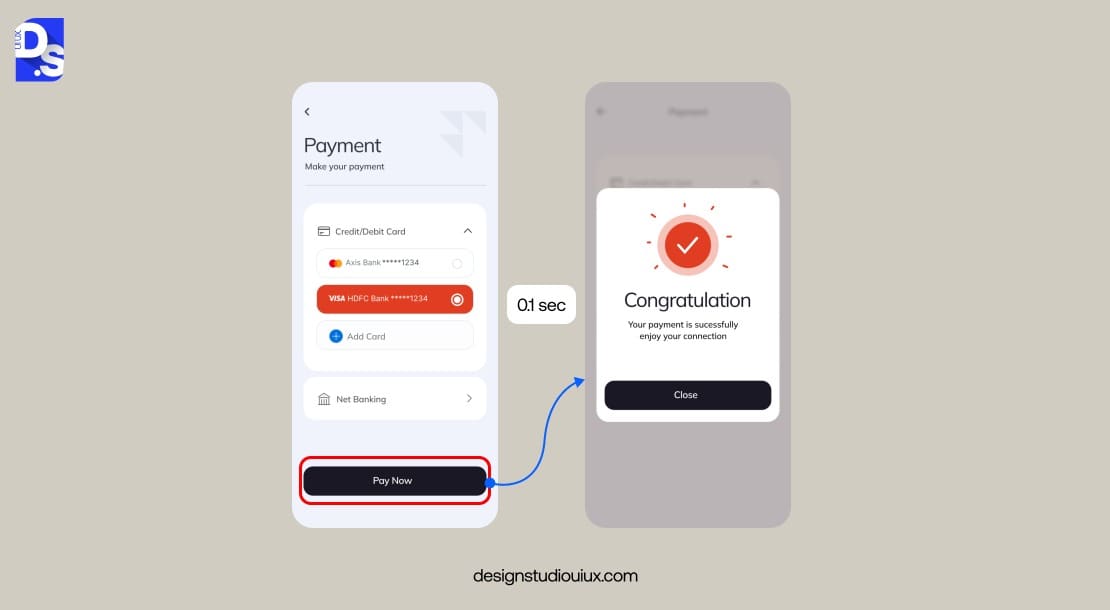
Silence is deadly. When users click “Submit”, they expect confirmations, not a frozen screen. Without it, users feel lost. Quick responses keep them hooked; delays make them bounce.
Jakob Nielsen’s research says that a response time of 0.1 seconds from a digital product’s interface feels ‘instant’ to users. 1 second keeps them focused. Anything between that and 10 seconds severely tests their patience.
Keep responses snappy, under a second if possible. Test timing to avoid lags. Add visual cues like progress bars or “Saved!” messages to all important responses. Use spinners, progress bars, or microcopy (Hang tight! We are processing your order”) as responses as well.
Instagram nails this UX design principle. Tap “Like” on the app and the heart fills instantly. That is feedback done right. It cuts uncertainty, boosts confidence, and keeps users in the flow.
5. User-Centered Design
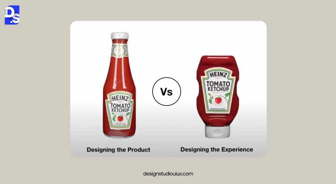
A good UX designer has to be a good detective and a good therapist. The person should be able to make people feel comfortable, ask the right questions, read between the lines, and follow the right hunches.
These people skills are extremely important for creating designs that solve the right problems. Products that solve real problems win hearts, and wallets. Adopting user-centered design and involving users early is the best way to reach this result.
This approach is all about digging into what users need and weaving that into every step of the UX design process. Start with research, surveys, interviews, and so on. Test prototypes with users and tweak based on what they say.
Use empathy maps to understand what users think, feel, see, and do while interacting with your product.
Listen, learn, iterate. That’s how you build something users enjoy.
6. Visual Hierarchy
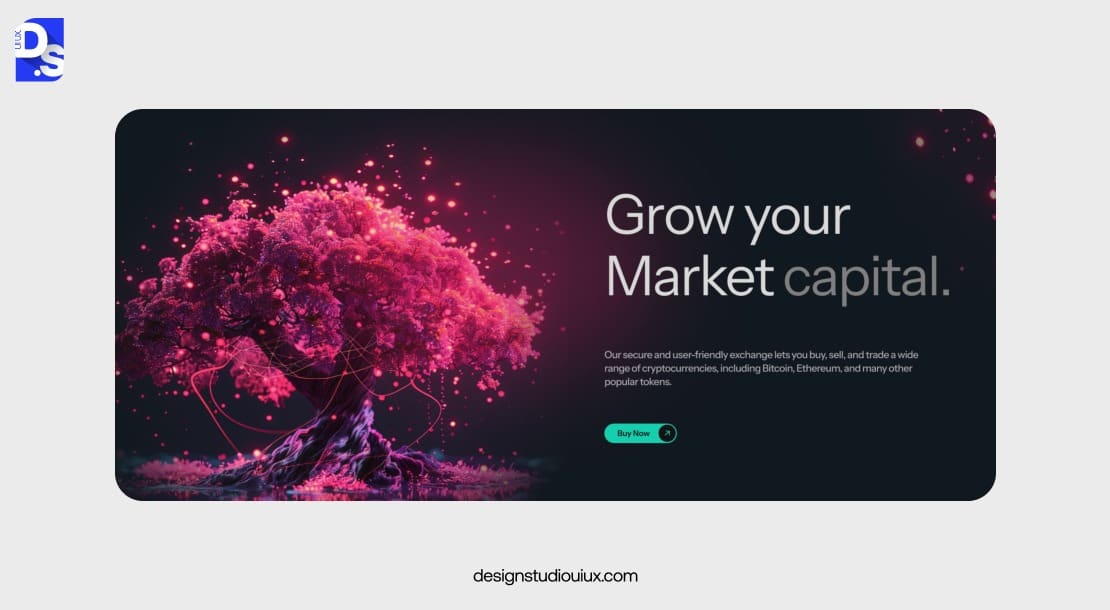
The general idea of a visual hierarchy is pretty straightforward. You make important stuff bigger and more contrasting and less important stuff smaller and less visually powerful in the layout.
Headlines get priority, while required legal links in the footer can be smaller. From a cognitive perspective, that means users do not have to spread their attention across the whole page at the same time.
Users can focus on each piece, just for a moment, and understand them one at a time.
We can use that to increase the probability of the user seeing the right stuff. Make visual groups of related stuff and give each one a big, high contrast “entry point”. For example, on a lead generation page, make a list of selling points with a headline like “Why buy this”.
On the pricing page, give each package a big title and then list all the features underneath. Then, order those little content groups on the page, so the most valuable stuff is scanned first. The user should scan the selling points and then see the registration form, in that order, because they won’t register if they do not understand why.
By following this design principle, users get what they need first, and businesses get results, like more clicks where it counts. News sites do this well. Giant headlines grab you, and smaller subtext fills in details. If you want to do the same, use size to spotlight key stuff in your designs.
Add color or contrast to the right places to draw attention. Lay things out logically, grouping related items.
7. Mobile First Design
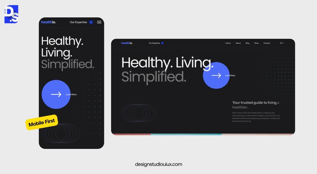
In January 2025, mobile devices accounted for over 62% of web page views worldwide. With this in mind it feels like the terms “mobile-first” have stopped being worth mentioning – they should be a given in all professional UI/UX development services.
Everything is now assumed to be responsive and mobile-first, and it is considered a deadly bug if your site or web app does not work well on mobile. Not being mobile-first is also a death sentence for SEO – Google penalizes sites that do not work well on mobile.
Begin with mobile layouts, focusing on core features. Simplify navigation for touchscreens. Test on real devices to catch (and eliminate) signs of mobile-unfriendliness in your designs.
8. Learnability

The term “learnability” in UX design refers to how easy it is to interact with a new product and the degree of effort required to learn to perform new tasks. It is a form of usability, except that when designing for learnability, we have to take into account that the user will probably have to learn how to use the interface while interacting with it.
When learnability is high, users can learn new interactions without any training or instructions. Whenever you design an interface that requires high learnability, look at computer games for inspiration.
Game designers are extremely good at teaching complexity and giving the right kind of feedback at the right time so people are not even really aware they are learning something new.
If you come up with something that users have likely not encountered before, do not be alarmed if the initial usability is not high right off the bat. Worry instead about designing a system that allows users to ambiently learn it while interacting with it.
Design with intuition in mind – stick to familiar patterns.
Add light onboarding, like tooltips or quick guides. Test with newbies to see where they stumble. Keep refining those points.
9. Error Prevention and Recovery
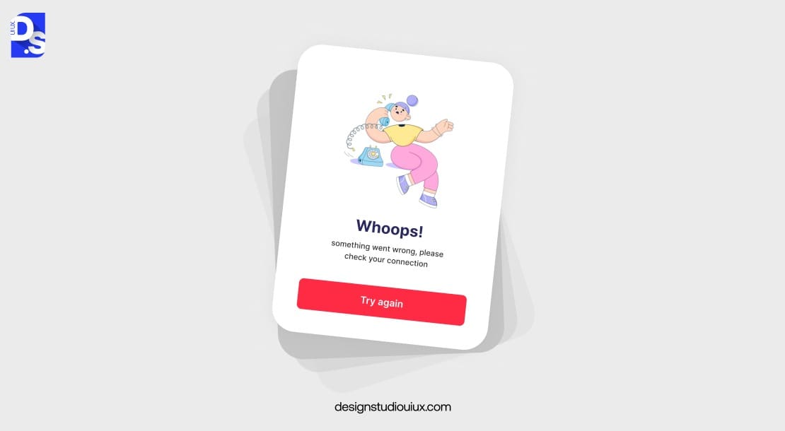
The best kind of errors in UX design are the ones that do not occur. But we cannot remove the possibility of errors entirely. As soon as you are asking the user to type something into a field, there is a chance they will make a mistake.
And when they do, they must be able to confidently troubleshoot on their own. This means that the way the system communicates with the user is vital for error prevention.
It is about smart design, like locking past dates on calendars or auto-fixing typos. Fewer mistakes mean happier users and smoother flows. When errors do slip through, recovery should be a breeze.
Use validation to catch bad input early. Give clear, friendly error messages – “Oops, try again” with a fix tip. Offer undo buttons for oops moments. Plan for flexibility too, accept varied inputs like “USA” or “U.S.” It is all about earning users’ trust by giving them control – keeping them in the driver’s seat at all times.
10. Aesthetic Usability Effect
In 1995 Japanese HCI research scientists Masaaki Kurosu and Kaori Kashimura tried to understand the correlation between usability and aesthetics in computer interactions. They asked 350+ participants to judge twenty-six different ATM interfaces based on ease of use and how aesthetically pleasing the interface was perceived to be.
The results of the study indicated that people do not judge usability based on how usable the interface actually is. We judge usability based on aesthetics. In other words, we are biased to believe that beautiful products work better, even if they do not.
And even when they do not, we still think they are beautiful and are far more forgiving of usability issues we encounter in the product
This phenomenon is called the aesthetic-usability effect. This does not mean we can focus on only making things beautiful and call it a day. Our willingness to forgive does have its limits. The real lesson here is that we should focus on making our designs beautiful while also prioritizing usability.
That means constantly conducting user tests to validate both the visual appeal and the usability of the design.
11. Minimalism and Clarity
According to educational psychologist John Sweller, overloading our memory typically results in a higher rate of errors. That is why, when we strip away all the unnecessary elements from a design and reduce the operational and cognitive costs, we greatly improve the design’s usability.
While there is a place for maximalism in UX design, when it comes to facilitating complicated tasks or processes, opting for minimalism with a strong focus on clarity is the way to go.
12. Task Oriented Design
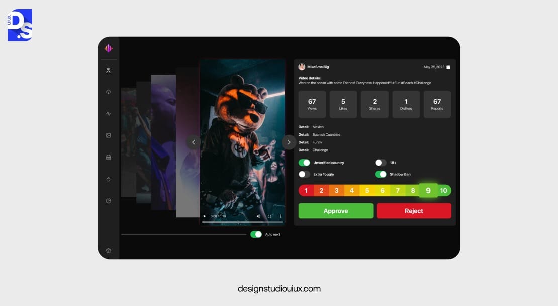
Task-oriented design centers on structuring interfaces to align with users’ goals, ensuring every element serves a clear purpose.
This principle prioritizes workflows by breaking down complex processes into intuitive, linear steps that mirror how users naturally approach tasks.
For instance, instead of overwhelming users with options, a task-oriented interface might guide them through a sequence like “select → customize → confirm” to complete actions efficiently.
By focusing on high-priority tasks, designers reduce cognitive load and eliminate distractions that could derail users from achieving specific outcomes like booking a trip or posting content.
To implement it, start by mapping user journeys through interviews or observational studies. Identify pain points and reorganize navigation to reflect task hierarchies. For example, primary actions (submitting a form) should be more prominent than secondary ones (editing preferences).
Regularly test task flows to ensure they remain frictionless as user needs evolve.
13. Context Awareness
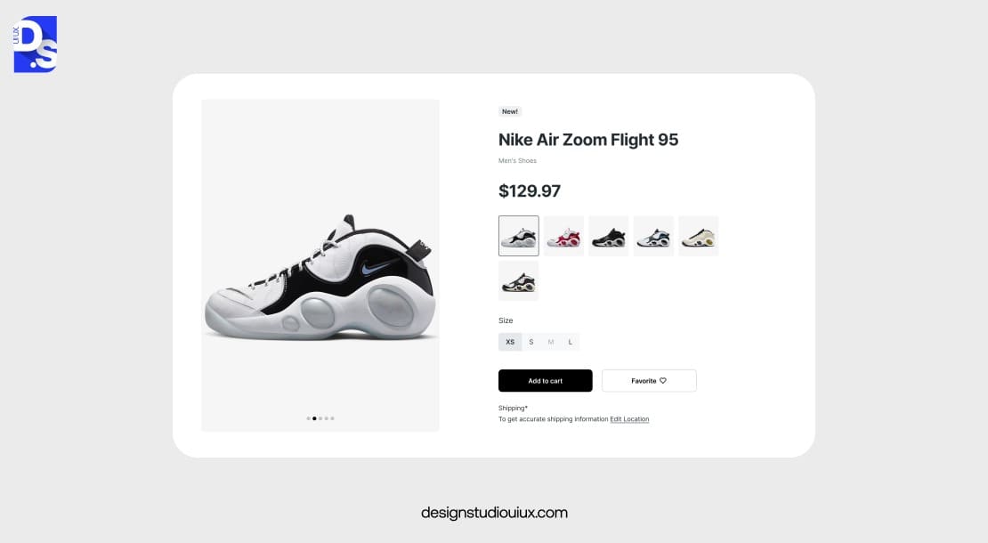
Context awareness involves designing systems that adapt to users’ environments, behaviors, or real-time needs.
For example, a context-aware app might simplify its UI during commutes or offer advanced tools during focused work hours.
This principle urges designers to leverage data like location, device type, or user history to personalize interactions.
Why does this matter? Users expect seamless experiences across changing scenarios.
A one-size-fits-all approach ignores situational barriers, such as glare on screens outdoors or noisy environments where voice commands are impractical. Context-aware design bridges this gap by dynamically adjusting layouts, content, or functionality.
To achieve this, analyze user environments through data like GPS or motion sensors to understand their context. Build adaptive features, such as larger text in low-light settings. Use AI to predict preferences based on past behavior, refining the experience over time.
14. Trust and Credibility
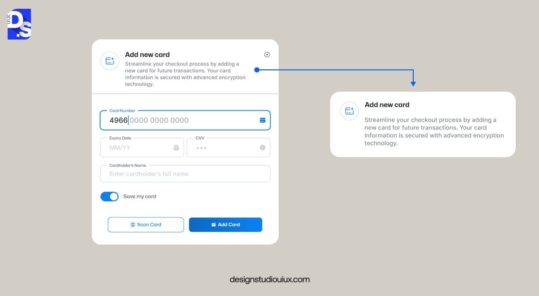
Trust and credibility are the bedrock of user loyalty. This principle urges designers to make their interfaces feel secure, transparent, and reliable through consistent branding, clear communication, and proactive error handling.
Maintain visual consistency across all touchpoints, from typography to button styles. Clearly explain data usage in plain language, avoiding jargon. Implement security measures like encryption and provide visible assurances (such as SSL badges) during sensitive interactions like payments.
Ensure features work as promised and errors are resolved gracefully.
When users consistently feel safe and informed, they’re more likely to engage deeply and advocate for your product.
15. Feedback Loops
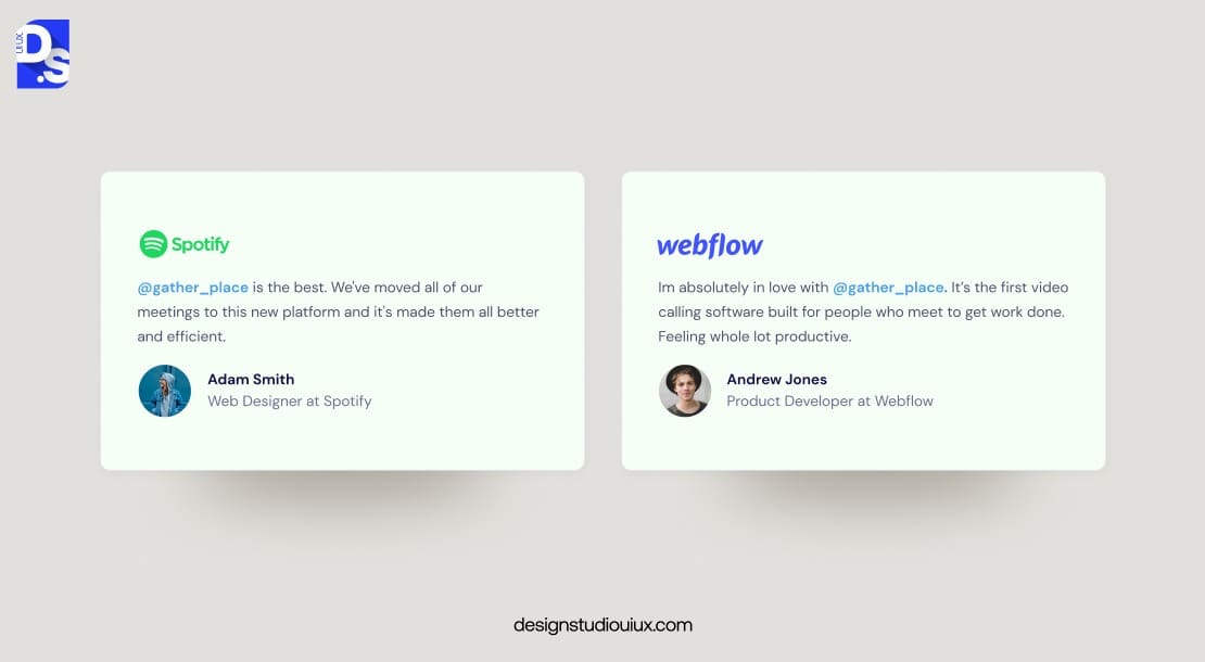
Not only is every company different, but each company is changing all the time – some faster than others. That is partly why UX is a process, not a one-time task. If you are not constantly adapting, your designs will be based on old information, and they’ll be wrong.
That’s why following this principle is so important. This principle transforms static products into evolving solutions that stay relevant as needs change. Without feedback, designers risk building features users don’t want or need.
To adopt this, designers must embed mechanisms like in-app prompts triggered after key actions (for instance, “Was this helpful?” post-purchase) or passive data collection (such as tracking navigation patterns) into their designs.
Pair quantitative data (click rates, drop-offs) with qualitative insights (user interviews) to uncover why issues occur. Then, prioritize rapid iteration – small, frequent updates based on feedback prevent major overhauls later.
If users struggle with a new feature, roll out tweaks incrementally while communicating changes transparently.
The Evolution of UX Design Principles in 2025 and Beyond
As we approach 2025, UX design principles are transforming under the weight of technological leaps and societal shifts.
Artificial intelligence is a game-changer, pushing interfaces toward hyper-personalization. Apps and websites can now analyze behavior patterns, like how long someone lingers on a screen, and adapt layouts or content in real-time, making experiences feel almost psychic.
Voice and gesture controls, fueled by smart devices and IoT, are also rising. This shift demands a focus on natural, seamless interactions over static visuals.
Designers must now craft for hands-free navigation or spatial gestures.
Inclusivity is another force reshaping UX design principles. With “digital equity” gaining traction, designers are prioritizing using elements like colorblind-friendly palettes or voice-powered interfaces to appeal to users with different abilities.
Meanwhile, immersive tech like AR and VR, two UX trends to watch out for, are blending physical and digital worlds. UX principles must evolve to handle 3D navigation and sensory feedback to create cohesive “phygital” experiences.
Sustainability is also emerging as a priority. UX pros are exploring energy-efficient design choices – dark modes, leaner animations – to cut their designs’ digital carbon footprints and nudge users toward greener habits.
By the end of this year, following the principles of UX design will be all about balancing cutting-edge tech with ethical responsibilities.
How to Apply UX Design Principles Effectively?
Bringing UX design principles into your projects starts with adopting a user-first mindset.
- Kick off with research – talk to users, watch them in action, and dig into their goals and struggles.
- This groundwork reveals what matters most. It lets you prioritize features that solve real user problems.
- Map out user journeys with Miro to see where tasks happen; use tools like Figma to prototype interfaces that guide users smoothly through each step.
- Conduct usability tests early with real users – even on your paper sketches.
- Adopt a design system early and use it consistently throughout the project.
- Tools like Zero-Height help document components, while Storybook helps developers stick to guidelines.
- For accessibility, automate checks with Axe and manually test screen readers like NVDA.
- Prioritize WCAG compliance and engage diverse user groups in all tests.
- Use analytics tools like Hotjar to track behavior and identify pain points. Pair this with qualitative feedback via Typeform surveys.
- Most importantly, foster a culture of iteration from the start.
- Use Agile or Lean methodologies to break projects into sprints, allowing continuous refinement based on feedback.
Conclusion
Great UX design is not about trends but solving problems with time-tested strategies. By mastering principles like task-oriented design, context awareness, and trust-building, you can improve your UX design outcomes and drive more engagement.
These results ultimately show why UX design is critical for business success in the long term.
Whether you are looking to learn UX design principles independently or to boost the quality of your professional UX design, the key is to start small, test often, and iterate fearlessly.
Ready to elevate your product? Partner with Design Studio UI/UX to turn these principles into results. Contact our UX design agency for expert guidance on any and every UX design principle.
FAQ’s
What are the 7 principles of UX design?

- Make the UX design useful to target users.
- Make it usable for everyone.
- Ensure that every element is easily findable.
- Design for credibility.
- Ensure it is accessible to everyone.
- Make it visually desirable.
- Make it truly valuable to target users.
What are the 5 elements of UX design?
Jesse James Garrett’s framework structures UX design through 5 key elements. Have a clear UX design strategy. Define its scope. Give the design a clear structure. Build a UX design skeleton and build upon it. Lastly, create a user-centered visual surface layer.
What is the 60 30 10 rule in UX?
This design rule creates visual harmony with color. Use a 60% dominant color for backgrounds. Add depth and contrast with a 30% color for key design elements. Use a 10% accent color to make highlight-worthy elements (e.g., CTAs) visually striking.
What are the attributes that affect UX?
Is the product’s UX design usable? Is it accessible to all? Does it deliver smooth performances? Does it have a clear visual hierarchy? Is all the content in it clear, relevant, and easily digestible? These attributes collectively determine UX quality.
What are the golden rules of UX design?
USERS MATTER THE MOST. Never confuse them – maintain strict design consistency. Engage them constantly with clear feedback. Ensure total accessibility. Test every design decision with real users. Keep validating the UX design’s ability to serve them even after finalizing it.
Fundamentals of UX design?
Understand users deeply before any project. Design the content to suit the needs of users. Update wireframes and prototypes again and again based on what users say. Perform usability tests – pre/post launch. Keep refining the UX as per user feedback.
What are the 5 layers of UX design?
It starts with explaining the ‘why’ behind the UX design project (Strategy). Then define the project’s ‘what’ (Scope). Then, organize all the information (Structure) in the design. Then, arrange the design’s interface (Skeleton). Finally, apply the visual layer (Surface).