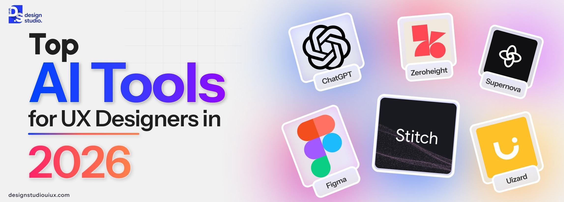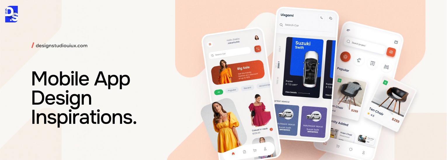
12 Inspiring Mobile App UI/UX Design Examples in 2026


Quick Summary
The best mobile app design examples include Gucci with its AR try-on feature, Sephora with seamless loyalty integration, Messenger with accessible navigation, Todoist for its color coded priority system, and Pinterest for its strong visual hierarchy among several others featured in this list.
FAQs
What is the best mobile app UI design example in 2026?
The best mobile app UI design examples in 2026 are Gucci, Sephora, Headspace, Robinhood, and Airbnb.
What is the difference between UI and UX design in mobile apps?
UI (User Interface) design focuses on the visual layer like layouts, colour schemes, typography, icons, and interactive elements.
UX (User Experience) design focuses on the structural and behavioural layer like user research, information architecture, user flows, wireframing, and usability testing.
UI is what users see; UX is how they feel and behave.
What makes a mobile app design successful?
A successful mobile app design consistently enables users to complete their core task with minimal friction, loads fast and performs reliably across devices, and builds trust through visual consistency and clear feedback.
Apps with strong UX retain 25% of users after day one and up to 40%+ after 30 days (industry benchmark). Design decisions like contrast, navigation patterns, onboarding clarity, and error handling, directly impact these retention metrics.
What design principles does Airbnb's app follow?
Airbnb’s app relies on immersive visual storytelling (HD photos and video to build trust before booking), social proof integration (prominent user reviews and ratings at every decision point), and warm colour psychology (coral and soft beige to evoke comfort and hospitality).
Why does Headspace use soft colors and animations?
Headspace uses soft blues, greens, and pastel backgrounds because these colours are associated with calm and reduced physiological arousal, a response supported by colour psychology research.
The design is engineered to match the product’s purpose: if the app itself feels stressful, users won’t meditate.
What is the best navigation pattern for mobile apps?
For most mobile apps, bottom navigation is the recommended primary navigation pattern as of 2026, per both Apple’s Human Interface Guidelines and Google’s Material Design 3 specification. It places 3–5 core destinations within natural thumb reach, reducing the effort required to switch between sections. Apps like Sephora, Messenger, and Robinhood all use bottom navigation. Tab bars exceeding 5 items should introduce a ‘More’ overflow menu rather than crowding the navigation bar.
How does gamification improve health and fitness app UX?
Gamification in fitness apps, leaderboards, achievement badges, challenges, progress bars, and social kudos, leverages behavioural psychology principles (variable reward schedules, social comparison, loss aversion) to sustain engagement beyond initial motivation.