


Mobile Navigation Best Practices, Patterns & Examples (2026)



Quick Summary
Mobile navigation is the structure and controls that help users move through an app and reach key destinations quickly. Good mobile navigation makes choices clear, keeps actions within thumb reach, and supports consistent, predictable movement.
This guide also includes a 14-point best-practices checklist covering destination limits, thumb reach, tap target sizing, and accessibility.
Mobile navigation is the map and compass of any app. Get it right and people move without friction, find what they need, and come back often. Get it wrong and they bounce. In this guide, the focus is simple and practical: what mobile navigation is, why it matters, the patterns that work, the best practices that keep users happy, and real mobile app navigation examples to learn from.
Mobile Navigation Best Practices (Actionable Checklist)
Start with clarity, then earn habits. A quick intro tour, clear labels, and thumb-reachable actions are core mobile app onboarding best practices that turn first-time taps into confident flows.
The core mobile navigation best practices are limiting primary items to 3–5, keeping tap targets at 44px or larger, ensuring thumb-reachable placement, pairing icons with labels, and testing navigation with real users before shipping.
- Limit primary items to 3–5 to keep choices clear.
- Pair icons with short labels for clarity and quicker recognition.
- Keep tap targets at least 44–48px to reduce accidental taps.
- Place key actions within thumb reach near the bottom.
- Make the current destination visible and obvious at all times.
- Respect platform conventions for back behavior and safe areas.
- Use simple, predictable animations to show hierarchy and movement.
- Provide visible alternatives for gestures to aid discoverability.
- Ensure focus order and accessibility names are meaningful for assistive tech.
- Keep navigation performance fast with lightweight assets and caching.
- Test labels with real users through quick card sorting and tree tests.
- Keep wording short and consistent across the app.
- Avoid hiding frequent tasks inside drawers or overflow menus.
- Use empty states and onboarding hints to teach navigation gently.
Copyable Quick Checklist
Save this and ship faster: a lean set of mobile app design best practices you can paste into tickets, QA notes, or design specs.
- 3–5 primary tabs with clear labels
- Tap targets ≥ 44px and within thumb reach
- Visible current state and predictable back behavior
- Icons + labels for clarity; avoid icon-only ambiguity
- Accessible: roles, names, focus order, contrast
- Performance: lazy-load icons, cache, prefetch nav assets
- Gestures are optional; visible alternatives are provided
- Tested labels via card sorting or tree testing
Why Mobile Navigation Matters?
People are on mobile everywhere. On the bus. In a lift. In a queue. They dip in and out, which means the path to common tasks must be obvious and short. If users cannot find the right screen in a couple of taps, frustration rises and sessions get shorter. That hurts engagement, retention, and conversions.
Clear navigation reduces cognitive load and gives a sense of control. When the route is predictable, people complete tasks faster, explore more features, and feel confident to return.
This is the quiet engine behind better ratings, improved trial-to-paid conversions, and stronger lifetime value. For teams exploring mobile app UI/UX design services, remember: navigation UX makes or breaks the overall mobile experience.
What Is Mobile Navigation?
This refers to navigation within an app’s interface – the menus, tabs, and controls users tap to move between screens, not GPS or turn-by-turn driving navigation. It includes the visible elements users touch, the information architecture that groups destinations, and the rules that govern movement. It is also about what you hide and when you hide it. The best mobile navigation gives fast access to frequent tasks, puts secondary actions one layer down, and uses clear cues so people always know where they are.
Definitions: Navigation vs Bottom App Bar vs Tab Bar vs Drawer
Navigation is the whole system that lets users move through an app. A bottom app bar is a container at the bottom that can hold navigation actions, a floating action button, or key shortcuts. A tab bar (often called a bottom navigation bar) is a row of 3–5 primary destinations with labels. A drawer (often called hamburger or side menu) is a hidden panel that slides in to show secondary destinations, settings, or long lists that do not fit in the primary bar.
Mobile Website vs Mobile App Navigation: Key Differences
Mobile websites rely on browser controls and often use top menus or sticky headers for discovery. They must work on many screen sizes and under varied network conditions. Mobile apps can adopt native patterns like bottom tabs, segment controls, and gestures. They have more access to system-level interactions, can cache content, and can tailor placement to the thumb zone. Web favors wider reach and flexibility; apps favor deeper integration and faster, more ergonomic movement.
Navigation trade-offs also show up in onboarding and updates. Websites ship changes instantly; apps wait for reviews and updates. The browser back button is universal on the web; in apps, you must design back paths for every screen. Sharing is simpler on the web with a URL; apps need deep links that open the view.
Apps can send push notifications and work offline after caching, but must earn permission. Websites excel at accessibility and linkability if you follow standards. Both should prioritize thumb-reachable controls, clear labels, and predictable paths. Use analytics to map drop-offs and fix the slowest steps first.
Navigation is not an isolated process; it’s influenced by the structure, gestural model, and visual system of your whole application. To get the full story on how all these elements interact, check out our mobile app design comprehensive guide.
Top Mobile Navigation Patterns
Pick the right navigation UX design patterns and everything feels faster, clearer, and more intuitive. Here’s a quick tour of the options users learn in seconds:
Bottom Tab Bar (Primary Destinations)
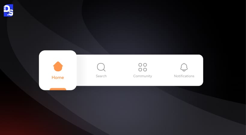
Overview: A row of 3–5 labeled icons at the bottom.
When To Use: Apps with a small set of top tasks. Social, content, and commerce apps use this pattern.
Pros: Great discoverability, clear wayfinding, always visible.
Cons: Space is limited. Too many items reduce clarity.
Example: [Image: Bottom tab bar with Home, Search, Create, Messages, Profile]
Watch Out: Do not hide critical items in “More”. If you must, consider a mixed pattern.
Top Navigation Bar (For Content-Heavy Apps)
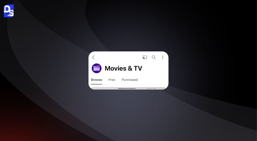
Overview: Tabs or segmented controls under a header, often scrollable.
When To Use: Apps with categories or feeds where the top area frames content.
Pros: Good for scanning sections. Works well with search at the top.
Cons: Harder to reach one-handed. Can clash with system bars.
Example: [Image: Top tabs for News, Sport, Culture, Lifestyle]
Watch Out: Avoid too many tabs. Use scrollable tabs only if labels are short and meaningful.
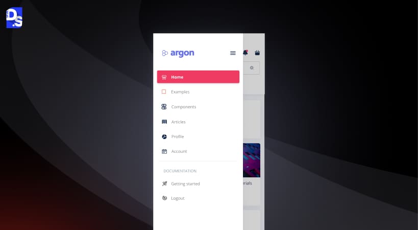
Hamburger / Drawer Menu (Secondary Navigation)
Overview: A hidden panel that slides in from the side to reveal extra destinations.
When To Use: When you have many secondary items, settings, or account options.
Pros: Keeps the main UI clean. Good for long menus.
Cons: Poor discoverability. Key actions can get buried.
Example: [Image: Drawer with Profile, Orders, Wallet, Help, Settings]
Watch Out: Do not tuck common tasks into a drawer. Keep high-frequency items visible.
Use a bottom tab bar when you have 3–5 frequently used destinations that benefit from constant visibility. Use a hamburger/drawer menu when you have many secondary items, settings, or account options that don’t need to be visible at all times but avoid hiding frequently used actions inside it, since drawers have poor discoverability.
Gestural Navigation (Swipe, Edge Gestures)
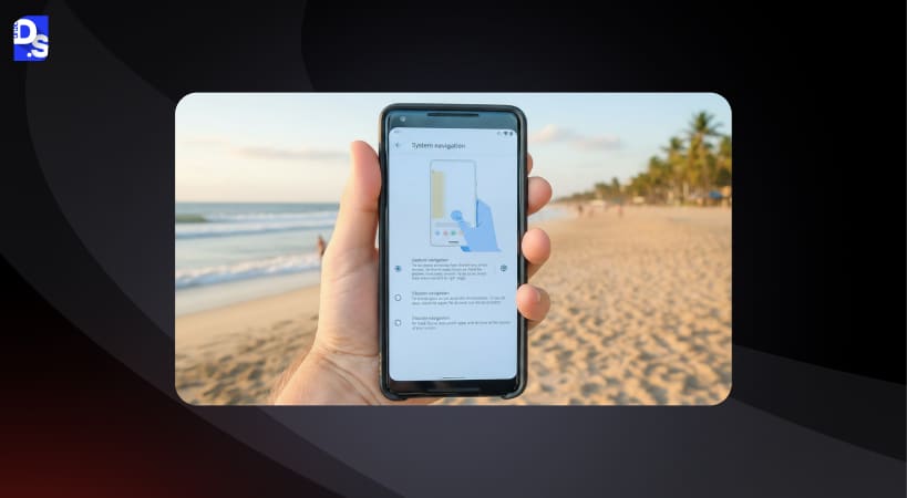
Overview: Swipe to change tabs, pull to refresh, edge-swipe to go back, and similar gestures.
When To Use: To add speed for power users alongside visible controls.
Pros: Fast and fluid once learned. Keeps the UI simple.
Cons: Low discoverability. Conflicts with system gestures if not careful.
Example: [Image: Horizontal swipe between Stories, Reels, Posts]
Watch Out: Always provide a visible alternative. Never rely on gestures alone.
Gesture-based navigation is faster for experienced users but has poor discoverability, new users can’t see what’s available without being taught. Icon-based navigation (with labels) is slower to execute but self-evident, since the options are always visible. Best practice is to use icon-based navigation as the primary system and layer gestures on top as optional shortcuts, never as the only way to complete a task.
Full-Screen / Segmented Controls / Vertical Split Navigation
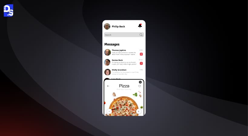
Overview: Full-screen views with segmented toggles, or split layouts on larger phones.
When To Use: When content states are mutually exclusive views of the same dataset.
Pros: Clear mode switching. Good for filters like List vs Map.
Cons: Too many segments confuse people.
Example: [Image: Segmented control for List | Map | Calendar]
Watch Out: Keep segments to three. Label plainly.
Mixed Patterns (Bottom Nav + FAB / Contextual Actions)
Overview: Combine a primary bottom bar with a floating action button or a context bar.
When To Use: When a frequent “create” or “scan” action needs prominence.
Pros: Clear primary action. Strong guidance.
Cons: Can feel busy if spacing is tight.
Example: [Image: Bottom nav plus a central FAB for Compose]
Watch Out: Do not duplicate the same action in multiple places. Keep hierarchy clear.
Accessibility & Inclusive Navigation
Start with a UX audit checklist: verify contrast, focus order, clear labels, hit sizes, and screen-reader names, then test with real users on diverse devices.
ARIA Roles, Focus Order, Tap Targets, Color Contrast
Use semantic roles to assistive tech to understand the structure. Keep a logical focus order that matches on-screen reading. Aim for high color contrast on active states and labels. Ensure the hit area extends beyond the visible icon so taps feel reliable.
<nav aria-label=”Main”>
<ul role=”menubar”>
<li role=”none”>
<a role=”menuitem” aria-current=”page” href=”/home”>
<span aria-hidden=”true”>🏠</span>
<span>Home</span>
</a>
</li>
<li role=”none”>
<a role=”menuitem” href=”/search”>
<span aria-hidden=”true”>🔎</span>
<span>Search</span>
</a>
</li>
<li role=”none”>
<a role=”menuitem” href=”/profile”>
<span aria-hidden=”true”>👤</span>
<span>Profile</span>
</a>
</li>
</ul>
</nav>
Screen Reader Testing & Keyboard Support
Turn on TalkBack or VoiceOver. Move through the nav and listen to each label and state. Check that the current tab is announced correctly. Verify that focus order moves left to right and then into content. For external keyboards, confirm that Tab and arrow keys reach and activate all nav items. Offer visible focus states so low-vision users can track position with ease.
12 Real Mobile App Navigation Examples
See how today’s mobile app design trends show up in the real world. Here are 12 crisp navigation examples that balance speed, clarity, and thumb-friendly movement. For more realistic views on mobile app design navigation, you can explore real mobile app ui examples.
YouTube
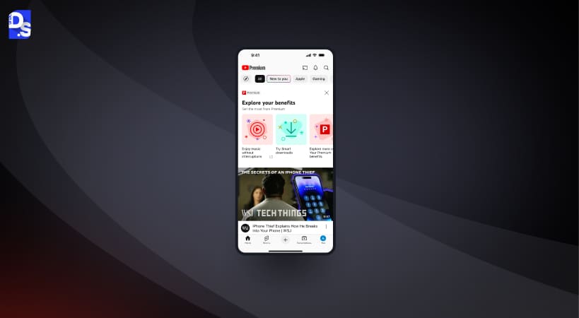
Pattern: Bottom tab bar with Home, Shorts, Subscriptions, and Library.
Why It Works: The primary tabs map to the main jobs: passive browsing, quick video bites, creator updates, and saved items. Labels are clear, and the Create action gets a prominent button without cluttering the bar.
Avoid: Overloading overflow menus with common actions. Keep primary tasks visible.
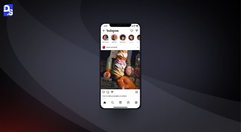
Pattern: Bottom tab bar with a central action, plus gesture shortcuts.
Why It Works: It blends visible destinations with quick gestures for power users. The central create action is obvious, while tabs like Home and Search stay predictable.
Avoid: Icon-only labels can confuse new users. Keep labels on or use onboarding hints.
Spotify
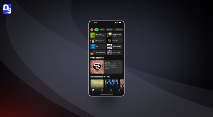
Pattern: Bottom navigation with Library, Home, and Search.
Why It Works: The three-tab approach reduces noise and helps people focus on listening. Search is only a tap away, and the Now Playing bar doubles as navigation into the player.
Avoid: Hiding queue or device controls too deeply. Keep frequent actions close.
Amazon
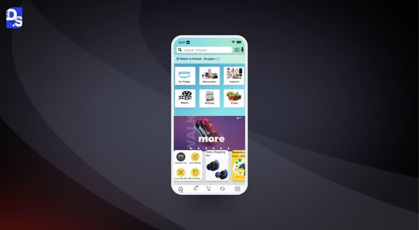
Pattern: Mixed pattern with bottom tabs, a big Search entry, and contextual menus.
Why It Works: Shopping tasks vary. The layout keeps search central, surfaces deals and orders, and uses a drawer for account-level items.
Avoid: Long, cryptic labels. Use short, action-led names and keep the bar focused.
Uber
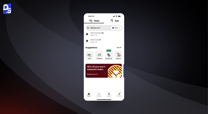
Pattern: Full-screen flow with bottom controls and contextual sheets.
Why It Works: The map is the stage. Key actions like destination entry and ride types sit within thumb reach. Bottom sheets guide the journey step by step.
Avoid: Forcing users into long lists before setting a destination. Keep the flow linear and clear.
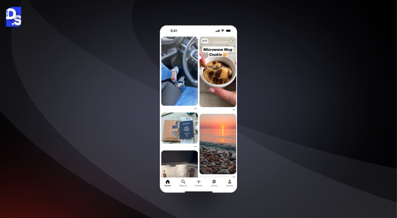
Pattern: Bottom tabs with a strong Home feed and Search.
Why It Works: Browsing and discovery are the core. The bar keeps these routes clear. Visual cues guide users without forcing heavy reading.
Avoid: Burying boards management. Provide quick paths from pins to board actions.
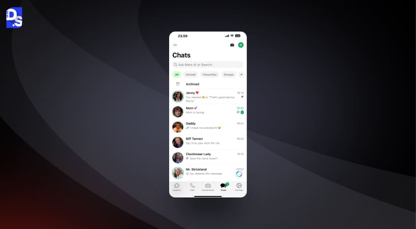
Pattern: Bottom tabs for Chats, Updates, Communities, and Calls.
Why It Works: Everyday tasks sit in plain view. The floating new chat action is easy to reach. Status and community features have clear homes without distracting from chats.
Avoid: Overloading the overflow with routine actions. Keep common actions in the main view.
Airbnb
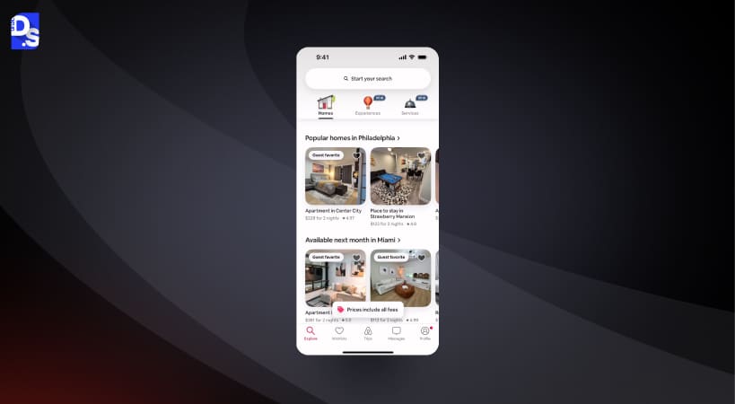
Pattern: Bottom tabs paired with rich filters and a prominent Search.
Why It Works: Most users start with a search, so it gets pride of place. Tabs help people switch between Explore, Wishlists, Trips, and Profile with zero confusion.
Avoid: Deep filter trees without context. Offer smart defaults and save recent choices.
Google Maps
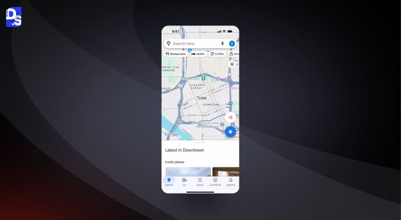
Pattern: Mixed pattern with bottom tabs, a search bar, and floating chips.
Why It Works: Big jobs like Explore, Commute, and Saved are only a tap away. Chips and drawers adapt the view without changing the user’s sense of place.
Avoid: Hiding offline maps or key settings. Keep essential tools one layer deep.
Twitter (X)
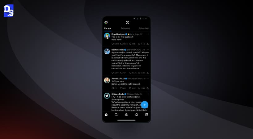
Pattern: Bottom tabs and a central compose action, plus gestures.
Why It Works: The pattern supports quick posting and fast switching between Home, Search, Notifications, and Messages. Labels keep it clear for new users.
Avoid: Crowding the bar with too many experimental tabs. Keep the core experience stable.
Monzo (Fintech)
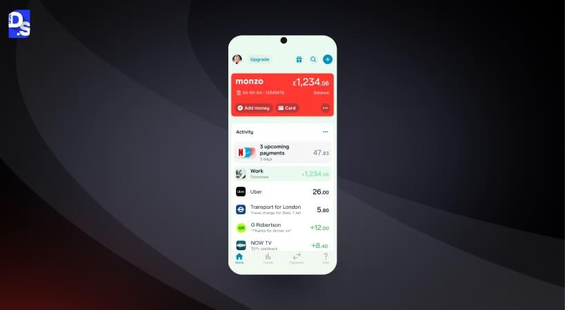
Pattern: Bottom tabs for Home, Payments, and Cards, with drawers for settings.
Why It Works: Banking needs clarity and trust. Primary financial tasks are front and center with clean labels. Secondary items sit in predictable secondary spaces.
Avoid: Icon-only labels in finance. Keep labels explicit to reduce anxiety.
Flipkart
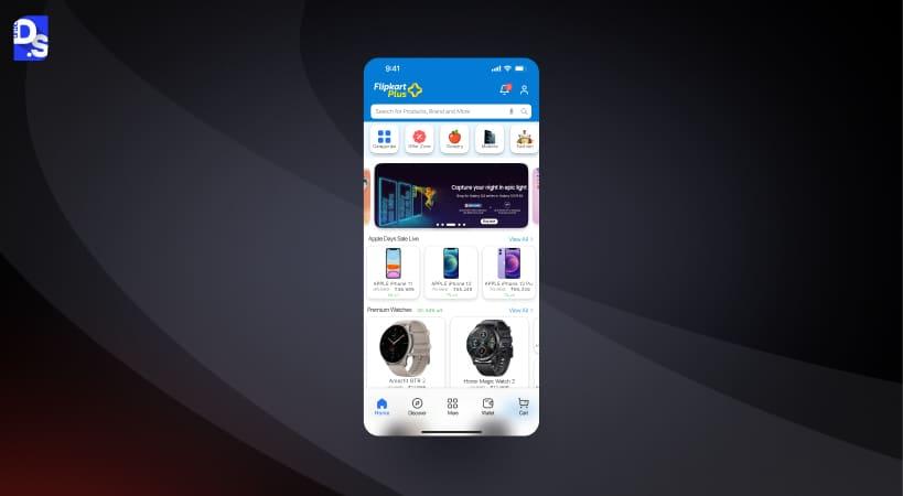
Pattern: Mixed pattern with bottom tabs and a strong top search.
Why It Works: Retail navigation prioritizes search, categories, and cart access. Bottom tabs support accounts and orders, while the top area handles discovery and deals.
Avoid: Long, hidden category trees. Offer shortcuts and recently viewed items to speed up returns.
Comparative Table: Which Navigation Pattern To Choose By App Type
| App Type | Recommended Pattern | Strengths | Trade-offs | Best For |
| E-commerce | Bottom tabs + prominent Search | Fast access to Search, Cart, Orders | It can get crowded during seasonal promos | Browsing and buying |
| Social | Bottom tabs + central Create action | Clear home, quick posting | Risk of too many tabs | Sharing and feed consumption |
| News/Content | Top tabs + bottom tabs (hybrid) | Easy scanning of sections, stable wayfinding | The top area is harder to reach one-handed | Category-led reading |
| Productivity/Tool | Bottom tabs + segmented controls | Clear modes, simple switching | Too many modes confuse users | Task-focused flows |
| Banking/Finance | Bottom tabs + drawer for settings | Trust, clarity, predictable structure | Drawer items may be overlooked | Frequent tasks and statements |
Summary
Pick the pattern that matches what people do most. Keep the everyday stuff right in front of them with clear labels. Park the rare bits out of the way. Fewer choices. Sharper choices. Better outcomes.
Core Principles Of Mobile Navigation UX
Great navigation starts with clear intent and steady mobile app design principles: reduce choices, respect ergonomics, and keep movement predictable.
Prioritize Destinations (3–5 Primary Items)
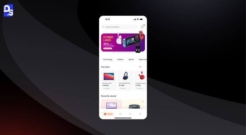
People scan. Too many choices slow them down. Keep the main bar focused on 3–5 destinations that cover most tasks. Push advanced or rare items into a secondary space. This lowers cognitive load and makes the interface feel tidy and calm.
Thumb Reach & Ergonomic Placement
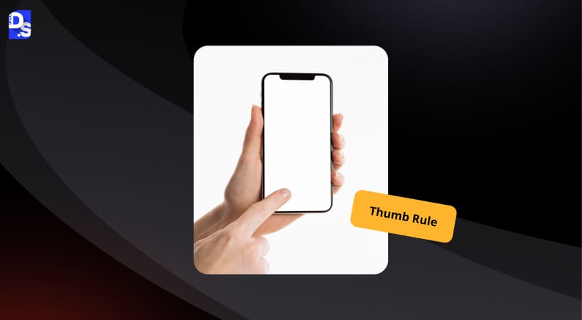
Most users hold the phone one-handed and use their thumb. Keep critical actions in the comfortable thumb zone near the bottom half of the screen. Avoid placing vital actions in the top corners. This small ergonomic tweak makes everyday use smoother and helps reduce errors.
Discoverability & Affordance (Icons + Labels)
Icons alone are risky if the meaning is not obvious. Pair icons with short labels for clarity, especially in the main bar. Use plain icons when the meaning is universal, like Home or Search. Use text+icon when the concept could be confused, such as Explore vs Discover. Clear affordance builds confidence and cuts guesswork.
Consistency & Platform Conventions
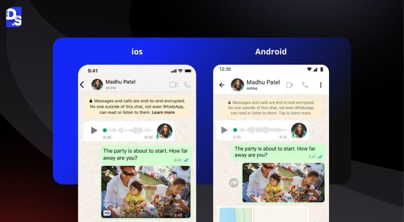
Follow iOS and Android guidelines for familiar placement and behavior. Respect system navigation patterns, back behavior, and safe areas. If your app breaks conventions, users must relearn basic movement. Keep things predictable so people can focus on their goals, not the interface.
Design & Testing Workflow
UX Research: Card Sorting, Tree Tests, Benchmarking
Start by listening. Hand people your features on cards and ask how they’d group them. Turn those groups into a simple tree and test if folks can find things quickly. Then peek at a few top apps in your space. Borrow the good labels, ditch the confusing ones.
Prototyping & Quick Guerrilla Sessions
Whip up a clickable mock. Five users are plenty for a first pass. Give them plain tasks. Watch where thumbs hesitate, where eyes dart, where sighs happen. Note mis-taps, time to first tap, and steps to reach the goal. Small tests, big clues.
Iteration With A/Bs And Real Metrics
Still torn between two layouts or labels. Split test them. Measure taps on primary items, drop-offs between screens, and time to completion. Ship the winner, then tune the wording. Rinse. Repeat.
Implementation Tips & Performance
- Put three to five primary items in the main bar—no more.
- Labels should be short, friendly, and consistent across the app.
- Keep tap targets generous and within easy thumb reach.
| Standard | Minimum Size | Unit |
|---|---|---|
| Apple HIG | 44 × 44 | points |
| Google Material Design 3 | 48 × 48 | dp |
| WCAG 2.1 (SC 2.5.5) | 44 × 44 | CSS px |
These aren’t interchangeable – a design meeting Apple’s 44pt minimum on iOS doesn’t automatically meet Android’s 48dp target, since points and density-independent pixels scale differently across screen densities. Design to the strictest applicable standard for your platform.
- Make the current location obvious. People hate feeling lost.
- Use gentle motion to show where people are going and why.
- Honor platform norms, safe areas, and the system’s back behavior.
- Lazy load non-critical icons and cache what you can.
- Prefetch assets for the next likely screen to keep things snappy.
- Prevent layout jumps by reserving space for bars and banners.
- Keep bundles lean. Nothing kills curiosity like a sluggish first load.
SEO, Performance & Content Implications For Mobile Navigation
Hidden menus look tidy, but they can hurt discovery if key links only appear after the script loads. Use real links for important sections so crawlers and assistive tech can reach them. Keep your link structure shallow for cornerstone pages. Write labels that actually describe the destination. Add the right schema where it helps the context. Above all, keep pages fast and stable. People stay when the app feels instant and predictable.
On mobile, make the first tap obvious: show a short row of top links that are always visible. Put the search where thumbs can reach. Use server-rendered anchor tags for core paths, not buttons that rely on heavy JS. Keep tap targets big, with clear contrast. Avoid nesting five levels deep; two or three is plenty. Add breadcrumbs so users know where they are. Prefetch likely next pages and lazy-load icons, not content.
Prevent layout shift by reserving space for images and ads. Track what people tap and rename unclear labels. Include an HTML sitemap and a clean robots.txt. Test with Lighthouse and real devices, then fix the slowest parts first.
Case Study: A Redesign That Actually Moved The Needle
In this mobile app UX case study, we unpack a before-and-after navigation redesign.
Problem
Our content app felt busy at the top and hid common tasks in a side menu. New users wandered. Session length dipped. Support kept hearing the same question: Where is everything?
Hypothesis
If we surfaced the big four tasks in a bottom bar with short labels and made search obvious, people would reach content faster and get stuck less.
What We Changed
We cut the noise and shipped a four-item bar: Home, Search, Topics, Profile. Everyday actions stayed visible. Settings lived inside Profile. Tap targets were larger. Labels were simple. We added a slim return bar so users could jump back to the last article with one tap.
What Happened Next
Time to content dropped. Fewer dead-end taps. More saved items. Fewer “can’t find it” tickets. Later A/Bs on labels squeezed out a little more lift, but the real win came from a calmer primary bar and a clearer path.
FAQs – Mobile Navigation UX
What is mobile navigation in an app, and why is it important?

Mobile navigation is how people move between key areas of an app. Good structure shortens paths, reduces confusion, and boosts task success, engagement, and return visits. Clear labels and predictable behavior matter.
How many navigation items should a mobile app include?
Aim for three to five primary destinations. This keeps choices scannable, lowers cognitive load, and preserves space for readable labels without truncation or ambiguity.
What are the best mobile navigation patterns for one-handed use?
Bottom tab bars and bottom sheets work well because they sit in the thumb-friendly zone. Keep tap targets generous and place the most frequent actions near the lower half.
Should I use a hamburger menu or a bottom tab bar in my mobile app?
Use a tab bar when a few tasks dominate daily use. Use a drawer for secondary or infrequent items. Do not bury high-frequency actions in hidden menus.
How does gesture-based navigation compare with icon-based navigation on mobile?
Gestures feel fast for experienced users but are hard to discover. Keep visible controls for core actions and treat gestures as optional accelerators rather than the only path.
What are the accessibility best practices for mobile app navigation?
Provide clear text labels, large tap targets, visible focus states, and strong color contrast. Ensure logical focus order, meaningful names, and consistent announcements for the current location.
How does mobile navigation affect user engagement and retention?
Shorter paths and clearer labels reduce errors and exit rates. When people find features quickly, they explore more, complete tasks, and are more likely to return and convert.
What platform differences (iOS vs Android) should I consider when designing mobile navigation?
Respect native conventions. iOS commonly uses tab bars and safe area insets; Android leans on the bottom navigation bar and system back. Align placement, wording, and states with guidelines.
How do I test mobile navigation usability, and what metrics should I track?
Run quick task-based tests. Track task success, time to first tap, taps to destination, mis-taps, and drop-offs between screens. Combine qualitative notes with these simple metrics.
When should a mobile app navigation be redesigned, and what are the red flags?
Redesign when users frequently get lost, rely on search for basics, or ignore key features. Other signals include long paths, inconsistent labels, and rising support questions.