


What Is Zero UI Design? Examples & Trends (2026)



Quick Summary
Zero UI is the latest addition to enterprise UX design, in which the design adapts to intent and context and can function without screen-based inputs. Known as invisible UI, it combines automation, intelligence, and gesture-based inputs to reduce user effort.
Zero UI (also known as Invisible UI) is an enterprise UX approach where systems complete tasks using intent, context, and automation instead of relying on traditional screen-based interactions.
Zero UI is also commonly written as “0 UI” — both terms refer to the same concept.
Introduction
Zero UI refers to a system that guides users to perform tasks with no or zero manual interaction. Here, people don’t have to click on the screen; instead, they use voice, gesture, and haptics for the same.
Enterprises are choosing this trend, as AI automation is becoming prevalent in workflows. Screens are also taking a backseat, hence the shift. It ultimately reduces time spent on repetitive work, operational friction, and consistency while maintaining governance or accountability.
What Is Zero UI?
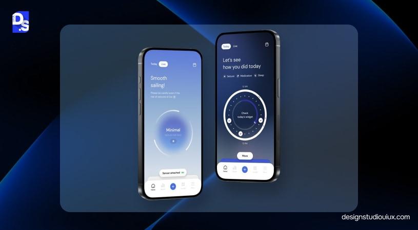
Zero UI is a UX design approach where systems complete tasks automatically using user intent and context, with little or no visible interaction.
Zero UI in UI/UX design refers to an interface that does not involve traditional screens, buttons, and visual interfaces. Also named as “invisible UX” (coined by Microsoft Advertising), it uses voice, gestures, sensors, automation, and system intelligence. It is a part of the enterprise UX foundation and adapts to user intent and behavior.
Key principles of Zero UI Design
Intent: Anticipates user intent in advance, which means people don’t have to provide explicit instructions.
Context: UI becomes truly invisible, as it adapts to environment, behavior, time, and location.
Automation: AI-based systems will help users complete tasks within seconds, requiring minimal or no user interaction
Feedback: Gives clear confirmation after a task is completed
Reversibility: Users can correct or undo their mistakes.
What Zero UI Is – What It Is Not
The term “Zero UI” often creates confusion, especially among non-designers. They think it is about removing screens, when it actually is a strategic reallocation.
Zero UI Does Not Mean No UX
Zero UI enterprise does not equate to no UX; in fact, it’s the opposite. The goal is to ensure screen-free user behavior through voice-enabled or similar strategies. The design should understand intent, handle errors, and tell users what to expect, without making it glaringly obvious.
No Screens Is Not Zero UI
Invisible UI emphasizes “not using screens for routine actions,” instead of no screens. 95% of America uses smart assistants regularly to book an Uber or to learn about the weather. Zero UI optimizes that experience even further.
What Zero UI Actually Is
Zero UI supports hybrid UI patterns by combining assistive inputs and automation with traditional UI to ensure the best experience with minimal interactions.
It cannot be used where:
- Approvals and confirmations are needed
- Where automation cannot be applied safely
- Interfaces that work with sensitive information
In practice, Zero UI increases the importance of UX strategy, error handling, and trust signals rather than reducing UX effort.
Zero UI vs GUI vs Voice vs Automation
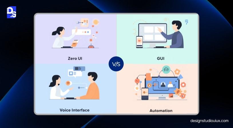
Zero UI/UX is the advanced form of GUI (Graphical User Interface), but it embodies more than that. Let’s understand the difference between Zero UI, GUI, Voice UI, and Automation.
| Interface/Parameters | Zero UI | GUI | Voice UI | Automation |
|---|---|---|---|---|
| User Effort | Very Low | High | Medium | Low |
| Interaction | Intent, context, and background intelligence | Screens, buttons, forms, and menus | Voice commands and responses | System-triggered actions with rules |
| Predictability | Depends | High | Medium | High |
| Risk | Can be high (in unmanaged instances) | Low | Medium | Medium |
| Governance Needs | Very High | High | Medium | High |
What to infer from this comparison table?
- Zero UI enterprise designs promote frictionless interaction, but require strong governance
- GUI offers maximum clarity but requires high effort
- Voice requires accurate intent recognition
Zero UI Vs GUI
Out of all the interfaces, GUI requires the most effort; users have to click, type, and confirm the steps. It works well in situations where precision is a must-have, but not for high-frequency situations.
Zero UI aligns intent, context, and user intent and operates without explicit instructions. It means the design should be compliant to instill trust among users who want a low-effort option.
Automation
AI in UX design can be used to execute routine workflows to maintain accuracy and efficiency. But it is not a reliable option for nuanced situations and requires frequent monitoring and manual overrides.
Voice UI
Voice UI replaces touch-screen navigation with voice commands, allowing users to go hands-free. In the voice UI guide, intent plays a key role here; if it is misinterpreted, unmitigated risks can appear.
Why Zero UI Matters for Enterprises (ROI + Ops)
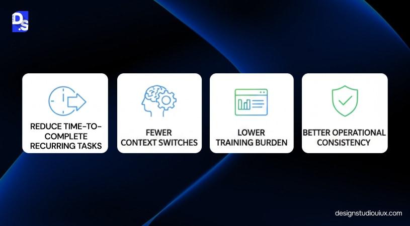
Friction can render even the most effective workflows useless, especially in high-growth enterprises. It optimizes UX performance metrics, helping teams to align their energy on core tasks in these 4 ways:
Reduce time-to-complete recurring tasks
Zero UI improves execution speed by 20-40% (above industry standard) by pushing routine activities in the background. In an operation-heavy environment, the impact is compounded on a massive scale.
Fewer Context Switches
It minimizes the need to stop work, open tools, and navigate enterprise design systems for simple actions. This leads to steadier focus and lower mental fatigue, boosting UX performance metrics.
Lower training burden for repetitive flows
Invisible UI removes reliance on procedural knowledge and document-based memorization during user onboarding. This shortens the timeline, thus resulting in a consistent user experience across the board.
Better operational consistency
When enterprise design systems execute standard actions automatically, outcomes become more predictable. It helps enforce process consistency by design, reducing variation caused by manual execution. This results in fewer mistakes, stronger compliance, and more reliable operations.
Zero UI Use Cases in B2B SaaS
Invisible UI works in high-intent, contextual situations to reduce friction from interaction layers. These are zero UI B2B SaaS use cases for you to consider:
Context-aware dashboards
No one loves digging through dashboards and menus just to use particular features of a SaaS onboarding UX. This is one reason why AI driven web design is gaining traction in enterprise SaaS products focused on reducing interaction friction.
Instead, they prefer interaction-less workflows that display contextual information based on the user’s current task.
Example: A revenue dashboard can list high-risk accounts during the forecast week without asking users to manually filter results while following form UX best practices.
Predictive Automation
In the SaaS UX guide, the “next step” is predictable but currently manual. Zero UI handles the calculation and the heavy lifting, presenting the user with a pre-configured solution that only requires a single confirmation to deploy.
Example: An ERP system detects that a raw material’s lead time has increased by 10 days. It automatically finds a secondary approved vendor, checks price parity, and drafts a purchase order. The procurement officer receives a notification: “Lead time delay detected. Approve alternative vendors?”
Agent-Assisted Workflows
AI agents act as a “Zero UI” layer that lives inside your existing communication tools (Slack, Teams, and email) to handle the 80% of work that doesn’t require high-level creativity.
Example: A Tier-3 engineer is tagged in a complex ticket. Before they read the 20-email chain, an agent provides a 3-bullet summary: the core technical conflict, the customer’s sentiment, and the three troubleshooting steps already attempted.
Voice & Gesture
When screens become an obstacle, voice and gesture can help, especially in fields like manufacturing and logistics.
Example: A headset receives a voice prompt: “Bin 42, 3 units.” They confirm with a simple “Picked,” and the inventory is updated in real-time without the user ever touching a handheld scanner.
Core Building Blocks of Zero UI
The Zero UI stack consists of 5 building blocks: context layer, intent layer, execution layer, feedback layer, and safety layer.
Context Layer
The context-aware UX represents the difference between a tool that assists and a tool that interrupts. It aggregates real-time data points to determine the user’s current environment and constraints. It involves:
- Role-Based Logic: As the name suggests, the design will be tailored based on user access, individual contributor or an executive.
- Environmental Awareness: The context layer also tracks device type and time sensitivity.
- Workflow Stage: Understanding project lifecycle to prevent surfacing irrelevant prompts.
Intent Layer
In a Zero UI environment, the system moves ahead without explicit commands to anticipate the user’s needs. This is where Natural Language Processing (NLP) and behavioral modeling allow the software to understand why a user is engaging.
Natural Language: Interpreting voice or text commands within the nuances of industry-specific jargon.
Inferred Goals: Predicting the next step based on historical data patterns (e.g., when users review this report, they send it to decision-makers).
Frictionless Interaction: Allowing users to express needs in their native language rather than the system’s rigid syntax.
Execution Layer
We are now moving towards the brain of this interface. This layer involves a web of APIs, agents, and integrations to perform tasks across siloed platforms. It helps users move toward a headless architecture through:
- Autonomous agents
- API-based integrations
- Automated logic
Feedback Layer
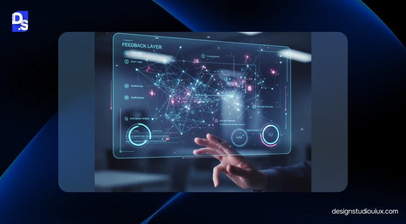
Trust building is tough in UI/UX design, especially when it comes to screenless interfaces. Feedback layer counters that through:
- Audit Trails: A transparent, searchable log of every action taken by the system for compliance and review.
- Multi-Modal Receipts combines haptic pulses, notifications, or automated activity feeds for subtle signals
- Process Timelines: Giving users a “live view” of where an automated task stands in its execution cycle.
Safety Layer
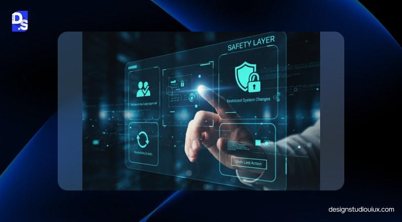
This is the last layer that specializes in governance, corporate policy, and security standards, and it plays a significant role in heuristic evaluation. It involves:
- Approvals involving human-in-the-loop approach
- Restricting system changes with/without oversight
- Reversibility or “Undo” Button
Discoverability & Control (Enterprise Trust Pattern Library)
According to Microsoft, zero UI has a major glaring problem: being discoverable. Invisibility is a great thing if it meets the UX audit checklist and answers these questions:
- What just happened?
- What to do next?
Let’s understand them in detail:
“What happened” patterns help people understand how the interface works, and “what can I do” patterns help users discover the system.
What Just Happened Pattern
Activity feed/receipts
A chronological record of actions taken by the system, detailing what happened, when, and by which rule or trigger.
Inline confirmations
Brief, contextual confirmations that appear at the moment an action occurs. These reduce uncertainty without forcing users into modal dialogs or separate screens.
Undo/rollback
Time-bound options to reverse recent actions. Undo restores a sense of control and lowers the perceived risk of automation.
Explain Why
Short explanations that clarify why an action was taken or suggested, referencing context, past behavior, or system rules to help users build confidence over time.
What Can I Do?
This pattern includes these features:
Command hints
Subtle prompts that show available actions in the current context to reduce guesswork and encourage correct usage.
Guided entry points
Guided entry points describe clear starting actions that anchor users when automation is available but not mandatory.
Progressive disclosure
Progressive disclosure is used to keep the interface simple but not compromise complexity for sensitive tasks. These disclosures only appear when they are needed.
Risks and Challenges of Zero UI (Enterprise-Realistic)
Although this UI has its perks, Zero UI is not without its risks and challenges. Here are 5 UX mistakes to consider before implementing:
Over-automation and loss of user agency
An aggressive system will make users feel disconnected, and the trust will slowly fade away. This also falls in place with website redesign mistakes and should be avoided at all costs.
Context errors and wrong triggers
Zero UI depends heavily on context signals, strictly speaking, accurate context. It is not suitable for incomplete, outdated, or misinterpreted context. These failures are often silent, making them harder to detect than visible UI errors.
Legacy integration and inconsistent data
When Zero UI operates across these systems, inconsistencies can lead to incorrect execution or partial automation that breaks workflows instead of simplifying them.
Role-based access and compliance risks
Automated actions still need to respect permissions, approvals, and audit requirements. Without strict role awareness and traceability, Zero UI can create compliance gaps, especially in regulated environments.
Shadow automation
When official systems are slow or restrictive, teams often build their own shortcuts using scripts, macros, or unofficial tools. These will bypass safeguards and increase operational risk, undermining the benefits Zero UI is meant to deliver.
How to Implement Zero UI Strategically (Step-by-Step Blueprint)
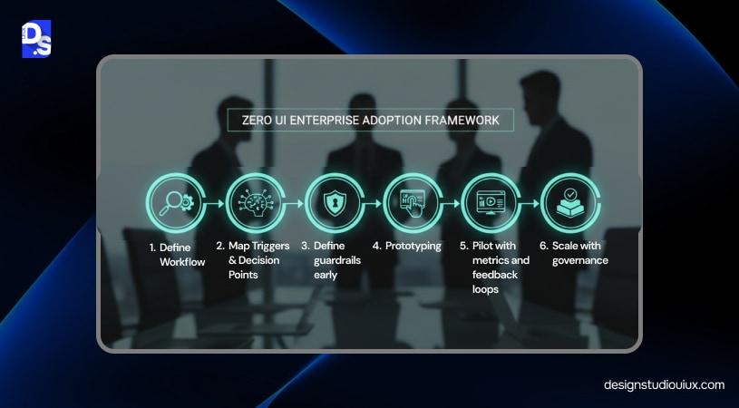
Rolling out Zero UI design needs to happen deliberately; it should not be covered from a broad perspective.
Define a workflow
First, designers need to pick one simple high-frequency and low-risk workflow to create these intent-driven interfaces.
Map Triggers & Decision Points
In this UX strategy, all the decision points are identified, which includes contextual inputs, intent signals, and areas where human intervention is needed.
Define guardrails early
Now is the time to establish boundaries, roles, approvals, logging, and reversibility. If automation is applied, then appropriate guardrails should also be set up, allowing users to access the interface without compromising compliance.
Prototyping
Zero UI is only effective when fallback paths are equally well designed, after understanding the background behavior through UX research services.
Pilot with metrics and feedback loops
Launch with a small group and track practical metrics such as task time, error rates, reversals, and user confidence.
Scale with governance
Once proven, it’s time to establish standardized patterns across teams, design systems, automation rules, and governance models to ensure consistency as Zero UI expands.
Measuring ROI and UX Success
Discussion about invisible UI needs to move beyond implementation and into UX performance metrics. These are the metrics that should be measured:
Operational Metrics
- Time saved per task through AI-assisted decision-making: How much effort are people putting in for repeatable actions?
- Throughput: How much work is completed in a timeframe?
- Exception rate: What is the frequency of automation failure/manual intervention?
- What is the UI’s rework rate?
UX Metrics
These UX metrics give a glimpse of how the interface is performing:
- Can users perform tasks without friction or confusion?
- How quickly are goals completed, including invisible steps?
- User confidence in understanding and influencing system behavior
- Willingness to rely on automated actions over time
Adoption Metrics
Adoption metrics are necessary to analyze the app/website’s user adoption rate.
- Opt-in/opt-out rates measure user’s willingness to enable or disable automation
- Automation acceptance is the measure of frequency, how frequently suggested actions are being approved
- Do users revert to manual or visible UI paths, or how often does fallback happen?
Zero UI in Practice (Mini Case Studies)
How would this work in real time? What about user trust, accuracy, and accountability? Here are some zero UI examples to address the situation:
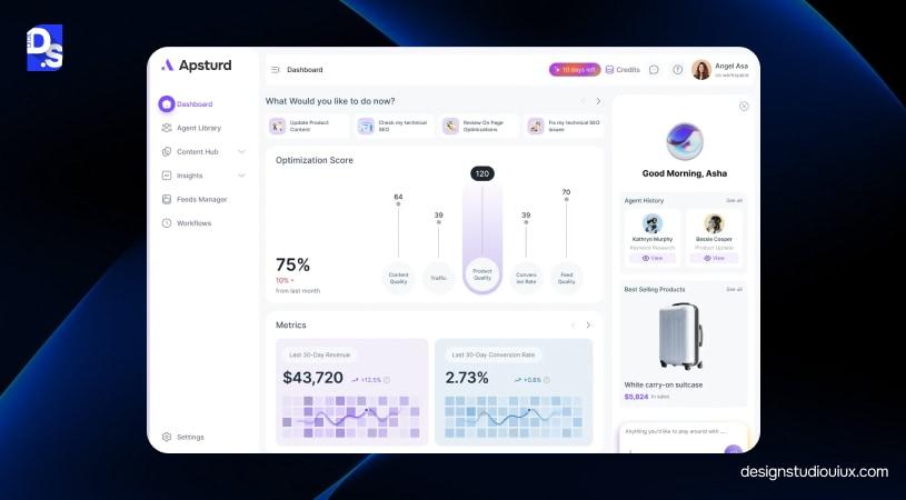
Case Study 1: B2B SaaS approvals
Problem
A B2B SaaS platform was used to process a high volume of routine and established approvals. UX audit services revealed that although they follow a set pattern, users have to review manually.
Approach
Zero UI was introduced using a predictive suggestion model. The system identified low-risk approval patterns based on role, history, and policy alignment, then surfaced recommended actions for quick confirmation. All actions generated audit receipts with timestamps, triggers, and decision rationale.
Outcome
- Approval turnaround time decreased by 25–40% for routine requests
- Manual review volume dropped by 30–50% without increasing exception rates
- Audit completeness remained intact, with 100% traceability for automated actions
- User trust increased as approvals became faster without losing visibility
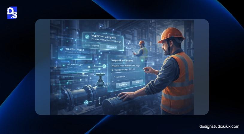
Case Study: Industrial & Field Operations
Problem
Field operations are time-sensitive, which mainly involve screen-based data entry. This led to the slowing down of task completion and missed or delayed updates.
Approach
Zero UI handled routine logging in the background, while a fallback UI allowed workers to review, edit, or correct entries at natural pause points.
Outcome
- Task documentation time reduced by 20–35% during active operations
- Data completeness improved by 15–25%, reducing follow-up corrections
- Error rates remained stable due to confirmation and fallback review
- Adoption was strongest in roles with continuous hands-on work
How Design Studio UI/UX Helps Enterprises Adopt Zero UI
Zero UI is not an experiment; it is a design-led change and should be treated as such. At Design Studio UI/UX, we help brands with enterprise UX design to deliver business value:
Audit and workflow mapping
We start by identifying where interaction can safely be reduced. This includes mapping high-frequency workflows, intent clarity, decision points, dependencies, and failure scenarios.
Prototype and validation
We prototype background behaviors, triggers, confirmations, and fallback UI together, then validate them with real users. This ensures automation aligns with expectations and does not introduce confusion or mistrust.
Design system and governance alignment
Zero UI patterns are integrated into existing design systems, role models, and approval structures. Permissions, auditability, and reversibility are defined upfront so automation scales without creating compliance or governance gaps.
Rollout and measurement
We track operational efficiency, UX confidence, and real usage patterns to refine automation over time.
Conclusion
Zero UI is all about eliminating unnecessary user input and moving toward AI-powered intent-driven systems. It will reduce friction, automate routine work, and bring consistency to complex operations.
It involves intent modeling, reliable context signals, feedback transparency, and establishing safety guardrails. Without these, automation can quickly undermine trust instead of strengthening it.
Organizations can start small and book an enterprise UI/UX consultation and then gradually scale the systems.
FAQs
What is Zero UI?

Zero UI is a UX approach where systems complete tasks automatically using user intent and context with minimal user interaction. It’s also frequently written as “0 UI” in search and casual use.
Instead of relying on screens, buttons, or menus, Zero UI uses automation, intelligence, and assistive inputs to reduce effort while keeping control, feedback, and governance intact.
How does Zero UI differ from traditional UI?
Traditional UI relies on screens, buttons, forms, and menus; users actively navigate and make decisions step by step Whereas Zero UI, in contrast, minimizes visible interaction by using intent, context, and automation to complete tasks in the background.
Does Zero UI replace screens?
Zero UI does not fully replace screens; it is usually hybrid, combining invisible interactions, like automation, voice, or gestures, with traditional UI.
What industries benefit most from Zero UI?
Zero UI delivers the most value in industries with repetitive, high-frequency workflows and clear intent signals.
- B2B SaaS & Enterprise Software—automating approvals, notifications, and predictive workflows.
- Industrial & Field Operations—hands-busy roles benefit from voice, gesture, and background task logging.
- Logistics & Supply Chain—Real-time updates and automated routing reduce manual intervention.
- Finance & Insurance—routine transactions, compliance checks, and alerts are streamlined with minimal user input.
Can B2B SaaS adopt Zero UI without disruption?
Yes, B2B SaaS can adopt Zero UI safely by combining automation with governance, fallback UI, and clear feedback.
Routine, low-risk workflows, like approvals, notifications, or predictive suggestions, can be automated while maintaining audit trails and user control.
How do enterprises measure ROI from Zero UI?
Enterprises measure Zero UI ROI by tracking operational efficiency, UX performance, and adoption metrics. Key indicators include:
- Operational metrics: time saved per task, throughput, exception rates, and rework reduction.
- UX metrics: task success, time-on-task, perceived control, and trust scores.
- Adoption metrics: opt-in/opt-out rates, automation acceptance, and fallback usage.
How do you ensure compliance and auditability in Zero UI?
Compliance and auditability in Zero UI are ensured through safety layers, fallback controls, and transparent feedback. It also includes:
- Permissions and role-based access: only authorized users or automated agents can perform specific actions.
- Audit trails and receipts: every automated task logs who, what, when, and why it happened.
- Approvals and reversibility: sensitive actions require confirmation, and users can undo or correct automated changes.
- Governance integration: Zero UI patterns are embedded in corporate policies and design systems to maintain consistent compliance.



