


12 UX Performance Metrics To Measure User Experience (2026)



from our Complete UX Audit Guide

Why UX Performance Metrics Matter?
You cannot improve what you do not measure in UX design. Most product conversations start with opinions. Helpful, yes, but opinions do not close gaps in activation, retention, or conversion.
UX performance metrics turn design debates into numbers that influence roadmaps and budgets. When teams can prove that a small wording tweak lifted a trial to paid by two points, people listen.
What are UX performance metrics, and why do they matter for SaaS Growth? It depends on adoption, habit loops, and low friction.
Metrics translate experience quality into signals that the business understands. Better onboarding completion, faster time to value, fewer friction events, and cleaner performance — all core outcomes of effective SaaS onboarding UX mean fewer support tickets, higher renewal rates, and stronger LTV.
This article shows the what, why, and how of tracking UX performance, with practical examples for GA4, SQL, and UX audit tools you already use. Use it to align design, product, and revenue targets without jargon.
How To Pick The Right UX Metrics
Choosing metrics starts with business goals. Tie each metric to a specific outcome, then track consistently.
- Early stage growth: Focus on activation, first value, and task success.
- Mature SaaS Shift to retention, product stickiness, feature adoption, and NPS.
- Enterprise motion Layer in reliability and performance signals used in procurement.
- One north star: Pick a single guiding metric that best reflects user and business value.
Mini framework
- If activation is weak, Measure task completion rate, onboarding completion, and time-to-value.
- If engagement is soft, Track feature adoption rate, frequency, and depth of use.
- If churn is high, watch retention cohorts, friction events, and time on task for key jobs.
Need a structured sweep of common pitfalls? See our UX audit checklist. It helps answer which UX metrics you should track for your current stage.
Key UX Performance Metrics You Should Track
Here’s a quick reference table you can drop into the blog to align product, design, and analytics on shared definitions. The aim is clarity and action: what each metric means, how to capture it, and what “good” typically looks like. Treat benchmarks as directional starting points; validate them against your audience, device mix, and complexity.
Use this as a skim-friendly anchor in reviews, then deep-dive into the funnel or cohort that needs attention. Keep cells short so the table reads fast during stand-ups and roadmap sessions.
| Metric | What it Measures | How to Track | Tools/Example | Typical Benchmark |
| Task Success | Users finishing a key job | Event pairs, funnels | GA4 funnel; SQL | 70–90% |
| Time on Task | Speed to complete a job | Start/complete timers | GA4 timers | Trending down |
| Error Rate | Friction and failed attempts | Log error events | GA4; server logs | < 3% |
| Drop-off Rate | Exits in a multi-step flow | Step funnels | GA4 funnel | < 40% |
| Time to Value | Time to first value | Value event delta | GA4; SQL | Hours, not days |
| Onboarding Completion | New users finishing setup | Completion flag | GA4 user property | 60–80% |
The 12 Core UX Performance Metrics
1. What Is Task Success Rate
Task success rate measures the percentage of users who complete a defined job to be done, such as inviting a teammate or exporting a report. It is a direct user experience metric and a clear UX KPI because higher completion usually correlates with activation and revenue.
How to measure
- GA4 Create a funnel from task_start to task_complete.
- SQL example:
SELECT COUNT(IF(task_completed=1,1,NULL))*1.0/COUNT(*) AS task_success_rate
FROM user_tasks
WHERE task_name=’invite_teammate’;
Benchmark: Aim for 70 to 90 per cent on well-designed core tasks.
2. How To Measure Time On Task
Time on task tracks how long users need to finish a job. Faster is not always better, but for most workflows, reduced time indicates less friction and higher efficiency. In SaaS website design, lower time on task improves support costs and employee productivity.
How to measure
- GA4 Fire a start event and a complete event, then compute the difference using user properties or event params.
- SQL example:
SELECT AVG(TIMESTAMP_DIFF(completed_at, started_at, SECOND)) AS avg_seconds
FROM task_events
WHERE task=’export_csv’;
Watch the median and 90th percentile to see long-tail pain.
3. What Is the Error Rate Or Friction Events
Error rate counts failed submissions, validation errors, and API failures that users experience while performing tasks. High error rate tanks satisfaction and drives abandonment.
How to measure
- GA4 Track error_event with error_code and form_id.
- SQL example:
SELECT COUNT(*)*1.0/NULLIF(SUM(attempts),0) AS error_rate
FROM form_attempts;
Benchmark: Keep frequent forms under a three percent error rate. Prioritise high traffic, high value forms.
4. How To Track Drop Off Rate Or Funnel Abandonment
Drop-off rate shows the percentage of users who exit a multi-step flow before completion. It is the most actionable conversion metric for product and growth teams.
How to measure
- GA4 Build a step funnel for signup or checkout.
- SQL example:
WITH steps AS (
SELECT user_id, step, MIN(event_time) t
FROM flow_events
WHERE flow=’signup’
GROUP BY user_id, step
)
SELECT 1 – COUNT(s3.user_id)*1.0/COUNT(s1.user_id) AS drop_off_rate
FROM steps s1
LEFT JOIN steps s3 ON s1.user_id=s3.user_id AND s3.step=3
WHERE s1.step=1;
Benchmark: Reduce drop off at the highest volume step first.
5. Activation And Time To Value
Activation marks when a new user first experiences product value. Time to value measures how long that moment takes. These user experience metrics strongly predict retention.
How to measure
- Define a clear value event, such as first_report_generated.
- GA4 Track sign_up to value_event time delta.
- SQL example:
SELECT PERCENTILE_CONT(0.5) WITHIN GROUP (ORDER BY TIMESTAMP_DIFF(first_value_at, signup_at, MINUTE)) AS ttv_median
FROM users
WHERE plan=’trial’;
Goal: Reduce median TTV to hours, not days.
6. Onboarding Completion Rate
Onboarding completion is the percentage of new users who finish the guided setup tasks. It is a leading indicator of adoption and revenue conversion.
How to measure
- GA4 marks a boolean user property onboarding_complete or a final step event.
- SQL example:
SELECT COUNT(IF(onboarding_complete=1,1,NULL))*1.0/COUNT(*) AS completion_rate
FROM users
WHERE created_at >= DATE_SUB(CURRENT_DATE(), INTERVAL 30 DAY);
Benchmark Target 60 to 80 per cent, depending on complexity.
7. Feature Adoption Rate
Feature adoption rate measures the proportion of active users who meaningfully engage with a specific capability. It informs roadmap and pricing decisions.
How to measure
- Define adoption rules, for example, used_feature_x three times in seven days.
- SQL example:
SELECT COUNT(DISTINCT user_id)*1.0/NULLIF((SELECT COUNT(*) FROM active_users_7d),0) AS adoption_rate
FROM events
WHERE event_name=’feature_x_use’
AND event_time >= TIMESTAMP_SUB(CURRENT_TIMESTAMP(), INTERVAL 7 DAY)
GROUP BY 1;
Use this alongside depth of use and frequency.
8. Retention Cohorts And Churn Link
Retention tracks how many users return after day 1, day 7, and day 30. Healthy cohorts point to product market fit, while falling lines suggest unmet value or friction.
How to measure
- GA4 retention cohorts by first_open date range.
- SQL example:
WITH cohorts AS (
SELECT user_id, DATE_TRUNC(‘day’, signup_at) cohort_day
FROM users
),
activity AS (
SELECT user_id, DATE_TRUNC(‘day’, event_time) active_day
FROM events
)
SELECT cohort_day,
COUNT(DISTINCT CASE WHEN active_day = cohort_day + INTERVAL ‘1 day’ THEN user_id END)*1.0/
COUNT(DISTINCT CASE WHEN active_day = cohort_day THEN user_id END) AS d1_retention
FROM cohorts LEFT JOIN activity USING(user_id)
GROUP BY cohort_day
ORDER BY cohort_day;
Watch D1 for onboarding resonance, D7, and D30 for habit.
9. Conversion Rate By Flow
Track conversion rate at the flow level, such as trial to paid, free to premium, or add to cart to purchase. This metric links UX changes to revenue.
How to measure
- GA4 funnels filtered by source, plan, or device.
- SQL example:
SELECT COUNT(IF(event=’subscription_started’,1,NULL))*1.0/
COUNT(IF(event=’trial_started’,1,NULL)) AS trial_to_paid
FROM user_events
WHERE period = ‘2025-10’;
Pair with split testing for confident decisions.
10. NPS And UX SAT
NPS gauges loyalty; UX SAT scores perceived ease and satisfaction for specific tasks. Together, they contextualise behavioural metrics.
How to measure
- In product surveys triggered after key actions.
- SQL example:
SELECT AVG(score) AS nps_avg
FROM survey_responses
WHERE survey_type=’nps’;
Use comments to guide qualitative improvements; combine with trends in activation and retention.
11. SUS Or CES
The System Usability Scale and Customer Effort Score provide quick, standardised measures of usability and effort. They are useful for releases and before-and-after comparisons.
How to measure
- SUS via an item questionnaire; CES via a single effort item.
- SQL example:
SELECT AVG(sus_score) AS avg_sus
FROM sus_surveys
WHERE release=’v3.2′;
Interpretation: SUS above 68 is above average. Use trends more than single points.
12. Performance Signals
Core Web Vitals and back-end latency affect perceived UX and conversion. Focus on Largest Contentful Paint, Cumulative Layout Shift, and Time To First Byte to protect the experience.
How to measure
- GA4 Web Vitals custom events or tools like PageSpeed.
- SQL example:
SELECT
AVG(lcp_ms) AS avg_lcp,
AVG(cls_score) AS avg_cls,
AVG(ttfb_ms) AS avg_ttfb
FROM web_vitals
WHERE page LIKE ‘/app/%’;
Aim for LCP under 2500 ms, CLS under 0.1, and good TTFB.
How To Combine Qualitative And Quantitative Methods
What is the best way to combine qualitative and quantitative UX data? Numbers reveal where users struggle, while observation explains why. Blend both for fast, targeted improvements.
- Identify. Use analytics to spot problem areas. High drop off in step two of onboarding, rising error rates on a key form, or slow time on task for exports.
- Observe, use heatmaps and session replay to watch behaviour and run short usability tests to hear where users hesitate and why.
- Improve Ship small, focused changes. Simplify labels, reduce fields, or change defaults to shorten time-to-value.
- Measure again. Re-run the same metrics. Did task completion rise? Did time on task fall? Did retention improve for the affected cohort?
Deep dive heatmaps guide available here. The mix protects you from chasing the wrong fix and builds a shared narrative across teams.
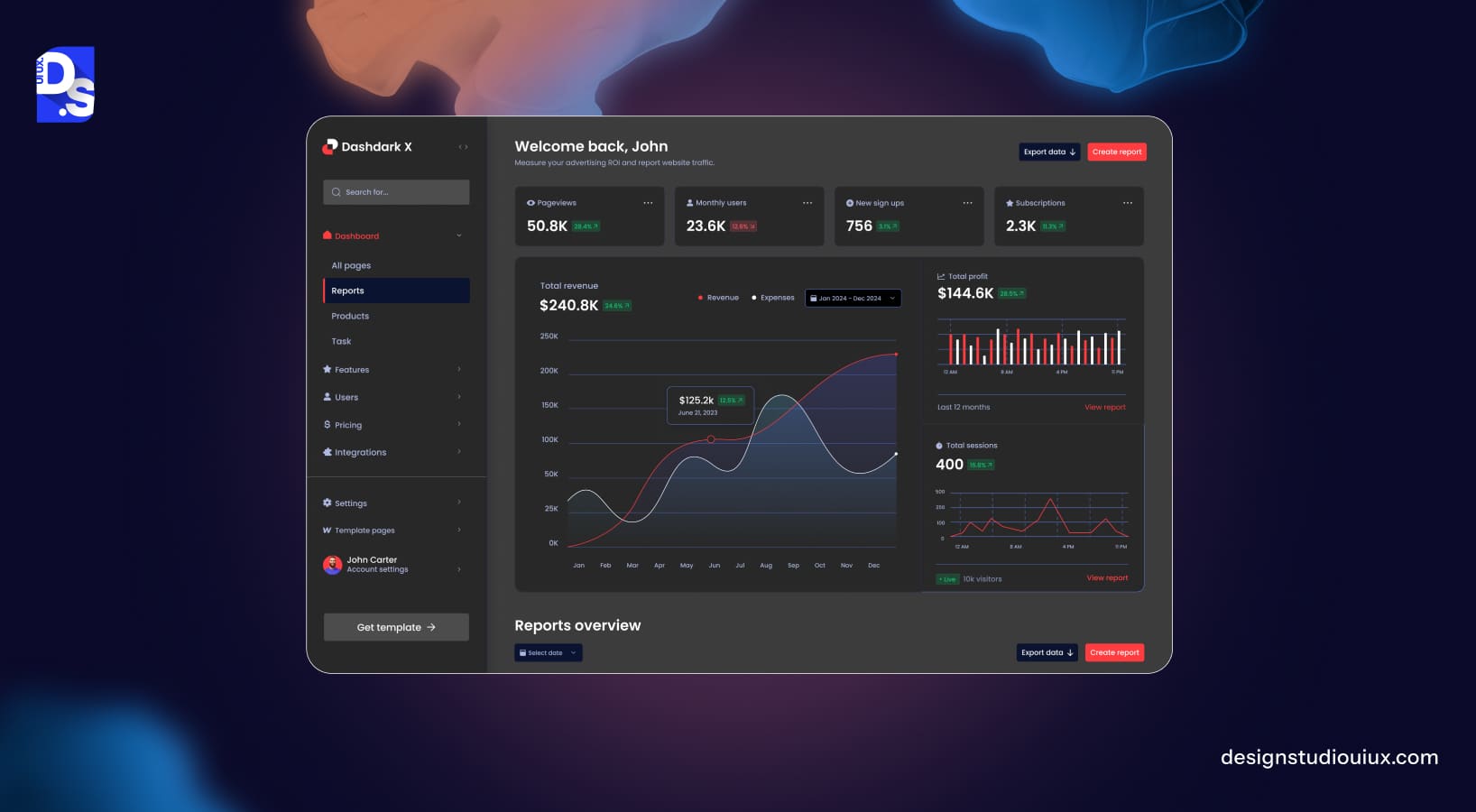
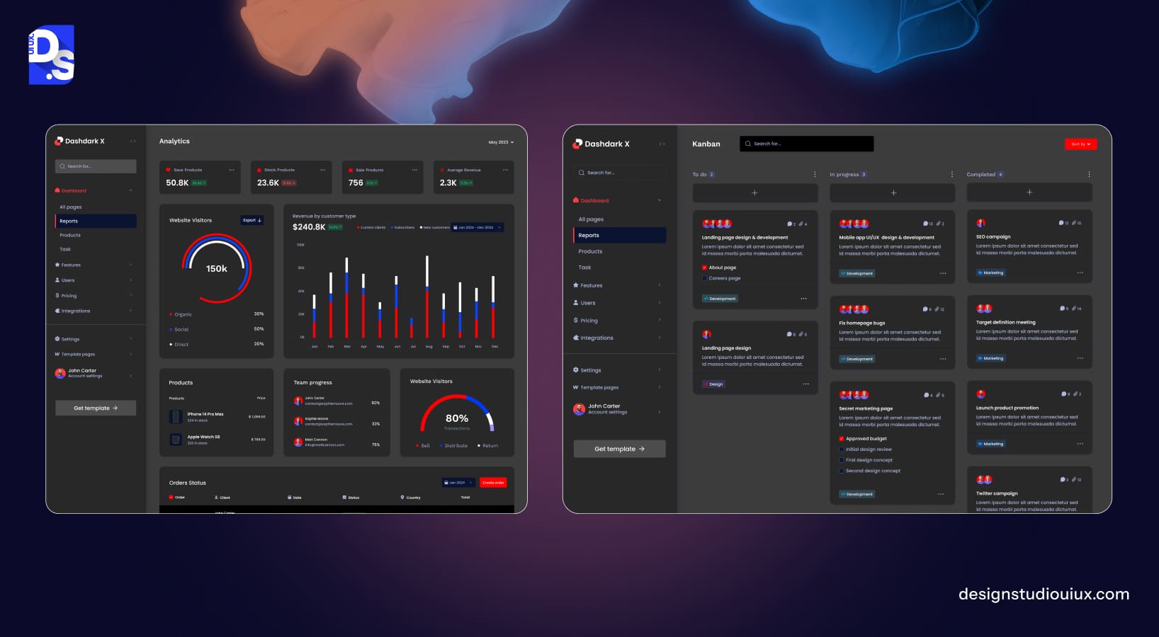
Sample UX Metrics Dashboard
How to build a UX metrics dashboard. A good UX analytics dashboard surfaces the few numbers that kick off the right conversations, then lets you explore the why behind them.
- The KPI Summary Panel shows task success, onboarding completion, time-to-value, feature adoption, and NPS. Add comparison to the last period and target.
- Conversion Funnel Visualise trial to paid, or a critical flow like workspace creation. Highlight the biggest drop and add annotations for recent experiments.
- Feature Adoption Chart: Rank features by adoption rate and trend. Add depth metrics to separate novelty from habit.
- NPS Trend And Comment Themes Track sentiment over time and tag themes like performance, pricing, onboarding, or support.
- Performance Score Card Pull Core Web Vitals into a simple green, amber, and red view for product pages and key app routes.
Tools: You can assemble this in Looker Studio with GA4 and BigQuery, or use Amplitude for product analytics. Sheets remains a great scratchpad for cohort pivots. When you quantify uplift, state it clearly. For example, a variant that increased trial-to-paid conversion from 12 per cent to 13.5 per cent at 95 per cent confidence yields a relative uplift of 12.5 per cent. Share both absolute and relative values to avoid confusion.
Internal references
- Tooling list and setup tips
- Offer a download prompt near the dashboard description. Placeholder copy
Download the free UX Metrics Dashboard and copy it to your workspace.
Include governance notes inside the dashboard so teams trust the numbers. Define events, ownership, and refresh times next to each chart.
Implementation: Events, Schemas, And Guardrails
Solid UX measurement rests on clear event design. Name events clearly and keep property values consistent. For each metric, document
- Business questions the metric answers
- Event names and parameters
- Calculation logic and filters
- Owner and alert thresholds
Guardrails
- Keep privacy in mind. Do not log sensitive fields.
- Sample where appropriate to reduce noise.
- Version events when you change definitions.
- Annotate releases and experiments to interpret spikes.
Add a small reference sheet to the repo that lists metrics and formulas. New joiners should be able to reproduce a chart from the spec alone.
Tooling: Practical Options That Work
Pick UX measurement tools that fit your stack. For most teams
- GA4 for funnels and web events
- BigQuery or a warehouse for SQL and joins
- Amplitude or Mixpanel for product analytics
- Looker Studio for shared reporting
- Usability testing tools for quick qual checks
You do not need everything at once. Start with the metrics tied to your quarter’s goals and extend as you prove value.
Roadmap: Rolling Out UX Metrics Across Teams
How often should UX metrics be tracked? Make cadence part of your operating rhythm.
Owners
- The product owns metric definitions and targets
- Design drives hypotheses and changes
- Analytics Maintains instrumentation and reporting
- Engineering reviews the feasibility and performance impact
Cadence
- Weekly Stand-up on activation, friction, and critical flows
- Monthly Deep dive on adoption, retention, and NPS
- Quarterly Strategy review and goal resets
Example timeline
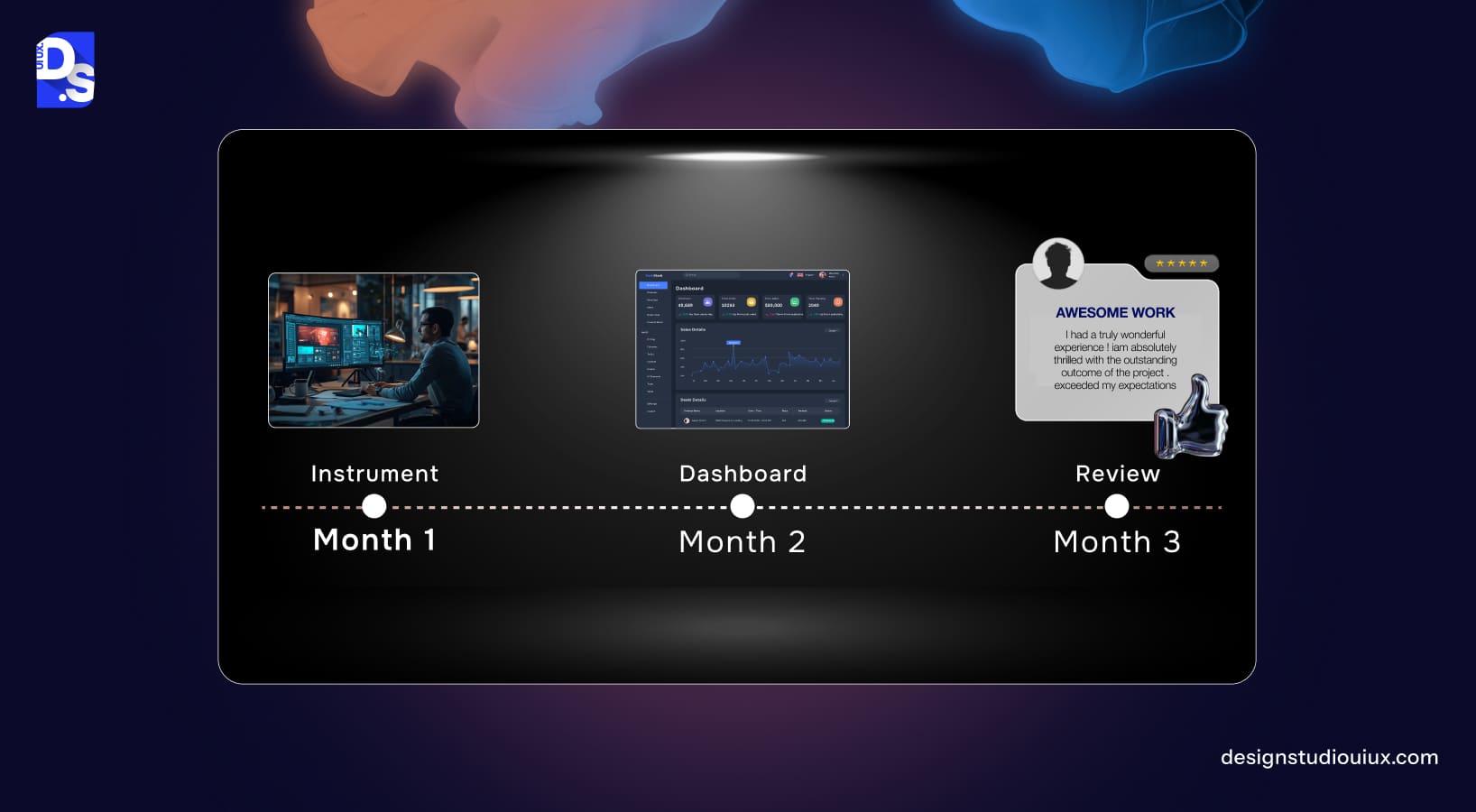
- Month 1: Define events, ship instrumentation, baseline metrics
- Month 2: Run two experiments, report uplift, and archive learnings
- Month 3: Expand dashboard to feature adoption and performance
Close the loop by tying UX metrics to planning. If task success improves by 10 points, plan the next bets that drive revenue.
Putting It Together: Narrative, Evidence, And Momentum
To make metrics land with stakeholders, you need a simple story. Start with the business goal. Show the baseline. Describe the change. Share the uplift with confidence bounds. Close with the next step. Keep that loop running, and your UX practice becomes a growth function, not a support lane.
Throughout this guide, you have seen how UX performance metrics align with the outcomes product leaders care about. The mix of behavioural data and qualitative insight gives you leverage. Add governance and a workable dashboard, and you can scale decisions across squads without losing context.
Sprinkle in SaaS UX best practices, such as clear value moments, progressive disclosure, and humble defaults. Keep experiments small, readable, and reversible. When wins compound, use them to fund larger bets such as navigation models or pricing flows. That is how design earns a seat at the revenue table.
Ready to Turn Numbers into Momentum?
Download the UX Metrics Dashboard and plug in your events to get a baseline within days. If you want outside help, book a 30-minute UX measurement audit and let us map your events, definitions, and targets to your goals. Adopt conversion-focused UX habits, and your next roadmap will be easier to explain and easier to defend.
FAQs – UX Performance Metrics
What Are UX Performance Metrics?

UX metrics are measurements that quantify user experience quality and its business impact. Examples include task completion rate, time on task, drop off rate, feature adoption, and Core Web Vitals. Use them to prioritize improvements and prove ROI.
Which UX Metrics Matter For SaaS Companies?
Focus on activation, onboarding completion, time-to-value, feature adoption, retention cohorts, and trial-to-paid conversion. Add NPS and performance signals to capture satisfaction and reliability.
How Often Should UX Metrics Be Reported?
Share a weekly pulse on activation and funnels, a monthly review on adoption and retention, and a quarterly strategy update that links UX uplifts to revenue and costs.
How Do Core Web Vitals Relate To UX Metrics?
They measure performance factors that shape perceived UX. Better LCP, CLS, and TTFB reduce abandonment and improve conversion, especially on mobile devices and in poor network conditions.



