


Enterprise Design System: Build, Scale & Govern UX



An Enterprise Design System (EDS) contains reusable tokens, components, variants, and guidelines used to deliver consistent UI and branding.
The key components include design tokens and components (essential for maintaining visual consistency). These mainly form the foundation or atomic level of EDS, and are fairly reusable.
EDS can help businesses with:
- Time-to-market
- Design efficiency
- Consistency score
- Cost savings
Who is This Guide For: CTOs, Heads of Product, DesignOps, Enterprise Teams
Introduction
An Enterprise Design System is a central collection of design tokens, components, guidelines, and governance rules to help product teams build consistent, high-quality interfaces. Enterprise design systems like this help large enterprises avoid fragmented UI, asset duplication, and slow project delivery.
EDS helps organizations with speed, consistency, and scalability. It becomes a single source of truth for teams, helping them maintain design quality and uniformity through reusable components. No matter how large the team grows, EDS will keep everything streamlined and everyone aligned.
In this article, we will discuss EDS, its core components, prominent examples, how to build them, and how to measure ROI.
What is an Enterprise Design System?
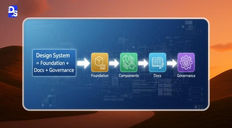
The definition of Enterprise Design System (EDS) describes it as a standardized set of design rules, reusable design components, style guides, and pattern libraries, used to streamline product design and development processes.
EDS is a single source of truth for designers and developers, to help them create efficient enterprise UX design.
EDS is different from a style guide, the former is a complete set of rules, mainly used to streamline design at scale, and covers everything from visuals to coding. Style guides, on the other hand, only have design principles, references, and other rules.
The component library contains the attributes of each UI element ( for example, size), states, and its specific code.
The design pattern library contains design elements that can be reused multiple times, such as titles, breadcrumbs, buttons, and search bars.
Enterprise Design System Vs Style Guide
| Enterprise Design Systems | Style Guide |
| Revolves around design philosophy | Revolves around branding |
| Mainly used by UX teams | Mainly used by external teams, content marketing agencies, advertisers, etc. |
A style guide is a manual for designers, which tells how to use branded elements and styles. It usually includes:
- Logos (with different media, formats, and colors).
- Fonts and parameters for their use.
- Product photos, stock images, and clip arts.
- Color palettes.
- Content templates for social media, email, and press releases.
Design system is a central repository for designers, developers, and product managers to create authentic, brand-specific digital experiences. It contains:
- Reusable blocks, including code snippets
- Grid systems to support graphic design
- Design philosophies
- Usability and accessibility guidelines
Enterprise Design System vs UI Kit
A UI kit is a pre-built set of visual components — buttons, forms, icons, cards usually static and disconnected from code or governance. An enterprise design system includes everything a UI kit offers, but adds design tokens, coded component libraries, documentation, and a governance model that keeps everything consistent as the organization scales.
Think of a UI kit as the raw materials and a design system as the entire operating infrastructure built around those materials — tokens define the rules, components apply them, documentation explains them, and governance keeps them from drifting apart as more teams contribute.
| UI Kit | Enterprise Design System |
|---|---|
| Static visual components | Coded, functional components |
| No governance model | Governance, versioning, contribution rules |
| Design-only | Design + engineering, integrated via tokens |
| Good for a single project | Built to scale across teams and platforms |
Why Enterprises Need Centralized UI Governance
A centralized document repository is responsible for maintaining consistent branding, accessibility, and design implementation. Through this, UX teams can amp up their creativity and efficiency.
Why Enterprises Invest In A Design System
Enterprise tools like CRM software rely heavily on consistent UX patterns to reduce cognitive load and improve team productivity. The benefits of design systems are multifaceted, as listed below:
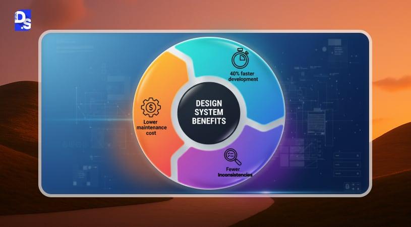
Consistency across multiple product teams
An EDS can align your design and development teams through design principles, visual guidelines, and reusable components. This ensures the branding is consistent and coherent across platforms.
Faster development velocity
Design systems contain reusable components, and pattern libraries, processes, and principles to significantly improve development speed. EDS can boost development velocity by 40%.
Reduced design debt
Without a design system, design and development teams have to develop new components during each iteration. Initially, it would not matter much, but soon, the number would scale up. Then it would lead to fragmentation, chaos, and design debt (inconsistency).
A design system standardizes UI, thus reducing design debt by 25%. Design teams would use reusable components to bring a consistent branding experience.
Better collaboration between design & engineering
The design system is a repository for designers and developers- both teams can access Figma libraries, Storybook components, and documentation. This leaves no scope for ambiguity, short feedback loops, and actually improves cross-team coordination.
Lower long-term maintenance cost
With faster time-to-market, and reduced errors, enterprises will save ample time, especially designing new products. If your team gets it done quickly with little retouch, you will save money in the future.
Core Components of an Enterprise Design System
Design Tokens
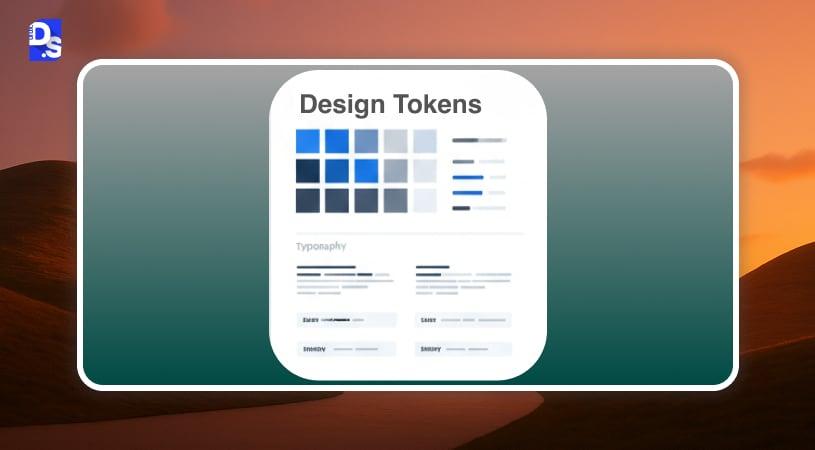
Design tokens are used to add consistency across elements (functionally and aesthetically) in a system. These tokens store attributes like colors, fonts, radii, and spacing.
Color Tokens: Contains brand colors, UI colors for color consistency
A token may include data such as:
{
“Color-primary”: “#4A6CF7”,
“Spacing-md”: “16 px”
}
Instead of only storing hex codes, they contain information in a human-readable format.
Spacing Tokens: Contain information about spacing, used to maintain consistency across layouts
Typography tokens: Font sizes, type scales, typographic hierarchies, and line-heights. This may contain attributes such as: -font-heading: Roboto;
Shadow tokens: Elevation levels
Radius tokens: Contains data about round-cornered buttons, input fields, and containers.
Component Library
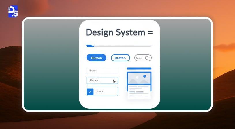
A component library houses UI elements that can be reused across projects to maintain consistent styles and behavior. It contains pre-built, responsive components to speed up designing. These elements pair with their coded counterparts in React, Angular, Vue, or native platforms.
According to atomic design methodology:
- Primary and secondary buttons with enabled/ disabled states and forms with input fields (atoms)
- Design tokens (atoms)
- Color palettes, fonts, and icons (atoms)
- Animations (atoms)
- Search bars, logos, and dropdowns (molecules)
- Card-like elements for profiles or products
- Navigational elements like headers, footers, and sidebars, image carousels (organisms)
A component library also stores WCAG, ARIA labels, keyboard accessibility, and support for onscreen readers.
Document & Usage Guidelines
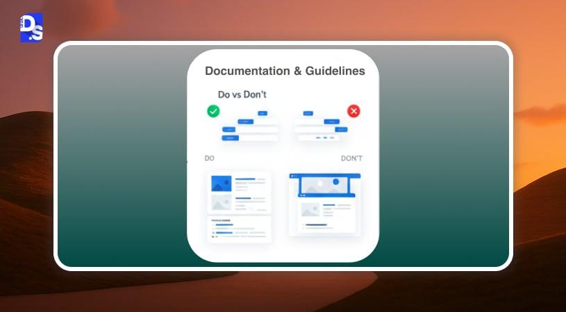
Design documentation is an important knowledge transfer tool, with UI examples and guides for the next designer/ developer. If the main designer is unavailable, others can finish the project.
It contains design and accessibility guidelines, dos and don’ts for designing a system to prevent misuse of the component library, and overlooking style guide elements.
What to expect:
- Usage guidelines: Components, best practices, and platform considerations.
- Visual cues to explain what’s acceptable/ unacceptable.
- Figma master files that include component specs and guidelines.
- Storybook integration: Necessary to understand component states, behavior, and accessibility.
Governance & Contribution Model
A governance model is necessary to safeguard the design rules and ensure that the project is not derailed. This model provides:
- Acts as a guideline for decision-making and conflict resolution.
- Contains principles for maintaining design quality and avoiding inconsistencies.
- Helps designers to streamline their workload and reduce rework.
DesignOps
It clearly defines team roles and responsibilities:
- Design system teams are necessary for maintaining and upgrading the design system.
- System owners overlook strategy and vision.
- Conflict resolution is mainly assigned to the governance committee.
- Product teams use the system to provide and review feedback.
A well-written document contains clear guidelines (for adding, modifying, or removing components), review, and change management.
Versioning
With time, design systems should evolve, which means:
- The design should go through periodic reviews to identify touchpoints that need improvement.
- The major version includes breaking updates.
- Minor versions will only list.
- Patch versions are necessary to address bugs or access.
- Design systems should have version control, i.e., different versions for managing legacy projects.
Approval Workflow
Approval workflow is the process from design proposal to release, and involves:
- A design request is submitted.
- UX and UI designs are reviewed for accessibility and usability.
- The next process includes engineering review, feasibility, and performance checks.
- Accessibility testing (understanding WCAG compliance, keyboard behavior, contrast).
- Final approval.
Release Cycles
Release cycles define how enterprises work with updates:
- Monthly releases for minor components and improvements
- Quarterly updates for major updates
- Emergency patches for stability issues
Contribution guidelines for open-sourced or crowd-sourced projects to guide users on how to add new ideas without altering the system.
Basically, it contains information about how to:
- Contribute
- Review other contributions
- Integrate those changes
Tooling and Tech Stack
EDS has a complete tooling ecosystem to maintain UI consistency across platforms. Although it can involve an infinite number of tools, we have only discussed these:
Figma
On Figma, you can see live interactions between components, templates, and interactive patterns. Here you can:
- Collaborate between product, design, and engineering teams.
- Create master components and their variants.
- Work with auto-layout responsiveness.
- Work with component states (hover, focus, loading).
- Use shared libraries for scaling multi-product scaling.
Storybook
Storybook, an open-source platform, helps designers create UI for React, Vue, and Angular. If they want to build and test components in standalone environments and improve element reusability.
GitHub
Github is mainly used for version control. Designers can pull requests, issue boards for component management, build CI/CD pipelines and publish libraries (NPM packages, internal registries).
Tokens Automation
Token automation tools are necessary to generate tokens, sync them between Figma and code, and produce output tokens in CSS, JSON, Android, XML, and iOS Swift formats. It also consists of automated triggers to supercharge token generation and prevent manually raised errors.
How To Build an Enterprise Design System (Step-by-Step Roadmap)
Let’s walk through the design system implementation steps.
Component Inventory Audit
At first, experts will review the existing resources and documents to understand the current processes. They must learn what tools are used and how mature the design teams are. Then, the researchers will use a UX audit checklist to:
- Find inconsistencies.
- Figure out the vital components and their functionalities.
- Group these components based on those attributes to ensure a cohesive design system.
Define Principles, Tokens & Foundation
After the team has been exposed to inconsistencies, it’s time to build the foundation, principles, and tokens.
Design Principles
Design principles would be helpful for decision-making scenarios and for maintaining consistency. While preparing these rules, remember these pointers:
- Begin with understanding core values.
- Explain with concrete examples (Specificity).
- Maintain accessibility.
- Leave room for scalability.
Now, it’s time to set the visual style, aka design tokens, including:
- Color
- Typography
- Iconography
- Imagery
- Spacing
- Radii
- Motion
- Shadows
These elements together would bring a brand to life and create a positive first impression.
Build Component Library
The component library comes next to principles in the design system process. It involves:
Figma Components
On Figma, designers would work on designing buttons, cards, and headers for the system. It is also used to determine component states, element variants, resize the elements, and modify auto-layout.
Code Components
The Figma elements should have corresponding coded components in React (for web apps), Vue (lightweight), and Angular (enterprise-scale applications).
Storybook Integration
Storybook integration is necessary to maintain parity between Figma and coded components. Through this integration, designers can preview coded components, states, check accessibility and responsiveness, and ensure consistency (visual and functional).
Documentation+ Usage Rules
The documentation and usage guidelines are about how to use EDS elements and where to use them, without leaving room for ambiguity. It might include:
- Component anatomy diagrams
- Do/ Don’ts
- Interaction rules and accessibility requirements
- Code snippets
- Figma usage guide
- Content recommendations
- Voice and tone specifications
- Platform-specific instructions
Integration and Distribution
After developing the design system, it needs to be accessible for development teams.
NPM Packages
Organizations often publish their design systems as NPMs (for example, npm install @company/design-system) for reusability.
CI/ CD Automation
CI/CD automation allows design teams to always be up-to-date, reduce errors, and guarantee quality.
- Build components automatically
- Run tests (visual, accessibility, snapshot)
- Deploy NPM packages
- Update Storybook automatically
Storybook Integration
Storybook acts as the source of truth for coded components. Developers may use it to:”
- Check every component (for states, sizes, variants).
- Allows designers to preview component behavior.
- Sync documentation at every stage.
Governance and Maintenance
Governance rules are applied to maintain the quality and scalability of the design system. It involves DesignOps, version management, and cross-team contributions.
Similarly, for maintenance, a separate document is created which includes the following data:
- How to update the design.
- How components are added.
- Ways to incorporate user feedback.
Adoption Across Multiple Teams
Multi-team adoption of a design system in a large organization is ensured through training and workshops, onboarding playbooks, and other strategies. In this phase, product teams track these usage metrics:
- Component adoption
- Component duplication
- Contribution rate
- Release cycle
- Improvements in accessibility
Common Mistakes In Enterprise Design Systems (and How To Avoid Them)
Here are the top 6 operational reasons your design system may fail:
Overloading Component Library
Enterprises often want to create an all-encompassing design system, with hundreds of hyper-focused components. Design teams will then encounter bloating, unnecessary duplicate components, and an incoherent design system. This means higher maintenance costs, slow CI pipelines, and inconsistent adoption.
Solution:
- A lean core component library (high-usage components).
- An 80/20 adoption philosophy.
- Usage of analytics.
No Governance Model
If your team continues adding components to the library without design system governance, your EDS will break. This could lead to regressions, inconsistent UI, and lastly, unreliable releases.
How to avoid it:
- With a cross-functional working group
- Working with a clearly defined contribution workflow (reviews, code quality checks, and release protocols)
- Versioning and maintaining change logs
No Token Architecture
With no token components, teams have to hard-code every component in the resource library. So, every time, these elements will be redefined, with no support for theming, accessibility, or multi-brand issues.
How to solve it:
- Using a token-first architecture before working on component development.
- Working with a centralized pipeline for web+ native token synchronization.
Poor Documentation
When teams have a strong component library, but not proper documentation, guidelines, do/ don’ts, and samples of engineering code, they have to redesign everything from the beginning. Without documentation, enterprise-wide adoption will be wonky, leading to longer build time.
Solution:
- Documentation should not be considered as an afterthought.
- It should include live code examples, integration patterns, and performance caveats.
- Assign an internal doc owner
Lack of Engineering Buy-In
Not accounting for engineering teams during EDS creation is a grave error. Because without engineering buy-in, no enterprise-wide adoption will be possible.
Solution
- Provide DS onboarding walkthroughs for engineers.
- Create a contribution channel for engineering teams.
- Measure component reuse metrics, UI defects, time-to-market.
Not Working With A DesignOps Owner
Without an assigned DesignOps owner to manage roadmap, governance, metrics, and cross-team alignment, EDS may drift or become shelfware.
Workaround
- Assign a dedicated DesignOps for maintaining adoption, versioning, and release cycles.
- Ask them to align design, engineering, and product teams as per the roadmap.
Enterprise Design System Examples (Apple HIG, Material Design, Carbon, Salesforce Lightning)
Apple’s Human Interface Guidelines (HIG)
Apple’s HIG is one of the earliest and most influential design systems, setting standards for consistency, accessibility, and platform-specific behavior across iOS, macOS, watchOS, and visionOS. Unlike component-library-first systems, HIG leads with principles and interaction patterns, then lets each platform’s component library implement them differently.
What to learn:
- Platform-specific rules matter — a pattern that works on iOS shouldn’t be forced onto macOS or watchOS unchanged
- Documentation can lead with philosophy and behavior, not just visual specs
- Long-term consistency comes from strict adherence to interaction conventions, not just shared visual assets
Google Material Design
Google Material Design is a widely adopted design system, used primarily to build cross-platform enterprise UI patterns. It consists of guidelines, components, and iconography needed to develop intuitive interfaces.
What to learn:
- Prioritize using motion and elevation for better usability and hierarchy.
- Should use visual language to explain principles.
- Should contain proper documentation and multi-platform guidelines.
IBM’s Carbon
IBM Carbon Design System comes with a complete code kit (for frontend development), UX, and dashboard design guidelines. It is mainly used for enterprise-grade business applications that lean toward being data-heavy.
Key learnings:
- Accessibility should not be optional.
- Components should be tailored for data visualization.
- Rely on developer-first tools.
Salesforce Lightning
Salesforce Lightning consists of modern web design trends and principles for the Salesforce ecosystem. This is the first system to introduce design tokens, instead of hard-coding every component each time.
Key learnings:
- Build a system that supports no-code/ low-code designers and developers.
- Use strictly defined guidelines to rapidly develop customized components, and avoid UX drift.
ROI Metrics & KPIs to Measure The Success of Design Systems
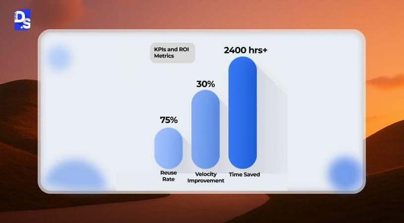
A design system is already in your organization. But how would you measure/ analyze its success?
Time-To-Market/ Design Efficiency
- How did your design processes improve after EDS implementation?
- Has the time-to-market parameter for new products improved after EDS?
Reuse Rate (%)
If your EDS has a high reuse rate, it indicates a team-wide strong adoption, and less duplicate components. When reuse rate increases, your team’s design debt increases, which contributes to design efficiency.
Consistency score
Consistency score evaluates the uniformity of different UI and branding components across platforms and touchpoints, as per this SaaS UX guide.
Design Hours Saved
This parameter measures how the design system has impacted design processes, and hours saved across teams.
Defects Reduced
These systems rely on using standardized components, which significantly design process steps. Fewer defects means speedier product development and 40% higher user satisfaction rate.
When Do You Need an Enterprise Design System? (Design Criteria)
Often, enterprises don’t realize they need a design system until it’s too late.
So do you need it? Here are some signs to consider:
Fragmented Product Teams
If you have multiple product teams and notice inconsistencies in UI elements, it is a red flag.
These inconsistencies can be in color, typography, or spacing.
Do you notice duplicate and inconsistent elements?
All these signs lead to building a design system.
Design Debt
As mentioned above, each team would create separate versions of buttons, inputs, and patterns without a Design System. This would lead to fragmentation and expensive cleanup efforts. However, a DS would centralize and standardize UI decisions, significantly reducing design debt.
Inconsistent UI
If users notice differences in navigation, behavior, form layouts, and other elements, it signals that brand UI is drifting. This is not a good sign, and can be solved through web, mobile, dashboards, and internal tools, improving brand image and usability.
Scaling from 10→ 50 Engineers
When your engineering team grows, new experts are employed. Without a central data source, they will create new elements, which means longer onboarding time.
Product Redesign Cycles Increasing
With a scalable framework, your project will continue for an extended period, This scalability is what modern enterprise website design demands. A central library would help here, as it contains tokens, theme variables, and design components, change them once, and see them reflected in real-time.
How Design Studio UI/UX Helps Enterprises Build Design Systems
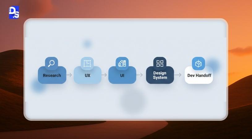
At Design Studio UI/UX, we partner with enterprises to build scalable UI, and reduce design debt. Our approach includes:
Design System Audit
We begin with a comprehensive audit of your existing UI ecosystem. This includes analyzing duplicated components, visual inconsistencies, accessibility gaps, and tech-stack fragmentation. The audit is the foundation for your Design System roadmap.
Token Architecture
Our team defines a scalable token architecture for color, typography, spacing, shadows, radii, and motion. These are set up to support theming, brand evolution, and cross-platform consistency across web, iOS, and Android.
Component Library Build
We design and build atomic, modular components in Figma and translate them into code-ready libraries for React, Vue, or Angular. Each component includes variants, states, accessibility rules, and documentation aligned to enterprise standards.
DesignOps Setup
We help establish DesignOps processes, versioning, workflows, automation, contribution standards, and release management, so your system scales smoothly as teams grow.
Developer Integration
Our engineers integrate the Design System into your development pipeline via Storybook, npm packages, CI/CD workflows, and automated accessibility testing. This guarantees seamless adoption by product teams.
Governance Framework
We implement a governance model that defines ownership, approval workflows, cross-team contributions, and long-term maintenance standards.
Conclusion
Organizations working on complex design projects will inevitably encounter UI drift, fragmentation, and design debt, unless they use a well-defined Enterprise Design System. It will contain all the necessary components needed to scale the design process and maintain collaboration between engineering and product teams. Organizations, irrespective of large or small, should have an EDS to reduce long-term maintenance overhead.
FAQs – Enterprise Design System
What is an enterprise design system?

An enterprise design system is a centralized framework of design tokens, components, patterns, and guidelines used by organizations to accelerate delivery and maintain brand cohesion across multiple platforms and apps. Many large organizations refer to these simply as enterprise design systems.
How is a design system different from a style guide?
A style guide includes elements like colors, fonts, and logos or simply, visual elements. A design system covers a lot more, including coded components, usage rules, pattern libraries, and governance models. On the other hand, a design system works as an operational guideline.
What's the difference between a design system and a UI kit?
A UI kit is a static set of visual components with no code or governance attached. A design system includes everything a UI kit offers, plus design tokens, coded components, documentation, and a governance model making it a full operating infrastructure rather than just a visual asset pack.
How long does it take to build a design system?
The timeline to build a design system depends on the platform, complexity, component standardization, and UI complexity. On average, an MVP design might take 3-6 months, and full-scale development might take another 5-6 months.
Do design systems reduce development time?
Design systems provide ready-to-use reusable components, patterns, and guidelines, to reduce incessant feedback cycles, defects, hard-coding, and speed up the project delivery timeline.
What are design tokens in a design system?
Design tokens store reusable design elements, such as color, typography, iconography, shadow, radii, spacing, and motion. These work together to establish visual alignment everywhere across the platform.
Is a design system necessary for SaaS companies?
A design system is necessary for SaaS companies to maintain branding uniformity across dashboards, especially during scaleups. It supports smooth collaboration between engineering and design teams, removes fragmentation, and speeds up development.
How do enterprises maintain a design system?
Enterprises use structured governance: versioning, contribution models, DesignOps roles, controlled release cycles, feedback loops, and analytics ensure the system stays relevant.
What is DesignOps in relation to design systems?
DesignOps maintains the operations behind design systems and involves workflows, tooling, governance, documentation, and cross-team alignment. Their role is to oversee design and development teams work cohesively, updates are reviewed, and systems are scaled without disruption.
What tools are used in enterprise design systems?
In enterprise design systems, tools like Figma (for designing), Storybook (coded components), Github (for version control), NPM (distribution), and automation tools for faster development.
Can small companies also use design systems?
Smaller teams can also use design systems to speed up UI decision-making process, and faster adoption across teams. They can begin with a simpler system to avoid design debt, and then scale from there.