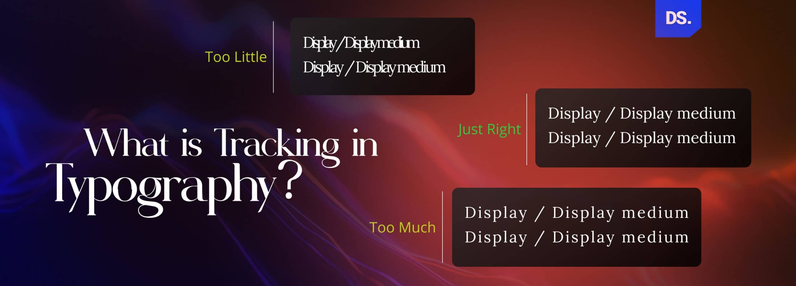
Tracking in Typography: Letter Spacing, Examples & Tips



Summary
Tracking in typography adjusts the spacing between letters across an entire block of text, unlike kerning, which modifies the space between individual letter pairs. When used together, tracking and kerning can significantly enhance clarity, readability, and overall visual harmony.
Tracking in Typography Definition
Tracking is the process of manually adjusting the horizontal space between letters in a word/line to create a specific visual aesthetic for a design.
Google Material Design 3 says letter spacing is very important for type scales. It can directly change how easily people can read text across digital screens. It also affects your brand tone and visual hierarchy.
The rules are to
- tighten it for large headlines,
- open it for small text and capital letters,
- loosen it for decorative or handwritten fonts, and
- increase it for text written on busy backgrounds.
At the same time, Butterick’s Practical Typography confirms that letter-spaced text at headline sizes actually reduces legibility.
Tracking in typography (also known as letter spacing) is the practice of adjusting the horizontal space in between the characters in a word or a line. The amount of horizontal space between letters, numbers, punctuation, and other characters in a word or a line is usually fixed.
UI/UX designers manipulate this spacing, i.e., apply “tracking typography” to make the lengths of lines/words look more even and improve the overall appearance and legibility of the text. The same goes for designers in any field that uses typography.
Join us on this journey of discovery, as we decode the art/science of tracking, and empower designers to reshape the visual world around us.
What Is Tracking in Typography and How Is It Used Today?
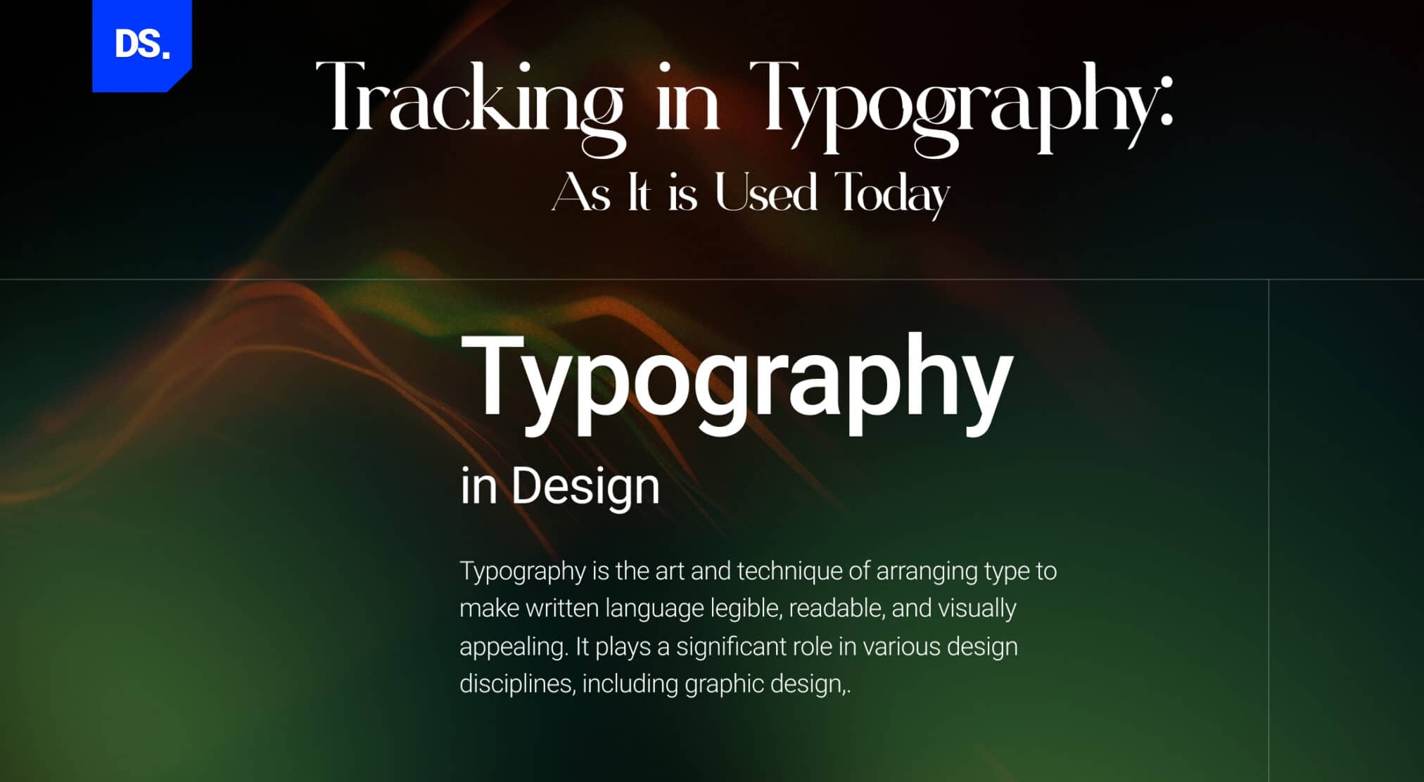
Tracking in typography is basically the process that changes the space between all letters in a text line equally. Today, the concept is used in UI/UX designing and print media. This improves site readability, user experience and overall aesthetics of the digital product.
Unlike kerning which changes the space between 2 specific letters, tracking adjusts all spaces at the exact same time. This gives designers total control over text density. This way, tracking sets the visual tone and hierarchy at any scale.
In the intricate craft of typography, where every curve, letter, line, and spacing bears immense weight, tracking has emerged as an ultra-potent technique.
It is just as important as font size, weight, and height. The system dictates exact spacing numbers for every text role. It breaks them down into Display, Headline, Title, Body, and Label.
It is widely lauded by UX designers for its all-encompassing effectiveness. Here is how tracking is used-
- Web designers use tracking in typography to give the content on their website an aesthetic appeal, an effort that directly reflects on their brands.
- UI designers use tracking to make their app content more legible to increase the amount of screen time users spend on their products.
In print media, the use of tracking dates back to the time of the manual printing press.

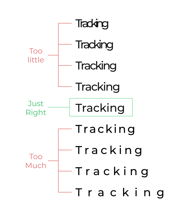
Tracking in typography examples (Source)
Despite its illustrious history of significance in typography, print media, and digital media, tracking continues to be an underrated, misunderstood, and confusing concept for many aspiring designers. There are 3 myths behind this confusion:
Myth #1: Tracking is All Technique, No Creativity
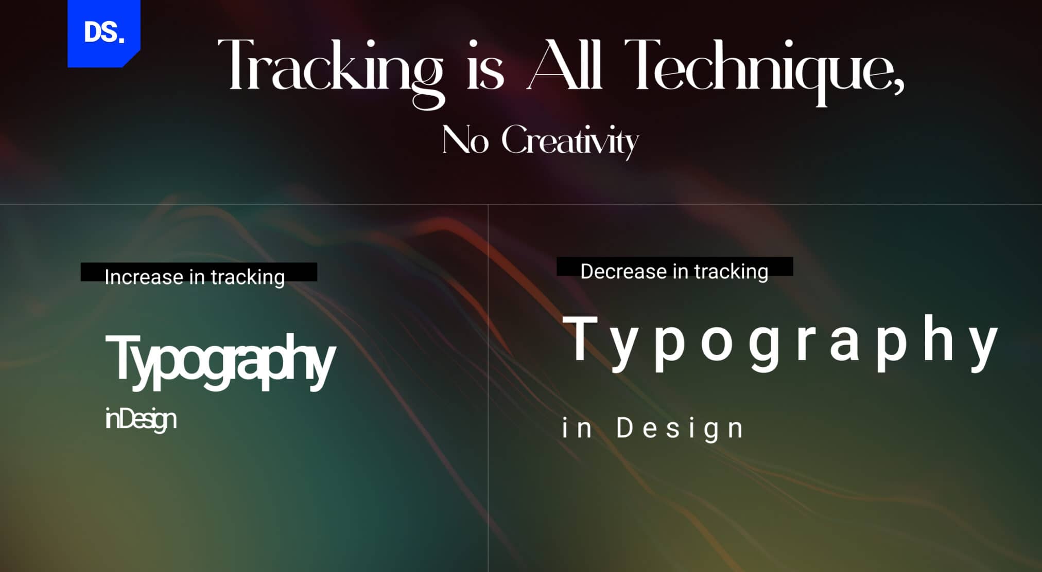
Good tracking takes technical knowledge and creative judgement. It is more than a mechanical tool where designers close space for headlines and open space for tiny text. Loose tracking feels open and calm and tight tracking feels powerful and solid.
Typography guides show that capital letters always need extra spacing and all-caps text is very dense visually. Hence, designers have to study the look, not just copy rules. Tracking without real creativity makes your layouts feel boring.
Tracking is often seen as a purely technical detail that’s not vital to the creative aspects of the design process.
Tracking is a single but vital part of any design strategy that aims to improve the appearance of a page and the legibility of all pieces of text on the page.
Tracking is a versatile tool that allows designers to create various effects in their designs. It also supports strong visual hierarchy design principles by helping designers guide user attention through clear and readable typography.
And like with all versatile tools, you need creative skills to make the most of tracking. In other words, if a designer doesn’t know the fundamentals of tracking, their designs won’t be able to create designs that are good-looking or clear to the target audience.
Here’s an example that demonstrates how creativity is at the core of tracking:
Example of Tracking in Typography
A UI/UX designer is asked to create a promotional landing page for a restaurant app.
The brand’s goal is to convey a modern, user-friendly atmosphere that entices visitors and encourages them to explore the app’s features.
To achieve this look, the designer has to follow these strategies:
- picks a sleek sans-serif font, that instantly aligns with the app’s Gen Z aesthetics.
- Rather than adhering to default letter spacing, the designer makes subtle adjustments, adding more space and breathing room between the characters.
- This subtle manipulation of tracking instantly gives the text a more open and friendly feel, which matches the user-friendly vibe the app wants to project.
- To magnify the app’s welcoming vibe, the designer curates a vibrant color palette.
- The synergy of generous letter spacing and lively colors leads to the creation of a landing page design that’s legible, aesthetically pleasing, and reflective of the brand’s core ideas.
This example showcases how tracking in typography and design stands as a fertile ground for creativity for UI/UX designers. Applying this creativity is vital because professionally designed typefaces always come pre-spaced for different size ranges.
If the typeface you’re using is within the intended size range, there’s no need to manually adjust the spacing. But, that wasn’t the case in this example. Here, the designer was using a typeface smaller than the intended size range of the text on the app’s landing page.
With the creative use of tracking, the designer set the typeface larger than the initial range and improved the legibility of the small text. Tracking also allowed the designer to give the text on the page an airier and more inviting feel.
Myth 2: Tracking is the Same as Kerning
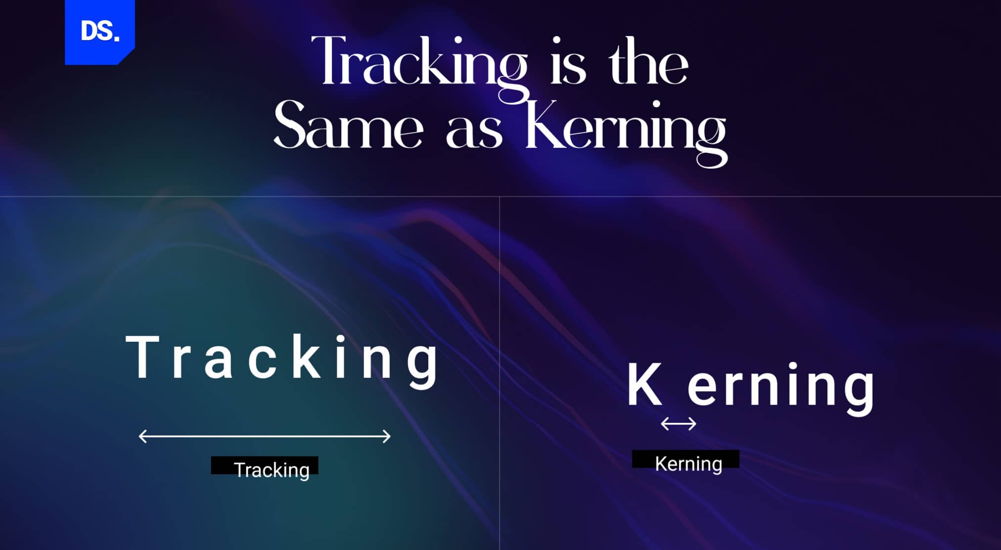
Tracking is also misunderstood because it’s confused with kerning which is the process of adjusting the space in between individual letters. On the other hand, tracking is the process of adjusting the space between ALL characters in a word/phrase, not just individual letters.
Smashing Magazine’s guidelines show that pro fonts already fix common letter-spacing problems automatically. But unique text sizes, decorative typefaces, and small screens require manual work. Designers must use tracking to control the total space across the text.
Then, they use kerning to fix individual letter pairs on small screens.
Here is a visual example of the difference between kerning and tracking:
Kerning: T O O M U C H S P A C E
Tracking: T O O C L O S E T O G E T H E R
As you can see, kerning is used to adjust the space in-between individual letters, while tracking is used to adjust the space between all letters in a word/phrase. Both can improve the legibility/readability of text and can be used to create different moods and tones in designs.

(Source)
Good tracking can’t replace good kerning and vice versa. Both are vital aspects of the design process. But to think both are similar to the point they don’t deserve equal attention is a huge mistake that UI/UX designers must avoid.
Myth #3: No One-Size-Fits-All Approach
Another reason why tracking is not appealing to new age designers is because there’s no “one size fits all approach” to the process. Here’s the reasoning behind this myth:
- The optimal tracking for a piece of text will depend on its size, style, and overall design.
- That means designers must approach the process of tracking on a case-by-case basis depending on the size, style, and overall design of the text they’re working with.
- Hence, there are no universal principles of tracking that designers must use at all times.
Also, Google Fonts Knowledge, the official learning resource from Google, states that proper letter spacing depends on the typeface and size. Still, the guiding rules for legibility never change.
These statements are all wrong. Tracking practices are based on a long list of universal guidelines based on optics, letter spacing, and letter forms. Here are some of the universal tracking guidelines that designers must follow to make their work more visually appealing:
Capital Letters
Give capital letters enough breathing space. Don’t squish them together too much, or they’ll be hard to read.
- Incorrect: “UXDesign” (letters too close)
- Correct: “U X D e s i g n” (appropriate spacing between capital letters)
Lowercase Letters
Don’t spread lowercase letters too far apart. This can make the text less clear and visually appealing.
- Incorrect: “t h i s” – Excessive tracking in lowercase letters can make words lose their coherence.
- Correct: “this” – By keeping lowercase letters closer together, designers maintain readability.
Complex or Handwritten Fonts
Use looser tracking for complex or handwritten fonts. These fonts can be more difficult to read, so giving them extra space usually helps improve legibility. For example, when using a decorative, cursive font like Harlow Solid Italic, open tracking is vital.
- Wrong: When “HarlowSolidItalic” is designed with tight tracking, the text is hard to understand.
- Right: “H a r l o w S o l Id I t a l i c” open tracking allows this unique font to be legible and stand out without crowding the space.
Small Text on Packed Backgrounds
If your text is small and the background is colorful and full of multiple design elements, add more space between letters. This will make your text stand out and be easier to read.
Imagine a small sign that reads “SALE!” with all letters tightly packed on a colorful, eCommerce website landing page. Some readers may miss the call to action altogether. Increasing the tracking: (S A L E!) makes it more legible in the middle of all the visual noise.
Large Text (Headlines and Sub-Headlines)
For large text, like headlines and sub-headlines, always try to tighten the spacing between letters. Large text with tight spacing looks neater and more cohesive.
For example, a bold headline like “MEGASALE!” keeping the letters as close together as possible helps maintain a more cohesive and eye-catching appearance.
Compare the previous example with this one: “M E G A S A L E!”
Close tracking helps maintain a compact appearance, which is vital when emphasizing a topic that’s worthy of making the headline.
Butterick’s Practical Typography notes that spacing works for all-caps but this can fail for lowercase text. It warns that if you loose large headline text, it can break the optical flow needed for word recognition. Hence, tighten the headline accordingly.
Small Text
When using a smaller font, do the opposite of what you’d do with large text. Try to find ways to increase the space in between letters to make it easier to read. For example, in a short product description, using a small font with open tracking will almost always enhance readability:
“item123” is much easier to read than “i t e m 1 2 3”
In short, designers can follow these core practices for better readability:
- make headlines and lowercase text tighter.
- loosen up small text, hard-to-read fonts, and script fonts.
- give capital letters more space to breathe.
- expand tracking when text sits on noisy backgrounds to fix optical issues.
By following these universal tracking guidelines, designers can strike the optimum balance between letter spacing and make sure that their work isn’t just visually appealing but also easy-to-read, no matter what type of font or typeface they use.
Here’s a chart summarizing the do’s and don’ts of tracking in typography:
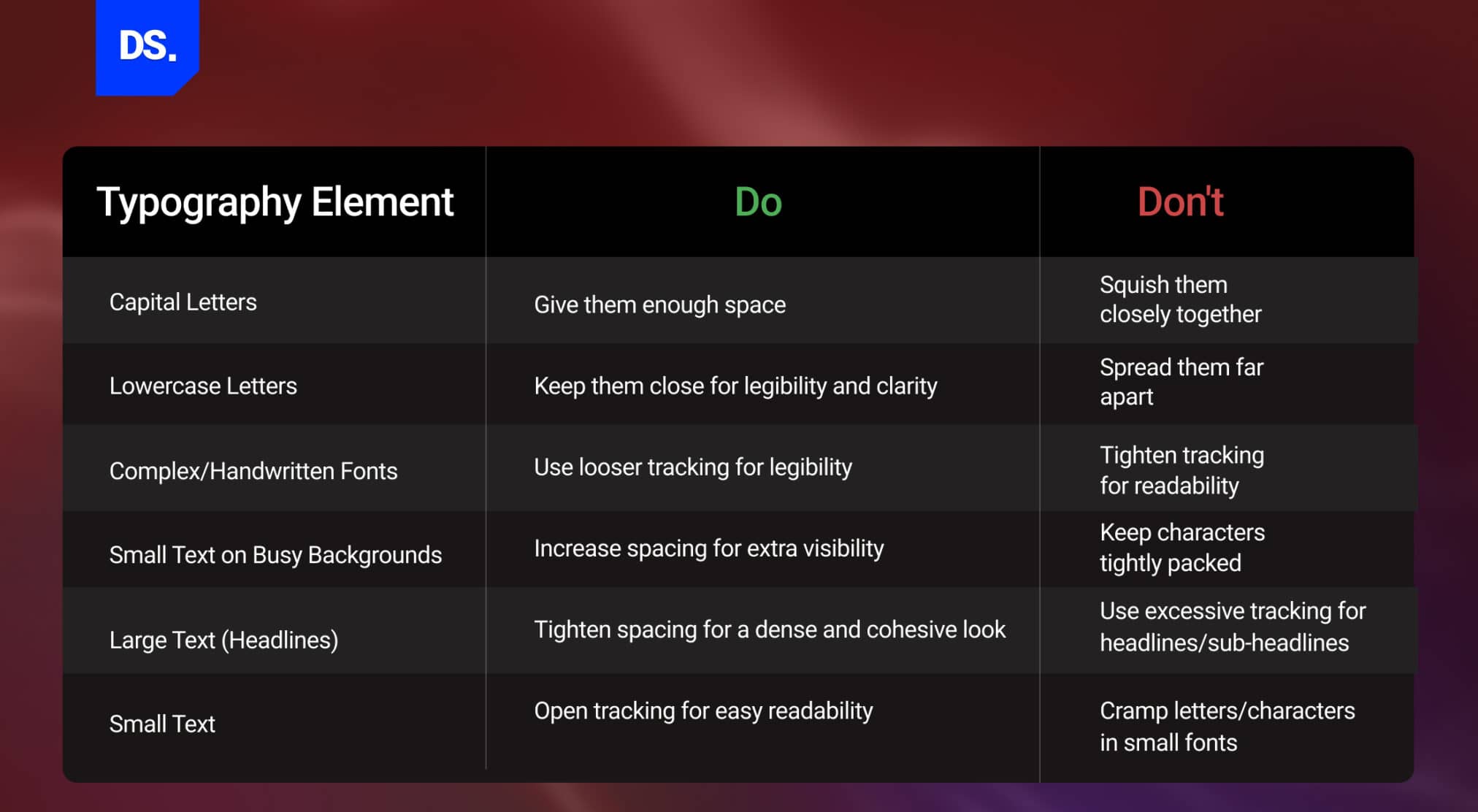
The default, built-in spacing of any font will not always be suitable for your design work. This is especially true if the text you’re designing is set to be displayed on a low-resolution screen or printed on a low-quality surface.
In these cases, designers must adjust the tracking to improve the text’s legibility. Use this chart of do’s and don’ts to strike the right tracking balance every time this issue comes up in your design work.
Also, take a look at this table and learn about the tracking values-
| Typography Usage | Tracking Recommendation | CSS Letter Spacing | Why Designers Use It |
| Large Display / Hero (48px+) | -20 to -40 units | -0.02em | Creates compact premium-style headlines for fintech landing pages |
| Headlines H1/H2 (28–47px) | -10 to -20 units | -0.01em | Keeps larger headings visually connected and easier to scan |
| Subheadings H3/H4 (18–27px) | 0 to -10 units | 0 to -0.005em | Neutral to slightly tight- Maintains clean structure without making text feel crowded |
| Body Text (14–17px) | 0 to +10 units | 0 to 0.01em | Default or very slight positive |
| Small Body / Captions (11–13px) | +10 to +30 units | 0.05em to 0.1em | Positive tracking improves legibility |
| ALL CAPS Labels / Badges | +50 to +100 units | 0.1em to 0.15em | Always increase tracking for ALL CAPS |
| Small UI Labels (under 11px) | +30 to +60 units | 0.1em to 0.12em | Accessibility minimum per WCAG 2.1- helps accessibility compliance and reduces eye strain |
Google’s latest Material Design 3 guidelines provide the exact letter spacing for every font size. This creates a official standard for typography spacing across digital platforms.
How Leading Brands Apply Letter Spacing
Take a look at these brand examples for your research and writing:
- Apple – On all of its large marketing titles, Apple uses tight, negative letter spacing ( -0.015em to -0.022em). This gives the brand its signature premium and powerful vibe. In fact, they created the default font, San Francisco Pro, which look great with this specific type of tight spacing.
- Google – In its Material Design system, Google keeps regular spacing or adds a tiny bit of extra room between letters for main body text. They choose tighter spacing for massive display text. They talk about these choices openly in their Google Fonts Knowledge resource.
- Netflix – When designing big title text for show and movie posters, Netflix uses tight letter spacing to add a sense of drama and heavy visual impact. But when it comes to the user interface and menu buttons, they spread the letters out to ensure clear readability in the web content.
- Airbnb – Airbnb adds a lot of extra space between letters whenever they use ALL CAPS for labels and tags like ‘SUPERHOSTS’ or ‘NEW’. This perfectly follows the classic design guideline that all-caps text should always be spaced out.
- Spotify – Spotify relies on very tight spacing for its big playlist and album header text. This choice establishes a loud, music-centered visual style that stands out clearly whether the screen is in dark mode or light mode.
How Do You Change Tracking in Typography Using Design Tools?
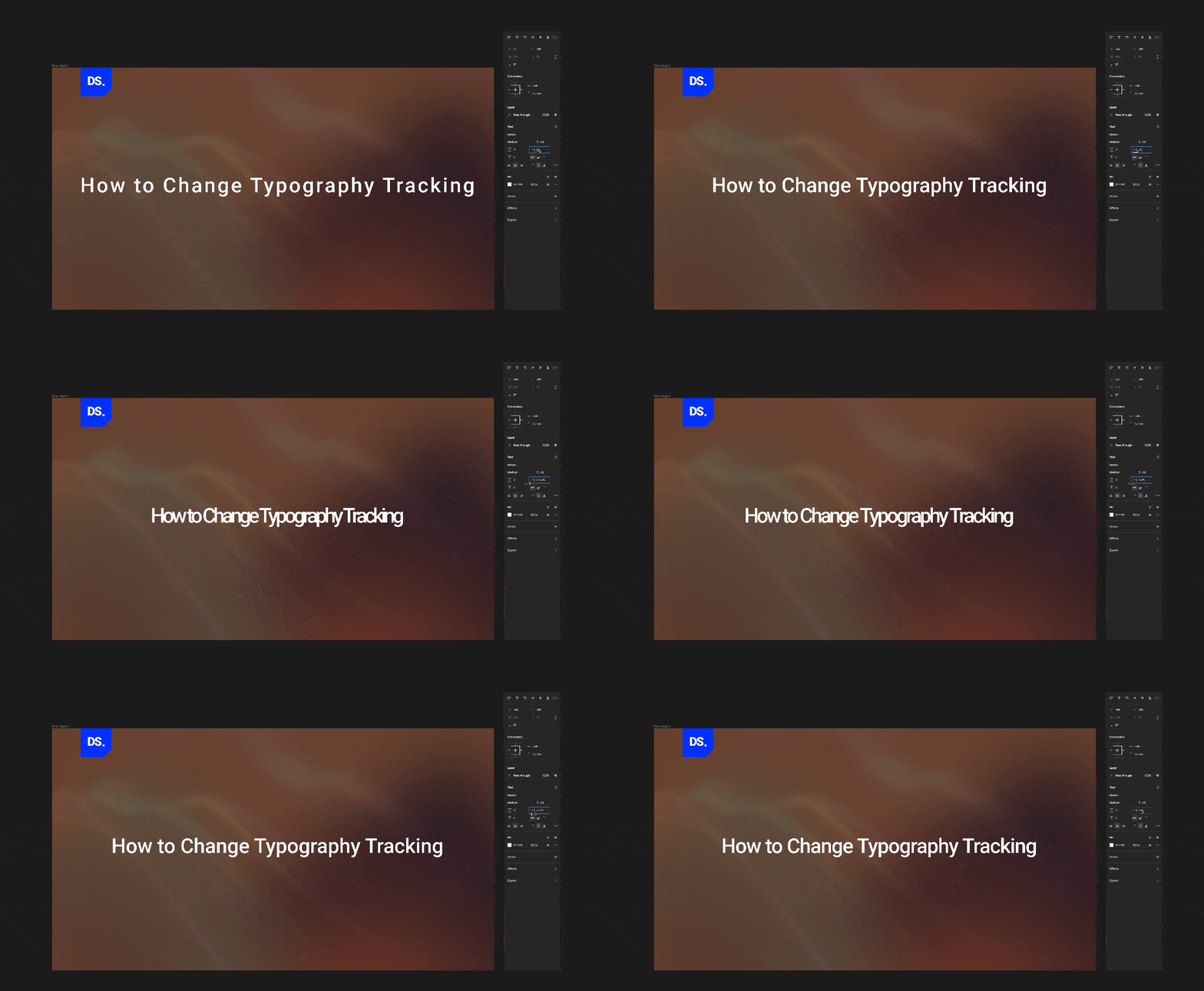
Most design software tools, such as Adobe Illustrator, Photoshop, Canva, etc., provide easy ways to change tracking or letter spacing. You can adjust your text spacing using “VA” icon in Adobe, Spacing slider in Canva, and CSS em units on the web to keep your layout perfectly scalable.
In Adobe InDesign, Illustrator, and Photoshop, you can change the tracking value setting by:
- Select the text you want to modify/adjust
- Go to the “Window” menu
- Select “Type”
- Select “Character”
- Look for an icon that looks like two letters “VA” with a two-headed arrow (<––>) underneath
- That’s the tracking tool
- Adjust the tracking value to increase/decrease letter-spacing as required
If you’re using Canva, change the tracking value by:
- Select the text you want to modify/adjust
- Locate the option titled “Spacing” in Canva’s top toolbar
- The spacing tool icon resembles 3 parallel lines (in one row, top-down) with a double-sided arrow (↕︎) right next to it
- Select “Spacing” to open up a list of options
- From this menu, modify the letter or line spacing settings
In Canva, adjusting the letter or line spacing” function serves the same purpose as changing the tracking value in Adobe software tools.
If you consider web UI, go for CSS letter-spacing with em units. For responsive design, it is recommended not to use pixels because according to MDN Web Docs, em units scale tracking proportionally.
What Are the Best Tips for Applying Tracking in Typography?
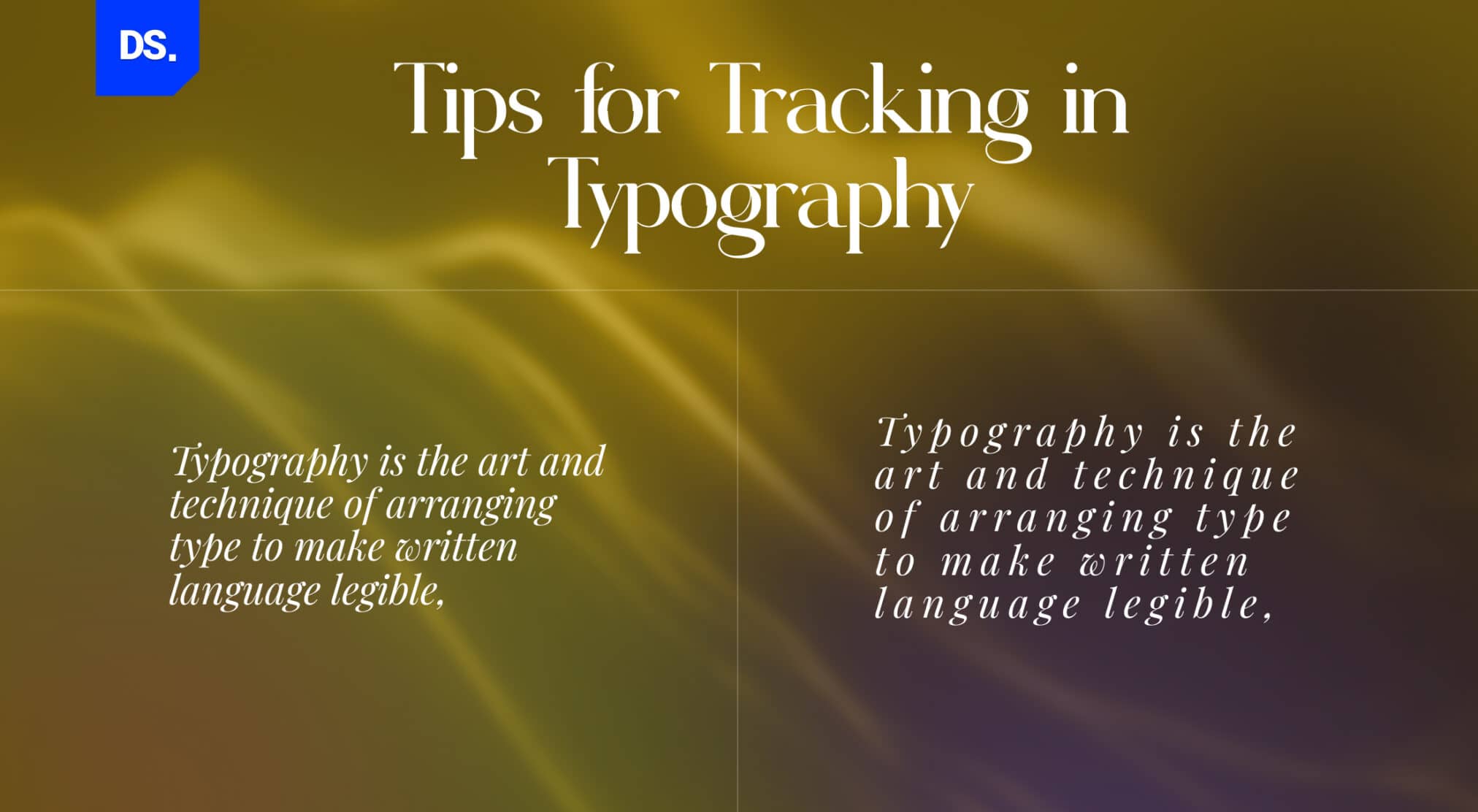
Now that we’ve discussed why and how designers should apply tracking to their work, let’s discuss some basic tips and recommendations that will make this journey smoother.
To apply tracking well, experiment first, make incremental changes, combine tracking with kerning and customize the tracking settings for different fonts. Also, don’t rely on random test screens. Adobe recommends spacing adjustments on the true background and scale to see how it truly feels.
Designs always look different on the final medium compared to a 100% software preview. Hence, it is better to make real-world testing a mandatory final step for all tracking changes.
Don’t Be Afraid to Experiment
Some fonts require more or less tracking to maintain a certain degree of readability and aesthetic appeal, especially at different sizes and in different UI contexts. Experimenting with tracking is the only way you’ll find the ‘sweet spot’ in terms of how tight/loose your text looks.
This is especially true for professionals working on responsive UI/UX designs. Experimenting with tracking will help designers ensure that their content remains legible and visually pleasing across all devices and layouts.
Make Incremental Changes
Always make tracking adjustments in small increments. It’s the only way you’ll gain precise control over the spacing in-between characters. Incremental changes are less likely to disrupt the text’s overall readability and aesthetics of the text. Keep making gradual tracking adjustments until you strike the right balance.
Tracking Works Best When Combined with Kerning
Efficient tracking takes care of the overall spacing between characters. But, in professional UI/UX design or website design, that isn’t enough. Tracking doesn’t address the issues that arise when certain characters appear too close due to their design.
For example, the letters “AV” in the word “AVENUE” appear naturally closer than the letters “VE” because the letters “A” & “V” have overlapping descenders. Tracking will not impact the spacing between the letters “AV.”
Here are some other examples of letters that appear naturally closer together in designs due to their built-in overlapping ascenders/descenders:
- AV, AY, AW — diagonal overlap
- VY, WY — matching diagonal angles
- FT, GT, LT, PT, TT — arm-to-stem proximity
When working with these letter pairs, designers must use kerning and fine-tune the spacing between them. Only then can they ensure optimal readability.
The design site A List Apart explains that tracking and kerning easily control how smoothly text flows. Tracking sets the overall pace of a block of text, while kerning fixes the the awkward gaps between specific letter pairs. If you change the overall spacing but don’t double-check the individual letters, you leave errors behind.
Doing both is what separates okay design from truly professional work.
Different Fonts, Different Tracking Practices
While most professional fonts typically come with pre-defined tracking settings, these settings aren’t always ideal when you use the font in a size that’s not originally intended by the font designer. You’ll have to customize the tracking settings for such fonts.
For example, in UI/UX design, you’ll have to design interfaces that have limited screen space. Even if you use a widely popular font like San Francisco Pro, Roboto, or Open Sans, you’ll have to increase tracking slightly to maintain the legibility of the text in your interface.
- San Francisco Pro — Apple’s system font- Add a little extra space between letters when it’s smaller than 12px.
- Roboto — Google’s system font- Give small UI labels a bit more breathing space (+0.5em letter-spacing).
- Open Sans — a popular web font- Spaced well out of the box, but keep an eye on it if you go under 14px.
According to Google Fonts Knowledge, typefaces are generally calibrated for specific sizes. When you use them outside that size range, you may have to adjust the letter-spacing. It is a standard design practice, not just an extra detail for perfectionists.
Here’s a handy chart of the top most-used fonts in web design and UI design, along with some recommended tracking practices for designers:
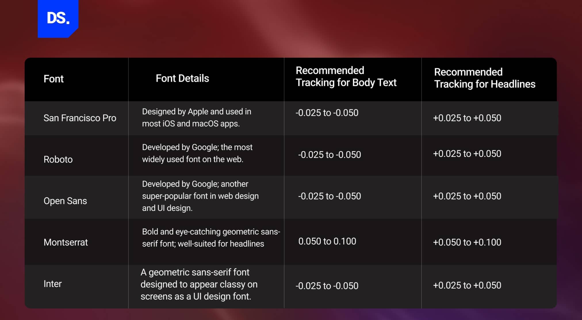
Typically, fonts that are overly bold, italicized, or full with intricate design elements are more likely to need supplementary tracking adjustments. If you’re using a thin font with little weight, you shouldn’t have to care as much about excessive tracking.
Tracking for Accessibility
Accessibility(WCAG 2.1) rules state that text spacing must be flexible so that users can occupy more space – up to 0.12 times the font size without breaking the page. This extra breathing room as per accessibility guideline matters because people with disabilities, low vision, etc. can easily navigate the product.
To maintain this accessibility compliance, it is suggested not to use pixels (px) for letter-spacing. Use em units instead to keep your code flexible and accessible.
Conclusion
The more you learn about tracking, the simpler it gets as a concept. In fact, experimenting with different fonts and tracking settings for just a few hours will not only deepen your understanding of this crucial design element but also expose you to evolving typography font trends. Revamp your existing website for better results by combining these typography insights with strategic design updates.
So, what are you waiting for? Open your editing software, copy-paste a bunch of text on the document and start tightening or loosening the spaces between the letters! For more in-depth info on tracking, consult Design Studio – UI/UX Design Company now!
FAQs
What is tracking in typography?

Tracking in typography is the process of adjusting space between letters in a word or text block.
It helps designers to make the text look airy or tighter, depending on project requirements.
What is the purpose of tracking?
Tracking helps designers create balance and breathing room in text. It prevents letters from feeling cramped, improves headline clarity, and ensures paragraphs look visually comfortable. Proper tracking also helps text fit neatly into a design without resizing the font.
How does tracking affect readability and legibility?
When tracking is too tight, the letters will cram up, making it harder to distinguish. When it’s too loose, words lose their natural flow. Balanced tracking improves clarity, supports faster reading, and makes content easier to scan on both screens and printed pages.
What is the difference between tracking and kerning in typography?
Tracking changes overall spacing across a full word or paragraph. Kerning, on the other hand, adjusts spacing between specific letter pairs, such as “A” and “V,” to remove awkward gaps.
What is the importance of kerning and tracking in typography?
Kerning and tracking work together to improve readability, maintain consistent spacing, and enhance visual hierarchy. Without proper spacing control, even a good font can appear unprofessional or visually uneven.
How do you increase or adjust tracking in design tools?
In tools like Figma, Adobe Illustrator, or Photoshop, select the text layer and adjust the “letter spacing” or tracking value in the typography panel. Positive values add space; negative values tighten characters uniformly.
How does tracking affect text in responsive web design?
In responsive web design, tracking helps maintain readability across mobile screens. Well-managed tracking prevents cramped layouts and ensures text remains visually balanced at different screen sizes.
What are the four types of typography?
The four main typography categories are serif, sans-serif, script, and display. Serif fonts feel traditional, sans-serif fonts look clean and modern, script fonts resemble handwriting, and display fonts are bold, decorative styles used for visual impact.