


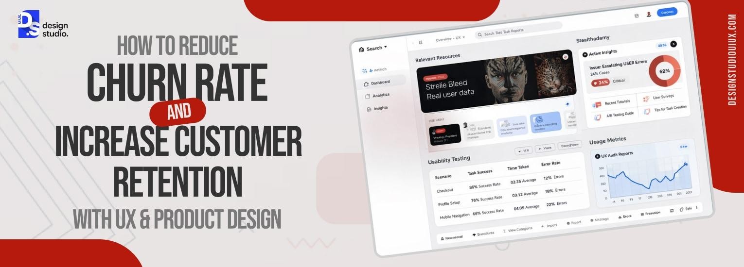
How UX Reduces SaaS Churn and Increase Retention?



User churn rate can be reduced by simplifying core tasks, creating seamless onboarding, providing a consistent experience, and showing the business value before people decide to drop out.
Customer churn is caused by cognitive load (high mental effort), time taken to reach value (TTV), and feature abandonment. These are mainly UX failures, all of which result in low customer retention rate.
People sign up but don’t stay, or they don’t use a newly launched feature. So the question arises, how to reduce churn rate? Simple, the UX should have simpler onboarding process, accompanied by feedback systems and progressive disclosure.
What Is Churn Rate & Customer Retention?
Churn rate is the percentage of users who stop using a product or cancel a subscription during a given time.
Customer retention rate is its complete opposite. It’s the percentage of people who choose to continue using a particular product over time.
If we see this from a business perspective, longer the customer stays, more profit will be generated. This is why UX is important, as retention improvements compound into long-term profitability.
A customer who is using an app for 3 years is more valuable than someone who just ghosts after 3 months (high LTV). Also, it can be 5-25 times more expensive to find new customers rather than retain the existing ones (high CAC).
If the churn rate is high, you are running a leaky bucket, not a revenue-generating business.
Churn is rarely a pricing problem, it’s almost always a UX problem dressed up as one. Users who don’t understand your product, who get lost in your dashboard, or who never reach their “aha moment” during onboarding will cancel regardless of price.
Our SaaS UX design guide covers the full retention UX stack, from onboarding design to dashboard clarity to the moments that keep users coming back.
The Hidden UX Reasons Users Churn
Poor onboarding UX
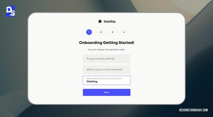
Ideally, an SaaS onboarding experience should explain a product’s value so that users don’t abandon it. But organizations often fail to strike a balance. Either it becomes a confusing “features/ buttons” or a dashboard with zero data.
Both these situations trigger a negative reaction, such as:
- People question their intelligence
- People think that the platform is too much work
Result: Immediate abandonment if they cannot complete a task within 3-5 minutes.
Confusing navigation & IA
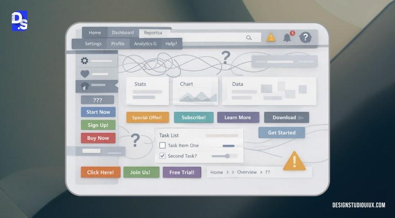
A clean navigation/ Information Architecture can reflect an organization’s clarity and professionalism. But it is not the case for every application.
Users expect “Invoices” to be listed under Finance, but finds them buried under “User Profile> History> Documents”. This breaks their mental model, leading to endless frustration.
Result: People will resent every time they have to figure out a basic feature. As a result, they will keep skipping the platform until they find a better solution.
Feature overload without guidance
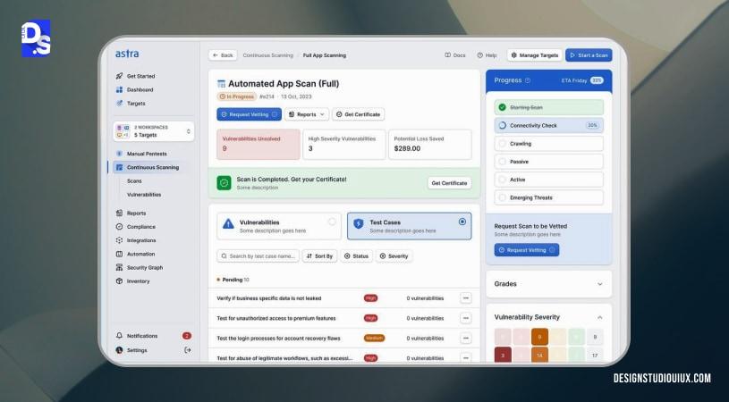
Feature overload is serious concern for SaaS platforms, especially when it keeps adding “Power” features. This clutters the entire platform for 90% of users, leading to decision fatigue (Hick’s Law). Users will experience the phenomenon Paralysis by Analysis, and stop using the product.
Inconsistent UI patterns
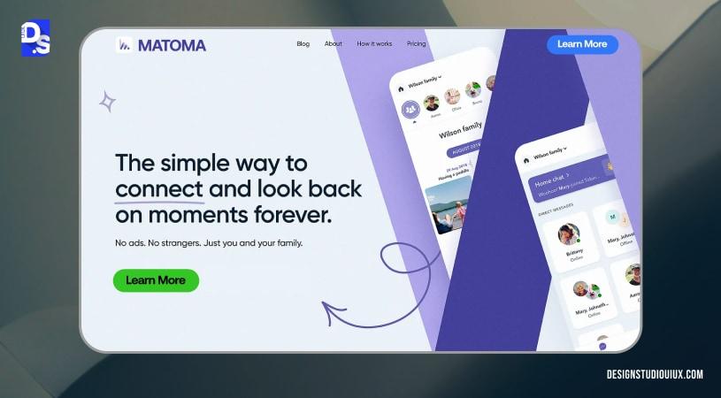
Inconsistency in color grading/ patterns is a red flag.
The issue arises when blue is used for the “Save” button on one page, and green link is used for submission elsewhere.
This frustrates users, because they have to think everytime before clicking anywhere.
Lack of feedback & system status
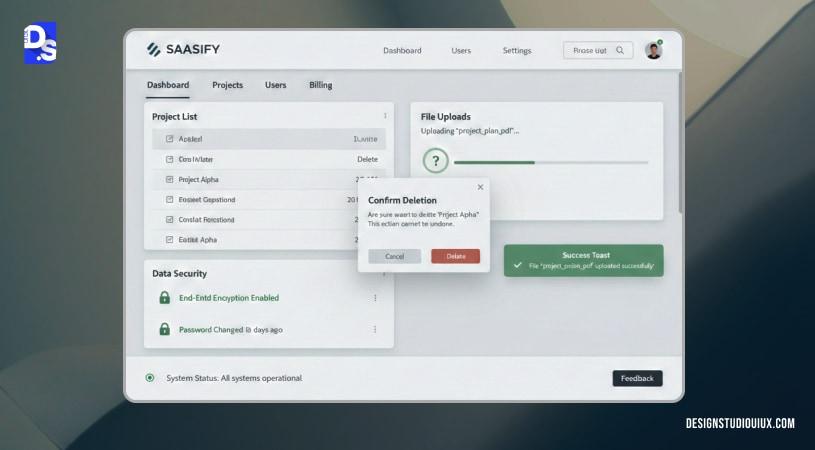
UI/UX should not act as a black box. Users need confirmation after performing CRUD (Create, Read, Update, and Delete) operations.
The issue arises when they don’t receive those feedback in ther form of loading spinners, success toasts, and confirmation prompts.
It leads to lack of trust in themselves and the system, they are unsure about:
- Their files (Are they saved or not?)
- Data security (Is my data safe against breaches?)
High cognitive load
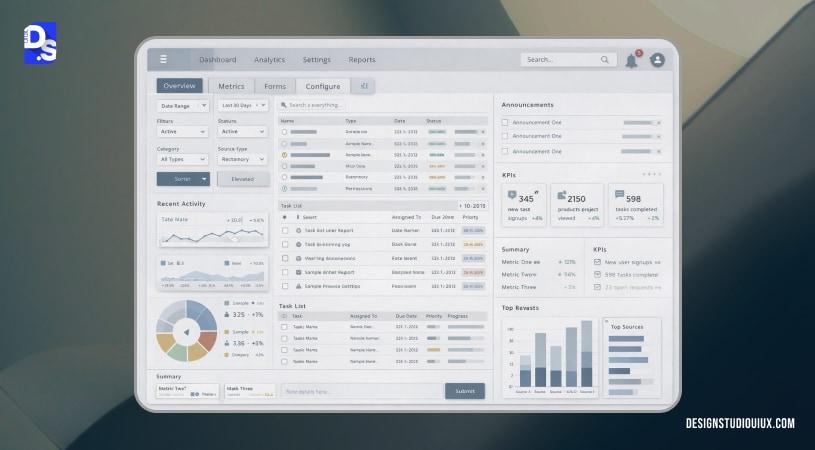
Everyone has limited working memory capacity.
If UX forces users to memorize screens and processes, and navigate through concentrated data, it will result in cognitive load. It means giving too much efforrt to process simple information.
It will result in system avoidance, users start dreading the interface and revert to the old way. They think the platform is too mentally demanding to use, thereby leaving it.
Slow perceived performance
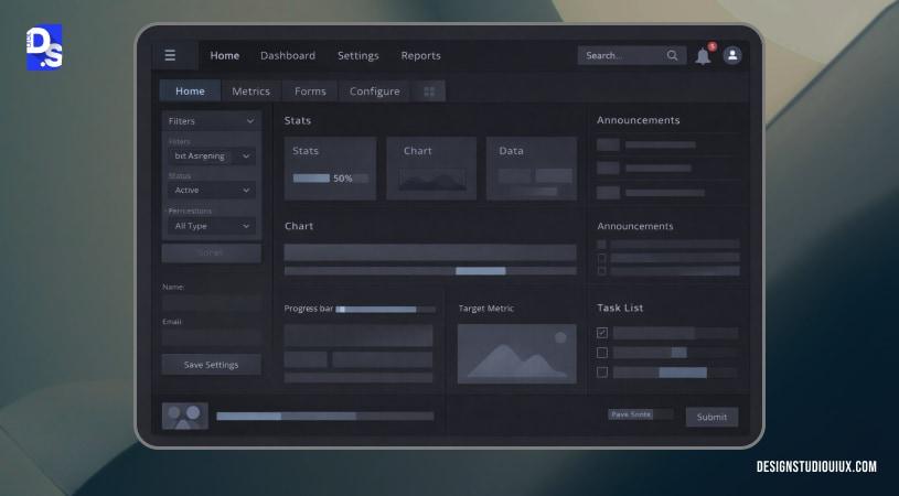
Poor UI/UX may change how people perceive the platform. It might not be technically slow, but people still register it as such.
Today, people look for instant gratification, even a 2-second delay might feel longer than necessary.
It result in a gap, leading to people drifting toward reliable and stable modern interfaces.
UX-Led Strategies to Reduce Churn & Increase Retention
User retention is influenced by these 3 factors: value (users must quickly understand it), core tasks (how fast people complete them), and confidence (how confident people are about the platform). Here are proven churn reduction strategies:
Improve Onboarding to Reduce Early-Stage Churn
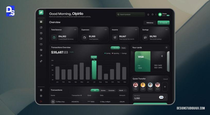
When users feel lost or overwhelmed, they cannot complete a task or quickly reach value. A strong onboarding UX should gently guide users, instead of teaching them:
Progressive disclosure
Through progressive disclosure, a product’s features are gradually revealed, giving users time to familarize themselves.
Impact: Reduces overwhelm and abandonment during the first session.
Metrics Measured : Activation rate.
Empty states
Empty states guide users on what to do next and the purpose, instead of just presenting blank screens.
Impact : Reduces confusion especially during critical moments and keep users engaged.
Metric Measured : Activation rate.
Contextual guidance
Instead of generic tutorials, contextual guidance (tooltips and inline hints) provide in-the-moment assistance to users.
Impact: Reduces early friction without interrupting flow.
Metric Measured: Activation rate, early retention
First-value moment design
Design onboarding around the fastest path to the first meaningful outcome, not product walkthroughs to enable UX as a business lever.
Impact: Shortens Time to Value and lowers first-week churn.
Metric Measured: Activation rate, early retention
Design Frictionless Core User Flows
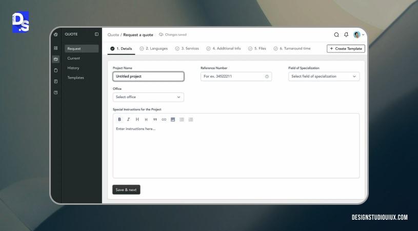
A frictionless core user flow can be achieved by avoiding these UX mistakes:
Remove unnecessary steps
Anything that don’t add value such as redundant inputs, confirmations, and screens should be removed.
Retention impact: Reduces frustration and task abandonment.
Metric influenced: Retention, task success rate
Optimize task completion paths
The shortest, clearest path to complete high-frequency tasks is the clear winner.
Retention impact: Encourages repeat usage by making success predictable.
Metric influenced: Retention, feature adoption
Reduce decision fatigue
Decision fatigue can be reduced by offering limited choices, presenting preselected defaults, and guide users through constraints.
Retention impact: Prevents mental exhaustion that leads to disengagement.
Metric influenced: Retention
Use Behavioral UX to Increase Engagement
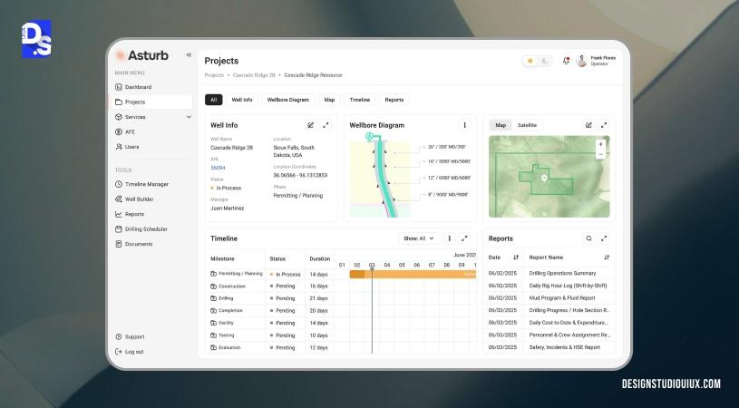
Habit-forming loops
Habit-forming UX is about merging two concepts: UX design and behavior loops. It follows a simple architecture:
Trigger, action, variable reward, and lastly investment.
Retention impact: Builds routine usage instead of one-time interactions.
Metric influenced: Retention, adoption
Micro-interactions
Micro-interactions should be subtle (ripple effect on a button or success checkmark) to build confidence among users.
Retention impact: Increases perceived responsiveness and satisfaction.
Metric influenced: Retention
Feedback systems
Feedback systems (success confirmation or similar actions) are important to create smooth, intuitive experiences.
Retention impact: Reinforces value and encourages continued use.
Metric influenced: Retention, adoption
Reduce Cognitive Load Across the Product
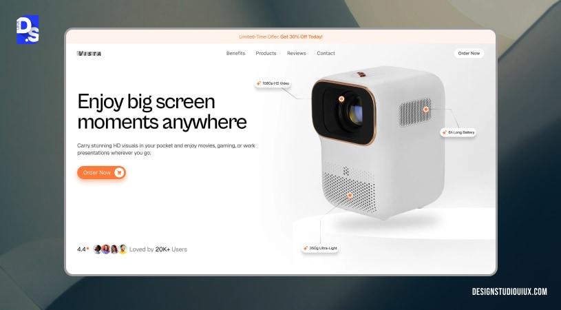
High cognitive load means higher churn (it happens silently). This can be tackled through the following entities:
Visual hierarchy
Spacing, contrast, and typography can be used to guide attention and establish priorities.
Retention impact: Makes interfaces easier to scan and act on.
Metric influenced: Retention
Clear CTAs
Every screen should have a primary action that aligns the platform with user intent.
Retention impact: Reduces hesitation and task drop-off.
Metric influenced: Activation, retention
Consistent UI patterns
Familiar interaction patterns reduce relearning, thus improving churn rate.
Retention impact: Builds confidence and speeds up task execution.
Metric influenced: Retention, adoption
Continuously Improve UX Using Real User Data
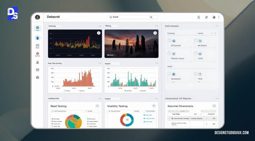
Heatmaps
Heatmaps Helps in visualization where users are clicking or ignoring elements.
Retention impact: Reveals friction and missed affordances.
Metric influenced: Activation, retention
Session recordings
Observe real user behavior to identify confusion and breakdowns.
Retention impact: Helps fix issues users won’t report.
Metric influenced: Retention
Usability testing
Test real tasks with real users to validate clarity and flow.
Retention impact: Prevents UX debt that causes long-term churn.
Metric influenced: Activation, retention
UX audits
UX Audit systematically review flows, patterns, and inconsistencies across the product.
Retention impact: Improves overall usability and long-term engagement.
Metric influenced: Retention, adoption
UX Metrics That Directly Correlate with Retention
UX metrics can indicate the underlying issues, even it seems okay in general. Evaluating them beforehand may prevent product abandonment and other signs of user churn. Here are some metrics you need to evaluate to reduce churn in SaaS:
Activation rate
Activation rate measures the percentage of users successfully completes a predetermined milestone (adding a social app user adding 5 friends).
It indicates the efficiency of a tool’s onboarding flow, and everything compounds on that. High activation rate itself is not an indicator of high retention, it’s just the entry point. But a poor UX will definitely have a high churn rate.
Time to Value (TTV)
Time-to-value measures the user’s journey from first login to when they realize the product’s core features/ benefits.
For UX with unnecessary steps, long forms, or noise in general, the TTV will be insanely long. A short TTV will encourage people to return for a second session.
Feature adoption rate
Feature adoption rate is directly dependent on the Information Architecture. It measures how many people use specific features, or in other words, discoverability and IA.
If you want people to use features, they should not hide them under three menus.
Users using multiple features signal good IA, and a sign of high retention rate.
Task success rate
Percentage of users who complete a specific task (Export File) on their first attempt forms the task success rate.
This is the biggest determiner of usability. Low task success rate means the UI is confusing users, and breaking their mental models. Or it might indicate another problem: the labeling is not done right.
If you want to avoid the “learned helplessness” situation, start improving this rate. When users feel comfortable using the tool, they will have an emotional loyalty to the brand.
Retention cohorts
Here, the retention data is broken down by user’s joining time or the version they first encountered.
It is mainly measured during A/B testing to see if the UX has actually improved or not. It shows whether the decision is improving user churn or not.
Drop-off points
Drop-off points are screens and steps where users are abruptly exiting the application. These are usually identified through heatmaps and session recordings (high friction events like unexpected paywall or complex data requests are identified).
Working on any of these touchpoints can significantly alter the checkout process and reduce customer churn.
How Reducing Churn Impacts Revenue (From A Business Lens)
Churn rate directly impact a business’s revenue, lower the churn, higher is the revenue. These parameters might direct businesses to reduce churn in SaaS:
LTV Growth
Customer lifetime value indicates the total revenue generated by customers over a specific time. When customers use the platform for a longer time, a business’s profitability grows exponentially without customer acquisition or pricing changes.
CAC (Customer Acquisition Costs) efficiency
Ideally, the CAC to LTV ratio is 3:1, but a higher churn rate might result in a drop in LTV, as seen in UX performance tracking reports. if the ratio collapses, the payback period will be longer. If the churn is reduced, CAC improves, resulting in overall profitability.
Expansion revenue
This indicates additional revenue generated by existing customers through upgrades, add-ons, or increased usage. Customers that stay longer are likely to contribute more through these high-value plans.
Brand trust
A lower churn rate will signal a positive market presence, strengthening the brand’s long-term credibility.
When to Fix UX to Prevent Long-Term Churn
UX churn rate is poor, but what are the signs to look out for? How would you identify the best time to focus? Here are the 4 churn reduction strategies to try out:
High drop-off after onboarding
Users are signing up, but you are seeing a massive spike in platform exits (from first or second screen). According to UX for CRO, the fix is to simplify the user flow, instead of working on the entire design.
Flat retention curves
A healthy product has a curve that flattens out (meaning a core group stays forever). A “leaky” product has a curve that goes straight to zero. This means no matter how many new users you get, your total active users stay the same. So, you should work on creating a habit-forming loop to reduce customer churn.
Increasing support tickets
You know the UI is failing if the customer support team is overwhelmed with service requests. This means the IA needs to be clearer, with better labels and positioning, all are website redesign indicators to consider.
Feature under-utilization
Only 2% of users are using a newly launched feature (despite of being a killer feature). This indicates a discoverability problem as per SaaS UX expertise, which means UI redesign might be a good idea for churn rate reduction.
Conclusion
Customer retention cannot be achieved only through discounts, reminders, or simple followups. It depends on how the product is behaving, if user is experiencing smooth experience, then they will stick around.
Improving UX metrics, such as time-to-value, task success rate, or cognitive load will shape the future interactions as well.
If UX is fixed at the foundational level, customer churn rate will gradually decrease, and stay that way. If a platform is experiencing persistent churn rate, a focused UX audit is the best way to figure it out.
FAQs
What is customer churn rate?

Customer churn rate is the percentage of customers who leave a product or cancel their subscription within a defined time period, and it is used to measure customer loss and retention health.
What causes high customer churn in SaaS products?
High churn in SaaS is most often caused by slow time-to-value, confusing onboarding, poor usability, and low feature adoption, not pricing or support alone.
How can UX design help in reducing churn rate?
UX design reduces churn by helping users reach value faster, complete tasks easily, and adopt core features consistently, reducing friction and frustration over time.
How do you reduce churn rate and increase customer retention?
Reduce churn by improving onboarding, shortening time-to-value, simplifying core workflows, reducing cognitive load, and continuously fixing UX issues using real user data.
What is the difference between churn rate and retention rate?
Churn rate measures how many customers leave, while retention rate measures how many customers stay. They describe opposite sides of the same behavior.
What is a good churn rate for SaaS companies?
For most SaaS companies, a monthly churn rate below 5% is considered healthy, while best-in-class B2B SaaS often targets 1–2% monthly churn.
How does onboarding experience impact customer retention?
Onboarding impacts retention by determining how quickly and clearly users experience their first value. Poor onboarding leads to early churn; effective onboarding increases activation and long-term retention.
Which UX metrics indicate potential customer churn?
Key UX metrics that signal churn risk include low activation rate, long time-to-value, low feature adoption, poor task success rate, high drop-off points, and flat retention cohorts.
Can improving UX really increase customer retention?
Yes, customers stay when a product is easy to understand, fast to deliver value, and reliable to use. Good UX reduces friction at critical moments, onboarding, core tasks, and feature discovery, so users reach value quickly and repeat that experience over time.
When should a company conduct a UX audit to reduce churn?
A company should conduct a UX audit to reduce churn when churn signals appear before revenue loss becomes visible. UX audits are most effective as early diagnostics, not last-minute fixes.
- High drop-off after onboarding
Users sign up but fail to reach first value, indicating unclear flows or slow time-to-value. - Flat or declining retention curves
Retention plateaus despite new features, suggesting core UX issues—not missing functionality. - Rising support tickets for basic tasks
Frequent “how do I…?” questions signal usability gaps and UX debt. - Low feature adoption
Key features exist but aren’t used, often due to poor discoverability or unclear value. - Churn reasons are vague or inconsistent
When exit feedback says “too complex” or “not a fit,” UX is usually the root cause.









