

What is Typographic Hierarchy? Definition & Examples



Typographic hierarchy is really just the system designers use to organize text so you instinctively know what to read first, without ever having to think about it. There are six things doing the actual work behind that: size, weight, color, spacing, contrast, and position.
Nail those and keep them consistent, and text stops feeling like a dense wall of words. It starts pulling you along instead.
According to NNG 79% of web users scan, only 16% read word by word. Most people don’t read a webpage top to bottom, word by word, the way you’d read a novel.
They scan. They’re hunting for a headline that matches what they came for, then a subheading to confirm yeah, this is the right page, and only then do they actually settle in and read the body text for detail.
When the hierarchy is done well, that scanning behavior just works. When it’s not there, the reader has to do all that sorting themselves, and honestly, most won’t. They’ll bounce.
Try something real quick. Open up any article or landing page that’s actually well designed and cover the images with your hand. You’ll still know where to start. You’ll still know which section is about what, and which lines are just supporting detail versus the actual point.
None of that came from the pictures. That’s the type doing its job.
This isn’t some trend that fades out in a year or two. It’s a decision that has to get made for pretty much every piece of text out there, a blog post, a screen inside a mobile app, even a printed report someone’s flipping through in a meeting.
The question stays the same no matter the format: what order should someone take this information in, and how do you make that order obvious without actually writing it out in words.
This is why we should follow typographic hierarchy:-
- By maintaining a clear typographic hierarchy, designers can transform plain walls of text into engaging and digestible pieces of content.
- Headings become towering banners, subheadings serve as directional arrows and well-spaced paragraphs become neatly organized ‘text stalls.’
- Each text element plays a role in establishing an intuitive flow of information guiding readers through the content with ease and making it more accessible and visually appealing.
- Following the typography font trends also plays a key role, as selecting the right fonts can complement the hierarchy and further enhance the readability and overall design.
For designers who work a lot with text-based content, creating visually appealing and easy-to-read typographic hierarchies is a vital skill to master. Practicing and experimenting with different hierarchy styles and techniques is the best way to learn this skill.
But, there are some guidelines that designers should learn before they start practicing.
That’s really the whole point of this guide. Get through it and you’ll understand how typographic hierarchy actually works, what the main pieces are, and how to put it to use on something you’re actually building.
How Does Typographic Hierarchy Work?
Typographic hierarchy helps each piece of text carry a different visual weight. This is achieved through size, boldness, color, and spacing. As a result, readers can quickly identify what matters most, what details support it, and what serves as background context.
This visual variation directs the eye through the page in a clear order. The reader does not have to think consciously about where to look next.
The words: ‘typographic’ and ‘hierarchy’ are not unfamiliar to those in the field of design:
- The term ‘typographic’ refers to all matters related to typography, i.e., font choice, font size, how far apart we place the letters, etc.
- The term ‘hierarchy’ refers to the levels of importance or priority within a set of text-based elements. (i.e., what readers should pay attention to first, second, and third).
- When you combine the two terms, you get typographic hierarchy: the strategic process of designing and organizing text to visually guide the reader’s attention.
Typography Hierarchy Example
Here is an example that demonstrates how implementing a well-defined typographic hierarchy can significantly enhance text readability, compared to text-based content lacking such organization:

As you can see in the example above, the difference between typographic chaos and clarity is striking. Without any hierarchy, every letter/word/sentence in the text and the design would look the same.
From this example, we can surmise that the main purpose of typography hierarchy is to make text-based elements in designs more readable.
The secondary purpose is to visually show the reader which pieces of information they should focus on. For example, in the example above, the headline “On the Moon” is the information readers should focus on. The rest of the text (sub-headlines, text body, etc.) are simply supporting the main headline.
According to Smashing Magazine research, important parts of a design are shown through its text styling. When you see how much clear information good typography can actually share, it becomes obvious that typographic hierarchy is a necessary concept, not just an extra feature.
3 Real-World Examples of Great Typography
Apple — Clean Size and Weight Contrast
- Uses a basic two-tier hierarchy: a massive, bold headline (60px+) paired with 17px body text.
- They rely strictly on size and weight rather than color.
- Follow less is more philosophy – with 3:1 size ratio between headline and body that manages visual clutter.
Google — Color and Scale for Fast Scanning
- Uses all available hierarchy tools (size, color, weight) simultaneously.
- Three-tier hierarchy combining size and color: blue headline links, green URLs, and grey description snippets.
- Speeds up content scanning.
Medium — Better Long-Form Reading Layouts
- Here, headers feature a bold serif font, paired with a big 21px sans-serif font for the paragraphs.
- There are thick subheadings and lots of breathing room between the lines to make long text easy on the eyes.
Why Is Typographic Hierarchy Important in Web Design?
Typographic hierarchy is important because people don’t read every word on a website, they usually scan through the pages. According to research done by Nielsen Norman Group, web visitors track content in an F-pattern, focusing on the top lines before scrolling down the left side.
Smart typography accommodates this habit perfectly so that users do not miss what they are looking for.
| Benefit | Why Typographic Hierarchy Matters |
| Clearer, Faster Insights | – Guides readers’ eyes to key information; – Boosts readability and understanding |
| Emphasis Made Visual | Highlights crucial points in the text through size, weight, and color adjustments |
| Organized Flow | Creates a clear visual structure with headings, subheadings, etc., making navigation effortless |
| Aesthetic Harmony | Elevates the visual appeal and impact of the overall design. |
| Brand Recognition Reinforce | Solidifies brand identity in users’ minds through consistent text design choices (e.g., picking a specific font to represent a brand) |
| Inclusive Access | It makes content accessible to more readers, including those with visual impairments |
| Professional Polish | Communicates the designer’s care and attention to detail |
What Factors Should You Consider When Creating a Typographic Hierarchy?
The most important factor is understanding the content before you start styling it. What is the main message? What does the reader need to see first? What is the secondary context, and what is just supporting detail?
A typographic hierarchy only works when it reflects the true priority of the information, not just the designer’s visual preference.
Before crafting a typographic hierarchy, designers must immerse themselves in the information itself. They must grasp the core purpose and objectives of the content.
This understanding will lay the foundation for a well-structured typographic hierarchy that succeeds in both resonating with the audience and guiding them toward the intended takeaways that formulate the very core of the content.
- Designers must ask themselves, “What message are we trying to convey? “What do users need to know first? Which elements deserve the most attention?”
- Next, they must step into your readers’ shoes; consider their reading and information-scanning patterns; and understand how they will scan, navigate, and interpret the text.
Once designers have this contextual clarity, they can create a logical hierarchy of text that flows naturally, while prioritizing important information.
Then, they can start treating the text as more of a visual element and weave apt visual cues and typography elements (like font size, weight, color, etc.) into the very fabric of the content.
What Are the Key Elements of Typographic Hierarchy?
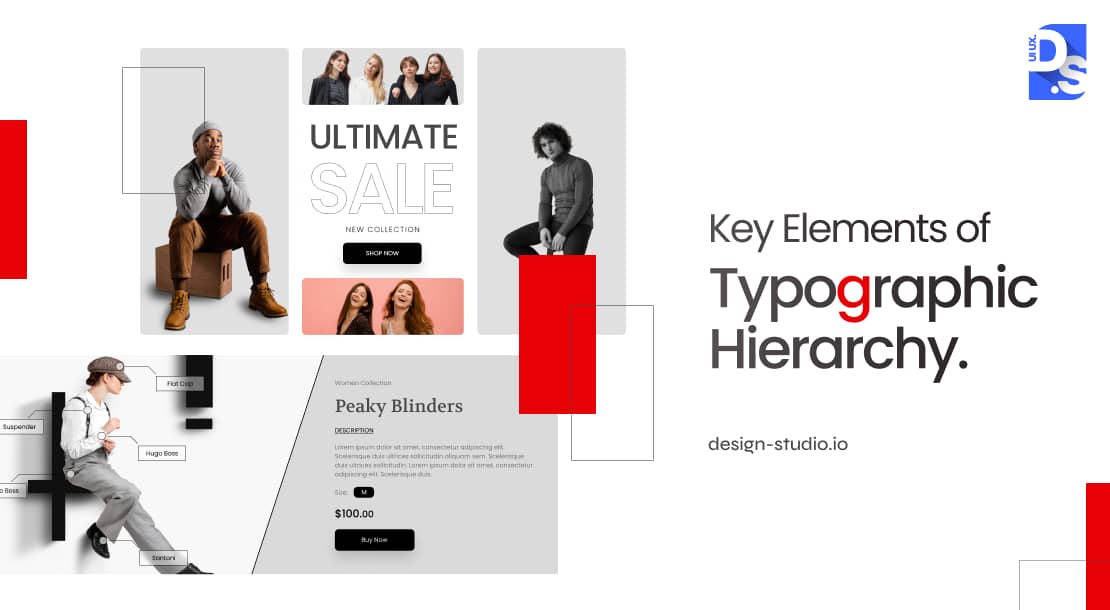
Typographic hierarchy relies on 8 key design elements, which work well alone but perform best when combined in a group. According to Canva’s visual hierarchy guide, it is recommended to blend color, typography, contrast, spacing and other design principles together.
Take a look at these elements and see how to apply them effectively:
| Design Elements | What It Does | Guidelines/ Rule |
| Size | Tells users where to look first- Larger text feels more important. | Headlines should be much bigger (double)than body. Subheadings should be 1.5x body text ( minimum size 14px). |
| Case / Capitalization | Creates visual distinction | Use capitals carefully for emphasis. Too much uppercase text becomes tiring to read. |
| Color | Helps organize information | Keep most colors subtle and use stronger colors only for important content. |
| Weight | Makes hierarchy instantly identifiable and key content stand out | Bold for headlines, medium for subheadings, regular for body copy |
| Style | Creates visual tone and emphasis within a typeface | Italics for secondary emphasis; bold-italic for strong, dual emphasis |
| Spacing | Keeps layouts clean and readable | Good spacing between lines and sections (Increase line height and paragraph) makes content feel less crowded. |
| Contrast | Separates content levels | Small but noticeable differences in size and weight help users scan faster. |
| Position | Influences what gets noticed first | Content placed at the top or center usually attracts more attention than supporting content elsewhere. |
Size:
The first point of call for designers is size, and for good reason. Size speaks volumes – literally. Larger fonts scream importance and are used for things like titles and headlines. Smaller fonts whisper the supporting details and they are used to present body copy, captions, meta info, etc.
Case Capitalization:
Capitalization can be a powerful tool in typographic hierarchy. Using uppercase characters in headings/subheadings is an easy way to differentiate various text sections.
For example, if you present the headline of a webpage in ALL-CAPS and BOLD, ITALIC FONT, it will instantly stand out in the readers’ eyes. But, designers must tread carefully. Shouting “ALL CAPS” in the body text will fatigue and frustrate readers.
Color:
Chromatic manipulation, i.e., adjusting the color/s of the text, is a powerful, yet underutilized, tool for establishing typographic hierarchy.
Subtle tonal variations within a color palette (e.g., using a mix of lighter/darker shades of a specific color) can help designers effectively differentiate the layers of information and direct user attention.
A Smashing Magazine research shows that bright colors draw the eye and pale colors soften details. This means designers need to carefully pick both the shade and tone for all hierarchy elements.
Weight:
Making typefaces bolder/thinner is an easy way to create a visual hierarchy that is instantly identifiable even for non-designers. By using bolder/thinner typefaces, designers can guide readers through the text, ensuring that they pick up the most crucial bits of info.
Style:
In typography, “style” refers to the different visual variations that can be applied within a typeface. They include italics, bold, strong, or regular. It is a useful tool for emphasizing certain elements or creating a distinct visual tone.
Spacing:
Intentional white space, both inter-word and inter-line, plays a crucial role in optimizing text clarity and building effective typographic hierarchy. Ample spacing around key elements (e.g., increased paragraph margins or line heights) fosters clarity and emphasis.
In this way, spacing helps guide users through the information efficiently.
Tracking in typography refers to the spacing adjustments between letters, numbers, and other characters within a word, phrase, line, or an entire paragraph. This practice of letter spacing is also a key sub-element of creating a well-structured typographic hierarchy.
Contrast:
Effective typographic hierarchy relies not just on color contrasts, but also on contrasting type sizes, weights, and styles. Designers can easily use contrasting font sizes, weights, and styles to make different sections of the text, like headers or body text, stand out.
For example, a mere difference of 5 or 6 points in type size or line height is sufficient to make the typographic hierarchy of a web/app page apparent to most users.
Position:
The positioning of headings, subheadings, and other prominent text significantly influences the typographic hierarchy. Think of text positioning as choreography. Where you place your text elements on the stage defines their role and prominence within the information hierarchy.
Important rules:
- Centering text, like a bold title, instantly grabs attention and says “important!”
- Placing text outside the usual margins, like a quirky quote in the corner, can also stand out and secure a second look from readers.
These positioning tricks are vital tools in every designer’s hierarchy toolbox. It helps them emphasize what matters the most within the hierarchy of the page.
These are the essential elements for creating a typographic hierarchy. Each element carries specific symbolic meanings that impact reader psychology. But how do they work together to build a cohesive symphony of information? That is where the different levels of typography hierarchy come in.
What Are the Three Levels of Typography Hierarchy?
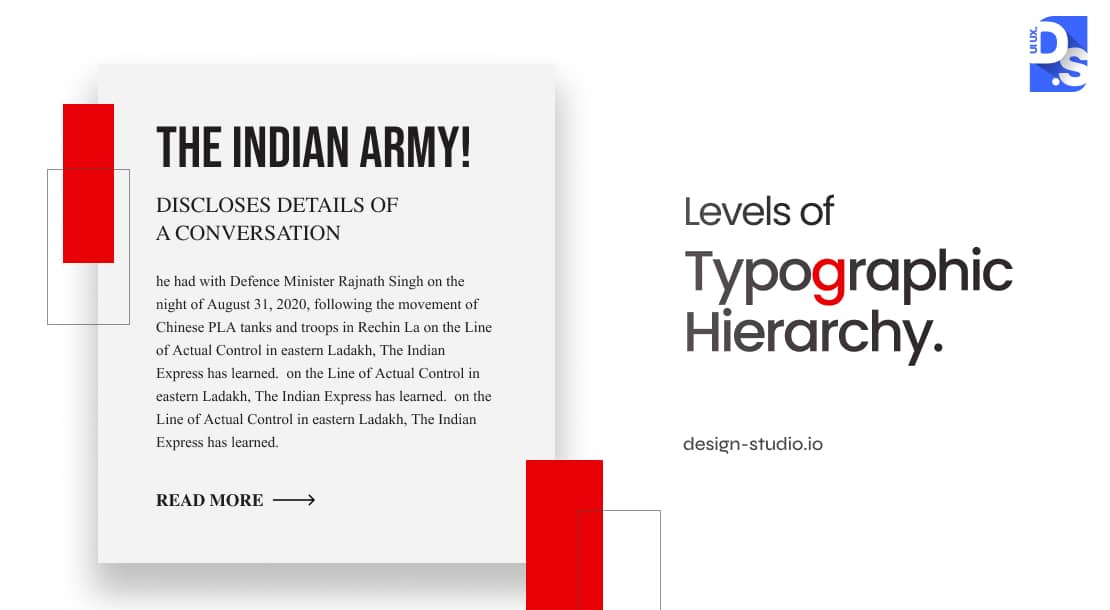
The foundation of a compelling typographic hierarchy lies in defining the number of distinct information layers it should contain. How many levels of information should you build? Professional designers recommend creating at least a sturdy three-tiered foundation:
| Hierarchy Level | Primary Role | Suggested Size | Suggested Weight |
| H1 Heading | Shows the most important message on the page | Minimum double the body font size | Bold, noticeable, and concise |
| H2 / H3 Heading | Separates topics and adds structure to content | At least 1.5× the body font size | Medium to bold; one step below H1 |
| Body Text | This section is the main- helps users read and understand content | minimum 14px size for better legibility | Regular clean typeface with good line weight with balanced kerning |
Headline:
The headline should be large, bold, and attention-grabbing. It should compel readers to delve deeper. Text size should be at least 2x the body font size. Leading or line spacing should be used to enhance the breathability of the headline. Choose a clear, impactful typeface and keep the header concise and compelling.
Subheadings:
The bridges between the headlines and the body, subheadings should offer context and additional details. They should maintain the visual distinction between the headline and the body. Text size should be at least 1.5x the body font size. Text weight can be bolder than the body text but it should be a notch below the headline’s weight.
Body:
The main workhorse of the information hierarchy, the body will carry the bulk of the text so prioritizing readability is a must. The text body should be large enough (minimum 14px for optimal legibility across all screens/devices) for everyone to comfortably read through the content.
Using clean, consistent typefaces and clean, legible fonts with good letter spacing/kerning is also important. High color contrast against the background of the text is also vital for accessibility. Designers should follow the WCAG guidelines to optimize their text-to-background contrast ratios.
From there, it’s up to the designer to add more levels to the hierarchy. These levels could include:
- Captions presented in smaller fonts alongside visuals.
- Nested subheadings to create more sections within existing subsections.
- Pull quotes, i.e., snippets from the text body that draw attention to the key highlights of the text.
- Author names, dates, and other meta information presented in smaller fonts with distinct styles.
Each level plays a critical role in the overall typographic hierarchy and guiding the reader’s journey. By creating different layers of information designers can optimize text clarity and readability. But, in digital projects, creating a clear typographic hierarchy requires more than that.
How Typography Hierarchy Changes on Mobile?
Mobile screens use a different typography approach than desktop layouts. Larger body text, shorter line lengths, and extra spacing help users read easily without squinting.
| Text Element | Desktop Recommendation | Mobile Recommendation |
| Body Copy | Minimum 14px | 16–18px for comfortable reading |
| Headlines | 32–60px depending on importance | 24–36px keeps headings noticeable without taking over |
| Line Spacing | Around 150% of text size | Around 160–170% of text size- improves readability on smaller screens |
| Line Length | 60–75 characters | 35–45 characters works better on narrow screens |
| Character Spacing | Normal spacing | Slightly wider spacing improves clarity |
| Heading Scale | Headlines about twice body size | Headlines about 1.5× body size for better proportion |
What Are the Typography Rules for Digital Design Projects?
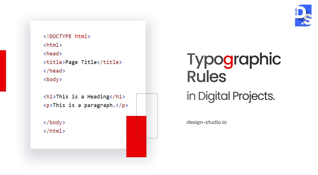
In digital projects, creating typographic hierarchies involves the visual elements mentioned earlier (size, style, spacing, etc.) and certain structural elements that come pre-defined within the HTML code.
Per the W3Schools HTML Headings Guide, heading tags (H1-H6) give a rank of value that search engines follow to judge your page topic. This makes good tag choices both a design and SEO win.
Here is what that means:
- HTML (Hypertext Markup Language) is the foundational language of web pages.
- It includes tags for all text elements: headings (H1, H2, H3, etc.), lists (UL, OL), etc.
- These tags create a hierarchy of importance that search engines use to understand the core content on the page.
Web designers must use HTML tags strategically to boost their search result rankings. Then they can adjust font sizes, colors, spacing, etc., to make the typographic hierarchy more visually pleasing.
Here are some specific guidelines on how to adjust the visual elements of a typographic hierarchy for a digital project:
Proximity or Space
In digital design, proximity and space are inextricably linked to the grid: the underlying digital structure where space is broken into modular units. Like pieces in a puzzle, these units come together to form a cohesive design within this underlying structure. It is in the grid where all design elements (including text) find their due places.
Understanding how to utilize the grid effectively is essential for crafting visually appealing and functional layouts. There are two popular approaches to applying a grid in a digital typographic hierarchy:
Predetermined:
In predetermined grids, space is divided into columns with options ranging from single-column (manuscript) to multi-column layouts. Design tools like Adobe InDesign allow for easy selection of grid types, and its application is often evident in web designs with 2, 3, or 4 columns.
Modern websites and web apps often utilize fluid grids that adapt to various devices, ensuring flexibility across print and digital platforms.
Improvisational Grid:
In this approach, designers embrace a more intuitive and organic process of arranging design and text elements. Instead of strictly adhering to a predetermined grid structure, they prioritize visual rhythm, balance, and other aesthetic elements, while still maintaining a sense of visual coherence and order.
Understanding the principles of both predetermined and improvisational grids enables digital designers to create design layouts that are functional, aesthetically pleasing, and easy to scan.
Weight and Size
Designers must use both weight and size to create visual and typographic hierarchy while maintaining balance. They can use large, bold elements as anchors for visual alignment and create focal points through strategic weight and size variations.
Here are some more specific instructions on how to use weight and size when creating a typographic hierarchy:
Weight:
Choose typefaces with multiple weight options. Always try to emphasize words without changing their size (by using heavy, medium, and other font weights). Use weight to highlight key concepts.
Size:
Try to limit to 3-4 sizes for clarity’s sake: body copy (8-12 points), titles (2x larger for impact), and subheaders in between (1.5x the body copy size). Use size variations to create emphasis and direct reader flow.
Experimenting with weight/size to create improvisational grids is highly recommended!
Color
Color plays a vital role in enhancing hierarchy and aiding visual navigation. Hence, color usage should never be a random process. Each decision should be informed by the content, the target audience, and the context.
As per NNG’s design analysis:
- Stick to a clear color plan and use the exact same text color for the similar design tasks.
- Choose black for standard paragraphs, grey for secondary text, and brand color for highlights turns colors into a helpful guide instead of visual clutter.
Common Typographic Hierarchy Mistakes to Avoid
- Too many fonts: Do not use more than 3 typefaces as it creates chaos, stick to 1/2 typefaces and accordingly vary their size and weight instead.
- Skipping hierarchy levels: It is a bad SEO practice to skip header steps and jump directly from H1 to H3/H4. Always use headers in a logical, step-by-step order.
- Uniform styling: When body copy, captions, and meta information share identical styling, nothing signals their different levels of importance. Drop caption sizes by just 2px to fix it and use slight color variations for captions.
- Paragraphs in ALL CAPS: Blocks of capital letters slow reading down by 13%. Avoid them for long text so word shapes stay recognizable.
- Relying only on color: Your layout must remain readable in black and white. Use size and thickness first, and use color only to support them.
- Bad line spacing: Crowded lines, i.e. lines with tight spacing are hard to skim. On the other hand, for tight spacing lines, the overall content might look disconnected. So, it is advised to keep the line spacing at 1.5 to 1.7 x font size for easy reading.
- Over-emphasizing everything: When you use too much bold or italics, nothing looks important. So it is better to keep hierarchy signals for critical elements only.
Final Take
Good type hierarchy is not just a passing trend; it’s a hardwired rule of how human brains read and process content. Whether you are designing a mobile app/web page, or a data-heavy dashboard, hierarchy rules are the same.
Always use clear visual layers with grouping features and highlight important details that draw users’ attention.
Unlike different UI UX design trends that keep changing every year, the importance of maintaining a clear typographic hierarchy never goes away. To learn more, contact Design Studio UI/UX, A leading UI/UX design agency today!