


12 Types of Web App UI Design Patterns for SaaS in 2026



What Are Web App UI Design Patterns?
Web app UI design patterns are reusable interface solutions built to solve problems that show up repeatedly across digital products — how users move between sections, how the screen behaves during a slow load, how a confirmation looks before someone deletes something permanently.
They are not templates, and they are not rules. They are decisions that have been tested across enough products, enough users, and enough failure points to earn a default level of trust. A product team that ignores them is not being original — it is spending time solving problems that already have answers.
SaaS products are complex, but people don’t judge them for their feature list. They are judged when they cannot match their prior expectations, and hence, they abandon.
Most products you see today use among these 12 design patterns, which we will uncover later, along with when to use or not use them, real-life examples, and guidelines. After working on multiple SaaS and enterprise projects at Design Studio UI/UX, we understand what works consistently.
Why Web App UI Design Patterns Should Matter To Product Teams in 2026?
A SaaS product or an enterprise web app already has some market expectations to match.
This expectation is calibrated by the tools they use regularly, like Notion, Figma, or Stripe.
They expect side bars to expand/ collapse or a skeleton screen during slow internet. Jakob’s law of familiarity uncovered this tendency. Therefore, you must have strong evidence before suggesting any deviation.
These UI patterns help product teams to build familiar applications and raise conversion rates by 400%.
So why are web app design patterns so significant in 2026?
- Cognitive familiarity: They match user’s expectations and provide the same experience.
- Guarantees efficient development: The timeline between design and development is significantly reduced.
- Scalability: UI patterns help product teams to scale the product without breaking consistency.
However, a word of caution: these are not templates, and should not be treated as such. The same pattern can be styled differently to fit the brand’s core message , and still provide a fascinating experience.
These 12 web app UI patterns are used across almost all product categories.
12 Modern Web App UI Design Patterns
Modern web app UI design patterns that are widely popular in 2026 include cards, sidebar, progressive disclosure, skeleton screens, empty states, modals, tabbed navigation, infinite scroll vs. pagination, data tables, search and filter, notification and toasts, and AI input and response patterns.
Cards
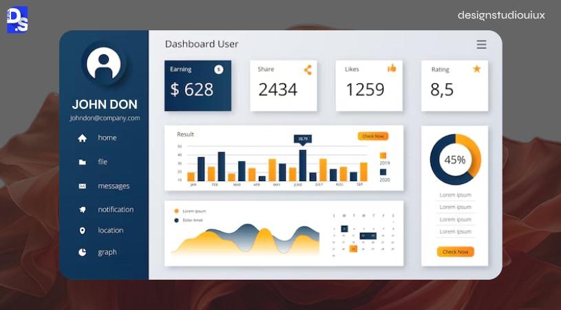
Cards are bounded rectangular units that store content in a discrete, scannable format. It treats each block as a self-contained unit to improve content interactivity and usability.
Problem It Solves:
Cards are SaaS dashboard design patterns to deal with information overload. They can break huge data chunks into snippets, helping users to understand complex data.
For example, if a CRM shows data about 30 open deals, people find it difficult to detect a specific record.
Cards can display the logo name, status, color, and the specific metric in one line to reduce cognitive load and friction.
Best Time To Use Cards
- To distribute data in content-heavy dashboards (in CRM records, product listings, and project dashboards)
- In drag-and-drop Kanban boards
- For heterogeneous data, where people need to quickly scan the data (in contrast to comparing data)
- To help users scan and select one data line from multiple options
When Not to Use Cards
- Cards should not be used for financial datasets
- Card UI pattern will not work if users have to view 20+ elements at once
- When users need to sort data by columns
Best Examples: Trello, Hubspot, and Linear
Trello sorts the task list on these boards, “To-do”, “In Progress”, and “Done” through cards. Users can grab and move it to respective lists to keep track of the work done.
“Deals” cards on the Hubspot CRM help a sales manager view and understand a potential sale in the pipeline.
Linear’s cards offers a compact view, by stacking a priority icon, a label, and an assignee into one area.
Stripe relied on skeuomorphism (simulates real-world objects), where each card replicates a mini credit card to build trust and authority.
Business outcomes
Cards are mainly used to optimize the visual structure of the content and minimize the risk of decision paralysis.
Accessibility
Cards are mostly keyboard-navigable, and the card tilted should be easily readable by screen readers.
Dark mode
In the dark mode, a slight background fill (1-2%) and elevation might create the intended effect on cards as seen in Trello.
Sidebar Navigation
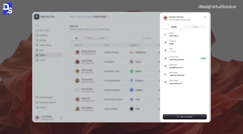
Sidebar navigation is a vertical menu usually situated on the screen’s left side, helping users to navigate through the primary areas of a platform without returning to a homepage or breaking the current session.
Problem It Solves:
Collapsible sidebar navigation menus are used in platforms that operate in multiple disciplines. It helps people to move between different pages of a website, without involving the home page every time.
Best Use Cases for Sidebar
- SaaS products that support 5+ primary sections
- Admin panels of project management tools
- Apps that support session switching/ management
When Not to Use Sidebar
- Single-purpose apps
- Mobile-first interfaces
- Primary UI contains competitive design elements
Sidebar Examples
Notion
Notion offers a personalized sidebar that shows all of the pages in a reorganizable tree structure.
Figma
Figma’s interface involves two sidebars without congesting the interface. The left sidebar is the primary actor here, providing access to Layouts, Assets, and Plugins. The right sidebar adapts to how people interact with these elements.
Slack
Slack’s sidebar helps users move between different channels, DMs, threads, apps, and saved items.
UX Outcomes
A sidebar will decrease the navigation time, and solve people’s frustration, they are less likely to raise a ticket for “I can’t find it”.
Accessibility
The active elements should have an “aria-current=”page”’ label for screen readers; it’s unavoidable from an accessibility perspective. It should explicitly mention both “Expand” and “Collapse” states.
Dark mode
These web navigation patterns have a darker background to distinguish from the main content without focusing too much on harsh contrast.
Progressive Disclosure
Progressive disclosure is a UX design pattern that controls how much information is revealed at a glance. Initially, only the important bits are disclosed, and further content is exposed on demand.
Problem It Solves:
If complex information is disclosed all at once, it might terrify users. Progressive disclosure only shows the surface-level information first, and the remaining after people interact with the element.
Use Progressive Disclosure for
- Forms with multiple steps
- Dashboards with multiple features for people with varying expertise
- Mobile-first approach
- Settings pages
Don’t Use Progressive Disclosure
- While dealing with sensitive information (medico-legal or financial sectors)
Use cases
Gmail Compose is the best example of this web app UI pattern. Initially, it opens only 3 sections, “To”, “Subject” and the “Body” window. If users click the “CC”, “BCC” sections or the rich formatting toolbar, only then they are displayed.
Stripe uses SaaS UI patterns in the payment form to reveal the primary information, amount, currency, and the product’s name. If users click the “Advanced options”, they can access the detailed fields, otherwise, they don’t need to.
Figma
Progressive disclosure in UX can be applied at a layer level, similar to Figma’s property panel. Users will first see a rectangular box first, but the Auto Layout will expand when selected, and don’t act as a fixed point.
Business outcomes
Progressive disclosures reduce task abandonment by not showing all the information at one go, thereby reducing cognitive load in usability testing.
Accessibility
The ARIA label “aria-expanded” for toggle buttons should be readable by screen readers, as it depicts open/ closed state. Also, the disclosed information must be keyboard navigable.
Skeleton Screen
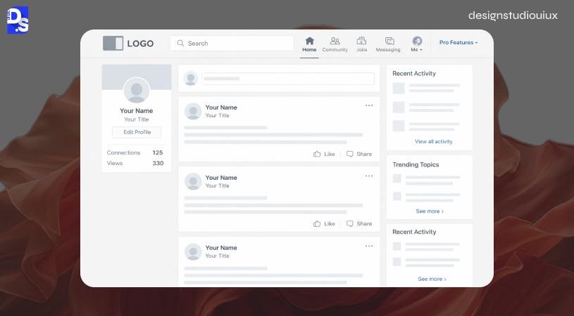
Skeleton screens are animated, vacant placeholders or layouts shown when the content is loading to decrease the supposed wait time.
Problem It Solves:
Skeletons can roughly show what and where the content will be displayed, thus reducing people’s frustration during loading.
The Right Time To Use
- When the content load time is higher than 300 ms
- If the page has different components with varying load time
- AI-enabled content generation platforms
- Grids where the content volume is varying
When Not to Use Cards
- Lightning fast loading speed (<100)
- You cannot discern the content shape
Case Studies
Linkedin feed uses a circular placeholder for the profile pic, a name bar, a longer bar for the headline and the rectangular text placeholder for the body. This is reinforced with a shimmer animation moving from left to right, giving a unified experience.
Vercel
Vercel pulls data asynchronously from multiple points, and sometimes, shows a skeleton shell.
YouTube
YouTube displays a skeleton framework of 16:9 placeholder (similar to a thumbnail), an avatar image, and a narrow structure for the meta data.
Notion AI
Notion AI is the best case scenario of streaming skeleton, where the cursor blinks on a blank page. When the text is generated, the cursor moves, similar to how it would appear originally.
UX Payoff
Traditional spinners fail to reduce the wait time, while as these screens have proven to improve the wait time by 20-30% on slow internet connection.
Accessibility
Technically, these are not readable by screen readers, which means they must be accompanied by text strings “Your content is loading, please wait” to check all the accessibility criteria.
2026 AI Note
Now, almost all AI LLMs support “Streaming Skeleton”. The skeleton comes live as soon as tokens are used, it bridges the dead zone (from prompt submission to first output) to prevent tool abandonment.
Empty State
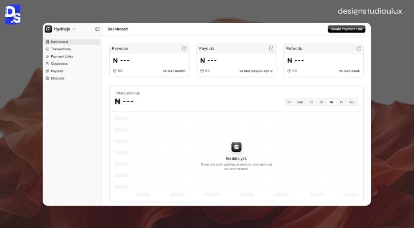
Empty state is a web app UI design pattern that appears when there is no content to display (for example, an empty search result). its job is to orient the user, explain the context, and prompt the first meaningful action.
Problem It Solves:
Empty states don’t double as edge cases, these are simply used to guide users, so they don’t feel confused and misled.
Best Use Cases
- Onboarding SaaS users for the first time
- Search results with no matches
- Empty notification inbox
- Any container that’s legitimately empty
UX Red Flags
- No blank spaces (a single text line is fine)
- Using an error message (for a normal case)
- Competing actions (more confusion)
Who’s nailing this UX pattern?
- Spotify nudges users with its “Let’s Find You Something For Your Playlist” with a cursor positioned inside the box.
- Whenever users create a new project in Asana, they are greeted with a simple “Add your first task”.
- Figma shows an icon illustration and “no components yet” message
- A new Slack channel welcomes people with a bot-generated welcome message
What does this mean?
New users benefit from well-designed empty states, and they are shown to improve activation rate in SaaS products. However, our experience at Design Studio reveals that it is a severely neglected area during web app design (and it should not be).
Accessibility
Empty state illustrations should be paired with text to support image-disabled screen readers.
Modal/ Dialog
A modal/ dialog acts as an overlay over the primary content, displaying critical information to grab user’s attention before resuming interaction with the background elements.
Problem It Solves:
Modals draw attention to the critical information without forcing users from the main navigation area. They prevent unnecessary page transitions and help users make faster decisions.
Best Use Cases
- Confirmation before deleting anything (irreversible)
- Short forms (less than 5 elements)
- Lists that support image and content preview
- Error messages that require user attention
Time to Avoid
- Sections that require undivided attention
- Complex forms (>5 elements)
- Processes that spans multiple steps
Who’s Using This?
- Github asks for confirmation before deleting a repository
- Linear minimizes friction with its 6-input modal box
- Notion opens a lightbox to show an image in its full size
- Stripe shows a refund modal including the payment details, refund amount and a single “Refund” button
How does this help?
Modals are the best tools to maintain contextual understanding for minor decisions. However, these are also the most misused elements, leading to friction and frustration in enterprise SaaS.
Accessibility
Aria labels used here are role=”dialog”, Escape to dismiss, and aria-modal=”true”. The focus must be placed within the modal (first interaction point).
Tabbed Navigation
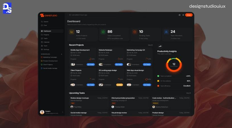
Tabbed navigation groups the content into different content buckets or panels to switch back and forth without leaving or reloading the page.
Problem It Solves:
Tabbed navigation removes the necessity of using separate pages to display relevant information.
Must be used
- In SaaS, profile pages (Overview/ Activity/ Settings)
- In eCommerce, “Description”, “Reviews”, “Product Specifications”
- Dashboards that groups content category-wise or timeline-wise
- Settings Page
When Not to Use
- More than 7 tabs
- Replace multi-step forms
- When users need side by side comparison
Platforms That Use This Design Pattern
- Github repository tabs, “Code Issues”, “Pull Requests”, “Actions”, “Projects”, “Wiki”, “Security”, “Insights”, and “Settings” are sorted as per usage frequency, and shows live counts.
- HubSpot lets sales reps jump between “Activity”, “Notes”, “Emails”, “Calls”, “Tasks”, and “Meetings” for better viewing.
- Stripe uses multiple programming language tabs for its API documentation page, and the selected code is then applied across the entire document.
Impact
Helps users to directly navigate to the designated area without the endless page scrolling.
Accessibility
For containers, role=”tablist”, for tabs role=”tab” and aria-selected, for panels, role=”tabpanel” and aria-labelledby.
Infinite Scroll Against Pagination
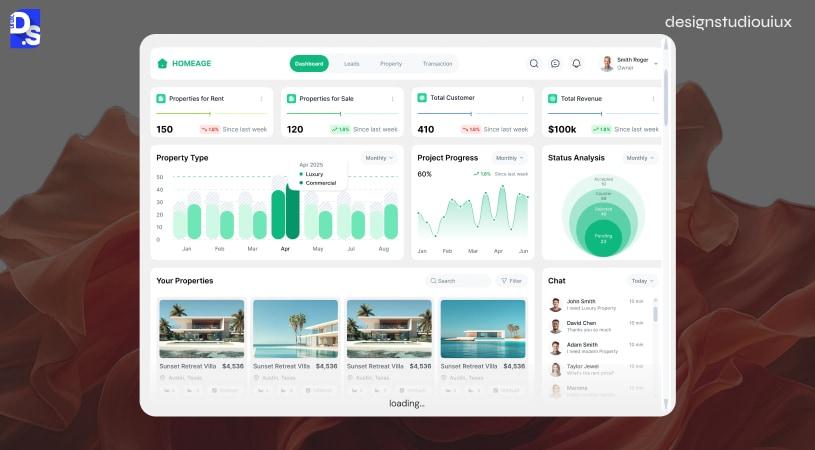
Pagination UI design pattern breaks down large content into number pages and establishes navigational paths between them. Infinite scroll helps users to seamlessly access and engage with content.
Problem It Solves:
Both infinite scroll and pagination fetch large datasets progressively, and serve different purposes.
Works Best
- Infinite scroll is best suited for content discovery on social media and visual boards
- Pagination is best for SERPs, logs,e-commerce, and bookmarkable URLs
Best Contenders: Google, Instagram, Stripe, Pinterest, Linear
- Google uses pagination to help users find a particular result
- Instagram and Pinterest uses infinite scroll to help users with content discovery
- Stripe combines pagination with page controls and selectors to browse through financial records
- Linear follows a more ethical approach through “Load More”
Business Impact
These play a role in streamlining the task completion process. Infinite scroll does not make sense in search results pages, because there’s no point of return.
2026 Ethical Design Update
Infinite scroll is devoid of natural stopping points, and hence, avoided in corporate contexts. “Load More” provides a hybrid system, giving control back to the user, that’s why at Design Studio UI/UX, we prefer using “Load More” for content discovery .
Accessibility
Infinite scroll cannot be accessed through keyboard, “Load More” helps in this case.
Data Table
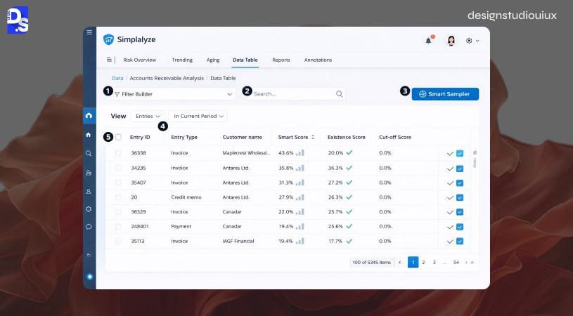
A data table is a structured grid of rows and columns designed for comparing, sorting, and filtering records across a large dataset, it is the most appropriate pattern when users need to analyze information rather than simply browse it.
Problem It Solves:
A data table is the best UI design pattern to compare, filter data within large datasets.
Best Use Cases
- Admin panels, CRM records, HR management tools with bulk select options
- Datasets with 5+ elements
- Report dashboards
Use Cases
- Airtable uses grid-view to display consumer data
- Stripe uses color-coded data tables to display financial data
- Notion displays the same dataset as a table, board, calendar or list with filters or sort options
Business outcomes
Using data table UX features for 2026 include sticky headers (for rows), inline double-click, column resizing, and toggle bars.
Accessibility
Data tables with <th scope=”col”> and aria-sort options are applied to sort content ascendingly, descendingly or none. Labels are applied to specific row records to help users sort and filter the data.
Search and filter
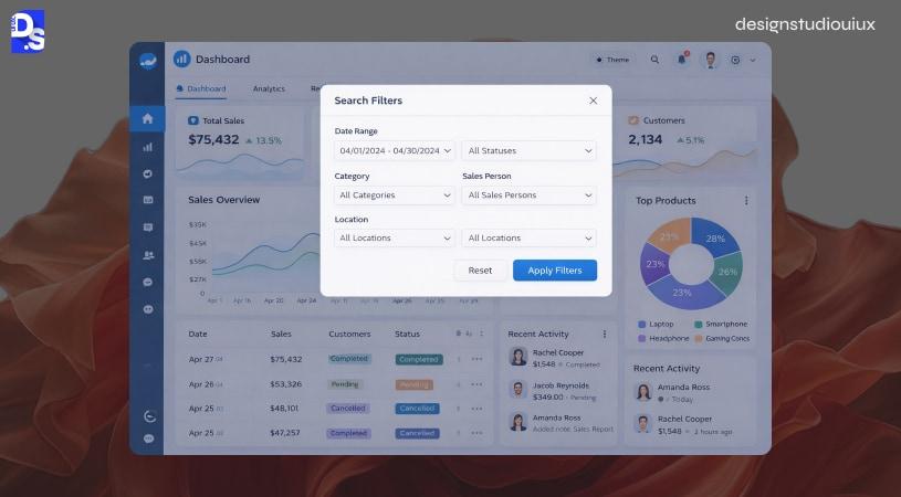
Search and filter patterns allow users to retrieve specific records from large datasets by applying constraints, reducing what is visible to exactly what is relevant.
Problem It Solves:
Search and filters help users to fetch a particular data from a large dataset without getting overwhelmed.
Best Use Cases
- Web apps that displays lists with 50+ elements
- Filters can be universally applied
- In SaaS, multi-attribute filtering is prevalent
Actual Examples
- Notion’s filters allow users to apply concurrent constraints
- Linear’s CMD+K interface triples as a search option, action bar and navigation interface
- Github applies a query syntax that helps power users to precisely match records
- Hubspot applies faceted filtering on the dashboard
Accessibility
Search inputs should use a live region to announce the results for screen readers to pick that up.
Notifications/ Toasts
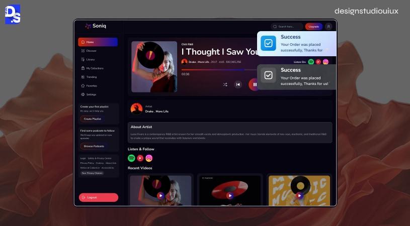
Notifications/ toasts are temporary, non-disruptive messages that alert users but don’t necessarily interrupt the current workflow, it disappears on its own without requiring user input.
Problem It Solves:
Temporary warning messages that ask users to reconfirm their actions without causing disruptions.
Time to Use Them
- To confirm actions (“Saved successfully” and “Deleted”)
- To display non-critical warnings
- Background procedures
When Not to Use
- Critical alerts, modals are best for that
- Where user input is mandatory
- Avoid more than 2 toasts
- Lengthy messages
Inspirations
- Figma uses a minimal toast to display (Link copied to clipboard)
- Vercel deploys toasts to populate both success and failure messages
- Notion’s immediate “Page Moved to Trash. Undo” toast
- Github’s “pull request merged” is also an inspiration
Best practices
- Place the toast at the bottom right corner,
- Don’t cover the main content
- 5 seconds auto-dismiss toast with (x)
- Provide Undo actions
- Stack multiple toasts
Accessibility
- ARIA label role=’alert’/ ‘status’
- Should stay active for 5 seconds
- Must support icons and text labels
2026 Update
Enterprise users often complain about notification overload, and that’s why they are bundled into an activity log. At Design Studio UI/UX, we suggest including a notification settings panel in the web app design that lets businesses to control toast generation events.
AI Input & Response Pattern
AI input and response patterns are an emerging category of web app UI design specifically built for generative interfaces covering prompt input, streaming output, confidence signals, error handling, and human correction flows.
Problem It Solves:
An emerging web app ui design pattern, used specifically for AI engines, because traditional form patterns fall short.
Sub-patterns
- Prompt input fields are different than form inputs supporting auto-expansion and multi-line formats, “Send” and optional file attachments
- Streaming text reveal discloses the output gradually, instead of showing a blank space
- Confidence indicators reveal if the content is AI-generated
- Error and retry patterns appear when AI prompts fail to produce results
- Human override affordance help users to edit, accept, or reject the responses
Best Picks
- Claude uses streaming text reveal and “Stop Generating”, “Copy”, “Retry”, and Thumbs Up and Thumbs Down (Not accurate/ helpful)
- Vercel provides 3 variants for users to compare
- GitHub Copilot uses inline suggestions to show ghost text at cursor locations
Accessibility
Streaming text should be announced via aria-live="polite" so screen readers aren’t interrupted mid-sentence. Confidence indicators and error states need text labels, not color alone. Retry and stop-generating controls must be keyboard-reachable and clearly labeled for assistive tech.
Business outcomes
These web app UI design patterns help businesses deal with edge cases that might appear in AI-driven SaaS products.
How to Choose the Right UI Design Pattern For Your Web App?
The steps to choose the right UI design pattern include: 1. Identifying core user tasks 2. Follow users’ mental model 3. Consider data volume 4. Run a 5-person usability testing 5. Validate your design for accessibility.
Identify the user’s core task on this screen
The right UI design patterns help users complete their core tasks. So, begin with a simple question, what is the user’s end goal?
- Cards/ infinite scroll help users with browsing
- Data tables are used to assist users during data comparison
- Progressive disclosure/ multi-step forms are mainly used for creating
- Scanning uses a search bar and filters
- Toasts/ modals are used to receive user’s feedback
Audit what users expect from their mental model
Jakob’s law of familiarity states that people expect interfaces to function similarly to what they are already using.
Their expectation is already influenced by others, which means novelty features may not work in most cases.
People using platforms like Notion, Linear, or Stripe might expect similar elements, sidebar navigation, command palettes and structured data tables.
In most cases, deviations don’t make sense, unless backed by thorough user research and testing.
Consider Your Data Volume
The volume of data directly influences how one would choose the appropriate web app UI design pattern. Here is a guideline:
- Cards or simple lists can be used for datasets with less than 50 items
- Searchable lists coupled with filters are best suited for datasets with less than 500 items
- Data tables, server-side pagination and column sorting are appropriate for large datasets (> 500 elements)
Test Two Pattern Candidates With Real Users
Now, it’s time to validate the design and UI design pattern and understand which one is more user appropriate. Create two wireframes and run a usability testing with 5 people. This is done to identify:
- The areas where users hesitate to use the platform
- Which interface delivers an intuitive experience?
- Which UI patterns will assist with task completion?
Validate Against Accessibility Requirements
UI design patterns all have WCAG 2.1 implications. Before implementing these design patterns, one must ask:
- Is this navigable via keyboard?
- Does it comply with specific ARIA roles (tabs, modals, tables)?
- How will the screen readers interpret it?
5 Common Mistakes When Implementing Web App Design Patterns
Mistake 1: Mixing Pattern Categories On The Same Screen
Using a card and a data table simultaneously on the same screen to present the same data signals uncertainty and confusion to users.
The fix: Pick a web app UI pattern that aligns with your use case, and apply it uniformly across the platform.
Mistake 2: Applying Infinite Scroll to Task Completion Contexts
Infinite scroll is not applicable for all scenarios. While it works best for discovery, it might not be the best choice for search results, or for transactional pages. Users cannot return to a specific record if infinite scroll is applied on these pages.
Mistake 3: Overloading Modals With Complex Workflows
A recurring UI design pattern mistake we see during SaaS audit is modals with 5+ elements or multi-step flows. It might seem reasonable when designed in isolation, but it impacts the overall experience.
The fix: If the modal is featuring complex data that requires decision trees or complex procedures, then it’s best to create dedicated pages.
Mistake 4: No Empty State Design
Without an empty state, a web app design might be considered faulty by new users. Neglecting this screen may impact onboarding and product adoption rate. An easy way to fix the issue is to create an empty state coupled with a first-action CTA during website redesign.
Mistake 5: Ignoring Focus Management In Modals & Overlays
Ignoring focus management in modals is one of the most common web app UI design mistakes we encounter during audits. People may feel stranded when the focus does not move contextually across design elements, from modals to triggers and dropdowns.
Conclusion
Web app UI patterns are not ornamental, they are the backbone of all the digital products people see and interact with. The right pattern can make the case in favor of your application or against it. So, it should be chosen after rounds of UX research, market research, wireframing, prototyping, and usability testing.
Our team at Design Studio UI/UX understands this very well, and employs this methodology while working on B2B SaaS and enterprise applications because design decisions made without this groundwork do not stay invisible for long.
FAQ’s About Modern Web App UI Design Patterns
What are the most common web app UI design patterns?

Web app UI design patterns include cards, sidebar navigation, progressive disclosures, skeleton screens, empty states, modals, tabbed navigation, search and filter, data tables, notifications, and AI UI patterns (an emerging theme of 2026).
What is the difference between a UI design pattern and a design system?
A UI design pattern is a single, reusable solution to one interface problem — like how a modal confirms a deletion. A design system is the complete infrastructure that contains many patterns together, plus tokens, components, and governance rules that keep them consistent across a whole product.
When should I use a card pattern vs a data table?
Use cards when users are browsing or scanning heterogeneous items casually — like a Kanban board or product gallery. Use a data table when users need to compare, sort, or filter structured data with 5 or more attributes per record, like financial records or CRM lists.
Is infinite scroll good or bad for web app UX?
Infinite scroll is good where content discovery (social feed) is the end goal, and people don’t have a specific destination. But it cannot be used to scroll through search results or financial transaction records, such as Google, because people need to return to a specific page or URL.
How do I make web app UI design patterns accessible?
UI design patterns must be supplemented by ARIA labels, correct states (enable/ disable), and navigable by keyboard. They must also be supported by visible focus indicators and be readable by screen readers (NVDA, JAWS, and VoiceOver).
What are the new UI design patterns for AI-powered web apps in 2026?
AI UI design patterns are inherent to AI systems, and include streaming text reveal, confidence indicators, error and retry patterns for LLM failures, prompt input fields, and human override, all belong to this category. These patterns help users select or reject AI-generated responses, and improve the prompt’s quality.