


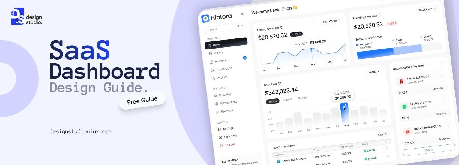
SaaS Dashboard Design: Build Dashboards Users Love



SaaS dashboard design is the process of creating data driven interfaces that help users visualize key metrics, understand product performance, and make faster business decisions. A well designed SaaS dashboard reduces churn, improves retention, and directly supports decision making across roles – from executives to product teams.
Stakeholders might leave a poorly designed SaaS dashboard within 5 seconds. If they cannot understand the metrics, they will be confused, and might lead to higher churn than expected. Aside from that, it might hurt business operations in the following ways.
- Time Lost in Interpretation
- Wrong KPIs might hurt the decision-making process
- Loss of trust in the product
- Delayed reactions
- Inefficient decision cycles
UI/UX design for SaaS products involve creating a strategic plan, following the design principles, and optimizing it based on customer feedback to address these issues.
Why SaaS Dashboard Design Is A Business-Critical Decision?
A dashboard is the first point of interaction between a business and its customers. It helps them to visualize the department-wise key metrics, such as, sales, marketing, finance, support, and development. It helps users to understand a product’s value and the next action items, this is the gap between abandonment and the “aha moment”.
Dashboard design matters for SaaS because it streamlines the data visualization, while a poorly designed system might lead to confusion and product abandonment.
SaaS dashboards are where product value is either proved or lost, but designing them effectively requires an understanding of what users need at every stage of their product journey, not just at the dashboard moment itself.
Our SaaS UX design guide covers how dashboard design connects to onboarding psychology, user activation milestones, and long-term retention UX.
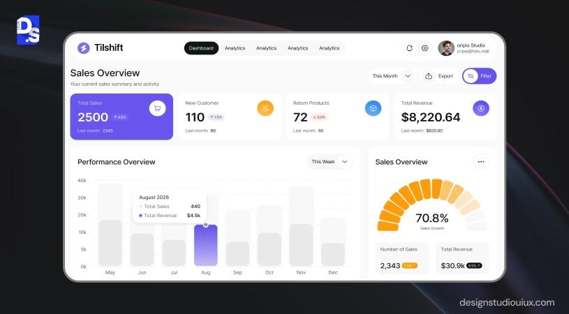
Metrics To Measure SaaS Dashboard Design Quality
These performance metrics indicate the dashboard’s efficiency:
Churn rate: Confused users will drop off, reducing the product’s value
Support ticket volume: Users raise tickets after failing to navigate the platform
Net Promoter Score: A smooth and actionable dashboard will create a positive first impression
Experts say that focusing on the UX is a good idea, as UX directly impacts SaaS retention numbers.
UI-first vs UX-first Dashboard Thinking
An UI-first dashboard emphasizes aesthetics over data through colorful charts, widgets, and interface elements.
An UX-first approach tends the difficult questions, such as:
- Metrics to be displayed on the dashboard
- Does it support decision-making? If yes, how?
- KPIs that should be placed above-the-fold
From a SaaS UX design principles standpoint, this is a better choice between the two.
Types of SaaS Dashboards: Know What You Are Building
SaaS dashboards are classified into 4 categories, operational, strategic, analytical, and tactical. Depending on the category, they serve different purposes, audience, and provide insights accordingly.
Operational Dashboards
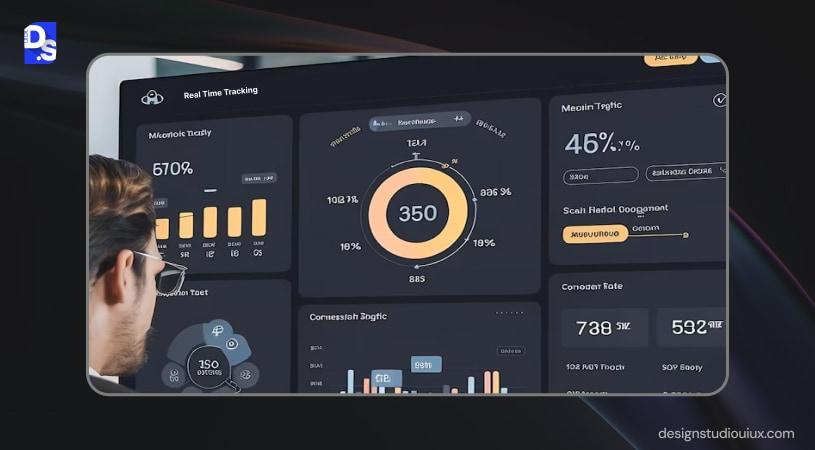
Operational dashboards work with real-time data, mainly used to monitor daily activities, and evaluate and address system issues. It tracks website traffic (active visitors, session duration), customer support tickets (volume, response time), and inventory statistics.
Applications
- Displays key business parameters and instant updates
- Tracks performance to assist in decision-making
- Supervisors, floor/ reporting managers, and team leads
Examples
Datadog and PagerDuty are operational dashboards that display live graphs, alerts and system status allowing engineers to focus on problem-solving activities.
Analytical Dashboards
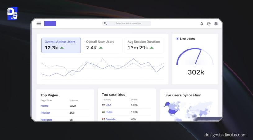
Analytical dashboards are the types of SaaS dashboards that analyze historical data to detect trends, patterns, and provide information to help with decision-making. They work with large datasets that offer strategic insights.
Applications
- Mainly used for data exploration, trend analysis and visualization
- Predictive analysis of past performance
- Mainly used by data analysts and Business Intelligence teams
Why it should be used
- Understand sales trends (Monthly revenue, conversion rates)
- Customer metrics, including retention and churn
- ROI & cost per acquisition
Example
Amplitude and Mixpanel are the best analytical dashboards that help teams with detailed analysis of behavioral data.
Amplitude is best used to analyze feature adoption data, whereas Mixpanel focuses on event-based analytics.
Strategic Dashboards
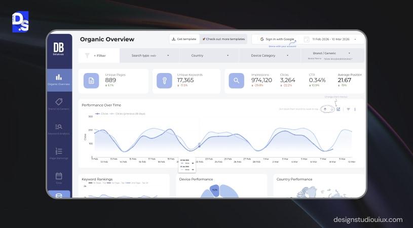
Strategic dashboards provide a birds-eye view of business performance, and are mainly directed at C-suite executives, department heads, and senior executives.
These platforms support long-term planning at a company-wide level, and mainly tracks revenue growth, customer acquisition cost (CAC), monthly recurring revenue (MRR), and churn rate.
Examples
Most business intelligence platforms including Tableau and Looker come under strategic SaaS dashboards. Tableau is used to visualize revenue growth, and regional performance metrics. Looker dashboards are inclined toward real-time business intelligence and executive reporting.
Tactical Dashboards
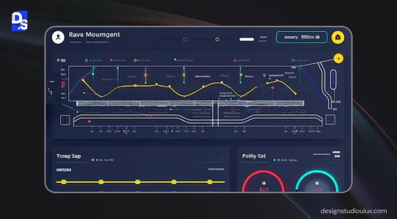
If strategic dashboards drive long-term planning, tactical dashboards assist in short-term decision-making.
They offer insights on operational progress and team-level performance, such as sales pipelines, marketing campaign performance, project status, and task completion rates.
Examples
Hubspot and Monday.com are well-known tactical SaaS dashboards that mainly answers these questions:
- Which deals can be closed?
- The best performing campaigns
- Which tasks are delayed?
| Type | Primary User | Key Metrics | Update Frequency | Design Priority |
| Operational | Technical | System alerts, error rates | Real-time | Speed |
| Analytical | Product Managers, Analysts | Retention, funnels, engagement | Hourly/ daily | Data visualization |
| Strategic | Executive, founders | Revenue churn, growth KPIs | Weekly/ monthly | Business clarity |
| Tactical | Team leads, managers | Campaign results, project status | Daily | Actionable insights |
Our team has designed SmartMoving an operational dashboard that allows workflow management through role-based, mobile-friendly interfaces, automated alerts, whitelabelling, and simplified analytics.
Understanding The SaaS Dashboard Design Process (Step-by-Step)
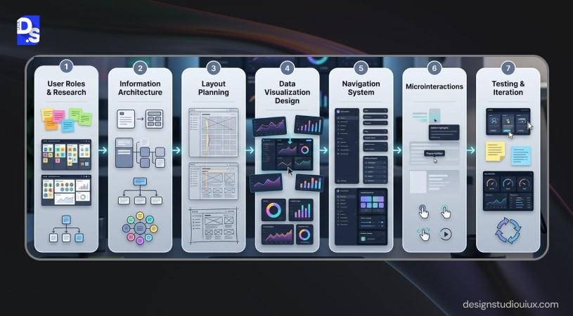
Step 1: Define User Roles & Jobs-to-Be-Done
Businesses invest in the preliminary user research services to understand the target audience and the problems they need help with. This clarifies a major concern:
- Executives tracking KPIs might need a strategic dashboard
- Business analysts or Subject Matter Experts might benefit from an analytical dashboard
The Jobs-to-Be-Done framework hits the right questions, depending on the role:
- What is the roadmap to hit our revenue and growth targets? (Executives)
- Which features are driving engagement and retention? (Product managers)
- Is the system running smoothly right now? (Operations)
- Which campaigns are generating the highest-quality leads?
The dashboard design also depends on the metrics they are going to track.
- A marketing manager views minimum qualified leads
- Product managers deal with active feature usage
- While sales managers visualize sales qualified leads
Step 2: Map Information Architecture
A SaaS dashboard should have a comprehensive Information Architecture, where the content should be distributed through user roles and tasks. The hierarchy should be user-centric, helping them discover the critical data first.
Sorting Card
Users can categorize data through cards as per revenue metrics, customer health, product analytics, and marketing performance. It allows users to mentally structure information, and align it with user expectations.
User Interviews
User interviews tell why some visitors prefer specific metrics over others, and how these metrics impact the overall user experience.
Affinity Mapping
Once research data is collected from card sorting and interviews, designers often use affinity mapping to identify patterns.
Affinity mapping involves grouping similar insights together to uncover themes such as:
- Frequently used metrics
- Common user goals
- Recurring usability challenges
- Important decision points
The “Above the Fold” KPI Rule
“Above the fold” refers to the part of the interface visible without scrolling. Users typically scan dashboards quickly, so the most critical metrics should appear in this area.
Step 3: Choose Your Layout Pattern
Layout patterns help users to scan information about the key metrics and make the necessary information.
F-pattern
Universally, people scan an interface in the F-shape, from top-left across the row, then drops down, and then goes horizontally. Most dashboards follow this pattern only by placing:
- Critical metric on the top-left corner
- Top row lists primary KPIs
- Left column contains secondary priorities
In the SaaS dashboard, the top-left corner receives the most attention, making it the highest value real estate.
- Analytics platforms
- Monitoring & reporting dashboards
Z-pattern
In the Z-pattern, users scan left to right, then diagonally to bottom left, and finally to the right in the bottom right corner. It is mostly used in:
- Simple dashboards
- Landing page analytics
- KPI analytics panel
SaaS websites use a grid system to position widgets, charts, panels to provide information in a cohesive manner. Widget size would depend on the data type, a large widget will display primary metrics, while smaller widgets might display secondary indicators.
Step 4: Design Data Visualizations
Data visualization UX best practices mention information should be presented clearly and logically. SaaS dashboards rely on different charts for this purpose, such as:
- Line chart
Line charts are used to track show trends and growth/ decline over time, best for understanding fluctuations. Metrics covered using this chart include, MRR, website traffic, churn, and daily active users.
- Bar chart
Bar charts are used to compare data across different sections, and rank them based on the performance metrics. They measure feature usage across different segments, product plan, and customer acquisition by region.
- Donut chart
Donut charts are used to measure proportions or compositions, and their contribution to the whole. These charts are used to identify traffic sources (organic, paid, referral), subscription plans, device usage breakdown, and customer segmentation.
While designing a SaaS dashboard, designers should not focus on the current dataset. These organizations grow quickly and the platform should scale accordingly. Three important questions to ask here are as follows:
- What will be the chart’s readability if the dataset grows to 10x?
- Will there be a scope to add more visualization metrics?
- Can users still identify the data and underlying patterns?
Step 5: Build Navigation & Global Controls
Navigation is also important in a SaaS dashboard, and it is established through the sidebar on the left, global filters and controls, and date range pickers.
A collapsible left sidebar will contain links to all the main sections of the dashboard, such as:
- Overview
- Reports and analytics
- User management
- Integrations
- Settings
Why should it be collapsible? This adds a layer of flexibility (expanding on the icons and labels), and a bit of space. It offers a consistent navigation for all product pages and better scalability for all the new features.
Global filters are available on the top of the dashboard for better accessibility across all pages. This includes data range pickers, attribute-based filters, toggles (switches perspectives between different roles), empty states, among other options.
Step 6: Add Microinteractions & Feedback Loops
Designers elevate a dashboard’s interactivity through microinteractions in UI design such as hover, loading skeletons, and tooltips, all of them can improve clarity, responsiveness, and overall usability.
Hover states appear when users move the cursor over an interactive element, in navigation menu items, buttons and action controls, chart elements, data table rows, and filter dropdowns.
Loading skeletons is a temporary placeholder that shows how the dashboard will look like without its inherent data.
Tooltips are contextual messages that might appear hovering over the “i” section. They are widely used in dashboards to explain data points, metrics, and interaction controls.
Step 7: Test, Iterate, Validate
The process does not end with SaaS dashboard design, designers should test the model for friction, iterate, and then conduct the final validation. This step involves 3 important validation methods:
- 5-second rule
- Usability sessions
- UX performance metrics
5-second Rule
The best and fastest way to evaluate a dashboard’s efficacy is to apply the 5-second rule. Show the interface for 5 seconds and ask:
- Primary metric
- Dashboard objective
- Standout features
- Actions driven from insights
Think-aloud usability sessions
In this approach, users will verbally explain what they think about the dashboard. They describe:
- What do they believe each metric represents?
- What are they trying to accomplish?
- What are the confusing metrics?
- Why are they clicking or not clicking certain elements?
Not sure where to begin to design a SaaS dashboard? Book a free consultation!
Core SaaS Dashboard Design Principles You Should Not Skip
SaaS dashboard design principles emphasize clarity over creativity, progressive disclosure, appropriate data, visual consistency, role-based grouping, accessibility, mobile-responsiveness, and performance optimization to build intuitive interfaces.
Clarity over cleverness
A SaaS dashboard should prioritize data clarity, instead of aesthetics. It should follow the 5-second rule, “Can users understand the data within 5 seconds?”
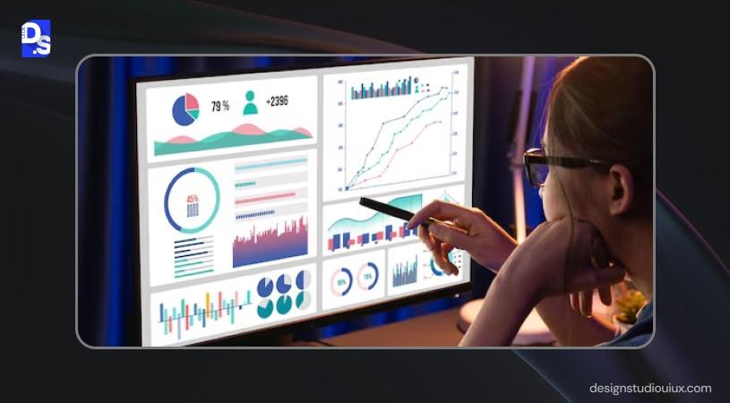
Interfaces to draw inspiration from:
- KPI cards with clear metric labels
- Standard charts such as line or bar graphs
- No unnecessary data
Progressive Disclosure To Show Depth on Demand
A SaaS dashboard UI should display the summarized version, and gradually disclose the details. Most organizations overdo this, by showing all the details, at once, thus bombarding users with too much information.
Good example of progressive disclosure
A card showing comparison of performance, current vs. previous month. This is achieved through a high-level metric, a sparkline (micro-trend) and an option to expand the option.

The Expanded view will provide more details such as:
- A comparison chart with distinguished axes and labels
- Filters for more information
Bad example of progressive disclosure
A bad SaaS dashboard UI design will overcrowd the screen with dozens of metrics, charts that don’t actually reveal anything, and don’t support drill-down capabilities.
Actionable data, not passive reports
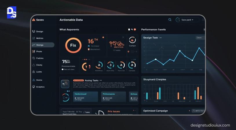
A SaaS dashboard design includes data to help businesses with decision-making, instead of just displaying numbers. It might contain alerts (revenue drops), indicators (customer churn), and quick actions for detailed exploration.
Consistent visual language across all states
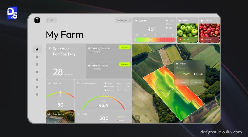
In web app design process, consistency pays off in the long run, whether it is visual or technical. SaaS dashboards should follow a visual language across the charts to create a smooth user interface. This means color usage (green for growth), chart type, typography, and iconography, all should tie together a report that provides perspective to decision-makers
Role-based views and modular widget layout
SaaS dashboards should come with modular widget layouts for different roles and departments (data which is only visible to them). Everyone should not view all the data, for example, executives might see revenue growth, while product teams might check feature adoption rate.
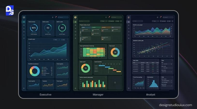
So, the dashboard should include:
- Customizable dashboard widgets
- Role-based views
- Modular rearrangement
Accessibility by default (WCAG 2.1 AA)
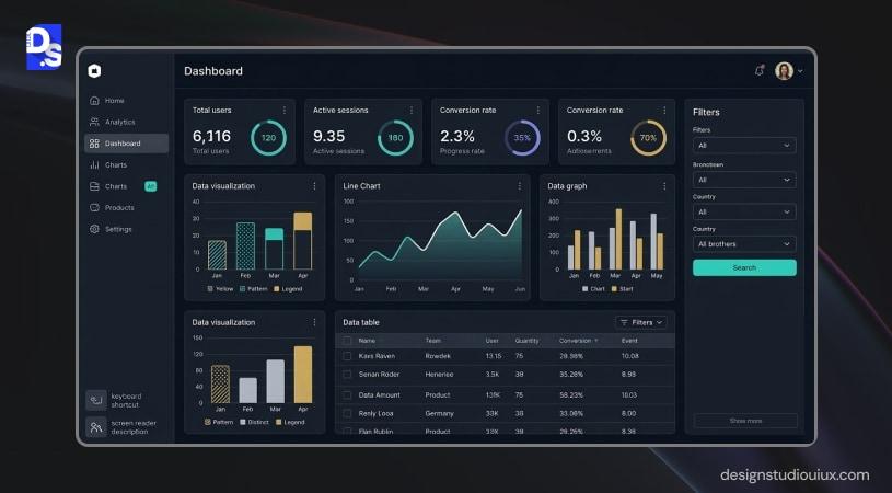
WCAG 2.1 AA ensures that the dashboard is accessible to differently-abled people across the board. This is achieved through high color contrast (to make information perceivable), keyboard navigation (operable), screen reader compatibility (robust), and accessible chart labeling (understandable).
Performance is UX — under 2s load time is non-negotiable

Performance and UX are interlinked, dashboards that do not load under 2 seconds experience customer churn. This performance can be optimized through lazy loading, KPI cards, and optimized data queries.
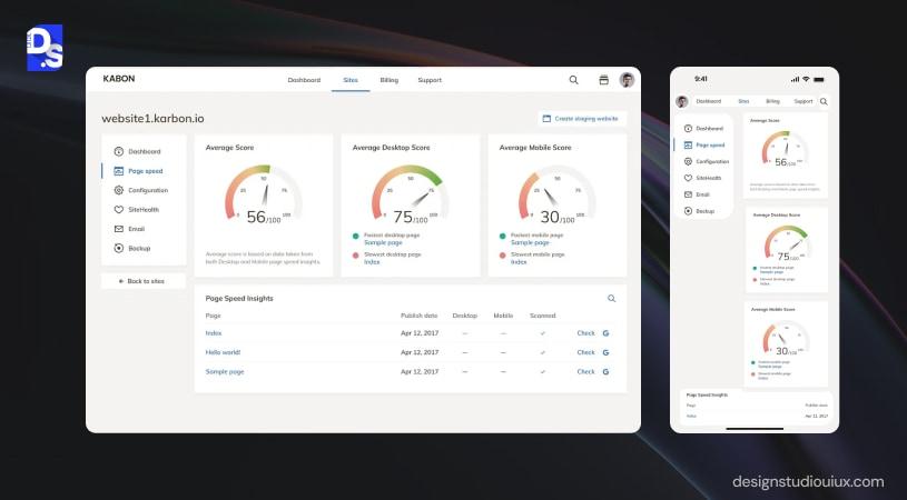
Mobile-responsive with desktop optimization
While dashboards are primarily used on desktop environments, users often check metrics on tablets or smartphones. A modern dashboard must therefore be mobile responsive while still optimized for desktop analytics workflows.
Good example
- Responsive layouts that adapt to smaller screens
- Simplified mobile views prioritizing key metrics
- Interactive charts optimized for touch
What Are The Top SaaS Dashboard Design Trends In 2026
Latest SaaS dashboard design trends involve AI-powered prediction, mandatory dark mode, collaborative dashboard, motion design, natural language, and accessibility-first designs.
AI-powered predictive insights embedded in the dashboard
With AI being integrated in software applications, AI-powered prediction is the next logical step. Dashboards can offer futuristic insights after analyzing historical data, such as:
- Predicted customer churn risk
- Revenue forecasts for the next quarter
- Suggested actions based on behavioral trends
- Automatic anomaly detection in performance metrics
Dark mode as a standard “power user” expectation
Dark mode is eminent in modern SaaS dashboards, especially those relying heavily on analytics. It is perfect for long periods of data reviewing, as it removes visual fatigue and boosts readability.
If dark mode UI design best practices are correctly applied, the dashboard should have a proper balance of color, contrast and readable elements that remain visible even in dark environments.
Also, a well-designed dashboard will support theme switching, allowing users to switch between light and dark modes as per convenience.
Collaborative dashboards — comment, annotate, share views
Instead of exporting reports or sharing screenshots, teams can collaborate directly inside the dashboard through features such as:
- Commenting on specific charts or metrics
- Annotating important data points
- Sharing filtered views of the dashboard
- Tagging team members for discussion
Motion design & microinteractions as trust signals
SaaS design trends suggest embedding motion design and microinteractions into the SaaS dashboard interface. This include:
- Smooth transitions when filters update charts
- Hover states that highlight data points
- Animated loading indicators for data processing
- Microinteractions confirming user actions
Natural language / voice querying replacing filter UIs
Natural language interfaces make dashboards more accessible for non-technical users.
- Show revenue growth for the last quarter
- Which marketing channel generated the most leads?
- Compare churn rate between enterprise and SMB customers
Accessibility-first as a regulatory and UX requirement
Accessibility-focused dashboards typically include:
- High contrast color palettes
- Keyboard navigation support
- Screen reader compatibility
- Clear labeling of charts and data elements
Common SaaS Dashboard Design Mistakes
SaaS dashboard design mistakes are as follows: aesthetics over data, too many KPIs, absence of empty states, no role-based segmentation, wrong chart usage, static charts, skipping usability testing, and not working with a predetermined budget.
Designing for aesthetics, not decisions
Product teams heavily push aesthetics over data, without asking this vital question: “Will this help?” If a chart or a graph is not directly helping the decision-making process, then there is no need for that in the dashboard.
More than 7 KPIs above the fold — decision paralysis
This was a regular occurrence during our audit of SaaS dashboard UI design. Most of them want to show everything at once, leading to KPI overload. This hurts conversion, by creating decision paralysis.
A good dashboard should include:
- 3-5 primary KPIs
- Drill-downs and secondary views
- Visual consistency
No empty state design
Saas dashboards should not fail in absence of data, instead, they should guide users in that situation too. However, we have seen dashboards that just display blank cards instead of explaining the reason.
What to do instead?
- Explain why data is missing
- Suggest next steps (connect data sources, create campaigns, invite users)
- Provide onboarding guidance
Same view for every user role
Many teams design a single universal dashboard for all users. When every role sees the same metrics, most of the data becomes irrelevant to them.
Strong dashboards use role-based views, ensuring users see the metrics that actually support their responsibilities.
Pie charts for more than 5 data segments
We have seen this happen in the first-versions of SaaS dashboards we audited earlier. Pie charts, while being great data visualization tools, are not the ideal choice for displaying more than 5 KPIs.
Treating dashboards as static reports
Sometimes, SaaS dashboards don’t fully lean on interactive elements, which is a mistake in our opinion. Nobody likes static reports, stakeholders must have access to segment data:
That’s why modern dashboards include:
- Dataset filters
- Drill-downs and other elements
- Time pickers (for comparison)
- Detailed breakdowns of anomalies
Building without a performance budget
While building SaaS products, performance optimization comes as an afterthought. We have seen products becoming slow and heavy with more features being added, and losing people’s trust.
Skipping usability testing entirely
Finally, one of the biggest mistakes is launching dashboards without usability testing.
Many teams assume their dashboards are intuitive because the internal team understands the metrics. Real users often struggle with navigation, chart interpretation, or finding key insights.
Even simple sessions can reveal issues such as:
- Misunderstood chart labels
- Hidden filters users never discover
- Metrics that lack context
Real-World SaaS Dashboard Design Examples (With Analysis)
The best SaaS dashboard design examples will display the information people want to see, without focusing on aesthetics. Here are few examples that support this statement:
Hubspot CRM
Hubspot CRM prioritizes role-based workflows, depending on departments, such as sales, marketing, customer success and operations.
It allows teams to customize the platform based on roles and responsibilities to show data accordingly.
Primary highlights include:
- Role-based widgets for relevant KPIs
- Modular dashboard components that can be rearranged
- Clear KPI hierarchy
- Custom reporting modules
Stripe
Stripe, the payment gateway, is one of the best SaaS dashboard design examples, and stands out because of progressive disclosure and contextual empty states.
Progressive Disclosure
Stripe first disclose information through high-level summaries, which can be expanded further to reveal transaction insights.
Contextual Empty States
Businesses should learn empty state designing from Stripe. The interface explains what will happen after the first transaction is conducted. The dashboard offers clear instructions and onboarding options to guide users on what to do next.
Amplitude
Amplitude, a popular analytics interface, smartly deals with empty states by introducing sample datasets and onboarding flows. Key insights include:
- Interactive onboarding steps
- Product template analytics
- Appropriate metrics and chart
- Sample data dashboards
School Bus Tracking System
We have also applied these principles in this dashboard UI/UX design case study. Our school bus tracking system allows parents, drivers, schools, and drivers to manage school bus routes and manage transportation.
The challenge was to present the complex operational information through a simplified interface. We have applied these principles:
- Role-based interfaces for guardians, drivers, and school administrators
- A central admin dashboard managing routes, users, and payments
- Clear real-time tracking information to reduce uncertainty for parents
- A cohesive ecosystem including mobile apps and web dashboards
Fintech Dashboard
Our fintech dashboard design is targeted at small banks and financial institutions. The goal is to prioritize sensitive data, complex transactions, and loan-related updates.
Our key design features include:
- Structured financial summary widgets
- Step-by-step workflows for loan applications
- Easy navigation through icons to access the essential sections
- Progress indicators to guide users through complex financial transactions
What makes a great SaaS dashboard design?
Great SaaS dashboard design shows users exactly what they need to see to feel successful — nothing more. It prioritizes role-specific KPIs, uses appropriate chart types, loads fast, handles empty states gracefully, and guides users toward the next best action rather than just displaying data.
Request a free UX audit to audit your SaaS dashboard.
SaaS Dashboard Design Checklist For Designers
A SaaS dashboard design checklist consists of 3 steps, research and strategy, layout and information architecture planning, and data visualization.
Research & Strategy
This is the foundation of any SaaS UI design:
User roles defined
The process begins with understanding user roles, goals, and responsibilities, and using that information to tailor the interface.
North Star Metric per role identified
Role-based segmentation helps in mapping data with user roles, and reducing data-based complexity.
Jobs-to-Be-Done mapped
A step further into role-based segmentation, this process helps designers to understand why users need to view a particular data over others.
Layout & IA
A well-structured layout ensures that users immediately see the most important insights:
Primary KPIs above the fold
Like a headline, primary KPIs should also be immediately visible, so they must be placed at the top.
Layout pattern (F/Z) applied
F/Z patterns help users scan the critical information without exerting too much effort.
Global filters accessible from every view
Filters such as date ranges, product segments, or campaign channels should always be available so users can explore data quickly.
Data Visualization
This layer determines the effectiveness of the product.
Chart types match data relationships
Depending on the data, your dashboard should contain relevant charts, such as
- Line chart for trends
- Bar charts for comparisons
- Donut or stack charts for compositions
Empty states designed for all widgets
Every chart should include a clear empty-state message explaining why data may be missing and what users should do next.
Color carries meaning, not just decoration
Colors should communicate meaning (e.g., green for growth, red for decline) rather than simply making the dashboard visually appealing.
Accessibility & Performance
A SaaS dashboard should balance usability and fast performance:
WCAG 2.1 AA contrast ratios
This ensures that all the texts, charts, and UI elements should have a balance of color and contrast.
Largest Contentful Paint
Dashboard pages should load within 2 seconds to maintain trust and credibility.
Mobile Breakpoints Tested
The dashboard should be uniform across all devices, mobiles, tablets, and desktops without breaking.
Begin a UX audit on your existing dashboard and optimize it for better results.
How to Choose a SaaS Dashboard Design Agency
Process-first vs deliverable-first agencies
A Saas dashboard design agency should not focus on the deliverables, rather it should establish the process first. Usually, the process begins with discovery, research, UX workflow mapping, wireframing, and post launch.
Red flags to consider
These are some early signs that you should watch out for:
- Not going through the usual discovery or research phase
- Creating a Figma design without a specific goal
- Not mapping the user workflows
- Not enough experience to design analytical products
What to ask before hiring
These are the critical questions everyone should ask before onboarding a SaaS design partner, such as:
- Can you show portfolio examples of SaaS dashboards?
- What is your approach to UX research and dashboard strategy?
- Do you focus on building scalable design systems?
- What is your approach about post-launch support and usability testing?
Why does a specialist studio outperform a generalist agency for SaaS?
SaaS dashboards are designed to tackle complex organizational data, and they require a specialized approach. A specialized organization would begin the process with SaaS UI/UX design and consulting services before proceeding any further. The ideal agency would:
- Create data-focused dashboards
- Focus on scalability with additional features
- Optimizes the analytical workflows
Check our SaaS dashboards for fintech, healthcare, and B2B platforms here.
The moment users open the SaaS dashboard, they should immediately understand what is happening with their business and what to do next. When dashboards fail to deliver this clarity, the result is confusion, slower decisions, increased support load, and ultimately higher churn. If you want more details, you can read “ how to design and build a SaaS product”.
Great dashboards begin with research, and prioritize clarity, scalability, and performance through thoughtful information architecture, proper data visualization, and role-based views. Finally, usability sessions, performance metrics, and iteration are essential to ensure the interface truly supports decision-making. At Design Studio UI/UX, we apply these principles to create dashboards for fintech, logistics, healthcare, and other domains.
FAQs
What is SaaS dashboard design?

SaaS dashboard design means the process of creating a data-driven SaaS interface to highlight key metrics, visualize performance, and quickly access the core insights to make better decisions for their businesses.
What are the principles of Saas dashboard design?
Key SaaS dashboard design principles include clarity over complexity, progressive disclosure, actionable data visualization, consistent visual language, role-based views, accessibility (WCAG 2.1), strong performance, and responsive layouts so users can quickly understand insights and make informed decisions.
How to design and build a SaaS dashboard?
Designing a SaaS dashboard involves defining user roles and key metrics, structuring information architecture, choosing clear layouts and appropriate data visualizations, adding filters and navigation, and validating the interface through usability testing to ensure users can quickly understand data and make decisions.
What is the difference between a SaaS dashboard and a report?
A SaaS dashboard is an interactive, real-time interface that displays live KPIs, visual charts, and filters that allow users to explore data and respond to changes immediately.
A static report is a generated summary of historical performance, detailed breakdowns, and documentation, often exported as PDFs, spreadsheets, or presentations.
What tools are used for SaaS dashboard design?
Figma is used to design and prototype the dashboard, and it is technically enhanced by Tailwind CSS or React in the development phase. In some cases, designers might combine data-driven platforms like Databox or Tableau.









