


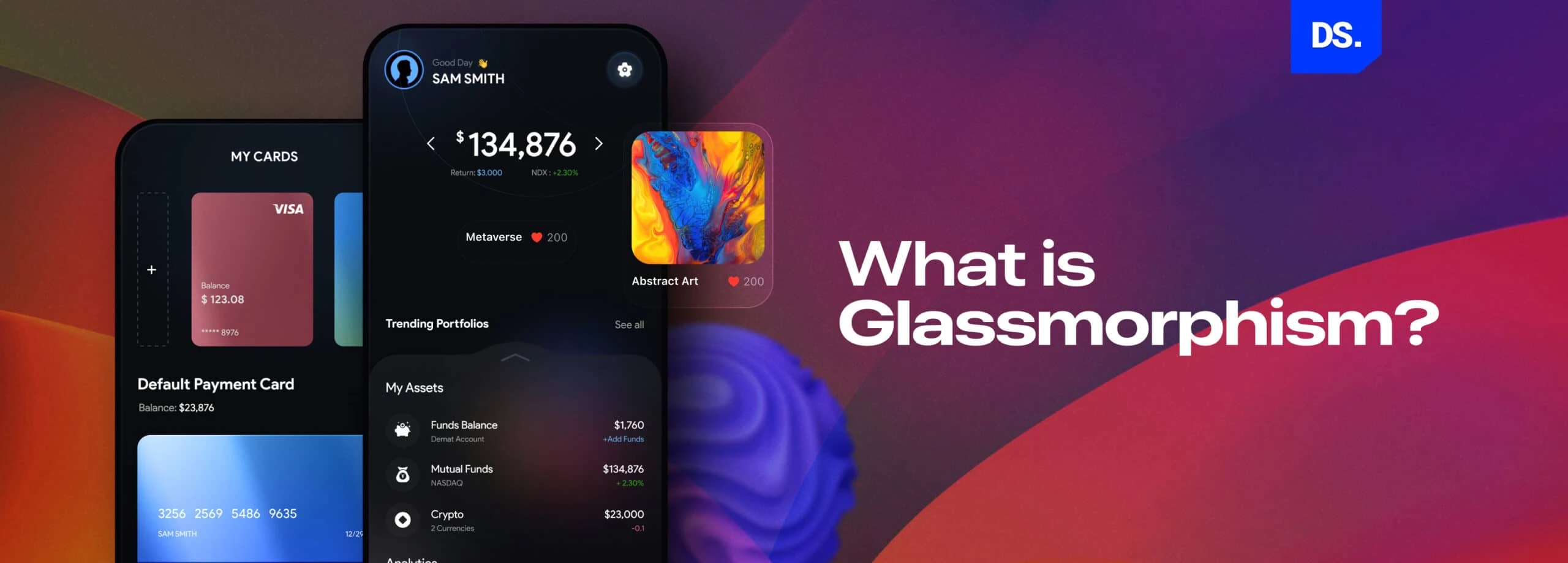
Glassmorphism UI Design: Examples, Best Practices & Trends



Quick Summary
Glassmorphism is a UI design trend that creates a frosted-glass effect using background blur, transparency, and layered depth. It’s especially effective for app onboarding screens, where it highlights key elements while keeping the interface uncluttered.
What is Glassmorphism Design?
Glassmorphism is a UI design style that uses transparency, background blur, and layered depth to create a frosted-glass effect on interface elements like buttons, cards, and dashboards. The result is a clean, airy layout with a floating-glass appearance.
It is a trend that makes user interface elements look like frosted glass, the semi transparent elements float above a colorful background. This creates a sense of depth and it makes layouts feel layered.
It adds a touch of minimalism, modernity, sleekness, and a futuristic appearance to web and app interfaces. It makes interfaces appear simple yet sophisticated. Like neumorphism design in UI, glassmorphism is a relatively new app design trend but it is already one of the most popular app design trends of the 2020s.
The goal of glassmorphism design is to create an interface that looks like an assortment of glassy panels hovering in the background space. By “glass-morphing” the design elements, UI designers give them an “airy” feeling. They have the appearance of frosted virtual glass and look like they are floating in the background.
Glassmorphism helps designers add visual hierarchy to their creations and create focal points for the content they want to highlight. That is why popular brands like Microsoft and Apple have embraced the glassmorphism design style.
The inclusion of glassmorphism design in MacOS’s Big Sur in 2020 is a good example of the popularity of this design trend.
Glassmorphism Vs Neumorphism: What’s the Difference?
Glassmorphism and neumorphism both use subtle depth effects, but they work differently: glassmorphism creates transparency and blur to mimic frosted glass, while neumorphism uses soft, dual-toned shadows to make elements look like they’re pressed into or raised from the background with no transparency involved.
Glassmorphism Design Trend Examples
Let’s see an example:
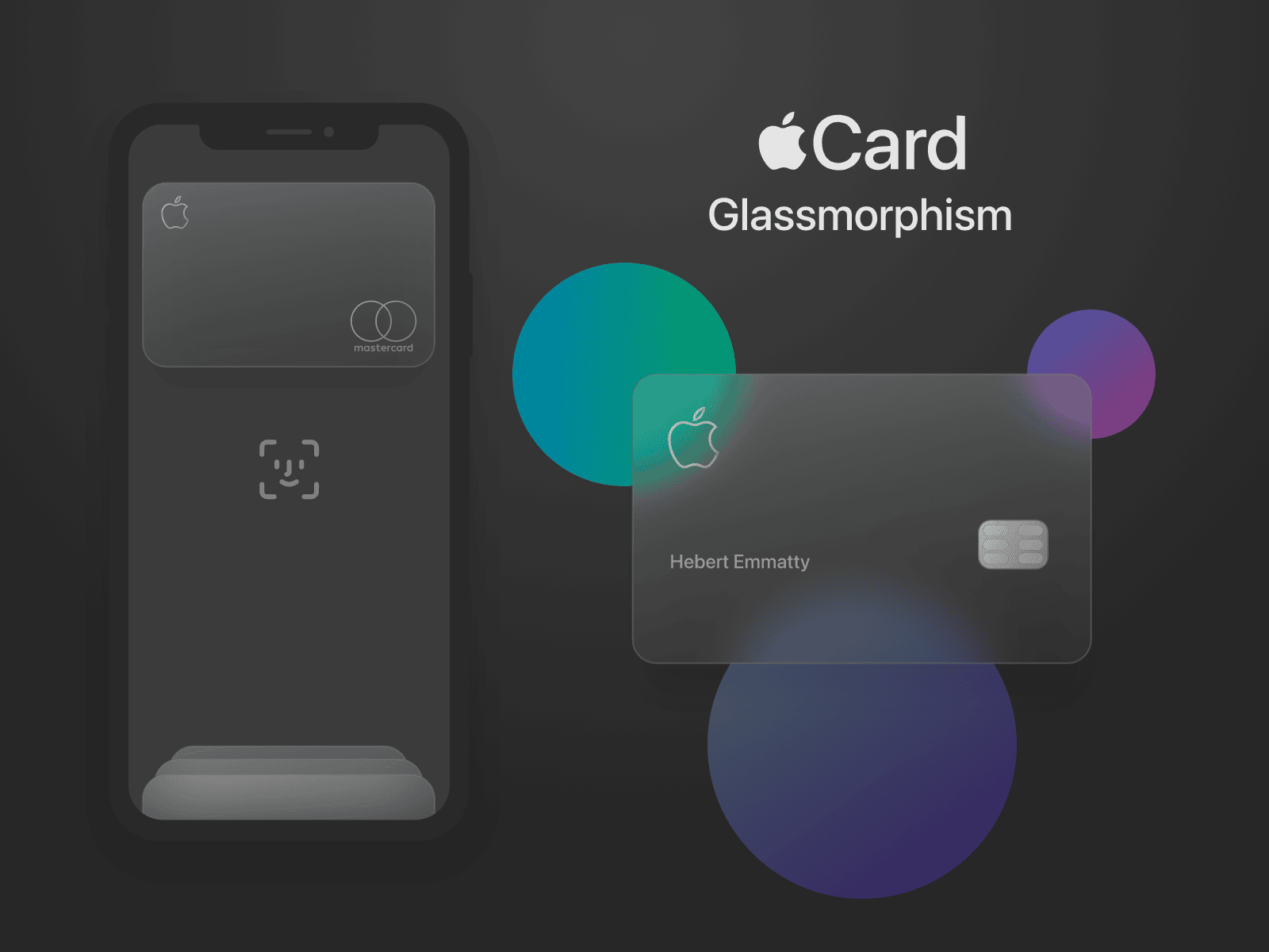
Notice how the transparent card appears as if it is floating in space? The same effect that you see in this card, can be recreated for CTA buttons, dashboards, onboarding screens, and more. It can also be used to design windows or widgets.
For example, this redesign of the Messenger App for MacOS illustrates the perfect use of glassmorphism:
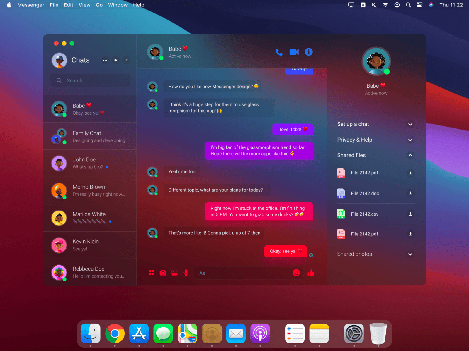
This app window with its frosted glass-like appearance and semi-transparent elements looks so much classier than a traditionally designed app window, right? It is no surprise that this modern app UI/UX design trends has been embraced by tech giants like Apple.
In fact, Apple used the frosted glass effect long before this design style was given the status of a certified trend.
If you have an iPhone or iPad, just look at the widgets on your home screen. Do you notice the semi-transparent elements and the frosted glass effect? Here is an example:
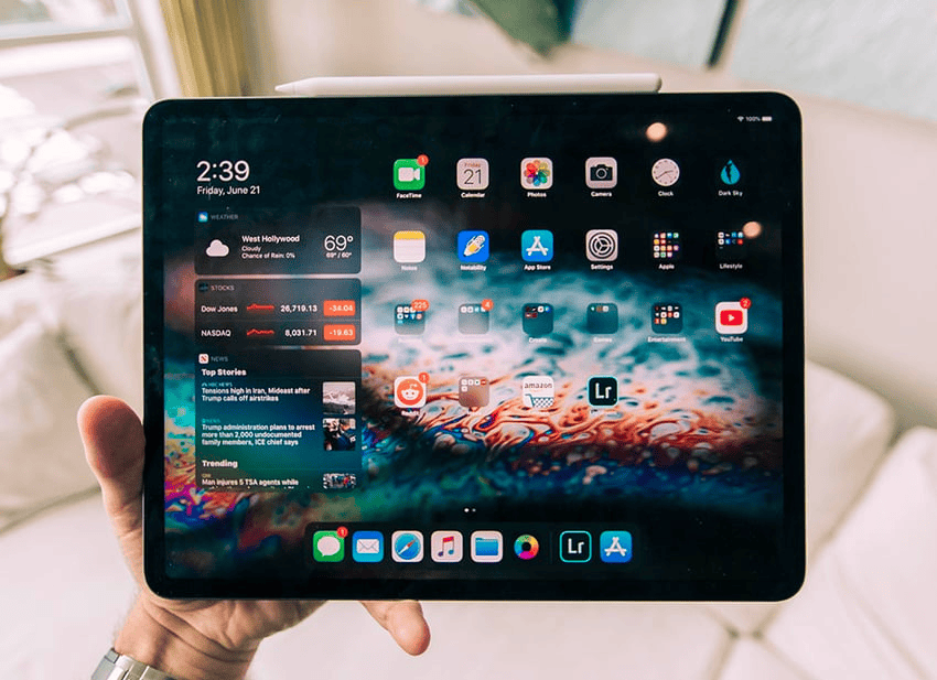
Do you notice the traces of glassmorphism? Now that you have a clear idea of what glassmorphism looks like in app design, let’s lay down the key principles or characteristics of this design trend.
What Are Glassmorphism Design Principles?
The core principle is frosted transparency. Designers achieve this effect by using a background blur on an object, Multi-layered layouts, Layered elements (like stacked glass), Bold color backgrounds (essential), Soft drop shadows and Subtle border strokes. These are the key elements of Glassmorphism.
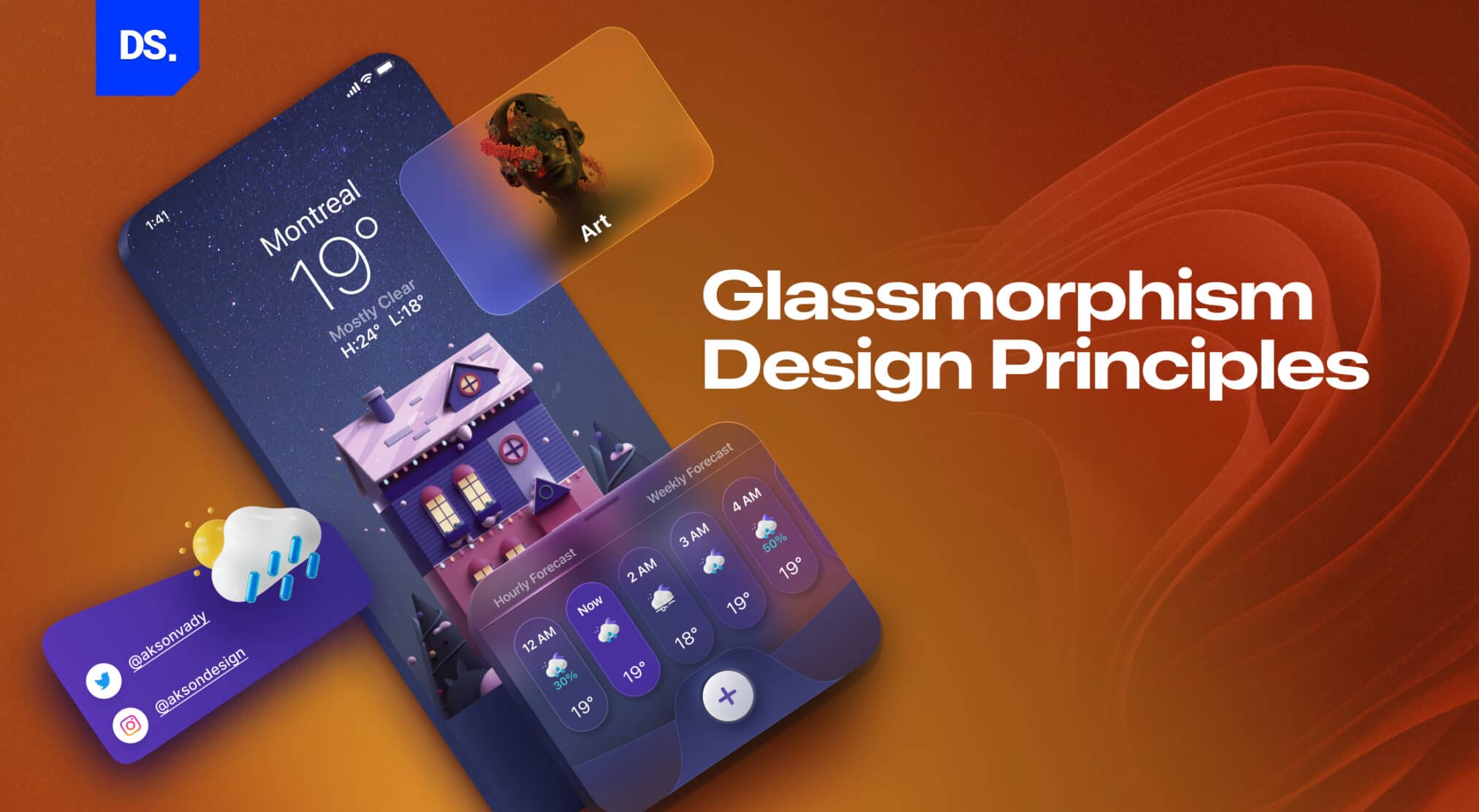
Unlike age-old design styles and trends like Brutalism or Neubrutalism, glassmorphism is relatively new, and it does not have a fixed set of design principles. But, there are certain features that can be immediately identified with glassmorphism. They are:
1. Frosted Glass Like Appearance
Icons, buttons, windows, and other UI elements look translucent or semi-transparent. They look like they are made of frosted virtual glass.
2. Multi-Layered Style
Glassmorphic designs are inherently multi-layered. Typically, these designs feature a translucent background over a vividly-colored background. This multi-layer style gives the interface elements a 3D effect.
3. Colorful Background
Choosing bright colors for the background is an easy way to further highlight the glass-like appearance of the interface elements. The bright, vivid colors in the background contrast with the glass-like, semi-transparent elements, demonstrating the role of color psychology.
This contrast creates a visible blur around the interface elements. The blurring adds depth to the design and boosts the visual hierarchy of the UI design. Light colors will also work but won’t give the depth that bright, busy backgrounds do.
4. Shadows
If you add a shadow effect to the different layers in the multi-layered design, you can create a sense of depth and give each layer a three-dimensional appearance.
5. Border Highlighting
Interface elements in Glassmorphic UI designs typically feature border highlights. These highlights/accents help define their shape.
These principles of Glassmorphic design will be easier to understand once you review the history of this app design trend, particularly its name.
How Glassmorphism Impacts UX
Glassmorphism is not an aesthetic filter, it adds depth between separate layers, maintains visual hierarchy, and improves readability.
It works best in situations where clarity and focus are first priority, in dashboards, fintech apps, and OS interfaces.
How to Create a Glassmorphism Effect in UI Design (with CSS Examples)
Designers apply glassmorphism through various tools, including CSS. Here is a sample code snippet for your reference:
- Begin with a semi-transparent background: background: rgba(255,255,255,0.2);
- Next, add blur using CSS: backdrop-filter: blur(10px);
- Designers should apply soft borders and shadows for depth.
- Combine the style with bright background gradients for contrast.
- Designers can also replicate this easily in Figma, Webflow, or Adobe XD by layering translucent shapes with blur filters.
Although glassmorphism is trending right now, it should be applied selectively to support design goals, not as a distraction.
Glassmorphism in Dark Mode and Accessibility Design
When using glassmorphism in dark mode, designers should increase contrast, lighten backgrounds, and use white borders to maintain readability.
Always check WCAG 2.1 contrast standards to make sure text remains legible over frosted backgrounds.
Best Tools to Design Glassmorphic Interfaces
Although multiple tools are available, designers often rely on these tools to create glassmorphism:
- Figma: for live preview & community plugins
- Adobe XD: for frosted transparency prototypes
- Blender or Framer Motion: for 3D or animated glass effects
So which one is the best tool from the bunch? It depends on the degree of realism needed for the interface.
Common Mistakes to Avoid When Using Glassmorphism in UI Design
Glassmorphism is appealing, but these UX mistakes can quickly undermine its performance.
- Using too much blur might slow down UI performance
- If the contrast is too low, it will affect readability
- Too many layers will create visual noise and distraction
- Low accessibility will lead to UX friction
Glassmorphism is good, but a design should never distract users from core tasks.
A Brief History of Glassmorphism
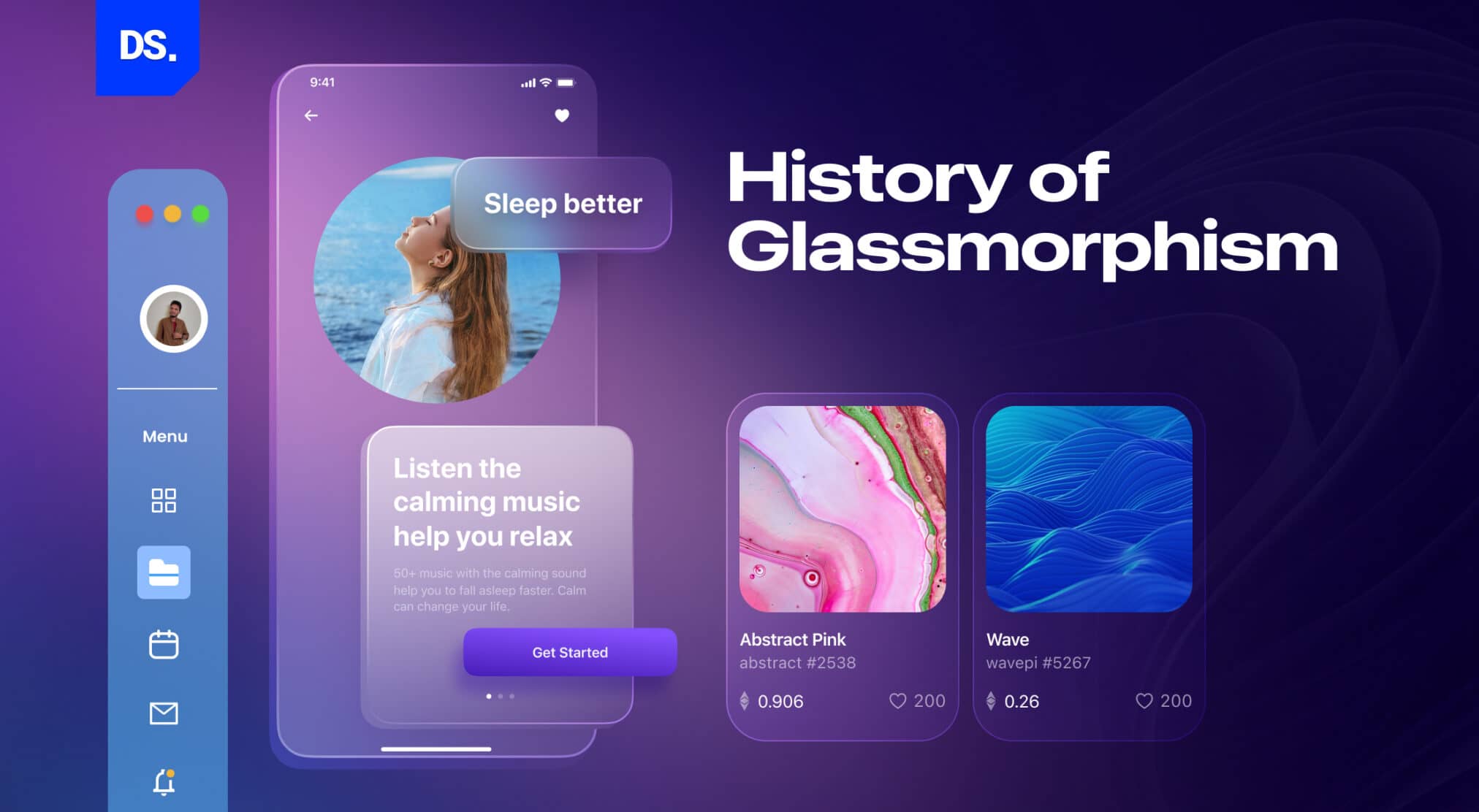
The style has roots in designs like Apple’s iOS 7 and Microsoft’s Fluent Design System. “Glass” + “morphism” = “Glassmorphism.” UI Designer Michal Malewicz coined this term.
The term “Glassmorphism” was coined in 2020 and popularized by the well-known UI designer Michal Malewicz in the same year. According to Malewicz, when users see a Glassmorphic design, they see different layers on top of each other.
Each of these layers looks like pieces of “virtual glass.” Hence, naming this design style “Glassmorphism” made sense.
But, the idea of giving UI elements a glass-like appearance dates way back to the 2013 iOS update. In this update, the iOS menu (check the previous image) was re-designed.
It now featured semi-transparent interface elements with the frosted glass effect. The seeds of Glassmorphism as a design style were planted.
Four years later, Microsoft launched the Fluent Design System: a design language for creating UIs that are visually appealing and accessible. This design system came with a background effect called “Acrylic Material.” This semi-transparent, blurred background effect was inspired by the look of glass.
Some key characteristics of this blurred background effect include:
- Semi-transparent backgrounds to create a sense of depth.
- Giving the UI elements blurred edges and other features that make them look like they are made of glass.
- Light and shadow to make the UI elements look like they are floating in space.
In other words, by using the “Acrylic Material” effect, designers could easily add Glassmorphic elements to their interface designs. Three years later, Apple launched the macOS Big Sur update and added similar translucent and glass-like visual elements to its operating system.
These changes made the OS look more modern and elegant. Pretty soon, UI designers from across the world were raving about how good glass-like visual elements looked on UI designs. By 2020, the status of Glassmorphism as a certified app design trend was solidified.
Here is a brief chart detailing the evolution of the Glassmorphism app design trend:
- 2017: Microsoft introduces the “Acrylic Material” feature in its new design language called “Fluent Design System.”
- 2020: Apple incorporates similar visual elements in macOS Big Sur. The term “Glassmorphism” is officially coined.
- 2021: Glassmorphism keeps surging in popularity among web and app designers.
- 2022: Glassmorphism is featured in a number of popular apps and websites like Canva.
In 2026 (and beyond) glassmorphism will only keep increasing in popularity. Why? Because employing this design style makes a lot of sense in a variety of scenarios.
From Glassmorphism to Liquid Glass: The Future of Transparent UI Design in 2026
As we speak, UI design is evolving, with glassmorphism leading the way. After redefining interfaces, it evolved into Liquid glass, and created a lot of buzz in the design world.
Glassmorphism is characterized by transparent layers, snowy effects (frosted surfaces), and subtle depth. Now, liquid glass adds motion, realism and dynamic interactivity into the design.
It was first introduced by Apple at WWDC 2025 and completely reimagined user interface design. The glass-like surface is accompanied by real-time reflections, responses powered by fluid motion and adaptive lighting. This move pushed us towards responsive, immersive, and context-aware UI devices.
Glassmorphism is best known for the sleek frosted look, which is achieved by blending transparency, blur, and layers of depth. In 2025, Apple pushed it further by introducing Liquid Glass, giving rise to context-aware material.
It is static and translucent, but Liquid Glass is reactive, it reacts to light, motion, and user interactions and creates an immersive experience. Due to this added benefit, it was widely adopted across Apple’s ecosystem.
Although Liquid Glass is an advanced form of glassmorphism, and glassmorphism is still alive, in fact thriving in UX design.
Future of Glassmorphism and Liquid Glass in AI & AR Interfaces
What to expect in 2026? Glassmorphism and Liquid Glass will morph and converge with AI and AR interfaces.
Designers will prioritize personalization, thus creating dynamic, adaptive UI interfaces that react to user actions
Why Use Glassmorphism in Web or App UI Design?
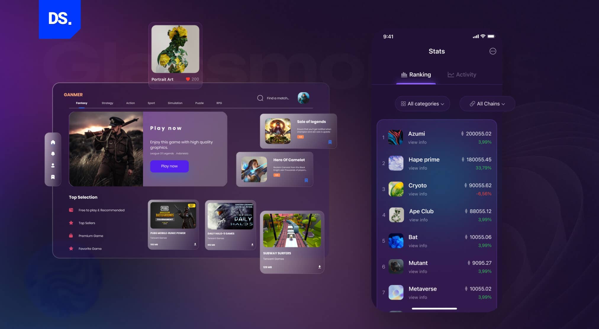
Because it’s cool! It helps create a visual hierarchy and makes the interface feel alive. It guides users visually. It stands out from flat designs. The frosted glass effect makes important elements, like a login card, stand out.
i. Adding Visual Hierarchy
Glassmorphism can be used to create a sense of depth in an app UI. This sense of depth adds visual weight to certain interface elements. Hence, a visual hierarchy can be formed by using Glassmorphic effects.
For example, you can make a button stand out from the background in an interface by giving it a Glassmorphic effect.
ii. Highlighting Content
Glassmorphism can be used to draw attention to important content sections. For example, you can make a notification appear as if it is floating above the background.
iii. Designing Onboarding Screens
Since Glassmorphism gives users a sense of depth, visual appeal, and immersion, it is ideal for designing onboarding screens for mobile apps. Here is an example:
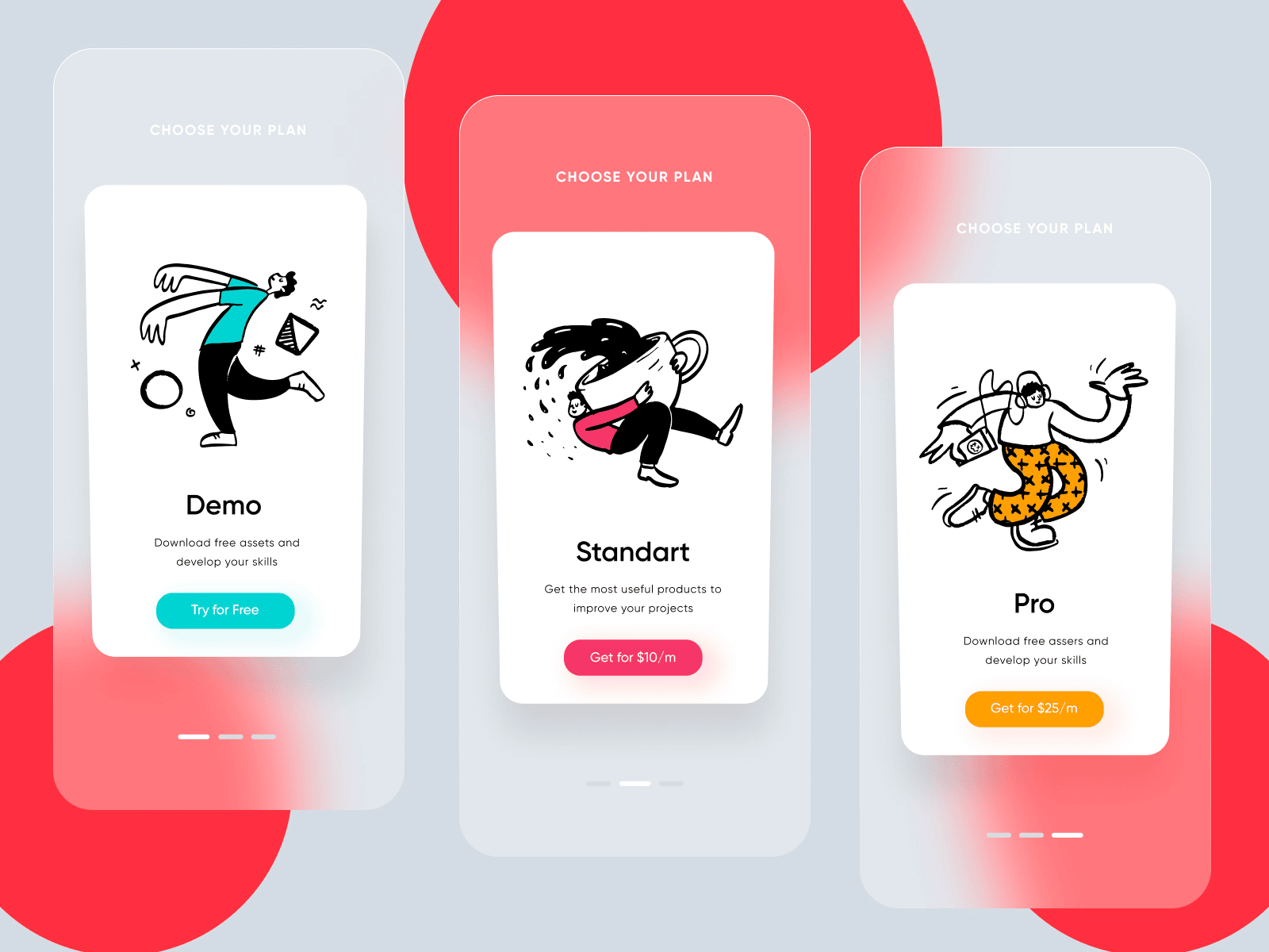
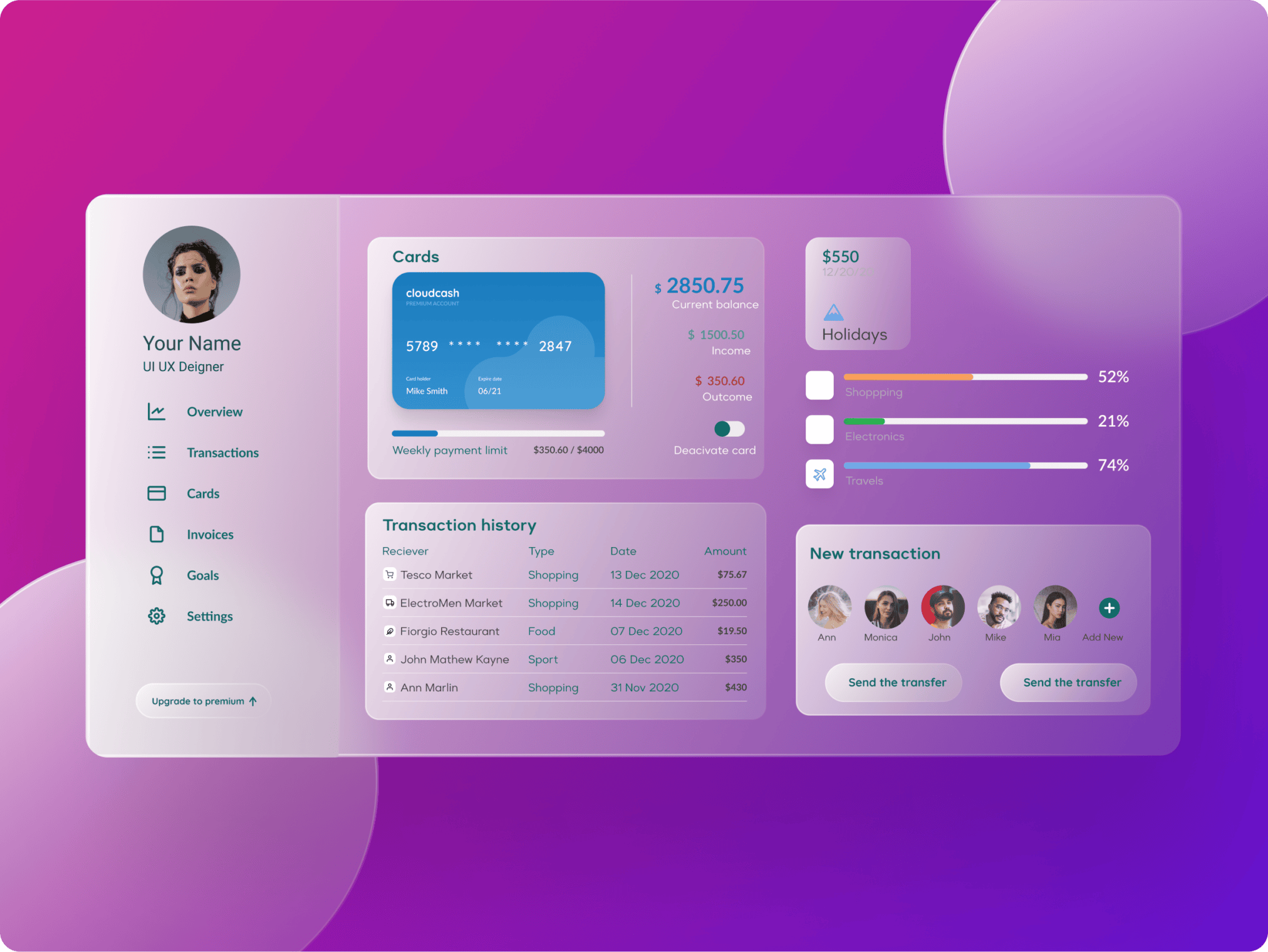
iv. Designing Dashboards
Picture a translucent dashboard that appears to be floating on a colorful background. Sounds visually stunning, right? It is. When glassmorphism is used to design dashboards in apps, it makes them visually striking and easier to scan. Here is an example:
Conclusion
Overall, Glassmorphism is an ultra-versatile design style that has many use cases. It has also become a noticeable part of web design trends, especially in interfaces that prioritize visual depth and engaging user experiences.
It can be used to create engaging and interactive interfaces. Aspects of this design style can also be used to create various effects in UI and web design.
If you’re interested in implementing Glassmorphism or other design trends, our UI/UX Design Agency can help, you can also look into neubrutalism web design trend for a different approach that emphasizes bold, raw aesthetics. We hope that this article was helpful in breaking down the key aspects of the Glassmorphism design trend!
FAQs
What is glassmorphism in UI design?

It’s a modern UI style. It makes UI elements look like frosted glass. They float over a colorful but blurry background. This creates a sense of depth.
Why is glassmorphism popular in 2026?
It looks fresh. It looks futuristic. It helps organize complex information in dashboards. It makes UIs easier to read. Plus, big tech loves it.
What are the key principles of glassmorphism design?
Frosted UI layers. Bold color backgrounds. Soft shadows that help define the design elements. Thin borders.
Where is glassmorphism used in web or app design?
Dashboard cards. Mobile widgets. Login screens. It is great for any element you want to visually ‘lift off’ the page and give extra prominence.
Glassmorphism vs Neumorphism - What is the Difference?
Neumorphism means using soft shadows to make flat UI elements look like they’re floating. Glassmorphism is about making flat UI elements appear alive.