


Muted Colors in Web Design: What They Are, Uses & Examples



Muted colors are desaturated tones created by blending bright hues with gray, white, black, or complementary colors. They bring balance, calm, and focus to web design by toning down visual intensity.
Muted Colors in Web Design: Why Soft Tones Dominate Modern UI
Here’s a funny thing about design, sometimes the loudest message comes from the quietest color.
Scroll through today’s top websites, and you’ll notice a calm confidence: gentle grays, faded teals, and soft pinks instead of the old neon blues. Designers have realized something important, users don’t want their screens screaming at them.
Muted color palettes aren’t just a trend; they’re a reaction to overstimulation. When everything online fights for attention, subtlety suddenly feels luxurio
The Quiet Power of Muted Tones
Imagine visiting a site late at night. The screen is pure white, the CTA glows like a signal flare, and every hover flashes. Within minutes, your eyes plead for mercy.
Now picture that same layout reimagined with gentle slate, warm greige, and a blush accent. It feels like stepping from a concert into a cozy café.
That’s the gift of muted colors—they don’t shout; they listen.
When we tried this for a client’s prototype last year, the user feedback made me smile:
“I could browse longer without getting tired.”
“It feels so calm—it makes me trust the brand more.”
That’s when it hit me. Muted tones aren’t just aesthetic. They change how people feel and focus.
In this article, we’ll explore:
- What muted colors are (and what they’re not)
- Why they work so beautifully in UI design
- Mistakes that ruin muted palettes
- Step-by-step process to build your own
- Real-world brand examples
- Muted color trends
- When not to use them
- Tips, FAQs, and final takeaways
Let’s turn down the volume—and make your design speak softly but clearly.
What Are Muted Colors?
The Simple Definition
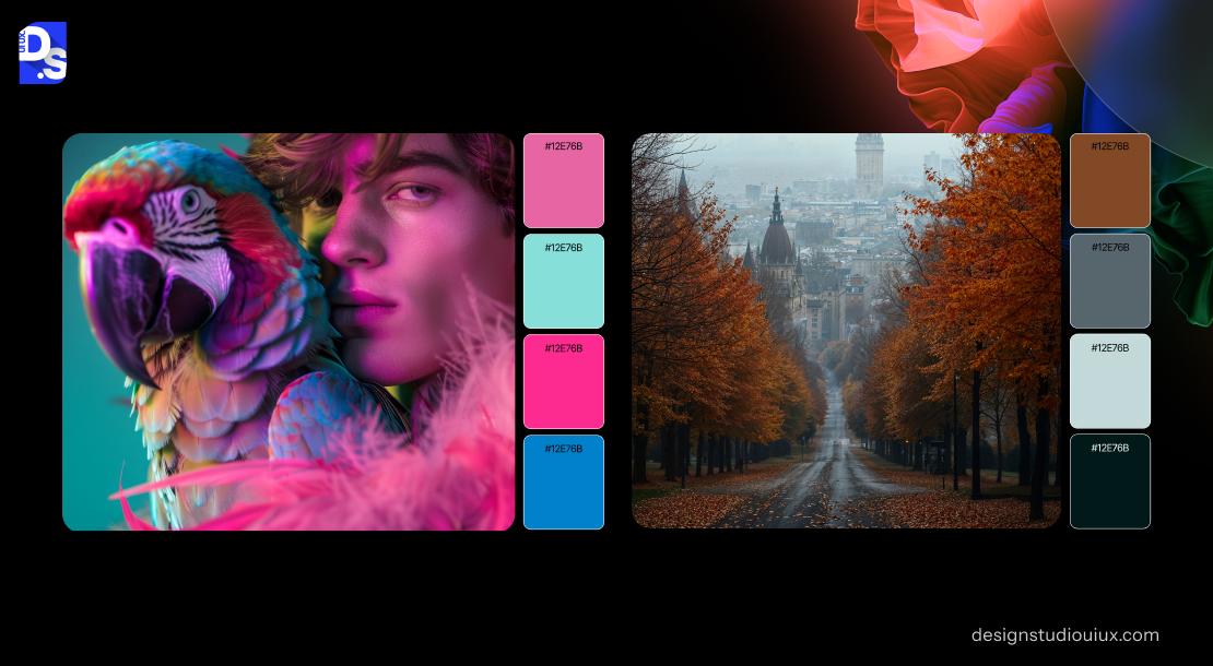
A muted color is basically a tone that’s taken a deep breath. You start with a bright hue, then ease off its intensity by adding a touch of gray, white, black, or even its opposite on the color wheel.
If pure blue is an ocean wave at noon, muted blue is that same sea at dusk—calmer, softer, still beautiful.
What separates muted from pastel? Pastels are airy because they’re mixed with white. Muted colors can be dark or light—the defining feature is desaturation, not brightness.
Designers sometimes call them subdued, washed, or low-key tones. Whatever the term, the goal’s the same: elegance without exhaustion.
How Designers “Mute” a Color
Let’s get hands-on for a second. Here’s how I typically do it:
- Add gray: It’s the safest way to dull vibrancy without changing hue.
- Mix complementary colors: A drop of orange tames blue; a dash of green softens red.
- Blend with black or white: Black adds depth; white adds air. Both reduce glare.
- Apply transparent layers: A white overlay at 10–20% opacity can “quiet” a color instantly.
- Adjust in Figma or Photoshop: That saturation slider is your best friend—move it left until your color stops shouting but still speaks.
And always—always—test it on multiple screens. What looks calm on your monitor might look muddy on someone else’s.
Muted vs. Vibrant vs. Neutral
To keep it simple:
- Vibrant colors grab attention—great for ads, bad for reading long content.
- Muted colors guide attention—perfect for building trust and readability.
- Neutrals support everything else—they’re the blank space in your symphony.
Muted colors sit comfortably between the two. They have character, but they’re polite about it.
Why Use Muted Colors in Web / UI Design?
Muted tones do more than look good—they make your site feel right. Let’s unpack why they’ve become the backbone of so many clean, high-converting interfaces.
Visual Comfort: Let Users Breathe
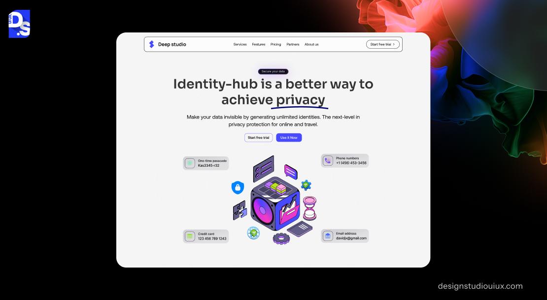
Bright colors may look lively but can exhaust users over time. Muted palettes invite people to linger.
It’s like soft lighting in a café—you stay longer without realizing it.
This is crucial for content-heavy sites like blogs, dashboards, or learning platforms. The longer someone stays, the deeper they engage.
Subtle Hierarchy & Focus Control

Muted palettes give you control. You can reserve saturated hues for what matters—buttons, CTAs, alerts—while the rest of your UI stays quietly organized.
It’s a simple, elegant way to direct attention without shouting.
To understand this balance better, check our post on how to build visual hierarchy for stronger UX design.
Emotional Tone & Branding
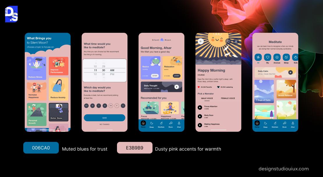
Color psychology isn’t fluff—it’s science. Muted blues convey security; sage greens feel natural; dusty pinks feel personal.
If you’re designing for a brand that values calm confidence or authenticity, these tones speak the right emotional language.
Explore more in discover how color psychology influences web design decisions.
Staying in Tune with Design Trends
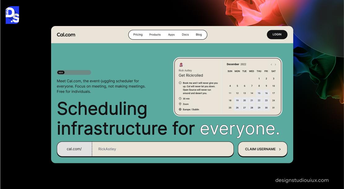
Today’s web design trends favor longevity over flashiness. The days of rainbow gradients and neon overload are fading.
Muted color systems communicate stability—a trait audiences associate with professionalism.
Want to see where this shift fits in globally? Read modern web design trends.
Reduced Visual Noise
A muted interface steps out of the spotlight so your content can shine. Text reads cleaner. Images feel richer.
It’s not just minimalist—it’s mindful.
Common Pitfalls & Accessibility Challenges
Of course, muted doesn’t mean easy. Many designers go too soft and lose contrast or clarity. Here’s how to avoid the usual traps.
Weak Contrast
Low contrast can destroy usability. Muted backgrounds with muted text = tired eyes.
Always check ratios. WCAG suggests at least 4.5:1 for body text, 3:1 for large headings.
If a combination fails, darken the text slightly or brighten the background. Small tweaks preserve both mood and accessibility.
Flat or Lifeless Layouts
Over-muting everything can make your interface feel faded.
To avoid that:
- Add texture or grain for tactile warmth.
- Keep one or two vibrant colors for highlights.
- Mix light and dark muted tones for depth.
Balance serenity with spark.
Color Blindness
Some muted pairs (like sage vs. gray-green) can look identical for color-blind users.
To fix this, rely on luminance and shape cues, not hue alone. Use icons or underline patterns where meaning matters.
Mood Mismatch
If your brand is bold, playful, or energetic, muting too much might flatten its personality.
Use muted colors for backgrounds, but keep the spirit alive with dynamic accents.
Light vs. Dark Mode
Muted colors behave differently in dark environments—they can lose energy fast.
Always test across both themes.
For practical tips, see best practices for dark mode UI design.
How to Build a Muted Color Palette (Step-by-Step)
Creating a muted palette sounds simple, but it’s one of those things that separates good design from great design. The difference lies in subtle decisions—how much gray you add, how tones interact, and how your palette feels across devices.
Below is the practical framework I use when crafting muted color systems for web projects.
Start with Your Brand’s Core Hue
Every muted palette begins with a single bold color—the one that defines your brand personality.
Maybe it’s a turquoise that feels refreshing, or a warm maroon that feels grounded. This becomes your anchor hue.
Once you’ve chosen it, the rest of your palette revolves around how you soften and support it.
Desaturate with Care
This is where the magic happens. Start adjusting saturation levels until your color calms down but doesn’t lose life.
You can do this by:
- Adding gray to quiet the hue
- Mixing its complementary color (like green with a touch of red)
- Blending in white or black for tone control
Here’s a real example:
Bright teal (#009688) → Muted teal (#637D7A)
It still says “teal,” but now it feels more sophisticated, less digital.
Build Tints and Shades
Don’t stop at one color. Create lighter and darker variants of your muted hue.
These help you build hierarchy—backgrounds, hover effects, card containers, etc.—without introducing too many unrelated colors.
This step also makes your design more cohesive across sections and devices.
Add Neutrals for Balance
Muted palettes breathe best when paired with neutrals. Think warm beige, greige, soft white, or charcoal gray.
These neutrals act as “quiet zones,” allowing other tones to stand out subtly without overwhelming the viewer.
In our studio, we call this “visual breathing space.”
Introduce an Accent (But Just One)
A muted palette doesn’t mean no energy. Choose one accent color—something slightly bolder—to break monotony.
This accent might power your CTAs, highlight links, or reinforce interaction feedback.
Remember, the point of an accent color is to lead the eye, not distract it. That balance becomes much easier when your hierarchy principles are clearly defined from the beginning
Test in Context
Never trust a color swatch alone. Drop your palette into an actual mockup—cards, buttons, hero sections.
Test how it feels, not just how it looks.
Does your text still stand out?
Does the overall tone feel on-brand?
If anything looks off, adjust until it feels cohesive.
Review and Refine
Finally, check your palette across screens, browsers, and lighting conditions. Muted tones can appear warmer or cooler depending on display type.
Iterate until it feels balanced, not bland.
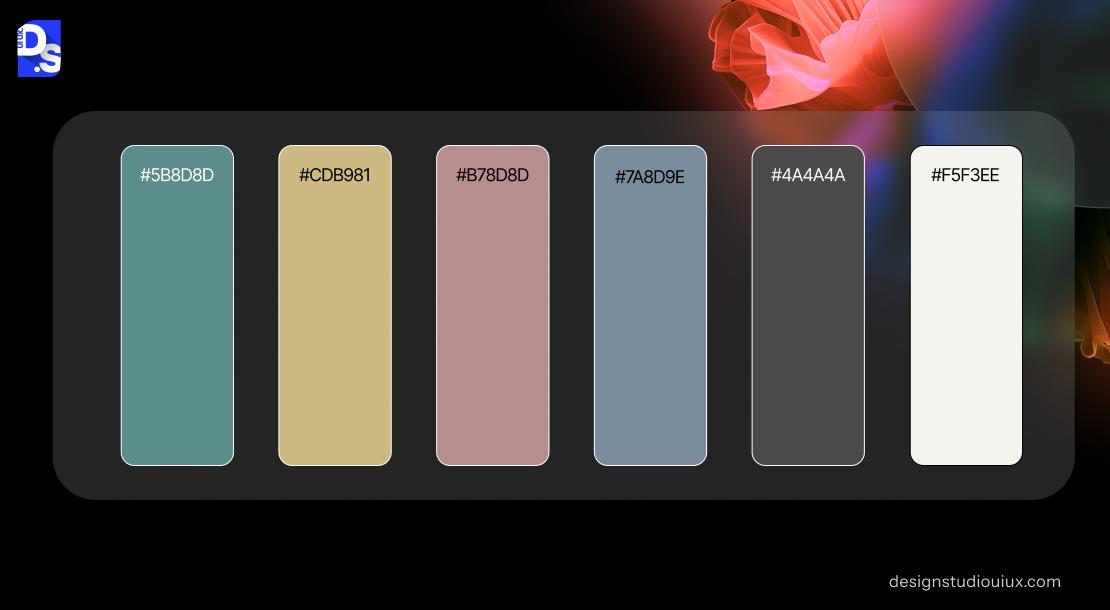
Example Muted Color Palette
Here’s a sample muted UI palette you can adapt:
| Color Name | Hex | Usage |
| Muted Teal | #5B8D8D | Card backgrounds, UI base |
| Warm Greige | #C9C5BA | Neutral background, section filler |
| Dusty Rose | #B78D8D | Soft accent, hover states |
| Slate Blue | #7A8D9E | Secondary components |
| Charcoal Muted | #4A4A4A | Text and navigation |
| Cream Off-White | #F5F3EE | Page background, contrast base |
💡 Tip: Muted colors shine when paired with typography that complements them—fonts with clean geometry or soft humanist details work beautifully.
If you want visual inspiration, explore examples of minimalist website design done right.
Real-World Examples & Mini Case Studies
Theory is one thing, but seeing muted colors in action helps the concept click. Let’s look at a few well-known brands and one of our own projects.
Airbnb – Calm, Welcoming, and Warm
Airbnb is a masterclass in using muted palettes. Their blend of cream backgrounds, pale pinks, and coral accents feels approachable yet aspirational.
Notice how the UI almost disappears, letting photos tell the story. That’s the beauty of restraint.
Notion – Productivity Meets Simplicity
Notion’s design philosophy is simple: stay out of the user’s way. Their muted gray interface lets typography and structure guide focus.
Every shade feels intentional—just enough contrast, never shouting for attention.
It’s minimalism with a heartbeat.
Our Studio’s Wellness Project
We once worked with a wellness brand whose site was full of bright greens and yellows. It looked lively but chaotic.
During usability testing, most users said:
“It feels a little harsh on the eyes.”
So, we softened the palette:
- Bright green became sage
- Yellow turned into warm beige
- Added a muted terracotta for highlights
The outcome?
- 18% longer sessions
- 12% drop in bounce rate
- Multiple users said the new version “felt peaceful”
That’s the power of quiet design choices.
Aesop – Organic Luxury
Aesop’s visual identity relies entirely on muted, earthy hues—olive greens, sandy browns, and neutral blacks.
Their palette feels timeless because it aligns perfectly with the brand story: natural ingredients, thoughtful craft, and authenticity.
You could call it “understated confidence”—and that’s the emotional sweet spot muted colors occupy.
For more detailed process inspiration, check our complete UI/UX design process and deliverables guide.
Muted Color Trends for 2026 & Beyond
Muted colors are here to stay, but the way designers use them is evolving.
Let’s peek at what’s coming next.
Muted + Micro-Neon Combos
A surprising new trend is blending muted bases with micro pops of neon—like a soft gray interface with a sliver of bright coral underline.
It gives energy without clutter.
Organic and Earth-Based Tones
As sustainability takes center stage, designers are leaning into clay, terracotta, olive, and ochre.
These hues feel grounded and connect digital experiences to natural warmth—almost like bringing tactile textures into pixels.
Adaptive and Responsive Color Systems
Dark mode isn’t optional anymore. Expect adaptive systems where muted light and dark variants coexist—each optimized for visibility and contrast while keeping the same emotional tone.
AI-Generated Muted Palettes
Design tools are getting smarter. Figma, Adobe Firefly, and similar platforms now suggest muted versions of your brand colors based on your UI context.
It’s faster, and surprisingly accurate—great starting points for experimentation.
Soft Gradients and Subtle Texture
Flat colors are fading. Expect designers to introduce paper grain, noise overlays, or fabric-inspired gradients that keep muted palettes from feeling static.
For a wider look at how this fits into modern interface styles, check out latest web design trends shaping digital aesthetics.
When Not to Use Muted Colors (Know the Exceptions)
Muted tones can make a digital experience feel elegant and mature, but they’re not a silver bullet. Like any good design decision, context is everything.
Here are moments when subtlety might actually hurt your message.
When You Need Instant Attention
Muted colors are soothing, but sometimes you need to shout.
Think of gaming websites, eCommerce sales, or festival campaigns—here, color has to grab you in the first two seconds.
If you mute everything, the brand energy disappears before it even begins.
In short: don’t whisper when you need a cheer.
For Young, Energetic Brands
Youth-oriented brands—especially those targeting Gen Z—often thrive on color vibrancy. These audiences connect with playful, saturated, and expressive tones.
A completely muted palette might feel too corporate or distant.
A good compromise? Use muted tones for structure and vibrant accents for flair.
When Function Depends on Color
Dashboards, trading platforms, or analytics tools rely heavily on color cues.
If you mute reds and greens too much, critical alerts can blend right into the background.
In such cases, clarity beats calm—make sure function stays visible.
When Your Brand Is Naturally Bold
Some brands are built on energy—fashion labels, sports brands, entertainment platforms.
Muting their identity would be like turning down the volume at a concert.
Use restraint wisely; not every story should be told in a whisper.
Color-Only Communication
If your interface depends solely on color to convey information (status indicators, health levels, progress bars), muted palettes can backfire.
Always combine color with icons, shapes, or motion for clarity.
Actionable Tips + Best Practices
Designing with muted tones is equal parts art and testing.
Below are field-tested tips we follow at the studio whenever we build muted color systems for clients.
- Design in context, not isolation.
Always test your palette inside mockups—headers, buttons, cards, and form fields. Colors behave differently in motion and layout. - Keep at least one vibrant anchor.
One strong accent color (like coral or gold) gives your palette rhythm and hierarchy. - Test for accessibility.
Use tools like Stark or Colorable to verify WCAG contrast. Muted doesn’t mean unreadable. - Mix texture with tone.
Subtle shadows, gradients, or background grain can add warmth and realism. - Audit across devices.
Muted palettes can shift slightly warmer or cooler between displays—always preview on multiple screens. - Document your palette.
Save your muted tones as design tokens or variables in Figma or your CSS system. That consistency saves hours later. - Trust your eyes, not just the numbers.
Color theory helps, but gut instinct often finishes the job. If something feels off, it probably is.
For a broader design foundation, you might also want to read core principles behind effective website design.
Summary & Wrap-Up
Muted colors aren’t about playing it safe—they’re about creating digital experiences that feel calm, thoughtful, and genuinely human.
They reduce visual noise, encourage reading, and make users stay longer without even realizing why.
In a world of visual chaos, restraint has become a form of confidence.
Let’s recap the essentials:
- Start with one core hue and desaturate gently.
- Layer neutrals and tonal variations for flexibility.
- Use one bold accent for energy.
- Test for contrast, context, and emotion.
- Adjust across devices and modes.
Muted colors work because they respect the viewer’s eyes and emotions. They don’t scream; they invite.
If you’d like to explore how muted palettes can strengthen your digital presence, our studio can help you design with intention and subtlety.
For deeper implementation details—tokens, systems, and scaling—check our full UI/UX design ultimate guide.
Let’s Design Your Calm, Confident Web Presence
Your website doesn’t have to shout to stand out.
At Design Studio UI/UX, we craft modern digital experiences using color psychology, clean design, and usability-first thinking.If you’re planning a redesign or want to refresh your brand palette, we’d love to collaborate.
👉 Schedule a call and let’s build something subtle, elegant, and unforgettable.
FAQ’s -Muted Colors in Web Design
What makes a color “muted”?

It’s simply a color with reduced intensity. Think of it as turning down the volume on brightness—adding gray, white, or black to mellow the hue.
Are muted colors better for readability?
Often yes, especially when paired with strong text contrast. They reduce strain for long reads, but still need testing for accessibility.
Can I mix muted and vibrant colors?
Definitely. The best designs use contrast—muted backgrounds make vibrant accents shine.
Do muted tones work in dark mode?
They do, but you’ll need to increase brightness slightly. Dark backgrounds tend to swallow low-saturation hues, so push them up a notch.
How many colors should a muted palette have?
Keep it lean: 5–7 tones—one base hue, two neutrals, one or two accents, and tonal variants. Simplicity equals clarity.