Data Visualization UX Best Practices (Updated 2026)



What is Data Visualization in UX Design?
Data visualization in UX design is the process of converting large datasets into easy-to-understand presentations through charts, graphs, heatmaps, and interactive dashboards.
UX teams must possess the critical skills to process huge volumes of data, and clearly present it to stakeholders and consumers.
MIT in a 2024 report mentioned that the human brain can process visuals almost 60,000 times faster than text, making images the best communication medium for expressing data-based design decisions.
Seven core principles guide effective data visualization:
- Identify the purpose of data visualization, whether it should cover trends over time, part-to-whole relationships, distribution, comparison, or correlation.
- Match visualization complexity to your readers’ expertise level.
- Choose a chart type based on the specific data relationship.
- Remove all distracting gridlines, labels, and decorative elements.
- Prioritize honesty and transparency, avoid distorted scales, outlier omission, or misleading color coding.
- Use consistent fonts, colors, and layouts throughout every visualization.
- Apply qualitative, sequential, or divergent palettes based on the data type.
Why UX Designers Prefer Data Visualization
- Raw datasets, tables, and logs are difficult for non-experts to interpret.
- Data visualization simplifies data analysis by converting raw data into visuals that are easier for the human brain to process, a principle also supported by IBM’s Data Visualization Basics.
For example, a professional UI designer might use a line chart to compare the fulfillment ratings of different user groups. Performing the same task by reading spreadsheets, tables, and other raw data would take significantly more time and effort.
Key industry data supporting data visualization in UX:
- Nielsen Norman Group (NN/g) identifies data visualization as one of the most effective strategies to communicate complex information to non-technical teams, minimizing risks of misrepresentation by 43%.
- Users retain 65% of information when paired with relevant visuals, compared to only 10% from text-only content. (Brain Rules)
- Data-driven companies that use visual analytics tools are 5x more likely to make better and faster decisions than their peers.
What are the UX Best Practices of Data Visualization
The seven data visualization UX best practices include:
- Specifying visualization objective over a chart type
- Understanding audience expertise
- Selecting the right chart type as per data relationship
- Removing decorative and redundant elements
- Maintaining data honesty and transparency
- Keeping font and color systems consistent throughout the visualization
- Keeping color palette consistent for qualitative, sequential, and divergent data
All these practices play a role in removing misrepresentation and improving comprehension.
1. Define the Purpose of Data Visualization
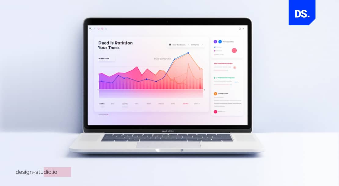
Data visualization must serve a clear objective, such as showcasing trends over time, demonstrating part-to-whole composition, inspecting data distribution, comparing values between groups, or understanding the correlation between variables.
The chart type depends on the purpose: a line chart or bar chart works for trends, while correlations are best represented by scatter plots or heatmaps.
Any mismatch between the purpose and the chart type can lead to data misinterpretation.
Typically, professional UI/UX designers use data visualization to achieve any one of these five objectives:
- Communicate Trends and Changes Over Time: Designers use data visualization to show how a particular dataset/s has evolved over time. For example, if we have a dataset that logs the sales of an app subscription over time, we can use a line/bar chart to visualize this data and identify patterns/trends that would otherwise be difficult to see in a raw dataset.
- Illustrate Part-to-Whole Composition: Designers use data visualization to illustrate how individual parts contribute to a whole.
- Examine Data Distributions: Data visualization can also be used to examine how data is distributed across different dimensions (time, space, and other variables).
- Compare Values Between Different Groups: UX designers often use data visualization to compare values/figures between different data groups, underlining similarities/differences between different groups.
- Explore Correlations Between Different Variables: Data visualization can also be used to explore correlations between different data variables.
| Purpose of Data Visualization | Why Is It Important for UX Designers? | Examples of UX Designers Using this Technique | Ideal Visualization Technique | Best Practice for UI/UX Designers |
| Communicate Trends and Changes Over Time | Used to illustrate patterns and trends in specific datasets over time. UI/UX designers use this to show how seasonal cycles affect products’ sales and revenue streams. | Track how many users sign up for a new app feature each monthMeasure time users spend on a particular web pageMonitor the frequency of bugs reported over a year | Line charts, Bar charts, Column charts | X-axis = time. Y-axis = UX performance metrics being tracked. |
| Illustrate Part-To-Whole Composition | Compares each component’s contribution to the whole dataset. In pie charts, each slice represents a fraction of the whole. | Display % of users who regularly use different product featuresVisualize the market share of different apps in a specific niche | Pie charts, Donut charts, Sunburst charts, Marimekko charts, Waffle charts, Polar area charts | Each of these slices should add up to 100% |
| Examine Data Distributions | Identifies how data is distributed across different dimensions, categories, or groups, e.g., sales across age groups, income levels, and locations. | Identify common error messages users encounter in an appAnalyze the distribution of time visitors spend on different website sections | Scatter plots, Histograms, Box plots | X and Y axes should represent the data variables being compared. |
| Compare Values Between Different Groups | Identifies differences and patterns between different data groups. | Compare approval ratings across different user age groupsTrack performance of monthly marketing campaignsCompare users who access the app on different platforms | Bar charts, Column charts, Stacked bar charts, Stacked column charts | X-axis = different data groups. Y-axis = the metric(s) being compared. |
| Explore Relationships Between Different Variables | Identifies trends and correlations in different data variables, e.g., the relationship between ad spend and sales revenue. | Understand the correlation between user age and complications faced on an app’s interface | Scatter plots, Line charts, Heat maps | X and Y axes should each feature one of the two variables being compared. |
2. Understand the Audience

The complexity of data visualization is determined by the technical expertise of the audience.
- Non-technical associates (product managers, clients, and executives) benefit from pie charts, bar graphs, and plain-language labels.
- Technical specialists like engineers, data specialists and researchers prefer scatter plots, heatmaps, and multi-variable charts supported with dense annotations
According to a Nielsen Norman Group report, visualizations that do not match the audience’s expertise level directly lead to reduced comprehension.
When visualizing data, designers must consider their target audience:
- Who is the data visual intended for?
- What does the target audience already know about the topic?
- What kind of visualization are they likely to find engaging?
- What type of language or terminology will the audience understand?
Answering these questions helps designers to pick the right data visualization technique, where even the advanced data is simplified for users to process and understand.
It reflects why UX design is important and why the complex data must remain accessible.
3. Choose the Right Data Visualization Technique
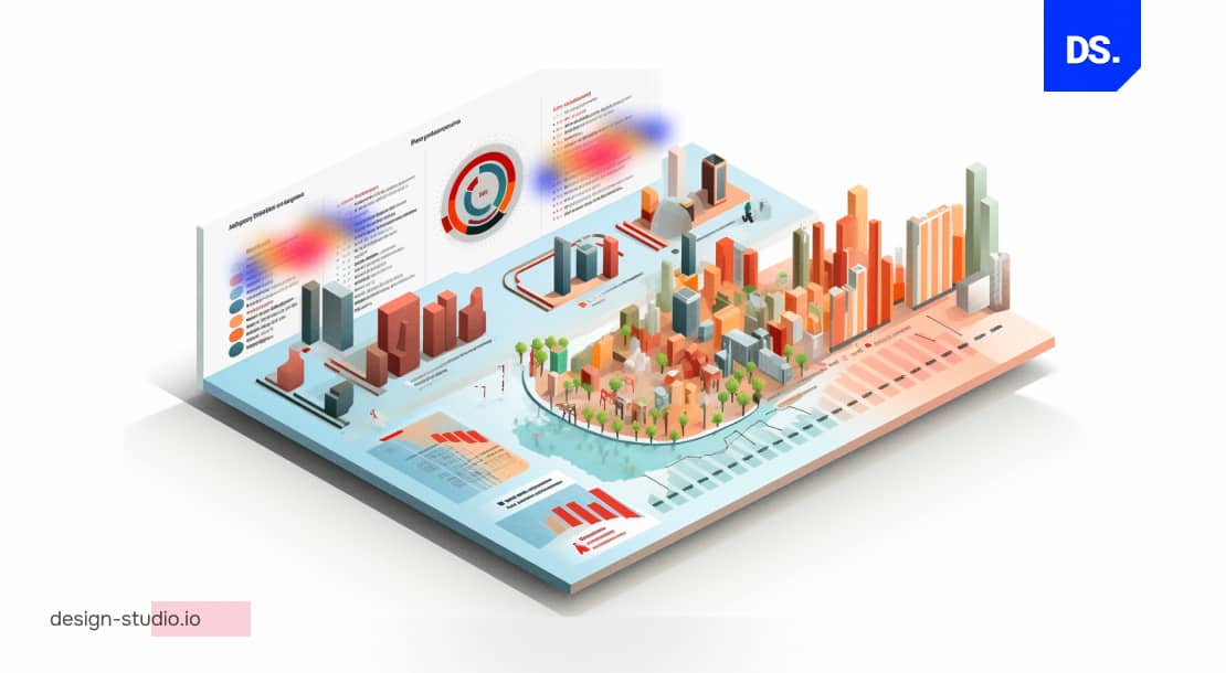
There are five core charting techniques for UX data visualization:
- Line graphs to map trends over a specific time period
- Bar charts for group comparisons
- Scatter plots to show correlation between variables
- Pie charts for part-to-whole composition (under 7 segments)
- Heatmaps to plot user interaction density on interfaces
All these chart types have their own set of pros and cons. Pie charts are not suited to indicate changes in data, and line graphs cannot be used to compare independent groups. The type of chart is dependent on the data available for communication.
Use the chart-type selector guide below to identify the right technique for each use case:
| Chart Type | Best Used For | Avoid When | 2026 Tool Examples |
| Line Graph | Trends over time | Comparing unordered groups | Tableau, Google Looker |
| Bar Chart | Group comparisons | Showing change over time with >2 groups | Power BI, Datawrapper |
| Scatter Plot | Correlation between 2 variables | Non-expert audiences without annotation | R/ggplot2, Flourish |
| Pie Chart | Part-to-whole (under 7 segments) | Showing trends or changes over time | Infogram, Canva |
| Heatmap | User interaction density on UI | Comparing exact numeric values | Hotjar, Microsoft Clarity |
| Stacked Bar | Multi-part composition + comparison | Too many stacked segments (5+) | Tableau, Flourish |
| Box Plot | Data distribution and outliers | Non-technical stakeholder audiences | R, Python / Matplotlib |
i. Line Graphs
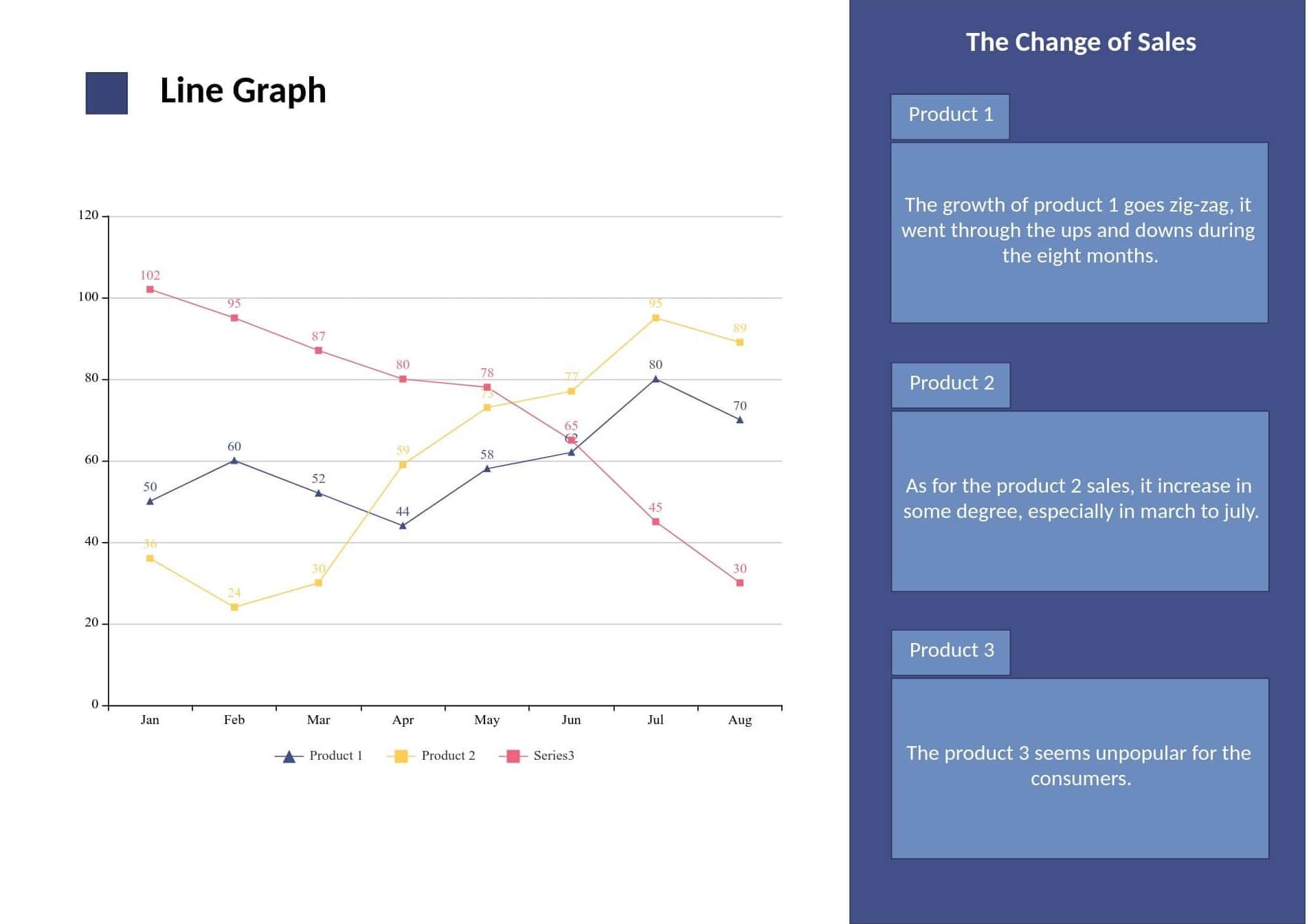
A line graph should be used when there is a time element in the data and other factors vary with time.
- Line graphs are perfect for analyzing website traffic, rate of feature adoption, and conversion trends over weeks, months, and years
- Each chart should have 4-5 lines (max) to avoid visual noise
- The Y-axis should have proper labelings (from 0), unless using a non-zero baseline is explicitly mentioned
Here’s an example of how line charts can be used to track changes in produce sales data over a specific time period:

(Source)
ii. Bar Charts
Bar charts are best suited to compare discrete quantities across different categories or groups, such as performance across user segments, feature usage by platform, or campaign performance per channel.
- Horizontal bar charts work well for non-expert audiences, especially with long category names.
- Always establish a zero baseline.
- Order categories logically, typically from highest to lowest value.
- Limit color variation to focus attention on the most important data group rather than every segment.
PRO TIP: Horizontal bar charts are easier to scan through, especially for non-expert audiences.

Horizontal and Vertical Bar Charts (Source)
iii. Scatter Plots
Scatter plots are used to understand the relationship between two continuous variables:
- Should contain clear and concise titles, labeled axes and variables
- The trend line depicts the direction of correlation
- Colored dots are used to highlight important information
While technical audiences have the skills to analyze scatter plots directly, general audience needs proper annotations and a summary in simple language to understand the correlation between the variables
Each dot represents a year of significance:

(Source)
In this scatter plot, all the dots are connected in a line. To understand the order of the key data points, follow this line. This makes it easy to understand how the relationship between driving habits and gasoline costs has changed over the decades.
Here are the ‘best practices’ designers can learn from this scatter plot:
- Use clear and concise titles for the variables.
- Clearly label the x/y-axis with the names of the variables being plotted.
- Use a trend line to show the direction of the correlation between the two variables.
- Use colors to highlight important data points.
Be careful not to overcomplicate things. The scatter plot above is obviously intended for mature audiences. If your target audience is not expert level, you’ll have to create a more simplified and concise scatter chart.
iv. Pie Charts
Pie charts are best suited to show composition, how a complete dataset is divided into distinct parts, such as the percentage of users on each platform or revenue share across product categories.
- Display a maximum of 6–7 elements, more segments make the chart unreadable.
- The slices should be ordered in a descending order, from largest to smallest, starting from the 12 o’clock position
- Decorative elements like 3D effects, shadow styling and exposed slice effects should be removed to avoid data distortion and confusion among readers
v. Heatmaps
Heatmaps are used in UX design to identify where users click, tap, scroll, move their mouse, or spend the most time on a page or interface.
- The high-engagement areas are marked in warm colors like red and orange
- On the other hand, the cool colors like blue and green are used to indicate low-engagement areas
- Heatmaps can tell where the navigation is failing, which CTAs are not performing well, and which areas of content are receiving unnecessary attention
- Hotjar, Microsoft Clarity, and Crazy Egg can be used to create heatmaps from real
4. Remove Unnecessary Elements That Could Distract from Your Purpose
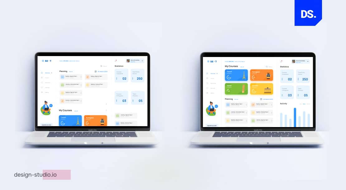
Decorative elements with no additional information or value should be removed, such as:
- Decorative gridlines
- Redundant axis labels
- 3D chart effects
- Unnecessary color variation
- Excessive legend entries
- Background images
This principle follows Edward Tufte’s data-ink ratio, using most of the ink to represent actual data. Minimalistic data visualizations help with communication and minimizing cognitive effort of users.
5. Honesty and Transparency
Proper data visualization must follow some principles to prevent misrepresentation and protect the trust of stakeholders.
- The axes of the chart should start at zero, the baseline should not be cropped, as it would exaggerate the difference between data points
- The same scales must be uniformly applied throughout the visualization
- Outlier data, one with an opposing view, should not be eliminated
- Data sources must be cited
- Color conventions should be matched with expectations and traditional conventions, such as green means positive, and red means negative, in Western conventions.
Using the wrong data visualization technique can result in loss of stakeholder trust, inaccurate product descriptions, and wrong business decisions.
Data distortion, even unintentional, may contribute to severe misinterpretation and alteration of public opinion. Therefore, the data in the visualization must be proofread before pushing it forward publication.
What Are the Most Common Data Visualization Mistakes to Avoid?
These data visualization mistakes should be avoided by every designer, such as:
- Truncating the Y-axis to overstate the difference between two data points.
- Not choosing the right chart type for a specific data category
- Using 8+ colors in a single chart, creating indistinguishable patterns.
- Missing source citations, presenting data without attribution.
- Matching visualization complexity to your own expertise rather than your audience’s.
- Not prioritizing accessibility, only using color to differentiate data, and not considering colorblind users (affecting 8% of males worldwide)
- Using too many data points to a scatter plot without prioritizing sampling or clustering, thus creating a chart with too many dots
6. Maintain Clarity and Coherency
Clarity in data visualization can be maintained through consistent fonts, chart styles, and labels across the entire dashboard.
- The audience don’t need to rethink while moving between charts
- Only two different typefaces should be used for visualization
- The color system should be same across all data points
- Chart titles must be declarative that explains the core insight, for example, ‘Mobile Conversions Increased 34% in Q1’ instead of the generic labels, such as ‘Conversion Data’
7. Use Colors That Symbolically Represent Your Data
Color plays an important role in data visualization. Color psychology design principles are applied to create emotional responses from the target audience.
When choosing the right colors for data visualization, designers must consider the following things:
- The palette should match the type of data. Green can indicate the rising graph, and shades of red can be used to represent decline in the number of subscribers
- Colors applied in the design should be distinguishable from each other
- The overall design of the visualization should be consistent. A dark-to-light color palette can explain how the data points of a scatter plot has evolved over time
- The palette should be limited, excess of colors will make the graph cluttered and harder to comprehend
The three color palettes to use for different data categories:
- Qualitative palettes are used to display categorical data with no natural order, such as product types.
- Sequential palettes are best for ordered numeric data, such as monthly revenue figures where darker shades represent higher values.
- Divergent palettes are used for data with a meaningful midpoint, such as satisfaction scores ranging from very negative to positive.
The additional rules for maintaining color accessibility:
- The color palette should be limited to 5-7 versions
- The contrast ratio should be sufficiently maintained to comply with WCAG 2.1 AA guidelines (minimum 4.5:1 contrast ratio for text)
- Color-blindness test should be performed through tools like Coblis or Color Contrast Analyzer

Qualitative, Sequential, and Divergent Color Palettes (Source)
After creating data visualization, don’t forget to test it with your target users and stakeholders. Make your work public only if they say that the visualization clearly paints the data-backed narrative that you intended to paint.
What Are The Emerging Data Visualization UX Trends That Will Define 2026?
The five defining data visualization UX trends of 2026 are:
- AI-powered personalization adapts to user behavior and role
- Embedded data-based design means live analytics across product interfaces
- Accessibility-first visualization through WCAG-compliance contrast ratios, text alternatives, and keyboard navigation
- Microinteractions such as hover effects, animated transitions, and interactive drill-downs are replacing static content
- Narrative data visualization involves visual cues and written context guiding users through the data platform
i. Personalization Powered by AI
AI-powered personalized data visualizations include dashboards that adjust as per chart type, density of data, annotations, user roles, history, and behavior.
- A CFO and a UX researcher will work with different data hierarchies, chart types, or depth of details
- Gartner predicts that by 2028, 60% of existing dashboards will be replaced by Gen AI-powered narrative and visualization.
- AI adoption denotes a trend, the trend of moving away from one-size-fits-all static reporting
This massive shift is driving the enterprise transition toward AI-adaptive dashboards and interfaces that abandon static views in favor of real-time, automated storytelling.
ii. Data-Based Design
Data-based design embeds live analytics on the product’s UI, instead of adding it in a separate analytics tab.
Some examples:
- Real-time engagement metrics on social posts
- Live pages containing A/B tests results as overlays
- In-app dashboards that shows updated data of user interaction
This bridges the processes of data collection and formulating design response, helping UX teams to make evidence-based decisions within a short period of time (hours instead of weeks).
iii. Design Accessibility
Accessibility in data visualization ensures that visually impaired users, those with color blindness, or users with cognitive differences can easily read charts and graphs.
The best practices for modern enterprise web design include:
- WCAG 2.1 AA contrast ratios should be followed, which is 4.5:1 (minimum) for text to be exact.
- Visual content should be accompanied by alt text and data tables
- All interactive visualizations should be supported with keyboard navigation
- Never rely on color alone to express meaning.
In 2026, accessibility compliance is increasingly a legal requirement, not just a design recommendation, across the EU, US, and UK.
iv. Micro-interactions
Microinteractions turn plain, static data into interactive experiences. Some examples include:
- Hover state to reveal data on demand
- Animated transitions that reveal real-time updates
- Dashboards supported with click-to-drill-drown functionality
- Progressive disclosure that reveals the summary first, and then the additional details on demand
These features enable non-technical users to control data presentation without causing cognitive effort.
v. Narrative
Narrative data visualization or data storytelling uses visual data and clear annotations, contextual explanations, and logical step-by-step flow to guide them through the data.
This leaves no room for viewer interpretation, and instead, provides direct answers to questions related to “so what?” reasoning.
Research from Stanford indicates that wrapping data in stories makes information up to 22 times more memorable than chart-only presentations, positioning data storytelling as an essential UX tool for driving stakeholder alignment.
Conclusion
Almost every company today is collecting large amounts of user-data. There’s an ever-growing demand for UX designers who can create effective data visualizations and communicate complex information in a clear and engaging way.
Hopefully, this comprehensive UI/UX design guide on the best data visualization practices helps UI/UX design professionals master the fundamentals of this essential industry skill. For more in-depth assistance on creating amazing data visualizations, contact Design Studio’s UX/UI design experts now!