

• Home
  • Blog
  • Ecommerce Website Design Best Practices
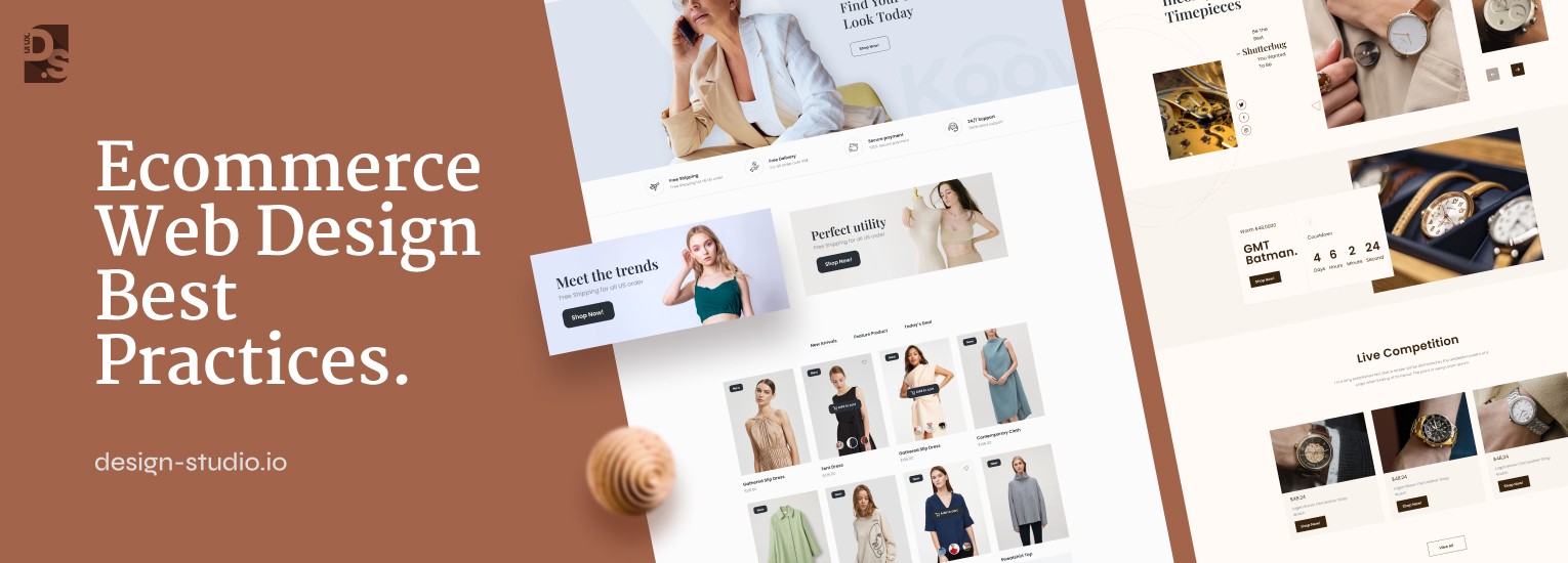
Ecommerce Website Design Best Practices 2026

Top 10 Ecommerce Website Design Best Practices in 2026

Part of our Ecommerce UX Best Practices Series

In the fiercely competitive world of online shopping, an ecommerce website design is not merely window dressing; it is a strategic weapon for securing conversions. Online shoppers have razor-thin patience for poorly designed ecommerce websites, and issues like cluttered navigation menus or arduous checkout processes can be straight-up conversion killers. 

The stakes are high, and the success of your ecommerce business hinges on a website that not only avoids design pitfalls but actively compels visitors to feel engaged and confident enough to take action, i.e., add products to their carts and complete their purchases.

So, how do you create an ecommerce website that consistently stands out and converts visitors into loyal customers? Let us explore the top 10 ecommerce website design best practices and equip you with the knowledge you need to craft world-class online shopping experiences:

Ecommerce Website Design Best Practices

Homepage Design

Ecommerce Website Homepage Design Best Practices

In the ecommerce game, first impressions are everything. And for most visitors, that first impression is developed through your website’s homepage. Think of it as your digital storefront window: it needs to be visually appealing, informative, and most importantly, guide users effortlessly towards their desired products.

In short, your homepage needs to be a conversion machine in disguise. Here are some battle-tested best practices to keep your homepage firing on all cylinders:

  • Scan-Ability: Optimize your homepage layout for easy scan-ability. Visitors shouldn’t have to wade through text walls to find what they need. Think clear hierarchy, concise messaging, and ample white space to guide the user journey.
  • Value Proposition: Deliver a clear value proposition right off the bat. What makes your ecommerce brand special? What unique online shopping benefits do you offer? Communicate this message prominently on the homepage to establish a strong first impression and set the tone for the user experience.
  • Hero Image: High-quality visuals are a must-have. A captivating hero image featuring your signature product can grab attention instantly. Think of it as your digital “shop window display.” Remember, our brains process visuals faster than text. Use this to your advantage and showcase your best offerings either with a stand-alone hero image or with a dynamic carousel of hero images highlighting products across different categories. Regularly update your carousel with new arrivals and seasonal offerings to keep returning visitors engaged.
  • Branding Consistency:  Maintaining consistency in design elements, color schemes, and brand messaging across your homepage will reinforce your brand identity and foster instant recognition among visitors. By consistently delivering cohesive brand experiences, you will be able to build trust and familiarity which will ultimately lead to stronger customer relationships. 

If your ecommerce brand has many product subcategories, do not forget to show them on your website’s homepage. This can be done by presenting the subcategories on subsequent screens or sections of the homepage.

By highlighting the different product categories on your homepage, you will make it easier for shoppers to quickly access the areas of your site that are most relevant to them. Reducing the number of steps a shopper has to take to find a product is a key conversion rate optimization (CRO) strategy for eCommerce sites.

Design for UX

Design for UX

Custom ecommerce website design is all about creating holistic experiences for potential customers. This means creating an organic, intuitive, and consistent user journey that caters to a diverse audience. It also means simplifying navigation and incorporating smart search functionalities to empower users to find what they need quickly.

By crafting such easy and engaging experiences, you will be able to forge powerful bonds with connection. We will delve deeper into specific design elements that can elevate your ecommerce UX throughout this article.  

Search Functionality

Ecommerce Website Search functionality Design Best Practices

Let’s face it: online shopping is all about convenience. While browsing categories and curated selections can be a delightful experience, the reality is most shoppers instantly resort to the search bar when they have a specific product in mind. The data is clear: studies have shown that 69% of shoppers go straight to the search bar whenever they visit ecommerce sites.

What do they do when their search experience is successful? They buy stuff. According to Forrester Research, visitors who use an ecommerce site’s search feature are two to three times more likely to convert. Here’s how to craft a search experience that empowers users:

  • Prominent Search Box: Make your search bar the hero it deserves to be. It should be prominently displayed and easily accessible, acting as a natural starting point for users embarking on their product discovery journey. Use bold borders, contrasting background colors, and large fonts to make your search bar stand out, even in visually rich environments.
  • Optimized Search Results: A well-designed search bar is of no use if the search results page is cluttered and hard to decipher. Adapting search results UX design best practices can help maintain a clean, organized layout that facilitates quick product identification and selection. Avoid visually overloading your searchers. Prioritize displaying the most relevant products or product-related information.
  • Autocomplete to the Rescue: A staggering 1-in-10 search queries online are riddled with misspellings and searches on eCommerce sites are no exception. That’s why implementing a search autocomplete feature is very important. It minimizes typos (and all the frustration that comes with them) and streamlines product discovery for users.

Pro Tip: Want to do what the leaders in the eCommerce space are doing? Go beyond basic autocomplete and leverage user data to provide relevant and useful suggestions. Also, display a list of trending searches on all search results pages.

Maintaining Visual Hierarchy

Maintaining Visual Hierarchy

In the world of ecommerce, trust is paramount. You are not just selling products; you are asking customers to hand over sensitive information. So, how do you create a professional and secure environment that fosters trust and drives conversions? Enter visual hierarchy. Think of your ecommerce site’s visual hierarchy as a roadmap that guides users on their shopping journey.

A clear and consistent structure, achieved through a well-defined visual hierarchy, empowers visitors to navigate your online store with ease. Here are some key elements your ecommerce site’s main pages must feature:

  • Prominent Branding: A prominent logo and store name at the top to establish brand identity and instill trust
  • Search & Navigation Power: A user-friendly search bar and clear, hover-based navigation menu empower users to find what they need quickly
  • Visual Cohesion: Maintain a consistent color palette, font style, and footer design across all pages for a polished and professional look
  • Contact Confidence: Display clear contact information to build user trust
  • Content Clarity: Clearly defined content areas ensure users can easily find the information they seek.
  • Footer Fundamentals: Do not neglect the footers! Include relevant information such as contact details, return policies, and social media links.

By prioritizing visual hierarchy principles and incorporating these key elements, even ecommerce web design companies create professional-looking ecommerce websites that foster trust before driving sales.

Pro Tip: Prioritize placement! Position the most important information blocks at the top of the page, ensuring easy access and engagement. Also, leverage color and trending typography strategically to draw attention to sale items or new arrivals, creating a sense of urgency and encouraging conversions on all pages.

Category Navigation Design

Category Navigation Design Best Practices

Clunky category navigation is the ultimate conversion killer. If it takes 5+ clicks for a visitor to locate their desired product, they are likely to abandon ship faster than you can say “checkout.” Here’s the secret UX design weapon: website taxonomy. Your ecommerce site’s taxonomy is the logical organization system for all products and content on your online store.

By grouping products into clearly defined categories and subcategories, you can create a user-friendly roadmap that empowers customers to navigate your product landscape with ease. Here’s how you can do that:

  • Clear Category Hierarchy: Divide your product catalog into well-defined categories and subcategories. The objective is to create a ‘taxonomy,’ i.e., a system where products are not mistakenly listed under multiple categories or wrong categories.
  • Navigation: Prominently display your category navigation system, preferably on the top or left section of your ecommerce site’s homepage. Here clarity is key; users should be able to effortlessly understand and access the various product categories and subcategories in the category navigation system at a glance. A well-structured navigation UX design ensures that customers can easily find what they’re looking for, enhancing their overall shopping experience and increasing the likelihood of conversions.
  • Minimize Navigation Layers: Smaller retailers with limited product offerings should avoid cluttering their navigation with unnecessary intermediary category pages. Sure, for retailers with extensive product catalogs, creating a multi-category website taxonomy is necessary. But, even they should avoid forcing their customers to navigate a maze of menus before finally reaching the product listing page. Offering hot-key access to all products directly from the header navigation menu is the best way to do that. It simplifies the journey for users, allowing them to discover products of interest with minimal effort.

Conducting multiple rounds of user testing is the best way to refine your navigation structure to the point of perfection.

Make Your Content Scannable

Make Your Content Scannable

Most website visitors skim, not read. Despite meticulously crafted product descriptions and informative blog posts, research shows users only engage with a fraction of the text displayed.  So, how do you communicate key information and drive sales in a world of short attention spans? Scannable content is your secret weapon.

Break up your content: product descriptions, blog posts, company information, etc., into bite-sized pieces for easy digestion. We’re talking concise, 150-character sentences, short paragraphs, strategic use of bolding for emphasis, and bulleted lists to create a structure that facilitates quick scanning and comprehension.

The more scannable your content, the higher the chance users will absorb your key messages.  Maintain a high standard of writing free from typos and misspellings to uphold your website’s credibility. Trust is key in ecommerce, and polished content goes a long way in building it.

Product Presentation

Product Presentation Best Practices

Your product pages are the digital showroom floor, and effective presentation is paramount to driving conversions and fostering customer trust. Here’s the key: design with scan-ability and user experience in mind. By optimizing product organization, imagery, and descriptions, you can create a seamless journey that empowers customers to discover and select your perfect products:

  • High-Def Hero Shots: Professional, high-definition product images are a must. Showcase your products from multiple angles to provide a clear and comprehensive view. Remember, visually appealing images build trust and confidence, ultimately leading to higher website conversion rates. Do not forget to optimize image size for fast loading times: a vital element for a smooth UX.
  • Quick Preview: One of the latest web design trends in visual merchandising is the “Quick Preview” option for product category pages. This innovative feature allows users to get a closer look at multiple products without leaving the main list, streamlining their research, particularly for mobile users. It is a great tool for empowering informed user decisions with minimal clicks.
  • SEO-Savvy Titles & Descriptions: SEO-optimized product names and descriptions aid in product discovery and improve search engine rankings. So, using clear and prominent product titles and descriptions is a must. Also, use relevant keywords and phrases logically throughout all product pages to aid discovery and improve SERP rankings.
  • Link Them Up: Visuals are powerful, but do not leave your customers guessing! Include clear links within your product images, allowing users to easily navigate to the specific products featured. This eliminates the frustration of trying to decipher where to find the items showcased in product galleries.
  • The Voice of the Customer: Harness the power of verified product reviews to build trust and influence buying decisions. Displaying star ratings and customer reviews on all product pages. Encourage user feedback by providing easy-to-use review forms that prompt specific evaluation criteria. 

By implementing ecommerce UX best practices, you can transform your product pages into conversion machines.

Optimize for Mobile

Optimize for Mobile

With smartphones driving 66% of online orders in 2023 and mobile shopping considered an ‘absolute necessity’ by 61% of US adults, it is fair to say that neglecting the mobile experience is a recipe for disaster for ecommerce brands. Failing to optimize for mobile alienates potential customers and squanders conversion opportunities.

When designing for mobile, prioritize a user interface that reflects your navigation structure. Implement a powerful search function with filtering options and a clear hierarchical menu system for extensive product catalogs. This empowers users to find what they need quickly, even on smaller screens, boosting satisfaction and conversions.

Ecommerce Shopping Cart

Ecommerce Shopping Cart Design Best Practices

We all know clunky product pages can kill a sale, but a convoluted checkout process is a close contender. The average ecommerce checkout completion rate is 46.4% (as of September 2022). If your ecommerce site is also hemorrhaging customers at such a high rate at the critical checkout stage, it is time to switch to the following practices: 

  • Less is More: A one-page checkout process is the best tool to reduce friction and minimize abrupt cart abandonment. Also, collect only ‘essential’ information required for delivery and payment. Things like account creation or loyalty program enrollments can wait; offer those things on a separate screen, post-purchase, or even include it in the order confirmation email.  The customer is more likely to complete account registration or join your loyalty program after a successful purchase.
  • Visual Cues & Strategic CTAs: Experiment with colors to subtly funnel customers through the buying process. Catch their eyes with strategically placed, crimson-colored CTA buttons and dynamic typography that draws attention to critical, purchase-related information. Make sure the ‘cart view’ and CTA buttons are prominent and visible to shoppers (preferably in the top section of the site) throughout the final stages of their purchase journey.   
  • Beyond Credit Cards: Expand your payment options to cater to customer preferences. Offering PayPal, Stripe, Amazon Pay, and other accelerated payment methods to boost user engagement, satisfaction, and conversion rates.

Remember, all design elements on the checkout pages should align with customer preferences and shopping cart UX best practices so that they don’t create roadblocks in the buyer’s journey. 

Continuous A/B Testing

In the fast-paced world of ecommerce, success hinges on constant evolution. That’s where A/B testing comes in a data-driven approach embraced by approximately 77% of major online businesses, including giants like Amazon and Flipkart. A/B testing removes subjectivity from website optimization:

  • It allows you to compare different layouts, colors, fonts, design elements, and images, quantifying their impact on user experience.
  • With A/B testing, you can target specific conversion elements like CTA buttons or product presentations and run statistically significant tests to identify the best performers.
  • You can also use A/B testing to pinpoint features that contribute to high bounce rates.
  • A/B testing new content ideas before launching paid advertising campaigns can save you time and money

By continuously testing and refining your website, you’ll lay the groundwork for sustainable growth in the ever-evolving ecommerce landscape.

Final Take

Armed with this arsenal of ecommerce website design best practices, you are now well-equipped to design a site that not only stuns visually but also converts like a champ. Remember, prioritize user experience, embrace mobile-first thinking, and leverage A/B testing to continuously optimize your online storefront!

About the Author

Sneh Sagar

Co-Founder & CTO, Design Studio UI/UX

Sneh Sagar is the co-founder of Design Studio UI/UX, a UX design agency with clientele spanning across different industries, domains, startups, companies in the growth phase, and large enterprises on a global scale. With 10+ years of experience and 350+ projects in his portfolio, he has built digital products for healthcare, SaaS, among other industries (most of them at a stage where the product no longer aligned with the business perspective). His impressive portfolio is the intersection of research, system thinking, and interface design to help teams by creating products with high usability and scalability.

Recent Articles

Looking for UX/UI research

or product branding?

user
Envelope
Phone

350+ Projects Delivered — And Counting