


Product-Led Growth UX Design: Patterns Driving Activation



Quick Summary
Product-led growth UX design uses onboarding flow structure, empty state design, and activation milestones to get users to real value without a sales demo. The flow that drives activation is short (five to seven steps), empty states guide rather than confuse, and progress markers in navigation keep users moving from signup to active use.
Product-led growth (PLG) UX design is the concept that builds interactive onboarding, empty states, and in-product moments to guide users from signup to activation entirely on their own. It is not an extra layer on top of the program; it is the complete user experience.
You can tell if a SaaS truly runs on product-led growth by looking at their initial user experience. It relies on smart design to keep users engaged from sign-up, all without a single email from a human.
Most articles on this topic explain the business strategy behind PLG: freemium pricing, self-serve signup, expansion revenue. This article shows the exact design and setup steps that make a product actually succeed with a self-serve business model. It explains onboarding process, empty state design, time-to-value engineering, and activation numbers. These details can retain modern users or help turn signups into active users.
What Is Product-Led Growth UX Design?
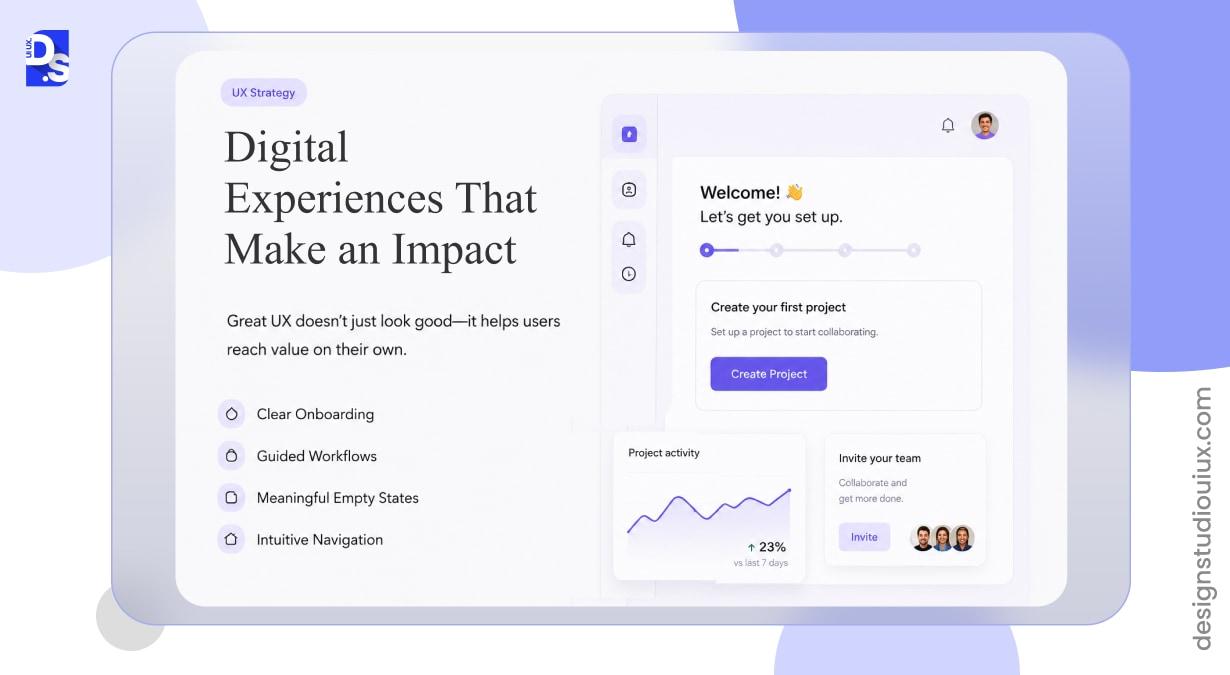
PLG UX design is the discipline of designing the onboarding process of the digital product, its empty states, navigation, and core workflows. It helps users reach value on their own, without a demo call or a rep walking them through it. General UX design checks if a tool works, PLG UX specifically designs screens to turn free sign-ups into active buyers immediately.
That distinction matters because a product can be well designed in the conventional sense, clean typography, sensible layout, accessible components, and still activate almost nobody. Activation is not a byproduct of good UI. It is the result of specific, deliberate structure: a defined “aha moment,” a flow that gets a new user to it fast, and screens along the way that never leave someone staring at emptiness with no idea what to do next.
Our breakdown of SaaS onboarding UX patterns covers how that aha moment gets defined and measured in practice, and our wider look at SaaS design principles covers where activation design fits into the rest of the product.
How to build Onboarding Flow that drives Activation?
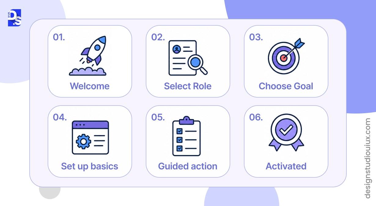
The best onboarding flow structure for driving activation is short/targeted and role-based on one guided outcome rather than a tour of every feature. Here, around 5-7 step flow is mainly recommended, as going further increases cognitive load and causes completion rates to drop.
The flow needs to ask just one or two segmentation questions via progressive profiling, immediately routing the user to a high-value action instead of explaining the full product.
This is where most PLG products go wrong. They treat onboarding as a documentation problem and try to explain twelve features in the first session. Working memory has hard limits, a finding that goes back to Sweller’s 1988 research on cognitive load, and a tour that covers everything teaches nothing. This mistake causes friction points during the vital thirty-second window when a user judges the product’s value, which usually happens before the welcome tour even finishes loading.
How Long Should a PLG Onboarding Flow Be?
Your PLG onboarding flow should be kept within five to seven steps- focused on a single outcome. If a feature is not necessary for a user to complete their task in the initial stage, you can save it for later and bring it up contextually when relevant. Do not front-load it on day one. Also, ensure there is a visible option to skip or exit the onboarding experience, particularly for experienced users who know exactly what they want, because forcing participation can even increase churn rate silently.
Should You Ask Users to Pick a Role Before Onboarding?
Yes, you should ask for a role up front if the product truly adapts and functions differently for different roles. Introducing a single well-placed question during or right after the signup flow can help you guide marketer/developer/admin toward three separate first actions instead of forcing a generic tour on everyone.
Example – onboarding segmentation used by HubSpot and Mailchimp.
This setup only delivers value if the collected answer directly changes what screens the user sees next.
How Do Empty States Drive Feature Adoption?
Empty states drive feature adoption because they turn what looks like a confusing dead end into an inviting first screen. A completely blank screen triggers the psychological response of loss aversion. This is a concept from Daniel Kahneman’s research which causes users to feel like they are missing something rather than finding an opportunity. When left alone, this confusion breeds feature blindness, where users permanently avoid that section. This contributes to SaaS product analysis data showing that a mere 20 to 30 percent of features see regular use.
Every empty state falls into one of three situations, and each needs a different treatment.
| Empty State Type | When It Appears | What It Needs |
| First-use | New user, feature not touched yet | Explain what belongs here, one clear CTA to create the first item |
| User-cleared | Inbox zero, completed checklist, cleared list | Positive reinforcement, treat it as a small win, not an error |
| No-results | Search or filter returns nothing | Suggest a next step, related content, or how to broaden the search |
What Should Every Empty State Include?
- Context: a plain-language reason the screen is empty, not a generic “nothing here”
- Guidance: one clear, single next action, not three competing buttons
- Visual weight appropriate to the space: an illustration for a full-page state, text only for a small card or tile
- Sample or demo content where possible, since showing users what “done” looks like beats asking them to imagine it
Products preloading sample data or auto-generating starter content, an approach documented in guides to PLG onboarding, can trigger user activation faster than setups offering a blank page and a lone button. The performance gap is so wide that updating these empty states represents one of the highest-leverage improvements a UX team can make during a single sprint. Our guide to SaaS dashboard design goes deeper on structuring the first screen a user lands on after signup.
How Do You Design for Time-to-Value Under Three Minutes?
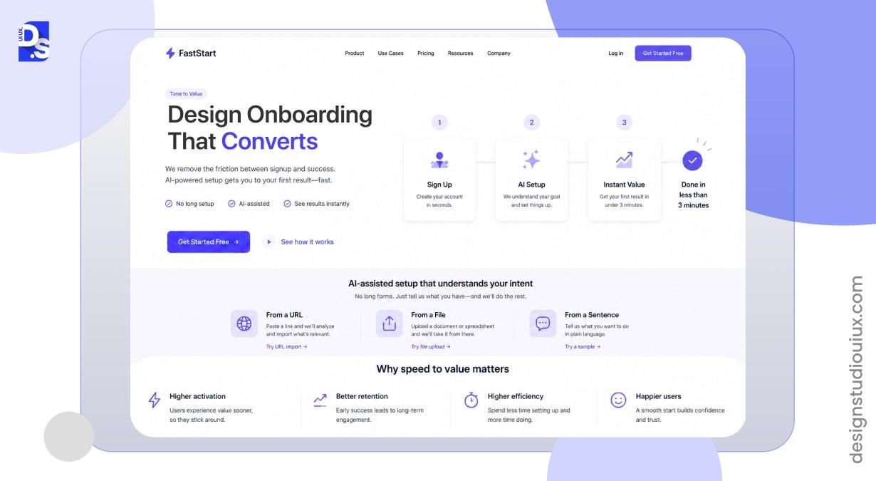
To design an experience that delivers real value under 3 minute mark, remove every unnecessary barrier right after the signup screen. Pre-fill whatever data can be inferred instead of asking for it. Push secondary configuration, integrations, team invites, notification preferences, to a later moment when the user already has a reason to care. Let AI-assisted setup infer intent from a URL, a file upload, or a single sentence instead of a ten-field form.
Speed matters more now than it did even two years ago. AI-native products have reset user expectations for how fast “getting started” should feel, illustrated by tools like Cursor, which drives time-to-first-query down to under two seconds, and a competitor whose product delivers a usable result that fast makes a five-minute setup wizard feel broken by comparison. Every field, every confirmation screen, and every “are you sure” dialog between signup and value is a place a user can decide the product is not worth the wait.
How Should Activation Milestones Be Built Into Navigation?
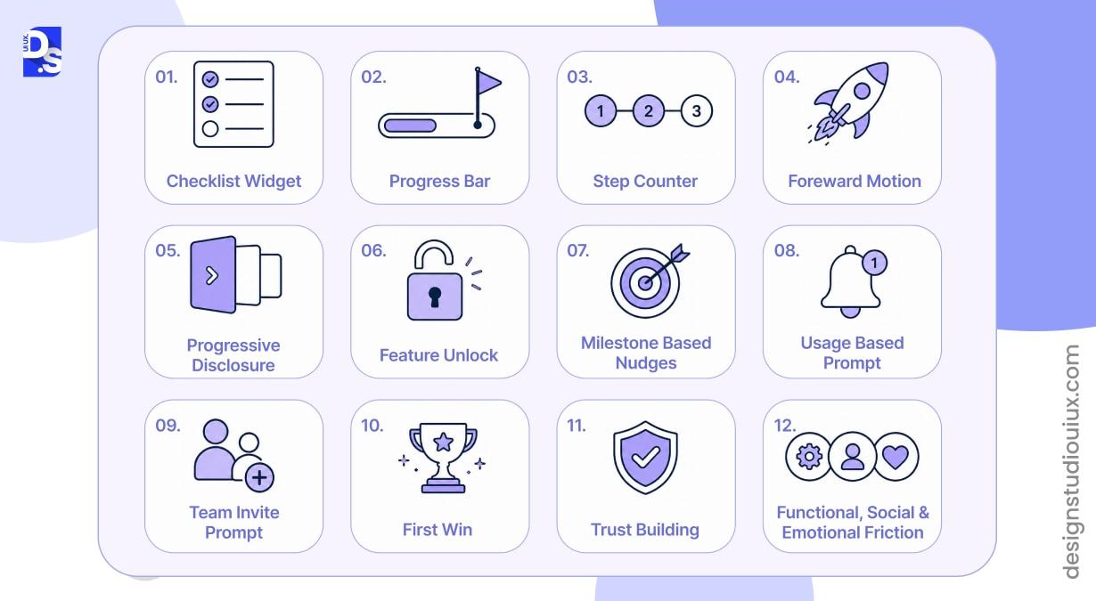
Activation milestones belong in navigation as visible, incremental progress markers, not hidden analytics events tracked only on the backend. Checklists and progress bars give users a visual push to keep exploring. This relies on the BJ Fogg Behavior Model, which proves that the right prompt in the right spot drives action. Navigation is exactly where that trigger should live.
Practical placement patterns that work well:
- A persistent but dismissible checklist widget for the first two or three sessions, not the first two or three weeks
- Progressive disclosure (PD) for secondary features, unlocking/surfacing them only after the core action is finished.
- Milestone-based nudges tied to real usage- not calendar days, since a user who is 3 actions from activation on day one deserves a different prompt than one who has done nothing after a week.
- Team invite prompts placed right after a user’s first individual win, since that is the moment they are most likely to see value in bringing in a colleague
That last point connects to a pattern worth naming directly: functional, social, and emotional friction. Functional friction is a UX problem, something in the interface blocking task completion. Social friction is a team-adoption barrier. Emotional friction is a user’s fear of recommending a tool that might embarrass them later. Fixing the UX only addresses the first one. Milestone design that pushes a user to invite teammates before they trust the product themselves is solving for growth at the expense of activation, and it usually backfires.
What UX Mistakes Kill Product-Led Growth Activation?
The mistakes that kill PLG activation are almost always the same five, regardless of product category.
- Front-loading a welcome screen full of paragraph text that gets dismissed in under a second, with no second chance to land the value proposition
- Dropping new users into a blank dashboard with zero orientation and calling it “clean design”
- Forcing a tour with no skip option, which punishes exactly the experienced users most likely to become power users
- Splitting the onboarding builder and the analytics tool, so the segments a team can target never match the segments actually driving activation
- Treating empty states as placeholders instead of onboarding surfaces, filling them with generic copy instead of guidance
How Do You Measure Whether PLG Onboarding UX Is Working?
Measuring whether PLG onboarding UX is working means tracking behavior, not just completion rates. A user can “complete” an onboarding flow and still never activate. The metrics that can actually correlate with growth are time-to-value, activation rate, feature discovery rate, and early retention.
| Metric | What It Tells You | Where to Look |
| Time-to-value (TTV) | How long from signup to first meaningful outcome | Product analytics, first-event timestamp vs. signup timestamp |
| Activation rate | Percentage of signups who complete the defined activation event | Funnel analysis tied to one clear, product-specific event |
| Feature discovery rate | Which core features new users engage with first | Event tracking on primary UI actions in the first session |
| Day-7 retention | Whether users come back after the first week | Cohort analysis, benchmark against your own product’s history |
| Post-onboarding NPS | Whether onboarding created satisfaction or just a completed checklist | Survey fired roughly two weeks after activation, not immediately after signup |
Treat onboarding updates as real experiments rather than guesswork. Test text ( call to action copy), steps, and flow lengths frequently, aiming to launch at least one trial with clear goals during every sprint. Teams that test onboarding this way consistently beat those that only redesign their process once a year.
Where Does PLG UX Concept Fits Into Product Roadmap
None of this requires a full product rebuild. Most teams see the biggest activation gains from three focused changes:
- rebuilding one broken onboarding flow around a single outcome,
- redesigning the two or three empty states users hit most often in their first session, and
- adding visible milestone progress to navigation.
Each is scoped enough to ship in a sprint, and each is measurable within a few weeks of shipping.
If you are auditing where your own product is losing activation, our team runs full UX audits that map exactly these gaps, onboarding structure, empty states, and activation milestones, against your own product analytics. You can also see how this played out in practice in our UI/UX design case studies, or go back to the SaaS UX Design Ultimate Guide for the full picture this post is part of.
FAQs
What is a Real life example of PLG UX design?

Product led growth (PLG) UX design aims to make apps easy to use so customers instantly see their value. A great example of PLG is Dropbox. This tool has a simplified onboarding flow that boosts sign-ups by giving users 500 MB of bonus storage for every friend they refer/invite.
What is the difference between PLG UX design and regular onboarding design?
PLG UX design focuses on the product itself to increase user acquisition i.e., creates an experience that satisfies customers before being asked to pay or commit. This approach makes every screen and empty layout work right away to deliver clear/trackable results. Regular onboarding design focuses on how the product works so that users can sign up to the product.
What counts as a good activation rate for SaaS products?
A good activation rate for a SaaS product falls between 30% and 45%. Here, what matters more than any benchmark is defining one clear activation event which is aligned with product value and tracking it.
Do empty states actually affect churn?
Yes, a blank dashboard on first login increases drop-off rates in digital products. When new users log in to a blank screen, they will get confused and often quit before seeing the product’s value.









