


12 Inspiring Web Application UI Design Examples in 2026



Summary
This blog highlights 12 inspiring web application UI design examples in 2026, showing how products like Figma and Taskade use clean interfaces, strong usability, and responsive design to create great user experiences. The key takeaway is simple: successful web apps focus on clarity, intuitive navigation, and user needs rather than visual complexity.
Introduction
Web app design is the process of designing the visual structure, patterns and user experience of web-based applications using UI design and UX design and frontend development.
It is mainly about managing complex functionalities of the web app, real-time interactions, cross-platform compatibility, and keeping the interface uncomplicated, unlike traditional web design.
Figma, Notion, Trello, Typeform all meet this criteria.
What Are Web Applications? How Do They Differ From Traditional Websites?
Web applications are computer applications developed using web technologies (HTML, CSS, JavaScript), UI/UX design, and programming languages that run in the backend.
These applications run on the internet and don’t need any installation or downloads for the same.
Usually, they are used for dynamic interaction with users across all platforms.
Regular websites traditionally provide information, while web apps are needed for performing complex tasks, such as document creation, workflow management, processing payments, or recording an audio.
Web apps have longer user sessions and sophisticated interaction patterns, which makes web app design an intensive discipline.
This inherent, cross-platform nature of these apps also guarantees seamless user experiences.
Well-designed web apps can intelligently adapt to the user’s device and its capabilities and provide consistent and optimized experiences.
For tech-savvy users, web apps represent convenience. Users do not need to worry about compatibility issues or manual updates, as all that heavy lifting is done on the server side.
They always get to access the latest versions of their preferred web apps online. But, for designers, crafting a web app presents a way bigger challenge compared to traditional website design.
Now after knowing what is web applications and its characteristics you should know what is web application design and its stages.
Basically Web app design is a process of building browser-based applications, by bringing together principles of user interface design, user experience design, and frontend development.
The entire design timeline can be broken down into 8 steps: i. Discovery and research, ii. Goal definition iii. User persona creation iv. Sketching sitemap and user flow v. Wireframing vi. High-fidelity prototyping vii. Usability testing and viii. Post-launch iteration.
While website design shares its foundational technologies – HTML, CSS, and JavaScript – with its broader cousin, web design, it has a distinct focus.
Web design revolves around functionalities, real-time responsiveness, and providing the same experience as native desktop and mobile applications following mobile app design trends.
To transform a concept into a sophisticated, user-centric web app, a professional web app design agency divides the design process into multiple stages:
Discovery and Research
- Defining project goals
- Identifying target audience segments
- Creating user personas
- Planning sitemaps and user flows
UI Design
- Developing a consistent style guide
- Sketching wireframes
UX Design
- Designing high-fidelity prototypes
- Conducting usability, responsive design, and cross-browser compatibility testing
Launch and Post-Launch
- Ongoing support and post-launch maintenance
Why Web App Design Matters in 2026?
Web app design matters because it directly controls conversion, retention, and revenue, not just how a product looks. A well-executed UI can lift conversion rates by up to 200%, and strong end-to-end UX design can push that as high as 400%, according to Forrester research cited across multiple 2026 industry studies (source).
That number holds up once you look at where the friction actually comes from. Load speed is one of the biggest factors. Google and Akamai’s research shows every extra second of load time beyond three seconds can cost a site up to 7% in conversions (source), which is why performance and design decisions can’t really be separated from each other anymore.
Checkout and navigation friction tell a similar story. Baymard Institute’s 2025 meta-analysis of 49 studies puts the average cart abandonment rate at 70.19%, and most of that gets traced back to confusing flows and unnecessary steps rather than price or product concerns (source). People also don’t tend to give second chances here. One bad experience is often enough to lose 88% of users for good, and 71% will abandon whatever they were doing the moment things start feeling slow or awkward to use.
The payoff for getting this right shows up on both ends of the funnel. On the acquisition side, every dollar invested in UX design returns up to 100 dollars on average, close to a 9,900% ROI, based on the same Forrester research. On the retention side, companies that invest in improving customer experience see an average 42% lift in retention and a 33% lift in satisfaction, which means good design keeps paying off well after launch.
So really, web app design isn’t something you tack on at the end once the real work is done. It comes first, before conversion, before retention, before any of the numbers a business actually cares about. And the data from 2025 and 2026 keeps pointing to the same thing.
Web App Design Vs Website Design (In A Nutshell)
| Dimension | Website Design | Web App Design |
| Primary Goal | Driving traffic by giving value (information) | Helps with completing tasks in real-time through specific functionalities |
| User Session Length | Shorter | Longer |
| Interactivity Level | Content remains static for most of the time | Dynamic content rendering |
| Performance Priority | Speed of page loading | Page load speed, performance during runtime and responsiveness |
| Navigation Complexity | Page hierarchy, simple menus | Complex flows, dashboards, and multi-state UI |
| Mobile Approach | Responsive layouts | Mobile-first experience |
| Key Design Tools | Figma, Sketch, Adobe XD | Figma, Storybook, component-based systems |
| Testing Required | Browser compatibility, speed | Usability, cross-device compatibility, accessibility and edge cases |
With that being said, here are 12 inspiring web app design examples and the design factors that contribute to their success.
What Does Data Reveal About UI Design Quality For Web Apps?
Web apps are designed to operate in high-pressure environments. This means the application must anticipate how people would act in those situations and adjust, minimizing cognitive load in the process.
- According to the Stanford Web Credibility Study, 75% of users would judge a corporate website by its design, a good web design indicates trustworthiness, inviting people to explore further.
- UI design remains a priority, as 38% of visitors are unlikely to engage with an unattractive digital product.
- Latest research from User Guiding reveals that even a minimal investment can provide significant returns (up to $100), meaning 200% conversion uptick compared to earlier reports. st website conversion to 200%
These numbers establish UI design not as a finishing step but as a core product function, one that determines whether users trust the app enough to engage with its functionality at all.
If businesses want to see better engagement and user retention rate, then this should not be considered as an afterthought.
What Are the Best Web App Design Examples of 2026 To Draw Inspiration?
Figma, Taskade, Zapier, Rappi-Pay, Vimcar, Notion, Trello, Zencastr, Airtable, Skyscanner, ideaBuddy and Typeform are the 12 best web app design examples of 2026 because they solve a specific user pain point and don’t just showcase designer’s preference.
Figma modernizes collaboration, Zapier simplified automation, and Typeform made data collection smooth like a conversation.
Let us explore these UI/UX design guidelines by assessing real-world examples in detail.
Once we are done analyzing them, we’ll recap all the key UI and UX design lessons learned that you need to apply to your work.
These web app design inspirations will help you design outstanding web apps of your own.
1. Figma
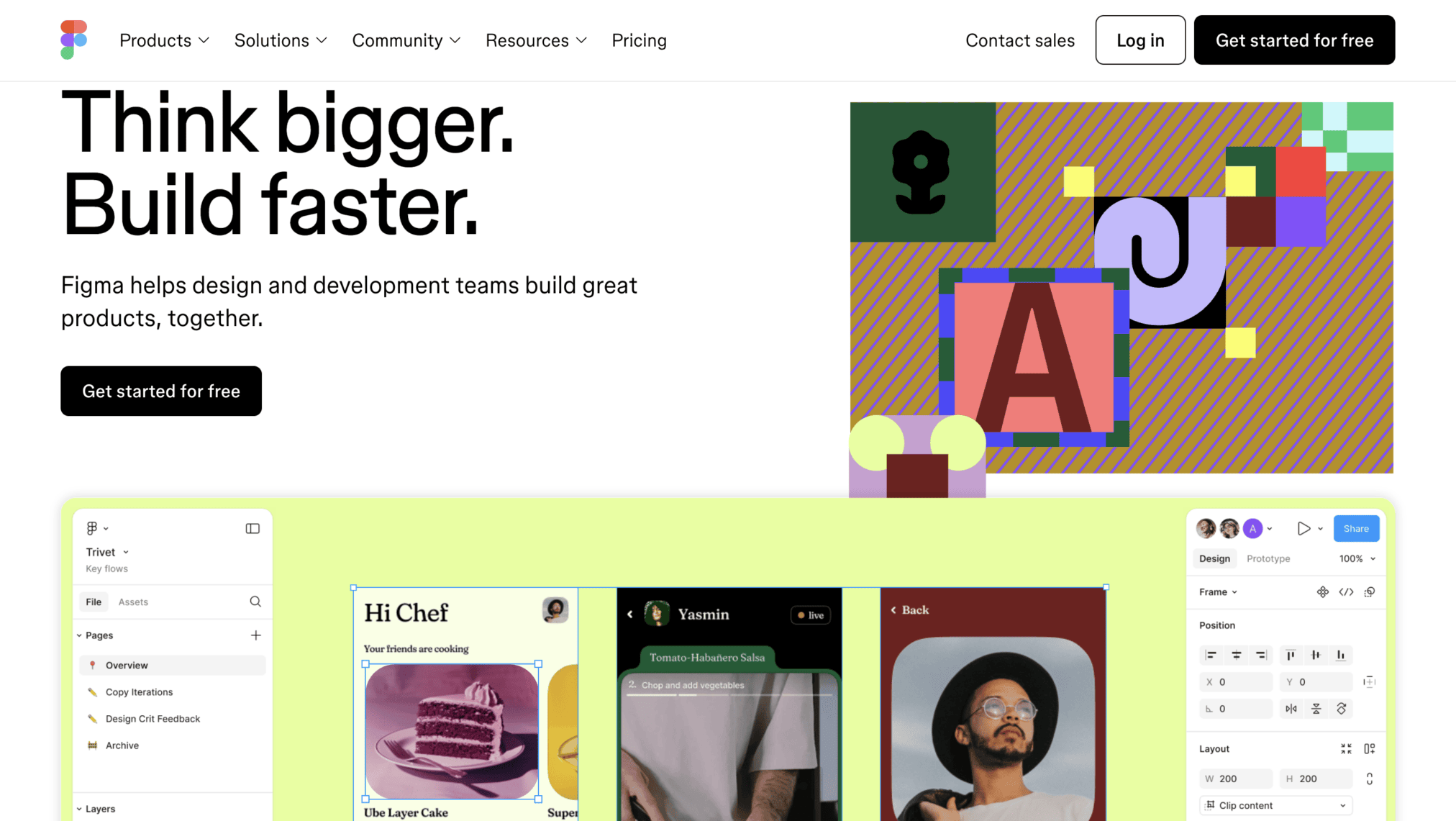
For design teams around the world, Figma is a familiar name. This collaborative design platform currently empowers 4+ million designers to create, prototype, and share design projects directly in their web browsers.
But what makes it such a stellar example of web app design?
A Designer’s Dream Interface
Figma’s interface is a designer’s dream. It is clean, intuitive, and adapts like a chameleon to any device. Essential design tools are neatly organized in a modular layout, making them instantly accessible, even for newbies.
Consistency reigns supreme – clear icons, well-chosen typography, and a thoughtful color scheme ensure a user-friendly experience that feels natural on every page and screen.
The real magic lies in Figma’s flawlessly-designed real-time collaboration features. Thanks to how easy it is to use these features: multiple designers can team up to work on a project simultaneously on the web app.
User Experience (UX) Built for Productivity
Figma’s core mission? Boosting designer productivity. And it delivers in spades thanks to exceptional UX design.
Smart features like auto-layouts and AI-powered design guides streamline the workflow, eliminating unnecessary steps.
Figma maps out the possible touchpoints that can give rise to friction: feedback requests, revisions asked by clients, and cross-team handoffs, contextual understanding and recovery.
Repetitive decision-making is mitigated through auto-layouts, component libraries, and AI-powered design suggestions.
Design teams can cut down the feedback cycle by 43% by using collaborative tools like Figma that makes the feedback process an extension of designing itself.
No matter the device – desktop or mobile – Figma offers a seamless cross-device experience, ensuring designers always have their projects at their fingertips.
This deep understanding of how modern design teams operate shines through in every interaction.
Lessons for Web App Designers
From setting clear goals (designer productivity on steroids) to catering to the specific needs of a specific audience, Figma’s design team offers a masterclass in web app creation.
Their commitment to simplicity, modularity, and intelligent features underscores a crucial lesson: the more complex your web app, the more intuitive and simple its interface needs to be.
2. Taskade
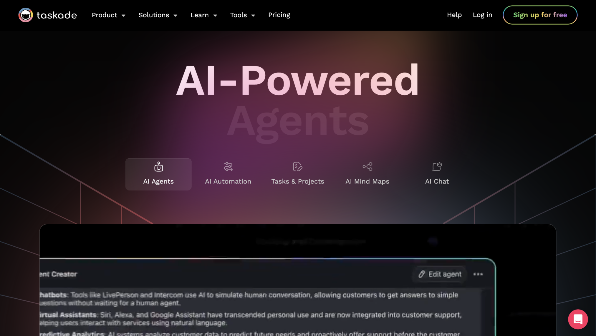
Taskade is not your average project management tool. This ambitious web app tackles common problems faced by remote teams with a visually stunning and user-friendly web app.
A Feast for the Eyes, a Breeze to Use
Taskade’s design strikes a perfect balance between aesthetics and usability. On the main interface, beautiful, hand-drawn illustrations come alive with subtle animations, subtly directing users on what they need to do.
There is a helpful video player that showcases the product in action, helping new users understand what the web app is all about.
Taskade’s design team cleverly uses user interface (UI) components like tabs to present features in a clear and organized manner. They’ve also mastered the art of visual contrast.
Every major design element in this web app is presented in bright colors that ‘pop’ against generous whitespace in the app’s background.
Branded and eye catching CTA buttons are strategically placed throughout the interface. They feel intuitive and guide users towards desired actions.
Finally, a dedicated download section at the bottom ensures users can effortlessly find the perfect Taskade version for their device.
Strong Focus on Usability
Taskade’s success goes beyond its stunning visuals. The user experience (UX) is equally impressive, offering a delightful blend of usability and trendy features.
Taskade understands the importance of remote work, making it effortless for users to organize their workflow and collaborate seamlessly with colleagues.
Lessons for Web App Designers
- Do not be coy if you need to make a lasting first impression with captivating visuals and animations.
- Taskade’s vibrant illustrations and prominent video player instantly grab attention and showcase the product’s value.
- Don’t be afraid of a vibrant color palette either; pair it with ample white space for balance, keeping in mind the principles of color psychology in web design.
- Combine beauty with functionality. Use intuitive UI components like tabs to structure features and information. Taskade’s tabbed interface guides users through functionalities without overwhelming them.
3. Zapier
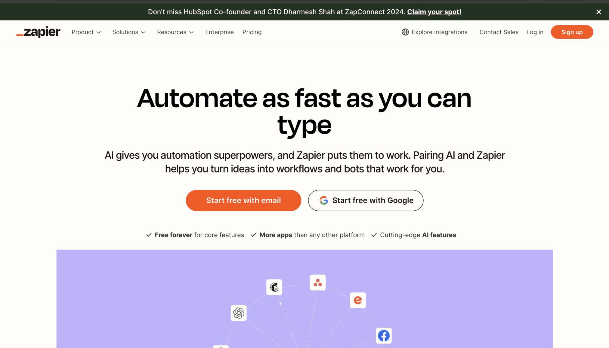
In the ever-growing world of productivity tools, Zapier stands out as the undisputed automation champion. Why?
Zapier’s commitment to an uncluttered interface, even with a super-complicated feature set, is a testament to the transformative power of good design.
Effortless Navigation
Zapier’s interface is the epitome of clean lines and intuitive design. The navigation flows like a well-worn path, with clear visual cues guiding users through every feature and function.
Zapier uses the logic of subtraction across the interface, removing the hidden factors contributing to complex automation.
It champions the drag-and-drop interface and progressive disclosure that helps users to select a trigger, an action, and then configure the connection.
Its UX design supports non-technical users during configuring multi-step workflows, without overwhelming them.
Even when you are browsing through the web app’s extensive toolbox, the interface will never feel like a cluttered mess.
The design team has masterfully balanced user-friendliness with robust functionality, ensuring anyone can become an automation whiz with minimal effort.
Designed to Automate
Zapier believes in simplifying the automation for non-technical users, and it reflects in its UX, from the workflow builder layout to its microcopy.
All these elements break down the complexities for the first-time users.
But the platform doesn’t rely on tutorials to do that, but through a simple language that feels doable and builds confidence.
Take the drag-and-drop workflow builder, for example. This intuitive tool exemplifies how Zapier’s design team had one clear goal with the web app: to make automation creation as effortless as possible.
Lessons for Web App Designers
Zapier’s design team has wisely avoided the urge to bombard users with unnecessary info. Instead, their focus is on relentlessly refining the tools that truly matter and making them as intuitive as possible.
This laser-sharp focus on intuitively giving users exactly what they need and expect, serves as a valuable lesson for aspiring web app designers.
Want your web app to be packed with features and yet user-centric? Then prioritize simplicity and usability over feature bloat. It is one of the most important app design best practices that designers should know.
4. Rappi-Pay
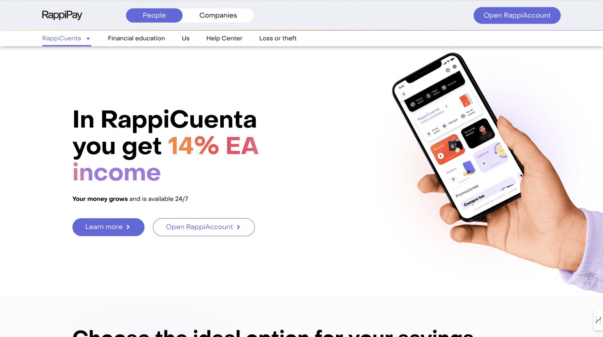
Forget boring payment apps! Rappi-Pay proves that innovative design and captivating storytelling can transform a mundane product into a user magnet.
UX with a Twist
Rappi-Pay does not just present features; it weaves a narrative. The product itself becomes the protagonist, drawing users into a story that highlights its benefits.
This immersive experience makes interacting with the app not just functional, but truly memorable.
Immersive Onboarding
Right after opening Rappi-Pay, you will be greeted by charming 3D scenes, brought to life with subtle animations and beautiful graphics.
As you browse, go through a carefully crafted story. By the time you are through with the first initial waves of multimedia content, you’ll clearly understand the app’s value proposition.
Lessons for Web App Designers
Learn from Rappi-Pay’s narrative-driven approach: use 3D scenes, animations, and graphics, to weave a cohesive visual story alongside the content.
Ensure your visual elements and content work seamlessly together on every screen to communicate your app’s value clearly.
5. Vimcar
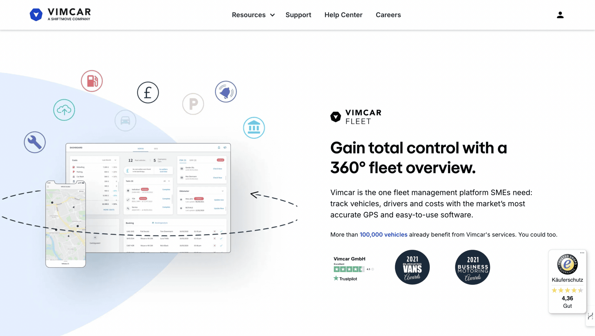
Vimcar, a fleet management leader, roars into new territories with a web app designed for one thing: user success. Their secret weapon? Deep user understanding and data-driven design.
Homepage Design
Vimcar’s homepage anticipates your questions. Clear, informative messaging instantly explains their offerings and setup process, leaving no room for confusion about the platform’s value.
They address key business pain points head-on, showcasing how Vimcar empowers companies to streamline fleet operations.
Visual Onboarding
A handy infographic visually walks users through the setup process, ensuring a smooth and stress-free onboarding experience.
Lessons for Web App Designers
Anticipate questions and provide clear guidance on your homepage. Do not know what your target users think?
Conduct user research to identify their pain points and the way they prefer to interact with apps similar to yours. Continue monitoring and improving your user experience based on data.
6. Notion
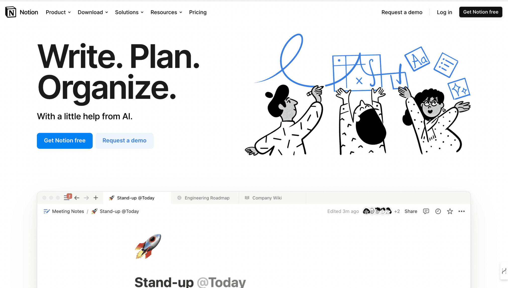
This AI-powered web app notion is a document editor, project management tool, and writing assistant, all wrapped in a sleek and adaptable design.
Modular Design
Notion is the prime example of modular web app design architecture.
It consists of independent, reusable blocks that can be customized (addition, rearrangement, and configuration) to fit the workflow’s requirements, instead of sticking to the same layout for every process.
This way it caters to each audience segment, be it solo note-takers, engineering teams, or the entire organization.
This level of flexibility empowers users to create a workspace that perfectly reflects their unique way of working.
Whether you are managing projects, creating documents, or taking notes, Notion offers a customizable and collaborative workspace that’s optimized to boost productivity.
Forbes lists Notion among its top productivity tools due to its customizable and modular architecture, both of which are spared to improve task completion rate.
Focus on Clarity
Minimalism reigns supreme in Notion’s interface. A consistent visual hierarchy ensures intuitive navigation, with clear distinctions between content blocks and functionalities.
This focus on clarity eliminates clutter and keeps users focused on the task at hand.
Notion doubles as a multi-function app by maintaining consistency in its visual hierarchy, through size, weight and whitespace to symbolize priority.
The headings are obviously larger than the body content, and the sidebar is collapsible to support the main area.
Even if the main area is filled with different content blocks, the visual structure will still remain consistent to minimize cognitive effort.
Lessons for Web App Designers
Prioritize a clean and consistent visual hierarchy. Users should instinctively understand how to navigate your app, without feeling overwhelmed by clutter.
If your web app allows users to customize their workstations, taking a modular approach like Notion is a great idea.
7. Trello
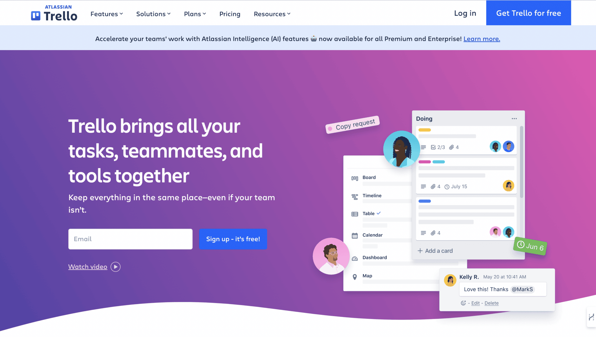
This web app trello uses a Kanban-style interface – think boards, lists, and cards – to empower individuals and teams to organize tasks, projects, and workflows collaboratively.
Simplicity
Trello with its Kanban interface acts as a visual model of an organizational workflow on a whiteboard. Boards, lists, and cards are used by teams to move through the stages, without making users learn the workings of the app.
Due to this, first-time users don’t face issues to be productive from the get-go, unlike other complicated project management tools.
Trello outperforms others by simply understanding people’s mental model, and bringing it out in real-time.
Constantly Evolving
Trello prioritizes user feedback: a fact that is evident in the routine design updates and new feature releases. This commitment to user feedback has kept the web app’s design relevant for over a decade.
Forrester’s 2024 B2B report showed companies that continuously update product UI/IUX by using feedback from usability testing are 43% more likely to retain their customers over a 12-month period.
Lessons for Web App Designers
- Do not underestimate the power of simplicity. Don’t refrain from giving your users control. Trello’s customizable elements empower users to tailor the app to their workflow, enhancing the overall user experience.
- Trello’s success also stems from its unwavering focus on refining its core project management functionality. So, continuously gather user feedback regarding your app’s core design features and use it to inform your updates.
8. Zencastr
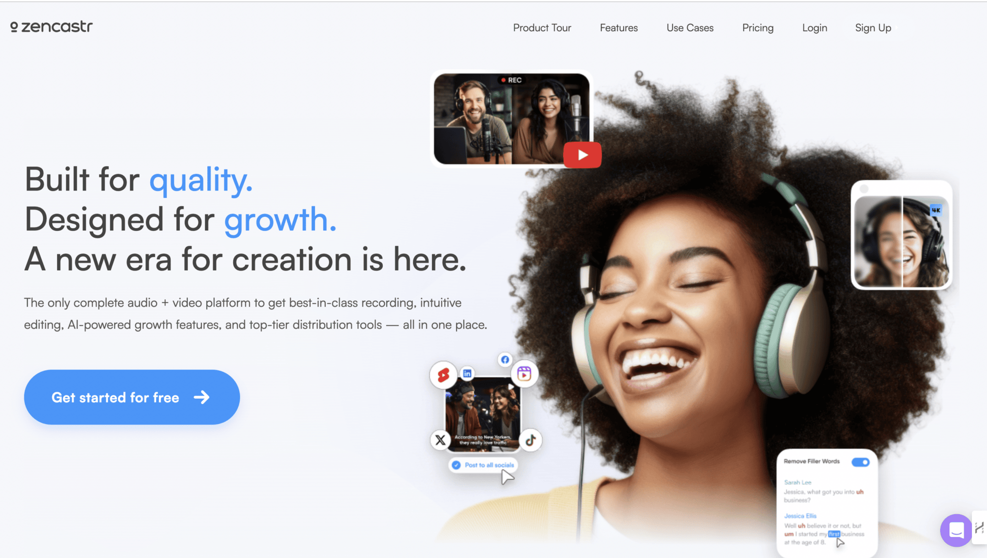
Zencastr is a podcasting tool. It empowers creators (regardless of experience) to record and edit studio-quality podcasts directly via their browsers.
Since this web app is designed for podcasting newbies, it serves as a great example of introducing users to new concepts and functionalities without overwhelming them.
UI for Everyone
Zencastr curated its platform for non-technical users by following one simple rule; redesign anything that needs to be explained. It uses large recording buttons with labels, and a back-to-dashboard to guide users when they feel lost.
The onboarding flow provides one concept at a time, through progressive visual cues to help a first-time podcasters navigate the platform without losing faith and confidence.
UX Flow
Zencastr prioritizes a seamless user experience. It assumes minimal technical knowledge, especially when it comes to audio and video tools.
The onboarding process is quick yet effective, guiding users through recording with clear buttons and informative panels.
Lessons for Web App Designers
Zencastr’s interface demonstrates how to guide new users through complex tasks with minimal confusion:
- prioritize clear labeling and intuitive design.
- Use clear buttons, informative panels, and intuitive navigation to prevent new users from feeling lost.
- Design with the assumption that the audience has minimal technical expertise. But, do not bombard them with instructions.
9. Airtable

Airtable is a revolutionary web app that merges the familiar grid layout of web apps with the muscle of complex, spreadsheet-based databases.
Visually Appealing Interface
Airtable’s interface was a breath of fresh air in the spreadsheet app sector.
It ditched the sterile spreadsheet look for a visually engaging design that emphasizes the importance of responsive design across desktops and mobile devices.
Drag-and-Drop Data Magic
Forget clunky MS Excel formulas; Airtable empowers users to effortlessly create, sort, filter, and view data in various formats – grids, calendars, and even Kanban-style boards.
Powerful filtering and sorting tools make finding and organizing information a breeze.
Lessons for Web App Designers
A user-friendly and visually stimulating interface will always keep users engaged, even when the app is all about managing complex datasets.
Weaving familiar design elements (spreadsheets, drag-and-drop functionality) into the app’s design leads to a comfortable user experience, just as Hick’s law, one of the most important laws of UX design, suggests.
10. Skyscanner
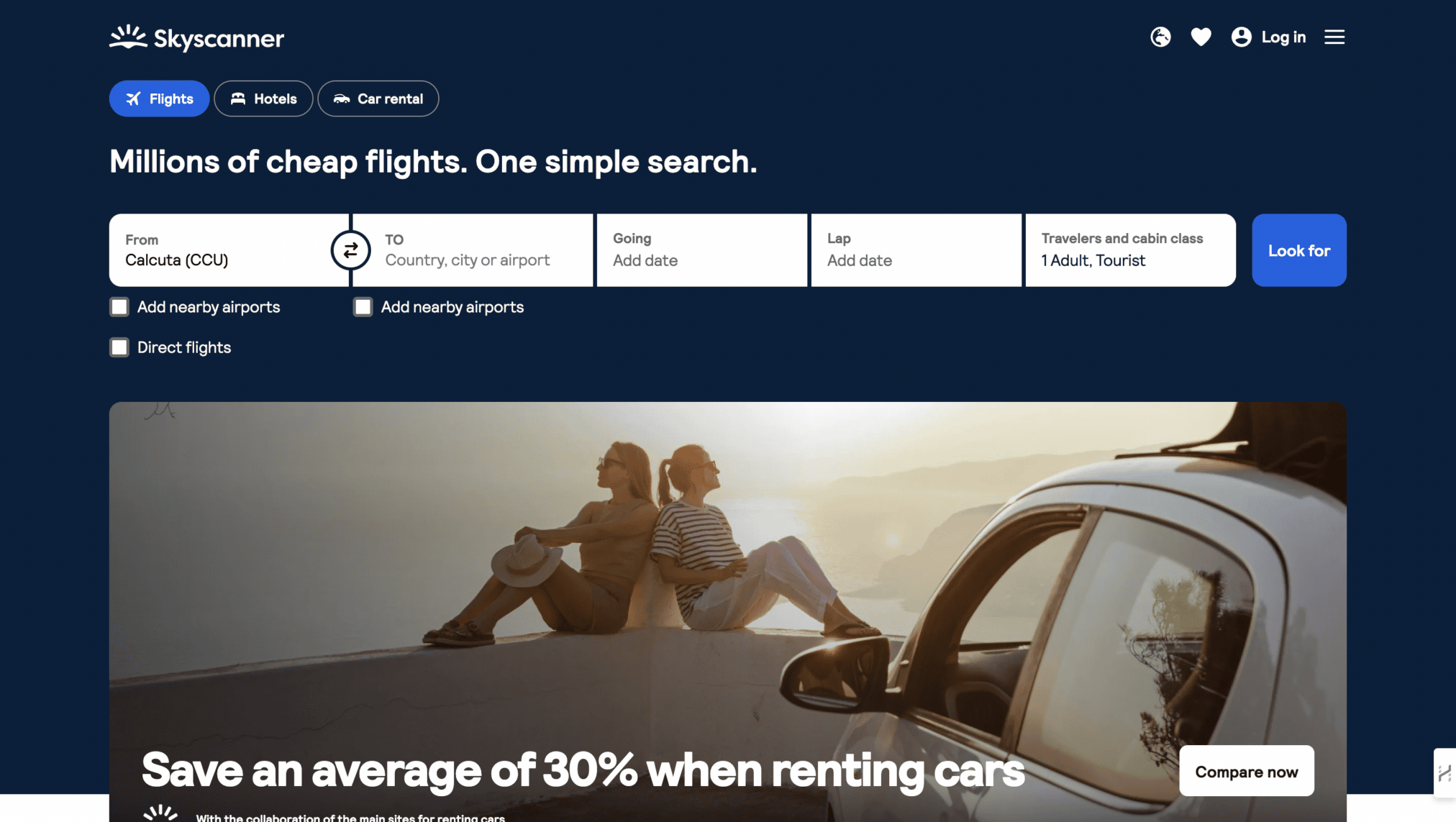
Skyscanner isn’t messing around. This online travel agency prioritizes one thing: getting you the best deals on flights, hotels, and car rentals, fast.
Their secret weapon? A web app designed with a laser focus on simplicity and user efficiency.
Interface for Action
A crystal-clear top menu in the Skyscanner’s minimalist UI lets users book flights, switch currencies on the fly, toggle between different currencies, and more.
There’s a prominent search bar, always front and center, urging users to embark on their travel adventures.
Skyscanner directs all its focus on user action by categorizing visual patterns, either it helps with platform navigation or doesn’t; the obstacles are then systematically removed.
The search bar is the first thing users notice when they land on any page and is the primary element.
Currency toggles, date selectors, and filter options are all secondary elements, gradually revealed to users as they move through steps.
Unlike other platforms, it does not support passive browsing, it rewards task completion.
Mobile-First
Skyscanner went ‘mobile-first’ quite a long time back. Skyscanner’s web app will seamlessly adapt to your mobile device.
Unlike the desktop version, the mobile browser app has no background images, tons of white space, and a smaller top menu.
Booking your next adventure from your phone? Piece of cake.
Lessons for Web App Designers
- Unlike many unsuccessful web apps, Skyscanner understands its core function – helping you find amazing travel deals.
- Their interface reflects this focus, ensuring booking flights, hotels, and car rentals is a breeze.
- Your web app’s design should have a similar degree of focus.
11. ideaBuddy
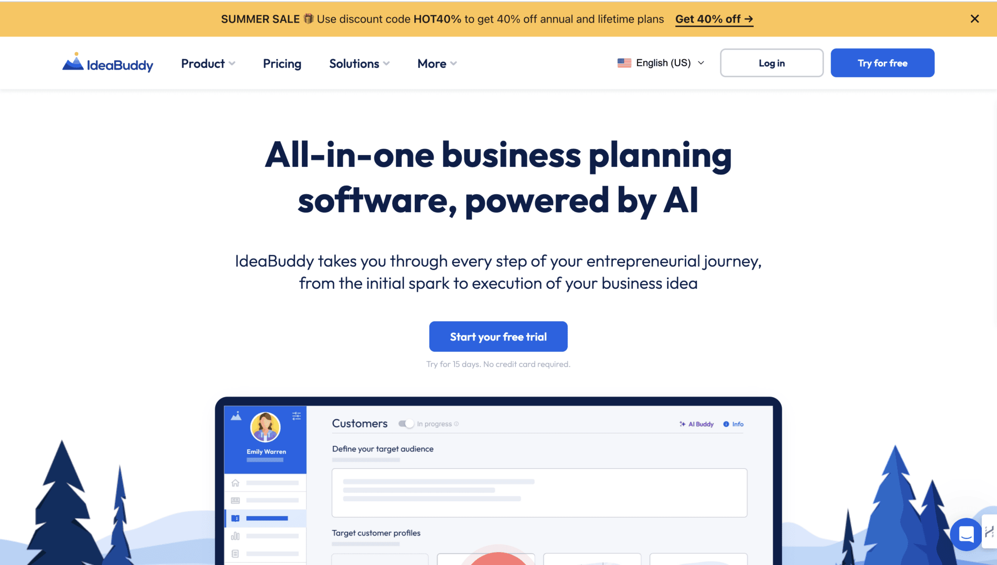
ideaBuddy is an AI-powered business planning web app that helps you transform business ideas into successful business ventures.
Heard of similar apps before? Here’s why ideaBuddy makes into this list while the others don’t.
User Comfort First
IdeaBuddy prioritizes user comfort and intuitive navigation. Familiar design patterns help users feel at ease and readily locate the information they need.
The clean layout and clear visual hierarchy guide users through the content and features seamlessly.
Awesome Landing Page
The web app’s landing page welcomes visitors with a carousel housed within an iPad-styled frame – a traditional web design pattern that instantly conveys the app’s purpose.
IdeaBuddy does not shy away from tried-and-true UI components like card-style carousels, listicles, and alternating stripe layouts.
But here’s the twist: these elements are infused with modern touches like trendy human illustrations.
This clever combination creates a comfortable and visually appealing experience that feels anything but dated.
Lessons for Web App Designers
Familiar UI elements can be revitalized with contemporary, top UI/UX trends! IdeaBuddy proves that classic patterns can be refreshed and elevated, striking a balance between comfort and innovation.
12. Typeform
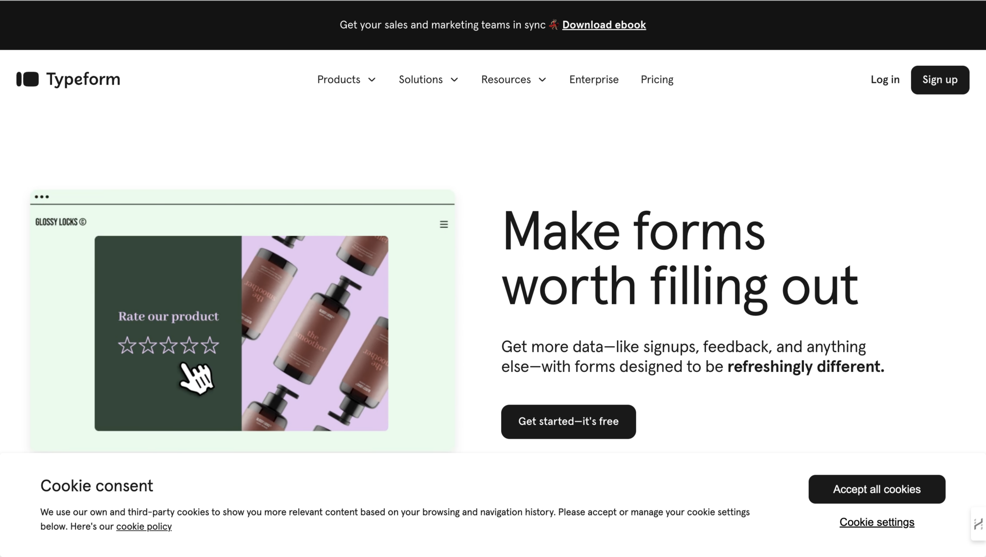
This web-based form builder ditches dull, data-collecting drudgery for visually captivating and engaging experiences.
Millions flock toTypeform for a reason – its design shines.
UI Design Wins
Typeform sets itself apart from the rest of form builders through its UI decisions: one question per page, smooth animated transitions to imitate progression, clean visual grammar, and mobile-first responsive design.
With these decisions, Typeform reduced psychological burden, thus reducing the rate of form abandonment.
UX Design Magic
Typeform’s conversational UX design reframed data collection techniques.
Instead of asking all the questions at once, it asks those questions sequentially, after users answer the question at hand, Typeform reciprocates, mirroring natural conversation.
Lessons for Web App Designers
- Make information retrieval conversational: Take a cue from Typeform and create forms that feel like a dialogue, not a chore.
- Maintain a consistent visual language with typography, color schemes, and icons. This strengthens brand recognition and improves user navigation.
Now, let’s clarify some terms and concepts.
What is Web App User Interface (UI) Design?
Web application user interface (UI) design is the process of designing all the visual elements a user sees when using a web application (i.e., buttons, menus, layout, icons, micro-interactions and colour systems).
These are designed to perform tasks with minimal cognitive load.
The user’s first impression of a web application is formed in 50 milliseconds and directly impacts their likelihood of engaging with and learning the product versus abandoning it.
To compete with native apps for user adoption, web app designers have to create simple, intuitive, and responsive user interfaces that enable users to accomplish their tasks with minimal effort and time.
This is easier said than done because designing such effective web applications requires expertise in web technologies such as HTML, CSS, JavaScript, and various web frameworks or libraries (e.g., React, Angular, Vue.js).
Designers also have to consider factors like cross-browser compatibility, dynamic content-loading, etc., while designing web app interfaces.
What is Web App UX Design & How Is It Different From UI Design?
Web app UX design focuses on enhancing the overall experience and satisfaction a user has when interacting with a web app. It involves:
- Understanding user needs, goals, and pain points through UX research
- Mapping out user flows and interactions, making each interaction intuitive
- Iterating on every design decision (color scheme, positioning of elements, responsiveness, etc.) based on usability testing methods
- Optimizing each interaction from onboarding to subscription for accessibility and engagement
While good UI design makes a web app visually appealing and its interface interactive, good UX design is what gets users instantly engaged and keeps them coming back for more.
What Should Businesses Expect From Web App Design In 2026?
Web design in 2026 will prioritize functionality (what works best) over plain visuals. Users prefer an immersive and personalized experience, and businesses want a design that performs.
But the real challenge is to select the right design instead of just chasing trends.
The goal is to create user-centered choices that will age well beyond time. Here are some things to consider:
- An interface that adapts, powered by AI and historical data on user behavior
- Contextual UI that switches between accessibility modes
- Micro-interactions in UX like progress bars and system status add motion to the design
- Data-first UIs with minimal white noise will gain priority
- Accessibility-first UI is the baseline, with stricter EU Accessibility Act
- A sub-2-second load time become non-negotiable, indicative of how UX design is pivoting towards usability and performance
The most important expectation shift is strategic: design that cannot demonstrate a direct connection to retention, conversion, or task completion rates will face increasing organizational pressure to justify its investment.
What Makes a Strong Web App Design?
A strong web app design succeeds at one thing above all others: making the user’s primary task faster and less effortful than any alternative.
From the 12 examples in this article, twelve consistent principles emerge:
- simplicity that scales with complexity (Figma)
- first impressions that earn attention (Taskade)
- functionality that never sacrifices usability (Zapier)
- narrative-driven onboarding (Rappi-Pay)
- anticipatory homepage design (Vimcar)
- modular customization (Notion)
- continuous iteration (Trello)
- accessibility-first labeling (Zencastr)
- familiar interaction patterns (Airtable)
- ruthless focus on core function (Skyscanner)
- comfort with innovation (ideaBuddy)
- conversational data collection (Typeform)
Here are some other key takeaways from the web app all-stars:
- Keep it Simple, Especially with Complex Web Apps: Take a page from Figma’s playbook. If your app boasts a ton of features, make sure the interface is clean and intuitive. A user should not need a decoder ring to figure out how to use it.
- First Impressions: Just like Taskade, grab users’ attention with captivating visuals and animations. Do not be afraid of bold colors but balance them out with plenty of white space for a clean look. Remember, beauty and functionality can go hand-in-hand.
- Focus on What Users Need, Not What You Want: Channel your inner Zapier and prioritize core functionalities. Do not bombard users with unnecessary info. Make the features you have as intuitive as possible: users should be able to find what they need quickly and easily.
- Visual Harmony: Maintain a consistent visual language with typography, color schemes, and icons to enhance brand recognition and make navigation a breeze.
- Responsive Design is a Must: According to the latest Statscounter Stats report, 62-65% of the users around the world are accessing websites from mobile devices. The web app needs to deliver an optimal performance, otherwise it would face tough competition from others.
- Tell a Story with Your Design: Learn from Rappi-Pay’s immersive approach. Use visuals like 3D scenes and animations to create a cohesive narrative alongside your content. Every screen should work together seamlessly to communicate your app’s value proposition.
- Read Your Users’ Minds: Be like Vimcar’s design team and anticipate your users’ questions. Conduct user research to understand their pain points and how they typically interact with similar apps.
- Guide the Way: Help users find their way. Implement a clear top menu, and strategically placed buttons, and leverage user experience testing tools to refine the navigation flow.
- Cleanliness is Key: Notion reminds us that a clear and consistent visual hierarchy is crucial. Users should be able to navigate your app instinctively, without feeling overwhelmed by clutter. Consider a modular approach like Notion’s if your app allows for customization.
- Customization: Trello proves that a simple design can be incredibly effective. Do not underestimate the power of clean layouts and intuitive features. But remember, simplicity does not mean sacrificing user control. Like Trello, empower users to personalize their experience for maximum impact.
- Creative with a Dose of Familiarity: Do not be afraid to innovate (like many of the web apps we discussed) but make it user-friendly. Strike a balance between novelty and intuitive design – users want to be surprised, not bemused.
- Make Forms Fun: Typeform shows us that data collection can be engaging. Ditch the boring old forms and create a conversational experience with smooth transitions and interactive elements.
What Are the Design Criteria for a High-Performing Web App UI in 2026?
A high-performing web app UI will have less than 2 seconds (Google Core Web Vitals, LCP), layout, AI-powered predictions, lightweight dashboards, dark/ light mode switching, accessibility compliance, and responsive layouts with micro-interactions and animations for system feedback.
- Google’s Core Web Vitals 2025, LCP (Largest Contentful Paint) to be under 2.5 seconds to rank higher in search results and report 24% lower bounce rates. For web apps, INP (Interaction to Next Paint) should be under 200ms for responsive apps.
- The layout should adjust to any screen ratio
- Micro-interactions that builds confidence along the way
- Smart suggestions and predictive search both powered by AI
- Simple dashboards that feels lightweight and uncluttered
- UI should seamlessly switch between dark/light transitions
- Mandatory WCAG 2.2+ for inclusivity
- Animations to highlight core functionalities
A web app’s UI should be strategically designed, instead of just focusing on spectacle. As the data suggests, these apps should be lightweight, engaging, and yet high-value to stand out from the rest.
Conclusion
Now, armed with these design gems, you are well on your way to crafting a web app that users will love! Want more in-depth analyses of web app design?
Let’s chat about our experience as a UI/UX Design agency in crafting engaging user centric digital experiences that keep users coming back for more!
FAQ’s About Web Application UI Design Examples
What is web app design and how is it different from website design?

Web app design mainly involves creating applications to run on web browsers across all platforms (such as Figma, Trello, Notion, etc). All these platforms help users with accomplishing a task without raising any obstacle. It combines UI, UX and frontend development for the same purpose. Website design, on the other hand, focuses on creating an interface that deals with giving information.
What makes a good web app UI in 2026?
A good web app UI would help users complete their tasks without becoming a cluttered interface. It must load under 2 seconds, adjust to any screen size, and offer a smooth, intuitive experience. Modern web apps also support AI-powered suggestions, accessible design, and micro-interactions that prevent the experience from becoming a cumbersome one.
What is the difference between UI design and UX design in web apps?
Web app UI design is the art of designing elements users first see and interact with, including the typography, layouts, colors, and icons. The UX design is mostly about helping users find the product’s value and ensure that they return each time.
How long should a web app take to load?
According to Google’s Core Web vitals, a web app should have an LCP of less than 2.5 seconds. Ideally, web apps with sub 2-second loading time outperforms its competitors by 2x times.
What are the best web app design examples?
The best web app design examples cater to the user’s needs and pain points, instead of just focusing on the visuals. Figma, Trello, Notion, Skyscanner, ideaBuddy, Zencastr, Typeform, Zapier, Airtable, Vimcar, and Rappi-pay can all fit this criteria.
What are the web app design trends for 2026?
The web app design trends of 2026 include AI-powered adaptive interfaces, accessibility-first design, sub-2-second load times, and lightweight dashboards to improve app’s interface and performance. They also follow the design trends of previous years, along with dark/ light mode switching, contextual micro-interactions, and personalized UX, backed by analytical data of user behavior.









