


13 Best & Inspiring Minimalist Web Design Examples in 2026



Quick Summary
The best minimalist website design examples in 2026 include Apple, Dropbox, Squarespace, Tesla, Notion, and Arc Browser — each using generous whitespace, a restrained color palette, and clear typography to reduce cognitive load and speed up loading times.
What is Minimalist Website Design?
Minimalist web design is the design philosophy that focuses on the core functionalities of a website and removes extra elements. It manages spacing, uses different limited color options, clean typography, and interactive elements.
It reduces cognitive load and guides users toward a clear action.
For example, companies like Apple, Tesla and Notion use minimalist designs because they load quickly and show better performance.
Minimalism is not a new design trend. In the art world, the minimalist movement of the 1960s and ‘70s was a reaction against the overly self-expressive era of abstract expressionism.
Similarly, the recent explosion in minimalism is a reaction against the excessively interactive apps and websites that we all use.
It attempts to balance out the hustle and bustle of these flashy platforms with the website equivalent of a peaceful cafe or a quiet library.
Flashy digital platforms will continue to invade our phones and workplaces for the foreseeable future. To counter this, minimalist web design will continue to be as popular as it is today.
Check out the table to understand how minimalist design is better than cluttered design.
How Does Minimalist Design Differ From Cluttered Website Design?
| Design Parameters | Cluttered Website | Minimalist Website |
| Website Loading Speed | Complex animations, too many tracking scripts, etc. increase loading speed. | Using white space and fewer animations manage site loading time. |
| User Focus | Too many elements in the interface confuses users | Clean structured interface keeps user focus on important details |
| Mobile Experience | Poor mobile UX for small screens | Layouts change size easily because there are fewer items to fix. |
| Conversion Rate | Lower due to weak or hidden CTAs | Higher as CTAs stand out without competition |
| Maintenance Cost | High as there are more components to manage | Low due to simpler systems |
| Cognitive Load | High because users have to process unnecessary elements | Low because interfaces are intuitive and frictionless |
| SEO Performance | Lower due to slower speed and poor user experiences. | Higher due to faster load times, better mobile optimization, and engagement rates. |
Here, we will look at some of the most impactful minimalist web design examples of the past decade. If you want your website to adopt this powerful and popular design approach – you will get a healthy dose of minimalist web design inspiration to get started.
In the next section, we’ll look at minimalist web design examples that get this balance right.
Which Minimalist Website Design Examples Actually Work in 2026?
Minimalist design examples that will actually work in 2026 are – Apple, Dropbox, Squarespace, Nordic Design, MADE, Helvetica Now, Everlane, Notion, Bose, Tesla, Muji, Framer, and Arc Browser.
Let’s explain their features in detail.
1. Apple
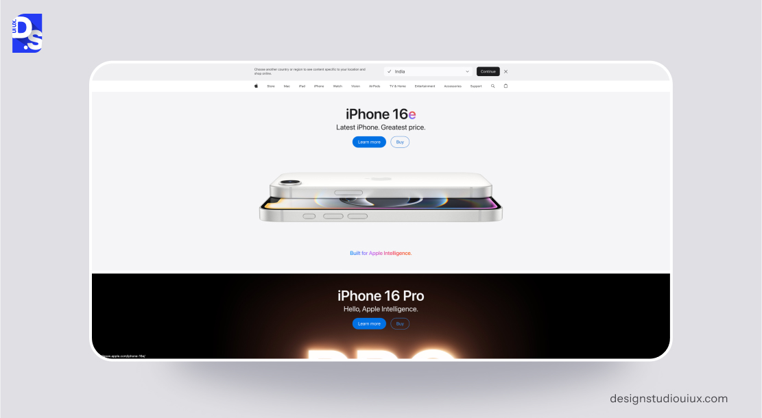
Apple’s website exemplifies minimalist design, mirroring its brand’s core values of innovation and sophistication, often cited among top minimalist website design examples.
The site focuses on visually driven product storytelling, using a clean and simplified layout.
Key minimalist design features:
- The site employs several strategies to maintain a clean aesthetic. Flat icons and concise menus reduce clutter. Navigation bars and technical specifications are tucked away in collapsible menus to keep the main interface uncluttered.
- High-resolution product visuals dominate the screen, underscoring the quality and design of Apple’s products.
- The website also uses the SLIP method effectively. Products are categorized logically, labeled clearly, and prominently displayed with full-screen imagery.
- Generous use of whitespace around text and images creates a gallery-like browsing experience, allowing products to stand out.
- The site predominantly uses white backgrounds, strategically incorporating product colors (like the various iPhone finishes) to draw attention.
- Clean, sans-serif fonts (SF Pro) ensure excellent readability and contribute to the website’s modern feel.
According to a Nielsen study, product pages that manage extra interface elements and prioritize visual hierarchy see up to 35% higher engagement.
Apple’s use of auto-play videos in the hero sections immerses users without overwhelming them – a testament to skillful minimal motion design.
Introducing subtle micro-interactions, like hover effects on product tiles improves user engagement without adding clutter.
2. Dropbox
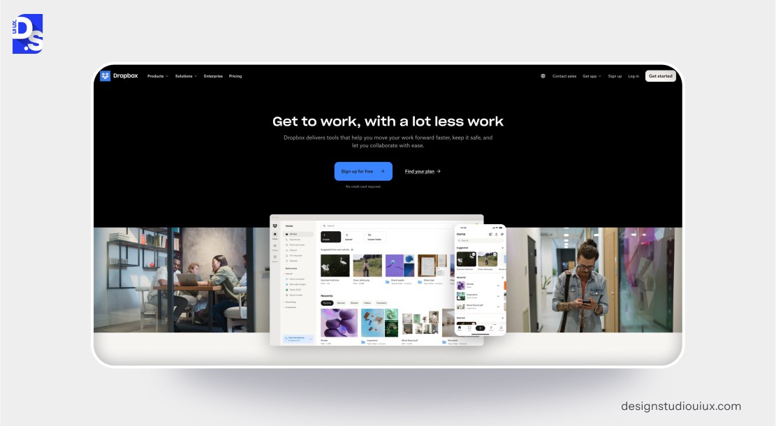
Dropbox’s website embodies functional minimalism, focusing on clarity and ease of use for its file-sharing service.
As one of the practical minimalist website design examples, the website uses abstract illustrations to simplify complex cloud storage concepts.
Key minimalist design features:
- Advanced features are nested under the ‘Solutions’ menus. Bold CTAs such as ‘Sign up for free’ are strategically placed to attract user attention.
- The website effectively sorts and labels use cases (e.g., “For teams”) for quick scanning. Ample spacing between sections helps prevent visual fatigue.
- A restrained blue-and-white color scheme evokes trust, with yellow accents used to guide user attention.
- Rounded sans-serif fonts (Sharp Sans) give the site an approachable feel.
- The intuitive hierarchy enables users to quickly understand Dropbox’s value proposition. The website could however benefit from warmer imagery or subtle animations or illustrations like floating folders.
According to a Baymard research, SaaS homepages that include simplified navigation and clear CTA get 28% more sign-ups than crowded interfaces. In other words, a clean hierarchy helps people take action much faster.
3. Squarespace
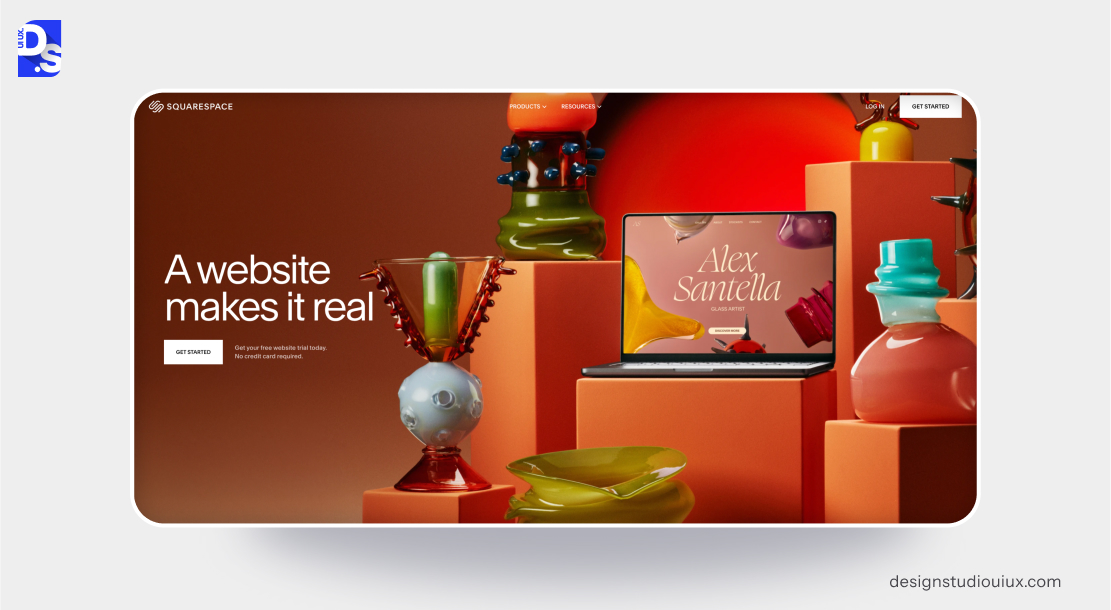
Squarespace’s website showcases its design tools through a minimalist aesthetic that blends elegance with persuasive marketing.
Key minimalist design features:
- Template previews use thumbnails to avoid clutter.
- Pricing details are consolidated under a single menu.
- Stunning website examples effectively showcase the website-building platform’s capabilities.
- Features are categorized clearly (e.g., ‘Websites,’ ‘Commerce’), with CTAs like ‘Get Started’ taking precedence. Large margins around text blocks enhance readability. Muted grays and blacks are offset by vibrant accents from demo sites.
- A mix of serif (Freight Text) and sans-serif (Avenir) fonts strikes a balance between creativity and professionalism.
Overall, this site is visually rich without being excessive; demo sites offer emotional inspiration. Guided storytelling leads users seamlessly through the site’s benefits.
4. Nordic Design
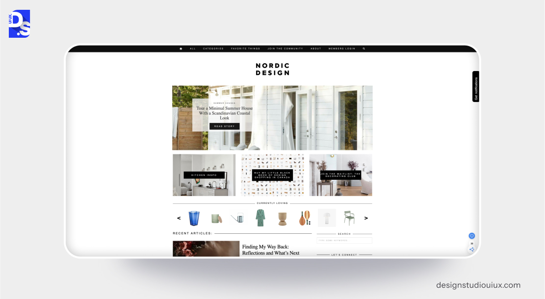
Nordic Design’s website combines minimalism with Scandinavian aesthetics, creating a calming, editorial experience.
Key minimalist design features:
- Flat icons replace text labels in sidebars, and social media links and archives are minimized in footer menus.
- Articles are categorized by topic (e.g., ‘Architecture,’ ‘Interiors’), with headlines in bold sans-serif fonts.
- Margins around images and text evoke the spaciousness of Nordic interiors.
- Earthy neutrals like beige and gray, along with black accents, embody Scandinavian minimalism
- Coming to typography, there are clean, geometric fonts (e.g., Futura) that reinforce a sense of modernity.
- The serene navigation complements the calming themes of the content, while grid layouts adapt gracefully to smaller screens.
Overall, the site achieves emotional resonance through imagery of nature and light, creating a “digital hygge” experience.
5. MADE
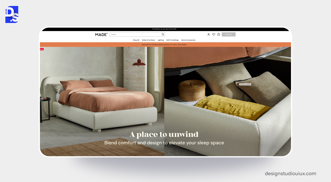
MADE’s website uses minimalism to showcase its furniture. It blends large visuals with subtle interactivity.
Key minimalist design features:
- Product filters are condensed into toggle menus, and customer reviews are accessible via clickable icons.
- Full-screen product images with parallax scrolling enhance the visual experience.
- Collections (‘New In,’ ‘Living Room’) are labeled clearly, and CTAs like ‘Shop Now’ are prominently displayed.
- Negative space frames furniture pieces, creating an art exhibit-like presentation.
- Neutral backdrops (white, and gray) allow the vibrant colors of the furniture to stand out.
- Modern sans-serif fonts (e.g., Neue Haas Grotesk) complement the brand’s contemporary style. Animations, such as fading text, add dynamism without creating clutter.
Overall, the site offers intuitive exploration. It allows users to easily shop and “window shop.”
6. Helvetica Now
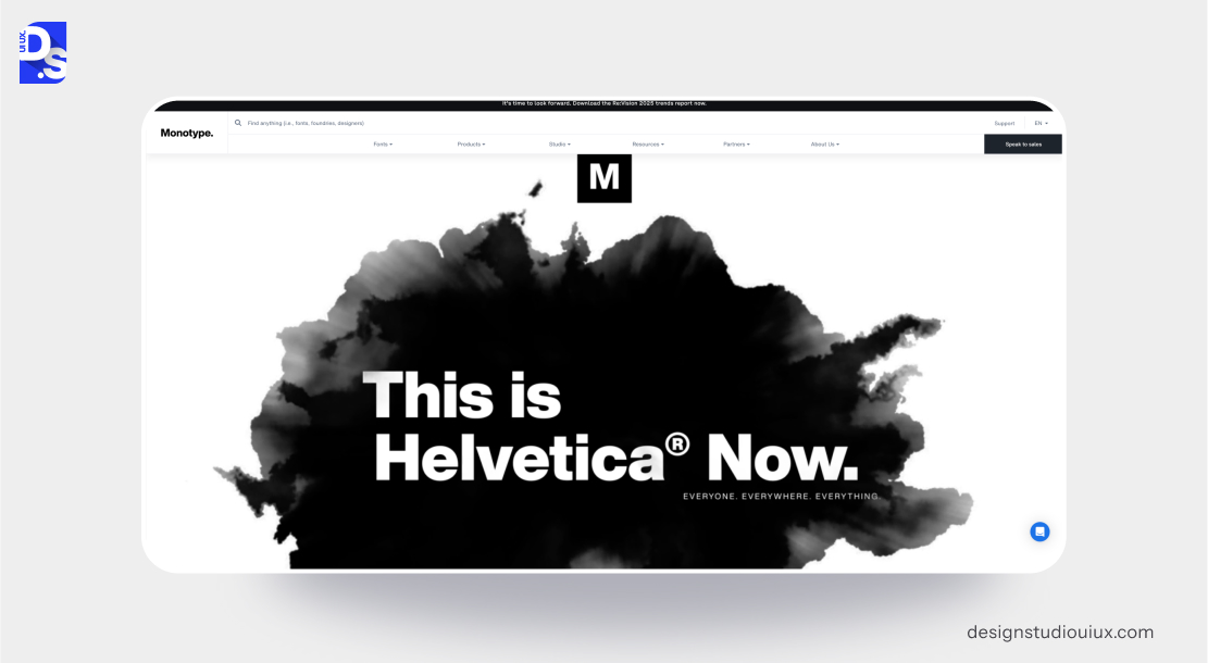
The microsite dedicated to Helvetica Now exemplifies minimalist typography. The site embraces simplicity by reducing navigation to a single hamburger menu – all technical specifications are hidden behind expandable tabs.
- Navigation is reduced to a single hamburger menu; all technical specs are hidden behind expandable tabs
- Font styles are neatly sorted by weight and intended use.
- The site exclusively uses Helvetica Now, which reinforces the self-referential nature of the design.
- Extensive negative space is used to frame individual glyphs, presenting them almost as museum pieces.
- The site employs a monochromatic color scheme (black, white, and gray) to prevent distractions
- The “Type Tester” tool effectively transforms the site into a functional demo, merging marketing with practical utility.
The overall aesthetic is intellectual rather than overtly emotional, appealing to typography purists.
7. Bose
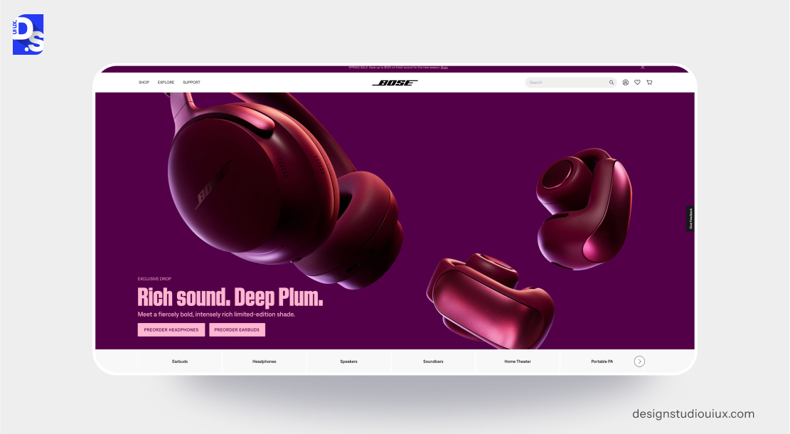
Bose uses minimalist web design to effectively focus attention on its premium audio products, keeping navigation clean and product visuals front and center.
Key minimalist design features:
- Streamlined icons and labels are used in the navigation bars and product categories.
- Detailed product specifications are placed within collapsible menus.
- Large, high-resolution images of audio products dominate the visual space.
- Products are neatly categorized with clear labels. Generous spacing around products and text enhances focus.
- The site features predominantly white backgrounds with accents of black and product-specific colors to draw attention.
- Modern, sans-serif fonts (including Bose’s custom typeface) ensure clarity and sophistication.
- The use of interactive 360-degree product views on the site provides an immersive experience without adding visual clutter.
This mixture of images and a minimalist layout creates a premium and engaging feel.
8. Tesla
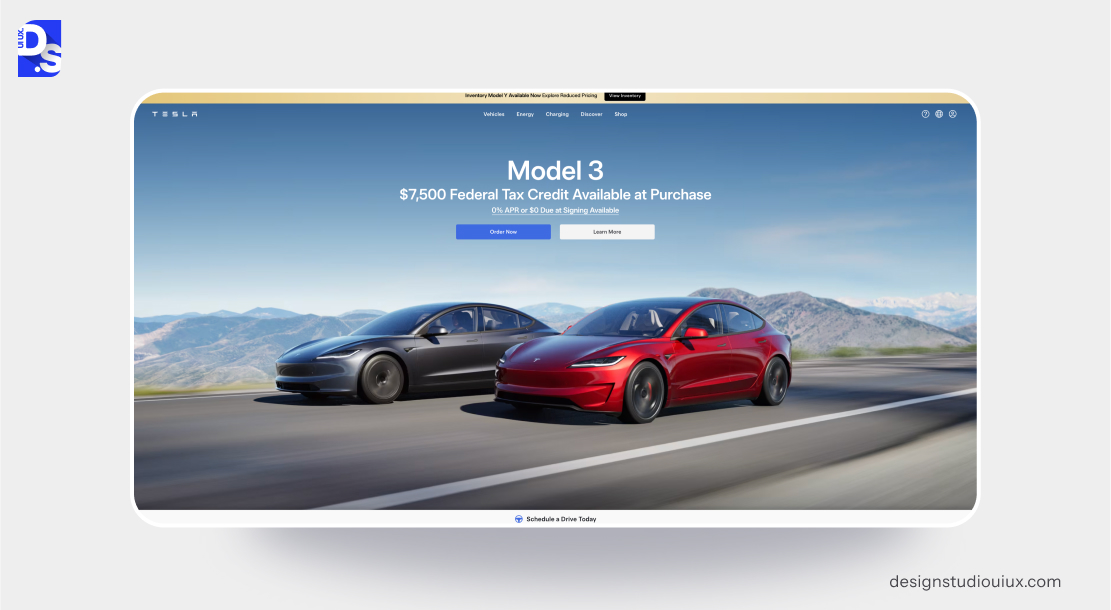
Tesla’s website exemplifies minimalism by emphasizing its innovative products with smooth navigation and a spacious design.
Key minimalist design features:
- The site features simplified navigation with only essential links.
- Additional details and specifications are hidden behind expandable sections.
- High-impact visuals of Tesla’s vehicles are prominently featured with full-width images and generous spacing and text blocks.
- The site primarily uses white, with strategic applications of black and red for contrast. Clean, sans-serif fonts ensure a modern and sleek aesthetic.
- Immersive video backgrounds on landing pages showcase Tesla’s innovation. But, they do not overwhelm users.
- Adding subtle hover effects on vehicle images makes the site more engaging.
GTmetrix’s Web Performance Research Report indicates automotive and luxury brand sites that follow simple navigation rank higher in LCP (Largest Contentful Paint).
9. Muji
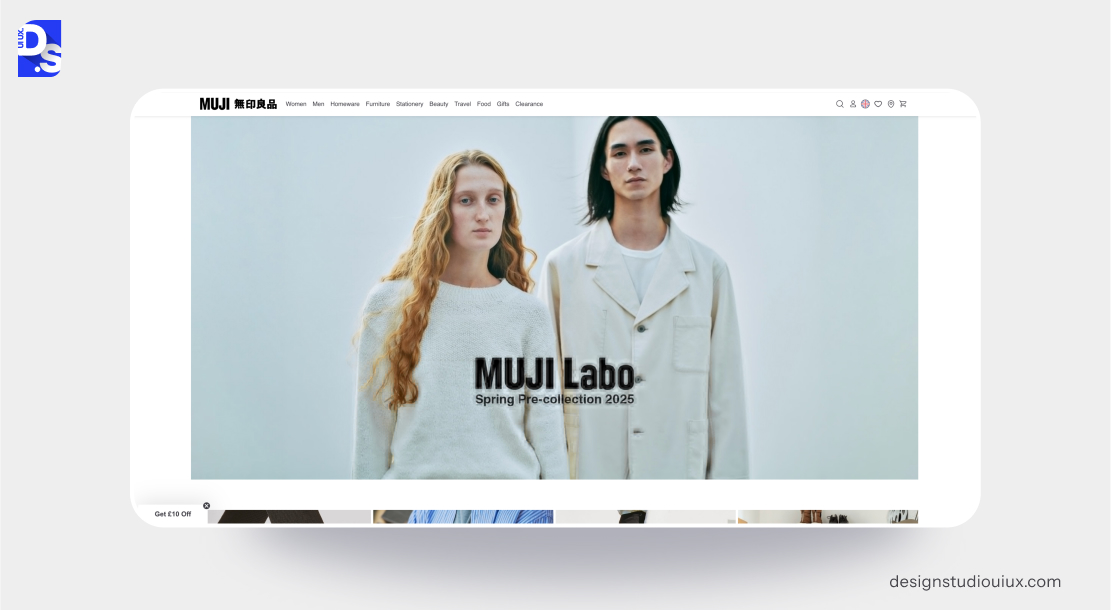
Muji’s website reflects the brand’s minimalist ethos through simple navigation, neutral colors, and functional design.
Key minimalist design features:
- Simplified icons and labels reduce visual clutter.
- High-quality images of Muji’s products dominate the visual space.
- Products are neatly categorized. Generous spacing around products and text enhances readability.
- The use of neutral colors with subtle accent hues reflects the brand’s understated aesthetic.
10. Framer

Framer’s website has a minimalist layout. With subtle animations and bold text, it offers a seamless experience that showcases its website-building services.
Key minimalist design features:
- The site highlights content by keeping icons and text to a minimum.
- High-quality visuals and animations are bold and only used to highlight key features of the platform.
- Features and use cases are organized into clear categories for effortless navigation.
- Extra space around elements makes the layout feel neat and airy.
- Bright colors stand out against a white background, making important elements and CTAs more noticeable.
- Bold, sans-serif fonts (for example- Inter) are used to ensure readability and create a strong visual impact.
- Simple animations and transitions in Framer enhance the design without losing its clean style.
11. Everlane
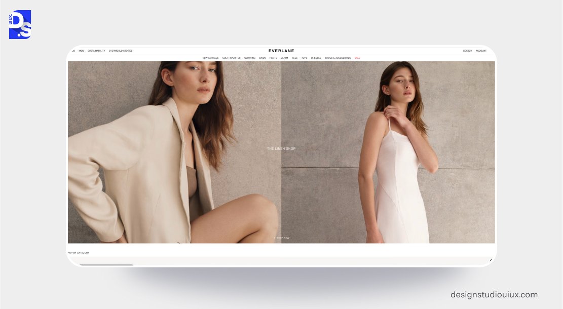
Everlane’s website employs a minimalist design philosophy to reflect the brand’s commitment to transparency and ethical practices.
Key minimalist design features:
- The website predominantly uses white, accented with muted tones to create a subtle, sophisticated feel.
- Clean, sans-serif fonts (e.g., Helvetica) ensure readability and align with the brand’s minimalist aesthetic.
- Optimized images ensure fast load times (crucial for eCommerce sites).
- The brand’s transparent pricing strategy and ethical storytelling are integrated seamlessly into the site’s design.
Any eCommerce site that wants to go minimalistic should take inspiration from Everlane.
12. Notion
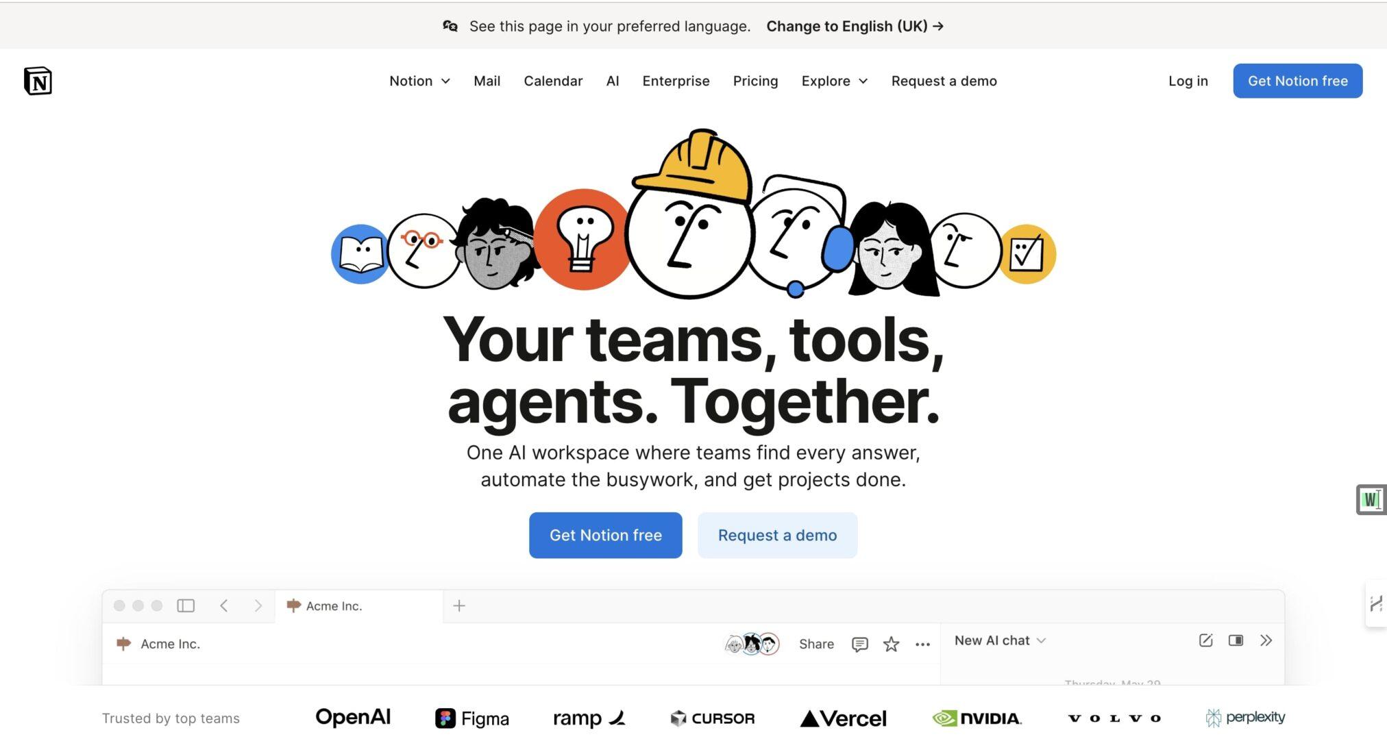
The first thing you notice about Notion’s website is its calm confidence. It doesn’t try to impress you; it invites you in.
Key minimalist design features:
- There’s space everywhere – wide margins, balanced typography, and subtle contrast that feels easy on the eyes.
- It’s the kind of digital space that lets you think, not just click.
- Everything about the site mirrors how Notion itself works.
- The layout is flexible yet structured, quiet yet expressive.
- Each scroll feels deliberate- text and visuals appear gently, like they’re waiting for you to catch up rather than rush ahead.
- There are no banners yelling for your attention, no animated chaos, no distractions. Just thoughtful pacing.
- What’s fascinating is how the website captures Notion’s philosophy without saying much.
- The neutral color palette gives a sense of focus, while its clean typography (interwoven with subtle micro-interactions) creates a rhythm you barely notice but deeply feel.
- It’s minimalism at its most human — not sterile or cold, but measured, spacious, and balanced. The kind of design that leaves room for your mind to wander.
Notion reminds us that minimalism isn’t about what’s missing; it’s about what remains when everything unnecessary is gone
13. Arc Browser
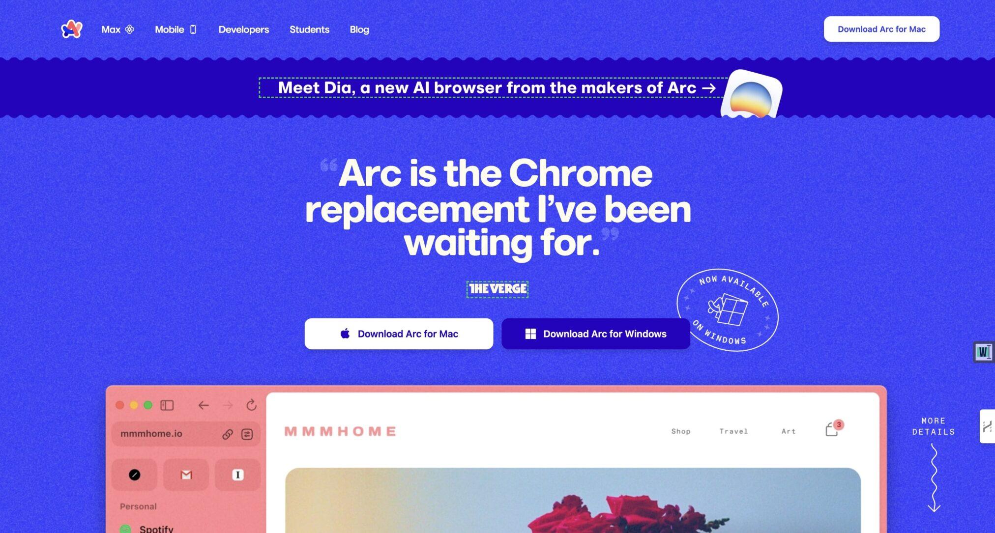
If Notion is calm, Arc Browser is curious. Its design feels alive, not in the flashy sense, but in the way a conversation feels alive — fluid, personal, evolving.
Key minimalist design features:
- When you visit Arc’s site, you’re not browsing; you’re gliding.
- Background gradients pulse softly, not to show off, but to hint at depth.
- Text fades in with a rhythm that feels almost cinematic. There’s motion, but no noise. Clarity, but no emptiness.
- Arc’s design team understands something many forget: motion can be minimalist too — when used with empathy.
- Instead of static white layouts, Arc leans into subtle transitions that mirror how we actually experience technology — always moving, but never chaotic.
- The typography plays a starring role. It’s bold, architectural, yet somehow still warm. Each section flows into the next without friction, like air moving through an open space.
- The dark palette with electric accents makes the visuals hum quietly, creating a sense of presence.
Arc doesn’t just practice minimalism- it evolves it. It brings emotion into restraint, reminding us that modern simplicity isn’t about subtraction, but precision. It’s not an aesthetic; it’s an attitude.
What Are The Key Principles for Minimalist Web Design?
Simplicity, use of whitespace, color palette, typography, and content prioritizations using SLIP are the best minimalist web design principles.
Each principle guides site workflow and ensures every element on the page helps users finish their tasks easily.
Simplicity: Thoughtful Reduction
The simplest way to achieve simplicity is through thoughtful reduction. The concept of simplicity in minimalism is not just about removing multiple design elements from a website – it is about carefully choosing what to keep.
It emphasizes the importance of retaining only those features that directly contribute to the user experience. To apply this principle, web designers use the SHE method.
- Shrink: Reduce visual bulk with flat icons.
- Hide: Place complex features in menus.
- Embody: Show quality with sharp visuals and easy-to-use interactions.
This careful curation ensures that every element in the website serves a clear purpose and that users focus only on what is important. It makes navigation straightforward and naturally intuitive.
Use of White Space: The Power of Context
Whitespace, or negative space, is the area around design elements not filled with content. In minimalist web design, whitespace is not empty space – it is a critical tool for framing all design elements (especially text content) to create visual breathing room.
The spaciousness helps users concentrate on the essential elements without feeling overwhelmed.
RSIS International Research shows that if you optimize spacing in your webpages, you can make small text 20% easier to read.
Prioritize Content with SLIP
Content is at the forefront of minimalist design. Minimalist web designers use the SLIP method – Sort, Label, Integrate, and Prioritize to organize content effectively.
This approach involves-
- sorting information into categories,
- labeling them clearly for easy identification,
- integrating related items for seamless navigation, and
- prioritizing key messages to ensure they stand out.
Limited Color Palette: Rhythm of Differences
Restrained color palettes are another hallmark of minimalist web design. By using fewer colors, designers can create a cohesive visual identity.
Such simple, visual aesthetics naturally feel more sophisticated and professional than heavily cluttered websites.
Strategic use of color, guided by the principles of color psychology in web designing can also direct user attention.
For example, using a bold accent color against a muted background can draw focus to important calls to action.
According to a study, clicks go higher when you use a two-to-three color palette with one dominant accent color.
Typography: Knowledge Through Clarity
Since minimalist sites have very few design elements, making the right typographic choices and following the right typography font trends are vital for making them look visually appealing.
Thoughtful typography not only enhances aesthetics but also makes website content more accessible. Clear and legible fonts reduce the cognitive load on users.
Report suggests websites that use at least two typeface families load faster than sites using three or more. This difference impacts bounce rate and Core Web Vitals scores.
Choosing certain typefaces can also convey specific brand values. For instance, The New York Times uses serif fonts in its headlines to give the site a sense of old-school credibility.
What are the Benefits of Minimalist Web Design?
Minimalism is one of the top web design trends as it improves loading speed, conversion, mobile performance, brand credibility and lower maintenance costs.
According to a Forrester report, every dollar you spend on reducing site friction and improving UX brings $100 in return, offering around 9,900% ROI.
This design approach has the following benefits.
Faster Loading Speeds
Fewer elements mean fewer HTTP requests. Websites with minimalist designs mostly load faster as they require less bandwidth and processing power.
This efficiency is crucial in today’s fast-paced digital environment where users expect instant access to information.
According to Google research data, more than 50% mobile users leave the site if it takes more than three seconds to load.
Note that simple designs load faster because they have fewer heavy files to download.
Enhanced User Experience
When designs are straightforward, users can navigate effortlessly without confusion or cognitive overload. Minimalist websites are great at fostering intuitive learning environments.
Research suggests every single dollar spent on better UX can return up to one hundred dollars. Basically, minimalism concept is the smartest investment a product team can make today.
Mobile Friendliness
According to a study, mobile devices now bring in over 55 % global web traffic. This makes the SHE method (Shrink, Hide, Embody) a practical design philosophy that can raise your user base.
Minimalist websites naturally adapt well to smaller screens because they have fewer elements to resize and reorient.
Improved Aesthetic Appeal
Minimalist websites are definitely more pleasing to the eye than overly cluttered sites. But, is minimalist web design inherently beautiful? Depends on who you are asking and who the designers are because beauty is subjective.
For some people, minimalist design may lack the emotional depth that more decorative designs provide. However, designers must strike a balance between simplicity and emotional expression.
They should incorporate color, texture, or unique shapes to enhance the aesthetic appeal of their websites without compromising on core minimalist principles.
What Are The Top Minimalist Web Design Trends for 2026?
Minimalism is about maintaining unified interfaces that blends structured content layouts with high site performance.
Important minimalist web design trends in 2026 include- motion minimalism, Calm UX, monochrome depth, typography, and AI assisted layouts.
According to a report, 67% of users trust a brand by looking at its website. They prioritize color palettes, generous whitespace, and clear typographic hierarchy.
Here’s how designers are reinventing the minimalist experience this year:
1. Motion Minimalism
Subtle motion has become the new texture. Designers are using gentle animations and scroll effects not to entertain, but to guide attention.
A fade, a tilt, a hover — these quiet gestures replace flashy transitions with purposeful storytelling.
It’s movement with restraint, rhythm without chaos.
2. Calm UX
We’re designing for overstimulated minds now. Calm UX focuses on serenity — muted tones, gentle contrast, and unhurried transitions. It’s the visual equivalent of an exhale.
You can feel the difference when using a calm interface; it doesn’t demand, it welcomes. The future of UX isn’t speed. It’s stillness.
3. Monochrome Depth
Instead of bright palettes, designers are exploring layered tones of a single color. A deep forest green or soft beige can build visual texture when combined with shadows and gradients.
This approach adds emotional depth without breaking the minimalist flow. Think mood, not minimal.
4. AI Assisted Layouts
Artificial intelligence is changing how minimalism is built. Designers now use AI tools that adjust spacing, test contrast, and even recommend typographic pairings. The irony?
AI helps create more human designs — balanced, adaptive, and inclusive. The result is minimalism that feels personal, not mechanical.
5. Typography as Emotion
In 2026, words are the new visuals. Designers are treating typefaces like personalities — expressive but disciplined.
Large, confident headlines and soft supporting text create contrast and rhythm.
Typography has become the emotional anchor of minimalist design, shaping tone even before a user reads a single word.
How to Build a Minimalist Website?
You can build a minimalist website design by using grids, fewer colors, clear navigation, CTAs, whitespace, user centric layouts, and optimizing web pages.
Follow these steps to get started.
1. Use a Grid System for Balanced Layouts
Grid creates a neat design that makes reading and navigating easier.
Recommended Tools:
- Figma offers robust grid layout features that allow for precise alignment and spacing
- Sketch also supports grid systems, making it easy to create balanced designs
2. Stick to a Limited Color Scheme and Font Family
- Limiting your color palette to 2 or 3 complementary colors.
- Choose 1 or 2 font families. Use these elements consistently throughout the site.
3. Prioritize User-Centric Navigation
- Use clear labels and a straightforward menu layout.
- Hide less critical options in expandable sections.
- Ensure that users can easily find what they are looking for without unnecessary clicks.
4. Embrace Whitespace Strategically
Use whitespace effectively to separate key content sections and highlight important features.
5. Use High-Quality Visuals
- Use professional images or custom illustrations in key areas of the site.
- Make sure these media files are optimized to maintain fast loading times.
6. Optimize for Speed
Constantly optimize your website’s design for speed by compressing images, minimizing HTTP requests, and using lightweight themes or frameworks.
Use GTmetrix to constantly analyze your site’s speed and make routine optimizations.
Data indicates, if your website meets google speed standards, the site will rank much higher in mobile search. If you use fewer scripts, images and simple layouts, you can optimize site pages and load the main content faster.
Important Speed Standards are-
- LCP (Largest Contentful Paint): under 2.5 seconds
- INP (Interaction to Next Paint): under 200ms
- CLS (Cumulative Layout Shift): under 0.1
7. Use Clear Calls to Action (CTAs)
- All CTAs on your site should be easy to locate.
- Use contrasting colors and ample whitespace around CTAs to make them stand out without overwhelming the user.
8. Follow User-Centric Design Principles
Always keep the user experience at the forefront of your design decisions.
Understand your audience’s needs and preferences, ensuring that every element serves a purpose and contributes positively to their journey on your site.
What’s the Best Website Builder for a Minimalist Website?
Squarespace is widely considered the strongest platform for minimalist sites — its templates default to generous whitespace and restrained typography, so simplicity is built in rather than something you have to fight the platform for. Webflow and Framer are strong alternatives if you want more custom control over layout and animation while keeping a clean aesthetic. WordPress can work too, but requires more deliberate theme and plugin discipline to avoid clutter creeping back in.
Conclusion
Minimalist design works best for brands which prioritize structured interfaces with only necessary elements. It simplifies visual complexity of the product and improves its productivity.
Now, if your website is cluttered and running slow, you can fix it with the help of our design team.
Let’s connect and bring your design vision to life!
FAQs on Minimalist Website Design
What is minimalist web design and why does it matter now?

Minimalist web design is the design practice of removing clutter from a website, giving users the space to see what they are looking for. It uses fewer colors, cleaner typography, and intentional white space to guide user actions.
Which websites are great examples of minimalist design today?
Best minimalist design examples are –
- Apple – follows visual storytelling that comes with generous whitespace,
- Notion – has calm typography and modular layout,
- Tesla – follows smooth navigation and full-width imagery features,
- Everlane – has subtle interface and follows ethical brand values, and
- Arc Browser uses subtle animation as a design tool.
Why do users connect so well with minimalist websites?
Users connect with minimalist websites because they reduce cognitive load and offer intuitive, and efficient product experience. By removing unnecessary elements, these sites become frictionless and helps users to find required details and take actions.
Does minimalist web design help SEO and performance?
Yes, a clean minimalist website improves SEO performance because pages load faster and contain less clutter. It ranks higher in mobile search results and improves user retention. Cleaner code and a logical structure also make the site easier for search engines to crawl.
How can a brand tell if minimalism fits its style?
A brand can determine its minimalism by evaluating whether its core identity is built on clarity, trust, and product quality.
Minimalism works best when it acts as a “less is more” philosophy and creates a structured product with visible core ideas and no clutter.
Isn’t minimalism just plain design with fewer elements?
No, minimalism is not just plain design, it is actually a practice that removes clutter and highlights core functions of useful elements. It focuses on quality and clarity of the digital product.



