


Ecommerce Navigation UX Best Practices with Examples

Quick Summary
Ecommerce navigation best practices involve using strategic whitespace, simple and logical menu structures, and clear product labels to help users quickly find what they are looking for.
FAQ’s About E-commerce Navigation UX Best Practices
What is ecommerce navigation?
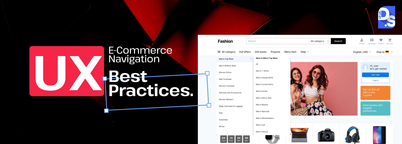
Ecommerce navigation includes menus, categories, drop-down subcategories, search bars, filters, links, breadcrumb trails, sticky menus, and mobile navigation paths that let people look around an online store. According to research by the Baymard Institute in 2024, the user experience of navigation and finding products is the most important factor in how well an ecommerce site works.
How many navigation items should an ecommerce site have?
eCommerce navigation includes a main menu (which should not contain more than 8 top-level items). When a user clicks on a top-level category, the user should see their relevant subcategories. The research has been validated by many of the best-performing ecommerce websites that were reviewed by Baymard’s 2019 UX study.
Does navigation affect ecommerce SEO?
A well-structured navigation system creates a clear site hierarchy that search engines can efficiently crawl and index. Internal links within navigation menus pass link equity to category and product pages, improving their search visibility. Additionally, Google’s mobile-first indexing means that poor mobile navigation, which affects 44.6% of US ecommerce traffic, can directly suppress organic rankings. Breadcrumb navigation also generates rich result markup opportunities in Google’s SERP displays.
What is sticky navigation in ecommerce?
Sticky navigation is a fixed header menu that remains visible at the top of the screen as users scroll down the page, implemented using CSS position:sticky. It ensures users always have access to department links, the search bar, cart icon, and promotions without scrolling back to the top.
What are the best mobile navigation patterns for ecommerce in 2026?
The best mobile navigation patterns for ecommerce in 2026 are: (1) a hamburger menu for compact navigation; (2) a bottom tab bar for primary section access; (3) a horizontal scrolling category bar; (4) a full-screen expandable menu for deep hierarchies; and (5) a floating action button (FAB) for quick primary actions like search or cart.
What makes a search bar effective for ecommerce navigation?
An effective ecommerce search bar includes: (1) prominent placement at the top of every page; (2) predictive text suggestions that auto-complete as users type; (3) advanced filters for price, brand, size, color, and availability; (4) auto-correct for misspellings; and (5) analysis-driven filter optimization based on actual search queries.
How does breadcrumb navigation improve ecommerce UX?
Breadcrumb navigation improves ecommerce UX by showing users exactly where they are within the site hierarchy, for example, ‘Home > Furniture > Sofas > Sectionals’. This reduces disorientation in deep product hierarchies, lowers bounce rates for users who land on product pages from search engines, and improves the overall sense of control users feel while browsing.