

Differences Revealed for Wireframe Vs Prototype Vs Mockup


Wireframes, mockups, and prototypes serve different purposes in the design process. Imagine the product you want to build has a new menu structure with unique navigation and custom user flows.
Turning this brand vision into a functional digital product requires the right tool at the right time as using the wrong one can cost a team weeks of rework.
The IBM Systems Sciences Institute found that fixing a problem during the implementation phase costs 6 times more than fixing the same issue during the design phase, and up to 15 times more if it reaches the testing phase, which is precisely why using the right design deliverable at the right stage matters commercially, not just creatively.
Knowing about these concepts will help designers create production-ready softwares.
So, wireframe vs mockup vs prototype: which one should you use? Let’s clarify all these points-
- Wireframes are the bare-bones blueprints that focus on the core structure and IA of a digital product.
- Mockups are the static, visual tools that showcase the product’s look (with color psychology and typography) and feel of the product.
- Prototypes are the interactive test drives that simulate the product’s actual user experience.
These three design deliverables help teams turn ideas into something they can see, test, and improve. They give teams a clear structure for early ideas and help find problems before development starts.
Forrester Research has found that companies that use prototyping in their design process reduce their overall development costs by as much as 33%. This is specifically because structural and usability problems are identified and resolved before any engineering time is spent on building the wrong thing.
They also help stakeholders review the design and agree on changes before coding begins.
What Is the Difference Between Wireframe vs Mockup vs Prototype?
Wireframe, mockup and prototype build a product step by step- wireframes outline the layout of the product, mockups show what things look like, and prototypes show how everything works.
Figma’s wireframing guide defines the wireframing process as the foundation stage as designers make structural decisions in this step without considering visual design. This explains why the three deliverables demand a step-by-step order.
To truly appreciate the distinct roles of these deliverables, go through this side-by-side comparison of wireframe vs mockup vs prototype:
| Parameter | Wireframe | Mockup | Prototype |
| Fidelity | Low to Mid | High | Low to High (can vary greatly) |
| Purpose | Define structure, layout, information hierarchy, and user flow | Showcase visual design, branding, and aesthetics | Test interactivity, user experience, usability |
| Interactivity | None (Static) | None (Static) | Clickable, Interactive (Simulates user actions) |
| Visual Detail | Minimal, grayscale, placeholders | Rich, full color, actual typography & imagery | Can range from basic to visually rich |
| Focus | Functionality, content organization | Look and Feel | User Journey, Task Completion, Feel of Interaction |
| Tools Used | Balsamiq, Sketch, Figma, Axure RP | Adobe XD, Figma, Sketch | InVision, Figma, Axure RP, Proto.io, Marvel |
| Time & Cost | Relatively quick & low cost to produce | Moderate time & cost | Varies significantly; can be time-intensive & costly |
| Ideal Use Cases | Early-stage planning, brainstorming, internal alignment, and initial client discussions | Design approvals, stakeholder presentations, marketing materials, developer handoff (visual specs) | User testing, usability studies, final design validation, investor pitches |
| Key Question Answered | “What goes where?” “How is it structured?” | “What will it look like?” | “How does it work?” “How does it feel to use?” |
| Iteration Speed | Very high; easy to make changes | Moderate; changes can impact visual consistency | Can be slower if high-fidelity and complex |
| Primary Audience | Designers, Product Managers, Information Architects, Developers (for structure) | Clients, Stakeholders, Marketing Teams, Developers (for visual guidelines) | Test Users, Designers, Developers, Clients, Stakeholders |
This table helps clarify why each deliverable is a crucial step in the design journey. The wireframe vs mockup vs prototype comparison, for instance, clearly shows the shift from structural planning to visual refinement.
How Long Does It Take to Create Each Deliverable?
The timeline expectations can vary with team size, project size and complexity of the design work. For a mid scale project (15-30 screens),creating wireframes can take 1-3 days, while mockups and prototypes (high-fi) can take 3-7 days respectively.
| Deliverable | Simple Project (5-10 screens) | Medium Project (15-30 screens) | Complex Project (50+ screens) |
| Wireframes | 4-8 hours | 1-3 days | 1-2 weeks |
| Mockups | 1-2 days | 3-7 days | 2-4 weeks |
| Prototypes (low-fi) | 2-4 hours | 4-8 hours | 1-3 days |
| Prototypes (high-fi) | 1-2 days | 3-7 days | 2-4 weeks |
- Uizard and Figma AI can make simple wireframes 30–50% faster. The time needed for human review and revisions usually stays similar. Uizard’s AI wireframing features are built around this premise, the tool generates layout suggestions from text prompts, cutting the time between a brief and a testable structure for straightforward screen designs.
- Projects often run late because stakeholder feedback takes longer than planned. Add set review points to keep feedback on track.
- Build lofi prototypes first, then create hifi versions. Finding layout problems early saves time and reduces rework.
What Is a Wireframe in UI/UX Design?
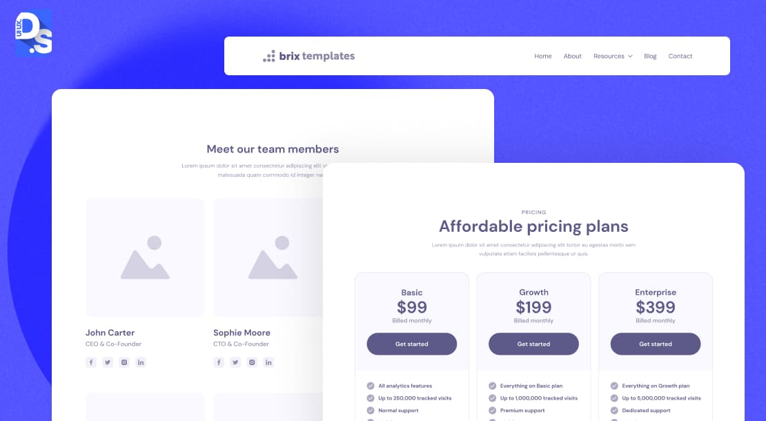
A wireframe is a stripped-down, skeletal framework of your website or application. It has no fancy fonts, no captivating colors, or glossy images. A wireframe is all about pure structure and functionality. It is the first step in visualizing how users will navigate your digital space.
The primary purpose of a wireframe is to define the information architecture, establish the hierarchy of content, and map out the user flow. It’s where you make the big, foundational decisions:
- Where does the navigation go?
- What do the first, second, and third screens of the product look like?
- How is content organized on all the product pages?
- Where are the key UI elements placed across all main pages?
These are the questions designers answer during the stage of early-stage wireframing. It is a critical phase for brainstorming and getting foundational concepts down. According to Balsamiq’s wireframing guide, wireframes help create a shared vision of what the product will include before any significant time or money is spent on visual design or development.
The main characteristics of all the wireframes created during this early stage are:
- They are typically low-fidelity wireframe, meaning they’re simple, often rendered in grayscale.
- They use basic shapes like boxes and lines to represent elements.
- They feature placeholder text (the classic “lorem ipsum”), not actual microcopy.
- Their focus is squarely on defining the product’s layout, the spacing in the interface, and the relationship between different design components, not on aesthetics.
All of this intentional simplicity keeps discussions centered on usability and structure. It prevents premature debates about visual appeal. This is why wireframes matter in UI/UX. They lay the groundwork for all subsequent design decisions.
Tools for Wireframing:
When it comes to wireframing tools, designers have a plethora of options, in addition to basic pencil and paper sketches.
- For quick, almost napkin-sketch-like wireframes, tools like Balsamiq are fantastic. They offer a hand-drawn feel that encourages rapid iteration.
- If you want to gradually evolve from low to mid-fidelity design wireframes with ease, use Sketch and Figma. Their built-in collaboration and testing features are awfully helpful with wireframe evolutions.
What Is a Mockup in UI/UX Design?
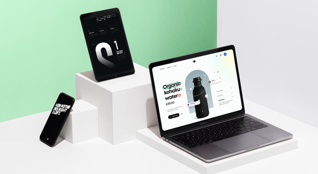
A mockup is a static, high-fidelity visual representation of the user interface. It takes the structural foundation laid by the wireframe and layers on the full aesthetic treatment: color palettes, typography, imagery, icons, and branding elements.
The two main goals of a mockup are to:
- Showcase the main visual design ideas
- Communicate the intended look and feel of the final product
Mockups are the deliverable that makes stakeholders say, “I see what that unique vision of yours is going to look like!” They are crucial for initial design reviews, gaining client approvals, and giving developers a clear visual guide.
The wireframe vs mockup distinction becomes crystal clear here; the former is about structure, the latter about appearance. Key characteristics of a mockup include:
- Its high-fidelity nature – mockups ought to be near-perfect representations of the final visual design.
- Details matter immensely here – from the exact hex codes of colors to the specific font weights and image resolutions.
However, it is crucial to remember that mockups are static. They are pictures of the interface, not interactive experiences. Clicking on a button in a mockup won’t take you to another screen. They are all visual specifications, not functional.
Mockup basically acts as the visual bridge between the team and the client, turning wireframes into real designs before any coding/testing starts. The Interaction Design Foundation’s mockup guide describes this bridge function as the moment when abstract structural decisions become concrete visual ones that non-designers can meaningfully evaluate.
Tools for mockups:
For crafting mockups, designers use tools like –
- Sketch: It runs on macOS that comes with a mature plugin ecosystem. It excels at building component-based UI systems.
- Figma: This tool is the perfect industry standard for your product design team.
- Adobe XD: This tool is the best fit for product teams which are already working within Adobe Creative Cloud environment.
- InVision Studio: It delivers flexible layout tools designed specifically for dynamic screen animation and interactive prototyping.
What is a Prototype in UI/UX Design?
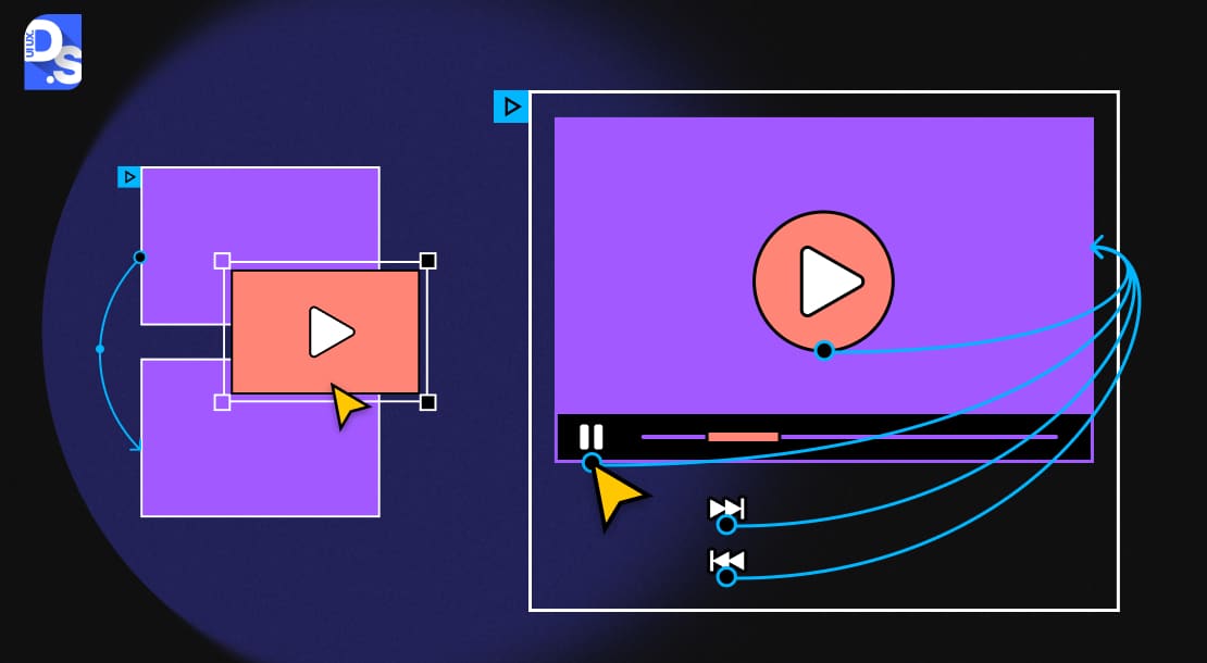
Now we arrive at the prototype – the stage where your design truly comes alive. If wireframes are the blueprints and mockups are the glossy brochures, then prototypes are the interactive test drives. A prototype is a simulation of the final product, designed to test and validate user flows and interactions. It’s the closest you can get to the real thing before investing heavily in development.
Prototyping is specifically meant for learning and testing. It answers if something works for real users by putting interactive items in front of them. The primary purpose of prototypes is to evaluate the user experience (UX).
Nielsen Norman Group’s prototyping research confirms this, the primary value of a prototype is not how it looks but whether it surfaces usability problems before any development cost is committed.
- How does it feel to navigate the app?
- Are the interactions intuitive?
- Can users accomplish their tasks easily?
They answer these questions for everyone in the team.
Prototypes allow developers and stakeholders to experience the product’s flow and functionality. They allow designers to uncover usability issues and gather feedback before they expend too many resources. By the time designers build high-fidelity UX prototypes, every stakeholder (including test users) gets a real sense of the final product’s feel and behavior.
Characteristics of prototypes can vary widely.
- They can range from low-fidelity (clickable wireframes, sometimes called “wireflows”) to extremely high-fidelity simulations virtually indistinguishable from the final product
- They may include , complete with animations, transitions, and even conditional logic.
- The defining characteristic is interactivity. Users can click buttons, navigate menus, and experience the product’s intended behavior. This hands-on nature makes prototypes invaluable for user testing and securing final buy-in.
Tools for Prototypes:
- InVision has long been a popular choice for creating clickable prototypes from static mockups.
- Figma again stands out for its integrated design and prototyping capabilities. It allows designers to seamlessly transition from visual design to interactive simulation within the same environment.
- Axure RP is another powerhouse for creating complex, highly interactive prototypes.
When Should You Use Wireframes, Mockups, and Prototypes?
You can use wireframes in the early project phase to map out structure and user flow. Use mockups in the middle stage to finalize visual design ( look) and branding. Use prototypes in the final stage to test real user interactions and behavior before writing code.
Knowing what each deliverable is is half the battle. Knowing when to deploy each is everything.
Wireframes:
- Wireframes are perfect for brainstorming or initial client meetings where the goal is to align on core functionality and user flow without getting bogged down in visual details.
- Use them to thrash out ideas quickly, test information architecture, and ensure everyone is on the same page about the product’s backbone.
Mockups:
- Mockups enter the scene when the structural foundation is solid, and you need to make a visual statement.
- Use them for design approvals with clients and stakeholders. They are your go-to for stakeholder presentations where you need to convey the product’s aesthetic appeal and brand identity.
- High-quality mockups can also be repurposed for marketing materials, pitch decks, and landing pages to generate early buzz.
Prototypes:
- Prototypes are your reality check. Their prime time is during user testing and usability studies. This is where you put your design hypotheses to the test with real users.
- Prototypes are also invaluable for final design validations before handoff to development. Complex features or novel interaction patterns particularly benefit from prototyping to de-risk the development phase.
Which Deliverable fits your Current Project Stage?
Follow this checklist to select the exact design asset your team needs today:
| Your Situation | Use This Deliverable | Why |
| You need to align the team on what the product will do and how users will navigate it | Wireframe | Structure decisions should be validated before any visual design work begins |
| You are presenting a new product concept to a client or stakeholder for the first time | Wireframe | Keeps feedback focused on structure and function, not aesthetics |
| You need client sign-off on the visual design direction before development | Mockup | Clients can evaluate look and feel without the confusion of interactivity |
| You need to show marketing or leadership what the product will look like | Mockup | High-fidelity static visuals communicate brand identity clearly |
| You want to validate whether users can complete a core task | Low-fi prototype | Fast to create, surfaces structural UX issues without visual design distraction |
| You need to demonstrate the product to investors or at a pitch | High-fi prototype | Simulates the real product experience; more persuasive than static visuals |
| You are handing off designs to developers | Mockup plus annotations | Developers need visual specs and behavior documentation, not just screens |
| You need to test a specific interaction or micro-animation | High-fi prototype | Only interactive prototypes can validate timing, feedback, and transition feel |
What Are the Common Misconceptions About Wireframes, Mockups, and Prototypes?
Wireframes, mockups, and prototypes are different steps in UI UX design process, but people often mix these concepts up. Common misconceptions people have are that- wireframes are meant for creating lofi designs, mockups are interactive designs, and prototypes are high fidelity designs which is not always true.
Also, many think that all these tools only help designers, but they are important for helping developers, clients, and users understand how the digital product will work.
The wireframe vs mockup vs prototype debates are rife with misunderstandings. Let’s clear the air on a few glaring ones.
Myth 1: Wireframes are only for low-fidelity designs
- While many wireframes are indeed basic, high-fidelity wireframes exist.
- They provide more detail in terms of specific content, precise spacing, and even navigational elements.
- But even high-fidelity wireframes still avoid full color and imagery to keep the focus on structure.
You can explore real-world wireframe examples to see this spectrum. The level of fidelity in a wireframe should match the complexity of the problem you’re trying to solve.
Myth 2: Mockups are Interactive
- They are not – mockups, by definition, are static visual representations.
- If you are clicking through screens, you’re interacting with a prototype, not a mockup.
- This mockup vs prototype distinction is vital for setting correct expectations when communicating with clients and team members.
Myth 3: Prototypes are Always High-fidelity
- Prototypes can, and often do, vary dramatically in fidelity.
- A simple, clickable wireframe (a low-fidelity prototype) can be incredibly useful for testing basic user flows early on.
- As the design progresses, prototypes generally increase in fidelity.
The idea of low vs high fidelity wireframes also extends to prototyping. Prototype can test designs best through user interaction ( testing), not how pretty they look.
What Are the Best Practices for Creating Wireframes, Mockups, and Prototypes?
Best practices for the design workflow starts from defining the core objective and understanding the needs of the target audience. The design process progresses from structure (with wireframes) to visual style ( with mockups) and finally to interactivity (with prototype). Here. designers –
- create low-detail wireframes to plan layout and content hierarchy
- change to high-detail mockups with strict design rules, and
- build clickable prototypes to test user flows and animations before coding starts (development phase).
Here are some detailed best practices that every designer must follow to make wireframes, mockups, and prototypes drive clarity and improve product success.
Start with Why (And For Whom)
Before sketching a single box, rigorously define the deliverable’s core objective and its intended audience:
- What specific hypothesis are you testing?
- What critical decision does this artifact inform (such as flow validation, visual direction approval, technical feasibility)?
- Is your audience deeply technical developers, business-focused stakeholders, or end-users for testing?
Remember, your devs will need functional clarity and annotations detailing the interface’s states/behaviors. Executives will require high-level flow and business impact visualization.
Tailoring your deliverables’ fidelity (for instance, grayscale wireframes for devs, branded mockups for marketing) and communication focus is vital for securing actionable feedback. Misalignment here will be the root of wasted effort.
Keep it Lean, Keep it Focused
Your starting point is wireframes, and their superpower is their ruthless focus on structure and flow. So, resist adding color, images, or detailed typography. Prioritize unambiguous layout, intuitive content hierarchy, and clear user pathways.
Employ a consistent, simple symbol set (for instance, distinct placeholders for text, images, video) and *essential* annotations to explain non-visual interactions (for example, “dropdown reveals on click,” “form validation error appears here”).
Embrace rapid, low-effort iteration – sketch on paper, use low-fidelity digital tools like Balsamiq. Aiming for pixel perfection at this stage is counterproductive; seek foundational clarity and validate core user paths quickly. Treat all feedback in the early stages as fuel for rapid iteration.
Mockups: Pixel Perfection and Brand Harmony
When you transition to mockups, attention to detail will be paramount:
- Make sure the alignment is pixel-perfect, the typography is consistent, and the brand guidelines are adhered to.
- Use real or realistic content where possible to give a true sense of the final product.
- Accessibility (color contrast, font sizes) should be a consideration at this stage.
When soliciting feedback, explicitly ask for evaluation of the visual language – aesthetics, emotional resonance, brand alignment; be prepared to articulate the rationale behind every visual design decision.
Prototypes: Prioritize Key User Journeys
The worst part of prototyping is scope creep. Avoid simulating every possible interaction at first. Instead, ruthlessly prioritize the 2-3 core user journeys critical to your product’s value proposition or carrying the highest usability risk (for example, onboarding, core transaction flow, complex filtering).
Build just enough interactivity (using tools like Figma, ProtoPie, or even coded prototypes) to credibly test your specific hypotheses about user behavior and comprehension. Focus on transitions, feedback mechanisms, and micro-interactions within these key flows.
Test early with representative users, observing actual behavior rather than relying on opinions. The goal is actionable insights, not a comprehensive simulation.
The Interaction Design Foundation’s prototyping guide reinforces this focusing prototype testing on the two or three highest-risk user journeys consistently produces more actionable findings than attempting to test every possible interaction at once.
Iterate the prototypes and gradually make them more complex based on this empirical evidence.
Collaborate and Iterate Continuously
Figma, Sketch (with Abstract or Plant), or Adobe XD (with cloud documents) are collaborative tools that make room for real-time feedback and version control. Figma Dev Mode is the practical endpoint of this collaboration, developers get exact spacing, color codes, and component states directly from the design file, removing the translation errors that happen in a static handoff.
Figma’s design guide states that working in live shared files rather than sending static pictures cuts revision counts and stops the approval of unbuildable designs.
Maintain clarity in the entire process of reviewing, prioritizing, and incorporating feedback into the next iteration. This continuous loop prevents costly late-stage surprises and builds shared ownership.
Don’t Over-Invest Too Soon
Align deliverable fidelity precisely with your project’s maturity and the immediate questions needing answers. Investing heavily in high-fidelity visuals or complex interactions for an unvalidated concept is a major resource drain.
Start with the lowest fidelity possible to answer the current question:
- quick sketches or low-fi wireframes for structural validation,
- grayscale wireframes or moodboards for initial flow/brand direction,
- mid-fi prototypes for core interaction testing.
Start lean, validate, and then incrementally add detail and fidelity. Only escalate fidelity (detailed visuals, complex micro-interactions in prototypes) once prior stages are validated. This lean approach will maximize learning while minimizing wasted effort.
Annotate Clearly
Never assume intent is self-evident, especially in wireframes and complex prototypes:
- Provide concise, unambiguous annotations directly on the artifact or in an accompanying spec.
- Explain interactive elements (hover states, clicks, gestures), conditional logic (“if user is logged in, show X”), edge cases (“empty state view”), non-visible behaviors (validation rules, error messages), and user flow connections (“submits to Confirmation Screen”).
- Use consistent terminology and reference design system components where applicable.
Clear annotations bridge the gap between design intent and development implementation. They reduce the risk of misinterpretation and rework, especially during handoff or when stakeholders review asynchronously.
By following these best practices, you make your wireframes, mockups, and prototypes drive clarity, ideological alignment (among team members), and ultimately, product success.
Conclusion
Wireframe, mockup and prototype, these three deliverables are not interchangeable parts in your workflow; they are the sequential pillars that support a careful, user-centered design process.
You can use each tool the right way and follow good design practices, your whole design process gets much better. It helps you avoid expensive last-minute changes, makes it easier to communicate with others involved, and leads to designs that work well and make users happy from the start.
If you are looking to streamline your design’s path to market by creating these deliverables, Design Studio UI/UX is here to help. Our UI/UX consulting company can provide the expert guidance and execution power needed to turn these deliverables into profitable realities.
Contact us now, and we’ll help you embrace the design trinity!