• Home
  • Blog
  • Mid-Fidelity Wireframes: Guide, Examples & When to Use

What are Mid-Fidelity Wireframes

Mid-Fidelity Wireframes: Guide, Examples & When to Use

Part of our Wireframe vs Prototype vs Mockup Series

Summary

Mid-fidelity wireframes are an upgrade from low-fidelity versions, offering clearer layouts, limited interactivity, and defined user flows to support early usability testing. They also include partial content, providing enough context for teams to understand structure and functionality.

A mid-fidelity wireframe is a type of wireframe that digital product designers create right after they create and approve their low-fidelity wireframes and before they create high-fidelity wireframes.

A wireframe is a basic blueprint with minimal styling created in the early stages of digital product design. It helps team members and stakeholders think about and communicate a product’s or website’s structure.

It serves as an objective visual reference to explore ideas related to the product’s function and content. The ‘fidelity,’ i.e., the level of detail in wireframes, increases over time as designers refine them.

The first versions of wireframes are basic black-and-white sketches drawn by hand that explain where all the main design elements of the web app will be placed on the screen.

These ‘low-fidelity’ wireframes consist of basic shapes, flow charts, arrows, and text. They do not feature specific user interface elements.

Once a low-fidelity wireframe has sown the seeds of the initial design ideas and established foundational design ideas, the team refines them to create mid fidelity or mid-fi wireframes.

According to Nielsen Norman Group’s prototype fidelity research, low fidelity wireframes reduce testing pressure and help teams embrace changes, making mid-fi wireframes our best bet for honest feedback in early stages. 

This blog is going to be a master class in mid-fidelity wireframes. We are going to explain:

  • What are Mid Fidelity Wireframes, in Comparison with Low and High-Fidelity Wireframes
  • Benefits of Using Mid-Fi Wireframes
  • Step-By-Step Guide to Creating Mid-Fidelity Wireframes
  • Medium Fidelity Wireframes Examples
  • Common Mistakes to Avoid When Creating Mid-Fi Wireframes
  • How to Enhance Mid Fidelity Wireframes for Better Results
  • Future Trends in Wireframe Design

What Are Mid-Fidelity Wireframes?

What Are Mid-Fidelity Wireframes?

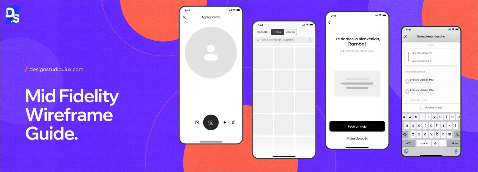
Mid-fi wireframes are a step above sketches when it comes to fidelity. They are more detailed than their low-fidelity counterparts but do not reach the level of high-fidelity wireframe designs. They feature some colors, some real text, as some UI elements.

  • Mid fidelity wireframes help the team begin the transition from abstract design ideas to more concrete design plans. They help the team start thinking about how users will interact with each screen or element within the final design and navigate among them.
  • These wireframes are also ideal tools in iterative design processes. Successful iterative design depends on the team’s willingness to regard design ideas as disposable so that they can discard weaker ideas and focus on the best ones.
  • Mid-fi wireframes are rough, disposable, and easy to create. Designers can create dozens of them, quickly and easily, through several rounds of iteration. If their design ideas hit a dead end with one set of these wireframes – they can start over again pretty easily.

Mid-fidelity wireframes are just one part of a larger collection of design outputs. Understanding how they relate to mockups and prototypes helps you figure out what your team really needs at each stage.

If that’s not always obvious, our guide on wireframes, prototypes and mockups breaks down the differences, when to use each, and even when you might want to skip a step.

What Is the Difference Between Low-Fidelity and Mid-Fidelity Wireframes?

The main difference between low and mid fidelity wireframes is their structural detail and interaction depth. Low-fidelity wireframes are basically fast, cheap, and perfect for brainstorming, as they keep you open to making massive changes.

On the other hand, mid-fidelity wireframes add enough detail and basic clicks to uncover navigation issues and user frictions.

Low-fidelity wireframes are great for starting digital design projects. They can be made within hours using simple materials like paper, pens, and tape.

However, low-fi wireframes do not represent detailed interactions, visual aesthetics, or all possible states or error cases within the design. So, the feedback they generate from users often overlooks more nuanced user experience issues.

Creating a mid-fidelity and clickable wireframe, lets designers take these wireframes to the next level of fidelity. By investing in more detail and fidelity, designers can make the user flows in the wireframes feel more realistic.  

Test participants and team members can also use digital input mechanisms to interact with mid-fi wireframes. This lets them gain better insights and feedback about how users will interact (click, tap, or gesture) with the product.

Compared to low-fidelity wireframes, mid-fi wireframes:

  • Provide a far better sense of the length and quality of all user flows within the design.
  • Reveal major obstacles to primary task completion.
  • Allow assessment of findability of core elements.

What Is the Difference Between Mid-Fidelity and High-Fidelity Wireframes?

The main difference between mid and high fidelity wireframes comes down to cost and flexibility in the design layouts. High-fidelity wireframes generally take time and resources to build. They are completely polished design ideas that often discourage stakeholders from giving raw, honest feedback.

On the contrary, mid-fidelity wireframes are cheaper, fast, and easy to pivot. 

According to UXPin prototype guide, these wireframes give just enough layout structure to test the design ideas without getting bogged down in colors or font. 

High-fidelity wireframes resemble the final product design way too closely. They feature detailed visuals, actual content, and branding elements.

Compared to high-fidelity wireframes, mid-fi wireframes are:

  • Easier to create, edit, and explain to users.
  • They are better at letting test users focus on the design’s structural and functional aspects – not aesthetics or content. 
  • Because they are detailed enough to convey essential functionality but not so polished that they appear final, stakeholders feel more comfortable offering honest and broad suggestions.

Learn the differences between: low vs high-fidelity wireframe.

Let’s take a look at the comparison table of these three fidelity wireframes.

AreaLow Fidelity WireframeMid Fidelity WireframeHigh Fidelity Wireframe
Detail LevelBasic shapes, placeholder text, black and whiteSome color, real text, defined UI elementsFull visual design, branding, real content
InteractivityNone — static onlyCan be made clickableFully interactive with realistic flows
Time to CreateMinutes to hoursHours to 1–2 daysDays to weeks
Best Used ForInitial brainstorming, concept generationUsability testing, stakeholder alignment, user flow validationClient approval, developer handoff, final UX testing
Primary ToolSketches, sticky notes, pen, paperFigma, Balsamiq, Whimsical, MoqupsFigma, Adobe XD, UXPin, Framer
Feedback TypeStructural / ‘does this make sense?’Functional / ‘can users complete this task?’Aesthetic / ‘does this feel right?’

What Are the Key Characteristics of Mid-Fidelity Wireframes?

Mid-fidelity wireframes prioritize clear layout, user flows, interactive/clickable features, helping teams test and refine the design structure. Lets discuss them in detail- 

Clear Layout

Their more defined structure makes it easier for all parties to understand the product design’s direction and provide constructive feedback.

User Flows

They help visualize user flows, i.e., how users navigate through various screens to achieve key goals so that team members can identify potential friction points early in the design process.

They also excel at mapping out user journeys and help designers understand the steps users will take to complete tasks within the interface.

Interactive

They can be made interactive or clickable – a feature that allows teams to validate their initial design layouts and user flows with target audiences. Interactive mid-fi wireframes also help designers gather usability-related feedback before moving to higher-fidelity designs.

Easy to Edit

Iterations and refinements based on feedback can be made swiftly in mid-fidelity wireframes compared to high-fidelity prototypes.

Great for Communicating Ideas

Mid-fi wireframes strike a balance between low and high fidelity by providing just enough detail to convey the design’s architecture without delving too much into specifics. However, they do present a defined structure that visually outlines the layout and user flow of a product.

This clarity helps the team grasp the direction of the project more easily.

What Are Common Misconceptions About Mid-Fidelity Wireframes?-Fidelity Wireframes

Only professional designers can create mid-fidelity wireframes

With easy-to-use tools like Moqups, Whimsical, Balsamiq, etc., even non-designers can ‘whip up’ mid-fi wireframes.

Mid-fi wireframes are only used for a limited period

Mid-fi wireframes serve as excellent tools for gathering feedback throughout an iterative design project. They can be referenced whenever designers make decisions about the final product’s features or functionalities.

Mid-fi wireframes are not as important as low or high-fidelity wireframes”

Mid-fi wireframes are vital in bridging the gap between initial concepts and final designs. Their ability to facilitate interactions and gather critical, functionality-related feedback makes them just as indispensable as low or high-fi wireframes for creating user-centered digital designs.

What Are the Main Benefits of Using Mid-Fidelity Wireframes?

Benefits of Using Mid-Fidelity Wireframes

Mid-fidelity wireframes guide every step of the design process- from finding early planning mistakes to testing ideas before building. Hotjar UX guides show that testing at this stage helps catch and fix design flaws early, which avoids the huge costs of fixing them later.

Good mid-fi wireframes pave the way to good designs by bringing out the best ideas and marshalling them toward implementation. Here are some other benefits of mid-fi wireframes:

Identify and Bridge the Gaps

Mid-fidelity wireframes are instrumental in revealing gaps in design concepts that may not be apparent when ideas remain solely in the designer’s mind.

  • By transferring abstract ideas onto a visual medium, designers can see their concepts clearly, which often uncovers flaws or overlooked areas. This process helps identify missing use cases or features that need to be addressed.
  • The initial mid-fi wireframes should prompt exploration and creativity. When team members observe what is absent or unclear in the design, it stimulates further ideation.
  • The open-ended nature of mid-fidelity wireframes encourages brainstorming and iteration, which leads to more refined and effective design solutions.

Time and Cost-Efficiency During the Design Phase

Mid-fidelity wireframes contribute significantly to time and cost efficiency by allowing teams to address potential issues early in the design process.

  • Firstly, they help ensure the design addresses well-defined user problems rather than just creating aesthetically pleasing solutions.
  • Successful mid-fi wireframes are built from the user’s perspective. They emphasize design solutions that genuinely meet user needs and solve the specific problems they face.
  • This focus on users prevents wasted effort on features that may not resonate with users. It also makes mid-fi wireframes perfect reference points for the entire team. They quickly remind everyone of the target audience and their requirements.
  • The ability to create clickable mid-fidelity wireframes long before any development begins also allows for quick iterations based on feedback. Teams can validate concepts with real users early on, ensuring that they are on the right track without investing excessive time or resources.
  • By visualizing workflows and user interactions at this stage, teams can detect usability problems before they become embedded in more detailed designs. This early detection minimizes costly changes or unnecessary work on features during later development phases.

Early Detection of Usability Issues

Mid-fidelity wireframes enable teams to identify usability issues before they escalate into larger problems during development.

  • The capacity to create clickable wireframes allows for user testing at an early stage.
  • This interaction provides valuable insights into how users navigate through screens and complete tasks. It instantly highlights all the key areas where they may encounter friction.
  • Because mid-fidelity wireframes are not polished final products, users feel more comfortable providing candid feedback about their experiences. This honesty leads to a more accurate understanding of usability challenges.

Balancing Detail and Flexibility in Design

Mid-fi wireframes may be a step above sketches when it comes to fidelity. But, designers treat them just like sketches – disposable and editable.

  • By using a limited color palette, designers avoid getting bogged down in excessive detail.
  • This allows them to focus on communicating core design ideas rather than final aesthetics. This approach is crucial for transitioning from abstract design concepts to tangible products. 
  • Mid-fi wireframes enable experimentation with different layouts and components for the same workflow. Granular variations and changes that may take hours in high-fidelity mockups can often be made in just minutes with mid-fi wireframes.
  • This efficiency allows teams to iterate rapidly without extensive time commitments.
  • By inviting discussion through annotations and intentionally leaving some areas unfinished, these wireframes encourage collaborative input and exploration.

Overall, mid-fidelity wireframes empower teams to engage in meaningful dialogue about the design while remaining adaptable to change.

How to Create Mid-Fidelity Wireframes? A Step by Step Guide

You have to follow a structured process to create mid-fidelity wireframes- starting from basic user research to building interactive, testable designs.

Here the main focus is adding more detail for real users and stakeholders to interact with it. 

According to Interaction Design Foundation, a proper wireframe can turn research data into structured layouts, putting user goals above good looks.

Let us go through the process of building a mid-fi wireframe.

By the time you get to this stage, you’ll already have several rough low-fi wireframes that you would like to develop further. The next steps include making these basic sketches more user-centric and constructing user interfaces, screens, pages, and user flows.

Understanding the User Flow and Functionality

Creating effective mid-fidelity wireframes begins with a deep understanding of user flow and functionality.

Define User Goals

  • Identify who will use your design. This involves researching to understand your target audience, including their demographics, preferences, and behaviors.
  • Document their specific goals and the challenges they face when using similar products. 
  • This information will inform the direction of your wireframe and keep it rooted in real user needs.

Create a Sitemap

  • Next, develop a sitemap to visualize the hierarchy of your website or app.
  • This sitemap will serve as a blueprint that outlines how different pages are organized and how they relate to one another.
  • It should showcase parent-child relationships among pages, indicating which sections are subcategories of others.

Creating a sitemap helps you understand how users might navigate through various sections of your product. It allows you to see the overall structure at a glance, making it easier to identify potential navigation issues or redundancies.

Map User Flows

  • Once you have a sitemap, visualize the journey users take to complete specific tasks. Mapping user flows involves outlining each step a user must take from start to finish.
  • Begin by identifying the desired end state – what users should see when they complete their task – and work backward to outline all necessary steps leading there.
  • This method simplifies complex tasks by breaking them down into manageable parts.

Develop Wireflows

Finally, combine your wireframes with user flows to create wireflows.

  • Wireflows illustrate both the user’s path through the application and the basic interface elements they will encounter along the way.
  • They consist of a series of wireframes connected by arrows that indicate how screens relate to one another.
  • Wireflows allow you to focus on user actions while maintaining an overview of navigation.
  • By presenting both the user’s journey and interface details together, you can ensure that critical interactions are highlighted without getting lost in excessive detail.

Structuring Wireframes Effectively

You can structure wireframes based on what users need to do and see, rather than just making them look pretty or forcing them into a rigid layout grid.

To make sure your wireframing process does not become a mess:

Start with Content

Before diving into layout, focus on the content that needs to be displayed. Content modeling can help prioritize info based on user needs and ensure that essential elements are highlighted.

Adopt Inside-Out Design

Instead of starting with a complete layout, begin by designing the smallest unit of content first. This approach allows you to build outwards, ensuring that the structure fits the content rather than forcing content into an arbitrary layout.

Use Limited Detail

Keep your wireframes simple by using a limited color palette and avoiding excessive detail. The goal is to communicate ideas clearly without getting caught up in aesthetics.

Highlight Critical Interactions

Focus on key interactions essential for user success. Prioritize these elements in your wireframe to ensure they receive adequate attention during development.

Incorporating Feedback Loops

Getting feedback from users is what makes mid-level wireframes truly useful.

Invite collaboration

Share your wireframes with team members and stakeholders early in the process. Encourage discussion and invite feedback to refine your designs effectively.

Conduct Design Critiques

Organize critique sessions where team members can provide input on the wireframes. Use this feedback to make necessary adjustments before moving on to high-fidelity designs.

User Testing

Test all clickable mid-fidelity wireframes with real users representing your target audience.

Iterate Based on Feedback

Use the feedback collected from critiques and user testing to inform necessary changes and ensure that your wireframes align with user needs and expectations.

How Long Does It Take to Create Mid-Fidelity Wireframes?

Time estimates for mid-fi wireframing vary significantly by project scale and tool proficiency. Here is a realistic guide:

Project TypeNumber of ScreensEstimated TimeNotes
Simple landing page3–5 screens4–8 hoursSingle user goal; limited navigation complexity
Mobile app (MVP)8–15 screens1–3 daysMultiple flows; navigation system design required
E-commerce website15–25 screens2–5 daysComplex product browse, checkout, and account flows
SaaS dashboard20–40 screens1–2 weeksData-heavy layouts; conditional states; admin vs user views
Enterprise web application40+ screens2–4 weeksMultiple user roles; complex workflows; accessibility requirements
  • Using AI wireframing tools (Uizard, Figma AI) reduces initial layout time by 30–50% — but review and iteration time remains similar
  • Non-designers using Balsamiq or Whimsical typically take 30–50% longer than experienced UX designers using Figma
  • Time estimates above assume one round of internal review before user testing; add 20–30% for each additional major revision cycle

What Tools are used to Create Wireframes?

To create clickable mid-fidelity wireframes, consider using the following tools:

Standard design software like Figma and Adobe XD also offers powerful features for designing, editing, and sharing interactive wireframes.

Here is a comparison table of the commonly used mid-fi wireframing tools in 2026:

ToolBest ForFidelity LevelFree Plan?Key Feature
FigmaCollaborative teams, design systemsLo-fi to Hi-fiYesReal-time collaboration; AI layout suggestions; industry standard
BalsamiqQuick lo-fi and mid-fi sketchingLo-fi to Mid-fiNo (free trial)Intentionally sketch-like; fast; great for non-designers
WhimsicalFast wireframing + flowchartsLo-fi to Mid-fiYes (limited)Simple drag-and-drop; great for mapping user flows
MoqupsWeb-based mid-fi wireframesMid-fiYes (limited)Templates-driven; good for rapid mid-fi creation
MarvelClickable prototypes from wireframesMid-fi to Hi-fiYes (1 project)This tool is good for fast click-through prototyping, also good for stakeholder demos
Axure RPComplex interactions and logicMid-fi to Hi-fiNoAdvanced conditional logic; best for complex enterprise UX
UXPinCode-backed interactive prototypesMid-fi to Hi-fiNo (free trial)Uses real components; bridges design and development
UizardAI-powered wireframe generationLo-fi to Mid-fiYes (limited)Converts sketches to digital wireframes using AI

What Do Mid-Fidelity Wireframe Examples Look Like?

A good mid-fi wireframe generally looks like an organized, partially detailed layout with basic text sizes, navigation labels, and placeholders for buttons and images. It does not show brand colors, real fonts, actual photos, or final spacing.

To get an idea of what your mid-fi wireframes should look like, check out these mid-fidelity design examples:

(i) What Do Mid-Fi Wireframes Look Like?

Mid-fi wireframes explaining the website and app versions of a digital product  

Mid-fi Wireframe for app

Mid-Fidelity Wireframes App Example

(Source)

Mid-fi Wireframe for website

Mid-fidelity wireframe for website

(Source)

As you can see, these wireframes are simple, have a limited color palette, and avoid excessive detail. Their goal is to communicate what the website and app should look like without getting caught up in aesthetics.

(ii) How Mid-Fi Wireframes Aid the Design Process

Mid-Fidelity Wireframe Design of a Bookstore App 

Mid-Fidelity Design Example of a Bookstore App

(Source)

Here, these wireframes visualize the journey users have to take in a bookstore app to complete tasks. They illustrate both the user’s path and basic interface elements. The wireflows focus on key interactions essential for user success while maintaining an overview of navigation.

Explore for more wireframe examples for web design to see how different layouts impact usability.

Do these mid-fidelity wireframes fit into modern, agile, or lean design workflows?

Modern, agile, or lean design workflows aim to achieve the same goal – do the least amount of work to progress to the next step in the design process.

So, are mid-fi wireframes a waste of time? Absolutely not. By creating mid-fidelity wireframes, designers can quickly visualize ideas and gather feedback.

According to NNG’s research, early rough prototypes get everyone on the same page and this avoids expensive design changes at the end.

If an idea proves ineffective, it is easier to pivot and explore alternative solutions without significant investment in time or resources. Mid-fidelity wireframes also support agile workflows by promoting flexibility and adaptability.

Mid-fi wireframes allow for quick adjustments based on stakeholder input or user testing results. Since they are less detailed than high-fidelity prototypes, changes can be made swiftly without the need for extensive rework.

What Common Mistakes Should You Avoid When Creating Mid-Fi Wireframes?

The main wireframing mistakes happen when you treat drafts like finished products rather than quick, temporary ideas.

To make sure your mid-fi wireframes are not a waste of time, avoid making these mistakes:

  • Overcomplicating wireframes with unnecessary details.
  • Skipping usability testing.
  • Miscommunicating with users, developers, or other stakeholders about the level of fidelity so that they can share their honest opinions.

Enhancing Mid-Fidelity Wireframes for Better Results

You can improve mid-fi wireframes by making them easier to test rather than making them prettier to gather more helpful and realistic feedback from real people.

To make your mid-fi wireframes even more effective:

  • Use annotations and labels for clarity (like in the second example).
  • Prioritizing accessibility and inclusivity early on so that you can avoid extensive and expensive rework in the later stages.
  • Make mid-fi wireframing a standard part of your design procedures’ prototyping and user testing phases; the more you make, test, and use these wireframes – the more value you’ll derive from them.

Future Trends in Wireframe Design

The future of wireframing is driven by AI and cross-reality; and this concept will save more time in creating initial design drafts. 

Before we let you go, here are some exciting predictions for mid-fidelity wireframes in 2026 and beyond.

AI and Automation Tools Reshaping the Wireframing Process

Tools like Figma now use AI to suggest layouts based on user input. Adobe XD uses AI to generate placeholder text and images in wireframes – it can automatically fill in content based on design context. 

These features help designers quickly generate wireframes that adhere to best practices. They are reducing the time spent on initial drafts and allowing for rapid iteration.

Top AI wireframing tools for 2026 are- Uizard, Galileo AI and Figma AI. These tools speed up, improve, and simplify the overall design process.

Look at this detailed table which lists some major AI powered wireframing tools –

AI ToolWhat It DoesBest Use CaseFree Plan
UizardConverts hand-drawn sketches to digital wireframes; generates UI from text promptsTurning paper sketches into shareable mid-fi wireframes in minutesYes (limited)
Galileo AIGenerates full UI designs from natural language descriptionsRapid initial layout generation for early design explorationPaid (waitlist)
Figma AI (First Draft)Suggests layout variations based on content and context within FigmaAI-assisted wireframing inside the world’s most-used design toolIncluded in paid plans
Framer AIGenerates responsive web layouts from prompts; publishable directlyFast mid-fi to live website workflow for landing pagesYes (limited)
Mockplus AIAuto-generates wireframes from product requirement documentsTranslating PRDs into visual wireframes for product teamsPaid

Adapting Wireframes for Emerging Technologies like AR/VR

Tools like Sketch are evolving to support 3D modeling. They allow designers to create mid-fidelity wireframes that reflect how users will interact with digital elements in a physical environment

Conclusion

Designers are optimists. We often believe that our solutions, whether we worked on them for 10 minutes or 10 weeks, are always well-crafted and properly thought out. However, ideas are cheap and plentiful; the ‘good’ ideas must prove themselves to be taken seriously.

This is where mid-fi wireframes help designers. They allow designers to visualize and test their countless design ideas in a resource-effective way. That’s why all leading digital designers, including the ones at Design Studio, a premier UI/UX design agency, are strong advocates for mid-fi wireframing and wireframing in general.

We urge all readers to take the same position. Incorporating mid-fidelity wireframes into your workflows encourages a culture of experimentation and iteration.

FAQ’s

What is the difference between mid-fidelity and low/high-fidelity wireframes?

Right Arrow

The difference between low, mid, and high-fidelity wireframes is their level of detail.

About the Author

Sneh Sagar

Co-Founder & CTO, Design Studio UI/UX

Sneh Sagar is the co-founder of Design Studio UI/UX, a UX design agency with clientele spanning across different industries, domains, startups, companies in the growth phase, and large enterprises on a global scale. With 10+ years of experience and 350+ projects in his portfolio, he has built digital products for healthcare, SaaS, among other industries (most of them at a stage where the product no longer aligned with the business perspective). His impressive portfolio is the intersection of research, system thinking, and interface design to help teams by creating products with high usability and scalability.

Recent Articles

Looking for UX/UI research

or product branding?

user
Envelope
Phone

350+ Projects Delivered — And Counting