


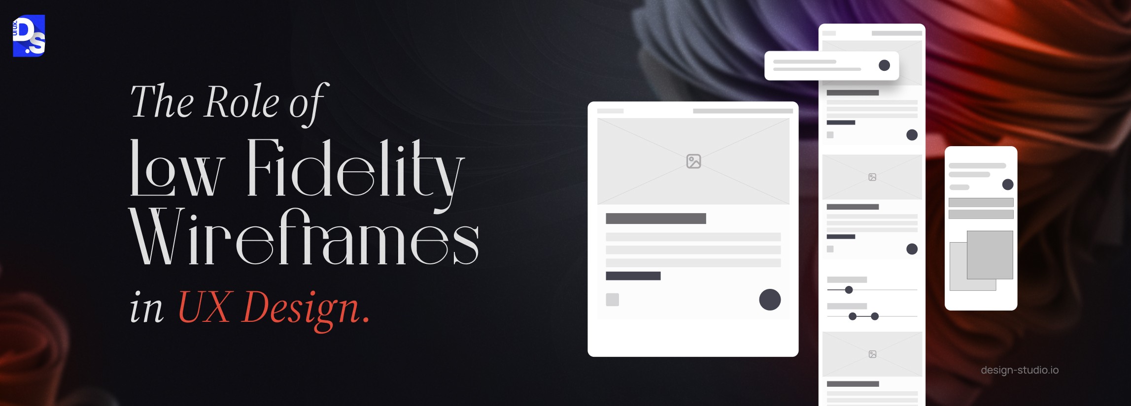
What is Low Fidelity Wireframe? Guide & Examples (2026)



Summary
A low fidelity wireframe is a simple sketch used in the pre-design phase to plan a website’s layout and user flow. These wireframes use basic shapes like boxes, lines, key screens, and placeholders to focus on structure and functionality rather than visual design.
For visionary startups, transforming groundbreaking ideas into tangible products requires a crucial first step: creating a low fidelity wireframe.
These basic layouts, whether hand-drawn sketches or simple digital mockups, serve a critical purpose: validating concepts long before a single line of code is written.
A lofi wireframe is a simple sketch or blueprint of the product layout with only basic shapes, texts, and lines.
It can help teams test design ideas and user flows before deciding on colors, interactive visuals and other design centric details.
Research shows these layouts can cut design time, development costs, and identify mistakes early.
Think of the iconic iMac, the revolutionary Tesla Roadster, or any other world-changing app or website, each of these innovations probably began as a low-fidelity wireframe.
This rapid prototyping tool has become essential in today’s fast-paced design landscape, where design ideas need to be practical, viable, and user-centred from the start.
Why Low Fidelity Wireframing Matters for UX Success in 2026?
Lo-fi wireframing can cut design time by 50%, help validate ideas quickly and prevent expensive redesigns.
According to a study on UX issues, fixing a design problem after product launch costs 100x more compared to fixing it in the initial wireframing stage.
Low-fidelity wireframes aren’t just about sketches, they’re strategic assets that save time and effort while improving collaboration and usability.
Reduces Design Time by Up to 50%
Starting your design process with low-fidelity wireframes helps teams identify layout and flow issues early, cutting design timelines nearly in half. Source: CubetTech
Using these tools can solve structural flaws instantly instead of redesigning hours of detailed work.
Wireframing before designing saves time and effort on every iteration, avoiding costly redesign of screens, components, and stakeholder alignment later in the process.
Yields 100x ROI for Every Dollar Spent on UX
Research shows investing in design strategies can return up to $100 for every dollar spent on UX.
This includes creating wireframes that reduce support costs, costly rework, and improve conversion rates.
Source: VWO
Prevents Late-Stage Errors
Low-fidelity wireframes prevent costly rework by spotting layout flaws before any visual design, development, or stakeholder sign-off investment is made.
This concept helps design teams to test their ideas, validate userflows and prevent critical usability issues.
It will save time and money to fix flaws early in design rather than paying for post-launch reworks, QA re-testing, and stakeholder approvals.
Data shows it costs 10–100x less to solve issues in the early stage compared to late redesign work.
Source: Phenomenon Studio
What is Wireframe in UX Design?
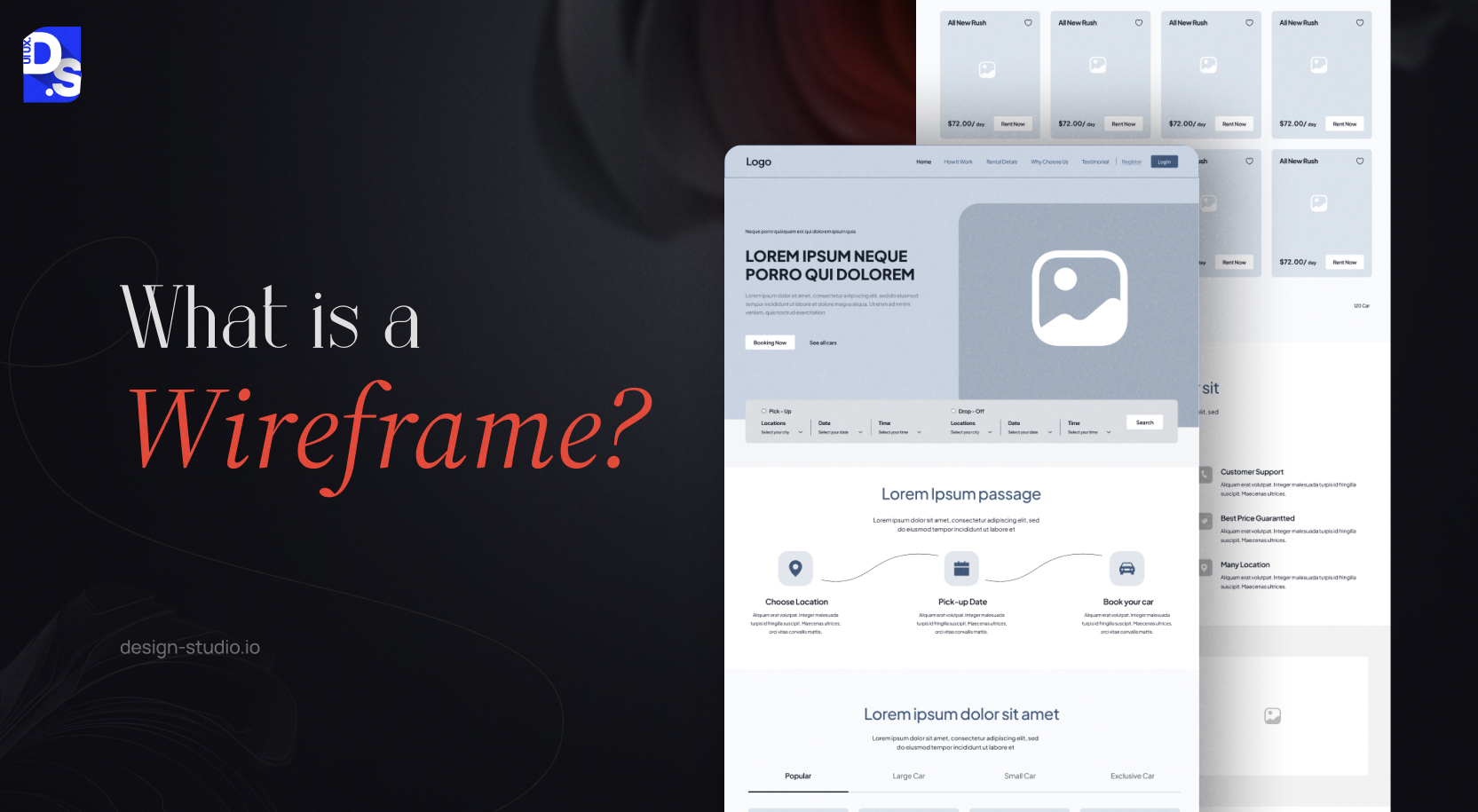
A wireframe is a simple blueprint for a screen. It shows the basic layout and structure, including the placement of important UI elements such as navigation, placeholder, buttons, and images.
It does not focus on the final look of the site and only defines how a user moves through the webpages. It differs from a mockup, which adds visual style, and a prototype, which adds clickable behaviour.
Wireframes progressively increase in detail as the design evolves.
Initially, they are low-fidelity sketches packed with basic black-and-white shapes and outlines that represent where key navigational elements, text, and graphics will reside.
By creating multiple wireframes for different webpages or app screens, you can establish a comprehensive skeletal view of your entire product.
These simple sketches, whether digital or hand-drawn, function as powerful ideation and collaboration tools, facilitating rapid design iterations and fostering alignment across teams.
This significantly contributes to a more streamlined and effective UX design process.
These benefits of wireframing are undeniable, with studies suggesting a reduction in overall design time by up to 50%.
What Does Fidelity Mean in UX Design?
In UX design, fidelity refers to the degree of detail and resemblance a wireframe bears to the final product. It describes visual accuracy and interactivity of the design features.
Three key aspects determine fidelity level:
- How closely the layout and organisation of the wireframe reflect the final product.
- The level of detail and comprehensiveness of the content included (text, images, etc.).
- The degree to which the wireframe incorporates interactive elements and simulates the final product’s behaviour.
You must explore these wireframe vs prototype vs mockup differences and understand their importance in different design stages.
You can categorize fidelity concepts into 3 stages-
- Low Fidelity Wireframes: Perfect for brainstorming early design ideas. Creates Basic, initial drafts of the product structure with mandatory visual elements. It mainly focuses on the overall workflow of the website.
- Mid Fidelity Wireframes: Slightly more detailed wireframes featuring more visual and functional elements, but still lacking all final design elements. It shows an overview of the content and navigation.
- High Fidelity Wireframes: Perfect for ideating the ultimate version of the website. Detailed, interactive wireframes that closely resemble the final product and include visual design elements, graphics, and interactive features.
You can choose low fidelity for rough sketches and mid fidelity for organized layouts with basic content and navigation. Also, you can use high fidelity to get functional and realistic design versions.
Evaluate your current design stage, feedback required, and user pain points before picking the right level, but understanding low fidelity vs high fidelity wireframes will provide you an edge over others.
By understanding fidelity, you can create the right wireframes for different stages of the UX design process.
Low-fidelity wireframes are ideal for early concept exploration and validation, whereas hi-fi wireframes excel at refining the final product’s look and feel pre-launch.
What is a Low Fidelity Wireframe and When Should You Use One?
A low fidelity wireframe is a basic non-interactive sketch that uses simple boxes and lines to structure the product journey.
You can use lofi wireframes to brainstorm design ideas in the initial phase, test layouts, gather feedback, and conduct A/B testing.
They are perfect tools for initial brainstorming which saves both time and resources. But the concept is not recommended for final product approvals, developer handoff, or client sign-off.
Think of lo-fi wireframes as grayscale blueprints:
- They focus on the core features of an app or website, using basic shapes, lines, and placeholders to represent content, images, and other elements.
- They are ideal for outlining the fundamental structure of a web page, app, or user interface idea.
- These wireframes are created during the early design stages, following initial brainstorming and concept development.
When Low-Fidelity Wireframes Add The Most Value?
Low-fidelity wireframes add most value:
- In the ideation or concept validation stage.
- Where speed matters more than visual accuracy.
- When stakeholders need alignment on structure and flow.
- When you want honest usability feedback without aesthetic bias.
- When budget or timelines do not allow detailed prototyping yet.
Basic wireframe drafts can be easily drawn by hand or made quickly with simple tools, making them perfect for checking concepts fast.
What Are the Key Benefits of Low Fidelity Wireframes?
Low fidelity wireframes improve communication between teams and speed up design changes.
It helps teams test ideas, get better feedback, spot errors, and align everyone on the user journey before committing to any final details.
Enhanced Feedback
Rough low-fi sketches generate better feedback because they keep people focused purely on layout and navigation.
Research shows that users give honest feedback regarding site functionality when the interface does not contain distractions like fonts or colours.
This can also easily solve foundational problems before investing time on the final visual.
Their simplicity encourages stakeholders and users to prioritise functionality and usability over aesthetics. This leads to valuable feedback that strengthens the overall UX design.
Agile Iterations
Agile iteration works best with low-fidelity wireframes because they are optimised for rapid changes and instant feedback.
Because they take only minutes to draw, your team can brainstorm and explore tons of ideas very quickly.
You can test and throw away five to ten different approaches in the time it takes to finish one high-end design.
This concept keeps your project efficient by making fixes fast and affordable.
Easy modifications allow designers to experiment with various design ideas quickly, essential for refining the design to meet user needs.
Saving Time and Resources
Fixing a design error takes minutes during the wireframe stage, but it can take weeks of expensive work if you wait until after the product launches.
It is found that solving issues during the initial design phase is 10 to 100 times more affordable than fixing bugs in a finished product.
Improved Communication
Lo-fi wireframes bridge the communication gap between designers, developers, and stakeholders by providing a clear layout and user flow.
By showing navigation and design layout, they prevent mistakes and confusion between internal teams.
This early alignment saves the entire team from wasting effort on the wrong ideas.
Design Validation and Functionality Checks
Lo-fi wireframes help validate design ideas and gain client approval before extensive design work begins.
Research confirms testing with five users at this stage can catch 85% of major usability errors. It only takes 30 minutes to find basic navigation and layout problems.
Once these design blueprints are approved, you can use them as your web design roadmap. They can help you test screen interactions before final work begins.
User Flow Visualization
Lo-fi wireframes contribute to user-centric design by focusing on user experience.
By connecting basic wireframes with flow lines, you can explain how a user moves through your product to finish a task.
This process highlights errors such as:
- Moments where users lack the information to make a decision.
- Missing steps in the user journey.
- Unnecessary screens that add friction.
Insights gathered during the design process inform the creation of lo-fi wireframes, which can later be refined into more detailed prototypes.
Lo-fi wireframes start by outlining the basic layout and UI elements, prioritising functionality over visual design.
As the design process progresses, lo-fi wireframes evolve into more detailed mid-fidelity and high-fidelity prototypes, incorporating visual elements and interactive features.
What Are the Limitations of Low Fidelity Wireframes?
Low-fidelity wireframes fall short because their plain look can sometimes fail to excite stakeholders, causing communication gaps among internal teams.
Lack of interactivity can also confuse users regarding the functions of buttons or forms.
Some people can take placeholder boxes too literally. Without visual cues and interactive elements, it may be difficult to envision the final product accurately.
No Visual Appeal
When we prioritize pure function of the design elements over visual polish, lofi wireframes may struggle to impress stakeholders who aren’t familiar with design methods.
No Interactivity
Static lo-fi wireframes do not allow user interaction, hindering the ability to accurately depict and test user flow and interaction.
Potential Miscommunication
Over-simplistic lo-fi wireframing can lead to miscommunication within teams or with stakeholders, especially those unfamiliar with wireframing principles.
Limited Later-Stage Use
Lo-fi wireframes excel in the early design stages. As the project progresses, more detailed high-fidelity wireframes or prototypes become necessary.
Despite these limitations, lo-fi wireframes remain an essential tool for early-stage design.
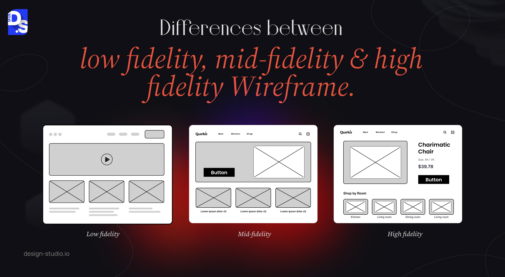
Difference Between Low Fidelity, Mid Fidelity & High Fidelity Wireframe
You can choose fidelity level based on your team size and how much detail you need. Use pen and paper for quick brainstorming and Balsamiq for a ‘hand-drawn’ digital look.
However, Figma is the current industry standard for millions of designers for any fidelity level.
Also, product designers have ranked Figma as the most-used design tool for three years in a row.
| Feature | Lo-Fidelity Wireframe | Mid-Fidelity Wireframe | Hi-Fidelity Wireframe |
|---|---|---|---|
| Structure | Only key screens outlined (homepage, product pages). Focus on core user flows and navigation. Basic shapes and lines represent core UI elements. | Most screens and UI elements included. Navigation structure clearly defined. May include basic wireframe symbols for complex interactions. | Highly detailed layouts mirroring the final product. Pixel-perfect placement of UI elements for precise visual representation. |
| Content | Minimal to no content. Greyscale presentation emphasises structure, not aesthetics. | Placeholder text (‘lorem ipsum’) and basic shapes. Increased content detail including headings, CTAs, and some placeholder text. | Full content suite implemented (final text, images, branding). Content aligns with brand style guide for a cohesive look and feel. |
| Interactivity | Entirely non-functional and non-interactive. User journeys may be visualised with flowcharts. | Partially functional with limited interactive elements. Clickable buttons and basic dropdowns simulate core interactions. | Highly functional, mimicking final product behaviour. Users can interact with most elements including forms, menus, and navigation. |
| Purpose | Rapidly test and validate core concepts. Gather early user feedback on functionality and usability. Facilitate rapid iteration. | Refine user flows and interaction design. Conduct usability testing with a more realistic experience. Gather feedback on visual hierarchy. | Prototype for client presentations and approval. Conduct user testing with a near-final product experience. Refine visual design and UI polish. |
| Design Tools | Pen and paper sketches. Simple digital wireframing tools. | More advanced digital wireframing and prototyping tools. | Advanced wireframing and prototyping tools. |
| Level of Detail | Lowest, focuses only on core functionality and user flows. | Moderate, balances functionality with basic visual representation. | Highest, closely resembles the final product in appearance and behaviour. |
| Time Investment | Lowest, quick and easy to create. | Moderate, more time required for increased detail. | Highest, most time-consuming due to visual fidelity requirements. |
The design process often begins with a flurry of creative energy, translating initial concepts into quick sketches.
These sketches can range from detailed illustrations to basic layouts, laying the groundwork for the UX journey.
As ideas solidify, these sketches can evolve into paper prototypes, providing a tangible representation of the steps a user would take to complete a task.
By scanning these paper prototypes and leveraging image editing software, designers can efficiently bridge the gap from low to mid to high-fidelity wireframes.
What is a Low Fidelity Digital Wireframe?
A low-fidelity digital wireframe is a rough blueprint made with software instead of paper. It uses simple shapes, lines, and placeholders to define the function and structure of the site.
Advantages of low fidelity digital wireframes over paper wireframes are:
- Product managers can use this concept to share data instantly with remote teams.
- You can employ it to create duplicate copies of design wireframes.
- It can easily turn sketches into clickable demos for presentations.
You can use paper for fast personal brainstorming, but switch to digital to store your ideas, get feedback from a distributed team, or present a cleaner look to stakeholders.
Designers have a wealth of tools at their disposal to create professional digital wireframes, catering to both high-fidelity and low-fidelity needs. Popular options include Balsamiq, InVision, Figma, Sketch, and UXPin.
Among these, Figma is the most versatile and user-friendly tool, great for team collaboration, browser access, and scaling up projects.
Even though ‘wireframe’ and ‘digital wireframe’ sound the same, digital wireframes generally strip things down to highlight the basic design structure.
You can make either of them simple or highly detailed based on the design needs of the website.
Low Fidelity Wireframe Examples
The four types of lo-fi wireframes include basic and advanced hand-drawn sketches, responsive wireframes, and mobile app lo-fi wireframes.
You can pick the right one for your goal:
- Simple paper sketches: You can choose these formats to brainstorm and test out rough concepts within minutes.
- Detailed hand-drawn wireframe version: Best for figuring out your site map, content placement, and menus.
- Responsive layouts: Best for seeing how your design automatically changes across different devices.
- Mobile wireframes: Best for designing touch-screen/thumb-friendly features like phone menus, lists, and buttons.
By prioritising minimalism and abstraction, lo-fi wireframes ensure the design clearly communicates core functionality, the primary objective at this early stage.
This emphasis on core functionality allows for valuable early-stage feedback and iteration before investing significant time and resources into more detailed design elements.
Ultimately, lo-fi wireframe examples serve as a springboard for design exploration, paving the way for a more refined and user-centred final product.
i) Hand Drawn Low Fidelity Wireframe (Basic)
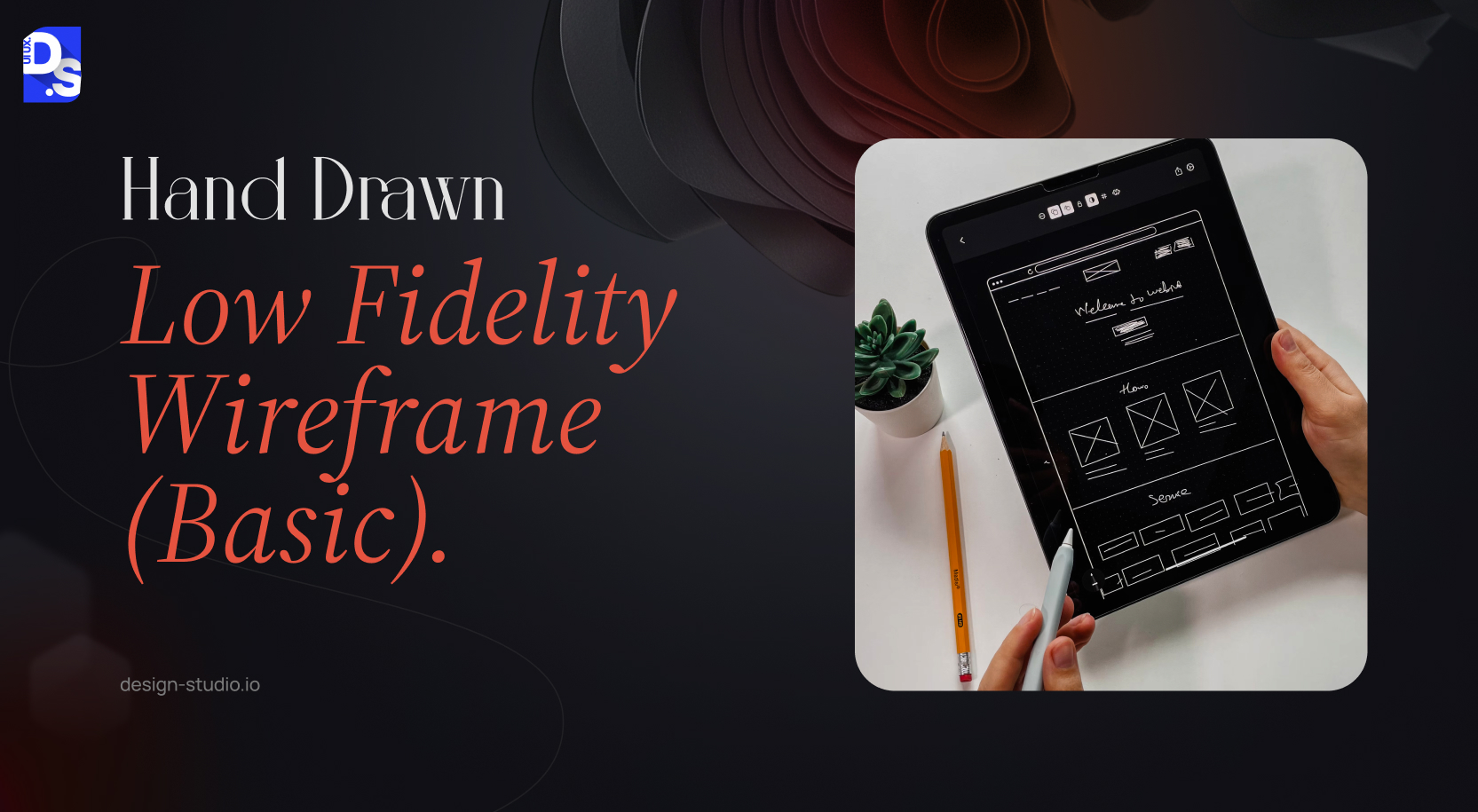
A basic hand-drawn wireframe is a 5–15 minute paper sketch that shows 3 to 5 key screens using only simple lines and shapes. It contains no real text or design but easily explains the user journey.
This is the quickest tool for initial design validation before opening any software, making it the best first step for any new feature, product, or redesign project.
ii) Hand Drawn Low Fidelity Wireframe (Advanced)
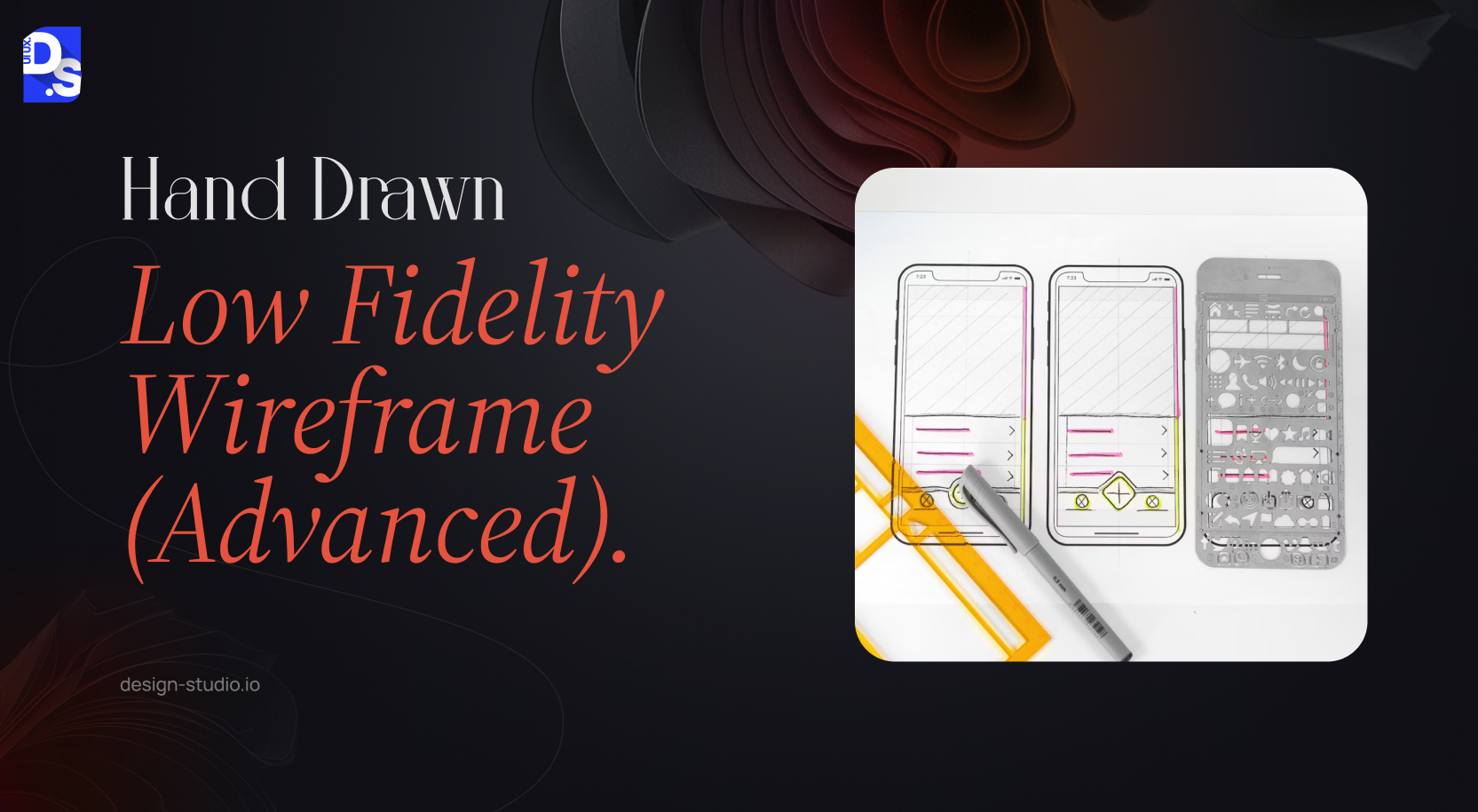
Alexandra Davis’ hand-drawn lo-fi wireframe redesign of the Bandsintown app exemplifies the power of low-fidelity wireframes. This format uses a single, detailed sketch to show every major area and navigation link within an application.
While it stays simple with basic shapes, it gives an overview of how information is organised across the whole platform even without colours or real content.
The wireframe is divided into clear labelled sections which are- Popular, Search, Your Tickets, Profile, and Friends.
Here, within each section, basic shapes and lines represent UI elements such as – buttons, navigation bars, and important content areas.
This lo-fi wireframe conveys the core functionalities of the redesigned Bandsintown app, browsing popular artists, searching for specific musicians, viewing tickets, and managing social connections.
Despite its simplicity, it lays the ideal groundwork for a user-centred design.
iii) Responsive Low Fidelity Wireframe
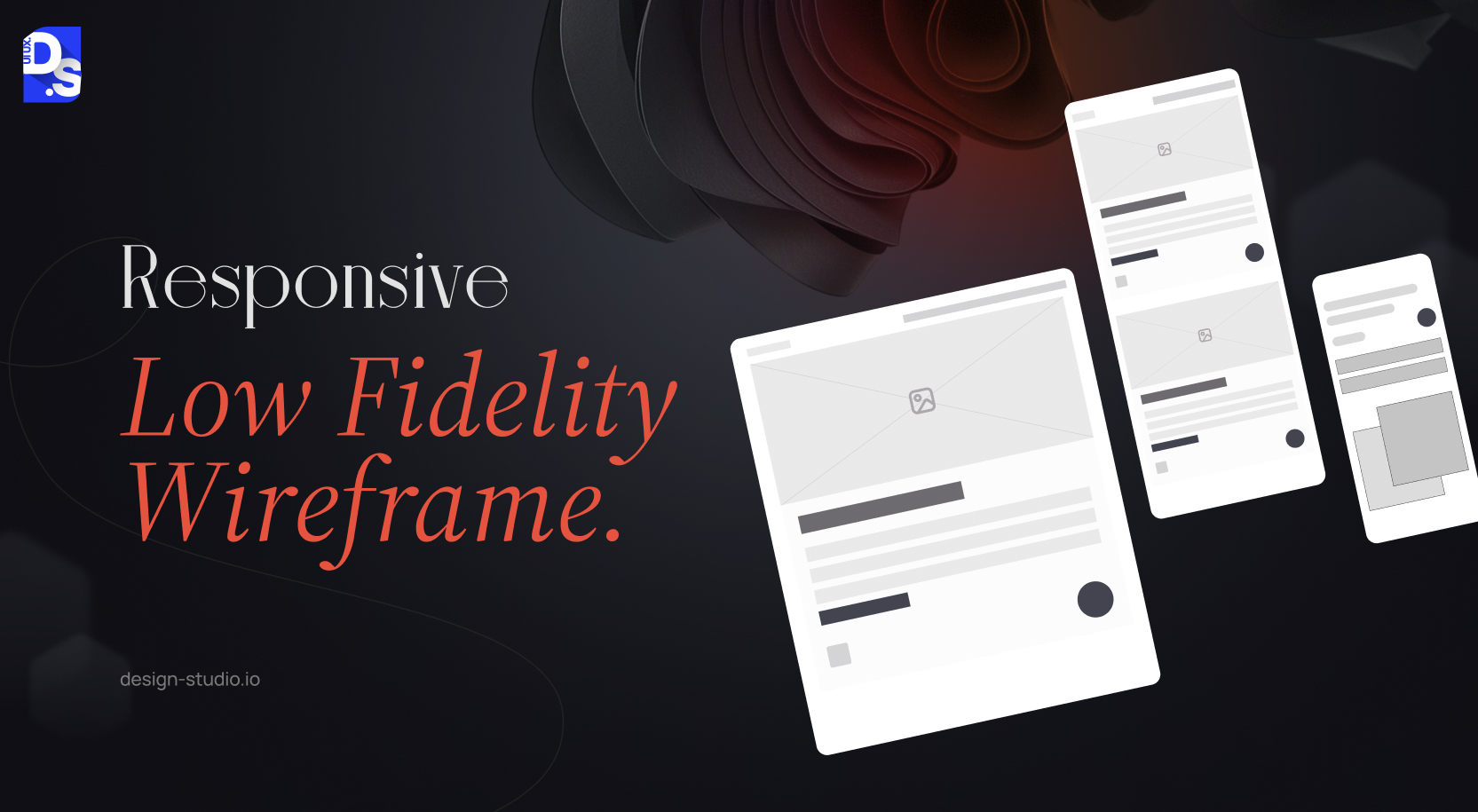
A responsive lo-fi wireframe is a basic visual representation of how an interface adapts to various screen sizes and devices. It validates how site architecture and content hierarchy work across different devices.
Best Practice Tip- Always design for the smallest screen first. It prioritises content and site navigation before expanding for larger devices.
Since mobile users make up more than 60% of web traffic, this concept helps align your design with user needs and behaviours.
Responsive lo-fi wireframes bridge the gap between design and development teams.
By outlining interface architecture and component placement across different screen sizes (desktop, mobile), they ensure clear communication and minimise misinterpretations.
iv) Low Fidelity Wireframe for Mobile Apps
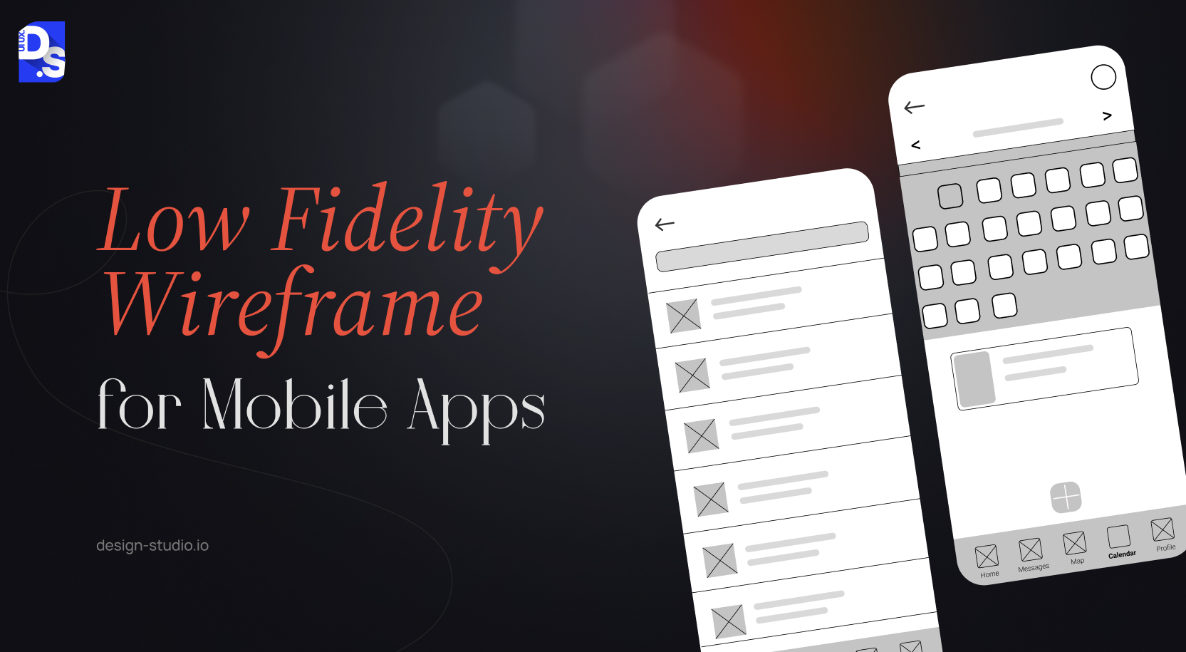
Low fidelity mobile wireframes are simple blueprints that use basic shapes to map out the layout and functionality of a website or application.
Even at this basic stage, you must follow standard design guides from Apple‘s Human Interface Guidelines (HIG) and Google‘s Material Design.
For example, maintain a tabbed navigation structure at the bottom and ensure menus are placed correctly.
These foundational blueprints created digitally or by hand, prioritise core elements like screen layout, content placement, and user navigation.
Basic shapes outline key screen parts like buttons and nav bars. This provides a solid framework to build on before adding the complex design details.
How to Create a Low-Fidelity Wireframe
You can build low fidelity wireframes by choosing tools such as pen or paper, or picking the right digital software.
Then illustrate design layout, add placeholders, and gather feedback for fast revisions.
Designers create low-fidelity wireframes within minutes. It may take a few hours depending on the complexity and functions of the digital product.
The beauty of lo-fi wireframing lies in its accessibility. Anyone can get started with just a pen and paper.
Here is the quick guide on wireframing process-
- Grab Your Tools: A pen and a sheet of paper are all you need to unleash your design ideas.
- Sketch the Layout: Outline the core structure of your web page or app screen. Use basic shapes like squares, rectangles, circles, and lines to represent key elements and establish the foundation for functionality and user flow.
- Add Essential Elements: Incorporate placeholders for text and images. Simple text labels and basic shapes will suffice.
- Refine and Iterate: Use your lo-fi wireframe to test and refine your design ideas. Share it with stakeholders and users to gather valuable feedback and make adjustments as needed.
Final Take
New to wireframing? Use this guide to start experimenting with hand-drawn sketches.
Use free wireframing tools like Figma or Miro to build slightly more advanced lo-fi wireframes as well.
As you progress, explore more advanced software options tailored to your specific needs and check out these wireframe examples for web design to gain further inspiration.
At Design Studio UI/UX, we leverage a diverse wireframing toolkit to ensure our designs are both visually appealing and functionally sound.
This strategic combination of best-in-class tools and our UX design expertise allows us to create innovative and user-friendly solutions that consistently meet the evolving needs of our clients and users.
FAQs
What is a low fidelity wireframe?

A low fidelity wireframe is a basic non-interactive sketch that uses simple boxes and lines to structure the product journey. They are perfect tools for initial brainstorming which saves both time and resources
What is the difference between low fidelity and high fidelity wireframes?
Low-fidelity wireframes are basic sketches that shows site layout and user flow. On the other hand, high fidelity wireframes are detailed layouts that mirror the final product.
Low fidelity wireframes contain basic shapes, lines, demo texts, etc., whereas high fidelity wireframes include menus, buttons, real imagery, final typography, etc.
When should you use a low fidelity wireframe?
You can use lofi wireframes to test design ideas in the initial phase, validate IA, gather feedback, and conduct user testing.
However, they are not recommended for final product approvals, giving important instructions to developers, and client sign-offs.
What tools are used to create low fidelity wireframes?
You can build lofi wireframes using pen, paper, and whiteboards. Also, softwares such as Balsamiq, InVision, Figma, Sketch, Miro, and UXPin can help designers build these layouts.
What are the limitations of low fidelity wireframes?
Lack of visual appeal and interactivity are the major limitations of lofi wireframes. Also, risk of misinterpretation regarding wireframing convention can cause confusion between teams and stakeholders.
What is fidelity in UX design?
n UX design, fidelity refers to the degree of detail and resemblance a wireframe bears to the final product. It describes visual accuracy and interactivity of the design features. You can define fidelity by visual, content, and interactive accuracy and categorise it into three stages- low, medium and high fidelity.
How do you create a low fidelity wireframe?
You can create low fidelity wireframes by choosing tools such as pen or paper, or picking the right digital software. Then illustrate design layout, add placeholders, and gather feedback for fast revisions. Designers can build such layouts within minutes, but it may take a few hours depending on the complexity and functions of the digital product.









