Not sure where to start? Most projects begin with a UX audit.
Talk to usDigital Banking App Onboarding
UX/UI Design

- QONA
- Digital Banking / Fintech
- UX/UI Design Mobile & Web Onboarding
- UX/UI Designers, Developers & Testers
- 1-2 Months
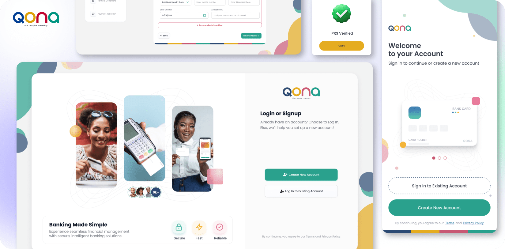
About QONA
QONA is a digital banking platform built to make financial access simple, compliant, and inclusive. Designed for multiple user types local members, foreign nationals, and returning customers the platform operates across both mobile and web, meeting users wherever they are.
What makes QONA’s onboarding challenge distinct is scale and complexity: three different user journeys, regulatory KYC requirements, multi-step verification, and the need to keep completion rates high all without sacrificing the trust and clarity a financial product demands.
QONA approached Design Studio UI/UX to design an onboarding experience that could handle this complexity while feeling effortless to the user.
Goal of the Design
Creating a Compliant and User-Friendly Onboarding Experience
QONA needed an onboarding experience that balanced regulatory compliance with ease of use. The goal was to design a seamless KYC journey for Kenyan members, foreign nationals, and returning users while reducing friction throughout identity verification, document submission, and payment setup.
We were tasked with creating a clear, conversion-focused onboarding flow that simplified complex compliance requirements, improved completion rates, and established a scalable design system to support future growth of the platform.
The Challenges
Designing a banking app onboarding isn’t a single UX problem – it’s a system of interconnected problems. Each one can break the user experience if handled poorly:
How Do You Make KYC Feel Human?
- KYC is non-negotiable in digital banking — but identity validation, document uploads, and liveness checks are friction by nature. The challenge was structuring these steps so users understand what’s needed, why it’s needed, and what happens next — without overwhelming them or causing drop-offs.
Three User Journeys, Three Sets of Rules:
- Kenyan members, foreign nationals, and re-joiners each require distinct data, verification paths, and consent flows. A single misstep in journey logic means a user hitting a dead end — or worse, submitting incorrect data that stalls their approval.
Designing for Failure States, Not Just Success:
- Most onboarding UX is designed for the happy path. Real users encounter OTP failures, document upload errors, payment retries, and rejected applications. Every edge case needed a clear, calm, recovery-oriented design response — not just an error message.
Regulatory Compliance Without Sacrificing Brand:
- Banking platforms often default to cold, clinical design in the name of compliance — losing the brand warmth that builds trust with younger users. QONA needed a UI that was professional and vibrant at the same time: trustworthy by design, not by default.
Our Approach
Discover
Effective fintech onboarding UX begins with understanding who you’re designing for not just what the platform needs to collect. QONA’s three user journeys meant three different contexts, risk levels, and expectations:
- Kenyan Members familiar with local ID formats, expecting a fast local experience with MPESA-compatible payment flows
- Foreign Nationals navigating an unfamiliar system with different document formats, potentially limited local knowledge, and heightened anxiety around financial trust
- Re-joiners existing users reactivating their accounts, who may have outdated data and need a streamlined refresh flow rather than a full re-registration
We mapped the full onboarding journey for each persona from the first screen to the final approved/pending/rejected state before writing a single line of wireframe logic. Understanding failure points in each journey was as important as understanding the success path.
UX Architecture & Flow Mapping
With all three journeys mapped, we moved into architecture. The most critical structural decision was creating a modular flow system — where shared steps (OTP verification, consent management, beneficiary details) could be reused across all three user journeys without building three isolated products.
- We defined the complete UX logic for:
Multi-step onboarding with visible progress indicators at every stage - OTP-based verification flows with clear retry and failure recovery
- KYC architecture — document capture sequencing, liveness check placement, and validation error handling
- Payment integration UX including success, failure, and retry scenarios with clear end-states
This architecture phase prevented scope creep during UI design and gave stakeholders a shared reference point before any visual work began.
Design Highlights


Translating QONA’s brand into a vibrant, trust-building UI was the first visual priority. Banking platforms often default to conservative blues and formal layouts we pushed further, creating a design that feels modern and approachable without sacrificing the professionalism users expect from a financial product.
The design process ran iteratively: low-fidelity wireframes validated the UX logic with stakeholders before any visual investment was made. Once flows were approved, we developed high-fidelity UI for all screens mobile and web and built interactive Figma prototypes for end-to-end user testing.
After multiple wireframing, prototyping, and feedback cycles, we delivered:
- Iterative Design Process We began with low-fidelity wireframes to validate UX logic with stakeholders before any visual investment was made. Once flows were approved, we developed high-fidelity UI for all screens ;mobile and web and built interactive Figma prototypes for end-to-end user testing.
- Comprehensive Onboarding Coverage Low-fidelity wireframes were produced for all onboarding journeys Kenyan member, foreigner, and re-joiner with every edge case and failure state mapped to ensure nothing was left to guesswork during development.
- Unified Design System High-fidelity UI designs for mobile and web were grounded in a clear design system specifying all components, colour tokens, typography, and interaction states giving the development team a single source of truth.
- Brand-Aligned, Future-Ready Assets All design-ready assets were structured in alignment with QONA’s brand guidelines, making them easy to extend as the product grows.
QONA's onboarding experience is now fully structured, scalable, and ready for real users built to comply, built to convert. The delivered design system enables QONA to:
- Onboard Kenyan members, foreign users, and re-joiners through distinct, validated journeys without a single dead-end flow
- Handle every KYC, OTP, and payment edge case through intentional, recovery-oriented design reducing support dependency at each step
- Scale the product confidently the modular design system and comprehensive documentation make future feature additions straightforward, without re-designing from scratch


Final ProductShowcase
A clean onboarding entry point. Guided KYC flows with zero ambiguity. Smooth OTP verification, document upload, and liveness check sequences. Clear end-state screens approved, pending, or rejected each with a defined next step. From the moment a new QONA user starts their onboarding, every screen tells them exactly what to do, why it matters, and what comes next.
This is what purpose-built fintech onboarding UX design looks like not just a sequence of forms, but a trust-building journey engineered for completion.
See how we apply the same conversion-driven thinking to other digital platforms:
→ Web App UI Design for Nexford University
→ Fintech App Dashboard Design for Digital Banking
→ View All Case Studies


UpcomingCase Studies










Happy Clients & Partners



“They gave a clear overview of the design and approval milestones and executed them accordingly. Communication and the work delivered were both top-notch. I’d highly recommend working with her!”



“We were looking for something creative and different from what everyone else was putting out there. And we found it with Design Studio. Great work!”


“Design Studio team were absolutely fantastic. Highly talented designers.”


“The DS team went beyond our UI redesign expectations. We are grateful for the work well done. Kudos.”


“The team was great, extremely communicative and patient with the project. I highly recommend it to anyone.”


“Design Studio did an awesome job. Their communication and timing were excellent. The quality of work was fantastic.”


“We’re thrilled with CRM Dashboard, Website design from scratch by Design Studio. They nailed the design and ensured flawless development and performance.”


“Design Studio created a beautiful, functional website and mobile app for us. Excellent communication and top-notch design!”


“Design Studio provided us with a sleek design and powerful backend development. Our user experience has improved dramatically.”
Got a Project in Mind?
Let's Talk!
 hello@designstudiouiux.com