


12 Best & Inspiring B2B Website Design Examples for 2026



Summary
Acme (unique navigation), MailChimp (elegant typography and visuals), Targit (clear explanation of Business Intelligence), Asana (minimalistic design), and DropBox (simple message) are the best examples of B2B website designs.
Introduction
A few months ago, we wrote an article discussing the most influential B2B web design trends of recent times. Some of our readers challenged us to find B2B website design examples that successfully implemented these trends. Challenge accepted!
In this article, we are listing the top ten B2B website design inspirations we’ve seen in recent years! We’ll dissect each b2b website examples to understand the design choices and practices that made them stand out from the competition.
How We Choose B2B Website Examples
B2B buyers are careful, research-heavy decision-makers who often involve multiple people before pulling the trigger. According to a survey by Databox, the average B2B design agencies needs anywhere between 1 to 3-months to land a customer.
Complex deals tend to take way longer than that. Thankfully, for website designers, B2B buyers are increasingly shopping online.
- According to Sana’s recent report, the percentage of B2B products/services being sold and bought online has increased from 51% to 67% in the post-pandemic world.
- Since 2021, B2B buyers have amped up their online spending by at least 45%.
Their main avenue of online spending? B2B websites. Most (if not all) B2B buyers use B2B sites as their primary research & purchase tools in 2026. They often return to sites numerous times to ‘dig’ around before finalizing their purchase.
The best B2B websites are designed to nurture leads throughout the B2B buyer’s lengthy review period. Most of these approaches align closely with modern B2B website design best practices followed by high-performing digital product companies.
That means these B2B websites:
i. Support Long Sales Cycles
Unlike B2C transactions, B2B sales cycles can feel like marathons. To support this lengthy sales journey, B2B web design experts will:
- Create/present informative content (white papers, case studies, etc.) for all stages of the buyer’s journey: from awareness to consideration to final decision
- Use intuitive navigation, quick loading speeds, and search functionality to make it easy for potential buyers to find relevant information
- Implement mobile-first design
- Highlight industry recognitions, client testimonials, and other achievements that position the B2B company as a thought leader
These sites also tend to feature quantified value propositions (explaining the ROI on the product/service) and transparent pricing information.
All of these qualities build trust and convince buyers that they’re on the right track.
Best B2B Website Examples
These B2B websites communicate the core messaging from the first instant, and guide buyers towards the decision-making process.
| Brands | What Makes Their Website Inspirational |
| Labguru | Core value is explained clearly using animated text snippets |
| Mailchimp | Breaks down the core email marketing features in bite-sizes |
| Targit | Targits combines minimalism and graphical elements to build credibility |
| Acme | Acme exhibits a unique and intuitive navigation structure |
| Yapstone | Yapstone couples minimalism and a clear visual hierarchy for an engaging user experience |
| Asana | A continuous layout packed with digestible information bits that gradually loads |
| DropBox | Perfectly communicates what DropBox’s brand statement is all about |
| Pixelgrade | Quickly captures user’s attention and convert that into engagement |
| Overpass | Has a clear, colorful, and modern visual design to impress customers |
| Adobe CXM | Works as a brand-centric content hub, and doubles as a lead nurturing platform |
| Slack | Positions its core value through bold visuals and strong social credibility |
| Hubspot | Hubspot cleverly aligns brand messaging, education and conversion paths to support B2B decision-making process |
1. Labguru

Labguru is advertised as the “ultimate laboratory management software” and you’ll get the feeling that the company means what it says as soon as you land on their website.
The first thing you’ll see on this B2B website’s homepage are dynamic and animated text snippets highlighting the main use cases of the Labguru platform. What follows is even more impressive.
Labguru’s homepage is packed with custom illustrations (with short text snippets on the side) and dynamic animations that explain the benefits of their software in a specific, yet concise way.
The site also has a simple, intuitive navigational structure and a consistent visual identity. These design qualities ‘hook’ potential buyers right away.
More importantly, they make buyers come back to learn more. Learning in-depth details about the company on the site is also easy as industry recognitions, client testimonials, and other achievements of the company are displayed boldly on the homepage.
Users can easily access case studies, white papers, blogs, and even brand videos. from the ‘Resources’ tabs, as well.
Signing up for free demos is also a breeze. That’s why this website will hook you even if you’re not an active buyer and are just browsing around for software solutions that help laboratories streamline their operations.
Plus, Labguru’s website uses cookies to track user behavior on their sites. They use that data to continuously customize future browsing experiences for users.
With each visit, the site will feel more personalized to your information-seeking needs. These are the main reasons why this B2B software firm is an industry leader and why its website is one of the best at supporting long sales cycles and nurturing leads.
Explain Business Solutions In-Detail
Many B2B brands (like Labguru) sell complex, industry-specific solutions. You need to have an in-depth understanding of certain industries & technologies to even decipher what exactly these B2B brands provide.
A professional B2B web design agency will never place such unreasonable responsibilities on its target users’ shoulders. Instead:
- They will use text, visuals, graphics, infographics, and data visualizations to present complicated details about the B2B brand clearly and understandably
- They will break down complex information into small, digestible sections with plenty of whitespace, clear headings, & bullet points
- Design subtle micro-interactions to guide users through the site’s offerings and provide feedback every step of the way
That is how web designers make B2B websites user-friendly and approachable, even for users who lack industry expertise. Mailchimp and Targit are two notable B2B companies that benefit greatly from having such websites.
2. Mailchimp
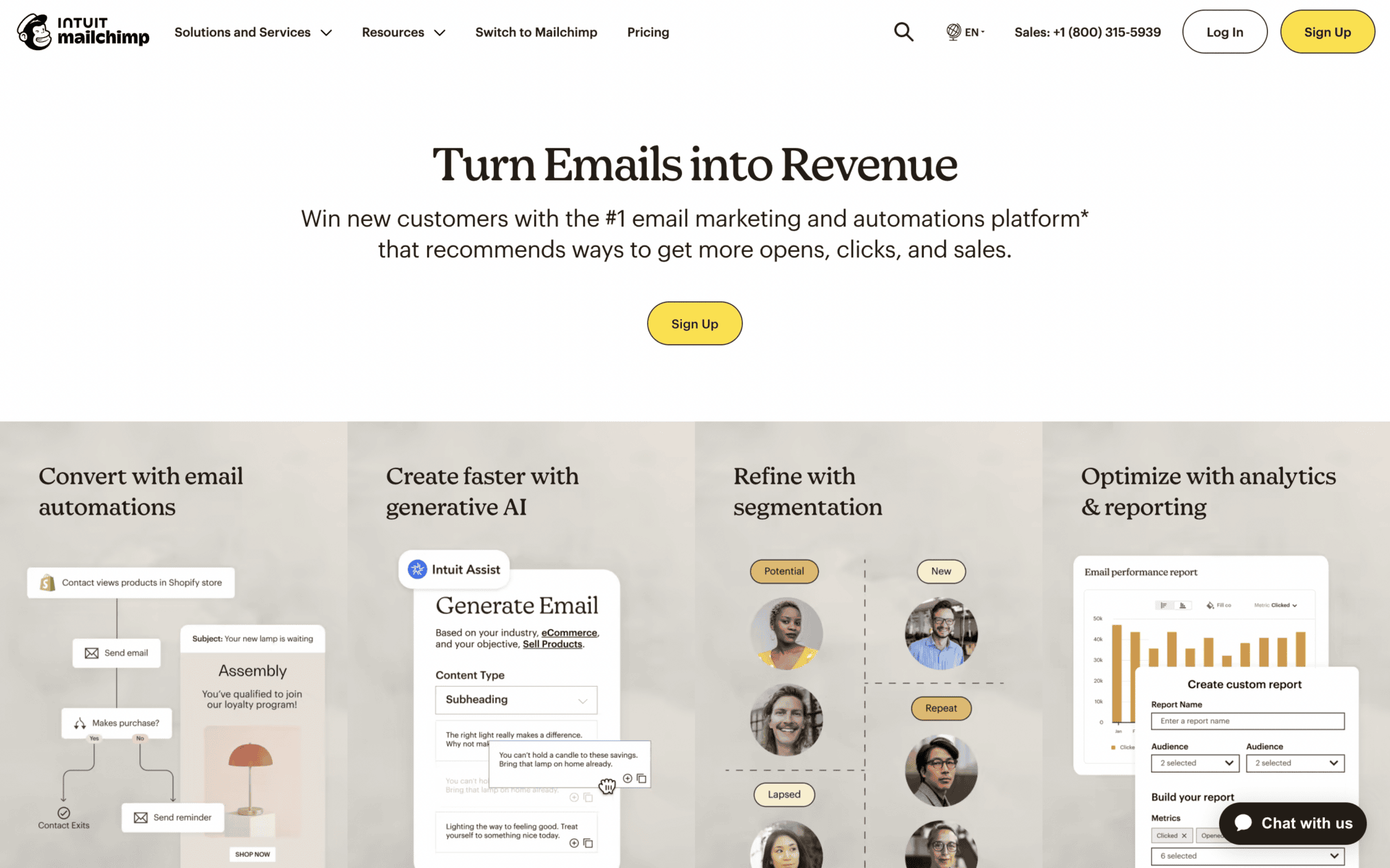
Every section of Mailchimp’s website is packed with information explaining how beneficial this email automation tool is for different types of users. You’ll learn everything about streamlining email marketing tasks, growing a subscriber base, and creating impactful marketing campaigns just by scrolling through this website.
Every service and every solution that Mailchimp offers is clearly explained on the site through small, digestible sections of information.
Each explanation is presented in elegant typography and accompanied by eye-catching visuals. The strategic use of brand colors, clear visual cues, and whitespace also create a sense of focus.
All of these factors combine to make Mailchimp’s website the perfect example of a B2B site that’s easy to understand, even for users who lack industry expertise.
3. Targit
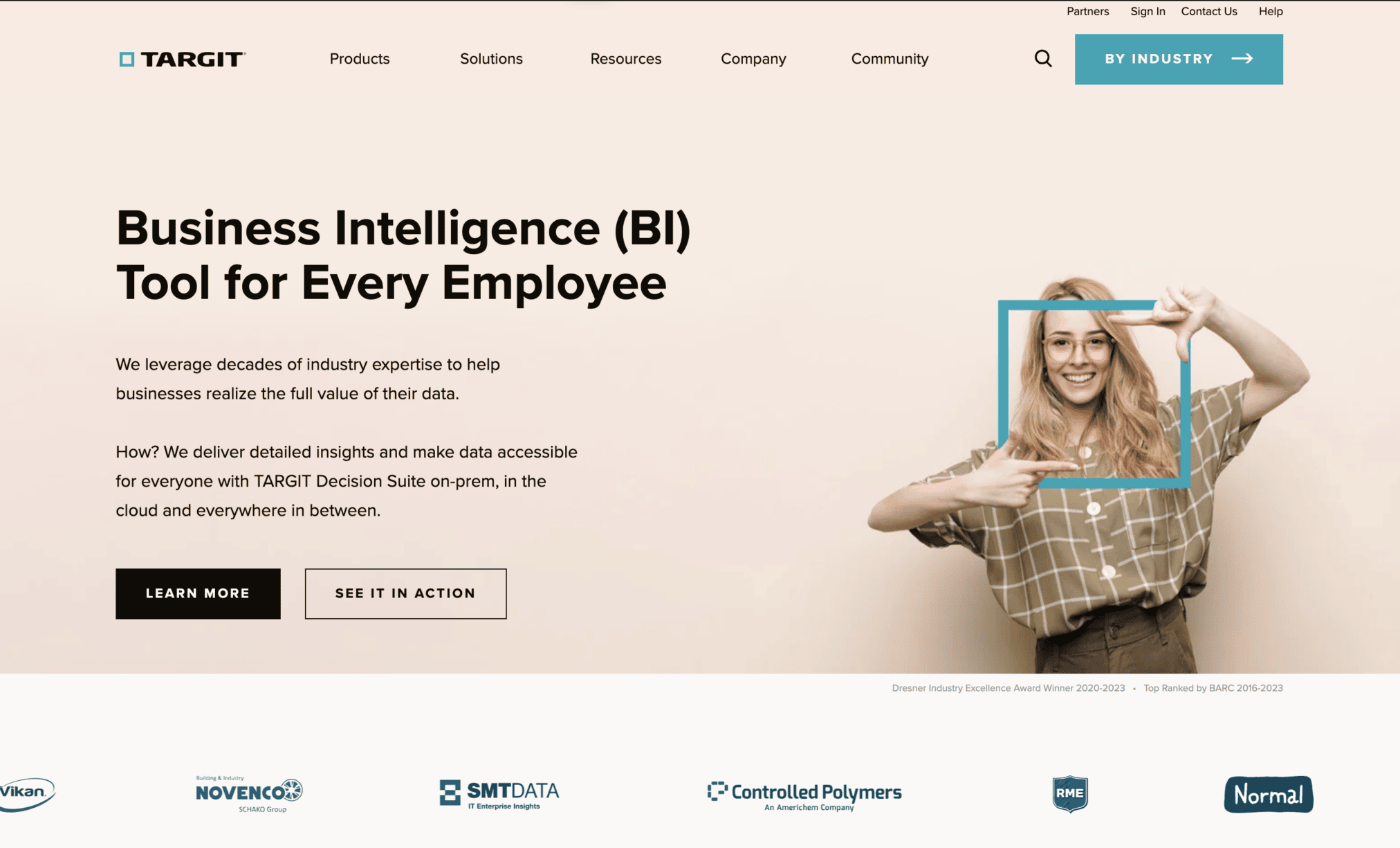
‘Business Intelligence’ is not an easy topic to communicate, especially when your target audience consists of manufacturing, material handling, and automotive companies.
Enter Targit, a B2B business intelligence company that manages to communicate essential details about its services and solutions through concise explanations and informative explainer videos.
The graphics and small snippets of information contrast nicely with the clean and simple design of the rest of the website. Business resources are presented front and center along with success stories that help build credibility.
Successfully Implement the Latest B2B Web Design Trends
At the start of the article, we said that we selected B2B websites that effectively follow the most influential B2B web design trends of recent times. What did we mean by that?
Well, we were in search of B2B websites that successfully:
- Appeal to new-age B2B buyers
- Share complex information via short, carefully designed website sections
- Use responsive, mobile-first design
- Adopt a clean and minimalist style
- Use high-quality images, charts, graphs, and infographics to present complex information
- Provide personalized content and interactive design elements to engage visitors
Acme, Yapstone, and Asana are three B2B brands with websites that meet all of these criteria.
4. Acme
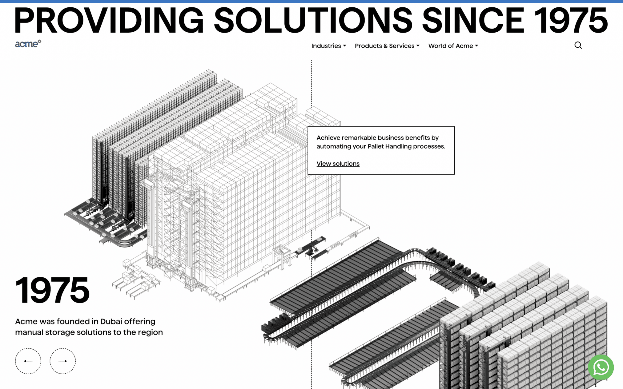
When it comes to ditching the visual overload and focusing exclusively on what matters, not many B2B sites do it better than Acme World.
This material handling & warehouse automation firm’s website features clean lines, clear messages, and a unique navigation structure.
Just move your cursor across different sections of the site’s homepage & see its background come to life and display animations that explain the types of services Acme provides. Very innovative, very trendy, and very effective!
5. Yapstone
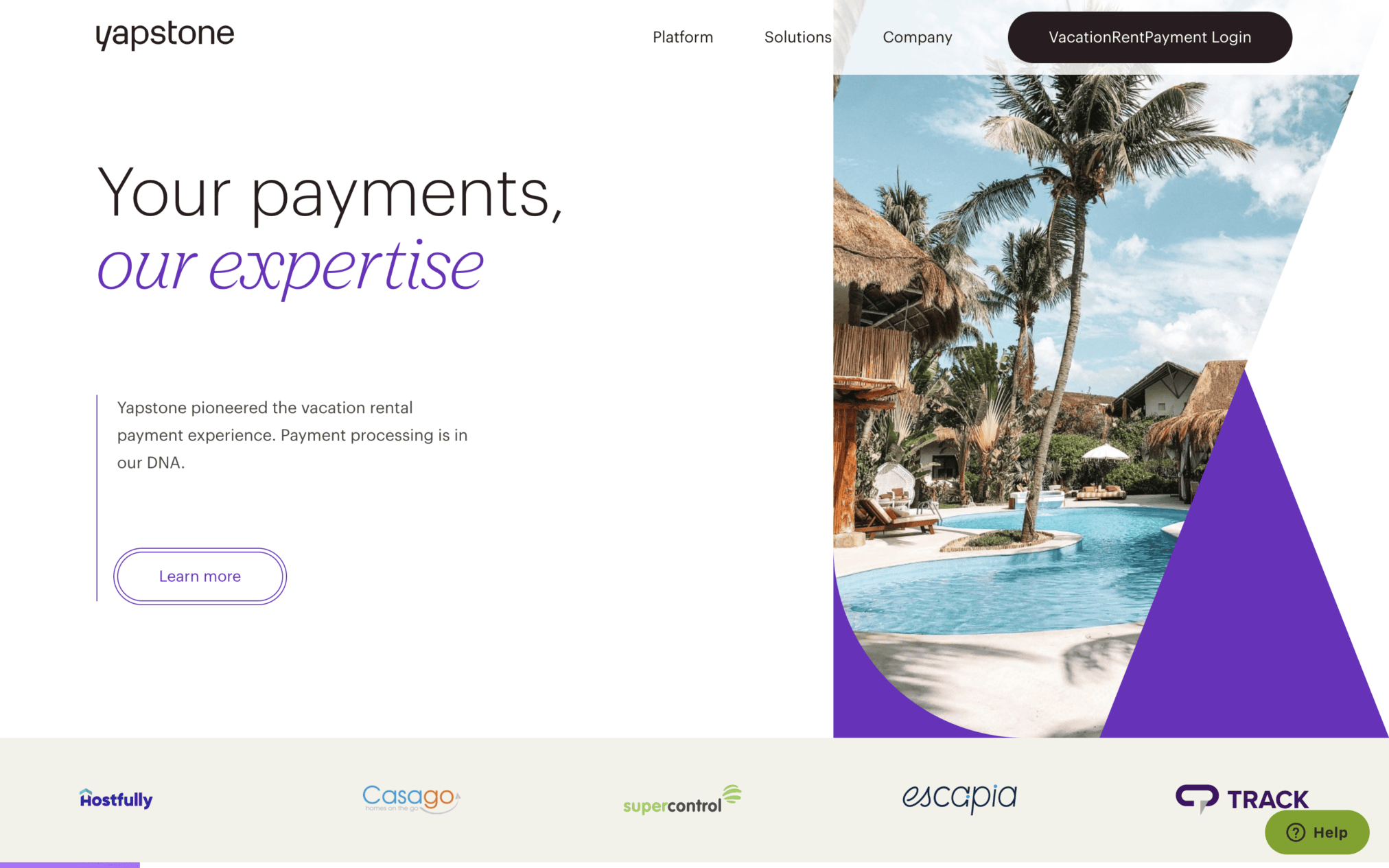
Yapstone provides localized payment processing services for hotels and vacation rentals that attract global audiences. Their clean and minimalistic website perfectly reflects their target audience.
It is packed with high-quality ‘vacation-friendly’ photos and technical information: all segmented into well-defined sections.
This clean and minimal layout coupled with a clear visual hierarchy makes this website easy to navigate & engage with.
6. Asana
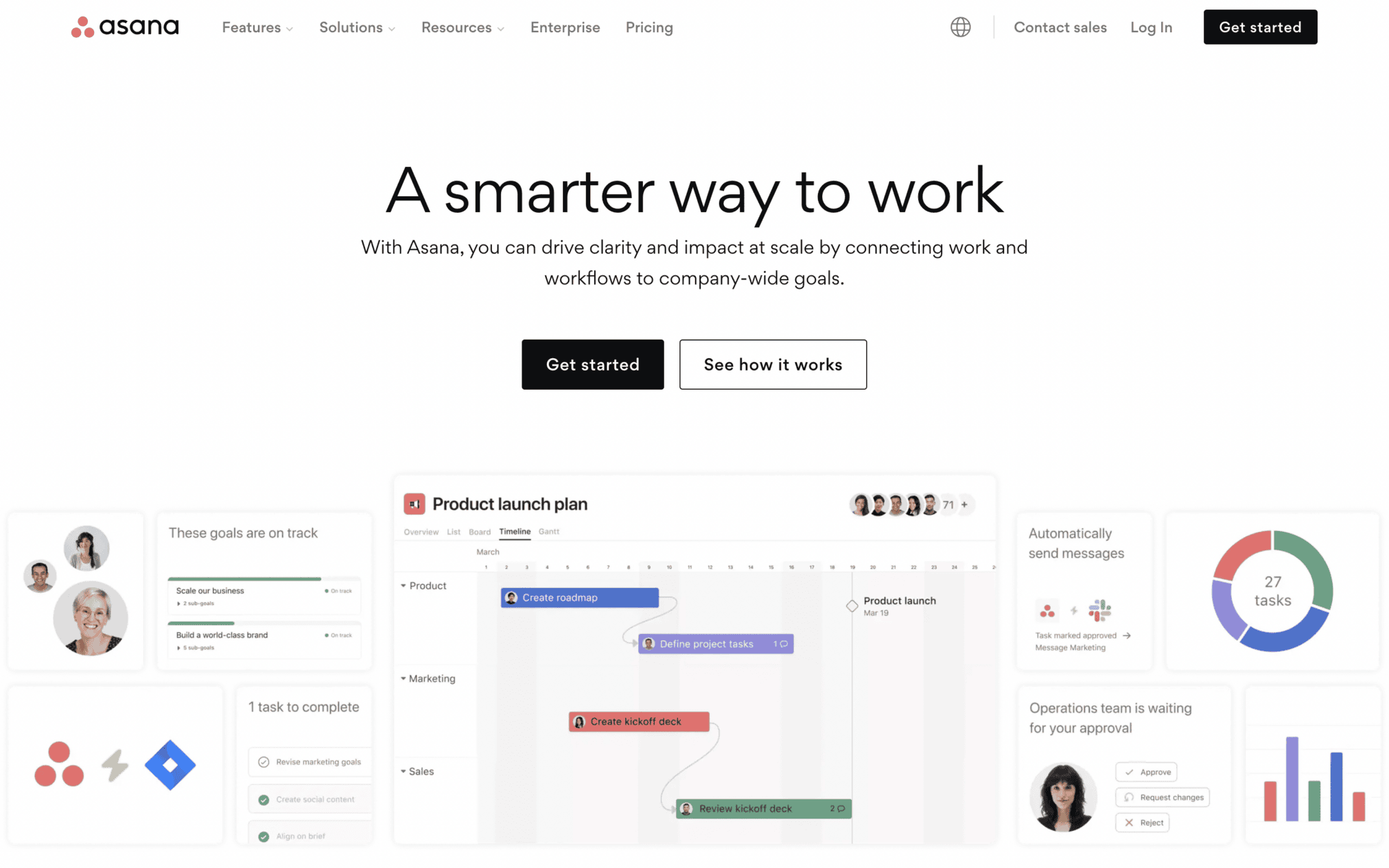
Asana’s website has a clean, uncluttered, and minimalist design. The use of a white background and simple typography makes the site appear even cleaner. Asana’s website also uses a one-page layout with a continuous flow of information packets.
These small, digestible pieces of info gradually load as the user scrolls down the site. This design approach is called “scrollytelling,” and it’s one of the most popular B2B design trends of recent times.
Asana’s website is able to pull off minimalism and scrollytelling, two popular B2B website design trends, perfectly and deliver immersive user experiences.
Instantly Engage Shoppers
B2B websites only get a few seconds to capture user attention and communicate value. That means users do not have time to read long company mission statements. They want to see crisp and concise statements describing the company’s core value propositions in brief.
These short statements should answer four questions at once:
- Who are you?
- What do you do?
- What sets your brand apart?
- What should visitors do next?
B2B websites that feature such hard-hitting statements tend to have higher retention rates. Dropbox, Pixelgrade, and Overpass are perfect examples.
7. Dropbox
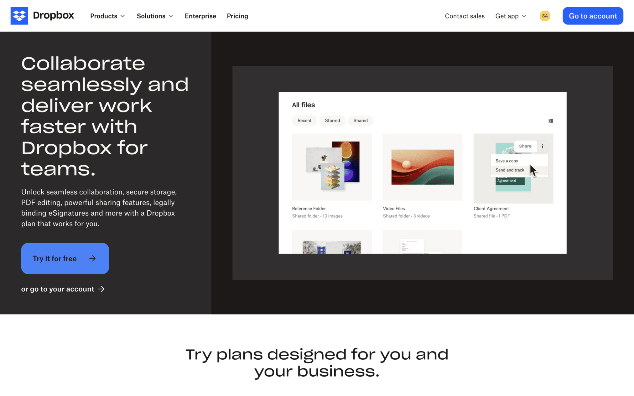
This is what Dropbox’s website used to look like until they changed it recently. Even though this design is not currently being used, it still deserves a spot on this list because it is one of the best examples of a B2B website instantly engaging visitors.
Dropbox allows users to store, sync, share, and electronically sign their files.
That is their main value proposition and that’s what they try to convey on their website’s homepage:
Store, Sync, Share, Sign. Simple.
These 5 “S’s” perfectly communicate what this B2B cloud storage solution provider is all about. No fluff, no fancy visuals: just a simple brand statement that goes straight to the point.
8. Pixelgrade
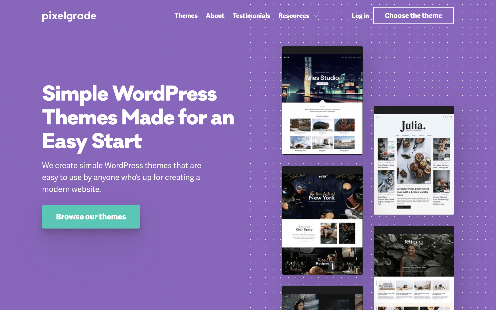
Pixelgrade exemplifies how a B2B website can leverage clarity to capture user attention and communicate value. The site minimizes cognitive load and ensures users are effortlessly guided towards engagement and conversion.
9. Overpass
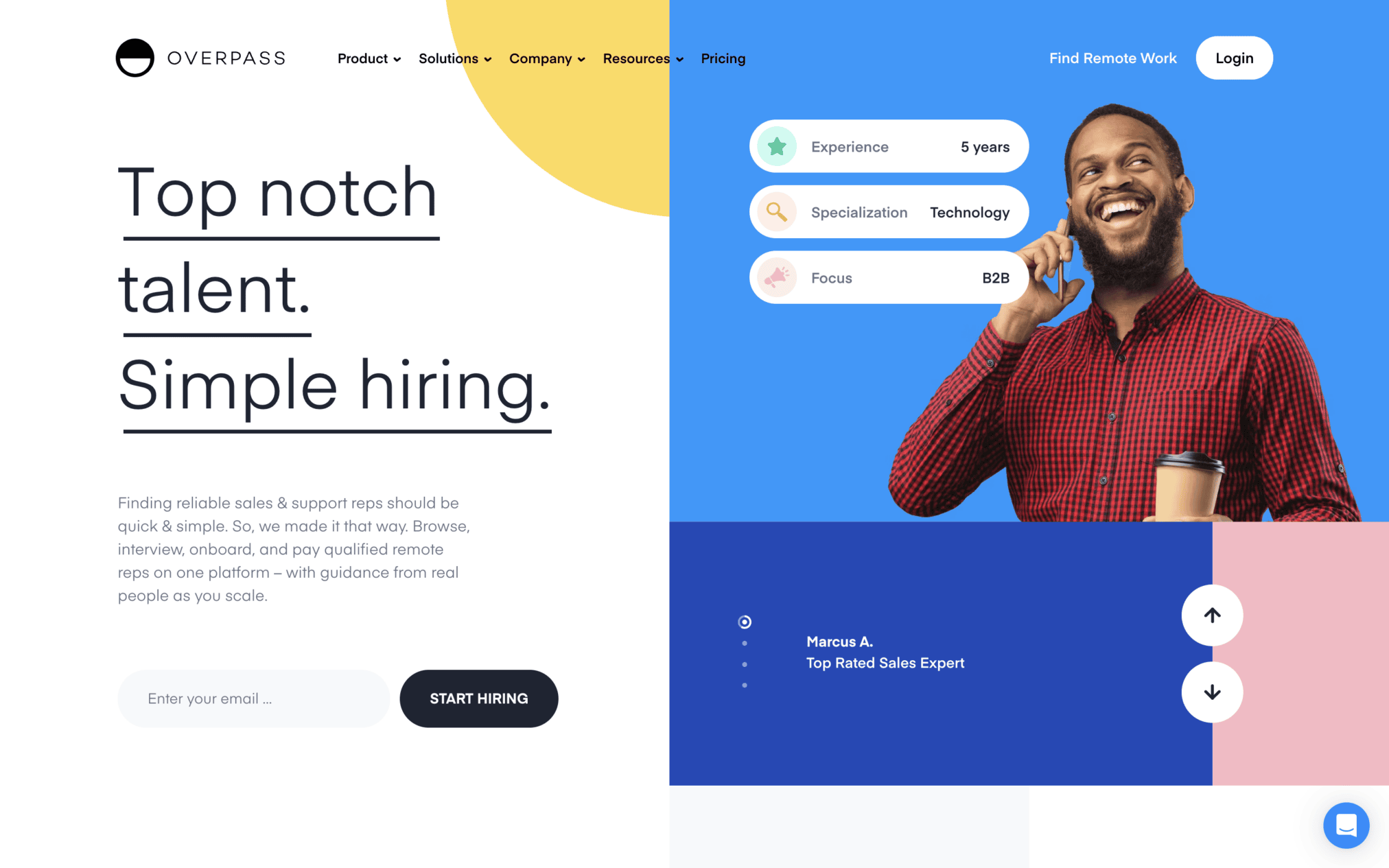
Overpass is a company that offers remote sales/support representatives across 40+ industries. The brand’s main value proposition is that it’s fair, cost-effective, and reliable. The B2B company’s website employs a clean, colorful, and modern visual design, giving users the right impression of the brand.
Within seconds of scrolling through this site, you’ll get clear explanations of the specific solutions overpass provides to businesses struggling with staffing issues. Plus, very few websites use animations and other visual elements to effortlessly capture user attention as efficiently as this website.
Honorable Mention:
Voluum
We are adding an extra item to this list. Many B2B websites excel at explaining their value proposition via short, hard-hitting statements:
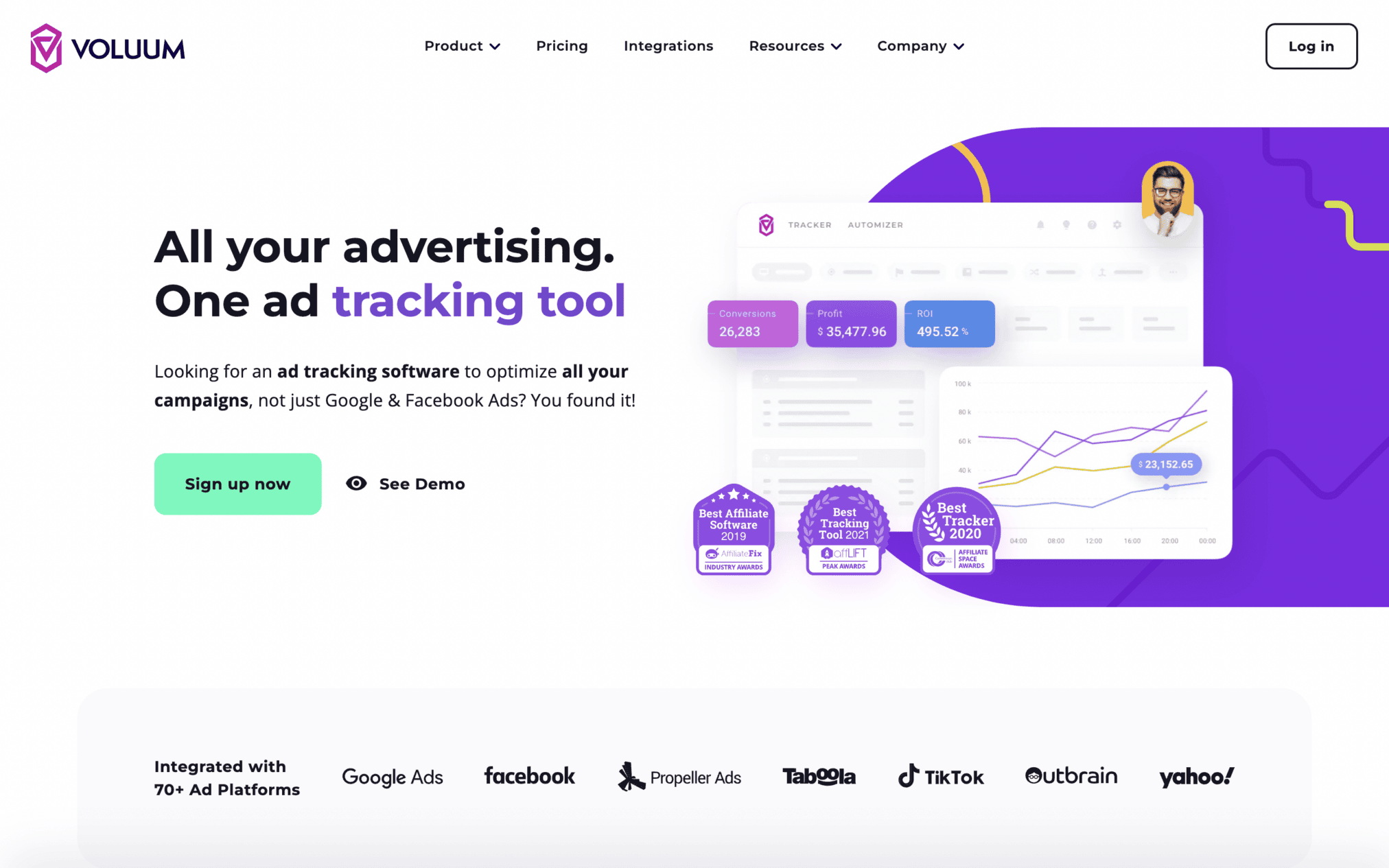
Voluum is one that caught our eye. This relatively new ad-tracking software solution provider is growing in popularity. Its sleek and simple website is a major reason behind its success.
Voluum nails its B2B value prop: simple language with a customer-centric copy minus all the jargon-ridden mess! A quick homepage scroll tells users exactly what they need to know about the B2B company’s main product: an all-encompassing ad-tracking software that tracks more than just Facebook & Google ads.
Use SEO-Optimized Storytelling to Familiarize Shoppers with the Brand
Browsing on a B2B site should not feel arduous. To ensure that product/category pages don’t bore users, B2B website designers must leverage the power of storytelling.
If all product or service pages are packed with interesting brand-related content or stories, discovering the brand becomes an interesting endeavor.
Another advantage of using web design to share your brand story is that you also get to optimize all that content for search engine visibility:
- Integrate relevant keywords throughout all pieces of content on your homepage, product pages, etc.
- Add enticing CTAs (like requesting demos) all across the brand story.
- Include a few lead capture forms in different sections of the story you’re sharing.
- Add some security badges, customer testimonials, and case studies into the mix.
This approach is like a double-edged sword. Not only do you get to pack your B2B site with conversational marketing content, but you also get to optimize that content to build a stronger online presence. A perfect example of this approach is Adobe’s CXM website.
10. Adobe CXM
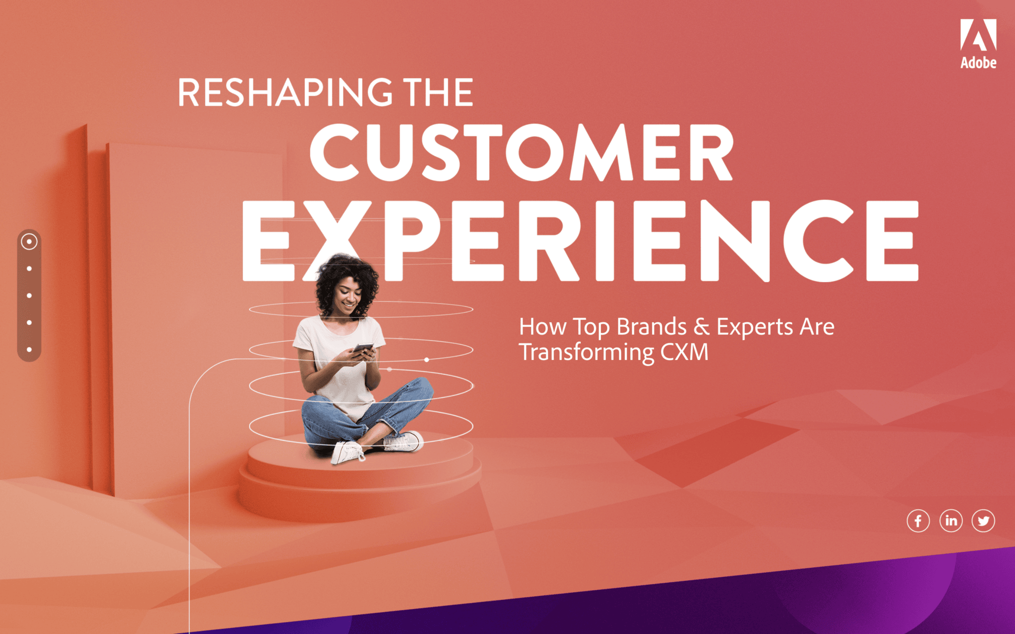
Visitors only need to scroll down the Adobe CXM homepage to learn everything the brand does to help B2B businesses. This learning journey is fun and engaging because the site’s homepage is packed with animated text and graphics.
There are no dry product listings and no boring visuals. Every piece of info falls perfectly under the brand-story-driven framework.
Plus, each of these story-focused design elements is SEO-optimized. That is why Adobe CXM’s website is not just a unique, brand-centric content hub: it is also a platform that succeeds in attracting organic traffic and nurturing leads.
11. Slack
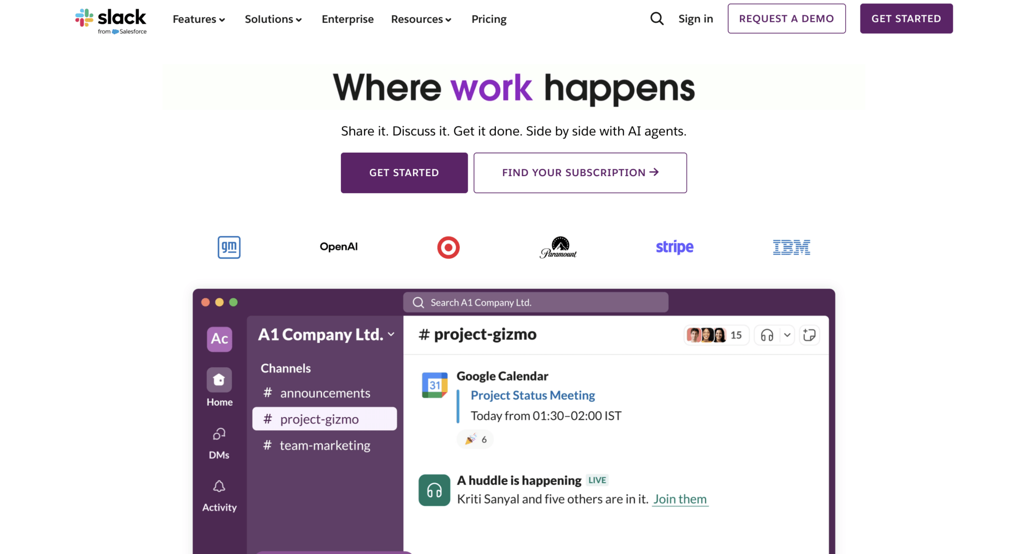
Slack’s website is the prime example of a B2B website design, simply because it positions value proposition immediately. The headline “Where Work Happens” doesn’t need further explanation, and the subheadline acts as a supporting character.
This website boasts of a modern and lightweight design that combines whitespace, bold illustrations, and even motion to explain how the product works.
Using these visuals, users can quickly understand how the platform works in real-time without giving much effort.
The home page also contains social proof through data and accreditations, which act as subtle behavioral cues. Both CTAs “ Get Started” and “Find Your Subscription” have smooth conversion paths, making the website effective for SMBs and enterprise buyers.
12. HubSpot
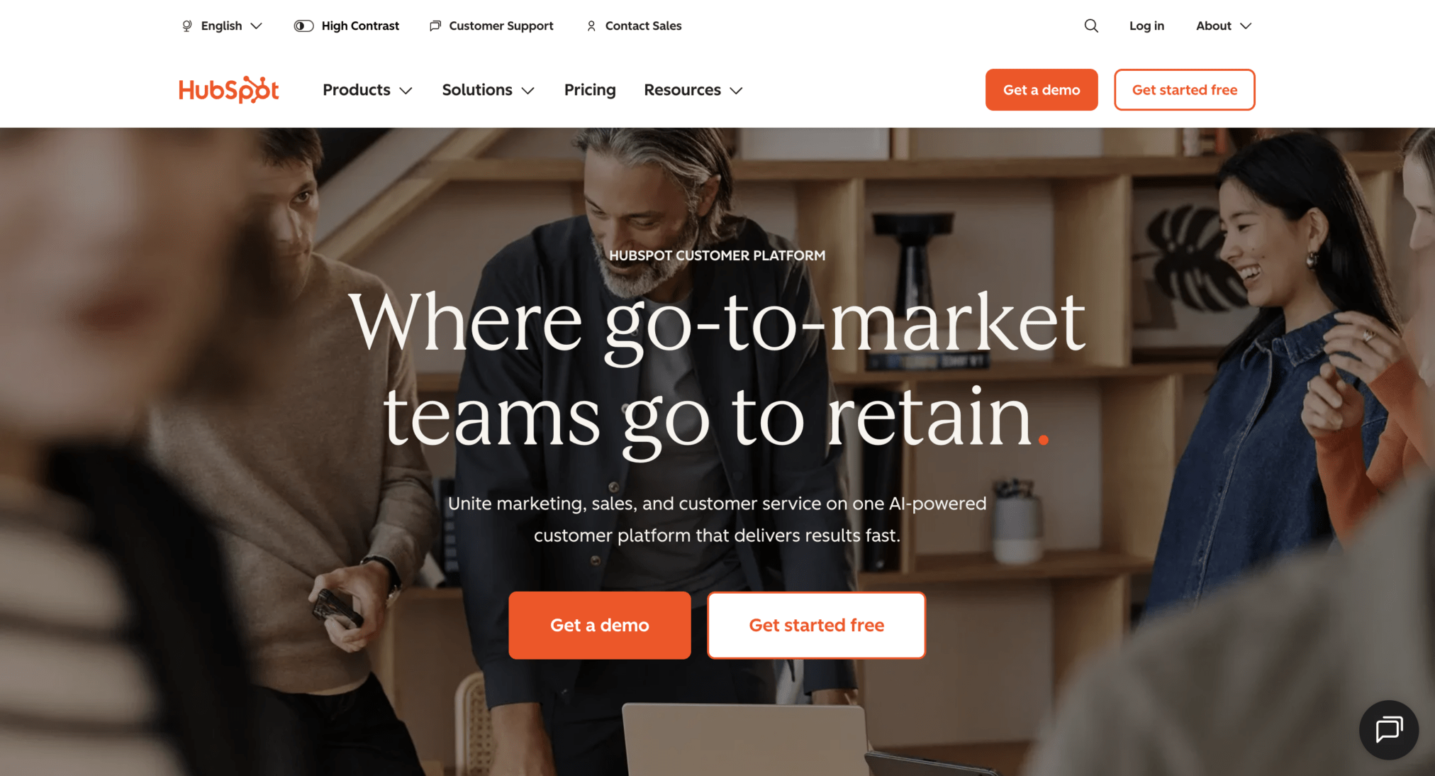
Hubspot balances education, credibility and B2B conversion without overshadowing each other. The website positions the tool as a growth lever through its headline, “Where go-to-market teams to grow”.
The core messaging aligns the website with business outcomes, such as lead generation, sales efficiency and customer retention.
Its Information Architecture serves multiple personas, marketing, sales team and service leaders to respective solutions.
Get A Demo and Get Started Free have different user flows targeted toward two different audience segments.
The website supports complex decision-making journeys by strategically integrating educational content, blogs, guides, and resources, all of which reinforce authority and user trust.
Performance Insights for 2026
Performance in UX constitutes many elements, such as speed, mobile-responsiveness, and UX stability. In 2026, we will see growth of AI-driven designs that adapt according to user intent.
- In web design, first impressions make or break a brand’s success. 94% of people say that their first impression is mainly influenced by design elements, and 75% of users trust a website based on aesthetics.
- U/UX and conversion rate are tied together, as a good design can boost conversion rates by up to 200% or even 400%.
- B2B SaaS websites typically have a 1.7% conversion rate, and for many industries, it may fall under 2-3%.
- Landing pages average conversion rates across industries are around 6.6%.
- Websites with a 1-second load time have up to 5× more conversions compared to 10-second load times.
A well-performing UX is the differentiator between successful and unsuccessful websites. Instead of chasing vanity metrics, brands should pursue real-time metrics, such as engagement, layout stability, and UX readiness.
Curious what’s driving these design choices? See our full breakdown of B2B web design trends for 2026.
Conclusion
There you have it: our top twelve B2B website design examples of 2026! Here is a quick recap of the types of websites we selected for this list.
We specifically selected websites that:
- Support long sales cycles
- Explain business solutions in detail
- Successfully implement the latest B2B web design trends
- Instantly engage shoppers
- Use SEO-optimized storytelling to familiarize shoppers with the brand
If you are creating a new B2B website from scratch or redesigning an existing site, make sure to integrate these five essential qualities into your design approach. At Design Studio UI/UX, we are constantly working on creating B2B sites like the ones mentioned in this list. To learn more about our creative process, contact us now!









