How Color Psychology Impacts Web Design and User Behavior?


Quick Summary
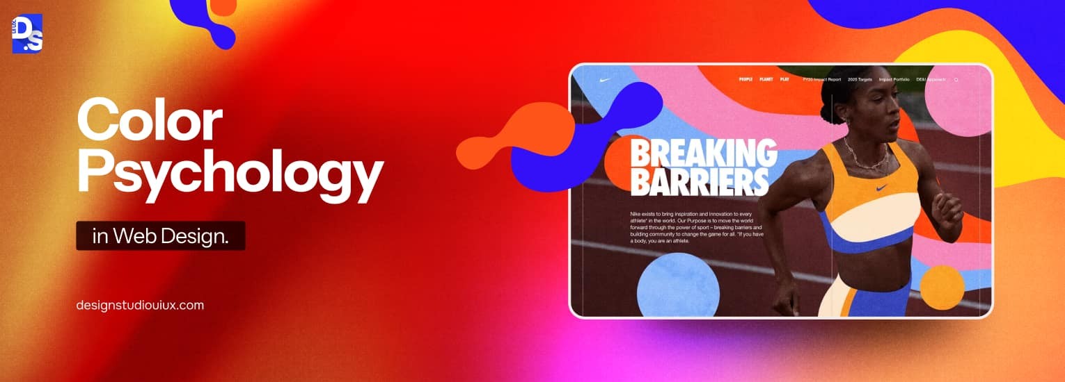
Color psychology in web design explores how different colors such as red, green, or blue can evoke emotions like urgency, calmness, or success. Using the right colors helps communicate the right message and guide users through the experience effectively.
FAQ’s About Color Psychology
How do colors affect user behavior on websites?
Colors directly influence user behavior, emotional responses, and what people think about a brand. Color influences how people perceive a website, trust it to take action (click a button, fill a form, or purchase things). Warm colors, orange and red are used to ensure activity, primarily used in CTAs. Cool colors, blue and green are used to ensure trust and calm, making them the best choice for finance and health brands.
What colors are best for increasing website conversion rates?
There is no formula to determine the best color for conversion, it solely depends on brand context, target audience, and the end goal. Red creates urgency and is widely used for sale CTAs; orange creates enthusiasm and warmth; green is associated with ‘go’ and is effective for sign-up buttons; blue builds trust and works well for financial services. The key principle: use a color for CTAs that contrasts strongly with your background so it stands out.
What is the 60-30-10 color rule in web design?
The 60-30-10 rule is a color composition guideline used by professional web designers to create visual balance. It works as follows: 60% of the design uses the primary color (usually the background or dominant brand color), 30% uses the secondary color (supporting sections, sidebars, headers), and 10% uses the accent color (CTAs, highlights, links, key icons). This distribution creates visual hierarchy and prevents any single color from overwhelming the design. Most well-designed websites, from Apple to Airbnb, intuitively follow this ratio.