


Responsive Web Design Vs Adaptive Design: Which is Better?



In today’s mobile-centric landscape, there are three main ways to deliver website content on mobile screens: responsive design, adaptive design, and separate mobile URLs. While separate mobile URLs have largely fallen out of favor, the debate between responsive vs adaptive design persists to this day.
Responsive design uses flexible grids and layouts that automatically scale to fit any device, whether it’s a phone, tablet, or desktop. Adaptive design, on the other hand, uses fixed layouts for specific screen sizes- loading the one that best fits the user’s device.
In short, responsive is fluid and dynamic, while adaptive is more rigid but tailored. Both aim to improve user experience across devices.
Since its introduction by Ethan Marcotte in 2010, responsive web design (RWD) has established itself as the industry standard. RWD leverages powerful techniques like flexible grids, media queries, and fluid media to deliver a consistent and engaging user experience across all devices: from smartphones to desktops.
Google has been an advocate for RWD, evidenced by its 2015 mobile-friendly algorithm update. While not mandating RWD specifically, Google emphasizes all-device accessibility, user experience, and mobile performance: aspects inherently championed by responsive design.
Over the past decade, this focus on mobile has driven many website owners to adopt RWD by following proven responsive design best practices to improve search rankings and deliver a seamless mobile user experience.
However, the choice between responsive and adaptive design is not always clear-cut and that is evidenced by the fact that many large and successful websites continue to employ adaptive design strategies to optimize their content and layout for specific device types and screen sizes. Let us check out the nuances of responsive design and its counterpart, adaptive design. We’ll explore the pros and cons of each approach and explain what makes a website “responsive” and how it is different from an “adaptive” one.
Performance Comparison: Adaptive vs Responsive
| Feature | Responsive Design | Adaptive Design |
| Layout Adjustments | Fluid & continuous | Fixed at breakpoints |
| Load Speed | May load unnecessary elements | Loads device-specific assets |
| SEO Friendliness | High (single URL, easier crawlability) | Medium (can have separate templates) |
| Maintenance | Easier, single codebase | More complex, multiple layouts |
| Device Support | Future-proof for new devices | Must be updated for new screen sizes |
Responsive Vs Adaptive Design: Unpacking the Core Concepts
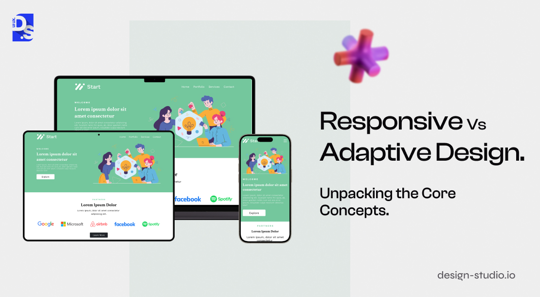
While both responsive and adaptive designs cater to the ever-changing screen sizes of today’s Internet, their technical approaches differ significantly. At its core RWD is all about presenting website content in the most optimal format for the specific device and viewport (the end-user’s screen and browser) accessing it. Early RWD implementations started with a fixed-width desktop design which was then scaled down for smaller screens. However, the rise of smartphones reversed that trend. Now, RWD is ‘mobile-first.’
That means responsive web design companies design and develop for the smallest screens first, then progressively enhance the experience for larger screens and more capable devices. This ensures a seamless user experience across all viewports from the get-go. Both responsive and adaptive designs adjust based on the browser environment (typically screen width).
But, RWD’s strength lies in its ability to adapt. responsive web designers use CSS media queries: a powerful tool that can modify a site’s appearance/behavior based on specific conditions related to the user’s device, browser, or system settings.
Through the strategic use of media queries, designers can target specific viewport dimensions and apply appropriate styles, allowing the website to fluidly adapt to a variety of devices and screen sizes. That’s why businesses turn to UI/UX web design services to ensure a consistent and engaging experience across all devices.
By defining different CSS rules for specific viewport ranges: the site’s typography, layout, and other design elements can also seamlessly resize and adapt to provide optimal user experiences, no matter how wide or narrow the user’s screen or browser window is. These features enable responsive websites to transcend the limitations of fixed-width layouts and provide fluid, device-agnostic experiences. It’s also how responsive design gets more conversions.
While RWD websites are inherently fluid, adaptive web design takes a more rigid approach. Imagine a website with pre-defined layouts for specific screen sizes, like a buffet with dishes optimized for different appetites. These pre-defined layouts are called breakpoints.
When a user accesses the site, their device’s width triggers the website to “snap” into the most appropriate pre-designed layout. This creates a step-wise adaptation, unlike the fluid flow of responsive design.
Responsive Vs Adaptive Design: The Core Differences
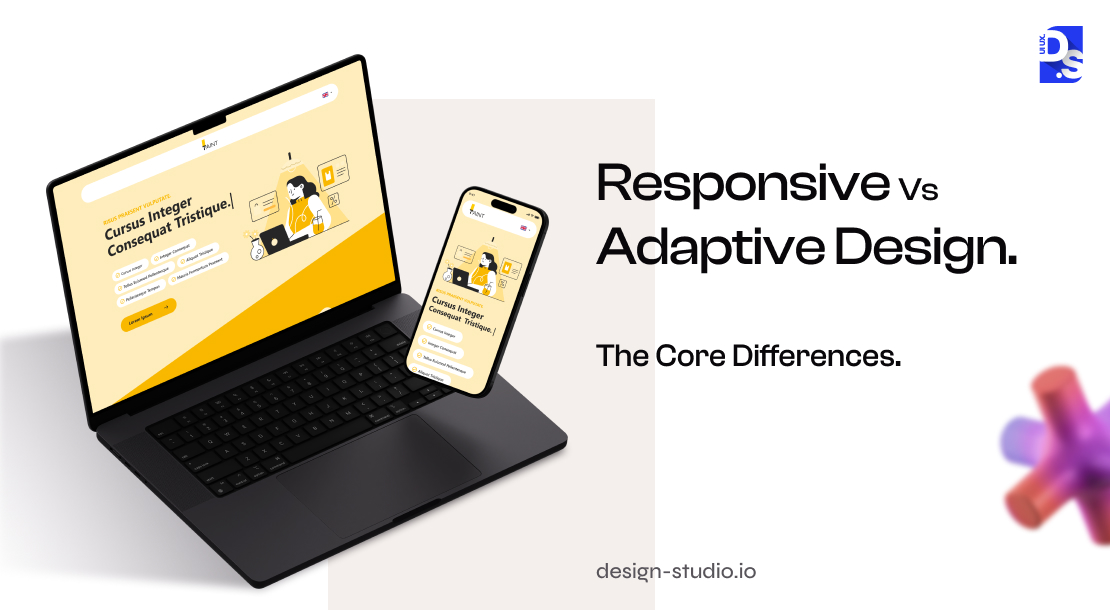
We have unpacked the core concepts of Responsive Web Design and Adaptive Design: fluidity vs. breakpoints. Now, let’s dive deeper to understand the technical implications and trade-offs of each approach. RWD aims to deliver device-agnostic experiences. This philosophy matches well with the current state of the web landscape. Here’s a glimpse into the importance of responsive design:
- 200+ Different Browsers: The sheer number of browsers users can choose from creates a complex environment for website owners and designers.
- Thousands of Unique Smartphone Devices: In the past decade, hundreds of smartphone brands have produced different Android devices. In the same period, Apple has launched over 120 unique devices. The sheer variety of devices, even within a single operating system, highlights the challenge website owners and designers face.
- Infinite User Preference Combinations: If we take into account individual user settings like zoom level and font size, matters get even more complicated.
These factors combine to create millions of potential scenarios for how your website content might be displayed on your users’ screens. RWD tackles this by leveraging the power of CSS media queries and a few other tricks:
- Media Queries for Content Breaks: Media queries are a powerful CSS feature that allows website designers to apply specific web design styles based on certain conditions. In RWD, media queries are used to define points at which the website layout should adjust to optimize for different viewport sizes. For instance, a responsive website might have a media query that auto-rearranges the layout of the site whenever the viewport size shrinks below 768px, i.e. when users transition from tablet to mobile browsing.
- Flexible Assets: Responsive websites can detect the user’s device capabilities and deliver the most appropriate asset version. For example, ‘responsive’ images load following the user’s device or screen, optimizing both load speed and UX.
- Fluid Containers: Instead of defining element widths in fixed pixels (e.g., 300px), RWD uses percentages (e.g., 45%). Using percentages instead of fixed pixel values for element widths allows the website to scale seamlessly across different viewports. As the viewport size changes, the element’s width adjusts accordingly, ensuring a consistent layout across different screens.
Responsive websites use these web design tools and techniques to make fluid, on-the-fly adjustments based on the users’ viewport sizes. Adaptive design, on the other hand, adopts a more rigid approach. It relies on pre-designed layouts optimized for specific screen sizes. These breakpoints are typically defined in pixels:
- 320px for mobile portrait (smaller smartphones)
- 360px for mobile portrait (larger smartphones)
- 480px for mobile landscape (smaller smartphones)
- 640px for mobile landscape (larger smartphones)
- 768px for tablet portrait (smaller tablets)
- 1024px for tablet landscape (larger tablets)
- 1200px for desktop (smaller desktop monitors)
- 1440px for desktop (larger desktop monitors)
- 1920px for desktop (high-resolution desktop monitors)
These breakpoints are not set in stone and can vary depending on the adaptive website’s target audience. When a user accesses an adaptive website, the server detects the device’s viewport width and delivers the layout designed for the closest-matching breakpoint. While some level of adaptation within each breakpoint layout is possible, it still lacks the fluid, on-the-fly adjustments of RWD. Adaptive design’s reliance on breakpoints makes it struggle in this ever-evolving device landscape. New screen sizes emerge constantly.
Creating, testing, deploying, and maintaining sets of pre-defined layouts for each device type and screen size become unsustainable after a while. Meanwhile, RWD’s inherent fluidity allows responsive sites to adapt naturally to new screen sizes.
Can a Website Be Both Adaptive and Responsive?
Is there a way to leverage the strengths of both responsive and adaptive design? Yes. This combined approach is known as RESS (Responsive with Server-Side Elements). RESS combines the fluid, viewport-centric approach of RWD with the targeted content delivery of Adaptive Design. The site’s layout remains responsive, adapting to different screen sizes. But, server-side elements are dynamically injected to enhance the UX. Here’s how a RESS website would function:
- It will serve mobile-optimized app download banners whenever users access the site from smartphones.
- There will be desktop-optimized ads whenever users access the site from PCs.
- It will dynamically adjust product descriptions based on the users’ browser, device type, and location to deliver more targeted experiences.
The key benefit of RESS websites is their ability to create tailored user experiences by leveraging server-side logic. However, RESS websites come with their own challenges:
- Implementing RESS requires expertise in both server-side and client-side dev, making it a more intricate and expensive setup compared to both RWD and Adaptive Design.
- Poorly implemented server-side elements can backfire badly. Sending unnecessary data or making excessive server requests can abruptly slow down RESS websites.
- Maintaining a RESS codebase involves managing both server-rendered and client-rendered components. This requires careful synchronization and is extremely demanding.
More importantly, unlike RWD and Adaptive Design, RESS lacks an extensive ecosystem of frameworks and tools to streamline development, design, and debugging. The incremental benefits of RESS do not justify the additional effort/resources needed to manage the added complexity of server-side elements. That is why modern-day web designers prefer working on responsive and adaptive sites.
Responsive Web Design Examples
1. Slack
Slack’s responsive website replicates both its desktop as well as mobile app experience. A seamless layout shift is offered through CSS Grid and Flexbox, meaning that users can navigate messages, channels, and CTAs without hassle with any device.
2. Dribbble
Dribbble modifies its grid structure according to screens: from 4 columns on desktops and 1 column scroll on mobile, making portfolios visually consistent in any device.
3. Shopify
Shopify employs responsive tactics to dispense various content placement in accordance to device. CTAs shift from the right-hand side of the screen for desktops to the middle below the form with mobile devices, maximizing conversions on different devices.
Adaptive Web Design Examples
1. Amazon
Amazon makes use of the adaptive design approach to keep its focus on speed and performance. Mobile users get a lite version of the site that’s layout-specific and pre optimized for smaller screens- cutting down load time and improving shopping efficiency.
2. USA Today
USA Today’s news platform is responsive in relation to device type. The content layout is aware of the device from which it’s accessed, offering ideal reading experiences based on tablets, smartphones, and desktops.
3. IHG Hotels
IHG utilizes GPS and location services in its intelligent mobile site to assist the users to locate nearby hotels promptly. The adaptive experience, specifically geared towards booking on-the-go, focuses on speed and availability.
Ways of Telling whether a Website is Responsive or Adaptive
In order to check if a website is responsive:
Resize your browser window. If this layout dynamically adapts when the window is being resized down or up it’s responsive.
Open Chrome DevTools → Enabling device toolbar → Resizing screens in various sizes.
To check for adaptive:
Resize the browser window. If the layout jumps at some particular widths (i.e., from 1200px to 768px), then it is most likely that it uses adaptive breakpoints.
Sites that adapt tend to change to a new layout instead of smoothly changing.
Responsive Vs Adaptive Design Important Features
Making things smaller isn’t just what it means to design for mobile — it’s about making every element function perfectly on screens of all kinds. That is how responsive and adaptive approaches impact the most important aspects of mobile-friendly design:
1. Header Content
Responsive: Header elements (logo, menu, search) automatically resize and move on resize of screen width. However, parent navigation bars can stack or collapse abruptly when they are long.
Adaptive: Sprinters can create separate headers for mobile and desktop providing stricter control. As a rule, mobile headers usually contain simplified navs or CTA buttons.
✅ Tip: For responsive websites, use flexible containers and make sticky headers the priority for usability.
2. Text Legibility
Responsive: Fonts can be scaled, depending on a screen size, when using rem and em units. A poor scalability can destroy readability unless tested on breakpoints.
Adaptive: You can specify exact sizes of fonts per layout. Makes for a good read but requires greater effort to be consistent.
✅ Tip: Apply modular scale typography in responsive design to achieve balanced and scalable size of fonts.
3. Navigation Menus
Responsive: Menus shrink into a hamburger icon or slide out drawer as screen shrinks.
Adaptive: You can customize alternate navigation behaviours by device (e.g. persistent bottom nav for mobile).
✅ Tip: Test responsive navs on any device. Tap targets must be kept accessible and thumb-friendly.
4. Sticky Headers
Responsive: Useful for long, scroll-heavy layouts. Can affect performance if not optimised.
Adaptive: Drier to handle because every layout is static; mobile layouts tend to be shorter, so stickiness can be extraneous.
✅ Tip: Apply sticky headers selectively with the help of media queries for small screens solely if you use a responsive design.
5. Visual Hierarchy
Responsive: Can shift unexpectedly when elements (that) reorder or resize incorrectly. This will mean risk of losing the emphasis on CTAs or key info.
Adaptive: Empowers the designers with total control on the visual path of an individual layout.
✅ Tip: Always preview your responsive layout on devices to save design intent.
6. Page Length & Content Density
Responsive: Desktop content spills over into mobile views, filling them up with long vertical scrolls very often.
Adaptive: Enables designers to hide or truncate unessential content on small layouts.
✅ Tip: Apply non mobile display classes (display: none) only where necessary when on mobile.
7. Imagery
Responsive: Images can smoothly scale by max-width: 100%, but large file size can spoil the performance.
Adaptive: Designers can serve optimized image for all layout/devices.
✅ Tip: Deploy srcset and sizes attributes to load responsive images without loading time bloat.
8. Embedded Content
Responsive: iFrames, videos and third-party widgets may break layout when not wrapped correctly.
Adaptive: You can define the fixed embed sizes to each screen, but it is a manual tweaking.
✅ Tip: Use responsive containers (aspect-ratio or padding hacks) in wrapping your embeds and keeping the layout intact.
9. Interactive Elements
Responsive: Buttons and sliders can adjust layout to screen size of the device, whereas tap targets can shrink or stack if not handled.
Adaptive: UX designers can optimize interaction UX (space between buttons, form inputs) for every layout.
✅ Tip: Support at least 44px tap targets, as well as sufficient padding for touch gestures in both strategies.
10. Calls to Action (CTAs)
Responsive: CTAs can move or resize depending on a screen. Placement might impact visibility.
Adaptive: Provides opportunities to move or even redo CTAs of various devices.
✅ Tip: Test Test CTA visibility and click-through behavior on mobile – particularly if they form part of a conversion funnel.
Pros and Cons of the Responsive Design
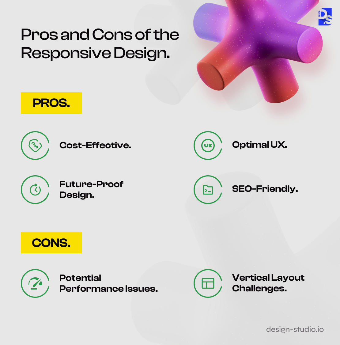
Here are the main reasons why responsive web design has become the de-facto gold standard for mobile-first websites:
Pros
- Cost-Effective: RWD eliminates the need for designing separate layouts, information architectures, navigation systems, etc. for different screen sizes, saving a ton of development and maintenance costs.
- Optimal UX: Whether it’s resizing content, loading appropriately sized images, or automatically sizing CTA buttons to perfectly fit the screen – responsive websites always deliver seamless, user-friendly experiences by dynamically adjusting their layouts and content presentation based on the user’s screen size.
- Future-Proof Design: RWD seamlessly adapts to new screen sizes and devices, keeping websites modern and accessible to new devices. There’s no need to update the design every few months.
- SEO-Friendly: It’s common knowledge that search engines prefer mobile-friendly websites and responsive sites fall under that category.
- Simplified Content Management: Just like with design maintenance, you only need to update content once for that change to be applied to all versions of your responsive site. Plus, responsive sites use percentages and relative units (REM) to auto-adjust all content sizes based on the available viewport.
Cons
Some web designers opt out of responsive design due to certain design trade-offs:
- Potential Performance Issues: Responsive sites are not tailored for individual devices, which is why, in certain instances, these sites may experience longer loading times, particularly when their media assets are not optimized for different mobile screen sizes.
- Vertical Layout Challenges: Unlike in adaptive sites, there is no targeted content delivery on responsive sites. On very small mobile screens, responsive sites that are packed with content can suffer from ‘endless’ vertical scrolling, which, although necessary to access all content, can frustrate users or cause them to overlook key information buried deep within the page.
On very small mobile screens, Responsive sites that are packed with content can suffer from ‘endless’ vertical scrolling. This extensive vertical scrolling can be necessary to access all content. It might frustrate users or lead users to miss key content buried deep down the page.
Pros and Cons of Adaptive Design
Adaptive Design offers an alternative approach to RWD and some surprising advantages:
Pros
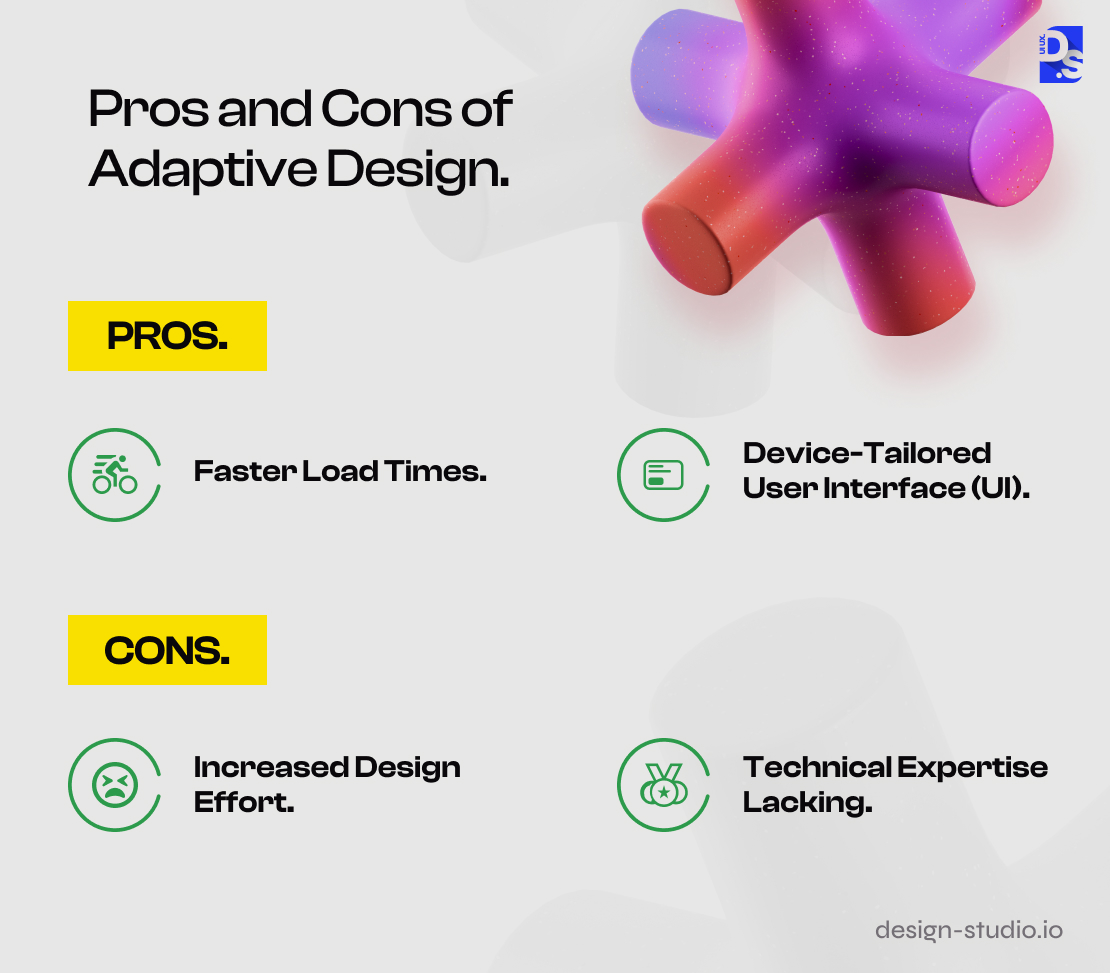
- Faster Load Times: Adaptive websites store pre-built layouts optimized for popular device screen sizes and resolutions. When a user accesses the site from a supported device, the server instantly delivers the most appropriate layout, potentially reducing the amount of data that needs to be processed and displayed. This leads to slightly quicker page loads, especially on devices with limited processing power.
- Device-Tailored User Interface (UI): The performance of responsive websites relies on how well your device and browser can perform complex CSS calculations to adjust the layouts fluidly and dynamically. Not all users have the latest gadgets which can run/read complex CSS code. Adaptive Design uses far simpler logic to deliver pre-defined layouts. This enables adaptive designers to deliver customized user experiences & intricate website UI designs for different devices. Such experiences lead to more engagement.
Cons
Adaptive design comes with its own set of challenges:
- Increased Design Effort: Unlike in RWD, where one codebase adjusts to all screen sizes, adaptive design requires creating and maintaining multiple layouts for different devices. This means more development time, more design time, and more resources are needed.
- Technical Expertise Lacking: Successfully implementing Adaptive Design requires a team with expertise in managing the complexities of different layouts, breakpoints, and codebases. Due to RWD’s popularity, finding such experts is getting harder every year.
Final Thoughts: Which Should You Choose?
- Use Responsive Design if you’re starting a new project or want scalability across future devices. It’s also better for SEO, cost-efficiency, and single-codebase maintenance.
- Use Adaptive Design if you’re retrofitting an existing large-scale site, want pixel-perfect control over specific devices, or prioritize performance on known screen widths.
Still unsure? Consider hybrid approaches or consult with a responsive web design agency to evaluate your specific use case.
FAQ: Responsive vs Adaptive Design
Q1. Which is better for SEO: Responsive or Adaptive design?
A: Google prefers responsive design since it has one URL and the codebase, which makes indexing and crawling rather easier. Responsive sites also respond well to newer devices, which makes for long-term SEO.
Q2. Can both of the responsive and adaptive be combined?
A: Yes. The strategy has a name, RESS (Responsive Design + Server Side Components). The layout has fluid responsiveness (RWD); server-side scripts emit device-specific content for the sake of performance.
Q3. If the question is whether to go for adaptive design for a legacy website, then the answer is yes.
A: Adaptive is usually optimal in the case of retrofitting older websites that lacked desktop options. It enables pinpointed layouts for known devices without having to reconstruct the codebase radically for responsiveness.