

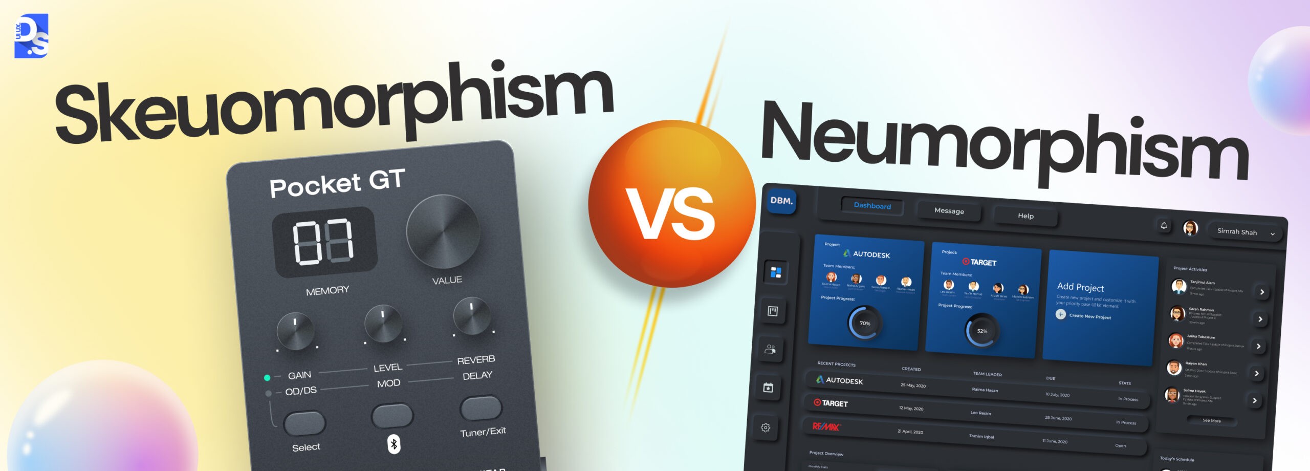
Skeuomorphism Vs Neumorphism : Battle of UI Design Trends



Summary
Skeuomorphism is based on mimicking real-world objects, including their textures and depth, while neumorphism adds soft shadows to create subtle depth. Both design trends approach realism differently, but each gives interface elements a tactile, modern look.
UI design is not about just building aesthetic digital products, it’s about creating modern, usable and functional products to gain users’ trust.
In 2026, two UI design trends are dominating the market, skeuomorphism (recreates real-world objects) and neumorphism (adds 3D-like appearance).
Although there’s contention between the two, one thing is clear, the right design trend will lead to better engagement, retention, and conversion.
What Does Skeuomorphic Mean?
Skeuomorphic describes a digital design that mimics the appearance of a real-world object like a folder icon shaped like a physical folder, or a save icon shaped like a floppy disk. The design principle behind this is called skeuomorphism, and it was the dominant UI style from the 1980s through the early 2010s.
What is Skeuomorphism vs Neumorphism?
The difference between skeuomorphism and neumorphism lies in the way they cover depth and familiarity.
Skeuomorphism recreates physical objects with their textures, gradients, and shadows (folder icons mimic physical file storage, and save looks like floppy disks) and has been a prevalent design for 30 years.
Neumorphism is a niche-specific design leaning toward depth over realism, using two types of CSS shadows (light and dark) over a neutral background to create a dynamic 3D effect.
The skeuomorphism vs neumorphism debate has been overblown in recent years. Both design approaches are intrinsically related and they currently coexist amicably in the world of digital design.
In contrast, emerging styles like Neubrutalism in web design embrace bold visuals, raw aesthetics, and a more rebellious approach to modern interface design, offering designers fresh ways to break from convention.
Both design approaches ultimately serve the same purpose:
- Making interfaces intuitive.
- Making interfaces visually appealing.
- Making interfaces user-friendly, which is equally important when aiming to design logos that resonate with users.
For UI/UX design agencies and designers alike, both are equally interesting to explore.
The choice between skeuomorphism vs neumorphism will ultimately boil down to your project’s goals and your target audience’s aesthetic preferences.
We will also discuss their impact on user experiences and navigate the nuances of choosing the right style for your next digital design project, highlighting the importance of UX design. Before that, let us clarify some terms.
Skeumorphism was first introduced as a design philosophy in 1980’s, where the digital element directly mimics physical world, at a time where people are beginning to use computer applications for the first time.
Neumorphism entered the scene later in 2019, and combined the concepts of flat design with skeumorphic depth to create the soft UI look. Skeumorphism ruled for 20 years, while neumorphism remains a niche-specific choice to this day.
Here are the three designs at a glance
Skeuomorphism vs Neumorphism vs Flat Design
| Dimension | Skeumorphism | Neumorphism | Flat Design |
| Origin | 1980s | 2019 | 2013 |
| Core Competency | Realistic textures, shadows, mimics physical objects | Soft shadows, dual shadows | Clean lines, no shadows |
| Adoption | 20+ years of dominance | Selective use | Used in mainstream elements |
| Accessibility | Good, high-contrast | Poor, low-contrast | Depends on color contrast management |
| Mobile performance | resource-intensive | Moderate | Light |
| Best Used For | Onboarding new user groups, gaming, audio software | Card layouts, brand graphics | Apps, websites, digital products |
| Cognitive load | Low for new users | Medium | Low for experienced users |
| Emotional tone | Warm | Calm, sophisticated | Efficient and neutral |
Skeuomorphism recreates real-world textures, shadows, and depth to make interfaces feel familiar, while flat design strips away all of that in favor of clean lines, solid colors, and no shadows – prioritizing visual clarity and speed over realism.
What Are the Key Differences Between Skeuomorphism and Neumorphism in Design, Usability, and Industry Impact?
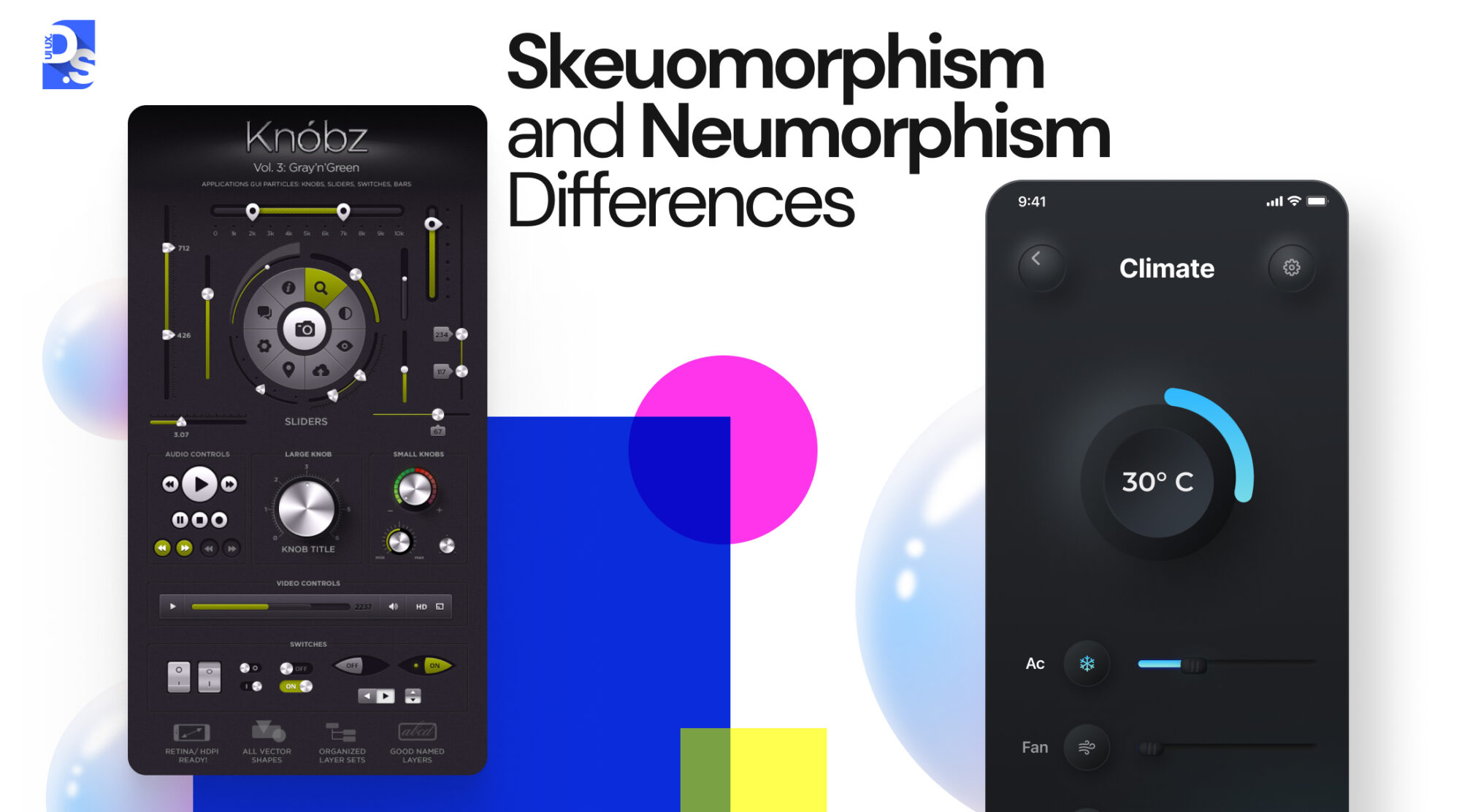
The main differences between skeuomorphism and neumorphism span four broad areas:
- Accessibility: Skeuomorphism supports visual affordance; neumorphism often fails to comply with WCAG contrast requirements.
- Design characteristic: Skeuomorphism replicates realistic objects; neumorphism focuses on adding subtle 3D depth.
- User experience: Skeuomorphism adds familiarity through real-world cues; neumorphism adds minimalism and depth signals.
- Industry impact: Skeuomorphism was the dominant style for 20+ years; neumorphism is mainly used for niche industries.
These differences are further explained in this table.
| Feature | Skeuomorphism | Neumorphism |
| Goal | Realistic representations of real-life objects with textures and shadows. | Subtle shadows and gradients to create depth without realism. |
| User Experience | Familiar and approachable but can become cluttered. | Minimalist with a touch of tactility. |
| Design Philosophy | Bridge the physical-digital gap, prioritize familiarity. | Add depth to flat design’s clean lines and minimalism. |
| Industry Impact | Dominant trend for 20+ years, widely used. | Niche trend, not widely adopted. |
The most notable point of difference between skeuomorphism vs. neumorphism is their impact on the industry.
While skeuomorphism dominated the digital landscape for over two decades, appearing in everything from Windows 95 to Apple’s early Mac OS, neumorphism has been nothing more than a UI/UX design trend.
The days of having entire websites/apps completely rendered in neumorphism are long behind us.
That does not mean neumorphism will be demoted to the dustbin of failed design trends.
Designers will still use elements of neumorphism, especially when creating things like card layouts or brand graphics that are not meant to be functional.
What Is Skeuomorphism and Why Did It Dominate Digital Design for 30 Years?
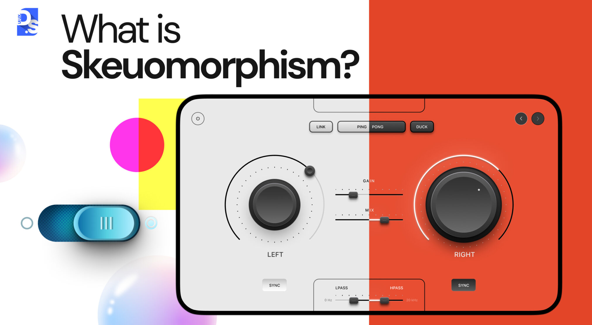
Skeuomorphism is a principle of user interface design that became popular in the 1980s.
The concept suggests designing interface elements to resemble the object they substitute:
- The folder icon resembles a folder.
- The delete button resembles a wastebasket.
- The save button resembles a floppy disk.
It was extremely successful for 30 years since it provided an effective solution to one critical task—to help those who were not used to using a graphical interface learn what every element did without explaining how the program works.
Skeuomorphic design reduced users’ cognitive efforts by presenting something familiar to them, thus, helping software giants like Apple and Microsoft stick to this type of design until the 2000s.
Skeuomorphism was developed in the 1980s: a time when computer interfaces were brand-new and users had no prior experience interacting with Graphic User Interfaces (GUIs).
These interfaces were mostly text-based and users had to enter cryptic commands to interact with the devices.
Needless to say, the average person was not drawn to these complicated, text-based interfaces.
To familiarize the average user with GUIs and computer technology, visionary designers working at major tech companies in Silicon Valley at the time decided to make the components and design elements on interfaces look more like their real-life counterparts.
The reasoning behind this design decision was simple: computer interfaces would feel much less confusing to use if they featured design elements that closely mimicked real-world objects.
- Abstract menus on interfaces were presented as filing cabinets with folders popping out, indicating to the user that this is where you can find your saved files.
- You could even rearrange files-to-folders: another real-life counterpart.
- That page on the interface where users could drag, drop, and delete unwanted files? It was now represented by a neat trash can icon.
- Want to save a file to your computer’s memory? Just click on the “Save” button which looks like a floppy disc: the (then) universal symbol of storing data.
All of these familiar-looking icons, buttons, and design elements sported textures and shadows which made them appear even more ‘real’ and feel incredibly tactile.
This realistic look enticed users to press down on the interface buttons, just like they would on real switches.
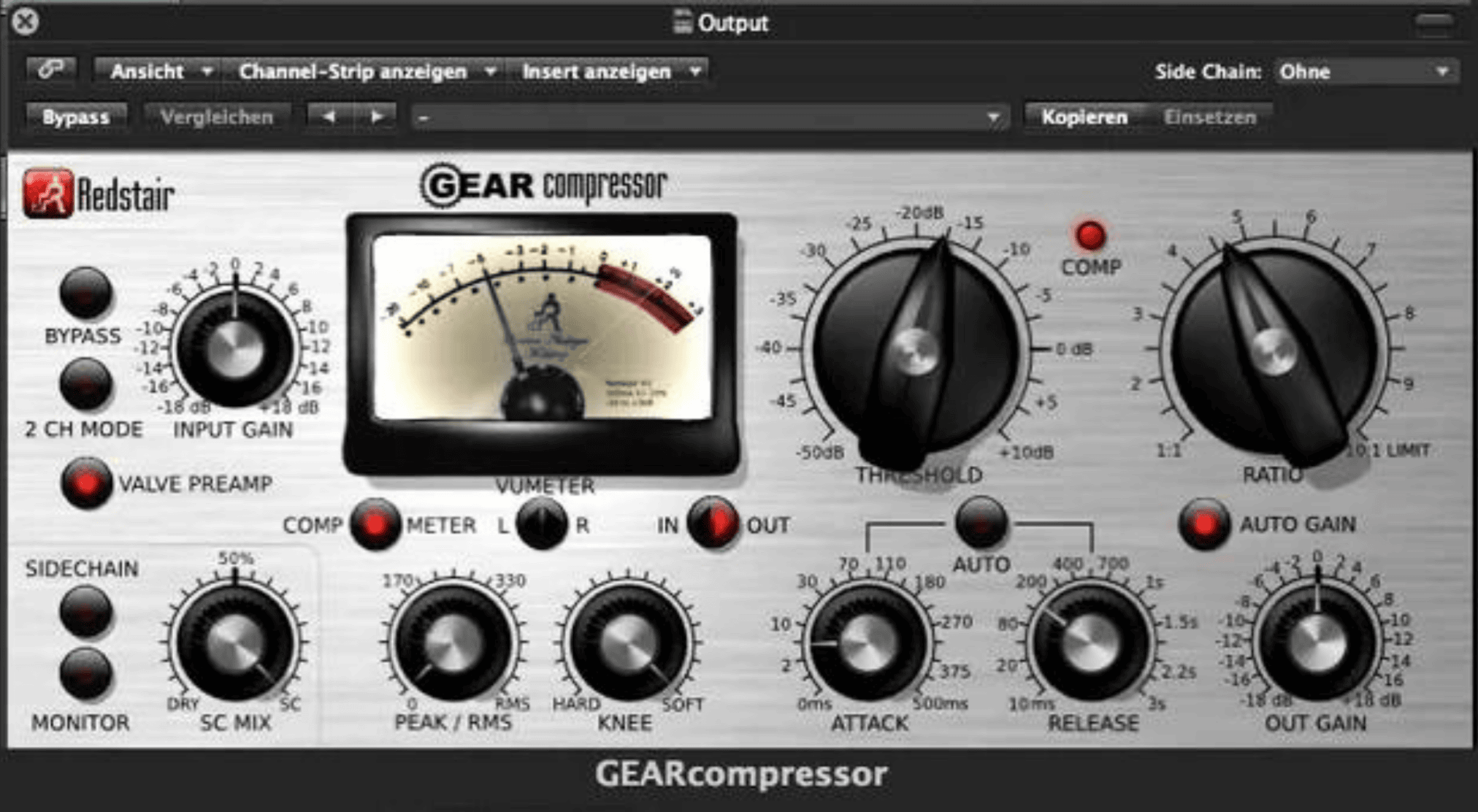
Skeuomorphic design became the industry standard almost as soon as it was incepted.
The idea behind it made total sense and it was championed by the leading software companies of the time who saw its potential to make computer interfaces accessible to wider audiences.
- Apple’s classic Mac OS interface was packed with skeuomorphic buttons, scrollbars, and menus.
- All the early versions of Windows embraced skeuomorphism.
- All the early game consoles like the Sega Genesis or the Nintendo Entertainment System (NES) used skeuomorphic designs to optimize their users’ transition from physical arcade games to video gaming consoles.
Between 1980 and 2010, skeuomorphic design helped hundreds of millions of users across the world navigate computer screens with ease.
It transformed intimidating digital interactions into comfortable extensions of the real world.
Skeuomorphic design has shown to reduce error rates and cognitive load of first-time users by 40%, due to its close resemblance to the physical world (Interaction Design Foundation’s 2024 History of UI Design).
Pressing a skeuomorphic button on a screen felt like pushing a physical switch and this feeling laid the foundation for modern-day user-centered design.
How Did Skeuomorphic Design Work?
- Abstract menus looked like filing cabinets with folders, just like their real-world counterparts, indicating where saved files could be found.
- The drag-and-drop interaction for file management directly mirrored real-world folder logic.
- The trash can icon allows users to delete files, just like a real-world trash can.
- The ‘Save’ button looked like a floppy disc, then the universal symbol of storing data.
- All icons, buttons, and design elements appear incredibly tactile, enticing users to press them just like real switches.
Skeuomorphic design successfully minimized user hesitation by recreating familiar elements, prompting Apple and Microsoft to continue with this design style till 2000s.
What Are The Key Features of Skeuomorphism ?
Skeuomorphic UI design offers four distinct features:
- Real-life object representation: Digital elements replicate physical objects (e.g., Apple’s iBook bookshelf, floppy-disk-shaped ‘Save’ icon).
- Culture and nostalgia: Design evokes familiar cultural moments (e.g., Spotify’s cassette tape playback interface).
- 3D appearance: Achieved through textures and directional lighting — shadows, gradients, and bevels give depth to elements.
- Limited mobile suitability: High-resolution textures and complex rendering are resource-intensive on mobile hardware.rdware).
The fourth factor is the reason it is replaced by flat design with the initiation of the mobile-first era.
| Key Feature of Skeuomorphism | Description | Example of Skeuomorphic UI Design | Example of Skeuomorphic UX Design |
| Real-life Object Representation | Mimicking the look/feel of physical objects. | Apple’s original iBook app bookshelf interface. Each ‘book’ had individual textures, reflections, and other design features that mimicked a real bookshelf. | Early iOS notification centers featured gears and a physical lever to allow users to “pull down” their notifications. |
| Cues from the Past or Culture | Evoking nostalgia through cultural references in design elements. | Spotify used to have a classic cassette tape interface for playback controls. | Nintendo Switch’s Joy-Con controllers featured a realistic D-pad, reminiscent of classic arcade game controllers. |
| 3D Appearance | Creating depth and dimension through colors, shadows, textures, and lighting. | Windows Vista’s glass effect, made icons appear as if they are placed on a layered desktop. | Early video game menus featured 3D buttons. When users click on these buttons, they would appear as if they are being “pressed down.” This effect provided tactile feedback to gamers. |
| Limited Mobile Suitability | Can be resource-intensive and hinder performances on low-battery devices like mobile phones. | Early Android icons used to feature detailed textures and intricate shadows. They were replaced with clutter-free flat icons. | BlackBerry’s skeuomorphic navigation buttons had to be phased out and replaced with flat, touch-based icons. |
According to Google’s 2024 Core Web Vitals, high-resolution assets and complex drop-shadow rendering both contribute to poor LCP (Largest Contentful Paint) on mobile devices.
To remove this bandwidth constraint in mobile interfaces and preserve battery life, skeuomorphic elements are gradually replaced.
Even when the first iPhone was launched in 2007, skeuomorphism dominated its interface, easing people into the concept of touchscreen technology.
However, as the average user became more ‘tech-savvy’ the need for the real-life and digital resemblance dwindled.
The average user no longer needed digital icons to look like their real-life counterparts to decipher what they resembled.
These icons started to look and feel heavier than they were supposed to, leading to huge amounts of clutter building up on phone and desktop screens.
Skeuomorphic design elements featured too many redundant details that the average user no longer needed.
In 2013, Apple ditched skeuomorphism for a new design style: flat design which prompted Forbes to officially declare the ‘death of skeuomorphism.’
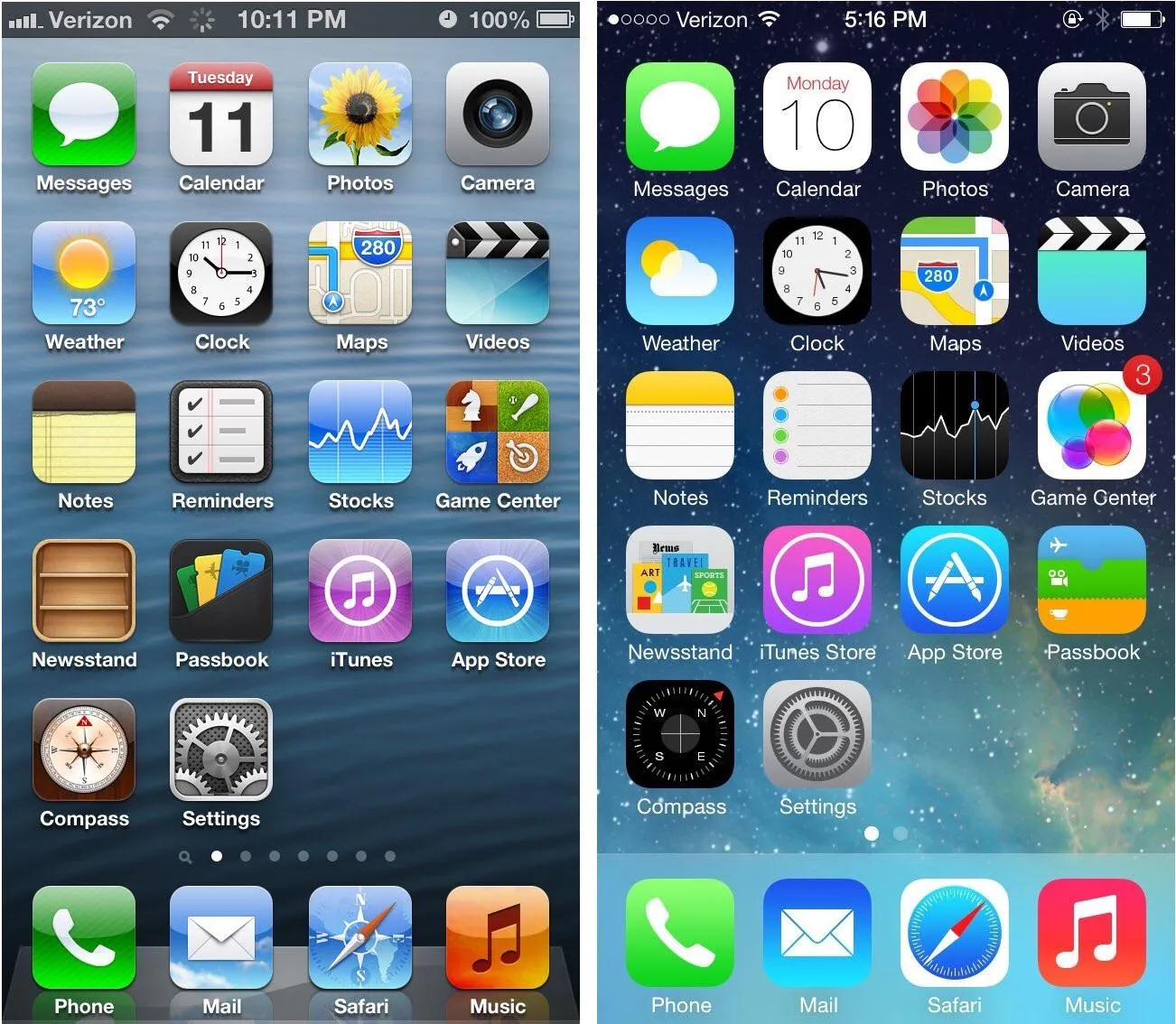
In 2013, Apple launched iOS 7 and this updated operating system featured an interface that looked nothing like its predecessor. The phone, messages, calendar, and all other on-screen application icons had lost their skeuomorphic designs.
They were replaced by sharper, flatter icons with slimmer fonts placed on clean, flat layouts. The bold, primary color palettes of the old iOS 6 interface were replaced by modern shades/tones.
Apple’s head of design Jony Ive has claimed that this new flat design style made the iPhone “appear bigger” because each app’s icon looked smaller and made better use of the screen space available to it.
Both designers and users agreed that the new flat design looked light and more visually appealing than the dated and cluttered skeuomorphic designs of the past.
A study in 2024 on flat design adoption by NNG demonstrated that flat design presents both pros (better visual clarity and less cluttered interfaces) and cons (‘flat design blindness’ or the inability to identify interactive elements without visual assistance of skeuomorphism).
This led to the reintroduction of subtle depth cues through neumorphic designs.
Once Apple made the switch from skeuomorphic design to flat design, others followed. Google, Microsoft, Sony, and most major software companies adopted flat design.
This design style had one clear mandate: digital interfaces must be clutter-free.
Visual clarity was placed at the forefront of this design approach so skeuomorphic elements like shadows, beveled edges, gradients, etc., were all stripped away from digital interfaces.
This transition from skeuomorphism to flat design was not easy for all companies.
For example, Windows 8 replaced all familiar icons with minimalistic tiles — a frustrating experience for many users.
From a user-acceptance perspective, Apple’s foray into flat design was the opposite of Microsoft’s.
The minimalist approach displayed in iOS 7 was celebrated as a work of art, and skeuomorphism was declared deceased as soon as flat design hit the market.
However, professional designers knew that skeuomorphism was far from dead.
Most professional designers would agree that skeuomorphism and flat design are not distinctively different, but closely related.
The camera icon on Apple devices, for instance, still features the camera graphic.
Yes, this graphic does not look as lifelike as it used to be before the iOS 7 update. But it still mimics a real-life camera.
In this sense, flat design did not ‘kill’ skeuomorphism. It simply muted it and made it subtler and more symbolic.
The flat design embraced the idea of representing familiar objects while shedding the clutter and baggage that came with skeuomorphism’s focus on detailed realism.
How To Implement Skeuomorphism and Neumorphism in Modern UI Design?
Neumorphism in modern UI design can be implemented through three core techniques:
- CSS box-shadow property: Use 2 low-opacity shadow values on a neutral background.
- Light shadow: Placed on the top-left corner as a highlight.
- Dark shadow: Placed on the bottom-right for depth.
The background colour should match the page element (usually neutral grey or off-white) to produce the soft extrusion effect.
Skeuomorphism plays with high-resolution texture assets, realistic gradients, and direction lightning effects, all of which can be applied through CSS, Webflow, Framer, or Figma.
These UI design styles should be tested for WCAG 2.2 contrast compliance and performance optimization.
When applied carefully, skeuomorphism and neumorphism can give a design dimension and individuality.
How would anyone know which style would work best? It depends on the use case and business requirements (accessibility is a key concern).
How To Implement Neumorphic Effect Using CSS Box-Shadow
In CSS, neumorphic design is created using three properties:
- Double box-shadow values on a single element.
- Light shadow: Positive x/y offset, low blur, white or light-grey colour at 80% opacity, placed top-left.
- Dark shadow: Negative x/y offset, same blur radius, 30–40% darker than the background, placed bottom-right.
The page and background colour must be the same — or the background 5–10% lighter — to create the intended soft extrusion effect.
The manual formula is box-shadow: -6px -6px 12 px rgba (255, 255,255,0.8), 6px 6px 12px rgba (0,0,0,0.15) on #e0e5ec background.
Which Design Tools Are Best For Creating Skeuomorphic and Neumorphic UI?
Four tools are commonly used to create skeuomorphic and neumorphic designs:
- Figma: Use shadow and blur plugins for neumorphism; noise and texture plugins for skeuomorphism.
- Webflow: Enables neumorphic CSS implementation without hand-coding.
- Framer: Add neumorphic micro-interactions and motion design.
- CSS Glass Generator: Create rapid neumorphic shadow values.
Adobe Photoshop or Illustrator is the superior choice for building high-fidelity and convincing texture assets that can be exported and implemented via CSS background-image or SVG.
How Do You Make Neumorphic and Skeuomorphic Designs Accessible?
Neumorphism is low-contrast by default, and here are five interventions to override it:
1. A minimum of 4.5:1 contrast ratio between text and background (WebAIM contrast testing mandatory before exporting)
2. Shadow depth should not be the only indicator of interactive and non-interactive state (a change in color, or size to signify affordance),
3. Use visible focus indicators to support keyboard navigation, must be tested with the Stark plugin for eight color vision deficiency situations.
The entire functional information must be portrayed through shape, label, or color. Skeuomorphic design provides familiarity with real-world through raised buttons, textured surfaces, and clear labels to signify interactivity.
What is Neumorphism and How Did It Emerge from Skeuomorphism?
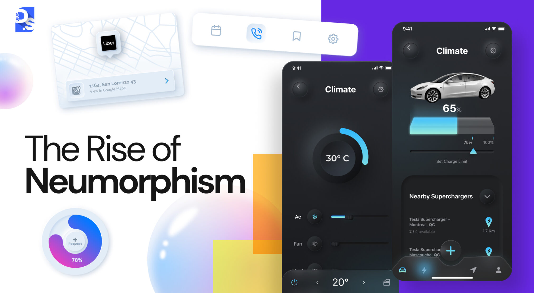
Neumorphism in UI design emerged in 2019 headlined by Alexander Plyuto, when he introduced interface prototypes on Dribble.
He showed how flat design apps will appear when rendered through skeuomorphic style, and soon Michal Msalewicz wrote an article and coined the term ‘neumorphism’ (‘new’ and ‘skeuomorphism’).
Here the clean lines and minimalistic color palette from flat design is merged with dual-shadow effect to create a soft-protrusion like illusion.
Unlike skeuomorphism, neumorphism delves on tactile quality, to create a modern aesthetic.
Throughout the 2010s, flat design dominated the world of digital design.
Every tech company was looking to make their digital products appear sleeker and more minimalistic than their competitors.
Sleek lines, minimal clutter, slim fonts, and other flat design elements became more than just aesthetic choices: they became symbols of technological advancement, a way for companies to declare their status as elite front-runners in the digital revolution.
Behind the scenes, a quiet, nostalgia-fueled design revolution was brewing.
Within days of Plyuto’s idea being shared on Dribbble, it went viral. Skeuomorphism was suddenly back in the conversation, this time with a contemporary twist.
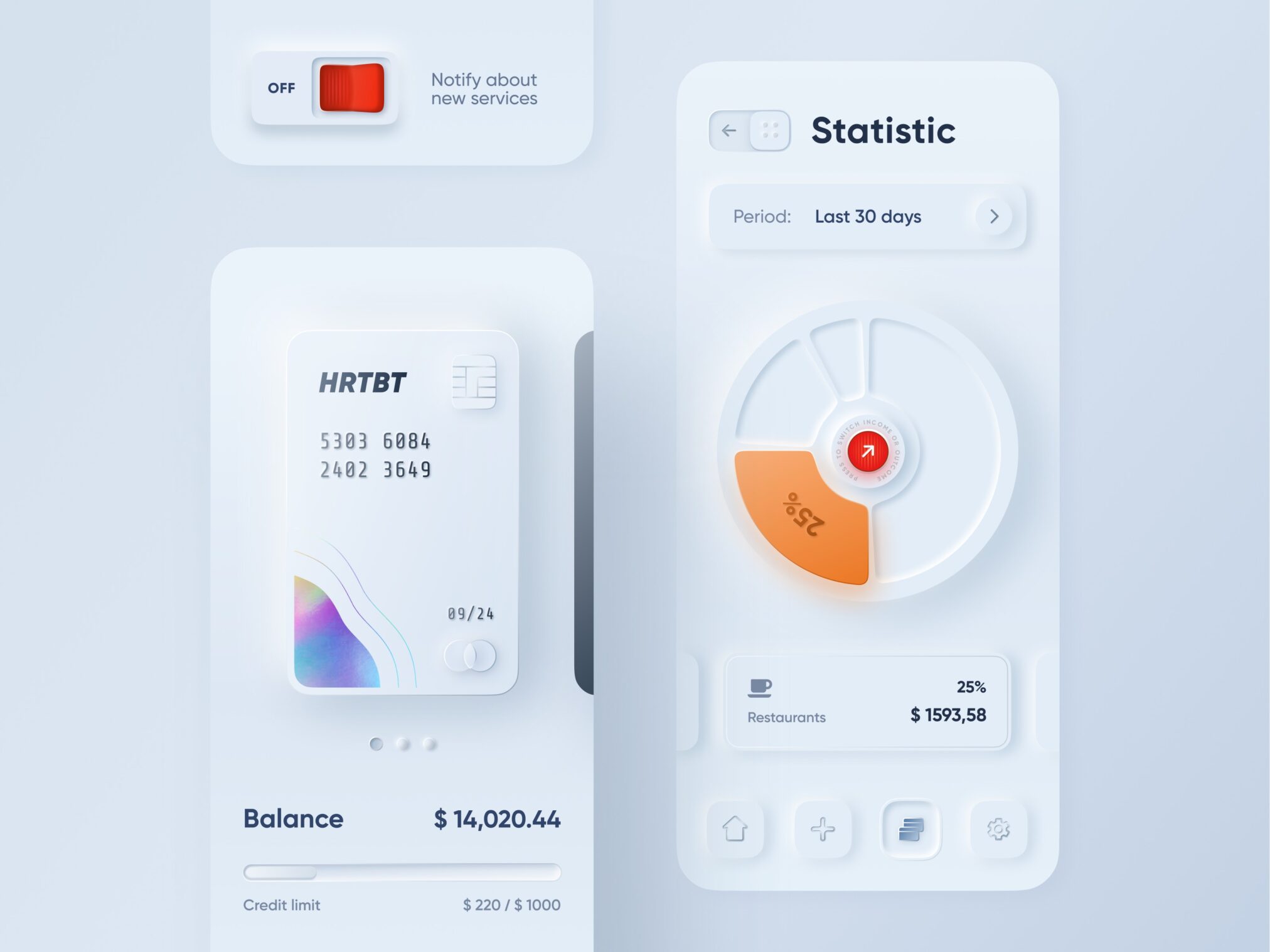
(Source)
Michael Malewicz in his original 2019 Medium article, coined the term ‘neumorphism’ for a design approach that does not fully conform to skeuomorphism or flat design and creates a 3D-like shadow depth through CSS techniques.
This article has been quoted 2,000 times and is considered one of the primary articles to understand neumorphism and technical implementation.
Jason Kelley, another prominent designer, marveled at Plyuto’s creation, calling it “new skeuomorphism.”
As you can see in the image above, this ‘new skeuomorphic’ interface feels both familiar and new. It creates a sense of depth and tactility by borrowing elements like shadows and textures from the physical world.
But, it uses these elements in a subtle, inconspicuous way, without sacrificing the clean lines and minimalism of modern flat design.
Neumorphism is not an out-and-out comeback to skeuomorphism; it is a design style that combines flat and skeuomorphic elements to create something entirely new.
A sample code would look like this:
“ { background: #e0e5ec; border-radius: 16px; box-shadow: -6px -6px 12px rgba(255,255,255,0.8), 6px 6px 12px rgba(163,177,198,0.6); padding: 24px; }”
Imagine a flat, minimalistic interface. To make it ‘neumorphic,’ you do not need to add much. Instead, simply add subtle shadows and highlights to the flat design elements on the interface.
You will notice that the elements appear ‘three-dimensional’ much like your typical skeuomorphic element. Here are some more subtle ways to make your designs neumorphic:
Extruded Appearance:
Soft extrusion in neumorphic design happens when elements appear to push upward and outward from the background (they don’t float or sit flat), like they are created out of the same material.
- This can be achieved by choosing a background colour that’s near identical to the page, and complementing it with double shadow elements.
- The light shadow would reflect light, while the dark shadow would create depth.
- Neumorphic elements include an embossed icon, a raised button, or a topographic view of interactive elements — and none replicate skeuomorphism.
Shadow Play:
Neumorphism relies on a dual-shadow technique to add depth to digital elements using laws of light hitting an elevated object.
- Light shadow (white or near-white, low opacity) is placed top-left to mimic ambient lighting on the top part.
- Dark shadow (located on bottom-right) indicates the depth of the shadow cast by the object.
Neutral Backgrounds:
Neumorphic designs works with neutral mid-range backgrounds to ensure that the dual-shadow depth technique to work:
- Use a gray-blue like #e0e5ec or a warm off-white background.
- The element and background must share nearly the same hue and lightness value.
- On extreme white or black backgrounds, one of the two shadows becomes invisible, the extruded effect collapses entirely, which showcases the impact of color psychology.
- Neutral backgrounds partially address the accessibility problem by maintaining some contrast.
These backgrounds also partially solve its accessibility problem by using shadow extremes to maintain some contrast, however, this still frequently falls below WCAG 2.2’s 4.5:1 requirement.
Rounded Corners:
Rounded corners in neumorphic design create a convincing extruded depth effect by eliminating the sharp 90-degree edges that would be physically implausible for a soft material pushed up from a surface.
Neumorphic elements use border-radius values that mirror this soft-material logic:
- 12–20px for card components.
- 50% for icon buttons.
Rounded corners also contribute to neumorphism’s emotional tone, smooth, organic, approachable, which differentiates it from flat design’s sharp geometry and skeuomorphism’s object-specific edge profiles.
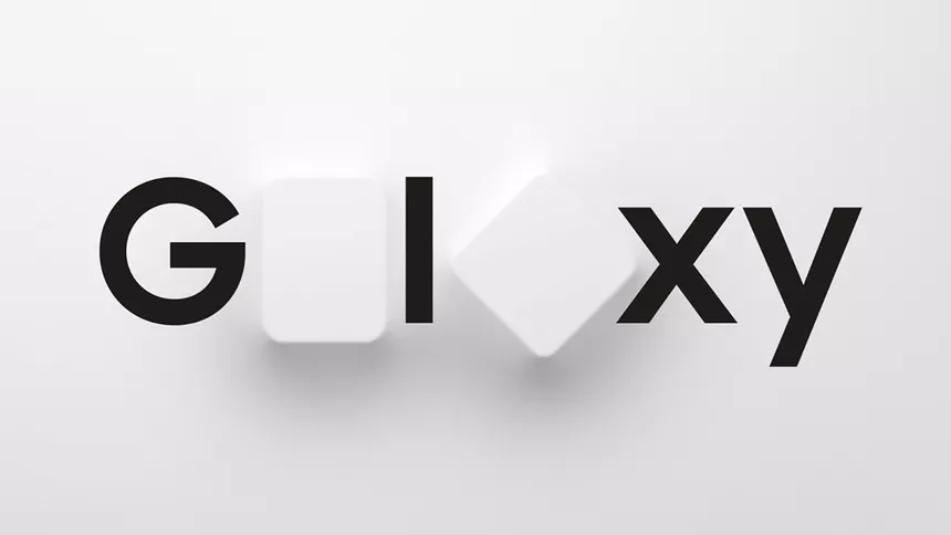
Smooth, subtle, and organic: These three words perfectly describe the neumorphic aesthetic. Since neumorphism went ‘viral’ in 2019, it has found its way into the mainstream several times, most notably in the Samsung Galaxy Unpacked logo which was released in 2021:
When applied correctly, the neumorphic style can definitely make any interface appear classy yet inviting. But, when any UI/UX trend gets way too much attention far too quickly, it is guaranteed to attract scrutiny.
That is exactly what happened. Many members of the design community started pointing out that neumorphism had no positive impact on usability.
According to them, neumorphic designs failed to meet a basic contrast-related web content accessibility guideline. WEBAIM 2024 Web Accessibility in Mind report states the minimum contrast ratio of 4.5:1 for normal text and 3:1 for large text.
Neumorphism cannot meet either of these standards because it uses shadow effects on near-white (near matching) background colors, making it inaccessible to 300 million people with color vision issues or vision impairment.
When designs fail to meet this specific color-contrast ratio, the design elements, components, and buttons tend to blend into the background.
It becomes impossible to figure out what is on the screen and all fonts appear illegible.
These negative effects impact people with vision issues the most.
Here is an example of what a neumorphic interface looks like to a person with blurry vision:
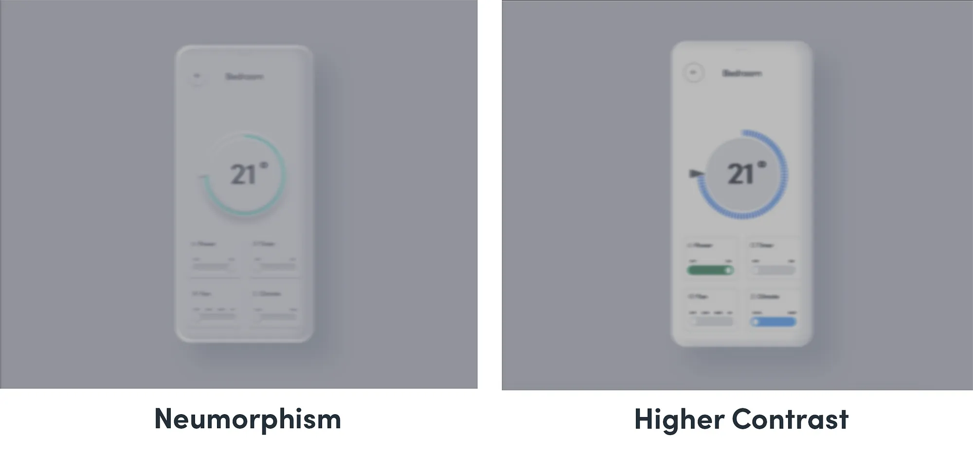
Notice how the poor contrast, the uninspiring color palette, and the absence of well-defined icons and easy-to-ready labeling makes this interface undecipherable?
Yep, that is the main issue designers have with neumorphism.
Another reason why many designers are not fans of neumorphism is the fact that it is not easy to execute.
Getting that cool, 3D-ish “bump” out of an object in Neumorphism with Cascading Style Sheets (CSS) is not as simple as just adding shadows.
It is like trying to sculpt something out of nothing. You will have to manually adjust the shadow and the color of the background to get that neumorphic, extruded appearance. It is all a bit nuanced!
All of this is not to say that neumorphism is best avoided. Once you start experimenting with neumorphic designs, the shadow play becomes easier to grasp.
You will start to see how adjusting one element affects the entire interface, developing your own instinctive understanding of neumorphic sculpting in CSS.
Making your neumorphic designs more accessible for users with visual impairments is also possible if you make the elements clear, legible, and organized in a logical structure.
Tools that support neumorphic implementation and accessibility testing:
- Figma — built-in contrast checker.
- WebAIM’s WCAG contrast ratio analyser.
- Stark’s accessibility plugin — necessary to simulate 8 types of colour vision deficiencies without writing a single line of code.
With these tools, accessibility testing becomes part of the design phase, not a post-launch remedy.
To ensure accessible neumorphic designs:
- Ensure strong contrasts.
- Avoid relying on shadows for hierarchy.
- Use alternative methods to share information with visually impaired users.
However, it is fair to say that unlike its predecessors’ skeuomorphism and flat design, neumorphism will never be the industry standard.
Conclusion
Skeuomorphism and neumorphism define notable phases in User Interface design. Skeuomorphism sought to mimic the physical textures to give a sense of the real world feel for the interface digital.
Neumorphism took it a step further by taking the flat design of this style and infusing it further with low contrast, soft shadows and highlights in order to give a subtle raised look.
According to the NNG UX trends report, every UI design pattern (skeuomorphism, flat design, material design and neumorphism) goes through the same repetitive cycle:
- Adoption
- Overextension
- Accessibility criticism
- Selective integration
This means no style is the answer to all questions: a well-designed UI would implement elements from different design styles. The most successful modern web design trends often combine usability, accessibility, minimalism, and subtle realism instead of relying on a single visual philosophy.
At Design Studio UI/UX, we have worked on both skeuomorphic and neumorphic projects. Our secret to successfully navigating the skeuomorphism vs neumorphism debate? Prioritizing users’ needs without sacrificing usability.
As a UI UX Design Company, we sprinkle some classic skeuomorphic cues into our designs whenever it boosts their intuitiveness.
We also lean on the subtlety of neumorphic designs from time to time to create sleek, clutter-free interface designs. To learn more about our process, contact us now!
FAQ’s About Skeuomorphism Vs Neumorphism UI Design Trends
Is Skeuomorphism Still Used in 2026?

Skeuomorphism is not a dominant style like it used to be, however, it is still used selectively. Modern digital products use depth cues in specific scenarios to further improve usability. That’s why audio production software (interfaces that resemble mixing boards and tape machines), gaming UIs (controllers and inventory systems), and onboarding flows for audiences with insufficient product knowledge. Apple’s Notes (legal pad texture), and Voice Memo app (a physical recorder), all retained some semblance of skeuomorphic inspirations.
Is Neumorphism Good or Bad for UX?
Neumorphism might create aesthetic results in a low-stakes environment, mainly for decorative purposes, brand’s image generation, card layouts, and portfolio, where the focus is not on functional clarity. But from a UX POV, it fails WCAG 2.2 accessibility requirements, making it inaccessible for around 300 million people with vision impairments. Sometimes, it fails to convey which elements are interactive, which is a major usability issue.
What replaced Skeuomorphism?
Flat design replaced skeuomorphism as the dominant UI standard when Apple launched iOS 7 in 2013. Flat design showed the dominance of clean geometric shapes, minimal color palettes, over shadows. Google’s Material Design (2014) followed with a modified approach that reintroduced subtle shadows to restore visual hierarchy, sometimes called ‘flat design 2.0.’ Neumorphism (2019) attempted to evolve flat design further by reintroducing tactile depth without realism.
What is the Difference Between Neumorphism and Glassmorphism?
Neumorphism creates depth by making elements appear to push out from the background surface using dual shadow techniques on a neutral, opaque background. Glassmorphism creates depth by making elements appear as frosted glass panels floating above a colorful background, using background blur (backdrop-filter: blur), high transparency, and bright color gradients visible through the translucent surface. Apple’s macOS Sonoma and Monterey use glassmorphism extensively in their system UI; neumorphism has not achieved comparable platform-level adoption.
When should a designer choose Skeuomorphism over flat design?
A designer should choose skeuomorphic elements over flat design in four specific contexts: when designing for audiences with limited digital literacy who need familiar physical cues (elderly users, first-time smartphone users in emerging markets), when designing specialized professional tools replicating physical equipment reduces the learning curve, when designing games or entertainment apps where physical realism enhances immersion and emotional engagement, and when onboarding users to entirely new interaction patterns. Outside these contexts, flat design or hybrid approaches typically serve better because they are lighter, faster, more accessible, and easier to maintain.